По-русски

Byzantine house

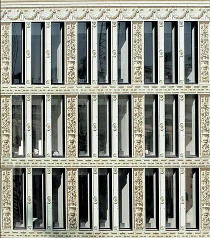
The project of the building on Granatny pereulok looks like a resumption of Sergey Tchoban’s graphic-ornamental searches started in St. Petersburg. Being grafted in Moscow the themes undergoes a number of changes, puts on stone and brings to life Byzantine memories which get an absolutely new interpretation here.

05 March 2008
Объект Архитектура
Architect:
Sergei Tchoban
Firm:
SPEECH
Object:
Granatny 6
Russia, Moscow, Granatny pereulok, 4

2004 — 1.2008 / 2008 — 2010

The chosen for the building site is simply exclusive, and for the other is merely significant because it is right by the Dom Arkhitektora [House of Architect]. For all the rest people the area is just nice, it is one of those parts of the capital centre that managed to save historical development and consequently – almost original urban environment of the end of 19th and beginning of 20th century. Classical embassy district, quiet, status, rich with various architecture – from such well-known masterpieces as private residence of Ryabushinsky by Fedor Shekhtel or house of Tarasov by Ivan Zheltovsky, to “ordinary” commercial apartment buildings constructed hundred or more years ago. They all had minimal influence of the soviet period and have even less of modern time. A zapovednik [a conservancy area]. Well, the eastern part of the site borders with one of such Moscow “zapovednik”.

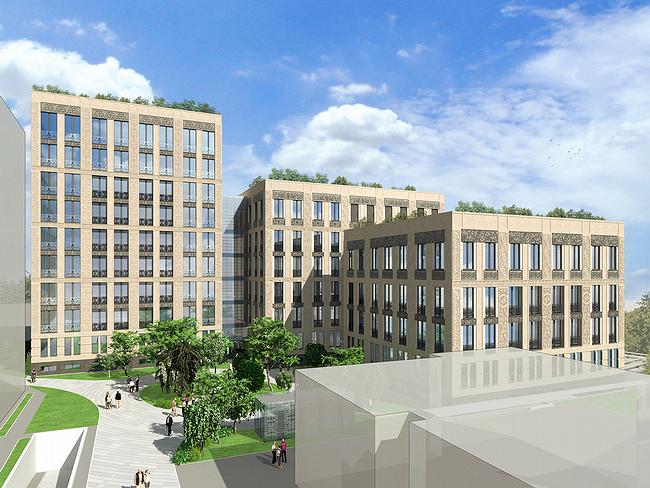
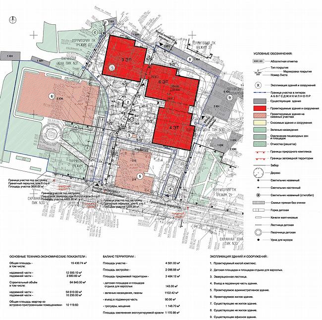
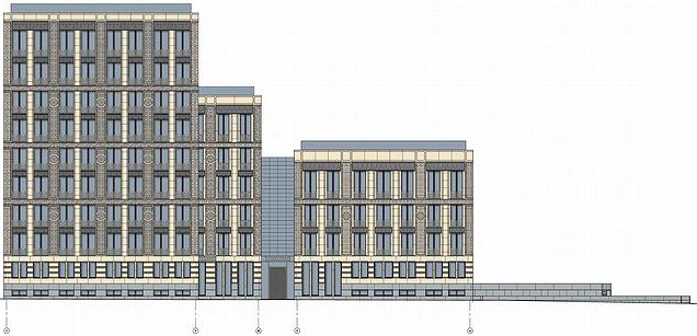
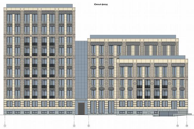
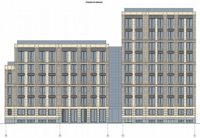
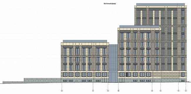
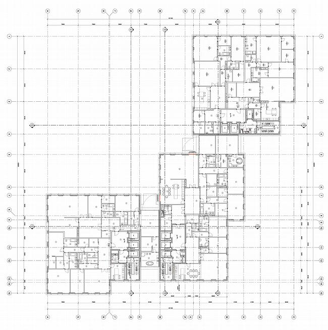
No wonder a residential building will be elite in such company – “ostozhensky” format. Each of the three buildings will be 1-2storey and have just 27 apartments. Its volume composition is common for such types of elite houses in center – the building consists of the three volumes different in height, joined be high glass bridges of passages – from Spiridonovka side there is 9storey one, then closer to Granatny the height lessens to 6 and then to 4 storeys, responding to the presence of Empire house, a monument of architecture. The building are placed “cornerwise”, isolating the small square yard from which through the trees of the small neighbor garden the Dom Arkhitectora will be well seen.

For such elite buildings, in the centre of Moscow, many things are “foregone” – their height is strictly determined by landscape-visual analysis, costly design and facing of facades – by the high price of the future apartments. This is paradoxical – the typology and location suppose strict standards and a multitude of rules, require respectability and make these innumerous buildings imperceptibly alike. And this elite typology demands from each building to have a highlight – some recognizable peculiarity, an attribute, and best – combined with a brief name. “…Semen Semenych, will you live in Medny house? – we will in Rimsky…Ivan Ivanych in Visantisky…”.

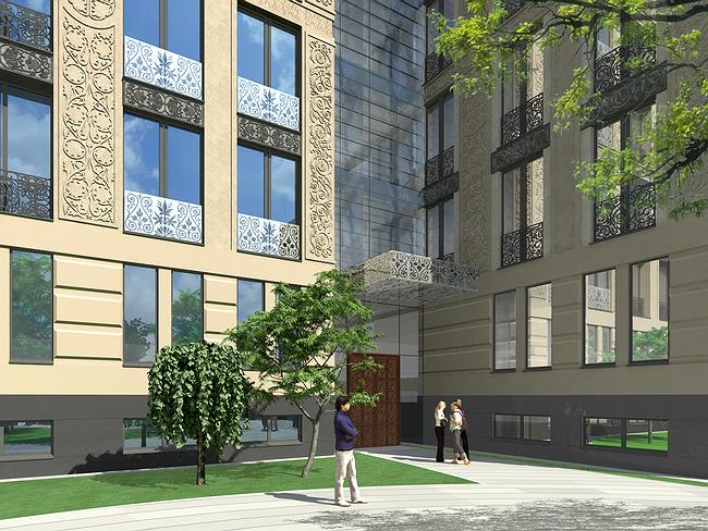
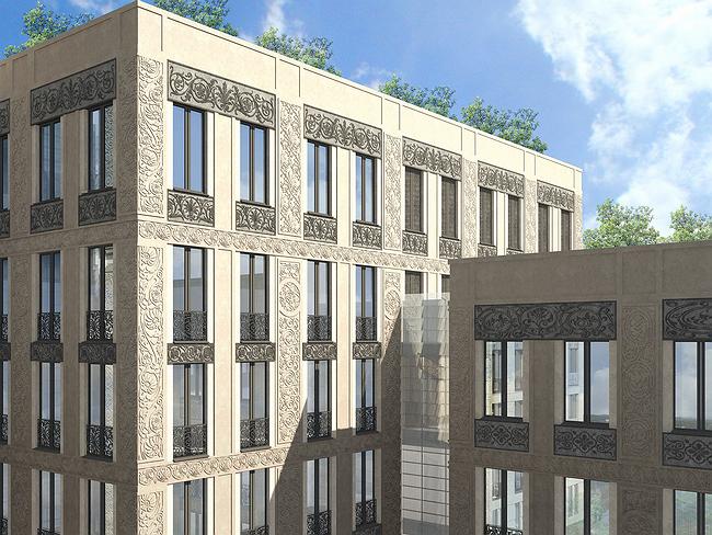
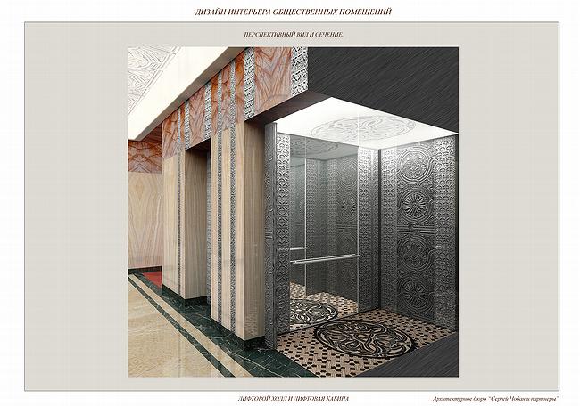
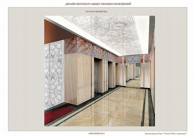
The house in Granatny is that “Visantisky” [Byzantine]. The origin of the name is historically literary, almost touristic and obvious. The method of its realization is an ornament that covers the building everywhere – outside and inside, including lift cabins. Ornament will be applied to the stone facing; glass parapets of “French” windows from floor to ceiling; to iron gratings where these windows are transformed into balcony-loggia; to oak entrance doors; hoods over those doors; ceilings in halls and walls of the mentioned lifts. In the yard there will be a small glass rectangular of a summerhouse – even glass has ornament. Such a list might make anyone dizzy, and it seems the house is not Byzantine, but Asian, because only there one can come across a house-size carved chest.

But this is not really so. Ever-present ornament, successfully established on the four (as minimum) types of materials – actually is arranged in style of simplified and enlarged art-deco. Vertical windows merge into 2torey height stripes, carving is inserted onto fielded panels adding a rhythm to the facades typical for architecture of modernism looking back to classicism. Basement is faced with classical rustication, central parts of facades, following axes symmetry, are marked by rows of loggias. This brings to architecture of Stalin period, notably rather post- than pre-war. Indeed – famous architecture Andrey Burov (1900-1957), many graduates of MarchI consider him their master, he experimented with such ornamental filling of façades. He designed the portico of Dom Arkhitectora in Granatny, which will view the yard of “Byzantine house” – a thread of succession is obvious.

However, need to remind that Art Nouveau in 1910 started experiences with “carpet” (or almost carpet) facade décor – the style interested in ornaments in all forms. By Pokrovskie Vorota on Chistoprudny boulevard there is a house covered by enlarged and flattened copies lions and deer of Vladimir and Suzdal, it is a close relative of the “Byzantine house” but built a little over hundred years ago. Besides, it is well-known, even after Burov in Art Nouveau architecture Soviet as well as European, interest in ornament was alive and developed, but never developed in to a mainstream. Nowadays, lace is very popular in architecture abroad, it seems that even more than in 70’s – they are used as decorative insertions or they cover the whole giant buildings, like airport Jeddah (Saudi Arabia) by Remment Koolhaas.

Generally speaking, if leave out “brutalism” that respects mass and texture, and also “minimalism” that likes plainness, ornament can be declared an essential part of architecture of 20th (and 21) century. It is well known that modernism also aims to dematerialize and make work light, aerial and transparent. The main methods here are the high technologies: transparency of glass and resistibility of iron concrete. But the old method of dematerialization – ornament and lace are also used and notably more often. By the way, about the potency of the method – erasure of material by covering it with some ornament – best of all knew in Byzantium, which passed the knowledge to architecture of the Islamic Orient.

And finally – Sergey Tchoban, the author of the building in Granatny, for some years now has been developing the theme of a facade-image and in particular facade ornament. In St Petersburg he has already constructed “Dom Aleksandra Benua”, a multi-functional centre, the front facade of which consists of Benua’s theatrical sketches applied to glass and are arranged like a chequered chessboard. “LangenZipen”, business centre in St. Petersburg, imitates a renaissance ornament with the help of glassprinting-photo applied to glass. More severe, geometrical variant of ornament is will be used on stone for Forum-Plaza, business centre, that is being designed by SPeeCH and about which have already told. “Byzantine house” mostly resembles “LangenZipen” by the net of facades with vertical windows, and also by the fact that the ornaments take us to a particular city – Rome, from where the elements of décor were taken (photographed). “Byzantine house” fits to the sequence – this is the next step, made for Moscow this time, which obviously takes much of the previous but uses more traditional material – stone. It seems that having left St. Petersburg for Moscow, the ideas of Sergey Tchoban “are turning to stone”: either materializing or become more traditional. Must be St. Petersbug is more graphic and ephemeral for the architect and Moscow is “of stone”. Well, the old “Byzantine” capital. St. Petersburg otherwise – new “West”, Roman, theatrical.

All Sergey Tchoban’s “facade-pictures” have a number of common peculiarities. They are used for buildings of average size, according to modern architecture standards. They are very classical, again according to modern architecture – but they do not have any column – decorations that are numerous, all refer to visual art: painting/graphics or sculpture. Seems that columns are purposely left out – because they are elements of specific architectural language. Architecture of columns has gone, and art of decoration is still here. These decorations are taken from everywhere, but with the only fundamental requirement – accuracy. Benua’s sketches – copies, Roman relieves – photos. In selecting the Byzantine ornaments was engaged a specialist-historian who has selected historically authentic images and motifs. So, on the 9storey building there will be Byzantine motives (12th-14th centuries), on the 6storey one – of Valdimir and Suzdal, on the smaller, 4storey – Balkan and early Moscow.

Another peculiarity of Tchoban’s facades, in some way is the result of previous – their concept richness. These facade-messages, and this was started by the house of Benua the architect considered it as a tribute to favorite artist whose home was not far away. This is why it is particularly interesting what Byzantium displays us the “Byzantine house”

Such Byzantine is new to Russian architecture. For one thing, it is unthinkable to imagine Byzantine motives in soviet architecture, in Burov’s work. They were ideologically strange, and firstly because before the revolution were ideologically overloaded. Conservatively overloaded. Byzantium for Russian 12th century is Orthodox religion and monarchy. In 19th century where Byzantium there is some giant dark (this is why unlike) church-stylization or Empire double eagle. And release of the Serbian brothers or even a Christ over the St. Sophia. That is not to say, these motives are left behind today – on the contrary, there was a movie on that not long ago.

But in “Byzantine house” there is nothing of the kind. No double eagles. With elegancy of St Petersburg and German composure the architect somehow managed to ignore that heavy burden, having taken form the theme only most essential – décor with light subject charge. Which is enough to have a discussion over – what a Byzantium we have got! Sure this is Byzantium, but of take another look – it is not. Or vice versa?

zooming
zooming


Architect:
Sergei Tchoban
Firm:
SPEECH
Object:
Granatny 6
Russia, Moscow, Granatny pereulok, 4

2004 — 1.2008 / 2008 — 2010

05 March 2008

Headlines now
The Golden Crown
The concept for a dental clinic in Yekaterinburg, developed by CNTR Studio, revolves around the idea of a “mouth full of gold”: pristine white porcelain stoneware walls are complemented by matte brass details. To avoid an overly literal interpretation, the architects focused on the building’s proportions, skillfully navigating between sunlight requirements and fire safety regulations.
Flexibility and Integration
Not long ago, we covered the project for the fourth phase of the ÁLIA residential complex, designed by APEX. Now, we’ve been shown different fence concepts they developed to enclose the complex’s private courtyards, incorporating a variety of public functions. We believe that the sheer fact that the complex’s architects were involved in such a detail as fencing speaks volumes.
A Step Forward
The HIDE residential complex represents a major milestone for ADM architects and their leaders Andrey Romanov and Ekaterina Kuznetsova in their quest for a fresh high-rise aesthetic – one that is flexible and layered, capable of bringing vibrancy to mass and silhouette while shaping form. Over recent years, this approach has become ADM’s “signature style”, with the golden HIDE tower playing a pivotal role in its evolution. Here, we delve into the project’s story, explore the details of the complex’s design, and uncover its core essence.
Gold in the Sands
A new office for a transcontinental company specializing in resource extraction and processing has opened in Dubai. Designed by T+T Architects, masters of creating spaces that are contemporary, diverse, flexible, and original, this project exemplifies their expertise. On the executive floor, a massive brass-clad partition dominates, while layered textures of compressed earth create a contextually resonant backdrop.
Layers and Levels of Flight
This project goes way back – Reserve Union won this architectural competition at the end of 2011, and the building was completed in 2018, so it’s practically “archival”. However, despite being relatively unknown, the building can hardly be considered “dated” and remains a prime example of architectural expression, particularly in the headquarters genre. And it’s especially fitting for an aviation company office. In some ways, it resembles the Aeroflot headquarters at Sheremetyevo but with its own unique identity, following the signature style of Vladimir Plotkin. In this article, we take an in-depth look at the United Aircraft Corporation (UAC) headquarters in the Moscow agglomeration town of Zhukovsky, supplemented by recent photographs from Alexey Naroditsky – a shoot that became only recently possible due to the fact that improvements were finally made in the surrounding area.
Light and Shadow
In this article, we delve into the architectural design of the “Chaika” house by DNK ag architects, which was recently completed in 2023 as part of the collection of signature designs at ZILArt. As is well-known, all the buildings in this complex follow a design code, yet each one is distinct. This particular building stands out not only for its whiteness and minimalism but also for the refined use of a limited number of techniques that, together, create what can confidently be called synergy.
Casus Novae
A master plan was developed for a large residential area with a name of “DNS City”, but now that its implementation began, the plan has been arbitrarily reformatted and replaced with something that, while similar on the surface, is actually quite different. This is not the first time such a thing happens, but it’s always frustrating. With permission from the author, we are sharing Maria Elkina’s post.
Treasure Hunting
The GAFA bureau, in collaboration with Tegola and Arkhitail, organized an expedition to the island of Kilpola in Karelia as part of Moskomarkhitektura’s “Open City” festival. There, amidst moss and rocks, the students sought answers to questions like: what is the sacred, where does it dwell, and what sustains it? Assisting the participants in this quest were landscape engineer Evgeny Levin, artist Nicholas Roerich, a moose, and the lack of cellular connection. Here’s how the story unfolded.
Depths of the Earth, Streams of Water
In the Malaya Okhta district, the Akzent building, designed by Stepan Liphart, was constructed. It follows a classic tripartite structure, yet it’s what you might call “hand-drawn”: each façade is unique in its form and details, some of which aren’t immediately noticeable. In this article, we explore the context and, together with the architect, delve into how the form was developed.
Fir Tree Dynamics
The “Airports of Region” holding is planning to build an airport in Karachay-Cherkessia, aiming to make the Arkhyz and Dombay resorts more accessible to travelers. The project that won in an invitation-only competition, submitted by Sergey Nikeshkin’s KPLN, blends natural imagery inspired by the shape of a conifer seed, open-air waiting spaces, majestic large trees, and a green roof elevated on needle-like columns. The result is both nature-inspired and WOW.
​A Brick Shell
In the process of designing a clubhouse situated among pine trees in a prestigious suburban area near Moscow, the architectural firm “A.Len” did the façade design part. The combination of different types of brick and masonry correlates with the volumetric and plastique solutions, further enhanced by the inclusion of wood-painted fragments and metal “glazing”.
Word Forms
ATRIUM architects love ambitious challenges, and for the firm’s thirtieth anniversary, they boldly play a game of words with an exhibition that dives deep into a self-created vocabulary. They immerse their projects – especially art installations – into this glossary, as if plunging into a current of their own. You feel as if you’re flowing through the veins of pure art, immersed in a universe of vertical cities, educational spaces – of which the architects are true masters – and the cultural codes of various locations. But what truly captivates is the bold statement that Vera Butko and Anton Nadtochy make, both through their work and this exhibition: architecture, above all, is art – the art of working with form and space.
Flexibility and Acuteness of Modernity
Luxurious, fluid, large “kokoshniks” and spiral barrel columns, as if made from colorful chewing gum: there seem to be no other mansion like this in Moscow, designed in the “Neo-Russian-Modern” style. And the “Teremok” on Malaya Kaluzhskaya, previously somewhat obscure, has “come alive with new colors” and gained visibility after its restoration for the office of the “architectural ecosystem” as the architects love to call themselves. It’s evident that Julius Borisov and the architects at UNK put their hearts into finding this new office and bringing it up to date. Let’s delve into the paradoxes of this mansion’s history and its plasticity. Spoiler: two versions of modernity meet here, both balancing on the razor’s edge of “what’s current”.
Yuri Vissarionov: “A modular house does not belong to the land”
It belongs to space, or to the air... It turns out that 3D printing is more effective when combined with a modular approach: the house is built in a workshop and then adapted to the site, including on uneven terrain. Yuri Vissarionov shares his latest experience in designing tourist complexes, both in central Russia and in the south. These include houseboats, homes printed from lightweight concrete using a 3D printer, and, of course, frame houses.
​Moscow’s First
“The quality of education largely depends on the quality of the educational environment”. This principle of the last decade has been realized by Sergey Skuratov in the project for the First Moscow Gymnasium on Rostovskaya Embankment in the Khamovniki district. The building seamlessly integrates into the complex urban landscape, responding both to the pedestrian flow of the city and the quiet alleyways. It skillfully takes advantage of the height differences and aligns with modern trends in educational space design. Let’s take a closer look.
Looking at the Water
The site of Villa Sonata stretches from the road to the water’s edge, offering its own shoreline, pier, and a picturesque river panorama. To reveal these sweeping views, Roman Leonidov “cut” the façade diagonally parallel to the river, thus getting two main axes for the house and, consequently, “two heads”. The internal core – two double-height spaces, a living room and a conservatory, with a “bridge” above them – makes the house both “transparent” and filled with light.
The White Wing
Well, it’s not exactly white. It’s more of a beige, white-stone structure that plays with the color of limestone – smoother surfaces are lighter, while rougher ones are darker. This wing unites various elements: it absorbs and interprets the surrounding themes. It responds to everything, yet maintains a cohesive expression – a challenging task! – while also incorporating recognizable features of its own, such as the dynamic cuts at the bottom, top, and middle.
Urban Dunes
The XSA Ramps team designed and built a three-part sports hub for a park in Rostov-on-Don, welcoming people of all ages and fitness levels. The skate plaza, pump track, and playground are all meticulously crafted with details that attract a diverse range of visitors. The technical execution of the shapes and slopes transforms this space into a kind of sculptural composition.
Proportional Growth
The project for the fourth phase of the ÁLIA residential area has been announced. The buildings are situated on an elongated plot – almost a “ray” that shoots out from the center of the area towards the river. Their layout reflects both a response to Moscow’s architectural preferences over the past 15 years, shifting “from blocks to towers”, and an interpretation of the neighboring business park designed by SOM. Additionally, the best apartments here are not located at the very top but closer to the middle, forming a glowing “waistline”.
The “Staircase” Building
In designing the “Details” residential complex in New Moscow, Rais Baishev spiced up the now-popular Moscow theme of a “courtyard” building with an idea drawn from the surrealist drawings by Maurits Escher. He envisioned the stepped silhouettes and descending slopes as a metaphysical mega-staircase, creating a key void within the courtyard that gave the project an internal “spine”. This concept is felt both in the building’s silhouette and on its façades.
Projection of the Quarter
No one doubted that the building that Vladimir Plotkin designed as part of the “Garden Quarters” would be the most modernist of all. And it turned out just that way: while adhering to the common design code, the building successfully combines brick and white stone, rhythmically responding to the neighboring building designed by Ostozhenka, yet tactfully and persistently making a few statements of its own. This includes the projection of the ideal urban development composition “14–9–6”, which can be found right next door, mathematical calculations, including those for various types of terraces (and perhaps the only reminder of the Soviet past of the Kauchuk rubber factory!), and the white “cross-stitch” pattern of the façade grid.
Domus Aurea
In this issue, we examine the “Tessinsky-1” house, designed by Sergey Skuratov and completed in 2023. Located in the middle of the Serebryanicheskaya Embankment district, at the intersection of its main streets, this house assumes a sort of “nodal” role: it not only responds to everything around it and preserves many memories of the former EMA factory within itself, but it weaves all this into a newly directed pattern, reconciling bright “gold” and dark-colored brick, largely with the help of the new, modern-yet-archaic Columba brick, which, come to think about it, is the most precious element here.
The Chimney of Nikola-Lenivets
In this issue, we are examining the “Obelisk House” designed by KATARSIS and built for the Arkhstoyanie 2023 festival. However, it was only finished later on, and this is why we are examining it now. It seems to us that after the “Obelisk House” appeared in Nikola-Lenivets, a dialogue and a few inner connections appeared between the temporary structures built here. These houses no longer look like “accidental neighbors”, more of which below.
​Periscope by the Bay
The jury awarded the second place in the competition for a public and cultural center in Petropavlovsk-Kamchatsky to the companies GORA (“Mountain”) and M4. In the consortium’s proposal, the building resembles a sperm whale with a calf swimming next to it or a periscope, whose lenses capture the most spectacular views from the surrounding landscape.
From Arcs to Dolmens
While working on the competition project for Petropavlovsk-Kamchatsky, ASADOV Architects prioritized the value of the natural and urban environment, aiming to preserve the balance of the location while minimizing the resemblance of the volume that they designed to a “traditional building”. The task was challenging, and the architects created three versions, one of which having been developed after the competition, where their main proposal took third place. However, the point of interest here is not the competition result but the continuity of creative thinking.
Hide and Seek
The ID Moskovskiy house, designed by Stepan Liphart in St. Petersburg, in the courtyards near Moskovskiy Avenue beyond the Obvodny Canal and recently completed, is notable for several reasons. Firstly, it has been realized with considerable accuracy, which is particularly significant as this is the first building where the architect was responsible not only for the facades but also for the layouts, allowing for better integration between the two. On the other hand, this building is interesting as an example of the “germination” of new architecture in the city: it draws on the best examples from the neighborhood and becomes an improved and developed sum of ideas found by the architect in the surrounding context.
The Big Twelve
Yesterday, the winners of the Moscow Mayor’s Architecture Award were announced and honored. Let’s take a look at what was awarded and, in some cases, even critique this esteemed award. After all, there is always room for improvement, right?
Above the Golden Horn
The residential complex “Philosophy” designed by T+T architects in Vladivostok, is one of the new projects in the “Golubinaya Pad” area, changing its development philosophy (pun intended) from single houses to a comprehensive approach. The buildings are organized along public streets, varying in height and format, with one house even executed in gallery typology, featuring a cantilever leaning on an art object.
Nuanced Alternative
How can you rhyme a square and space? Easily! But to do so, you need to rhyme everything you can possibly think of: weave everything together, like in a tensegrity structure, and find your own optics too. The new exhibition at GES-2 does just that, offering its visitor a new perspective on the history of art spanning 150 years, infused with the hope for endless multiplicity of worlds and art histories. Read on to see how this is achieved and how the exhibition design by Evgeny Ace contributes to it.
Blinds for Ice
An ice arena has been constructed in Domodedovo based on a project by Yuri Vissarionov Architects. To prevent the long façade, a technical requirement for winter sports facilities, from appearing monotonous, the architects proposed the use of suspended structures with multidirectional slats. This design protects the ice from direct sunlight while giving the wall texture and detail.