По-русски

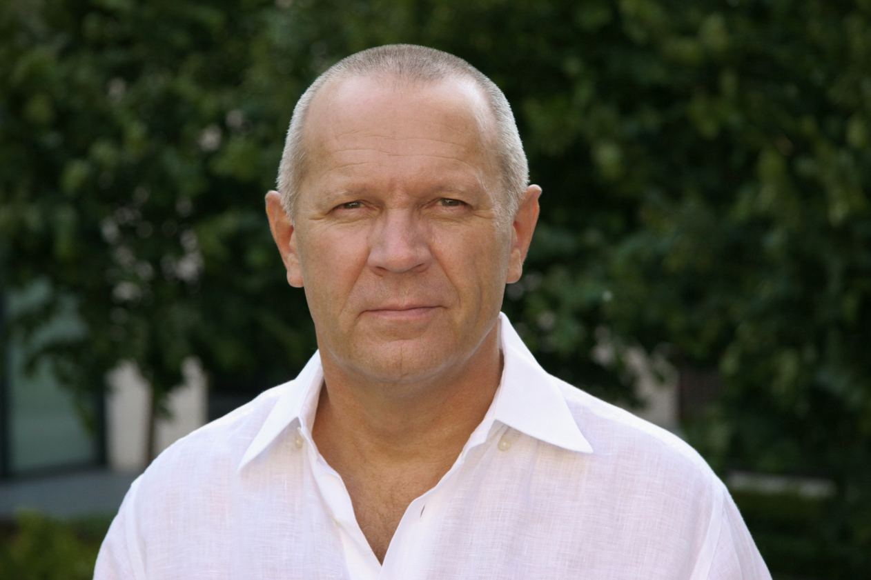
Nikita Biryukov: "Moscow has long since become unfit for bringing up self-sufficient people".

The leader of "ABV Group" on the contemporary Moscow, the profession of an architect, and the absence of hopes for a better future

07 June 2013
Interview
mainImg

Archi.ru: It has been over four years since the global economic crisis of 2008. How do you think architecture changed over these years?

Nikita Biryukov: I think it is still too early to judge whether or not the architecture changed after the crisis. The "medical" results of the architectural development will manifest themselves in a pretty long while. In fact, the crisis is still there, and architecture is a pretty inert process. And - today's situation is hardly better than the one that we had back in 2008. Yes, things are getting livelier a little bit but even if they are it is only because this process is by definition a long-term thing - most projects that are under construction today had been launched still before the crisis.

Archi.ru: How would you describe today's vector of development for the architecture in this country?

Nikita Biryukov: Sadly, I cannot say that it is satisfactory - in fact, this vector points in the completely wrong direction. I only see how things stand in Moscow; in the other cities things must be still worse. Architecture is a cost demanding business that requires serious investment. Today, for obvious reasons, everybody is trying to save up. Virtually all of the assets that were in the developers' hands have moved to the banks now, and the charismatic leaders have been replaced by crisis managers whose primary objective is implementing budgets. Most of them do not know a thing about the essence of the process, and this is why they are totally incapable of building up new venues or generating a scenario of developing this or that area. As a rule, they work with the already-formed and partially developed sites only to bring them to some kind of an end result - which is not even always positive. With such a background, one can hardly speak about any serious architectural movements or achievements.

Archi.ru: And what does this "background" do to the architects?

Nikita Biryukov: I can only speak for myself - life in the profession has become boring these days. The work in this city is being monopolized. Ever so often I get the feeling of a déjà vu, like we're back in the 90's. And this is disappointing because for more than 20 years, we have been growing together - both architects and developers. When we were just entering this business, we knew very little about it ourselves. Over the years, however, what we did was learn and grow. During all these years, when an educated customer came to the architect, he would know in advance what he was capable of, what was his personal potential. What we have today, however, is complete substitution of values - everything is gained through a tender. And look who is winning all those tenders? Great architects? Gosh, no! The tenders are won by the cheapest offers that are often made by companies with a shady past. Look at what is going on with "Slavyanka" shopping mall! First they hired the "Russians" of Turkish make, and they got what they got. And now they are hiring a couple of companies to do the facades. I think that signing up for such a job must be below one's dignity. And it is not just about the facades - it is about careless attitude towards the place. This complex should have been at least half its actual size - and then everything else would come out splendidly.

Archi.ru: Still, I wouldn't go as far as to claim that today's architecture can be compared to what they were building in the 1990's.

Nikita Biryukov: Of course, there is a difference, everybody has got more experience now. There are also new technologies and new materials. But the core of the profession is still the same, isn't it? Those who worked responsibly before, they work just as responsibly now. There was, after all, great architecture before the 1990's, wasn't there? There is but one formula: quality of solutions and quality of implementation.

Archi.ru: Today, Moscow is undergoing a change of power, new people have been appointed to the key positions, and the city itself has changed - it is more than double its recent size. How can you comment on the change of the architectural image of our capital?

Nikita Biryukov: I have no illusions as far as the new power is concerned. People come and go - the government remains the same. Moscow is still the same milking cow that it used to be. I am appalled to look at our city that has been damaged, and the damage is long-term. I enjoy watching old movies where Moscow is still green, where there are few cars in Moscow, and people walk the sidewalks and parks undisturbed. Today's Moscow is not a city for living - it is a city for making money, and not for making joy and happiness. Granted, my opinion may not be objective but, sadly, I am not the only one who thinks that way. The city has become angry and mean. And this dark and dangerous energy goes a long way to shape up the way we think and the way we live. In my opinion, Moscow has long since become unfit for bringing up self-sufficient people. This city is ruled by frightening vulgarity. I would never have thought that I would live into the day that I want to leave this city - but today it is just disgusting to live here. And we destroyed this city with our own hands - we have only ourselves to blame.

Archi.ru: What do you think of active participation of foreign companies in the architectural life of our country and our capital?

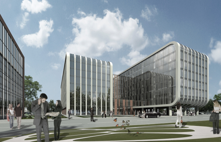
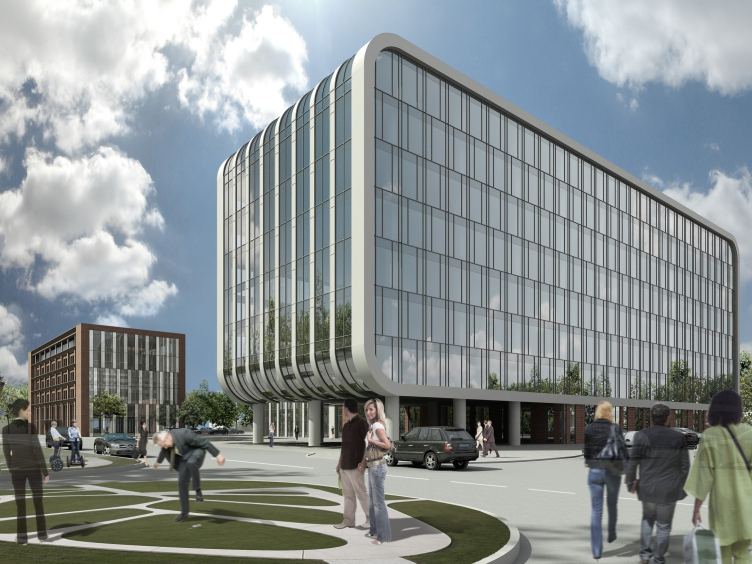
Nikita Biryukov: Yes, there is indeed a plague of foreigners living and working in Russia now. They are numerous, and they are different - just as we are. As a rule, the commissioner invites them at the initial design stages, when architectural proposals and concepts are developed, and then the project is fine-tuned by the domestic architects. Today, this workflow is quite common. Our company is doing a few such projects. For example, to work on the project of the business park in Skolkovo we were invited as the general planner, when the architectural proposal by the British company Scott Brownrigg was already approved. Working with this company was quite comfortable for us. When still at the stage of development of working documents we invited them to participate in the development of the project. Generally, however, as far as the presence of the western architects on the Russian market is concerned, I should point out the following: our foreign colleagues offer a product that is quite competitive but, at the same time, is not something that is out of the ordinary. If this same task had initially been assigned to our studio, we would have handled it just as well.

Archi.ru: If our homeland specialists are capable of doing the same job just as well, then why does the customer opt for the foreign architects?

Nikita Biryukov: The commissioner that invites the western specialists because of their different mentality, different educational background, and different approach to designing things - I cannot blame him, really, because over the last 20 years our architects brought discredit upon themselves. I am not speaking about EVERY designer. There are a small number of industry professionals that has been successfully working on the Russian market for quite a while now. The overall trend, however, is quite saddening - simply because the Russian architects do not get the slightest chance to redeem themselves. There was quite a situation with the tender for the renovation of the Polytechnic Museum when the Russian architects - both individual persons as well as whole Russian companies that had no foreign specialists working for them - were simply deleted from the list of the participants.

Archi.ru: What do you think is the main reason for such a precarious position of architects and architecture in this country?

Nikita Biryukov: Today, they are constantly holding up the constructivism as a model and as our national pride and lament the fact that it just slipped through our fingers. But what we need to realize is the fact that the constructivists were brought up by the powerful Russian culture. And then the entire cultural layer of this country was just severed out - some people emigrated, some died in World War Two, then there was Khrushchev's persecution... Today's generation is incapable, though hard it tries, of creating something of real value. An architect does not live and create in a vacuum. He is part of our society - just like our medical care system, education, industrial enterprises... The profession of an architect is, sadly, as under-respected as it has always been. 

I can hardly imagine that our architects and engineers will be trusted to built, say, "Burj Dubai" in the United Arab Emirates. And it is all the more saddening because of the fact that before the October Socialist Revolution of 1917 the Russian architects did create things that made history. Back then, the architects were trusted with the construction as well as with the budget. Now such a system successfully operates in Switzerland, where the architects hire the architects hire the contractors, form their team, and supervise their work from beginning to end.

Archi.ru: Well, but if there is no making amends, as you say, then perhaps some mechanisms must be developed so as to prevent things from going from bad to worse? How would you describe a perfect architect of today? Perhaps, we should start with education?

Nikita Biryukov: The "mechanism" is always the same. It is the law and its strict implementation instead of a variety of interpretations. The architect is always doing somebody's commission. We all are dependent people. As for the education... Russia has no comprehensive architectural education today in it. Moscow Institute of Architecture as a professional higher education institution has virtually been destroyed. All the attempts by all the high-brow people to open "schools of architecture" of their own can only make me smile. If you want to bring up a new and talented generation, some certain selection must be made over a considerable period of time. Today, the young kids get their real education after they graduate and start working with architectural companies. What will become of them is a matter of luck, to a large extent.


07 June 2013

Headlines now
A Step Forward
The HIDE residential complex represents a major milestone for ADM architects and their leaders Andrey Romanov and Ekaterina Kuznetsova in their quest for a fresh high-rise aesthetic – one that is flexible and layered, capable of bringing vibrancy to mass and silhouette while shaping form. Over recent years, this approach has become ADM’s “signature style”, with the golden HIDE tower playing a pivotal role in its evolution. Here, we delve into the project’s story, explore the details of the complex’s design, and uncover its core essence.
Gold in the Sands
A new office for a transcontinental company specializing in resource extraction and processing has opened in Dubai. Designed by T+T Architects, masters of creating spaces that are contemporary, diverse, flexible, and original, this project exemplifies their expertise. On the executive floor, a massive brass-clad partition dominates, while layered textures of compressed earth create a contextually resonant backdrop.
Layers and Levels of Flight
This project goes way back – Reserve Union won this architectural competition at the end of 2011, and the building was completed in 2018, so it’s practically “archival”. However, despite being relatively unknown, the building can hardly be considered “dated” and remains a prime example of architectural expression, particularly in the headquarters genre. And it’s especially fitting for an aviation company office. In some ways, it resembles the Aeroflot headquarters at Sheremetyevo but with its own unique identity, following the signature style of Vladimir Plotkin. In this article, we take an in-depth look at the United Aircraft Corporation (UAC) headquarters in the Moscow agglomeration town of Zhukovsky, supplemented by recent photographs from Alexey Naroditsky – a shoot that became only recently possible due to the fact that improvements were finally made in the surrounding area.
Light and Shadow
In this article, we delve into the architectural design of the “Chaika” house by DNK ag architects, which was recently completed in 2023 as part of the collection of signature designs at ZILArt. As is well-known, all the buildings in this complex follow a design code, yet each one is distinct. This particular building stands out not only for its whiteness and minimalism but also for the refined use of a limited number of techniques that, together, create what can confidently be called synergy.
Casus Novae
A master plan was developed for a large residential area with a name of “DNS City”, but now that its implementation began, the plan has been arbitrarily reformatted and replaced with something that, while similar on the surface, is actually quite different. This is not the first time such a thing happens, but it’s always frustrating. With permission from the author, we are sharing Maria Elkina’s post.
Treasure Hunting
The GAFA bureau, in collaboration with Tegola and Arkhitail, organized an expedition to the island of Kilpola in Karelia as part of Moskomarkhitektura’s “Open City” festival. There, amidst moss and rocks, the students sought answers to questions like: what is the sacred, where does it dwell, and what sustains it? Assisting the participants in this quest were landscape engineer Evgeny Levin, artist Nicholas Roerich, a moose, and the lack of cellular connection. Here’s how the story unfolded.
Depths of the Earth, Streams of Water
In the Malaya Okhta district, the Akzent building, designed by Stepan Liphart, was constructed. It follows a classic tripartite structure, yet it’s what you might call “hand-drawn”: each façade is unique in its form and details, some of which aren’t immediately noticeable. In this article, we explore the context and, together with the architect, delve into how the form was developed.
Fir Tree Dynamics
The “Airports of Region” holding is planning to build an airport in Karachay-Cherkessia, aiming to make the Arkhyz and Dombay resorts more accessible to travelers. The project that won in an invitation-only competition, submitted by Sergey Nikeshkin’s KPLN, blends natural imagery inspired by the shape of a conifer seed, open-air waiting spaces, majestic large trees, and a green roof elevated on needle-like columns. The result is both nature-inspired and WOW.
​A Brick Shell
In the process of designing a clubhouse situated among pine trees in a prestigious suburban area near Moscow, the architectural firm “A.Len” did the façade design part. The combination of different types of brick and masonry correlates with the volumetric and plastique solutions, further enhanced by the inclusion of wood-painted fragments and metal “glazing”.
Word Forms
ATRIUM architects love ambitious challenges, and for the firm’s thirtieth anniversary, they boldly play a game of words with an exhibition that dives deep into a self-created vocabulary. They immerse their projects – especially art installations – into this glossary, as if plunging into a current of their own. You feel as if you’re flowing through the veins of pure art, immersed in a universe of vertical cities, educational spaces – of which the architects are true masters – and the cultural codes of various locations. But what truly captivates is the bold statement that Vera Butko and Anton Nadtochy make, both through their work and this exhibition: architecture, above all, is art – the art of working with form and space.
Flexibility and Acuteness of Modernity
Luxurious, fluid, large “kokoshniks” and spiral barrel columns, as if made from colorful chewing gum: there seem to be no other mansion like this in Moscow, designed in the “Neo-Russian-Modern” style. And the “Teremok” on Malaya Kaluzhskaya, previously somewhat obscure, has “come alive with new colors” and gained visibility after its restoration for the office of the “architectural ecosystem” as the architects love to call themselves. It’s evident that Julius Borisov and the architects at UNK put their hearts into finding this new office and bringing it up to date. Let’s delve into the paradoxes of this mansion’s history and its plasticity. Spoiler: two versions of modernity meet here, both balancing on the razor’s edge of “what’s current”.
Yuri Vissarionov: “A modular house does not belong to the land”
It belongs to space, or to the air... It turns out that 3D printing is more effective when combined with a modular approach: the house is built in a workshop and then adapted to the site, including on uneven terrain. Yuri Vissarionov shares his latest experience in designing tourist complexes, both in central Russia and in the south. These include houseboats, homes printed from lightweight concrete using a 3D printer, and, of course, frame houses.
​Moscow’s First
“The quality of education largely depends on the quality of the educational environment”. This principle of the last decade has been realized by Sergey Skuratov in the project for the First Moscow Gymnasium on Rostovskaya Embankment in the Khamovniki district. The building seamlessly integrates into the complex urban landscape, responding both to the pedestrian flow of the city and the quiet alleyways. It skillfully takes advantage of the height differences and aligns with modern trends in educational space design. Let’s take a closer look.
Looking at the Water
The site of Villa Sonata stretches from the road to the water’s edge, offering its own shoreline, pier, and a picturesque river panorama. To reveal these sweeping views, Roman Leonidov “cut” the façade diagonally parallel to the river, thus getting two main axes for the house and, consequently, “two heads”. The internal core – two double-height spaces, a living room and a conservatory, with a “bridge” above them – makes the house both “transparent” and filled with light.
The White Wing
Well, it’s not exactly white. It’s more of a beige, white-stone structure that plays with the color of limestone – smoother surfaces are lighter, while rougher ones are darker. This wing unites various elements: it absorbs and interprets the surrounding themes. It responds to everything, yet maintains a cohesive expression – a challenging task! – while also incorporating recognizable features of its own, such as the dynamic cuts at the bottom, top, and middle.
Urban Dunes
The XSA Ramps team designed and built a three-part sports hub for a park in Rostov-on-Don, welcoming people of all ages and fitness levels. The skate plaza, pump track, and playground are all meticulously crafted with details that attract a diverse range of visitors. The technical execution of the shapes and slopes transforms this space into a kind of sculptural composition.
Proportional Growth
The project for the fourth phase of the ÁLIA residential area has been announced. The buildings are situated on an elongated plot – almost a “ray” that shoots out from the center of the area towards the river. Their layout reflects both a response to Moscow’s architectural preferences over the past 15 years, shifting “from blocks to towers”, and an interpretation of the neighboring business park designed by SOM. Additionally, the best apartments here are not located at the very top but closer to the middle, forming a glowing “waistline”.
The “Staircase” Building
In designing the “Details” residential complex in New Moscow, Rais Baishev spiced up the now-popular Moscow theme of a “courtyard” building with an idea drawn from the surrealist drawings by Maurits Escher. He envisioned the stepped silhouettes and descending slopes as a metaphysical mega-staircase, creating a key void within the courtyard that gave the project an internal “spine”. This concept is felt both in the building’s silhouette and on its façades.
Projection of the Quarter
No one doubted that the building that Vladimir Plotkin designed as part of the “Garden Quarters” would be the most modernist of all. And it turned out just that way: while adhering to the common design code, the building successfully combines brick and white stone, rhythmically responding to the neighboring building designed by Ostozhenka, yet tactfully and persistently making a few statements of its own. This includes the projection of the ideal urban development composition “14–9–6”, which can be found right next door, mathematical calculations, including those for various types of terraces (and perhaps the only reminder of the Soviet past of the Kauchuk rubber factory!), and the white “cross-stitch” pattern of the façade grid.
Domus Aurea
In this issue, we examine the “Tessinsky-1” house, designed by Sergey Skuratov and completed in 2023. Located in the middle of the Serebryanicheskaya Embankment district, at the intersection of its main streets, this house assumes a sort of “nodal” role: it not only responds to everything around it and preserves many memories of the former EMA factory within itself, but it weaves all this into a newly directed pattern, reconciling bright “gold” and dark-colored brick, largely with the help of the new, modern-yet-archaic Columba brick, which, come to think about it, is the most precious element here.
The Chimney of Nikola-Lenivets
In this issue, we are examining the “Obelisk House” designed by KATARSIS and built for the Arkhstoyanie 2023 festival. However, it was only finished later on, and this is why we are examining it now. It seems to us that after the “Obelisk House” appeared in Nikola-Lenivets, a dialogue and a few inner connections appeared between the temporary structures built here. These houses no longer look like “accidental neighbors”, more of which below.
​Periscope by the Bay
The jury awarded the second place in the competition for a public and cultural center in Petropavlovsk-Kamchatsky to the companies GORA (“Mountain”) and M4. In the consortium’s proposal, the building resembles a sperm whale with a calf swimming next to it or a periscope, whose lenses capture the most spectacular views from the surrounding landscape.
From Arcs to Dolmens
While working on the competition project for Petropavlovsk-Kamchatsky, ASADOV Architects prioritized the value of the natural and urban environment, aiming to preserve the balance of the location while minimizing the resemblance of the volume that they designed to a “traditional building”. The task was challenging, and the architects created three versions, one of which having been developed after the competition, where their main proposal took third place. However, the point of interest here is not the competition result but the continuity of creative thinking.
Hide and Seek
The ID Moskovskiy house, designed by Stepan Liphart in St. Petersburg, in the courtyards near Moskovskiy Avenue beyond the Obvodny Canal and recently completed, is notable for several reasons. Firstly, it has been realized with considerable accuracy, which is particularly significant as this is the first building where the architect was responsible not only for the facades but also for the layouts, allowing for better integration between the two. On the other hand, this building is interesting as an example of the “germination” of new architecture in the city: it draws on the best examples from the neighborhood and becomes an improved and developed sum of ideas found by the architect in the surrounding context.
The Big Twelve
Yesterday, the winners of the Moscow Mayor’s Architecture Award were announced and honored. Let’s take a look at what was awarded and, in some cases, even critique this esteemed award. After all, there is always room for improvement, right?
Above the Golden Horn
The residential complex “Philosophy” designed by T+T architects in Vladivostok, is one of the new projects in the “Golubinaya Pad” area, changing its development philosophy (pun intended) from single houses to a comprehensive approach. The buildings are organized along public streets, varying in height and format, with one house even executed in gallery typology, featuring a cantilever leaning on an art object.
Nuanced Alternative
How can you rhyme a square and space? Easily! But to do so, you need to rhyme everything you can possibly think of: weave everything together, like in a tensegrity structure, and find your own optics too. The new exhibition at GES-2 does just that, offering its visitor a new perspective on the history of art spanning 150 years, infused with the hope for endless multiplicity of worlds and art histories. Read on to see how this is achieved and how the exhibition design by Evgeny Ace contributes to it.
Blinds for Ice
An ice arena has been constructed in Domodedovo based on a project by Yuri Vissarionov Architects. To prevent the long façade, a technical requirement for winter sports facilities, from appearing monotonous, the architects proposed the use of suspended structures with multidirectional slats. This design protects the ice from direct sunlight while giving the wall texture and detail.
Frozen Magma
A competition for the creation of a public and cultural center was held in Petropavlovsk-Kamchatsky. Three architectural companies made it to the final, and we consider it important to share about the work of each. Let’s start with the winner – the consortium led by Wowhaus.
Campus within a Day
In this article, we talk about what the participants of Genplan Institute of Moscow’s hackathon were doing at the MosComArchitecture booth at the “ArchMoscow” exhibition. We also discuss who won the prize and why, and what can be done with the territory of a small university on the outskirts of Moscow.