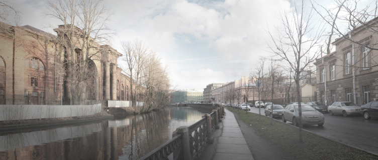
The

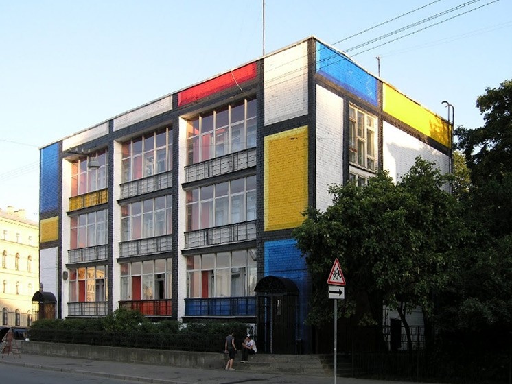
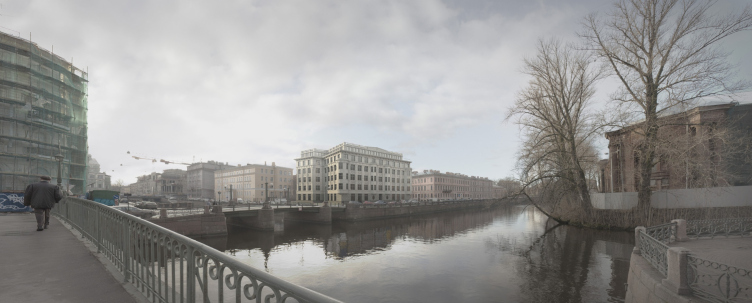
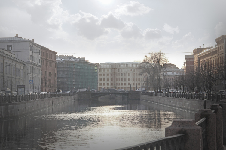
It was only in 1930's that this spot saw residential houses built, and later on also a kindergarten - a three-storey modernist "cube", noticeably sticking out of the overall rhythm of the embankment's housing. In 2007, this building was privatized by the well-known "Okhta Group" that had extremely ambitious plans for it - the reconstruction project included inviting Erick van Egeraat himself into it. The global financial crisis, however, poured cold water on the investors' enthusiasm, and the kindergarten building was ultimately left standing, minimally remodeled and turned into "Graffiti" hostel. In accordance with its new name, its walls were decorated with bold geometric compositions in the vein of Piet Mondrian. In this capacity, the building functioned long enough to become a tourist attraction of sorts, even though the hostel originally had been planned as a short-term fix. The development of the new project was commissioned to the team of Eugene Gerasimov.
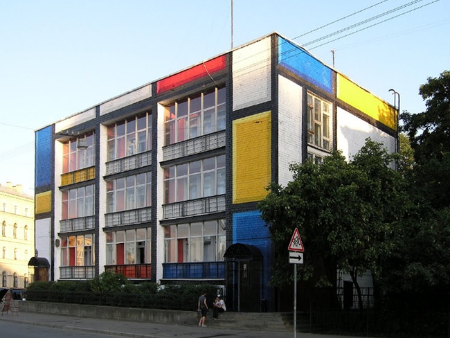
In spite of the
building's popularity, Committee on State Control, Use and Protection of
Historical and Cultural Landmarks, denounced the bright "cube" as a
dissonant element of the cityscape, and Eugene Gerasimov agrees to this
definition. What matters here is the position of the land site - it finishes
the distance of the
Building the residential
house on the spot where
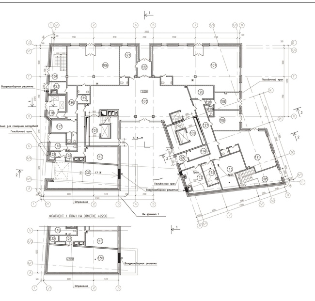
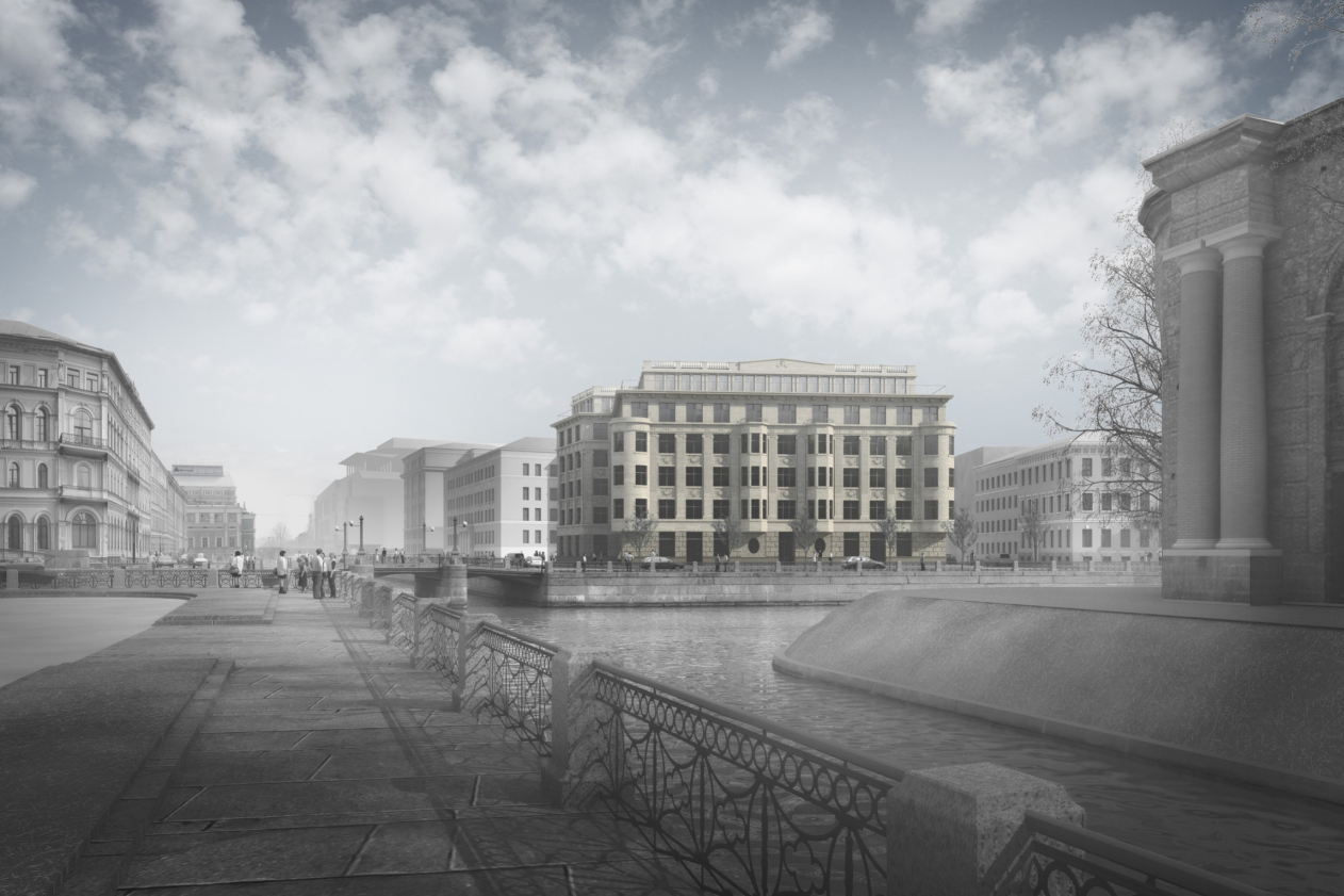
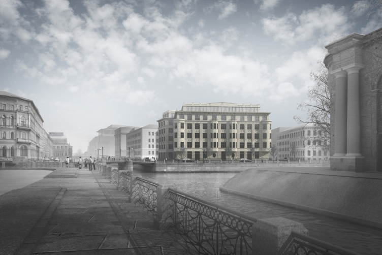
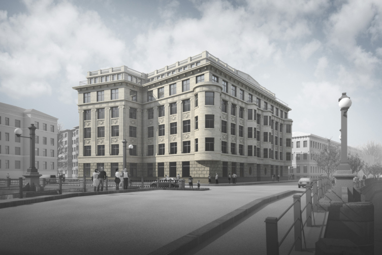
While inscribing the house into the Moika panorama, the architects tried to make it look flesh and blood of the embankment housing that dates back to the XIX century. Hence the proportions and the scale of the designed building - two-section and six-storey, it sports a whole number of elements and techniques that makes it akin to its immediate neighbors. For one, the main facade has a solution that is symmetric to the recessed central part - the niche of the main entrance that is flanked by two big oval-shaped windows. The first floor is coated with rusticated stone, while the others are finished with natural stone, of a more delicate nature, and with shades varying from dark beige to almost ivory.

The authors obviously drew inspiration from Saint Petersburg Neoclassic of 1910's: the tell-tale attic, inscribed into the balustrade above the roof, the brutal "fur coat" of the rusticated stone on the first floor, and the pilasters stretched over the entire height of the three floors leave no room for doubt about that. Although the choice of the Ionic order, the flutes on the pilasters, and the generally rich but at the same time austere outside ornament rather refer us to the earlier "historicism" architecture, while the oval windows that flank the main entrance could have, of course, been a part of a neoclassic building but would have looked more habitual in the facades of the houses built in "Northern Modernist" style.

Still,
Yet another
motif of the
And finally, the attic
fronton, that we earlier recognized as neoclassic, can also be seen as a
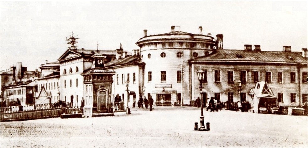
reminder of the fronton that crowned the entrance section of the Lithuanian
castle. What is interesting is the fact that for the neoclassic architects the
shape of the attic with a pitched roof was in itself a reference to the Empire
style. In this particular case, two themes - the Empire prototype and the
neoclassic style - are unobtrusively blending into one, giving the искусствоведам интерпретаторам a lot of room fr theorizing and (which is probably even more important)
- the multi basis contextual rationale to the design of the new building.
Thus, Eugene Gerasimov's
new project reveals a multitude of historical allusions: some of them serve to
remind of the Lithuanian Castle that was burned down during the revolution,
while some help to make the new house fit in with the housing array of the
embankment, and (which is also important) to highlight the fact that it belongs
to the elite category of residential houses.
The new house, however,
reveals a number of contemporary traits as well. In particular, one of the
characteristic traits of the contemporary historicism is the polysynthetism of
the quotations, the possibility to discover, at close examination, signs of
different styles (in this case, Empire, Modernist, and Neoclassic). Besides,
the contemporary character of the house is revealed by the wide windows, as
well as by the fact that the corner towers lack the characteristic supporting
console, a sort of "double chin", and a crowning hipped turret or a
faceted dome that we're all but obligatory at the turn of XIX and XX centuries.
Due to the fact that the
towers are not either supported or crowned by anything, the unsupported
vertical theme gets weaker and one starts perceiving the building as consisting
of horizontal layers - the "basic" ground one, and two upper layers
that are simpler, lighter, and look a lot like the additional stories that were
often built above the tenement houses in the per-war era. Hence two things.
First of all, this building has a lot less tectonics about it than its
historical prototypes did, but at the same time, in spite of all the
conservatism of its facades, it shows the horizontal attraction that is quite
modernist. Two themes, the classic tectonic one, and the "ribbon"
modernist intertwine in quite a peculiar combination - which makes the building
look recognizable and up-to-date at the same time.
Second of
all, the recessed upper floors, looking indeed like later-on additions on top
of a historical building, set the theme of imitation of a few life cycles of
the building - as if the totally new house makes believe that it has been
several times rebuilt, which also can be considered a sign of the times. And
finally, the stepping silhouette created by the recessed sixth floor is the
most recognizable trait of the house built in this historical city.
Incidentally, the mansard floor, even though hiding from the passers-by by a
cornice, serves a good turn when viewed from a distance: thanks to its
tallness, behind the new house, like behind a screen, the old soviet houses
will disappear.


