По-русски

The Return of the Project

Story of the project office and retail building on Kulneva Street (better known under its former name of “Mirax Plaza”) losing its designer supervision, being re-done, and then finally getting back into the hands of its authors to retrieve its architectural integrity.

10 December 2012
Object
mainImg
Architect:
Sergey Kisselev
Igor Shvartsman
Object:
Administrative and retail complex at Kulnev str.
Russia, Moscow, Kutuzovsky prospect (crossing with Kulnev street)

Project Team:
Sergej Kiselev, Andrey Nikiforov, Andrey Breslavcev, Anton Busalov, Gleb Holopov, Elena Klueva
Engineers: Igor Shvarcman, Konstantin Spiridonov

6.2006 — 9.2007 / 10.2007

The client: OAO “Mezhdunarodny Centr”
The project of the office complex “Mirax Plaza” is well known to anyone interested in the contemporary Moscow (see our article on the 2007 project). Although after the global financial crisis set in and the main investor left the project, it lost its proud-sounding name, the two austere prismatic towers saluting to the Moscow City skyscrapers from the opposite side of the Moskva River, are still almost complete and are clearly visible to the cars driving by down the Third Transport Ring

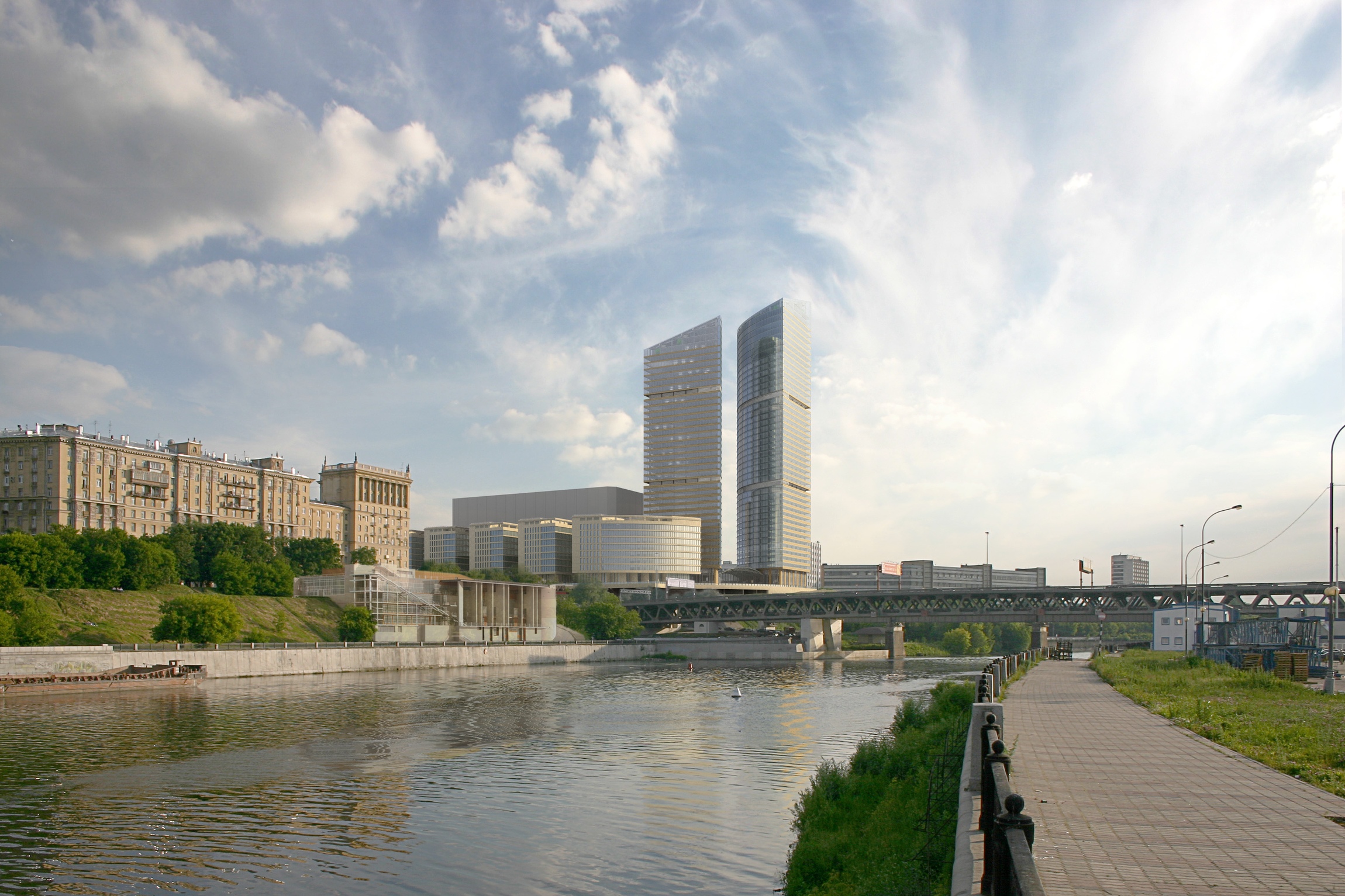
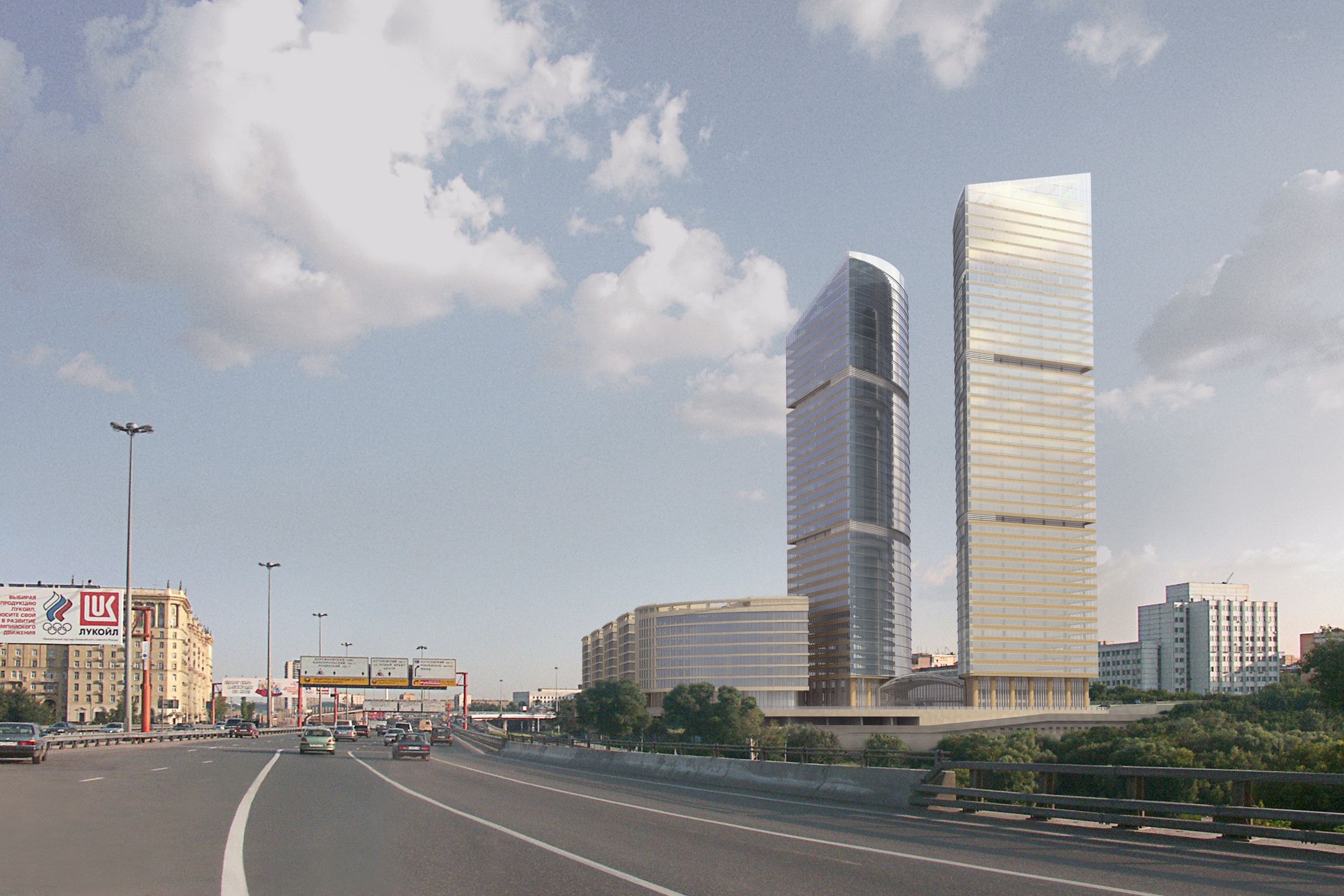
The towers, however, were but a part of the entire concept.
The other part of it was the group of ten-storey buildings inscribed into the neat oval of the layout at the foot of the two high-rises. The yellow stone buildings braced by dramatic horizontal ribs looking a lot like flying buttresses, had to continue the row of Stalin-era buildings standing along Kutuzov Avenue, and create an offset contrast to the office towers.

The 
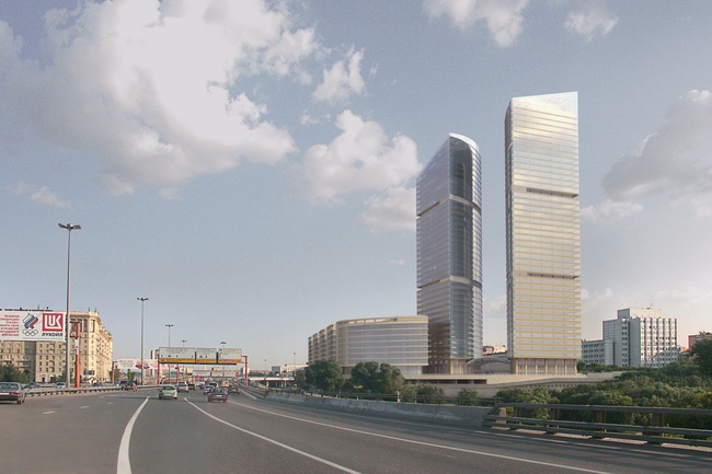
previous version of "Mirax-Plaza" project

However, as often is the case, not everything went to plan. The designer supervision over the construction of part of the “island” (the building that is turned onto Kutuzov Avenue and that makes up the “nose” of the oval), was handed over to another architectural office, the project was changed, and the building was not built the way it had been intended. In a nutshell, it was generalized and simplified: now there was less stone, more glass, and the horizontal ribs, while still preserved, became thinner and more monotonous. The casing blocks, from horizontal and tawny, with “scorch marks” so characteristic of Stalin times houses, turned into pink-gray and vertical, now looking very much like “seashell” casing that was used back in the 1970’s for coating the Soviet movie theaters and office buildings.
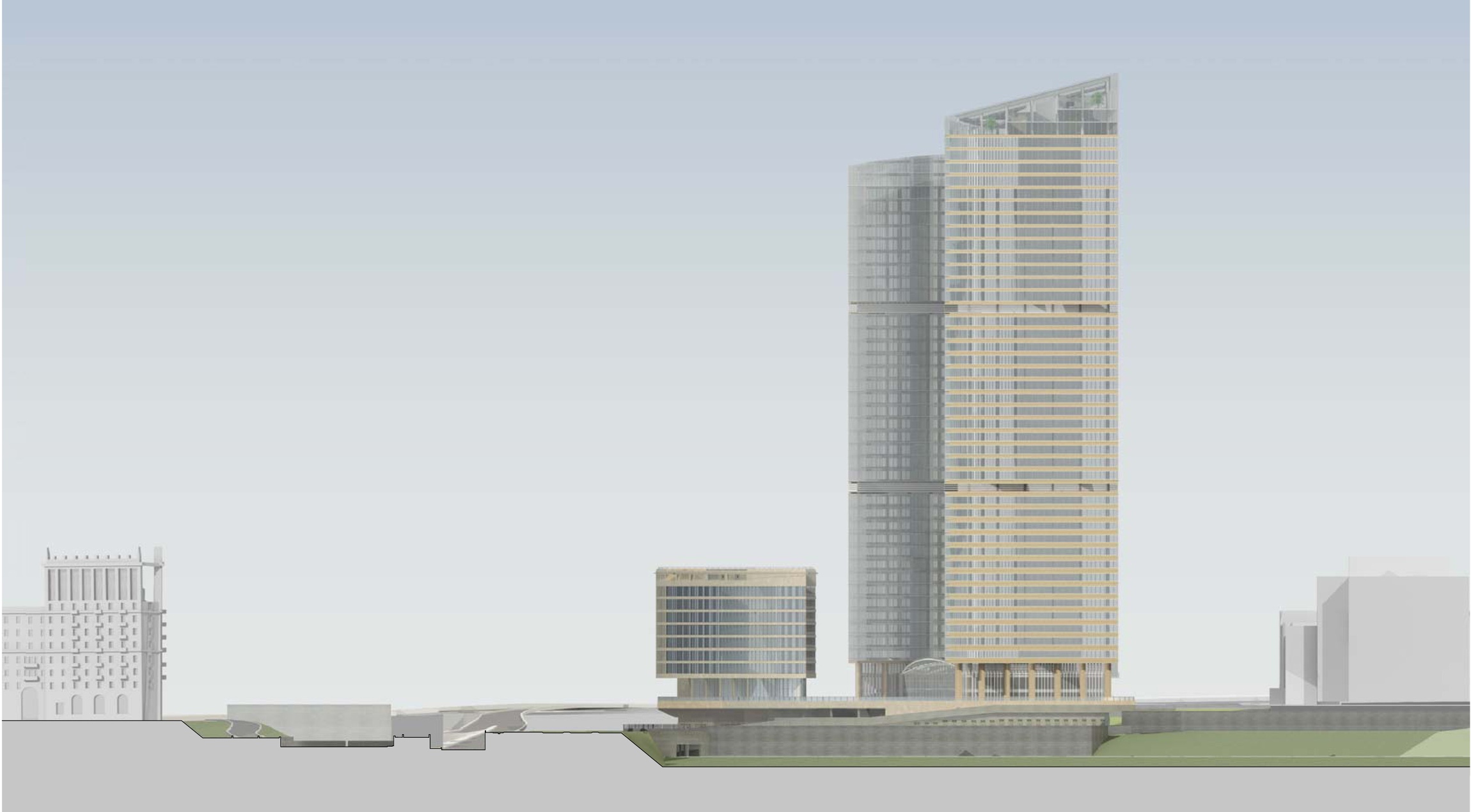
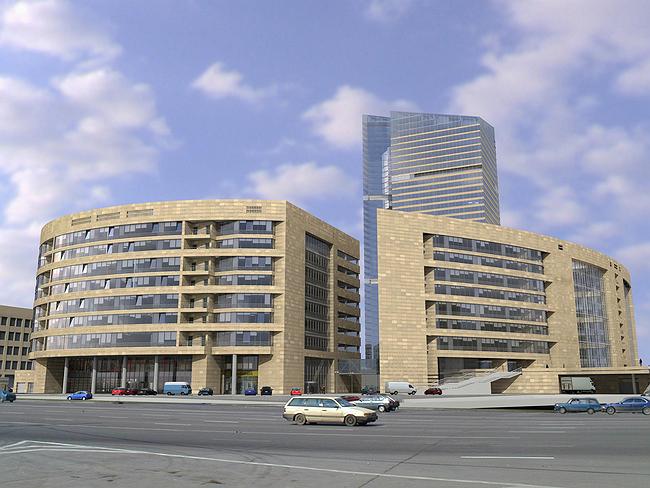
The building on the Kutuzov Avenue, built with neither designer supervision nor with “Sergey Kisselev and Partners”. Photo: panoramio.com, stargate

During the work on the ten-storey building that in fact makes up the elongated part of the oval situated next to the Third Transport Ring (designated by the letter "B" on the various layouts of the complex) it became clear that keeping its original shape would be impossible due to the recent changes in the land-use and development rules of the adjacent section of the railroad line. "While formerly our situation provided the opportunity of placing the stylobate pillars directly on this railroad section, now the agency for land-use would not even condescend to considering such a possibility" - the architects share. In other words, according to the original design, the 
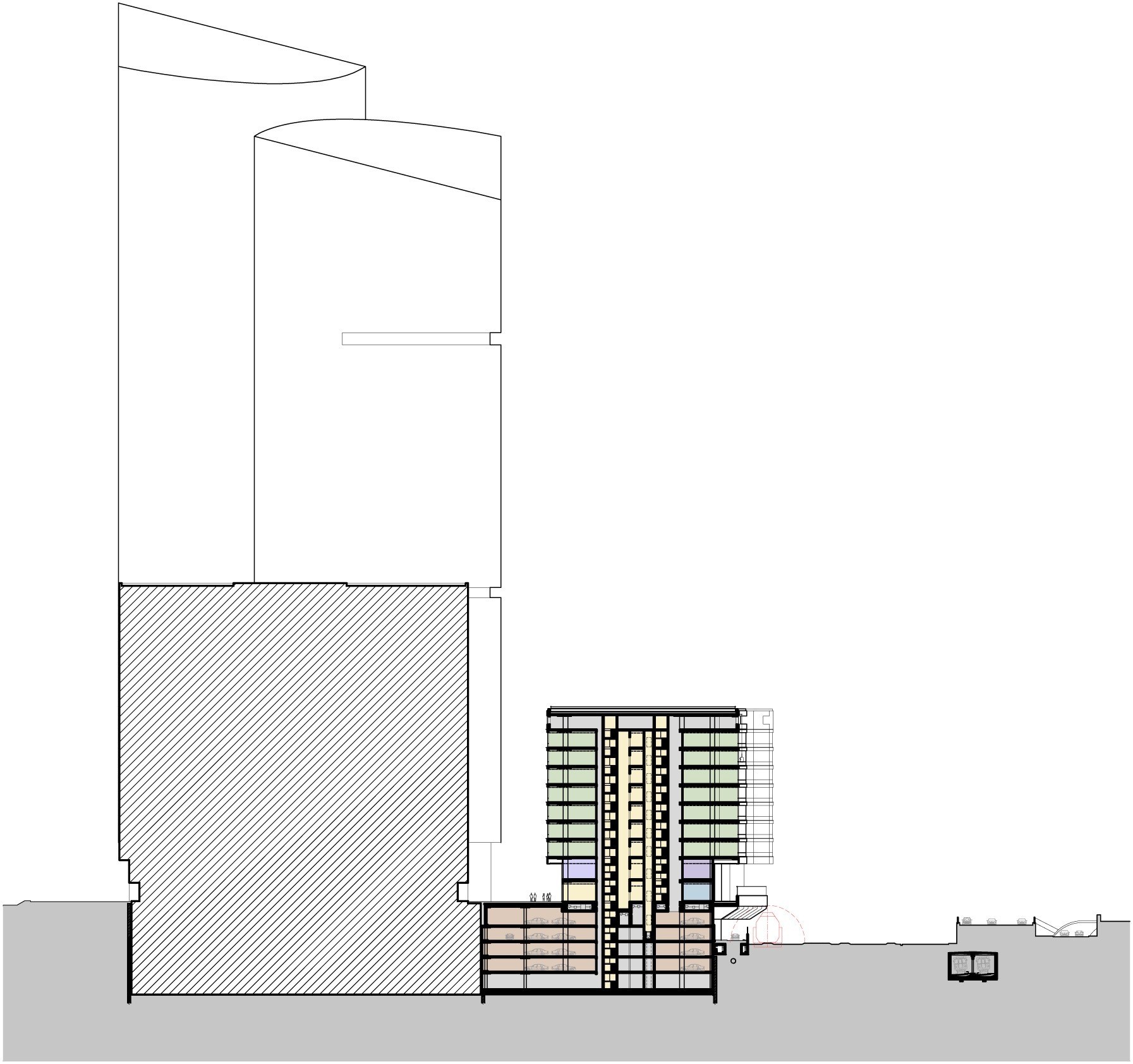
volume of Building "B" and the railroad line actually crossed: the dome-shaped arch of the facade would have overhung the tunnel that pierced the volume of the building from side to side chordwise but now the building was to recede into the confines of its construction site. 

The original layout

The commissioner announced a tender for the design adjustment of the ten-story building - naturally, with a view to preserve in the new project the original square footage with expenses minimized. For the architectural office "Sergey Kisselev and Partners" this in fact was a chance to retrieve its original project, and finally bring it to fruition. Knowing their own project inside and out, the architects quickly found the solution to the problem that was set before them. The design, of course, underwent a few significant changes (under the given circumstances it simply could not have been otherwise) but the authors "did their best to consider the structures that were already erected and were making all of their planning decisions, if it's possible to put it like this, in the reconstruction mode". In a word, they only proposed to make the most necessary changes, at the same time giving back to the project all of its original useful space. 

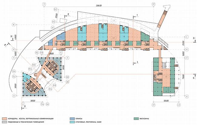
The regular-shaped, compasses-drawn but protruding too far beyond the confines of the site arch of the oval layout had to get cut off to make room for the railroad line - the layout of the building was no longer a segment and took on the constrained and squeezed shape, like a 1960's TV with straight sides and rounded corners.
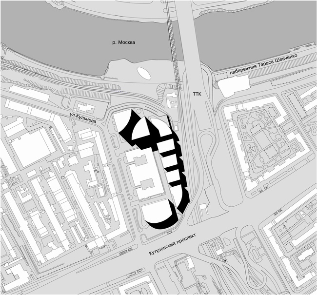
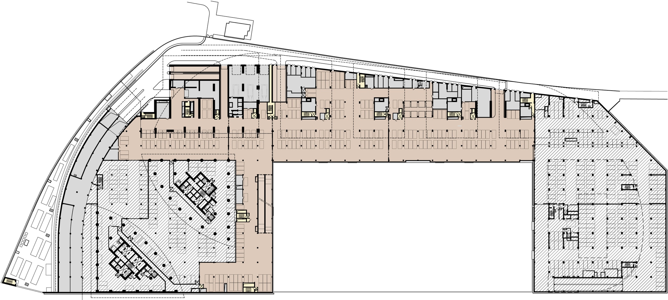
Site plan

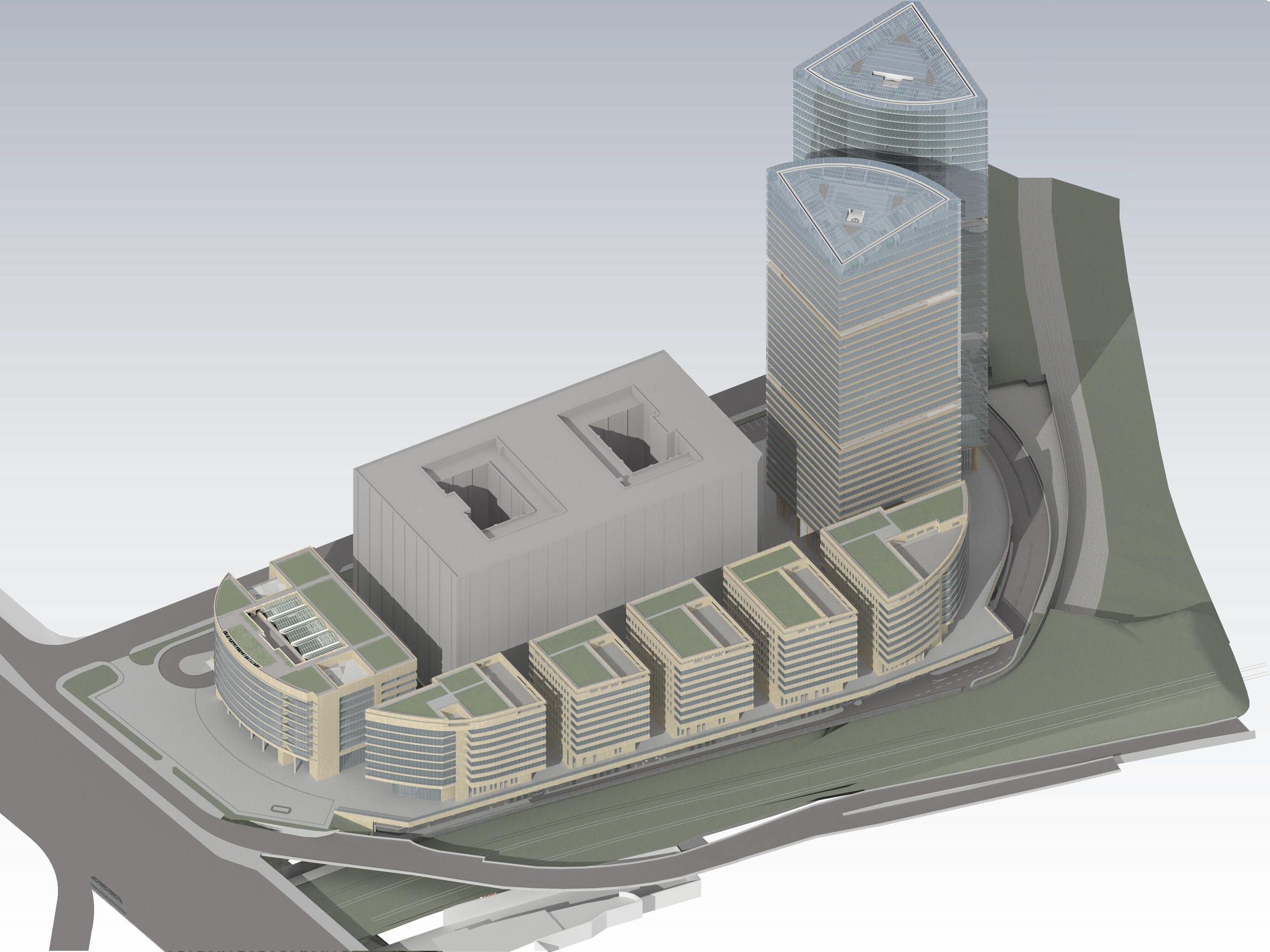
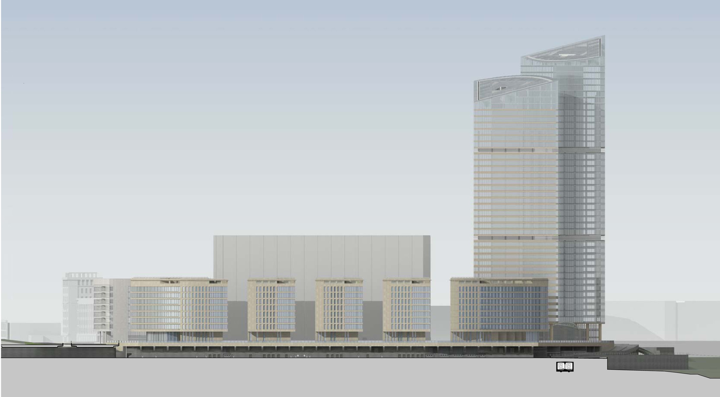
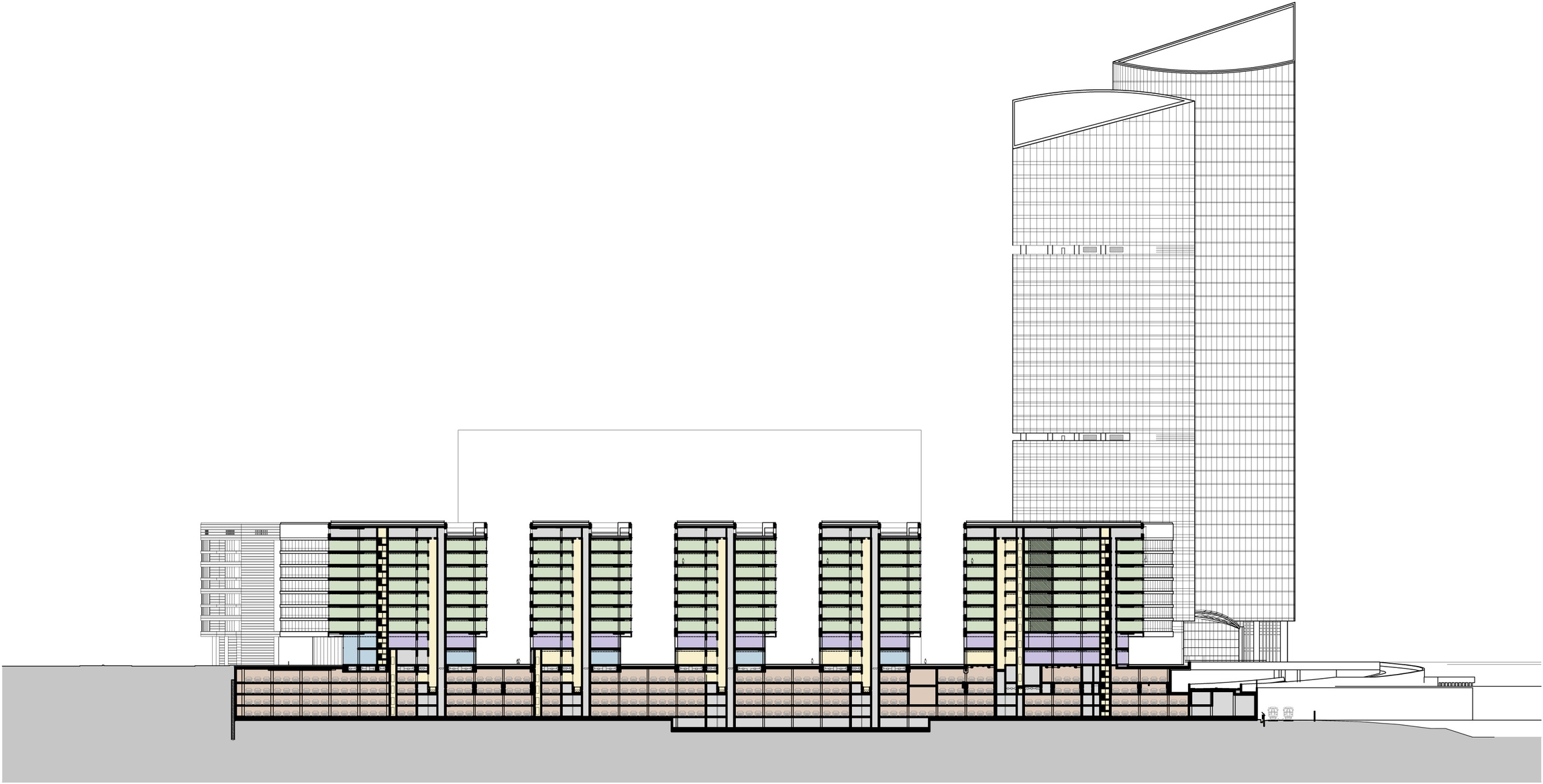
In order to compensate for the lost useful square footage, the architects divided the elongated building into five parts, replacing the four atriums with open courtyards. Each of the five resulting volumes got expanded lengthwise at the expense of reducing the space of the yards. This measure helped to retrieve all the lost square meters without increasing the height of the buildings. The yards, in the meantime, started looking more like short fragments of pedestrian boulevards: they all lead to the longitudinal inner street that connects all the five buildings. The latter, at the same time, overhang in deep cantilevers above the pedestrian space thus winning yet some more useful space and forming small marquees over the boulevards below. 

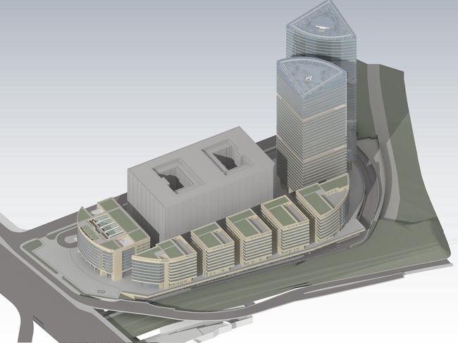
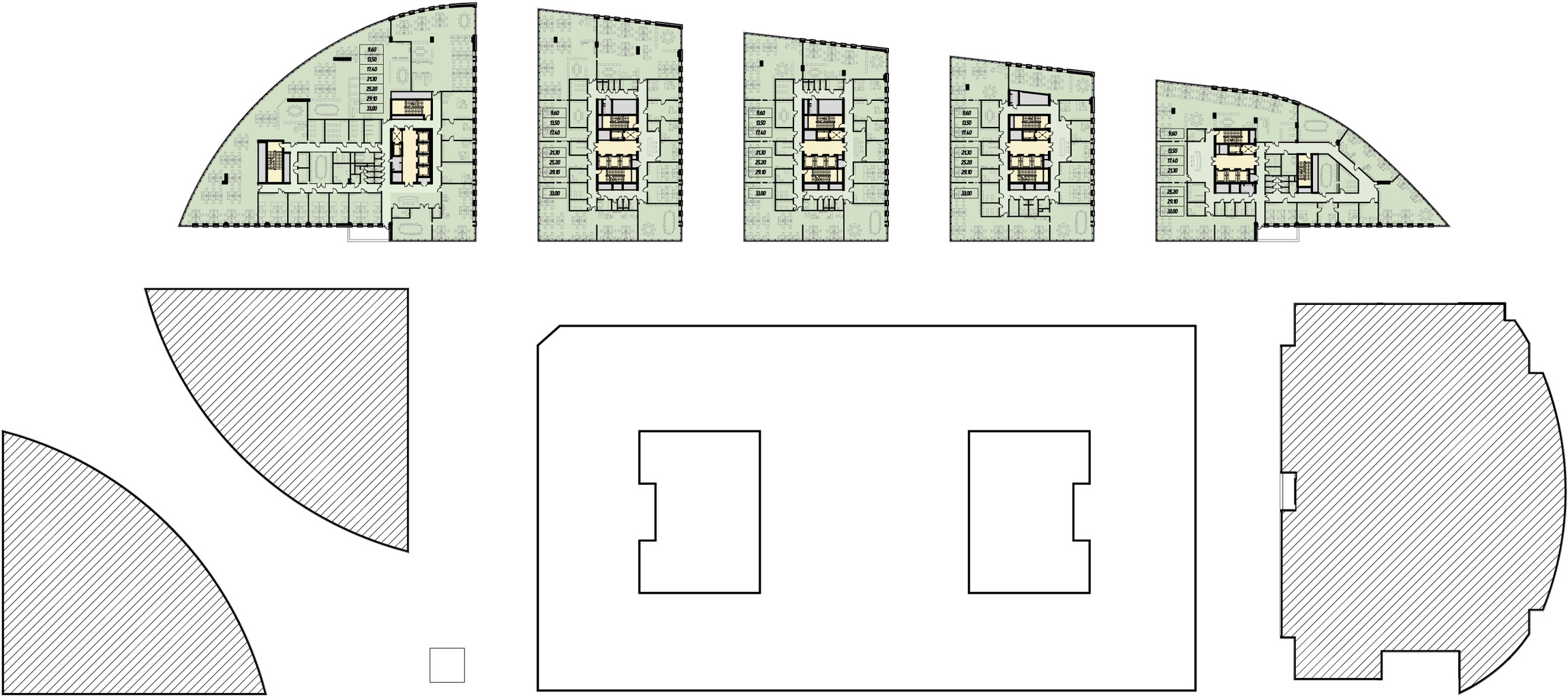
Visualization. Project of 2012. Version 2.

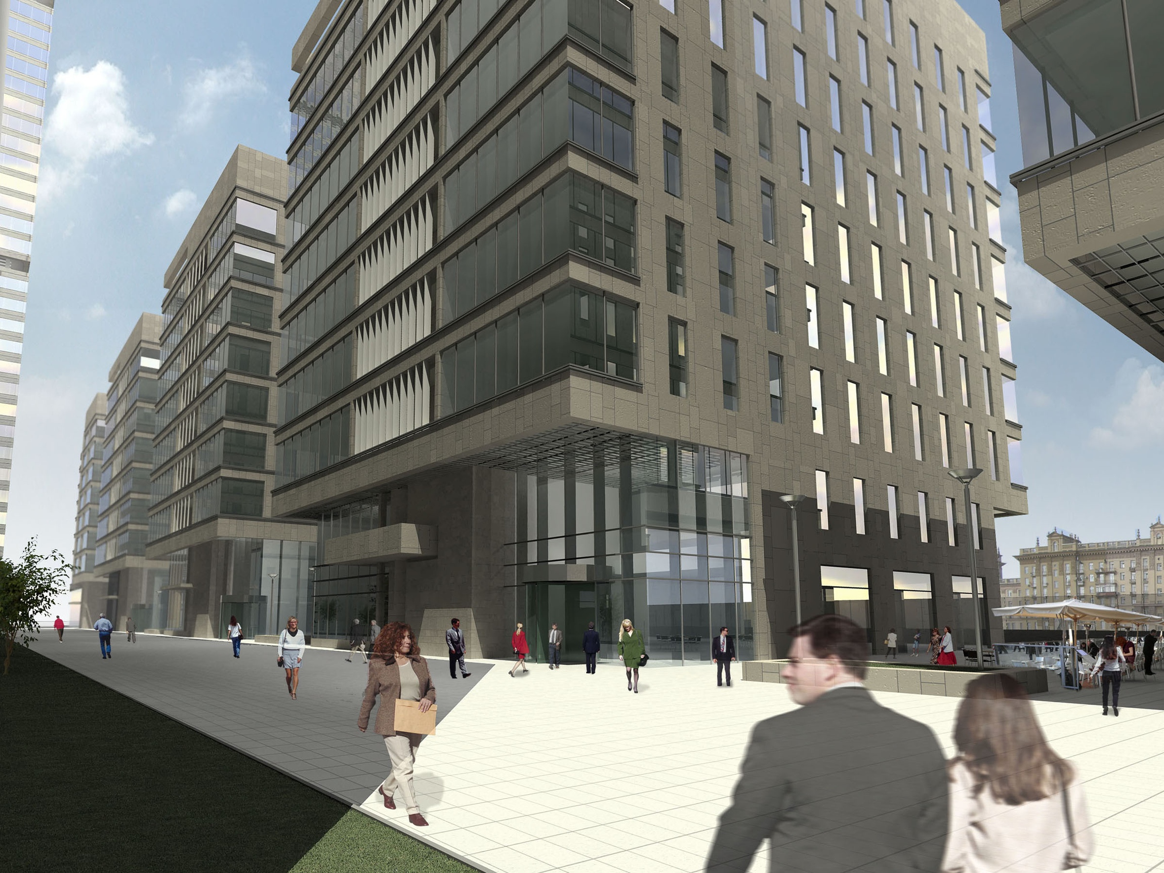
What is peculiar is the fact that the architects deliberately opted out of making their "yard" streets car-passable, fully reserving them for the pedestrians. This resonates a little with a reminder about the cancelled deluxe atriums - the yards, of course, lack the luxury of their glass surfaces stretched at a ten-storey height but they still remain the safe and comfortable space to be in. Unlike the atriums, however, the yards are open to the city and thus are more democratic: anyone can walk in and around here. This solution is more on the European than on Moscow side: Moscow is still having a difficult time getting rid of its endless fences and checkpoints, so the open little streets of the office center are a small but still an important step to meet the city community halfway. 

The pass-through pedestrian street of Building B

The facades, of course, also had to be remodeled: now they are made up of the same alternating pattern of horizontal stripes of stone and glass as the towers. At the rounded side walls the stripes get narrower - here they resonate with the graphics of the building that stands on the side of the Kutuzovsky Avenue. As we can see, the architects ultimately came to one of the most wide-spread, if not to say "classical" facade techniques of office architecture. The striking-looking "arrested" cascade of stone braces that in the original project was meant to bring association of the age of high speeds and similar technogenious things, has now turned into a respectable office street. Still, the authors have been able to restore the project's integrity, which was particularly important to them. The "courtyard" streets splitting the once-single building into five separate volumes, will look, at a quick glance cast from the side of the Third Transport Ring, like narrow slits and will not violate the integrity of the facade's image. Andrew Nikiforov is also positive that the architects have ultimately been able to keep the idea of the "oval island". 

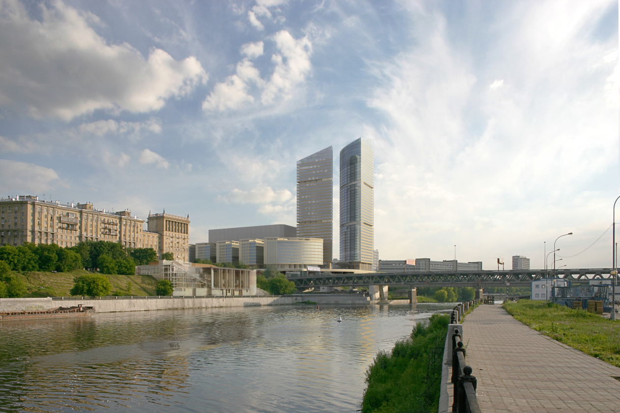
View from the Third Transport Ring

One cannot but be happy about the fact that the shattered and scattered project got almost unexpectedly "fixed". This story once again goes to show that a competent architect will always be able to solve the commissioner's situation as well as retrieve the all-but-lost project to restore its integrity and find a new image for it.

This "new image" that came as a result of the transformation described, is also worth special mentioning. It is more relaxed, more practical, and more democratic. "Mirax-Plaza", though austere and conceptual, was still dramatic and expensive-looking. It was meant to strike one's imagination with the glass of the atriums, the flying buttresses, and the regular arches and circles. Its architecture sported the contrastive tension: between the concrete and glass, the towers and the avenue (the former being the symbol of the power of money, the latter - the power of the tyrant). The contradictions of the city were aptly reflected in it and turned into a dramatic and powerful story. Which was quite resonant with the times: the period of quick growth, arrogant investors, and giant projects.

Now the contrasts are all but erased, the contradictions are softened, and the story is taken to a whole new level: now it has ceased, to a large extent, being a theatrical performance arrested in stone, and has started looking more like the natural history of finding common ground, reasonable economy, and architectural integrity. The complex is stepping back from the obstacle that its predecessor was stepping upon but at the same time it opens its arms and lets itself into the city. These are marks of our times - possibly, just as good as one can think of.


Architect:
Sergey Kisselev
Igor Shvartsman
Object:
Administrative and retail complex at Kulnev str.
Russia, Moscow, Kutuzovsky prospect (crossing with Kulnev street)

Project Team:
Sergej Kiselev, Andrey Nikiforov, Andrey Breslavcev, Anton Busalov, Gleb Holopov, Elena Klueva
Engineers: Igor Shvarcman, Konstantin Spiridonov

6.2006 — 9.2007 / 10.2007

The client: OAO “Mezhdunarodny Centr”

10 December 2012

Headlines now
A Deep, Crystal Shine
A new luxury residential development by ADM architects is set to rise in the Patriarch’s Ponds district, not far from Novopushkinsky Square. It will replace three buildings erected in the early 1990s. The project authors, Andrey Romanov and Ekaterina Kuznetsova, have placed their bets on the variety among the three volumes, modern design solutions, and attention to detail: one of the buildings will feature smoothly curved balconies with a ceramic sheen on their undersides, while another will be accented by glass “sculpture” columns.
A Roadside Picnic of Urban Planning Theorists
Marina Egorova, head of Empate Architectural Bureau, brought together urban planning theorists – the successors of Alexey Gutnov and Vyacheslav Glazychev – to revive the substance and depth of professional discourse. At the first meeting, much ground was covered: the participants revisited the theoretical foundations, aligned their values, examined a cutting-edge case of the Kazan agglomeration, and concluded with the unfathomable intricacies of Russian land demarcation. Below, we present key takeaways from all the presentations.
Perspective View
CNTR Architects has designed a business center for a new district in Yekaterinburg, aiming to reduce the need for commuting and make the residential environment more diverse. The architectural solutions are equally focused on creating spatial flexibility, comfortable working conditions, and a memorable image that could allow the building to become a spatial landmark of the district.
Malevich and Bathhouses, Nature and High-Tech
The Malevich Bathhouse complex is scheduled to open in the fall of 2025 on the Rublyovo-Uspenskoye Highway. The project, designed by DBA-GROUP under the leadership of Vladislav Andreev, is an example of an unconventional approach to the image of a spa in general and of a bathhouse in particular. Deliberately avoiding any kind of allusion, the architects opted for streamlined forms with characteristic rounded corners, a combination of wood with bent glass, and restrained contemporary shapes – both inside and out. Let’s take a closer look at the project.
Rather, a Tablecloth and a Glass!
After many years, the long-abandoned Horse Guards Department building in St. Petersburg has finally received the attention it deserves: according to a design by Studio 44, the first restoration and adaptation works are scheduled to begin this year. Both the intended function and the general scope of works imply minimal alteration to the complex, which has preserved traces of its three-century history. All solutions are reversible and aimed, above all, at opening the monument to the city and immersing it in a lively social scene – hence the choice of a cultural center scenario with a strong gastronomic component.
​Materialization of Airflows
The Nikolai Kamov International Airport in Tomsk opened at the end of August last year. We have already written about the project – now we are taking a look at the completed building. Its functionality is reinforced by symbolic undertones: the architects at ASADOV sought to reflect local identity in the architecture as fully as possible.
The City as a Narrative
Sergey Skuratov’s approach to large urban plots could best be described as a “total design code”. The architect pays equal attention to the overall composition and the smallest of details, striving to ensure that every aspect is thoroughly thought out and subordinated to the original vision. It’s a Renaissance-like approach, really – a titanic effort demanding remarkable willpower and perseverance. The results are likewise grand – architecture that makes a statement. This article looks at the revived concept for the central section of the Seventh Heaven residential district in Kazan, a composition so thoroughly considered that even the “gradient of visual emphasis” (sic!) across the facades has been carefully worked out. It also touches on the narrative idea behind the project – and even the architect’s own doubts about it.
A Garden of Hope for Freedom
In October, at the Spaso-Evfimiev Monastery in Suzdal, the Prison Yard Garden opened on the site that had served as a prison from the 18th century until the Khrushchev Thaw. The architectural concept was developed by NOῨD Short Film, and the landscape design by the MOX landscape bureau. In fact, there are two gardens here – very different ones. We try to understand whether they evoke the right emotions in visitors, while also showing the beauty of June’s ruderal plants in bloom.
A Laconic Image of Time
The Time Square residential complex, built on the northern edge of St. Petersburg, appears more concise and efficient than its neighbor and predecessor, the New Time complex. Nevertheless, the architect’s hand is clearly felt: themes of “black and white”, “inside and outside”, and most notably, the “lamellar” quality of the facades that seems to visibly “eat away” at the buildings’ mass – everything is played out like a well-written score. One is reminded of both classical modernism and the so-called “post-constructivism”.
The Flower of the Lake
The prototype for the building of the Kamal Theater in Kazan is an ice flower: a rare and fragile natural phenomenon of Lake Kaban “froze” in the large, soaring outlines of the glass screens enclosing the main volume, shaping its silhouette and shielding the stained-glass windows from the sun. The project, led by the Wowhaus consortium and including global architecture “star” Kengo Kuma, won the 2021/2022 competition and was realized close to the original concept in a short – very short – period of time. The theater opened in early 2025. It was Kengo Kuma who proposed the image of an ice flower and the contraposition of cold on the outside and warmth on the inside. Between 2022 and 2024, Wowhaus did everything possible to bring this vision to life, practically living on-site. Now we are taking a closer look at this landmark building and its captivating story.
Peaceful Integration on Mira Avenue
The MIRA residential complex (the word mir means “peace” in Russian), perched above the steep banks of the Yauza River and Mira Avenue, lives up to its name not only technically, but also visually and conceptually. Sleek, high-rise, and glass-clad, it responds both to Zholtovsky’s classicism and to the modernism of the nearby “House on Stilts”. Drawing on features from its neighbors, it reconciles them within a shared architectural language rooted in contemporary façade design. Let’s take a closer look at how this is done.
An Interior for a New Format of Education
The design of the new building for Tyumen State University (TyumSU) was initially developed before the pandemic but later revised to meet new educational requirements. The university has adopted a “2+2+2” system, which eliminates traditional divisions into groups and academic streams in favor of individualized study programs. These changes were implemented swiftly – right at the start of construction. Now that the building is complete, we are taking a closer look.
Penthouses and Kokoshniks
A new residential complex designed by ASADOV Architects for the Krasnaya Roza business district responds to its proximity to 17th-century landmarks – the chambers of the Hamovny Dvor and St. Nicholas Church – as well as to the need to preserve valuable façades of a historic rental house built in the Russian Revival style. The architects proposed a set of buildings of varying heights, whose façades reference ecclesiastical architecture. But we were also able to detect other associations.
Centipede Town
The new school campus designed by ATRIUM Architects, located on the shores of a protected lake in the Imeretian Lowland Ornithological Reserve, represents an important and ambitious undertaking for the team: this is not just a school, but a Presidential Lyceum for the comprehensive development of gifted children – 2,500 students from age 3 through high school. At the same time, it is also envisioned as a new civic hub for the entire Sirius territory. In this article, we unpack the structure and architecture of this “lyceum town”.
Warm Black and White
The second phase of “Quarter 31”, designed by KPLN and built in the Moscow suburb town of Pushkino, reveals a multifaceted character. At first glance, the complex appears to be defined by geometry and a monochrome palette. But a closer look reveals a number of “irregular” details: a gradient of glazing and flared window frames, a hierarchy of façades, volumetric brickwork, and even architectural references to natural phenomena. We explore all the rules – and exceptions – that we were able to discover here.
​Skylights and Staircase
Photos from March show the nearly completed headquarters of FSK Group on Shenogina Street. The building’s exterior is calm and minimalist; the interior is engaging and multi-layered. The conical skylights of the executive office, cast in raw concrete, and the sweeping spiral staircase leading to it, are particularly striking. In fact, there’s more than one spiral staircase here, and the first two floors effectively form a small shopping center. More below.
The Whale of Future Identity
Or is it a veil? Or a snow-covered plain? Vera Butko, Anton Nadtochy, and the architects of ATRIUM faced a complex and momentous task: to propose a design for the “Russia” National Center. It had to be contemporary, yet firmly rooted in cultural codes. Unique, and yet subtly reminiscent of many things at once. It must be said – the task found the right authors. Let’s explore in detail the image they envisioned.
Greater Altai: A Systemic Development Plan
The master plan for tourism development in Greater Altai encompasses three regions: Kuzbass, the Altai Republic, and Altai Krai. It is one of twelve projects developed as part of the large-scale state program bearing the simple name of “Tourism Development”. The project’s slogan reads: “Greater Altai – a place of strength, health, and spirit in the very heart of Siberia”. What are the proposed growth points, and how will the plan help increase the flow of both domestic and international tourists? Read on to find out.
The Colorful City
While working on a large-scale project in Moscow’s Kuntsevo district – one that has yet to be given a name – Kleinewelt Architekten proposed not only a diverse array of tower silhouettes in “Empire-style” hues and a thoughtful mix of building heights, creating a six-story “neo-urbanist” city with a block-based layout at ground level, but also rooted their design in historical and contextual reasoning. The project includes the reconstruction of several Stalin-era residential buildings that remain from the postwar town of Kuntsevo, as well as the reconstruction of a 1953 railway station that was demolished in 2017.
In Orbit of Moscow City
The Orbital business center is both simple and complex. Simple in its minimalist form and optimal office layout solution: a central core, a light-filled façade, plenty of glass; and from the unusual side – a technical floor cleverly placed at the building’s side ends. Complex – well, if only because it resembles a celestial body hovering on metallic legs near Magistralnaya Street. Why this specific shape, what it consists of, and what makes this “boutique” office building (purchased immediately after its completion) so unique – all of this and more is covered in our story.
The Altai Ornament
The architectural company Empate has developed the concept for an eco-settlement located on a remote site in Altai. The master plan, which resembles a traditional ornament or even a utopian city, forms a clear system of public and private spaces. The architects also designed six types of houses for the settlement, drawing inspiration from the region’s culture, folklore, and vernacular building practices.
Pro Forma
Photos have emerged of the newly completed whisky distillery in Chernyakhovsk, designed by TOTEMENT / PAPER – a continuation of their earlier work on the nearby Cognac Museum. From what is, in essence, a merely technical and utilitarian volume and space, the architects have created a fully-fledged theatre of impressions. Let’s take a closer look. We highly recommend a visit to what may look like a factory, but is in fact an experiment in theatricalizing the process of strong spirit production – and not only that, but also of “pure art”, capable of evolving anywhere.
The Arch and the Triangle
The new Stone Mnevniki business center by Kleinewelt Architekten – designed for the same client as their projects in Khodynka – bears certain similarities to those earlier developments, but not entirely. In Mnevniki, there are more angular elements, and the architects themselves describe the project as being built on contrast. Indeed, while the first phase contains subtle references to classical architecture – light touches like arches, both upright and inverted, evoking the spirit of the 1980s – the second phase draws more distantly on the modernism of the 1970s. What unites them is a boldly expressive public space design, a kaleidoscope of rays and triangles.
Health Factory
While working on a wellness and tourist complex on the banks of the Yenisei River, the architects at Vissarionov Studio set out to create healing spaces that would amplify the benefits of nature and medical treatments for both body and soul. The spatial solutions are designed to encourage interaction between the guests and the landscape, as well as each other.
The Blooming Mechanics of a Glass Forest
The Savvinskaya 27 apartment complex built by Level Group, currently nearing completion on an elongated riverfront site next to the Novodevichy Convent, boasts a form that’s daring even by modern Moscow standards. Visually, it resembles the collaborative creation of a glassblower and a sculptor: a kind of glass-and-concrete jungle, rhythmically structured yet growing energetically and vividly. Bringing such an idea to life was by no means an easy task. In this article, we discuss the concept by ODA and the methods used by APEX architects to implement it, along with a look at the building’s main units and detailing.
Grace and Unity
Villa “Grace”, designed by Roman Leonidov’s studio and built in the Moscow suburbs, strikes a balance between elegant minimalism and the expansive gestures of the Russian soul. The main house is conceived as a sequence of four self-contained volumes – each could exist independently, yet it chooses to be part of a whole. Unity is achieved through color and a system of shared spaces, while the rich plasticity of the forms – refined throughout the construction process – compensates for the near-total absence of decorative elements.
Daring Brilliance
In this article, we are exploring “New Vision”, the first school built in the past 25 years in Moscow’s Khamovniki. The building has three main features: it is designed in accordance with the universal principles of modern education, fostering learning through interaction and more; second, the façades combine structural molded glass and metallic glazed ceramics – expensive and technologically advanced materials. Third, this is the school of Garden Quarters, the latest addition to Moscow’s iconic Khamovniki district. Both a costly and, in its way, audacious acquisition, it carries a youthful boldness in its statement. Let’s explore how the school is designed and where the contrasts lie.
A Twist of the Core
A clever and concise sculptural solution – rotating each floor by N degrees – has created an ensemble of “dancing” towers: similar yet different, simple yet complex. The designers meticulously refined a single structural node and spent considerable effort on the column construction – after that, “everything else was easy”. The architects also rotated the core walls on each floor to maximize the efficiency of the office spaces.
The Sculpting of Spring Forest Matter
We’ve been observing this building for a couple of years now: seemingly simple, perhaps even unassuming, it fits in remarkably well with the micro-district context shaped by the Moscow MCD road junctions. This building sticks in the memory of everyone who drives along the highway, even occasionally. In our opinion, Sergey Nikeshkin, by blending popular architectural techniques and approaches of the 2010s, managed to turn a seemingly simple structure into a statement “on the theme of a house as such”. Let’s figure out how this happened.