По-русски

The Return of the Project

Story of the project office and retail building on Kulneva Street (better known under its former name of “Mirax Plaza”) losing its designer supervision, being re-done, and then finally getting back into the hands of its authors to retrieve its architectural integrity.

10 December 2012
Object
mainImg
Object:
Administrative and retail complex at Kulnev str.
Russia, Moscow, Kutuzovsky prospect (crossing with Kulnev street)

Project Team:
Sergej Kiselev, Andrey Nikiforov, Andrey Breslavcev, Anton Busalov, Gleb Holopov, Elena Klueva
Engineers: Igor Shvarcman, Konstantin Spiridonov

6.2006 — 9.2007 / 10.2007

The client: OAO “Mezhdunarodny Centr”
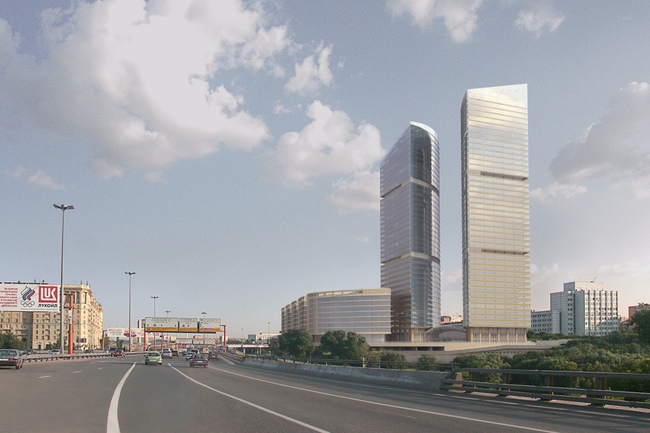
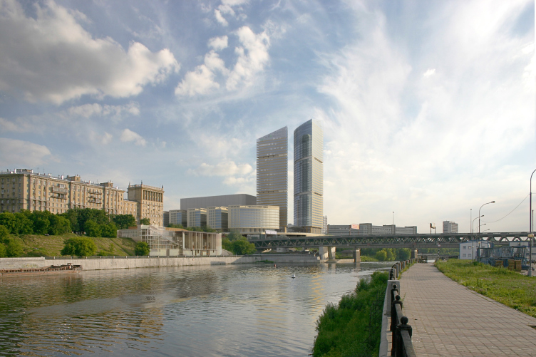
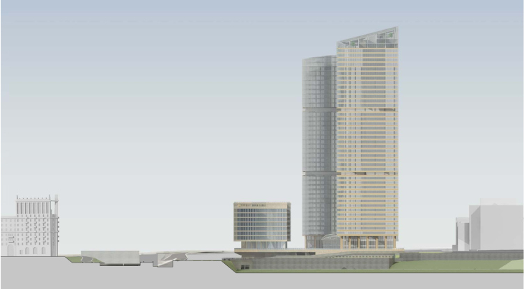
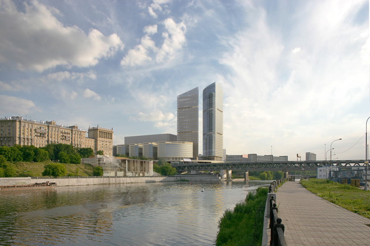
The project of the office complex “Mirax Plaza” is well known to anyone interested in the contemporary Moscow (see our article on the 2007 project). Although after the global financial crisis set in and the main investor left the project, it lost its proud-sounding name, the two austere prismatic towers saluting to the Moscow City skyscrapers from the opposite side of the Moskva River, are still almost complete and are clearly visible to the cars driving by down the Third Transport Ring

The towers, however, were but a part of the entire concept.
The other part of it was the group of ten-storey buildings inscribed into the neat oval of the layout at the foot of the two high-rises. The yellow stone buildings braced by dramatic horizontal ribs looking a lot like flying buttresses, had to continue the row of Stalin-era buildings standing along Kutuzov Avenue, and create an offset contrast to the office towers.
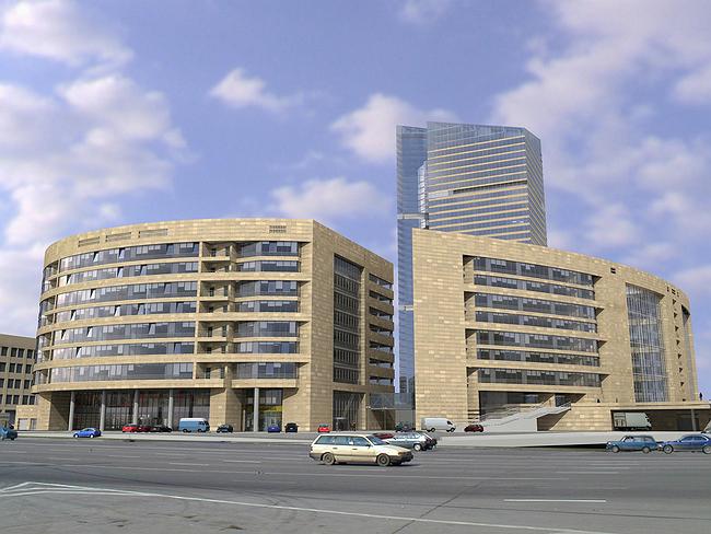
The previous version of "Mirax-Plaza" project

However, as often is the case, not everything went to plan. The designer supervision over the construction of part of the “island” (the building that is turned onto Kutuzov Avenue and that makes up the “nose” of the oval), was handed over to another architectural office, the project was changed, and the building was not built the way it had been intended. In a nutshell, it was generalized and simplified: now there was less stone, more glass, and the horizontal ribs, while still preserved, became thinner and more monotonous. The casing blocks, from horizontal and tawny, with “scorch marks” so characteristic of Stalin times houses, turned into pink-gray and vertical, now looking very much like “seashell” casing that was used back in the 1970’s for coating the Soviet movie theaters and office buildings.

The building on the Kutuzov Avenue, built with neither designer supervision nor with “Sergey Kisselev and Partners”. Photo: panoramio.com, stargate

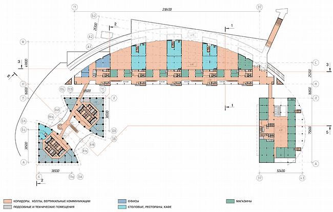
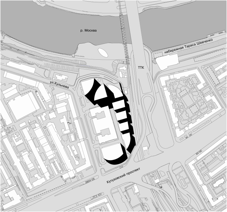
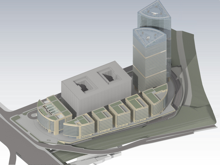
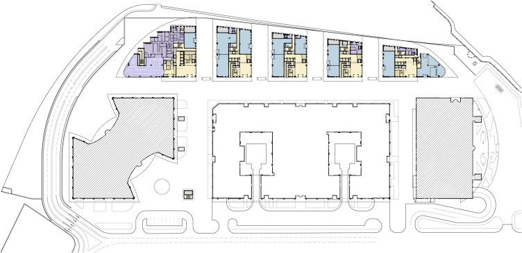
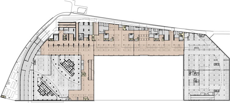
During the work on the ten-storey building that in fact makes up the elongated part of the oval situated next to the Third Transport Ring (designated by the letter "B" on the various layouts of the complex) it became clear that keeping its original shape would be impossible due to the recent changes in the land-use and development rules of the adjacent section of the railroad line. "While formerly our situation provided the opportunity of placing the stylobate pillars directly on this railroad section, now the agency for land-use would not even condescend to considering such a possibility" - the architects share. In other words, according to the original design, the volume of Building "B" and the railroad line actually crossed: the dome-shaped arch of the facade would have overhung the tunnel that pierced the volume of the building from side to side chordwise but now the building was to recede into the confines of its construction site. 

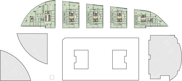
The original layout

The commissioner announced a tender for the design adjustment of the ten-story building - naturally, with a view to preserve in the new project the original square footage with expenses minimized. For the architectural office "Sergey Kisselev and Partners" this in fact was a chance to retrieve its original project, and finally bring it to fruition. Knowing their own project inside and out, the architects quickly found the solution to the problem that was set before them. The design, of course, underwent a few significant changes (under the given circumstances it simply could not have been otherwise) but the authors "did their best to consider the structures that were already erected and were making all of their planning decisions, if it's possible to put it like this, in the reconstruction mode". In a word, they only proposed to make the most necessary changes, at the same time giving back to the project all of its original useful space. 

The regular-shaped, compasses-drawn but protruding too far beyond the confines of the site arch of the oval layout had to get cut off to make room for the railroad line - the layout of the building was no longer a segment and took on the constrained and squeezed shape, like a 1960's TV with straight sides and rounded corners.

Site plan

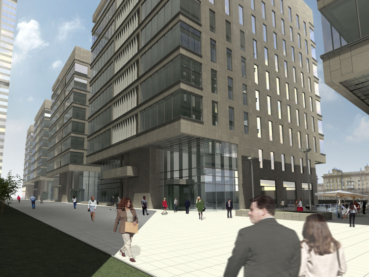
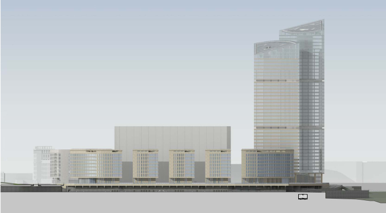
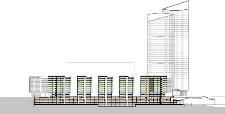
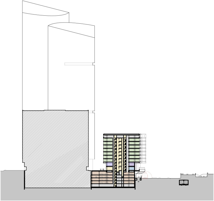
In order to compensate for the lost useful square footage, the architects divided the elongated building into five parts, replacing the four atriums with open courtyards. Each of the five resulting volumes got expanded lengthwise at the expense of reducing the space of the yards. This measure helped to retrieve all the lost square meters without increasing the height of the buildings. The yards, in the meantime, started looking more like short fragments of pedestrian boulevards: they all lead to the longitudinal inner street that connects all the five buildings. The latter, at the same time, overhang in deep cantilevers above the pedestrian space thus winning yet some more useful space and forming small marquees over the boulevards below. 
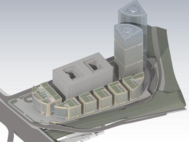
Visualization. Project of 2012. Version 2.

What is peculiar is the fact that the architects deliberately opted out of making their "yard" streets car-passable, fully reserving them for the pedestrians. This resonates a little with a reminder about the cancelled deluxe atriums - the yards, of course, lack the luxury of their glass surfaces stretched at a ten-storey height but they still remain the safe and comfortable space to be in. Unlike the atriums, however, the yards are open to the city and thus are more democratic: anyone can walk in and around here. This solution is more on the European than on Moscow side: Moscow is still having a difficult time getting rid of its endless fences and checkpoints, so the open little streets of the office center are a small but still an important step to meet the city community halfway. 

The pass-through pedestrian street of Building B

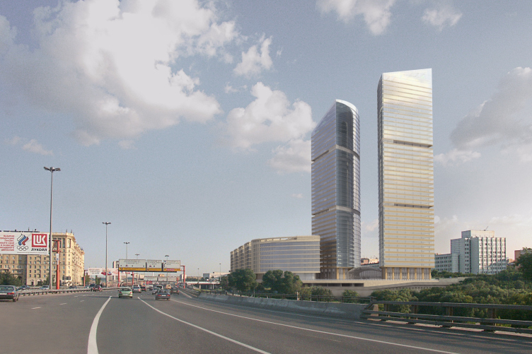
The facades, of course, also had to be remodeled: now they are made up of the same alternating pattern of horizontal stripes of stone and glass as the towers. At the rounded side walls the stripes get narrower - here they resonate with the graphics of the building that stands on the side of the Kutuzovsky Avenue. As we can see, the architects ultimately came to one of the most wide-spread, if not to say "classical" facade techniques of office architecture. The striking-looking "arrested" cascade of stone braces that in the original project was meant to bring association of the age of high speeds and similar technogenious things, has now turned into a respectable office street. Still, the authors have been able to restore the project's integrity, which was particularly important to them. The "courtyard" streets splitting the once-single building into five separate volumes, will look, at a quick glance cast from the side of the Third Transport Ring, like narrow slits and will not violate the integrity of the facade's image. Andrew Nikiforov is also positive that the architects have ultimately been able to keep the idea of the "oval island". 

View from the Third Transport Ring

One cannot but be happy about the fact that the shattered and scattered project got almost unexpectedly "fixed". This story once again goes to show that a competent architect will always be able to solve the commissioner's situation as well as retrieve the all-but-lost project to restore its integrity and find a new image for it.

This "new image" that came as a result of the transformation described, is also worth special mentioning. It is more relaxed, more practical, and more democratic. "Mirax-Plaza", though austere and conceptual, was still dramatic and expensive-looking. It was meant to strike one's imagination with the glass of the atriums, the flying buttresses, and the regular arches and circles. Its architecture sported the contrastive tension: between the concrete and glass, the towers and the avenue (the former being the symbol of the power of money, the latter - the power of the tyrant). The contradictions of the city were aptly reflected in it and turned into a dramatic and powerful story. Which was quite resonant with the times: the period of quick growth, arrogant investors, and giant projects.

Now the contrasts are all but erased, the contradictions are softened, and the story is taken to a whole new level: now it has ceased, to a large extent, being a theatrical performance arrested in stone, and has started looking more like the natural history of finding common ground, reasonable economy, and architectural integrity. The complex is stepping back from the obstacle that its predecessor was stepping upon but at the same time it opens its arms and lets itself into the city. These are marks of our times - possibly, just as good as one can think of.



Object:
Administrative and retail complex at Kulnev str.
Russia, Moscow, Kutuzovsky prospect (crossing with Kulnev street)

Project Team:
Sergej Kiselev, Andrey Nikiforov, Andrey Breslavcev, Anton Busalov, Gleb Holopov, Elena Klueva
Engineers: Igor Shvarcman, Konstantin Spiridonov

6.2006 — 9.2007 / 10.2007

The client: OAO “Mezhdunarodny Centr”

10 December 2012

Headlines now
Living in the Architecture of One’s Own Making
Do architects design houses for themselves? You bet! In this article, we are examining a new book by TATLIN publishing house. This book – unprecedented for Russia – features 52 private homes designed and built by contemporary architects for themselves. It includes houses that are famous, even iconic, as well as lesser-known ones; large and small, stylish and eccentric. To some extent, the book reflects the history of Russian architecture over the past 30 years.
A City Block Isoline
Another competition project for a residential complex on the banks of the Volga in Nizhny Novgorod has been prepared by Studio 44. A team of architects led by Ivan Kozhin concluded that using a regular block layout in such a location would be inappropriate and developed a “custom design” approach: a chain of parceled multi-section buildings stretching along the entire embankment. Let’s explore the features and advantages of this unconventional method.
Competition: The Price of Creativity?
Any day now, we’re expecting the results of a competition held by the “Samolet” development group for a plot in Kommunarka. In the meantime, we share the impressions of Editor-in-Chief Julia Tarabarina, who managed to conduct a public talk. Though technically focused on the interaction between developers and architects, the public talk turned into a discussion about the pros and cons of architectural competitions.
Terraced Design
The “River Park” residential complex has confidently and securely shaped the Nagatinsky Backwater shoreline. Featuring a public embankment, elevated courtyards connected by pedestrian bridges, and brick façades, the development invites exploration of its nuanced response to the surrounding context, as well as hints of the architects’ megalithic design thinking.
A Kremlin’s Core and Meteorite Fragments
We continue our coverage of the competition projects for the residential district that the development company GloraX plans to build along the embankment of the Rowing Channel in Nizhny Novgorod. ASADOV Architects approached the concept through a deep dive into local identity, using storytelling to pinpoint a central idea for the design: the master plan and composition are imagined as if a meteorite had struck a “proto-Kremlin”. Sounds weird? Find more details below!
The Volga Regatta
GloraX plans to develop a residential complex spanning 14 hectares along the Volga River in Nizhny Novgorod. The winning design in a closed-door competition, created by GORA Architects, features housing typologies ranging from townhouses to terraced high-rise slabs, a balance of functions, diverse ways of engaging with the water, and even a dedicated island (no less!) for the city residents.
A New Track
We took a thorough look at D_Station, a railcar repair depot dating back to 1906, recently reconstructed while preserving its century-old industrial structure, upon the project by Sergey Trukhanov and T+T Architects. Though work on the interiors – set to house restaurants and public spaces – is still underway, the building’s exterior already offers plenty to see. Visitors can explore the blend of old and new brickwork, appreciate the architect’s unique interpretation of ruin aesthetics, and enjoy the newly built pedestrian route that connects the Citydel Business Center’s arches to Kazakova Street.
Four Different Surveys
The “Explore the City” competition, organized this year by the Genplan Institute of Moscow, stands out as a pretty unconventional one for the architectural field but aligns perfectly well with the character of urban planning work. The winning project analyzed contemporary residential complexes, combining urban planning insights with a realtor’s perspective to propose a hybrid approach. Other entries explored public centers, motivations for car ownership, and housing vacancy rates. A fifth participant withdrew. Here’s a closer look at the four completed works.
Scheduled Evolution
ASADOV Architects unveiled the EvyCenter pavilion, a microcultural hub for fostering personal growth, organizing workshops, and doing gymnastics. Additionally, this pavilion serves as a prototype for a scalable country house, drawing inspiration from the “Loskutok” project, and constructed from CLT panels in a factory. This marks the beginning of a developer project initiated by the architectural firm (sic!), which is seeking partners to expand both small Evy settlements and even larger Evy cities, which are, according to Andrey Asadov, aimed at fostering the “evolutionary” development of the people who will inhabit them.
The Golden Crown
The concept for a dental clinic in Yekaterinburg, developed by CNTR Studio, revolves around the idea of a “mouth full of gold”: pristine white porcelain stoneware walls are complemented by matte brass details. To avoid an overly literal interpretation, the architects focused on the building’s proportions, skillfully navigating between sunlight requirements and fire safety regulations.
Flexibility and Integration
Not long ago, we covered the project for the fourth phase of the ÁLIA residential complex, designed by APEX. Now, we’ve been shown different fence concepts they developed to enclose the complex’s private courtyards, incorporating a variety of public functions. We believe that the sheer fact that the complex’s architects were involved in such a detail as fencing speaks volumes.
A Step Forward
The HIDE residential complex represents a major milestone for ADM architects and their leaders Andrey Romanov and Ekaterina Kuznetsova in their quest for a fresh high-rise aesthetic – one that is flexible and layered, capable of bringing vibrancy to mass and silhouette while shaping form. Over recent years, this approach has become ADM’s “signature style”, with the golden HIDE tower playing a pivotal role in its evolution. Here, we delve into the project’s story, explore the details of the complex’s design, and uncover its core essence.
Gold in the Sands
A new office for a transcontinental company specializing in resource extraction and processing has opened in Dubai. Designed by T+T Architects, masters of creating spaces that are contemporary, diverse, flexible, and original, this project exemplifies their expertise. On the executive floor, a massive brass-clad partition dominates, while layered textures of compressed earth create a contextually resonant backdrop.
Layers and Levels of Flight
This project goes way back – Reserve Union won this architectural competition at the end of 2011, and the building was completed in 2018, so it’s practically “archival”. However, despite being relatively unknown, the building can hardly be considered “dated” and remains a prime example of architectural expression, particularly in the headquarters genre. And it’s especially fitting for an aviation company office. In some ways, it resembles the Aeroflot headquarters at Sheremetyevo but with its own unique identity, following the signature style of Vladimir Plotkin. In this article, we take an in-depth look at the United Aircraft Corporation (UAC) headquarters in the Moscow agglomeration town of Zhukovsky, supplemented by recent photographs from Alexey Naroditsky – a shoot that became only recently possible due to the fact that improvements were finally made in the surrounding area.
Light and Shadow
In this article, we delve into the architectural design of the “Chaika” house by DNK ag architects, which was recently completed in 2023 as part of the collection of signature designs at ZILArt. As is well-known, all the buildings in this complex follow a design code, yet each one is distinct. This particular building stands out not only for its whiteness and minimalism but also for the refined use of a limited number of techniques that, together, create what can confidently be called synergy.
Casus Novae
A master plan was developed for a large residential area with a name of “DNS City”, but now that its implementation began, the plan has been arbitrarily reformatted and replaced with something that, while similar on the surface, is actually quite different. This is not the first time such a thing happens, but it’s always frustrating. With permission from the author, we are sharing Maria Elkina’s post.
Treasure Hunting
The GAFA bureau, in collaboration with Tegola and Arkhitail, organized an expedition to the island of Kilpola in Karelia as part of Moskomarkhitektura’s “Open City” festival. There, amidst moss and rocks, the students sought answers to questions like: what is the sacred, where does it dwell, and what sustains it? Assisting the participants in this quest were landscape engineer Evgeny Levin, artist Nicholas Roerich, a moose, and the lack of cellular connection. Here’s how the story unfolded.
Depths of the Earth, Streams of Water
In the Malaya Okhta district, the Akzent building, designed by Stepan Liphart, was constructed. It follows a classic tripartite structure, yet it’s what you might call “hand-drawn”: each façade is unique in its form and details, some of which aren’t immediately noticeable. In this article, we explore the context and, together with the architect, delve into how the form was developed.
Fir Tree Dynamics
The “Airports of Region” holding is planning to build an airport in Karachay-Cherkessia, aiming to make the Arkhyz and Dombay resorts more accessible to travelers. The project that won in an invitation-only competition, submitted by Sergey Nikeshkin’s KPLN, blends natural imagery inspired by the shape of a conifer seed, open-air waiting spaces, majestic large trees, and a green roof elevated on needle-like columns. The result is both nature-inspired and WOW.
​A Brick Shell
In the process of designing a clubhouse situated among pine trees in a prestigious suburban area near Moscow, the architectural firm “A.Len” did the façade design part. The combination of different types of brick and masonry correlates with the volumetric and plastique solutions, further enhanced by the inclusion of wood-painted fragments and metal “glazing”.
Word Forms
ATRIUM architects love ambitious challenges, and for the firm’s thirtieth anniversary, they boldly play a game of words with an exhibition that dives deep into a self-created vocabulary. They immerse their projects – especially art installations – into this glossary, as if plunging into a current of their own. You feel as if you’re flowing through the veins of pure art, immersed in a universe of vertical cities, educational spaces – of which the architects are true masters – and the cultural codes of various locations. But what truly captivates is the bold statement that Vera Butko and Anton Nadtochy make, both through their work and this exhibition: architecture, above all, is art – the art of working with form and space.
Flexibility and Acuteness of Modernity
Luxurious, fluid, large “kokoshniks” and spiral barrel columns, as if made from colorful chewing gum: there seem to be no other mansion like this in Moscow, designed in the “Neo-Russian-Modern” style. And the “Teremok” on Malaya Kaluzhskaya, previously somewhat obscure, has “come alive with new colors” and gained visibility after its restoration for the office of the “architectural ecosystem” as the architects love to call themselves. It’s evident that Julius Borisov and the architects at UNK put their hearts into finding this new office and bringing it up to date. Let’s delve into the paradoxes of this mansion’s history and its plasticity. Spoiler: two versions of modernity meet here, both balancing on the razor’s edge of “what’s current”.
Yuri Vissarionov: “A modular house does not belong to the land”
It belongs to space, or to the air... It turns out that 3D printing is more effective when combined with a modular approach: the house is built in a workshop and then adapted to the site, including on uneven terrain. Yuri Vissarionov shares his latest experience in designing tourist complexes, both in central Russia and in the south. These include houseboats, homes printed from lightweight concrete using a 3D printer, and, of course, frame houses.
​Moscow’s First
“The quality of education largely depends on the quality of the educational environment”. This principle of the last decade has been realized by Sergey Skuratov in the project for the First Moscow Gymnasium on Rostovskaya Embankment in the Khamovniki district. The building seamlessly integrates into the complex urban landscape, responding both to the pedestrian flow of the city and the quiet alleyways. It skillfully takes advantage of the height differences and aligns with modern trends in educational space design. Let’s take a closer look.
Looking at the Water
The site of Villa Sonata stretches from the road to the water’s edge, offering its own shoreline, pier, and a picturesque river panorama. To reveal these sweeping views, Roman Leonidov “cut” the façade diagonally parallel to the river, thus getting two main axes for the house and, consequently, “two heads”. The internal core – two double-height spaces, a living room and a conservatory, with a “bridge” above them – makes the house both “transparent” and filled with light.
The White Wing
Well, it’s not exactly white. It’s more of a beige, white-stone structure that plays with the color of limestone – smoother surfaces are lighter, while rougher ones are darker. This wing unites various elements: it absorbs and interprets the surrounding themes. It responds to everything, yet maintains a cohesive expression – a challenging task! – while also incorporating recognizable features of its own, such as the dynamic cuts at the bottom, top, and middle.
Urban Dunes
The XSA Ramps team designed and built a three-part sports hub for a park in Rostov-on-Don, welcoming people of all ages and fitness levels. The skate plaza, pump track, and playground are all meticulously crafted with details that attract a diverse range of visitors. The technical execution of the shapes and slopes transforms this space into a kind of sculptural composition.
Proportional Growth
The project for the fourth phase of the ÁLIA residential area has been announced. The buildings are situated on an elongated plot – almost a “ray” that shoots out from the center of the area towards the river. Their layout reflects both a response to Moscow’s architectural preferences over the past 15 years, shifting “from blocks to towers”, and an interpretation of the neighboring business park designed by SOM. Additionally, the best apartments here are not located at the very top but closer to the middle, forming a glowing “waistline”.
The “Staircase” Building
In designing the “Details” residential complex in New Moscow, Rais Baishev spiced up the now-popular Moscow theme of a “courtyard” building with an idea drawn from the surrealist drawings by Maurits Escher. He envisioned the stepped silhouettes and descending slopes as a metaphysical mega-staircase, creating a key void within the courtyard that gave the project an internal “spine”. This concept is felt both in the building’s silhouette and on its façades.
Projection of the Quarter
No one doubted that the building that Vladimir Plotkin designed as part of the “Garden Quarters” would be the most modernist of all. And it turned out just that way: while adhering to the common design code, the building successfully combines brick and white stone, rhythmically responding to the neighboring building designed by Ostozhenka, yet tactfully and persistently making a few statements of its own. This includes the projection of the ideal urban development composition “14–9–6”, which can be found right next door, mathematical calculations, including those for various types of terraces (and perhaps the only reminder of the Soviet past of the Kauchuk rubber factory!), and the white “cross-stitch” pattern of the façade grid.