По-русски

Palladian Style Improvisation

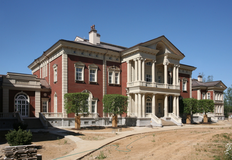
In this issue, we present the project of an “English House” – a palace built by Oleg Carlson for a commissioner from Moscow region. The facades of the house simulate the image of a British country palace and serve to conceal a complex and intriguingly sophisticated multi-layer space behind them.
22 November 2012
Object
mainImg

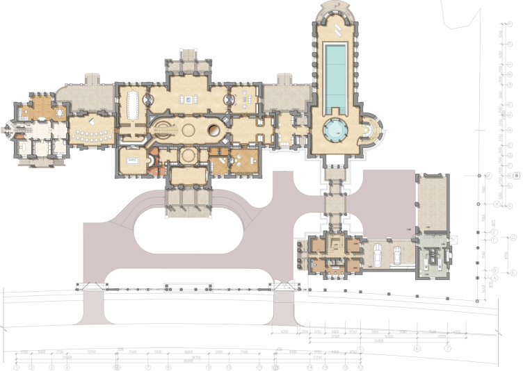
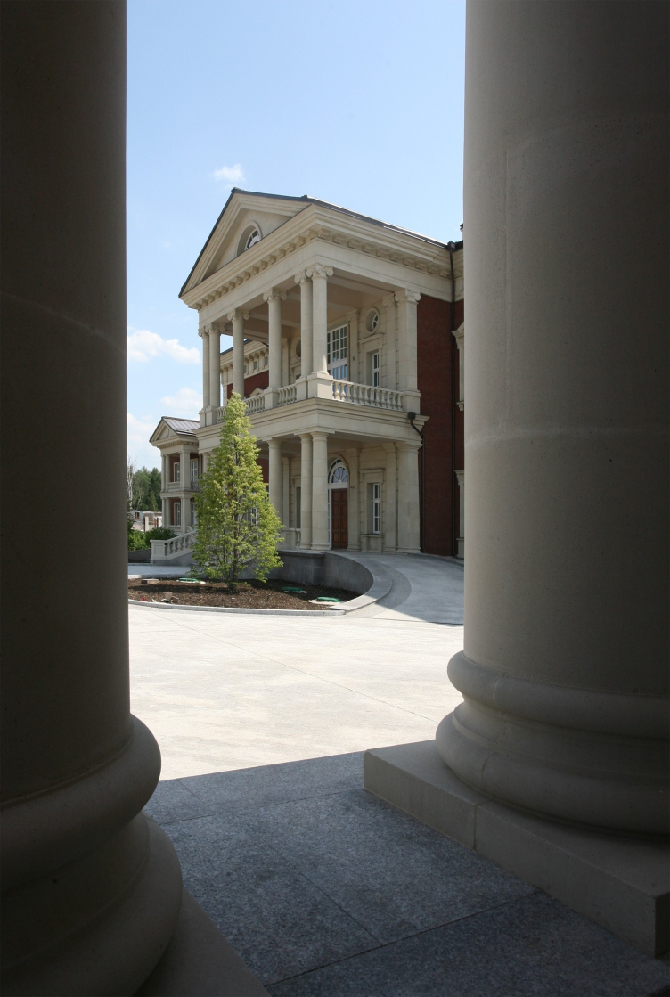
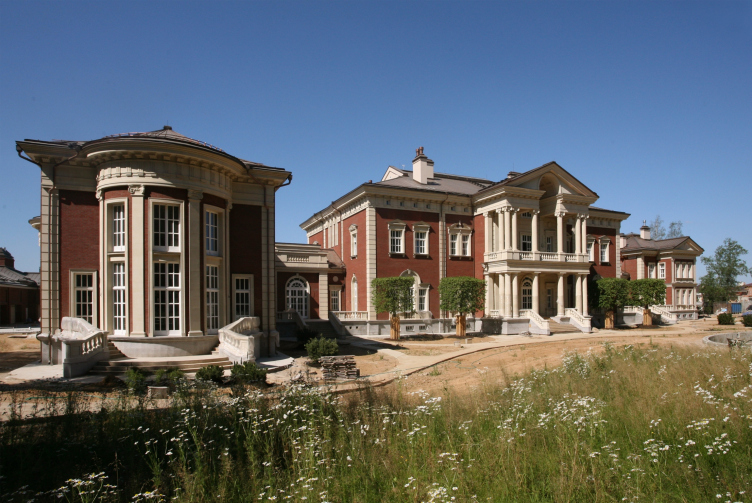
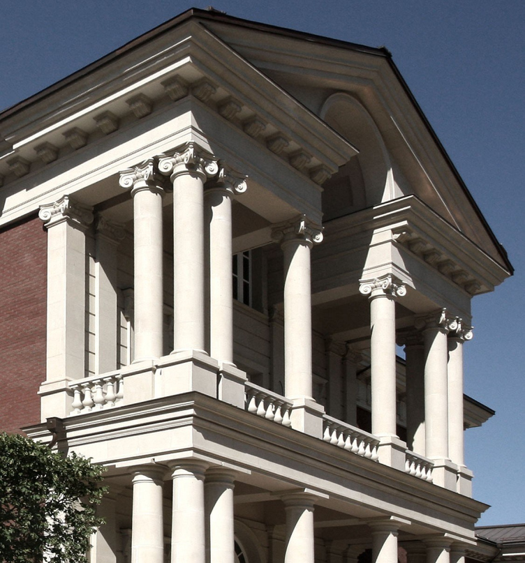
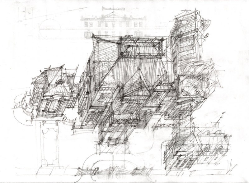
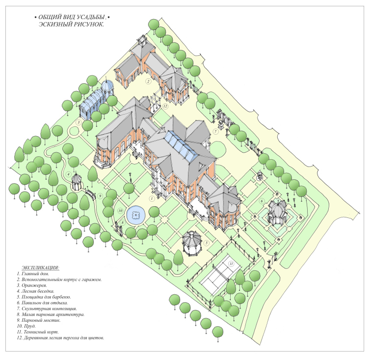
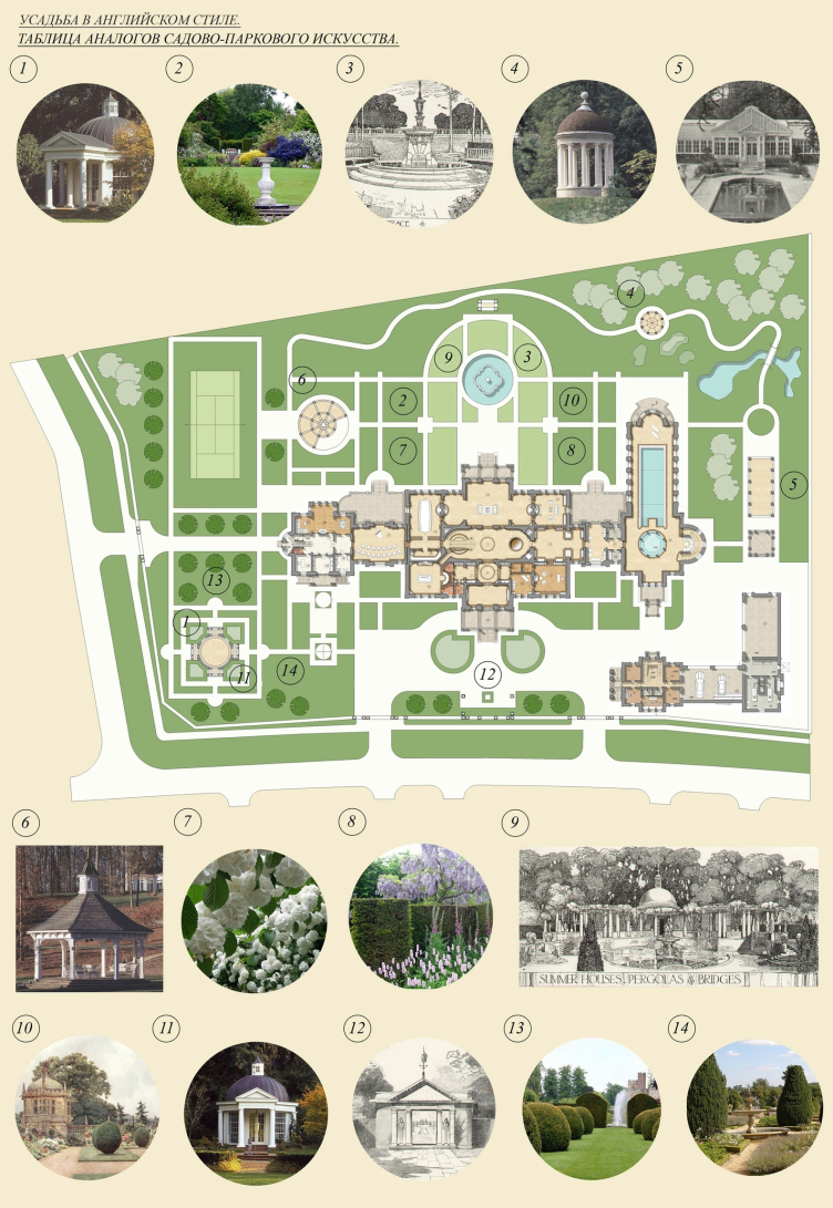
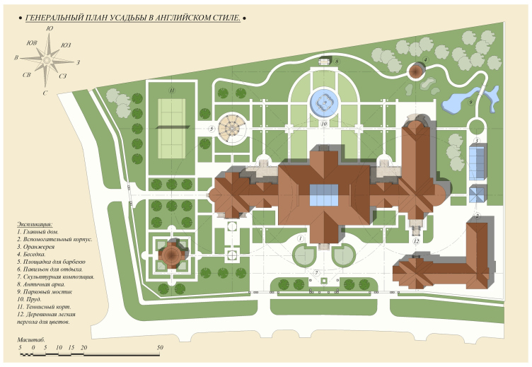
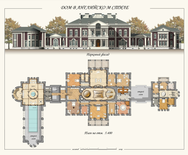
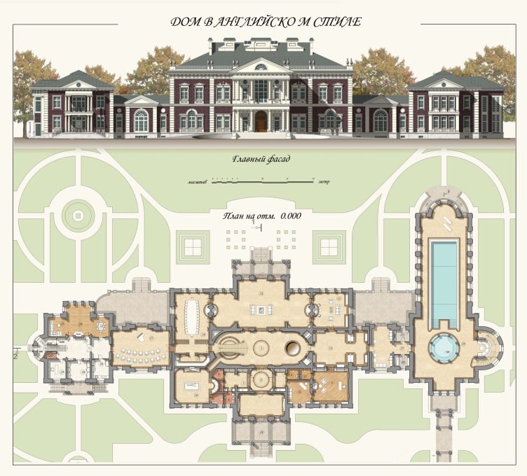
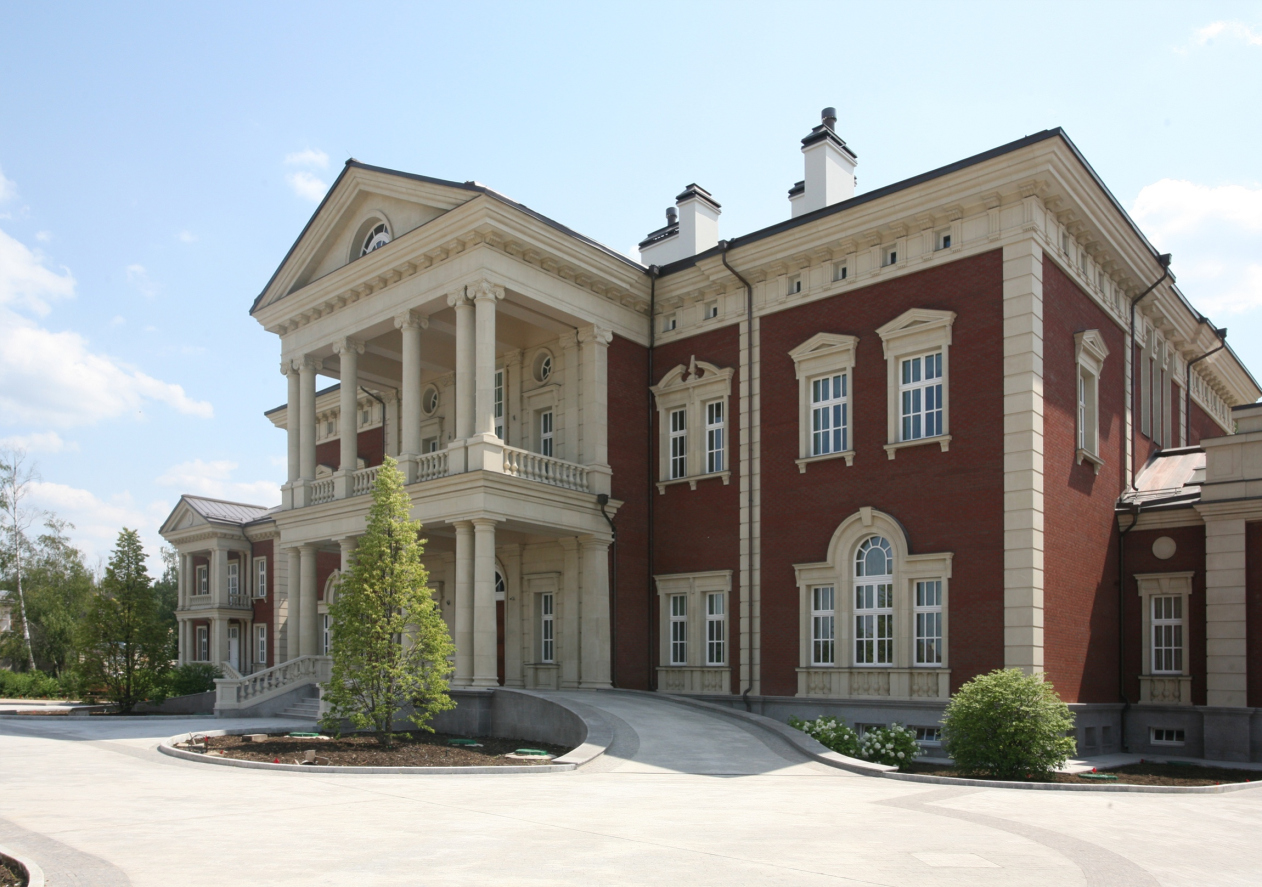
The central part of the house is a large two-storied volume, crowned with a hipped steep-pitched roof. The two main facades, turned onto the street and onto the woodland respectively, sport a double-level balcony portico that protrudes far ahead and thus becomes a very spacious one; in the summertime it will become a cool shady terrace full of fresh air, and in the wintertime it will also make a safe shelter from the snow. The side walls of the house are branching with two wings that also serve as overpasses leading to two little side houses, also double-storied but less tall and of a more stone-architecture character: they have fewer walls and more windows, no porticos but instead they get the semi-circular exedras, the shapes that are capable of giving the indoor space and the outside facades the air of light elegance of the classicism style. 

At the first glance cast at the main façade of the house with its wings and overpasses, the architectural ensemble look perfectly symmetric. This is not the case, however. One of the two outhouses is stretched transversely to the main longitudinal axis, and for a good reason: it contains the swimming pool, an essential attribute of any Moscow area palace of today. In fact, this is a “water house”, or a spa, as people prefer to call it nowadays, one that a person interested in the antiquity (which would make sense in the classical environment) might have called a miniature version of the Roman thermae. All the more so, because it’s not one but two pools that are going to be placed here: the circular warm one, under the dome and surrounded by eight columns (the real Roman caldarium), and an elongated cold water swimming pool. Above the circular pool, just as at the end of the elongated one, there are two large niches (these are the already-mentioned exedras) that give the indoor space its classic grace and polish, turning it from the trivial “spa” or “bathhouse” into the real thermae. The effect is enhanced by the sculpture that will be placed in one of the niches. 

There are several historical “reminiscences” of this kind in the house, the most noteworthy one being the underground rotunda in the basement floor. It is surrounded by an arched colonnade, and the deck of the first floor above it is cut by a large circular opening surrounded by a balustrade. Entering through the front porch, the guest finds this opening on the right, and, leaning on the balustrade, he or she can take a peek into the semi-underground world to see the arches, the columns and the statue – effect similar to the discovery of the crypt in the cathedral or an ancient cellar, excavated and preserved by archaeologists in some museum. This is a theatrical technique, designed to make the front space of the palace interesting and fascinating to the visitor. 

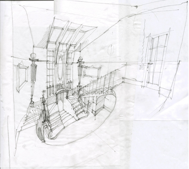
Higher up, directly above the opening of the “rotunda”, in the ceiling of the first floor (or, if viewed from above, in the floor deck of the second), there is yet another opening, just as round, with a balustrade. One can also look down through it to see the underground columns in the perspective of two occuli – this must be even more fascinating. Nearby, in the floor of the second storey, directly in the middle of thee hall, there is yet another “well”… a window that opens downwards. And finally, still higher up, in the ceiling of the second floor, there is yet one more opening, this time large and elongated, in the shaped of a smoothed-out “eight” – this topmost layer is turned into a balcony skirting the main halls along their perimeter. The entire structure is covered by a glass ceiling that turns the whole space into some kind of atrium, or a glass-roofed courtyard. 

Thus the four tiers of the front part of the house get interconnected with multiple vertical ties. The entire space is literally “stitched though” with air wells, and the whole intrigue is based exactly on that. The guests (as well as the hosts) can not only wander up and down the house but also look up and down the wells, seeing one another’s eyes. Coming to mind are things like baroque, mannerism, and, of course, the oculus, painted by Andrea Mantegna in Camera degli Sposi. In the latter, the ceiling bears the picture of a round opening with clouds beyond it and curious faces looking in. In the Moscow area palace this picture is not a painted one but it sure is implied and conveyed by architectural means. 

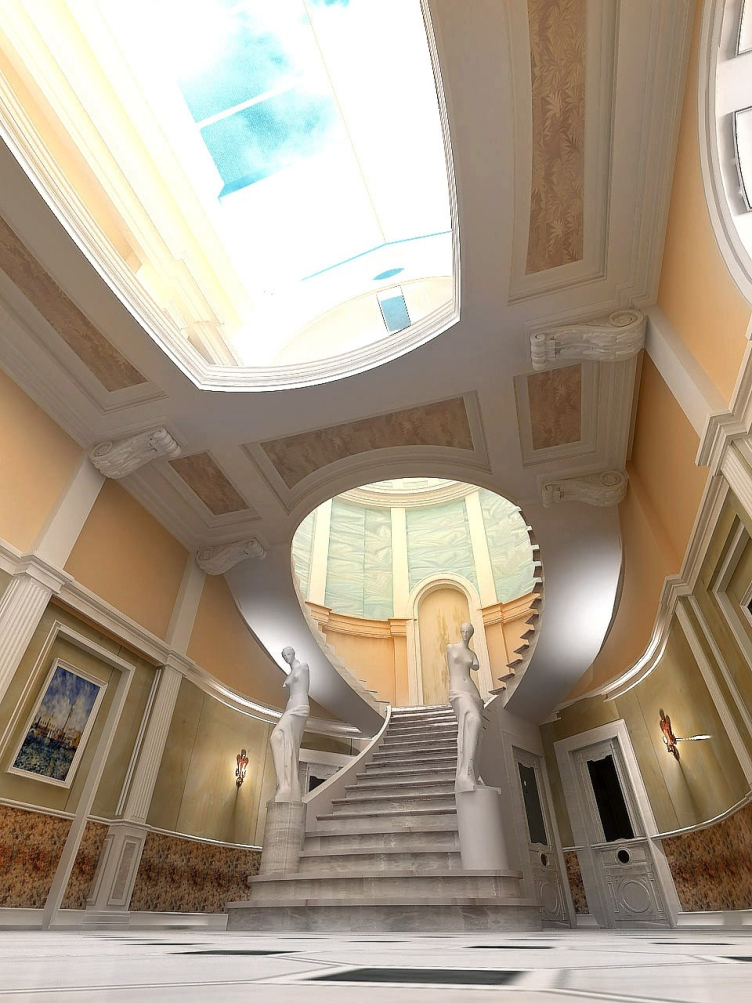
The main impression, however, is made by the staircase leading from the first floor to the second. One central staircase leads down, and two sets of stairs lead up. This is a real grand staircase, the kind that in some modern feature film about the English aristocracy Cinderella beauties and queens would go down. 

It is not by chance that the English are mentioned yet again: the house is built in the English style. Over the past 10 years England gradually turned into a standard of “good living”, so it is not surprising that the simulations of its architecture are becoming more and more popular among Russian customers. Building a good recognizable English house is actually a tall order, though. The thing is that the English architecture, though recognizable, is extremely diverse. If we are to take English Palladian Style, for example (the most chaste Palladian style in the world, in which the British historians take so much pride), then we will see that it is not very much different from late Russian Palladian style of the XVIII century. Besides, as early as in the late XVIII century, we already had anglophiles of our own – president of Moscow Institute of Architecture Dmitry Olegovich Shvidkovsky wrote a whole book on the subject. In a nutshell, if we take a Russian manor house with columns, chances are that we will find a very similar one to it in England. So, what part of it is responsible for the recognition and really makes a difference?

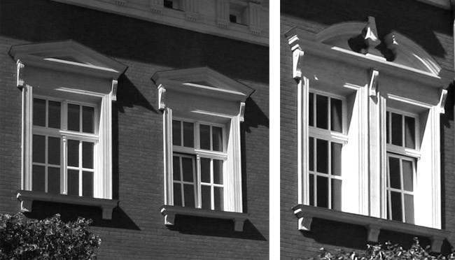
In this particular case, the architects base themselves on two things. The first one is that same Palladian style: the portico, the two almost-symmetric outhouses, the Palladian windows from the renaissance treatises (vertically divided into three parts, the top section finishing in an arch). The second one is the English renaissance of the Jacobean era, characteristic of which are the red-brick walls with white rusticated stones on the corners, high-pitched roofs (but with no garrets that were at the time so popular with the French), and with large chimneys (in this case, the little decorative walls simulating these chimneys crown the roof, masking the glass above the atrium). The large windows with the perpendicular white stone sashes of the recognizable vertical proportions dating back to the Tudor gothic style...

Or let us take a look at such a decorative device: two windows are “glued” together to form a single one and get one common gable with a small acroter in the shape of a classic obelisk. The twisted phials over the balustrade surrounding the roof are not gothic and not quite classical either. For a long time, England reluctantly studied Renaissance architecture, taking it from a third source - from the Flemish and the Germans. And then, as studiously as it had resented the pure “classical” forms, it started studying the legacy of the High Renaissance and the Antiquity. After which, with just the same zeal, it turned back to its own past (it is common knowledge how protective the British are of their traditions), and in the XIX it created the architecture following in the footsteps of Jacob the 1st era, and that eventually got the name of Jacobean. The XIX century simulations are not to be easily told from the buildings of the XVII century, though. 

The version of the English house proposed by Oleg Carlson is somewhere in the middle between the Jacobean architecture of the early XVII century, Palladian style of this same century’s second half, and the Jacobean architecture of the XIX century. Probably, it is this oscillation between the pure classics and the national peculiarities that the entire English architecture of the new era is all about. It must be admitted that the architect made the grade and the house looks recognizable indeed. 

Recognizable, even though the main effect of this architectural project lies not on the outside, of course, but on the inside – in the four-tier grand atrium of a hall, in its multi-layer saturated space, “packed” inside the respectable British walls, just like a surprise into a gift box might be.

zooming
zooming
zooming


22 November 2012

Headlines now
The Golden Crown
The concept for a dental clinic in Yekaterinburg, developed by CNTR Studio, revolves around the idea of a “mouth full of gold”: pristine white porcelain stoneware walls are complemented by matte brass details. To avoid an overly literal interpretation, the architects focused on the building’s proportions, skillfully navigating between sunlight requirements and fire safety regulations.
Flexibility and Integration
Not long ago, we covered the project for the fourth phase of the ÁLIA residential complex, designed by APEX. Now, we’ve been shown different fence concepts they developed to enclose the complex’s private courtyards, incorporating a variety of public functions. We believe that the sheer fact that the complex’s architects were involved in such a detail as fencing speaks volumes.
A Step Forward
The HIDE residential complex represents a major milestone for ADM architects and their leaders Andrey Romanov and Ekaterina Kuznetsova in their quest for a fresh high-rise aesthetic – one that is flexible and layered, capable of bringing vibrancy to mass and silhouette while shaping form. Over recent years, this approach has become ADM’s “signature style”, with the golden HIDE tower playing a pivotal role in its evolution. Here, we delve into the project’s story, explore the details of the complex’s design, and uncover its core essence.
Gold in the Sands
A new office for a transcontinental company specializing in resource extraction and processing has opened in Dubai. Designed by T+T Architects, masters of creating spaces that are contemporary, diverse, flexible, and original, this project exemplifies their expertise. On the executive floor, a massive brass-clad partition dominates, while layered textures of compressed earth create a contextually resonant backdrop.
Layers and Levels of Flight
This project goes way back – Reserve Union won this architectural competition at the end of 2011, and the building was completed in 2018, so it’s practically “archival”. However, despite being relatively unknown, the building can hardly be considered “dated” and remains a prime example of architectural expression, particularly in the headquarters genre. And it’s especially fitting for an aviation company office. In some ways, it resembles the Aeroflot headquarters at Sheremetyevo but with its own unique identity, following the signature style of Vladimir Plotkin. In this article, we take an in-depth look at the United Aircraft Corporation (UAC) headquarters in the Moscow agglomeration town of Zhukovsky, supplemented by recent photographs from Alexey Naroditsky – a shoot that became only recently possible due to the fact that improvements were finally made in the surrounding area.
Light and Shadow
In this article, we delve into the architectural design of the “Chaika” house by DNK ag architects, which was recently completed in 2023 as part of the collection of signature designs at ZILArt. As is well-known, all the buildings in this complex follow a design code, yet each one is distinct. This particular building stands out not only for its whiteness and minimalism but also for the refined use of a limited number of techniques that, together, create what can confidently be called synergy.
Casus Novae
A master plan was developed for a large residential area with a name of “DNS City”, but now that its implementation began, the plan has been arbitrarily reformatted and replaced with something that, while similar on the surface, is actually quite different. This is not the first time such a thing happens, but it’s always frustrating. With permission from the author, we are sharing Maria Elkina’s post.
Treasure Hunting
The GAFA bureau, in collaboration with Tegola and Arkhitail, organized an expedition to the island of Kilpola in Karelia as part of Moskomarkhitektura’s “Open City” festival. There, amidst moss and rocks, the students sought answers to questions like: what is the sacred, where does it dwell, and what sustains it? Assisting the participants in this quest were landscape engineer Evgeny Levin, artist Nicholas Roerich, a moose, and the lack of cellular connection. Here’s how the story unfolded.
Depths of the Earth, Streams of Water
In the Malaya Okhta district, the Akzent building, designed by Stepan Liphart, was constructed. It follows a classic tripartite structure, yet it’s what you might call “hand-drawn”: each façade is unique in its form and details, some of which aren’t immediately noticeable. In this article, we explore the context and, together with the architect, delve into how the form was developed.
Fir Tree Dynamics
The “Airports of Region” holding is planning to build an airport in Karachay-Cherkessia, aiming to make the Arkhyz and Dombay resorts more accessible to travelers. The project that won in an invitation-only competition, submitted by Sergey Nikeshkin’s KPLN, blends natural imagery inspired by the shape of a conifer seed, open-air waiting spaces, majestic large trees, and a green roof elevated on needle-like columns. The result is both nature-inspired and WOW.
​A Brick Shell
In the process of designing a clubhouse situated among pine trees in a prestigious suburban area near Moscow, the architectural firm “A.Len” did the façade design part. The combination of different types of brick and masonry correlates with the volumetric and plastique solutions, further enhanced by the inclusion of wood-painted fragments and metal “glazing”.
Word Forms
ATRIUM architects love ambitious challenges, and for the firm’s thirtieth anniversary, they boldly play a game of words with an exhibition that dives deep into a self-created vocabulary. They immerse their projects – especially art installations – into this glossary, as if plunging into a current of their own. You feel as if you’re flowing through the veins of pure art, immersed in a universe of vertical cities, educational spaces – of which the architects are true masters – and the cultural codes of various locations. But what truly captivates is the bold statement that Vera Butko and Anton Nadtochy make, both through their work and this exhibition: architecture, above all, is art – the art of working with form and space.
Flexibility and Acuteness of Modernity
Luxurious, fluid, large “kokoshniks” and spiral barrel columns, as if made from colorful chewing gum: there seem to be no other mansion like this in Moscow, designed in the “Neo-Russian-Modern” style. And the “Teremok” on Malaya Kaluzhskaya, previously somewhat obscure, has “come alive with new colors” and gained visibility after its restoration for the office of the “architectural ecosystem” as the architects love to call themselves. It’s evident that Julius Borisov and the architects at UNK put their hearts into finding this new office and bringing it up to date. Let’s delve into the paradoxes of this mansion’s history and its plasticity. Spoiler: two versions of modernity meet here, both balancing on the razor’s edge of “what’s current”.
Yuri Vissarionov: “A modular house does not belong to the land”
It belongs to space, or to the air... It turns out that 3D printing is more effective when combined with a modular approach: the house is built in a workshop and then adapted to the site, including on uneven terrain. Yuri Vissarionov shares his latest experience in designing tourist complexes, both in central Russia and in the south. These include houseboats, homes printed from lightweight concrete using a 3D printer, and, of course, frame houses.
​Moscow’s First
“The quality of education largely depends on the quality of the educational environment”. This principle of the last decade has been realized by Sergey Skuratov in the project for the First Moscow Gymnasium on Rostovskaya Embankment in the Khamovniki district. The building seamlessly integrates into the complex urban landscape, responding both to the pedestrian flow of the city and the quiet alleyways. It skillfully takes advantage of the height differences and aligns with modern trends in educational space design. Let’s take a closer look.
Looking at the Water
The site of Villa Sonata stretches from the road to the water’s edge, offering its own shoreline, pier, and a picturesque river panorama. To reveal these sweeping views, Roman Leonidov “cut” the façade diagonally parallel to the river, thus getting two main axes for the house and, consequently, “two heads”. The internal core – two double-height spaces, a living room and a conservatory, with a “bridge” above them – makes the house both “transparent” and filled with light.
The White Wing
Well, it’s not exactly white. It’s more of a beige, white-stone structure that plays with the color of limestone – smoother surfaces are lighter, while rougher ones are darker. This wing unites various elements: it absorbs and interprets the surrounding themes. It responds to everything, yet maintains a cohesive expression – a challenging task! – while also incorporating recognizable features of its own, such as the dynamic cuts at the bottom, top, and middle.
Urban Dunes
The XSA Ramps team designed and built a three-part sports hub for a park in Rostov-on-Don, welcoming people of all ages and fitness levels. The skate plaza, pump track, and playground are all meticulously crafted with details that attract a diverse range of visitors. The technical execution of the shapes and slopes transforms this space into a kind of sculptural composition.
Proportional Growth
The project for the fourth phase of the ÁLIA residential area has been announced. The buildings are situated on an elongated plot – almost a “ray” that shoots out from the center of the area towards the river. Their layout reflects both a response to Moscow’s architectural preferences over the past 15 years, shifting “from blocks to towers”, and an interpretation of the neighboring business park designed by SOM. Additionally, the best apartments here are not located at the very top but closer to the middle, forming a glowing “waistline”.
The “Staircase” Building
In designing the “Details” residential complex in New Moscow, Rais Baishev spiced up the now-popular Moscow theme of a “courtyard” building with an idea drawn from the surrealist drawings by Maurits Escher. He envisioned the stepped silhouettes and descending slopes as a metaphysical mega-staircase, creating a key void within the courtyard that gave the project an internal “spine”. This concept is felt both in the building’s silhouette and on its façades.
Projection of the Quarter
No one doubted that the building that Vladimir Plotkin designed as part of the “Garden Quarters” would be the most modernist of all. And it turned out just that way: while adhering to the common design code, the building successfully combines brick and white stone, rhythmically responding to the neighboring building designed by Ostozhenka, yet tactfully and persistently making a few statements of its own. This includes the projection of the ideal urban development composition “14–9–6”, which can be found right next door, mathematical calculations, including those for various types of terraces (and perhaps the only reminder of the Soviet past of the Kauchuk rubber factory!), and the white “cross-stitch” pattern of the façade grid.
Domus Aurea
In this issue, we examine the “Tessinsky-1” house, designed by Sergey Skuratov and completed in 2023. Located in the middle of the Serebryanicheskaya Embankment district, at the intersection of its main streets, this house assumes a sort of “nodal” role: it not only responds to everything around it and preserves many memories of the former EMA factory within itself, but it weaves all this into a newly directed pattern, reconciling bright “gold” and dark-colored brick, largely with the help of the new, modern-yet-archaic Columba brick, which, come to think about it, is the most precious element here.
The Chimney of Nikola-Lenivets
In this issue, we are examining the “Obelisk House” designed by KATARSIS and built for the Arkhstoyanie 2023 festival. However, it was only finished later on, and this is why we are examining it now. It seems to us that after the “Obelisk House” appeared in Nikola-Lenivets, a dialogue and a few inner connections appeared between the temporary structures built here. These houses no longer look like “accidental neighbors”, more of which below.
​Periscope by the Bay
The jury awarded the second place in the competition for a public and cultural center in Petropavlovsk-Kamchatsky to the companies GORA (“Mountain”) and M4. In the consortium’s proposal, the building resembles a sperm whale with a calf swimming next to it or a periscope, whose lenses capture the most spectacular views from the surrounding landscape.
From Arcs to Dolmens
While working on the competition project for Petropavlovsk-Kamchatsky, ASADOV Architects prioritized the value of the natural and urban environment, aiming to preserve the balance of the location while minimizing the resemblance of the volume that they designed to a “traditional building”. The task was challenging, and the architects created three versions, one of which having been developed after the competition, where their main proposal took third place. However, the point of interest here is not the competition result but the continuity of creative thinking.
Hide and Seek
The ID Moskovskiy house, designed by Stepan Liphart in St. Petersburg, in the courtyards near Moskovskiy Avenue beyond the Obvodny Canal and recently completed, is notable for several reasons. Firstly, it has been realized with considerable accuracy, which is particularly significant as this is the first building where the architect was responsible not only for the facades but also for the layouts, allowing for better integration between the two. On the other hand, this building is interesting as an example of the “germination” of new architecture in the city: it draws on the best examples from the neighborhood and becomes an improved and developed sum of ideas found by the architect in the surrounding context.
The Big Twelve
Yesterday, the winners of the Moscow Mayor’s Architecture Award were announced and honored. Let’s take a look at what was awarded and, in some cases, even critique this esteemed award. After all, there is always room for improvement, right?
Above the Golden Horn
The residential complex “Philosophy” designed by T+T architects in Vladivostok, is one of the new projects in the “Golubinaya Pad” area, changing its development philosophy (pun intended) from single houses to a comprehensive approach. The buildings are organized along public streets, varying in height and format, with one house even executed in gallery typology, featuring a cantilever leaning on an art object.
Nuanced Alternative
How can you rhyme a square and space? Easily! But to do so, you need to rhyme everything you can possibly think of: weave everything together, like in a tensegrity structure, and find your own optics too. The new exhibition at GES-2 does just that, offering its visitor a new perspective on the history of art spanning 150 years, infused with the hope for endless multiplicity of worlds and art histories. Read on to see how this is achieved and how the exhibition design by Evgeny Ace contributes to it.
Blinds for Ice
An ice arena has been constructed in Domodedovo based on a project by Yuri Vissarionov Architects. To prevent the long façade, a technical requirement for winter sports facilities, from appearing monotonous, the architects proposed the use of suspended structures with multidirectional slats. This design protects the ice from direct sunlight while giving the wall texture and detail.