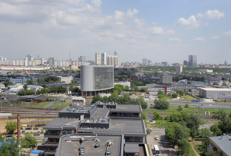
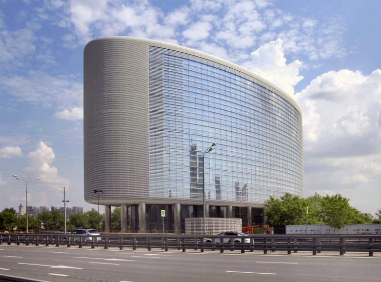
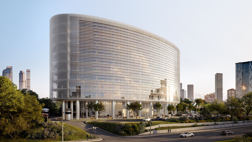
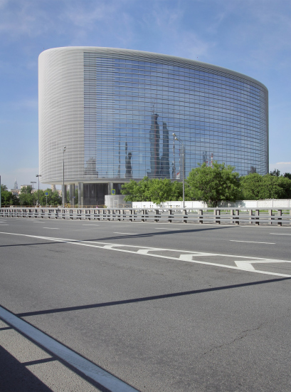
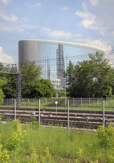
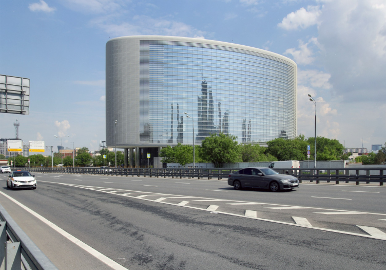
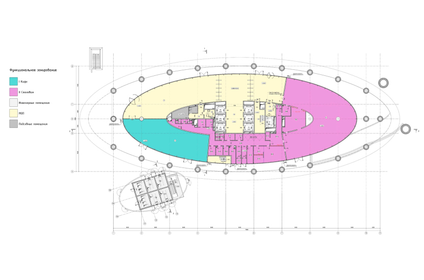
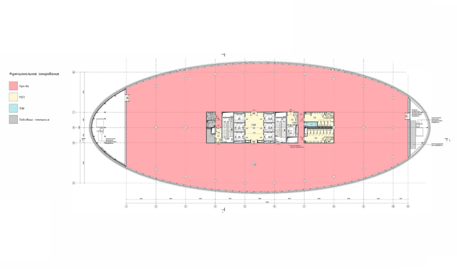
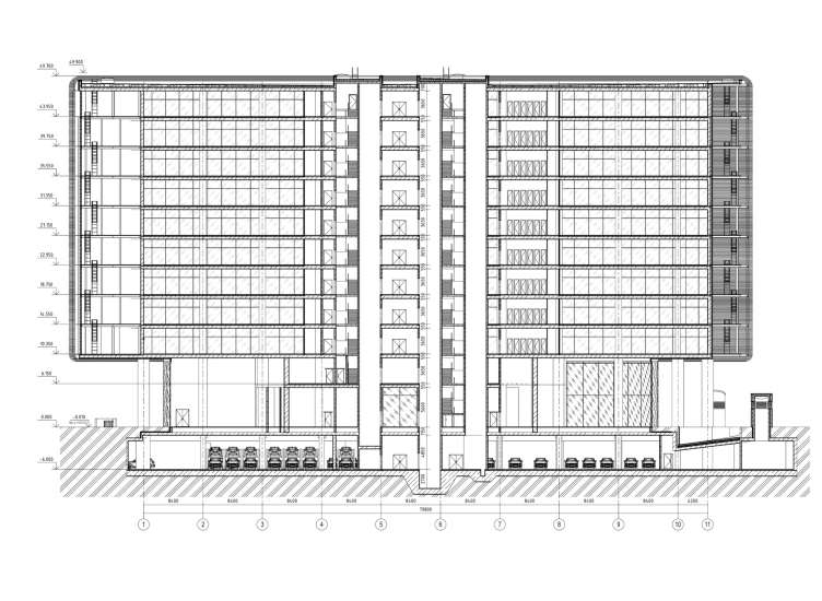
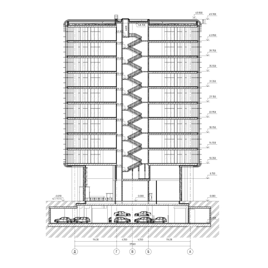
The business, or, should we say, scientific and business center is located almost at the heart of this triangle awaiting renovation and stands out in stark contrast to its surroundings, looking very new, even ultra-modern, like a “iPhone” building or a “space satellite” orbiting the city, as aptly described by its architect, Julius Borisov.
View of the Orbital business center and its surroundings from the terrace of the Level Prichalny residential complex, 2024
Copyright: Photograph © Julia Tarabarina, Archi.ru
The project became the first milestone in transforming a neglected area near Zvenigorodskoe Highway. The road network here is not yet fully developed – there are only red lines marking the planned routes – and while the surroundings will evolve, the direction of that development remains quite uncertain for now. So, we aimed to design a building that would stay relevant in any urban planning context. Its sculptural volume is equally dynamic from all sides; there’s no pronounced main façade as such. It’s a restrained, high-tech object – neat, expressive, and rationally assembled.
Our second goal was to avoid a situation where the lower office floors might end up hidden behind the elevated road; we were aware of the plans to raise 3rd Magistralnaya Street and therefore lifted the building on columns. Third: at the time of design, the urban planning documentation limited the height on this site to 75 meters. So, instead of placing the engineering systems and ventilation units on top, we positioned them at the ends of the building, saving on the technical floor and making future reconfiguration easier for new owners. Essentially, our building is a parallelepiped inscribed within an oval, achieved by relocating the technical zones to the ends. It’s not often possible to do this in large-scale projects, but in this case, the project was a “boutique” one – like the Zemelny or Akademik business centers. Here, we could afford unique solutions.
I have to say we were fortunate: the developer’s team and contractors were of excellent quality, and we discussed every aspect many times; it was a solid professional effort all around.
The idea of neutrality that the author mentions aligns well with the first name proposed by the architects for the business center: Helium, after the “colorless, odorless, and tasteless inert gas”. The name fits not only because of its neutrality but also because of the building’s “buoyancy”: you can imagine it as – not exactly a balloon, of course – but more like an airship tethered to the ground by its metal columns.
The comparisons to an iPhone and a satellite also ring true thanks to the building’s rounded, streamlined shape – top and bottom included – and even the glass screen that forms within its “frame”. One can easily picture a futuristic gadget of similar form. In my view, it also strongly resembles a UFO and – paradoxically – a whole series of modernist buildings in the shape of a “television” in a large frame. In this case, though, the reference – if it is one – is not direct but twice refined: modernist techniques are usually quoted “as is”, but here it’s a rounded lens that recalls both a 1960s television and the lens of the Akademik business center from the same architects, Julius Borisov and UNK.
There’s a clear sense of thematic development – both generally and in detail. You can feel the reference, but you can also feel new potential.
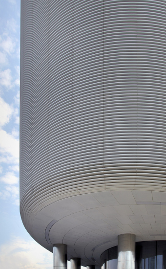
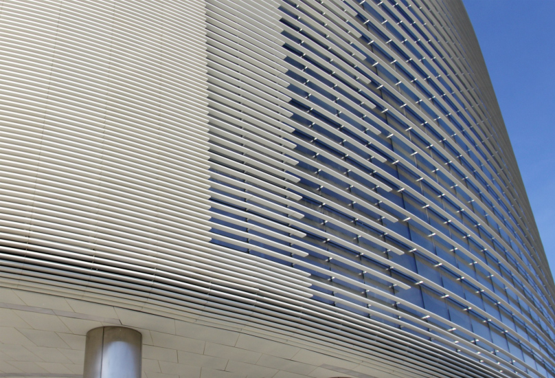
Take, for instance, the white aluminum fins. They create a very uniform stripe pattern, simple and tidy – so much so that in photos, when reduced in size, a moiré effect appears, like a print screen: perfectly straight little stripes. At the side ends of the building, the fins are packed so densely that it’s hard to spot the ventilation equipment unless you look really hard, and even then – not always. Julius Borisov used a similar approach in the Atom pavilion at VDNKh – this is already becoming the company’s signature technique.
Then the fins become sparser – not in a gradient fashion, but in three distinct steps, and what’s interesting is that not only the distance between the stripes changes proportionally but also the length of the transition “fringe”: the dense part is shorter, the sparse part longer; I suspected a 0.618 ratio, checked, and it’s close – about three-plus to two-plus – which is clearly visible in the glass arrangement.
A nearby technical room is concealed by a similar grid of deep horizontal slats. The actual glass is curved, which also contributes to the seamlessness of the form.
Orbital business center, UNK
Copyright: Photograph © Julia Tarabarina, Archi.ru
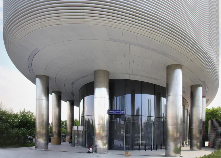
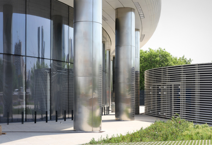
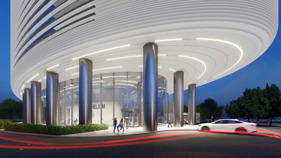
And on the lower floors, the glass is also ultra-clear and transparent – to maximize the visual unity of the interior and exterior spaces. At the end of the building, above the entrance, there’s a cantilevered structure, whose structural demands are lighter here because it only supports metal structures for technical systems. The cantilever itself, however, as is typical for this building, is designed as an extension of the façade; the fins almost literally – or at least organically – transition into its white surface, which is fitted with arc-shaped white light fixtures. Plus, the round columns of matte-polished aluminum and the molded glass of the entrance – all contribute to the effect of circularity.
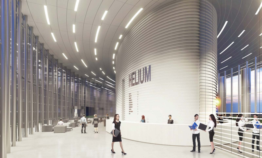
The interior concept proposed by the architects continues the same theme: a rounded core with horizontal striping, lighting in the same spirit as under the cantilever, slender metal columns around the perimeter.
The new owner – Russian Railways, which purchased the building in full (a testament, by the way, to the project’s success) – promises to implement the lobby interior in the spirit of the proposed ideas, and we hope to see that happen.
Overall, it’s worth noting that Orbital follows a line of ideas already tested by Julius Borisov in the aforementioned projects. All of them are characterized by a very minimalist form striving for stereometry – a form not exactly “simple”, that’s not quite the right adjective (there’s not just the angle, but also the oval or the segment) – but rather “pure.” This kind of form pairs well with glass – super-clear where needed, or screened by white fins – in combination with metal.
It’s also noticeable that the realized building matches the 3D design renderings very, very closely.
Two things are clear: first, the architects seek out a simple form that aims for perfection within the given task; then they execute it with careful attention to the demands of minimalism, investing a part of their soul in the details and nuances – such as the placement and concealment of ventilation equipment or the curve of the facade. We’ve seen plenty of curved facades in Moscow assembled from angular glass panels – and here’s an example of how it should be done. A benchmark for the evolving area.


