По-русски

Word Forms

ATRIUM architects love ambitious challenges, and for the firm’s thirtieth anniversary, they boldly play a game of words with an exhibition that dives deep into a self-created vocabulary. They immerse their projects – especially art installations – into this glossary, as if plunging into a current of their own. You feel as if you’re flowing through the veins of pure art, immersed in a universe of vertical cities, educational spaces – of which the architects are true masters – and the cultural codes of various locations. But what truly captivates is the bold statement that Vera Butko and Anton Nadtochy make, both through their work and this exhibition: architecture, above all, is art – the art of working with form and space.

12 September 2024
Report
mainImg
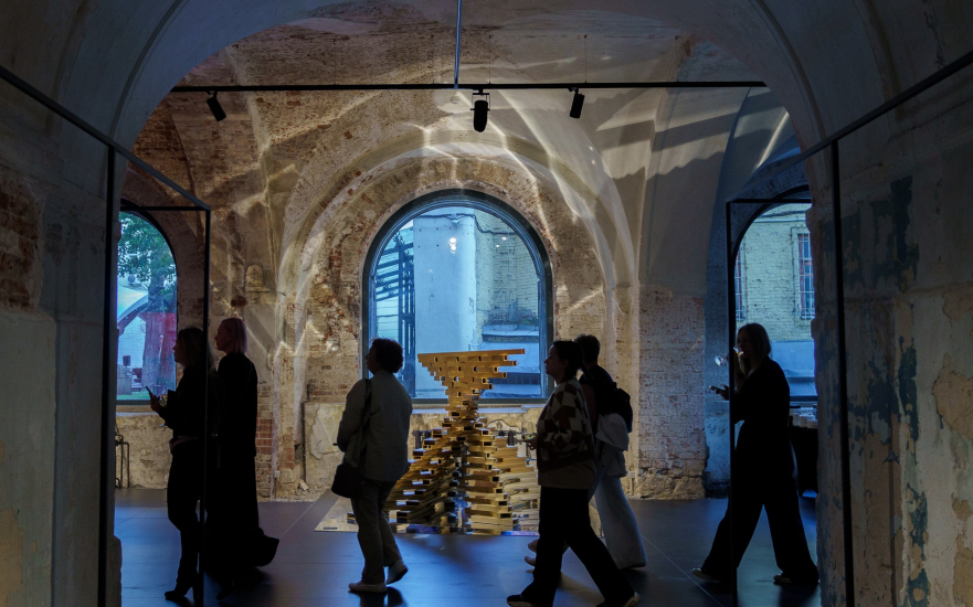
The exhibition celebrating the thirtieth anniversary of ATRIUM is spread across all three floors of the Ruin Wing of the Museum of Architecture. Titled “The Dictionary of Architecture”, it precedes another exhibition, which will mark the museum’s own anniversary – “The Museum of Architecture”, where many architects have promised creative expressions about the museum itself. ATRIUM’s installation, already prepared for the second exhibition, stands on the first floor to the left, and in some ways, it either launches – or concludes – the firm’s own exhibition.

Exhibition “Dictionary of Modern Architecture”, timed to coincide with the 30th anniversary of AB ATRIUM
Copyright: Photograph © Julia Tarabarina, Archi.ru


The essence of the exhibition is that, yes, it’s retrospective and celebratory, but not quite. ATRIUM has gone far beyond the bounds of the “traditional” company exhibition with a collection of architectural projects – and they’ve certainly succeeded. They’ve created a vibrant, cohesive, and sculptural exhibit in line with their constant pursuit of plastique form. “We’ve filled it not only with visual imagery but with meaning” – the architects emphasize.

The entire exhibition is titled “The Dictionary of Contemporary Architecture”, leading to a collection of around 30 terms that describe the components and qualitative characteristics of their own understanding of modern architecture. Each term is unpacked through an essay: “You’ll need at least an hour and a half to walk through and read everything”. The idea to reflect on the components and qualities of their architectural philosophy might have emerged either 10 or 30 years ago – perhaps even at the very beginning of their independent practice in 1994, when Vera Butko and Anton Nadtochy opened their own architectural firm. Nonetheless, the “dictionary” itself was written over the past six years in collaboration with Anton and his brother Sergey Nadtochy. Anton graduated from the Department of Theory and History of Soviet and Contemporary Foreign Architecture at MARHI, while Sergey studied in London at the Architectural Association School. As a result, the affirmations they created represent a fusion of various architectural discourses – at the very least, the Russian and Western ones.

At the entrance to the second floor of the exhibition, there is a manifesto presented in two versions: verbal and visual. The video, in fact, harks back to the “Arch Moscow 2012” festival, where ATRIUM participated in the “Complexity” project – which illustrates just how long this “dictionary” has been taking shape.

Our manifesto begins with words about space and speaks of architecture as a metaphysical process and a way of understanding the surrounding reality, as well as an art form, a language, a game, and a medium. These ideas run like a thread throughout the exhibition, they unfold like a red ribbon through the entire narrative. The manifesto is illustrated by a conceptual video, where all architectural forms emerge from chaos, which in reality is an organized structure of high complexity.

Ultimately, a unified field of meanings is created, describing the key qualities of contemporary architecture. We present our ontological perspective on architecture, in a sense.


The dictionary is organized using the letters of the word ATRIUM, with each letter corresponding to a key concept, along with secondary terms, not subordinated by meaning but simply by the starting letter. Hence, it’s a dictionary. From the beginning to the end of the name, the number of subordinate words increases. For instance, M: morphology, movement, method, motto (that key phrase or statement), materiality, meta-formation. Sometimes, you can discern a message from the neighboring concepts, such as “re-thinking – radical”. As I mentioned earlier, it’s a game of playing with words within a dictionary.

Exhibition “Dictionary of Modern Architecture”, timed to coincide with the 30th anniversary of AB ATRIUM
Copyright: Photograph © Julia Tarabarina, Archi.ru


However, there’s a bit of a stretch here. The dictionary doesn’t follow the entire alphabet – how is that? Is it only a part of the dictionary? There can be many answers, such as this: we’re looking at a dictionary specifically compiled by the architects of ATRIUM and exclusively focused on contemporary architecture – the authors have chosen the terms that suit their preferences. Another answer might be that if we start sorting through various phenomena, we can always find many different words under different letters to express the desired thought. If you spend that hour and a half wandering through the exhibition and reading everything, you’ll find that the vocabulary of a modern architect is indeed highly recognizable.

But there’s another thing that’s even more interesting.

Much has been said about whether architects write, whether they can write, and whether they even need to know how to write. Like any complex profession that requires talent and creative ability, architecture has been accompanied by texts since antiquity.

Moreover: “architects write differently, not like art historians or journalists” – emphasizes Anton Nadtochy.

Generally speaking, the subject of architects’ writings on architecture is vast and still waiting for its dedicated researcher. It would be a bit of a cliché to mention Vitruvius, but it seems that it all began with him – or almost with him. Often, texts by architects run parallel to, and diverge significantly from, the visual reality of the product they are creating. It might even seem that when architects start writing, they are trying to dodge the primary task. While in antiquity and the Renaissance, architects would frequently dive into descriptions of construction technology, today they lean more toward cultural studies, philosophy, and poetry. A manifesto, after all, is often poetry framed within philosophy. Thus, an architect’s text is, in many cases, an attempt to broaden the boundaries of the profession, complementing it through a cross-disciplinary method.

That being said, here we have a dictionary of concepts relevant to contemporary architecture, particularly close to ATRIUM. This dictionary is not just about representation, though that is certainly part of it – it’s also about self-reflection and analysis.

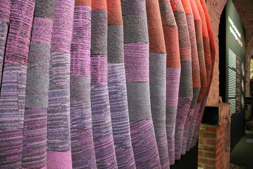
However! In general, it is quite normal for an exhibition to include words. At architectural exhibitions, these are often the data of specific projects and their descriptions, whereas at exhibitions where architects present themselves as contemporary artists, you’re more likely to encounter either manifestos or statements that are not immediately clear to everyone – a sort of “conceptualist gone wild” moment. Both approaches are familiar and well-known, but what does ATRIUM do? The architects make words an integral part of their exhibition, treating them as a formal element. First, they place them on rounded pink walls. Second, they make the words interact with the characteristic complex lines of their forms. Together, these lines, the vibrant pink signature color, and the words form a manifesto distributed across the space.

Exhibition “Dictionary of Modern Architecture”, timed to coincide with the 30th anniversary of AB ATRIUM
Copyright: Photograph © Julia Tarabarina, Archi.ru


The words envelop the exhibition space, and the deliberate incompleteness of the list – linked to the company’s name – rhymes with the fact that we can’t explain the angle of every line in the wireframe-like graphic mesh. Similarly, the words can probably be seen as “flashes” or “glimpses” of something bigger – essentially what the ATRIUM architects have been working on their entire lives: “contemporary architecture”. I asked Anton Nadtochy when modern architecture began for ATRIUM, and he recalled the 2000 Venice Biennale, which took place under curator Massimiliano Fuksas’ motto: “More Ethics, Less Aesthetics”. However, in this context, I think the 2002 Biennale by Deyan Sudjic, with the theme “Next”, might be more fitting. That event seemed to showcase the phenomenon that later became known as neo-modernism and “starchitecture”, or nonlinear, or digital architecture. However, it’s clear that the roots of the movement to which ATRIUM’s works belong can be traced back to the early 2000s. “Twentieth-century architecture ended two hundred years ago!” Anton Nadtochy boldly declares. One could argue that it didn’t end THAT long ago – but the meaning of the statement is entirely clear.

The second key feature of ATRIUM’s manifesto exhibition, beyond its dictionary-like structure and spatial distribution, is its focus on form for form’s sake.

For 30 years, ATRIUM has been working on form, constantly searching for it. Form that’s complex. Form that’s paradoxical. Unpredictable and surprising. WOW-form. Sculptural, flexible. There’s another handful of words. Incidentally, “complexity” is also an important concept in this case – so it’s no coincidence that on the second floor, among other things, you can see the video of the “Complexity” project presented at Arch Moscow.

  • zooming
    Exhibition “Dictionary of Modern Architecture”, timed to coincide with the 30th anniversary of AB ATRIUM
    Copyright: Photograph © Julia Tarabarina, Archi.ru
  • zooming
    Exhibition “Dictionary of Modern Architecture”, timed to coincide with the 30th anniversary of AB ATRIUM
    Copyright: Photograph © Julia Tarabarina, Archi.ru


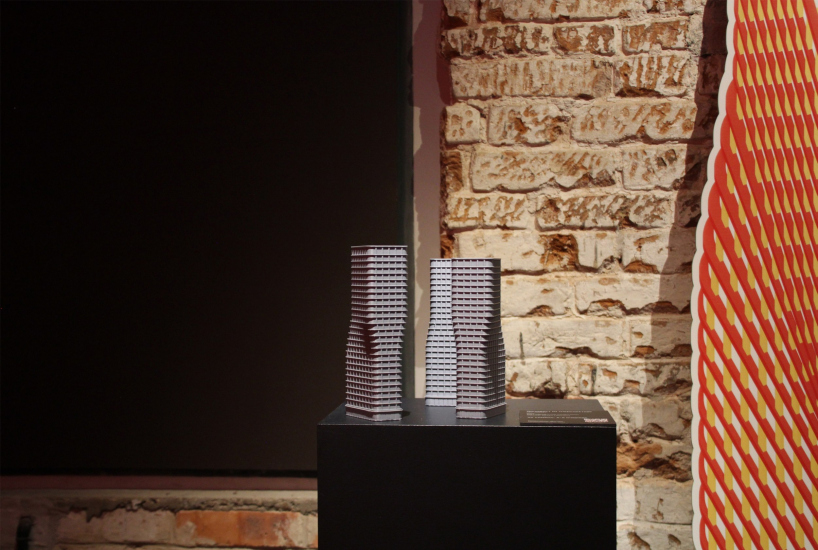
This is what form is about, says Sergey Nadtochy, standing next to the object created for the “Museum of Architecture” exhibition. The object consists of two cubes with very, very intricate cuts inside – or, perhaps, fused together from various volumes. There are two cubes because one is the inversion of the other: what’s a volume in one is void in the other, and vice versa. This is what a Museum of Architecture should be like! Just imagine the interior space! “We’ll definitely build it,” the architects conclude. And they clarify: “Back in the day, at VKhUTEMAS, such formal experiments were considered introductory studies, but now they are experiments on a whole new artistic and technological level”.

Exhibition “Dictionary of Modern Architecture”, timed to coincide with the 30th anniversary of ATRIUM
Copyright: Photograph © Julia Tarabarina, Archi.ru


The essence of the search for form lies in the treatment of architecture as art. This is a very appealing and correct approach. Over the last quarter-century, following the rise of neo-modernism, the meaning of architecture has been sought in many things – ecology, identity, urban space – often carefully avoiding the primary task: the search for form. ATRIUM, however, purposefully focuses on form, openly declaring that architecture is, above all, an art form. Even in their entry for the letter “A”, they leave only one word: “art” – “architecture as art”.

The entire first floor is dedicated to art objects. Some of these are early works, dating back to 2017, while others were created specifically for this exhibition – and, as we remember, there’s even an object made for an upcoming exhibition.

Exhibition “Dictionary of Modern Architecture”, timed to coincide with the 30th anniversary of ATRIUM
Copyright: Photograph © Julia Tarabarina, Archi.ru


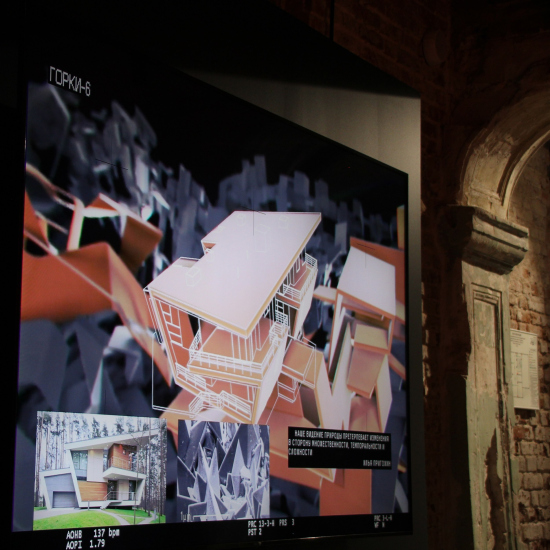
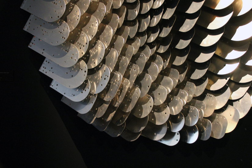
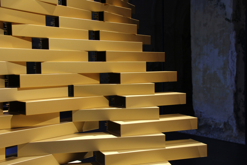
“Most of the art objects – Anton Nadtochy explains – Were designed using Grasshopper, based on its 3D models, with each element having a unique form. Some of the art objects were assembled using augmented reality”. Meanwhile, on a screen nearby, the assembly process of one of the objects is shown. It is an anodized gold structure: the person assembling it uses a tablet to view the outlines and number of each element, places the real fragment in position, checks it against the prototype, and fastens it in place. The process is indeed something worth seeing.

  • zooming
    Exhibition “Dictionary of Modern Architecture”, timed to coincide with the 30th anniversary of ATRIUM
    Copyright: Photograph © Julia Tarabarina, Archi.ru
  • zooming
    Exhibition “Dictionary of Modern Architecture”, timed to coincide with the 30th anniversary of AB ATRIUM
    Copyright: Photograph © Julia Tarabarina, Archi.ru


I ask, “And those reflections that your nonlinear gold pyramid casts on the window reveal – were they calculated as well?” “No,” he replies, “the reflections happened by chance. But they’re quite a sight to see too!”

  • zooming
    Exhibition “Dictionary of Modern Architecture”, timed to coincide with the 30th anniversary of ATRIUM
    Copyright: Photograph © Julia Tarabarina, Archi.ru
  • zooming
    Exhibition “Dictionary of Modern Architecture”, timed to coincide with the 30th anniversary of AB ATRIUM
    Copyright: Photograph © Julia Tarabarina, Archi.ru


“Our work on art objects is a process of form exploration, testing out solutions that we can later apply to ‘large-scale’ architecture,” Anton Nadtochy continues. “It’s easy and enjoyable to experiment with these, to develop a language that we can later use in projects of a larger scale”. At the same time, these art objects are design pieces that can be placed, for example, in the lobby of a residential building. ATRIUM has been working on producing its own industrial design objects for some time now, such as shelving units, which they further incorporate into their projects.

It’s important to emphasize that it’s not just about ventures into design. Everything shown at the exhibition – the displays, videos, objects, models, the computer game from the recent Arch Moscow exhibition, and even the showroom interior in the metaverse – was all created within the company, as ATRIUM is a full-cycle architectural firm, currently employing around 150 people.

Thus, I’d assume that the pursuit of form – complex, nonlinear, digital form, the kind of form that no one has yet conceived – can be understood as the core of Vera Butko and Anton Nadtochy’s architectural creativity. However, architecture is a multifaceted endeavor by nature, from the task itself to teamwork (which is also among the concepts) and the methods of implementation. So, around something that can be considered as “pure form” and “architecture as art”, various phenomena and ideas hover, attaching themselves to it more or less closely.

  • zooming
    Exhibition “Dictionary of Modern Architecture”, timed to coincide with the 30th anniversary of ATRIUM
    Copyright: Photograph © Julia Tarabarina, Archi.ru
  • zooming
    Exhibition “Dictionary of Modern Architecture”, timed to coincide with the 30th anniversary of AB ATRIUM
    Copyright: Photograph © Julia Tarabarina, Archi.ru


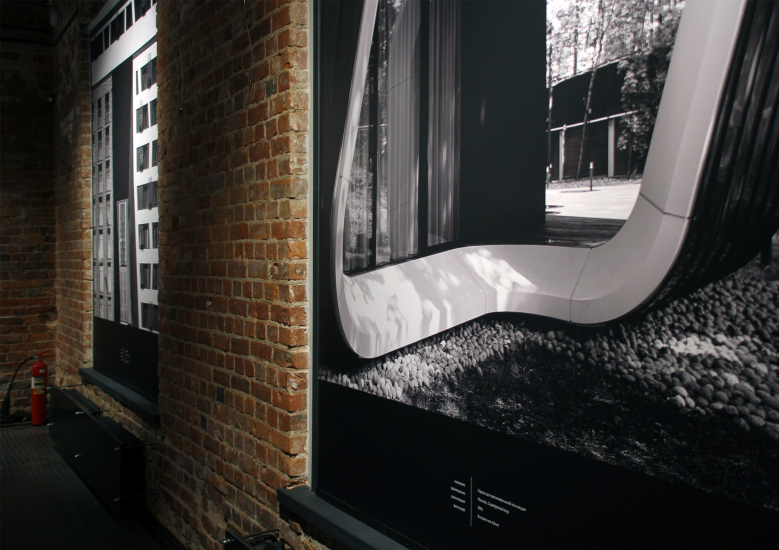
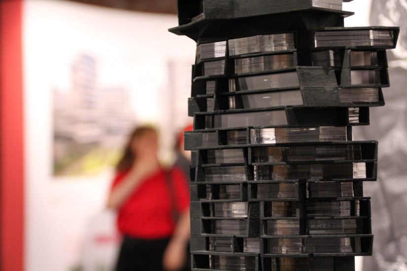
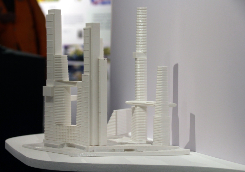
For example, cultural or natural identity, and the challenge of skyscraper design, solved in the format of a “vertical city”.

  • zooming
    Exhibition “Dictionary of Modern Architecture”, timed to coincide with the 30th anniversary of ATRIUM
    Copyright: Photograph © Julia Tarabarina, Archi.ru
  • zooming
    Exhibition “Dictionary of Modern Architecture”, timed to coincide with the 30th anniversary of AB ATRIUM
    Copyright: Photograph © Julia Tarabarina, Archi.ru


You see a lot of things here, and words become part of this intricately molded world, become a building material themselves, just as the architects’ research efforts are: in the pavilion dedicated to schools (yes, there is one!), you’ll find ATRIUM’s well-known book from last year, dedicated to educational spaces.

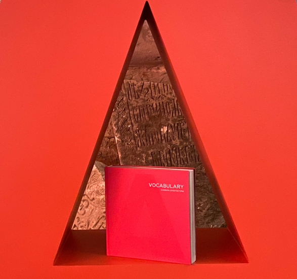
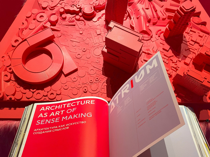
The “Dictionary” has also been published by Tatlin as the company’s anniversary book, embedding their projects into a narrative about the architectural fundamentals.

  • zooming
    Vocabulary book published for the 30th anniversary of ATRIUM
    Copyright: Photograph © Julia Tarabarina, Archi.ru
  • zooming
    Vocabulary book published for the 30th anniversary of ATRIUM
    Copyright: Photograph © Asya Chepur


And there is more to come. Anton Nadtochy says that ATRIUM has plans for other exhibitions and other explorations. I fully believe it!
 
The exhibition is open until October 3.


12 September 2024

Headlines now
The Golden Crown
The concept for a dental clinic in Yekaterinburg, developed by CNTR Studio, revolves around the idea of a “mouth full of gold”: pristine white porcelain stoneware walls are complemented by matte brass details. To avoid an overly literal interpretation, the architects focused on the building’s proportions, skillfully navigating between sunlight requirements and fire safety regulations.
Flexibility and Integration
Not long ago, we covered the project for the fourth phase of the ÁLIA residential complex, designed by APEX. Now, we’ve been shown different fence concepts they developed to enclose the complex’s private courtyards, incorporating a variety of public functions. We believe that the sheer fact that the complex’s architects were involved in such a detail as fencing speaks volumes.
A Step Forward
The HIDE residential complex represents a major milestone for ADM architects and their leaders Andrey Romanov and Ekaterina Kuznetsova in their quest for a fresh high-rise aesthetic – one that is flexible and layered, capable of bringing vibrancy to mass and silhouette while shaping form. Over recent years, this approach has become ADM’s “signature style”, with the golden HIDE tower playing a pivotal role in its evolution. Here, we delve into the project’s story, explore the details of the complex’s design, and uncover its core essence.
Gold in the Sands
A new office for a transcontinental company specializing in resource extraction and processing has opened in Dubai. Designed by T+T Architects, masters of creating spaces that are contemporary, diverse, flexible, and original, this project exemplifies their expertise. On the executive floor, a massive brass-clad partition dominates, while layered textures of compressed earth create a contextually resonant backdrop.
Layers and Levels of Flight
This project goes way back – Reserve Union won this architectural competition at the end of 2011, and the building was completed in 2018, so it’s practically “archival”. However, despite being relatively unknown, the building can hardly be considered “dated” and remains a prime example of architectural expression, particularly in the headquarters genre. And it’s especially fitting for an aviation company office. In some ways, it resembles the Aeroflot headquarters at Sheremetyevo but with its own unique identity, following the signature style of Vladimir Plotkin. In this article, we take an in-depth look at the United Aircraft Corporation (UAC) headquarters in the Moscow agglomeration town of Zhukovsky, supplemented by recent photographs from Alexey Naroditsky – a shoot that became only recently possible due to the fact that improvements were finally made in the surrounding area.
Light and Shadow
In this article, we delve into the architectural design of the “Chaika” house by DNK ag architects, which was recently completed in 2023 as part of the collection of signature designs at ZILArt. As is well-known, all the buildings in this complex follow a design code, yet each one is distinct. This particular building stands out not only for its whiteness and minimalism but also for the refined use of a limited number of techniques that, together, create what can confidently be called synergy.
Casus Novae
A master plan was developed for a large residential area with a name of “DNS City”, but now that its implementation began, the plan has been arbitrarily reformatted and replaced with something that, while similar on the surface, is actually quite different. This is not the first time such a thing happens, but it’s always frustrating. With permission from the author, we are sharing Maria Elkina’s post.
Treasure Hunting
The GAFA bureau, in collaboration with Tegola and Arkhitail, organized an expedition to the island of Kilpola in Karelia as part of Moskomarkhitektura’s “Open City” festival. There, amidst moss and rocks, the students sought answers to questions like: what is the sacred, where does it dwell, and what sustains it? Assisting the participants in this quest were landscape engineer Evgeny Levin, artist Nicholas Roerich, a moose, and the lack of cellular connection. Here’s how the story unfolded.
Depths of the Earth, Streams of Water
In the Malaya Okhta district, the Akzent building, designed by Stepan Liphart, was constructed. It follows a classic tripartite structure, yet it’s what you might call “hand-drawn”: each façade is unique in its form and details, some of which aren’t immediately noticeable. In this article, we explore the context and, together with the architect, delve into how the form was developed.
Fir Tree Dynamics
The “Airports of Region” holding is planning to build an airport in Karachay-Cherkessia, aiming to make the Arkhyz and Dombay resorts more accessible to travelers. The project that won in an invitation-only competition, submitted by Sergey Nikeshkin’s KPLN, blends natural imagery inspired by the shape of a conifer seed, open-air waiting spaces, majestic large trees, and a green roof elevated on needle-like columns. The result is both nature-inspired and WOW.
​A Brick Shell
In the process of designing a clubhouse situated among pine trees in a prestigious suburban area near Moscow, the architectural firm “A.Len” did the façade design part. The combination of different types of brick and masonry correlates with the volumetric and plastique solutions, further enhanced by the inclusion of wood-painted fragments and metal “glazing”.
Word Forms
ATRIUM architects love ambitious challenges, and for the firm’s thirtieth anniversary, they boldly play a game of words with an exhibition that dives deep into a self-created vocabulary. They immerse their projects – especially art installations – into this glossary, as if plunging into a current of their own. You feel as if you’re flowing through the veins of pure art, immersed in a universe of vertical cities, educational spaces – of which the architects are true masters – and the cultural codes of various locations. But what truly captivates is the bold statement that Vera Butko and Anton Nadtochy make, both through their work and this exhibition: architecture, above all, is art – the art of working with form and space.
Flexibility and Acuteness of Modernity
Luxurious, fluid, large “kokoshniks” and spiral barrel columns, as if made from colorful chewing gum: there seem to be no other mansion like this in Moscow, designed in the “Neo-Russian-Modern” style. And the “Teremok” on Malaya Kaluzhskaya, previously somewhat obscure, has “come alive with new colors” and gained visibility after its restoration for the office of the “architectural ecosystem” as the architects love to call themselves. It’s evident that Julius Borisov and the architects at UNK put their hearts into finding this new office and bringing it up to date. Let’s delve into the paradoxes of this mansion’s history and its plasticity. Spoiler: two versions of modernity meet here, both balancing on the razor’s edge of “what’s current”.
Yuri Vissarionov: “A modular house does not belong to the land”
It belongs to space, or to the air... It turns out that 3D printing is more effective when combined with a modular approach: the house is built in a workshop and then adapted to the site, including on uneven terrain. Yuri Vissarionov shares his latest experience in designing tourist complexes, both in central Russia and in the south. These include houseboats, homes printed from lightweight concrete using a 3D printer, and, of course, frame houses.
​Moscow’s First
“The quality of education largely depends on the quality of the educational environment”. This principle of the last decade has been realized by Sergey Skuratov in the project for the First Moscow Gymnasium on Rostovskaya Embankment in the Khamovniki district. The building seamlessly integrates into the complex urban landscape, responding both to the pedestrian flow of the city and the quiet alleyways. It skillfully takes advantage of the height differences and aligns with modern trends in educational space design. Let’s take a closer look.
Looking at the Water
The site of Villa Sonata stretches from the road to the water’s edge, offering its own shoreline, pier, and a picturesque river panorama. To reveal these sweeping views, Roman Leonidov “cut” the façade diagonally parallel to the river, thus getting two main axes for the house and, consequently, “two heads”. The internal core – two double-height spaces, a living room and a conservatory, with a “bridge” above them – makes the house both “transparent” and filled with light.
The White Wing
Well, it’s not exactly white. It’s more of a beige, white-stone structure that plays with the color of limestone – smoother surfaces are lighter, while rougher ones are darker. This wing unites various elements: it absorbs and interprets the surrounding themes. It responds to everything, yet maintains a cohesive expression – a challenging task! – while also incorporating recognizable features of its own, such as the dynamic cuts at the bottom, top, and middle.
Urban Dunes
The XSA Ramps team designed and built a three-part sports hub for a park in Rostov-on-Don, welcoming people of all ages and fitness levels. The skate plaza, pump track, and playground are all meticulously crafted with details that attract a diverse range of visitors. The technical execution of the shapes and slopes transforms this space into a kind of sculptural composition.
Proportional Growth
The project for the fourth phase of the ÁLIA residential area has been announced. The buildings are situated on an elongated plot – almost a “ray” that shoots out from the center of the area towards the river. Their layout reflects both a response to Moscow’s architectural preferences over the past 15 years, shifting “from blocks to towers”, and an interpretation of the neighboring business park designed by SOM. Additionally, the best apartments here are not located at the very top but closer to the middle, forming a glowing “waistline”.
The “Staircase” Building
In designing the “Details” residential complex in New Moscow, Rais Baishev spiced up the now-popular Moscow theme of a “courtyard” building with an idea drawn from the surrealist drawings by Maurits Escher. He envisioned the stepped silhouettes and descending slopes as a metaphysical mega-staircase, creating a key void within the courtyard that gave the project an internal “spine”. This concept is felt both in the building’s silhouette and on its façades.
Projection of the Quarter
No one doubted that the building that Vladimir Plotkin designed as part of the “Garden Quarters” would be the most modernist of all. And it turned out just that way: while adhering to the common design code, the building successfully combines brick and white stone, rhythmically responding to the neighboring building designed by Ostozhenka, yet tactfully and persistently making a few statements of its own. This includes the projection of the ideal urban development composition “14–9–6”, which can be found right next door, mathematical calculations, including those for various types of terraces (and perhaps the only reminder of the Soviet past of the Kauchuk rubber factory!), and the white “cross-stitch” pattern of the façade grid.
Domus Aurea
In this issue, we examine the “Tessinsky-1” house, designed by Sergey Skuratov and completed in 2023. Located in the middle of the Serebryanicheskaya Embankment district, at the intersection of its main streets, this house assumes a sort of “nodal” role: it not only responds to everything around it and preserves many memories of the former EMA factory within itself, but it weaves all this into a newly directed pattern, reconciling bright “gold” and dark-colored brick, largely with the help of the new, modern-yet-archaic Columba brick, which, come to think about it, is the most precious element here.
The Chimney of Nikola-Lenivets
In this issue, we are examining the “Obelisk House” designed by KATARSIS and built for the Arkhstoyanie 2023 festival. However, it was only finished later on, and this is why we are examining it now. It seems to us that after the “Obelisk House” appeared in Nikola-Lenivets, a dialogue and a few inner connections appeared between the temporary structures built here. These houses no longer look like “accidental neighbors”, more of which below.
​Periscope by the Bay
The jury awarded the second place in the competition for a public and cultural center in Petropavlovsk-Kamchatsky to the companies GORA (“Mountain”) and M4. In the consortium’s proposal, the building resembles a sperm whale with a calf swimming next to it or a periscope, whose lenses capture the most spectacular views from the surrounding landscape.
From Arcs to Dolmens
While working on the competition project for Petropavlovsk-Kamchatsky, ASADOV Architects prioritized the value of the natural and urban environment, aiming to preserve the balance of the location while minimizing the resemblance of the volume that they designed to a “traditional building”. The task was challenging, and the architects created three versions, one of which having been developed after the competition, where their main proposal took third place. However, the point of interest here is not the competition result but the continuity of creative thinking.
Hide and Seek
The ID Moskovskiy house, designed by Stepan Liphart in St. Petersburg, in the courtyards near Moskovskiy Avenue beyond the Obvodny Canal and recently completed, is notable for several reasons. Firstly, it has been realized with considerable accuracy, which is particularly significant as this is the first building where the architect was responsible not only for the facades but also for the layouts, allowing for better integration between the two. On the other hand, this building is interesting as an example of the “germination” of new architecture in the city: it draws on the best examples from the neighborhood and becomes an improved and developed sum of ideas found by the architect in the surrounding context.
The Big Twelve
Yesterday, the winners of the Moscow Mayor’s Architecture Award were announced and honored. Let’s take a look at what was awarded and, in some cases, even critique this esteemed award. After all, there is always room for improvement, right?
Above the Golden Horn
The residential complex “Philosophy” designed by T+T architects in Vladivostok, is one of the new projects in the “Golubinaya Pad” area, changing its development philosophy (pun intended) from single houses to a comprehensive approach. The buildings are organized along public streets, varying in height and format, with one house even executed in gallery typology, featuring a cantilever leaning on an art object.
Nuanced Alternative
How can you rhyme a square and space? Easily! But to do so, you need to rhyme everything you can possibly think of: weave everything together, like in a tensegrity structure, and find your own optics too. The new exhibition at GES-2 does just that, offering its visitor a new perspective on the history of art spanning 150 years, infused with the hope for endless multiplicity of worlds and art histories. Read on to see how this is achieved and how the exhibition design by Evgeny Ace contributes to it.
Blinds for Ice
An ice arena has been constructed in Domodedovo based on a project by Yuri Vissarionov Architects. To prevent the long façade, a technical requirement for winter sports facilities, from appearing monotonous, the architects proposed the use of suspended structures with multidirectional slats. This design protects the ice from direct sunlight while giving the wall texture and detail.