По-русски

Yuri Vissarionov: “A modular house does not belong to the land”

It belongs to space, or to the air... It turns out that 3D printing is more effective when combined with a modular approach: the house is built in a workshop and then adapted to the site, including on uneven terrain. Yuri Vissarionov shares his latest experience in designing tourist complexes, both in central Russia and in the south. These include houseboats, homes printed from lightweight concrete using a 3D printer, and, of course, frame houses.

04 September 2024
Interview
mainImg
Archi.ru:
You’ve worked in Sochi for a long time. How has your perspective on the development of tourist cities changed over the years?

Yuri Vissarionov:
I was assigned to Sochi right after graduating from university. Back then, it was a “city of our socialist future”, and now it has become a city of our capitalist present. Our task was to create a kind of “City of the Sun”. It was a fascinating concept, one that I studied during my university years under the guidance of a brilliant philosopher and aesthetics teacher from Nizhny Novgorod, Lev Zeleny. He involved us in the topic of ideal cities – utopian projects that are once again capturing the attention of the architectural community today.

So, in your view, an architect’s job is not just to design buildings but to foresee the future?

Absolutely. Designing is not just about drawing façades; it’s about designing life. Every architect is a futurist. Before drawing anything, they consider how people will live in this space. I don’t reject the creative aspect of architecture as art – I work on façades and graphic designs myself – but the main thing is designing life. That’s how we were taught to approach the profession. To design life means to understand the new trends of the near future, approach them correctly, and form your own vision.

Tourist complex Sheregesh. Hotel
Copyright: Image courtesy of Vissarionov Studio


What key trends do you see in city development?

These days, not only are the formats of housing changing, but also the way we view interior space – it’s becoming hybrid. Think back to our old building codes and regulations. When we were planning urban development, everything revolved around production. People were simply an accessory to the overall production drive. Accordingly, spaces were strictly zoned: industrial, residential, communal, and social infrastructure. Everything was highly regulated because society’s development trajectory was centered on production.

Now, everything is blending – many professions and lifestyles are merging into one. New typologies are emerging that didn’t exist before. Take, for example, the concept of light industry. It’s a combination of warehouse functions, hotels, residential spaces, and some social roles – things that were once simply impossible to combine. Such a mix of functions was only characteristic of the very early stages of city development, when people worked on the lower levels and lived above.

  • zooming
    1 / 3
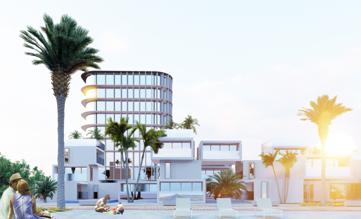
    Modular hotel complex in Sochi
    Copyright: Image courtesy of Vissarionov Studio
  • zooming
    2 / 3
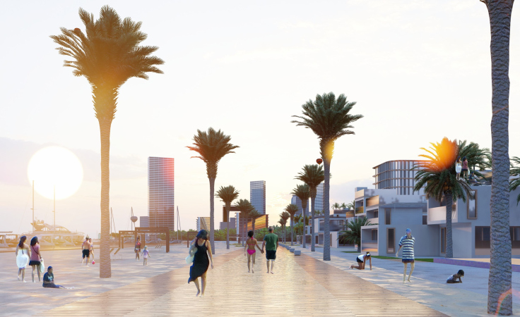
    Modular hotel complex in Sochi
    Copyright: Image courtesy of Vissarionov Studio
  • zooming
    3 / 3
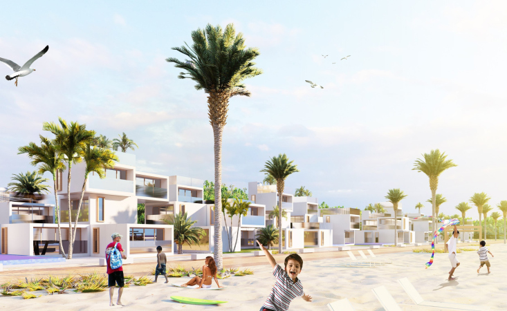
    Modular hotel complex in Sochi
    Copyright: Image courtesy of Vissarionov Studio


Or take modern food courts, for example. They’re not just for eating anymore – they’re primarily for socializing. It’s a kind of collective space for young people, a hybrid space where your social life is integrated.

If we think about how, in the past, apartments always had a living room – a “living room”, literally a room for living – that function is now gradually moving to public spaces. These spaces are becoming hybrid: people eat, socialize, sing, dance, draw, work, and use their computers there. We often see this in modern cafés – they’re becoming both a place to work and a place to live.

Tourist Village, Altai. Club-restaurant
Copyright: Image courtesy of Vissarionov Studio


How are these trends reflected in modern architectural design?

Today, for many, architectural design has become networked. Essentially, it all comes down to combining the typological spaces people use. Many functions are leaving individual units. For example, if a living space becomes very small – say, 15 square meters – the living room function disappears. It becomes just a bedroom, a place to sleep. The “living” function shifts to public spaces.

You mentioned modular design. Could you elaborate on this approach?

Yes, it’s an important topic. We need to differentiate between standard and modular design. A standard project is the repetition of a design one-to-one, with minor changes. A module, on the other hand, is the development of a set of building blocks, essentially like your good old construction kit.

Since the typology of space stems from human ergonomics, and humans haven’t changed much over the centuries, the basic known space types remain the same. Modern design is largely a matter of combining these types – it’s like playing with a Rubik’s cube: you combine standard elements to create new configurations.

  • zooming
    1 / 3
    Active Hotel Iskra
    Copyright: Image courtesy of Vissarionov Studio
  • zooming
    2 / 3
    Active Hotel Iskra
    Copyright: Image courtesy of Vissarionov Studio
  • zooming
    3 / 3
    Active Hotel Iskra
    Copyright: Image courtesy of Vissarionov Studio


How does the modular approach align with the need to preserve cultural identity?

That’s an interesting question. I believe modular architecture can absolutely reflect cultural identity. In fact, in recent projects, especially among young designers, I see clear examples of direct quotes. In my youth, that was considered shameful, but now people build with modules, and if they need more complexity, they borrow directly from existing works.

I saw a graduation project where the author designed a community center, and, inspired by Hundertwasser’s work, incorporated a characteristic element from his architecture. And you know what? The building immediately came to life, with an ethnic vibe. In this age of globalization, ethnic influences are essential.

After all, there’s not only the typology of space but also the typology of culture. There are certain enduring forms and images. These images also have their own modules – they change form, but they repeat. And when an image becomes a symbol, it starts functioning on an entirely different level.

Tourist complex Sheregesh. Hotel
Copyright: Image courtesy of Vissarionov Studio


Gzhel agro-tourist complex
Copyright: Image courtesy of Vissarionov Studio


What are the advantages of modularity?

First, it’s environmentally friendly. A module might not touch the ground at all, or it may only make contact at a few points. Modular buildings typically have autonomous sewage and water systems, and they usually only depend on electricity. This minimizes the environmental impact, which is why modular construction is allowed by various regulations. It’s often the only solution for tourism projects.

Second, modularity offers flexibility and mobility. A modular home relieves not only the resident but also the designer and operator of many problems. It’s temporary. We don’t just maintain these settlements; we can also dismantle them when necessary.

Tourist network of eco-spaces “Krasnaya Derevnya”, Kalevala
Copyright: Image courtesy of Vissarionov Studio


Tourist network of eco-spaces “Krasnaya Derevnya”, Kalevala
Copyright: Image courtesy of Vissarionov Studio


Additionally, modular homes are not uniform. Since it’s like a Rubik’s cube – a construction kit – there is variation in the choice of different components. Of course, it’s not a cure-all, but it creates a more diverse environment.

And, lastly, there’s the philosophical aspect. A modular home doesn’t belong to the land. It belongs to space, to the air. It’s like a human shell that people can carry with them wherever they need to go. It’s some kind of ideal of overcoming human limitations.

Agro-tourist complex “Gzhel”. Tree houses
Copyright: Image courtesy of Vissarionov Studio


Agro-tourist complex “Gzhel”. Glamping houses / tent camp
Copyright: Image courtesy of Vissarionov Studio


Could you share some projects where you’ve applied modularity?

For example, we worked on the “Kalevala” eco-village project with houseboats. This was a very interesting experience in creating floating homes. These are modules made from food-grade polystyrene foam with a metal frame. This approach allows for unique living spaces on water, opening up new possibilities for architecture and tourism.

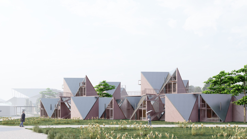
Recently, we worked on another tourism project – reconstructing a pioneer camp for Roscosmos in the Moscow region. It was an interesting experience. We used a 100% frame construction method and aimed to change the environment and build it quickly.

Tourist complex, Moscow region
Copyright: Image courtesy of Vissarionov Studio


Sheregesh tourist complex
Copyright: Image courtesy of Vissarionov Studio


What do modular homes look like technologically today?

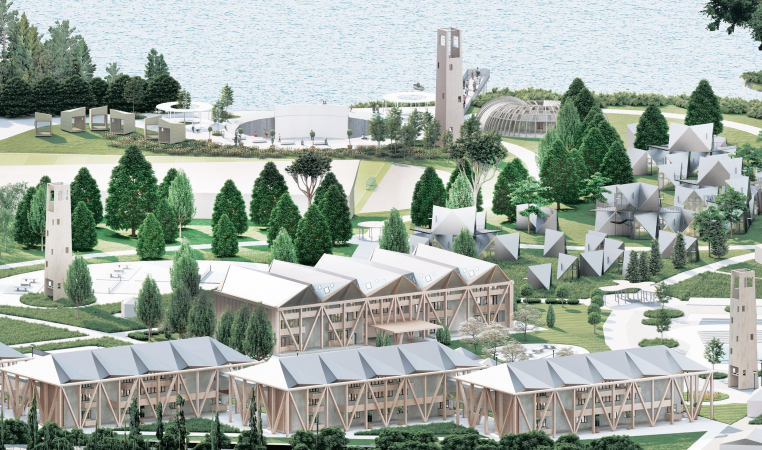
Mostly, it’s frame technology, but there are also different types: inflatable modules, shell modules. For example, right now in Sochi, we’re working on a 3D-printed village using 3D printing technology with lightweight concrete that includes insulation.

Initially, it was thought that a 3D printer would come in and print an entire house. But it turned out that this wasn’t the most efficient method. The houses end up looking boring, and on uneven terrain, you have to move the printer several times. So, a different method was developed. We started making the shells in a workshop and assembling them on site. This turned out to be the most advanced technology. Essentially, it’s a LEGO-like construction. It can vary and be placed in a park as a large landscape sculpture.

3D printing of houses in Sochi
Copyright: Image courtesy of Vissarionov Studio


3D printing of houses in Sochi
Copyright: Image courtesy of Vissarionov Studio


How do the architectural trends you mentioned generally influence the development of tourism infrastructure?

I’d say tourism is a journey in search of oneself – finding oneself in space, culture, and society. So, when we design tourist facilities, we must keep in mind this human desire for self-discovery through new experiences.

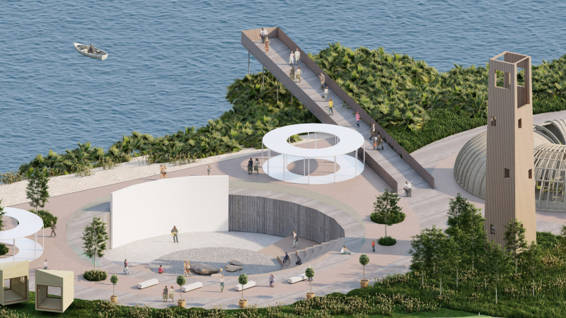
For example, we created an ethno park in Gzhel, which was an attempt to answer the question: how do we create Russian ethnicity in a modern context? When we started the design, we were tasked with creating a “Russian park” or a “Russian house”. We came to understand that this space is meant for the existence of a collective, a community, a society of “one’s own”. Who is “one’s own”? It’s the person’s closest circle – friends and relatives. So first, we created a small village for “one’s own”, and nearby, a space for tourists. Plus, it would be nice if international tourists came too, so we needed an event venue.

Gzhel agro-tourist complex
Copyright: Image courtesy of Vissarionov Studio


This led us to the creation of a multifunctional tourism and recreation complex that combines various types of outdoor activities – from gastronomy to folk festivals and sports. We aimed to embody the idea of a modern proto-town – a settlement with a unique community, crafts, and farming – using elements of Russian culture. Our concept was based on sustainability and traditional motifs, with predominantly wooden buildings in the style of Russian dachas and farm structures.

Or take, for example, our project in Sheregesh. This is an incredibly energetic place with unique nature, for which we came up with another story, also based on modularity – we created simple homes that take us back to the idea of a proto-settlement. Moreover, we designed a modern, eco-friendly solution that is “detached from the ground”. It’s an ideal option for such a location – something like “a doughnut in the air”, as in Ray Bradbury’s Martian Chronicles.

Sheregesh tourist complex. Duplex
Copyright: Image courtesy of Vissarionov Studio


Sheregesh tourist complex. The entrance zone
Copyright: Image courtesy of Vissarionov Studio


How do you see the future of architecture in the context of all the changes you’ve mentioned?

I believe the future lies in flexible, adaptive solutions. We need to design spaces that can evolve alongside people’s changing needs, while maintaining a connection to cultural context and the history of a place.

Modular design provides us with tools to create such flexible solutions. We can combine standard elements to create unique spaces. However, it’s crucial not to lose sight of the human scale, those very modules of images and ideas I mentioned earlier.

Gzhel agro-tourist complex
Copyright: Image courtesy of Vissarionov Studio


I also believe the future belongs to an interdisciplinary approach. An architect should be not only a designer and engineer but also an ecologist and product developer, influencing the lifestyle of society. We need to understand how our decisions impact people’s lives, societal development, and the environment.

And of course, we must remain open to new technologies. Digital design, virtual and augmented reality, artificial intelligence, 3D printing – these technologies are transforming our profession and will continue to do so in the future.


04 September 2024

Headlines now
The Golden Crown
The concept for a dental clinic in Yekaterinburg, developed by CNTR Studio, revolves around the idea of a “mouth full of gold”: pristine white porcelain stoneware walls are complemented by matte brass details. To avoid an overly literal interpretation, the architects focused on the building’s proportions, skillfully navigating between sunlight requirements and fire safety regulations.
Flexibility and Integration
Not long ago, we covered the project for the fourth phase of the ÁLIA residential complex, designed by APEX. Now, we’ve been shown different fence concepts they developed to enclose the complex’s private courtyards, incorporating a variety of public functions. We believe that the sheer fact that the complex’s architects were involved in such a detail as fencing speaks volumes.
A Step Forward
The HIDE residential complex represents a major milestone for ADM architects and their leaders Andrey Romanov and Ekaterina Kuznetsova in their quest for a fresh high-rise aesthetic – one that is flexible and layered, capable of bringing vibrancy to mass and silhouette while shaping form. Over recent years, this approach has become ADM’s “signature style”, with the golden HIDE tower playing a pivotal role in its evolution. Here, we delve into the project’s story, explore the details of the complex’s design, and uncover its core essence.
Gold in the Sands
A new office for a transcontinental company specializing in resource extraction and processing has opened in Dubai. Designed by T+T Architects, masters of creating spaces that are contemporary, diverse, flexible, and original, this project exemplifies their expertise. On the executive floor, a massive brass-clad partition dominates, while layered textures of compressed earth create a contextually resonant backdrop.
Layers and Levels of Flight
This project goes way back – Reserve Union won this architectural competition at the end of 2011, and the building was completed in 2018, so it’s practically “archival”. However, despite being relatively unknown, the building can hardly be considered “dated” and remains a prime example of architectural expression, particularly in the headquarters genre. And it’s especially fitting for an aviation company office. In some ways, it resembles the Aeroflot headquarters at Sheremetyevo but with its own unique identity, following the signature style of Vladimir Plotkin. In this article, we take an in-depth look at the United Aircraft Corporation (UAC) headquarters in the Moscow agglomeration town of Zhukovsky, supplemented by recent photographs from Alexey Naroditsky – a shoot that became only recently possible due to the fact that improvements were finally made in the surrounding area.
Light and Shadow
In this article, we delve into the architectural design of the “Chaika” house by DNK ag architects, which was recently completed in 2023 as part of the collection of signature designs at ZILArt. As is well-known, all the buildings in this complex follow a design code, yet each one is distinct. This particular building stands out not only for its whiteness and minimalism but also for the refined use of a limited number of techniques that, together, create what can confidently be called synergy.
Casus Novae
A master plan was developed for a large residential area with a name of “DNS City”, but now that its implementation began, the plan has been arbitrarily reformatted and replaced with something that, while similar on the surface, is actually quite different. This is not the first time such a thing happens, but it’s always frustrating. With permission from the author, we are sharing Maria Elkina’s post.
Treasure Hunting
The GAFA bureau, in collaboration with Tegola and Arkhitail, organized an expedition to the island of Kilpola in Karelia as part of Moskomarkhitektura’s “Open City” festival. There, amidst moss and rocks, the students sought answers to questions like: what is the sacred, where does it dwell, and what sustains it? Assisting the participants in this quest were landscape engineer Evgeny Levin, artist Nicholas Roerich, a moose, and the lack of cellular connection. Here’s how the story unfolded.
Depths of the Earth, Streams of Water
In the Malaya Okhta district, the Akzent building, designed by Stepan Liphart, was constructed. It follows a classic tripartite structure, yet it’s what you might call “hand-drawn”: each façade is unique in its form and details, some of which aren’t immediately noticeable. In this article, we explore the context and, together with the architect, delve into how the form was developed.
Fir Tree Dynamics
The “Airports of Region” holding is planning to build an airport in Karachay-Cherkessia, aiming to make the Arkhyz and Dombay resorts more accessible to travelers. The project that won in an invitation-only competition, submitted by Sergey Nikeshkin’s KPLN, blends natural imagery inspired by the shape of a conifer seed, open-air waiting spaces, majestic large trees, and a green roof elevated on needle-like columns. The result is both nature-inspired and WOW.
​A Brick Shell
In the process of designing a clubhouse situated among pine trees in a prestigious suburban area near Moscow, the architectural firm “A.Len” did the façade design part. The combination of different types of brick and masonry correlates with the volumetric and plastique solutions, further enhanced by the inclusion of wood-painted fragments and metal “glazing”.
Word Forms
ATRIUM architects love ambitious challenges, and for the firm’s thirtieth anniversary, they boldly play a game of words with an exhibition that dives deep into a self-created vocabulary. They immerse their projects – especially art installations – into this glossary, as if plunging into a current of their own. You feel as if you’re flowing through the veins of pure art, immersed in a universe of vertical cities, educational spaces – of which the architects are true masters – and the cultural codes of various locations. But what truly captivates is the bold statement that Vera Butko and Anton Nadtochy make, both through their work and this exhibition: architecture, above all, is art – the art of working with form and space.
Flexibility and Acuteness of Modernity
Luxurious, fluid, large “kokoshniks” and spiral barrel columns, as if made from colorful chewing gum: there seem to be no other mansion like this in Moscow, designed in the “Neo-Russian-Modern” style. And the “Teremok” on Malaya Kaluzhskaya, previously somewhat obscure, has “come alive with new colors” and gained visibility after its restoration for the office of the “architectural ecosystem” as the architects love to call themselves. It’s evident that Julius Borisov and the architects at UNK put their hearts into finding this new office and bringing it up to date. Let’s delve into the paradoxes of this mansion’s history and its plasticity. Spoiler: two versions of modernity meet here, both balancing on the razor’s edge of “what’s current”.
Yuri Vissarionov: “A modular house does not belong to the land”
It belongs to space, or to the air... It turns out that 3D printing is more effective when combined with a modular approach: the house is built in a workshop and then adapted to the site, including on uneven terrain. Yuri Vissarionov shares his latest experience in designing tourist complexes, both in central Russia and in the south. These include houseboats, homes printed from lightweight concrete using a 3D printer, and, of course, frame houses.
​Moscow’s First
“The quality of education largely depends on the quality of the educational environment”. This principle of the last decade has been realized by Sergey Skuratov in the project for the First Moscow Gymnasium on Rostovskaya Embankment in the Khamovniki district. The building seamlessly integrates into the complex urban landscape, responding both to the pedestrian flow of the city and the quiet alleyways. It skillfully takes advantage of the height differences and aligns with modern trends in educational space design. Let’s take a closer look.
Looking at the Water
The site of Villa Sonata stretches from the road to the water’s edge, offering its own shoreline, pier, and a picturesque river panorama. To reveal these sweeping views, Roman Leonidov “cut” the façade diagonally parallel to the river, thus getting two main axes for the house and, consequently, “two heads”. The internal core – two double-height spaces, a living room and a conservatory, with a “bridge” above them – makes the house both “transparent” and filled with light.
The White Wing
Well, it’s not exactly white. It’s more of a beige, white-stone structure that plays with the color of limestone – smoother surfaces are lighter, while rougher ones are darker. This wing unites various elements: it absorbs and interprets the surrounding themes. It responds to everything, yet maintains a cohesive expression – a challenging task! – while also incorporating recognizable features of its own, such as the dynamic cuts at the bottom, top, and middle.
Urban Dunes
The XSA Ramps team designed and built a three-part sports hub for a park in Rostov-on-Don, welcoming people of all ages and fitness levels. The skate plaza, pump track, and playground are all meticulously crafted with details that attract a diverse range of visitors. The technical execution of the shapes and slopes transforms this space into a kind of sculptural composition.
Proportional Growth
The project for the fourth phase of the ÁLIA residential area has been announced. The buildings are situated on an elongated plot – almost a “ray” that shoots out from the center of the area towards the river. Their layout reflects both a response to Moscow’s architectural preferences over the past 15 years, shifting “from blocks to towers”, and an interpretation of the neighboring business park designed by SOM. Additionally, the best apartments here are not located at the very top but closer to the middle, forming a glowing “waistline”.
The “Staircase” Building
In designing the “Details” residential complex in New Moscow, Rais Baishev spiced up the now-popular Moscow theme of a “courtyard” building with an idea drawn from the surrealist drawings by Maurits Escher. He envisioned the stepped silhouettes and descending slopes as a metaphysical mega-staircase, creating a key void within the courtyard that gave the project an internal “spine”. This concept is felt both in the building’s silhouette and on its façades.
Projection of the Quarter
No one doubted that the building that Vladimir Plotkin designed as part of the “Garden Quarters” would be the most modernist of all. And it turned out just that way: while adhering to the common design code, the building successfully combines brick and white stone, rhythmically responding to the neighboring building designed by Ostozhenka, yet tactfully and persistently making a few statements of its own. This includes the projection of the ideal urban development composition “14–9–6”, which can be found right next door, mathematical calculations, including those for various types of terraces (and perhaps the only reminder of the Soviet past of the Kauchuk rubber factory!), and the white “cross-stitch” pattern of the façade grid.
Domus Aurea
In this issue, we examine the “Tessinsky-1” house, designed by Sergey Skuratov and completed in 2023. Located in the middle of the Serebryanicheskaya Embankment district, at the intersection of its main streets, this house assumes a sort of “nodal” role: it not only responds to everything around it and preserves many memories of the former EMA factory within itself, but it weaves all this into a newly directed pattern, reconciling bright “gold” and dark-colored brick, largely with the help of the new, modern-yet-archaic Columba brick, which, come to think about it, is the most precious element here.
The Chimney of Nikola-Lenivets
In this issue, we are examining the “Obelisk House” designed by KATARSIS and built for the Arkhstoyanie 2023 festival. However, it was only finished later on, and this is why we are examining it now. It seems to us that after the “Obelisk House” appeared in Nikola-Lenivets, a dialogue and a few inner connections appeared between the temporary structures built here. These houses no longer look like “accidental neighbors”, more of which below.
​Periscope by the Bay
The jury awarded the second place in the competition for a public and cultural center in Petropavlovsk-Kamchatsky to the companies GORA (“Mountain”) and M4. In the consortium’s proposal, the building resembles a sperm whale with a calf swimming next to it or a periscope, whose lenses capture the most spectacular views from the surrounding landscape.
From Arcs to Dolmens
While working on the competition project for Petropavlovsk-Kamchatsky, ASADOV Architects prioritized the value of the natural and urban environment, aiming to preserve the balance of the location while minimizing the resemblance of the volume that they designed to a “traditional building”. The task was challenging, and the architects created three versions, one of which having been developed after the competition, where their main proposal took third place. However, the point of interest here is not the competition result but the continuity of creative thinking.
Hide and Seek
The ID Moskovskiy house, designed by Stepan Liphart in St. Petersburg, in the courtyards near Moskovskiy Avenue beyond the Obvodny Canal and recently completed, is notable for several reasons. Firstly, it has been realized with considerable accuracy, which is particularly significant as this is the first building where the architect was responsible not only for the facades but also for the layouts, allowing for better integration between the two. On the other hand, this building is interesting as an example of the “germination” of new architecture in the city: it draws on the best examples from the neighborhood and becomes an improved and developed sum of ideas found by the architect in the surrounding context.
The Big Twelve
Yesterday, the winners of the Moscow Mayor’s Architecture Award were announced and honored. Let’s take a look at what was awarded and, in some cases, even critique this esteemed award. After all, there is always room for improvement, right?
Above the Golden Horn
The residential complex “Philosophy” designed by T+T architects in Vladivostok, is one of the new projects in the “Golubinaya Pad” area, changing its development philosophy (pun intended) from single houses to a comprehensive approach. The buildings are organized along public streets, varying in height and format, with one house even executed in gallery typology, featuring a cantilever leaning on an art object.
Nuanced Alternative
How can you rhyme a square and space? Easily! But to do so, you need to rhyme everything you can possibly think of: weave everything together, like in a tensegrity structure, and find your own optics too. The new exhibition at GES-2 does just that, offering its visitor a new perspective on the history of art spanning 150 years, infused with the hope for endless multiplicity of worlds and art histories. Read on to see how this is achieved and how the exhibition design by Evgeny Ace contributes to it.
Blinds for Ice
An ice arena has been constructed in Domodedovo based on a project by Yuri Vissarionov Architects. To prevent the long façade, a technical requirement for winter sports facilities, from appearing monotonous, the architects proposed the use of suspended structures with multidirectional slats. This design protects the ice from direct sunlight while giving the wall texture and detail.