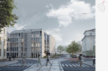
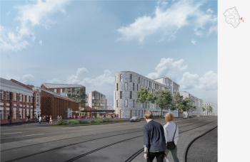
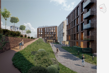
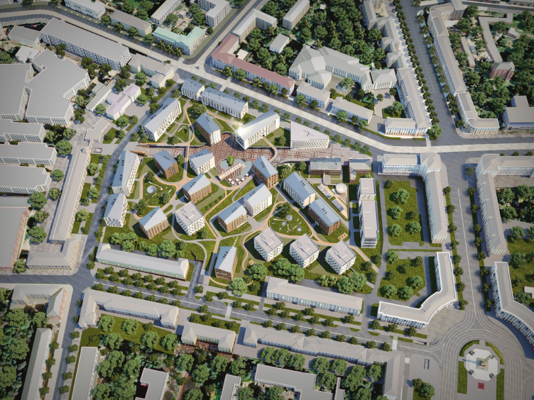
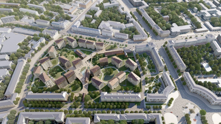
Minsk is a city of avenues, the Independence Avenue being the biggest one. It resembles Tverskaya Street in Moscow in some ways: wide, initially very pompous, then simply post-war classicism with national motifs. Across the Svislach River, Victory Square is strung along the line of the avenue, oval in plan; until 1961, it had a very straightforward name of Round Square. Now it’s the city center with classical architecture along the avenue and a bonus – parks along the river. A very nice place, indeed! To the north of the square, behind the buildings that form the avenue, there was a tram depot – it has been here since 1926.
In 2006, the depot was shut down, and in 2017, the developer company A-100 began to transform its territory into a premium-class district of Minsk with the name of “Depo”. As stated on the presentation website, “nothing even close to this concept has been done in Belarus yet”. The architectural and urban planning concept competition for the territory, held in 2018, was won by Sergey Skuratov Architects.
After winning the competition, Sergey Skuratov developed two architectural concepts for the entire complex, one after another, in 2019 and 2020. The original version was revised, but the main ideas were preserved. Then, from 2021 to 2023, Sergey Skuratov Architects prepared working documentation and implemented the first three buildings of the 1(6) phase. Currently, construction is underway for two buildings of the 2(7) phase.
Here are videos of the three iterations of the work, starting from the competition project of 2018:
Intermediate version of the 2019 concept
(VPN required for viewing):
The final concept 2020:
However, after 2022, the construction process continues, and, albeit according to Sergey Skuratov’s approved concept, unfortunately, Sergey Skuratov Architects are no longer involved in the project. According to the architect, parting ways with the client was due to the changed political and economic situation; the architects provided the developer with a list of important things for implementation and discussed possible changes in advance.
In other words, we are now witnessing the project in the initial stage of execution. However, we have heard quite a lot of good things about it, so finally, we went to Minsk in order to see everything with our own eyes, and make as much sense of the current situation as possible.
The first thing that immediately comes to mind: Sergey Skuratov, starting with the “Garden Quarters”, has honed his mastery to perfection – he has become a true master of designing large complexes, objectively speaking, not just complexes, but entire new residential areas with complex volumetric and spatial organization. These are neighborhoods integrated into the city at the level of modern urban planning preferences, often embedded within the contours of historical quarters, textured, delicate to the memory of the place, yet ultramodern.
All such projects are typically large, complex, and lengthy; it is not surprising that historical inevitability of varying degrees of irreversibility affects them in the course of development. Some projects did not materialize, others – even the “Garden Quarters” – were more or less transformed, not to say distorted. So, the evaluation here should be based, firstly, on the nature of the concept, and secondly, on the extent of its preservation.
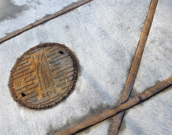
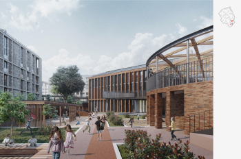
So, in Minsk, the extent of preservation of the original concept remains quite high. According to a recent story by representatives of the A-100 company, they are going to preserve and execute the city square with an artificial pond, in the middle of which they will partially restore the former car wash (sic!) of the depot, turning it into a café, the pedestrian street, multi-level space organization, the complex’s height, and the slanted roof ridges. They also plan to install an art object in memory of the depot and preserve other elements – small, yet reminiscent of the history of this place, such as, for example, tram rails.
If the pond is indeed implemented, and if they keep the low height and a multi-level structure of the new urban space within the square, it will already be quite a lot. However, since changes have occurred in the project, I would consider it in two iterations: the part that was actually built and the entire concept as a whole.
The First Buildings
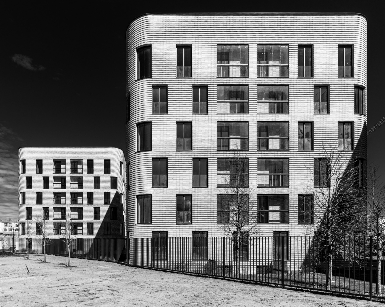
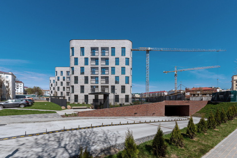
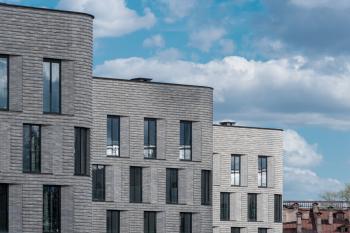
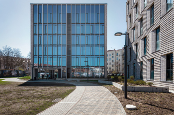
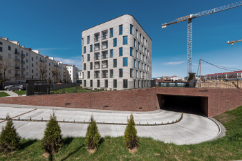
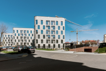
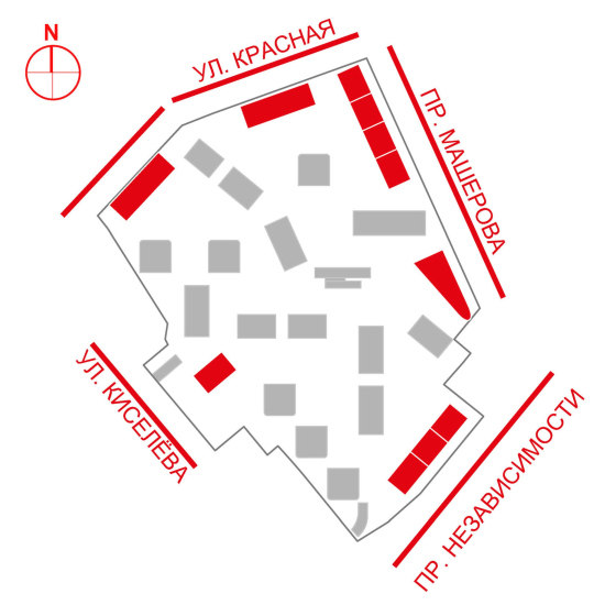
Let’s start with the tangible things – with the impressions produced by the new, already completed buildings. There are three of them, and they are identical, placed in a row behind the “Stalinist” front in the second line along Kiselev Street.
It should be noted that the “Stalinist” development, which forms both the context and the historical framework in this case, is pretty much the same from one post-Soviet city to another: plaster, large classical details, warm, mostly beige shades on the facades of the buildings, outlining contouring large, and sometimes very large courtyards. Inside, however, it’s usually a completely different scene: messy playgrounds, temporary trading points, makeshift parking lots, overgrown vegetation, drying carpets... All of this is usually expected to be seen behind the street façade.
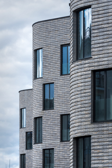
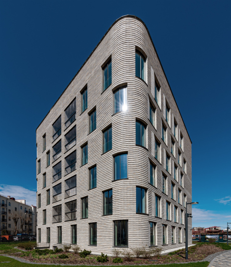
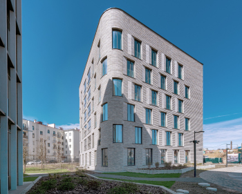
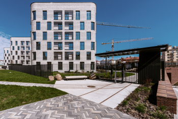
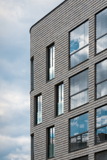
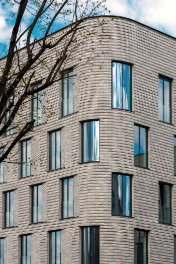
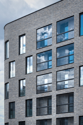
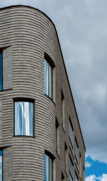
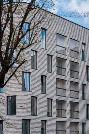
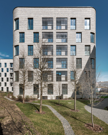
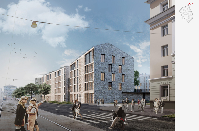
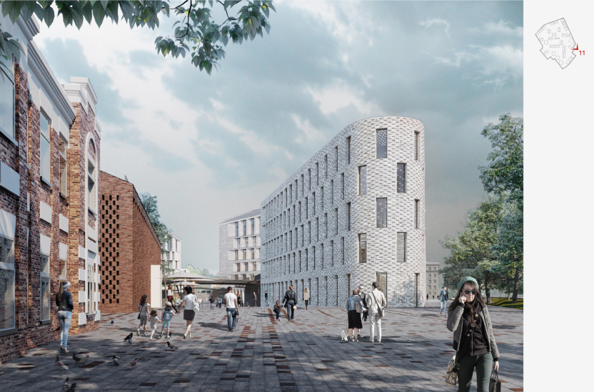
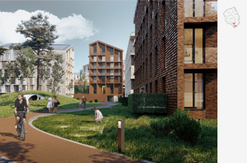
Here in Minsk, however, it’s the opposite. Behind the not so much pompous as cozy plastered houses and gate posts, a slender and fluid row of rounded corners opens up, windows arranged in a chessboard pattern, textured brickwork, and gleaming mirrored glass – not to mention the neat plants.
You don’t even get surprised by the fact that the new buildings are set at a 45° angle to the old contour – as if emphasizing that they are fundamentally different, despite the obvious tonal resonance and height similarities and rhythmic echoes with the rear facades of the 70-year-old development.
But these buildings already represent a different world, noticeably newer and more expensive, although they hide “behind the back” of the old one.
The Depo housing complex in Minsk, 3 buildings on Kiseleva Street, 6th stage (1st stage of construction)
Copyright: © Sergey Skuratov ARCHITECTS
So, the first impression when entering the courtyard of the first completed buildings can be described as the discovery of a hidden gem. And paradoxically, it is akin to the feeling that a tourist might experience in the city of Minsk, or even in its vicinity: for example, on the other side of the avenue, in a courtyard amidst moss-covered garages, you stumble upon a freshly whitewashed Church of the Holy Trinity. You find one city within another, and this is a fundamentally important impression.
Only when speaking of the church, Minsk of the 19th century sprouts there, or survives, within the predominant “Stalinist” construction, while in the case of Depo, within the contours of post-war development, we witness the formation of the embryo of a new modern city.
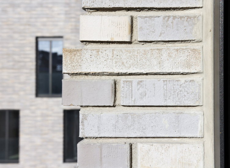
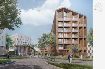
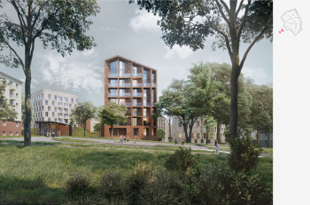
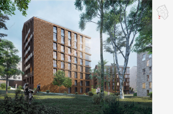
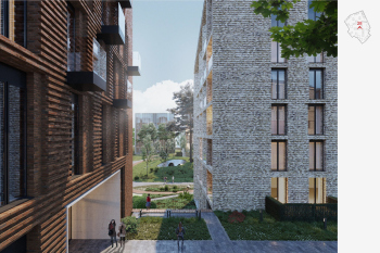
Despite all its modernity, it is subject to height and other restrictions, reacting contextually to the historical past and neighboring buildings. Thus, Sergey Skuratov chose brick as the material for the facades not only because, as an architect, he loves brick very much, although this is also true, but also as a memory of the industrial past of the depot. He placed buildings made of red brick in the central part because it is closer to the middle of the former industrial park, and suggested using light brick on buildings that lean towards the outer contour – because they respond to the proximity of light-beige “Stalinist” houses, paying respect to their shade of color.
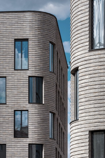
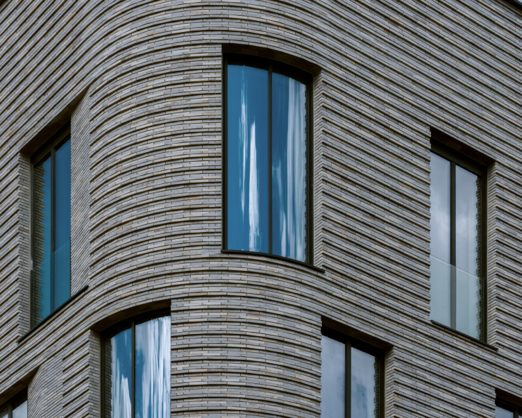
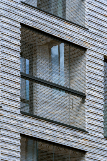
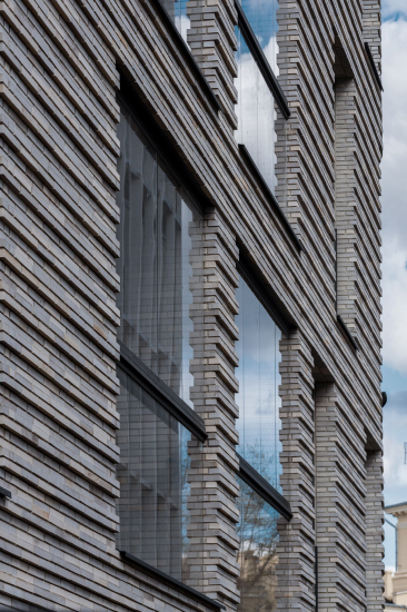
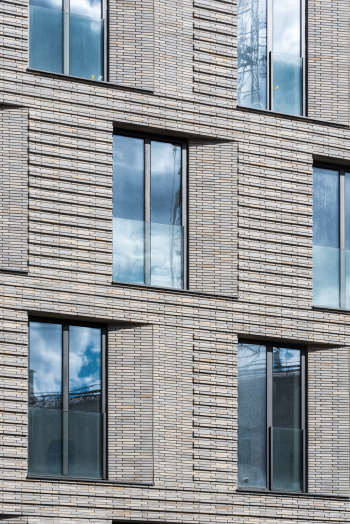
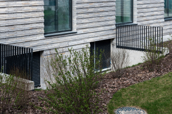
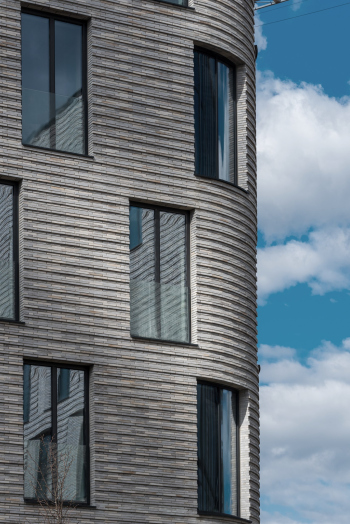
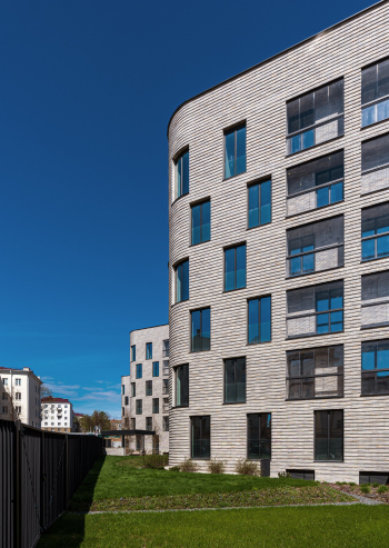
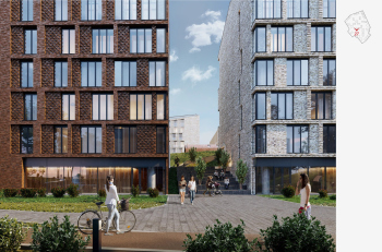
Such are the first constructed buildings of the complex. In the sunlight, the shade of their brick, slightly varying from gray to golden, becomes close to the color of the neighboring old houses. And at the same time, this brick is completely different: thin, textured, forming a linear relief. It mostly resembles the texture of the house “Medny 3.14” designed by Sergey Skuratov.
The Depo housing complex in Minsk, 3 buildings on Kiseleva Street, 6th stage (1st stage of construction)
Copyright: © Sergey Skuratov ARCHITECTS
The windows are not very deeply set into the thick of the wall, but behind the glass of the balconies is the same brick, which makes the façade look as if it’s multi-layered.
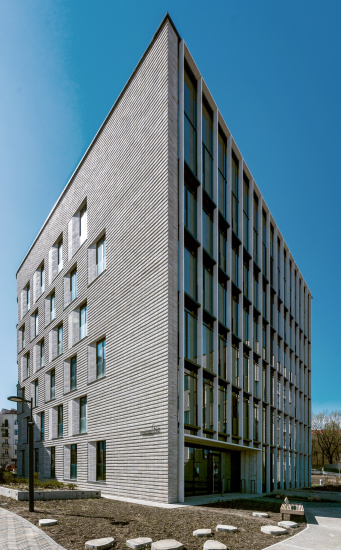
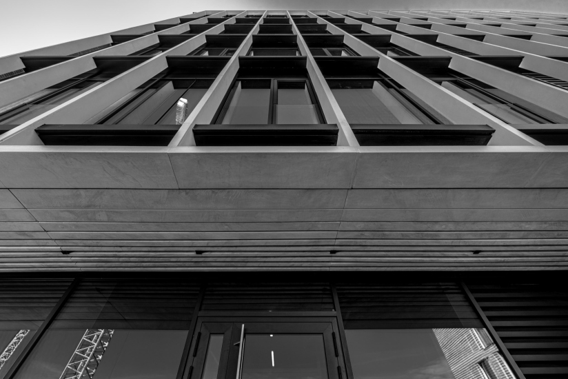
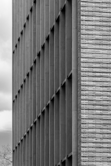
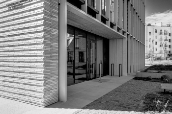
The theme is further developed when we see the northern facades of the buildings. They are entirely glazed and covered with a grid of slightly protruding concrete slats – white vertical and black horizontal. The motivation is clear: from the north side, you need to catch the light, so the apartments get glass walls, and at the same time, views towards the central part of the complex. And from a figurative point of view, it appears as if the wall has been cut with a knife, exposing some internal matter, permeable, delicate, yet stable.
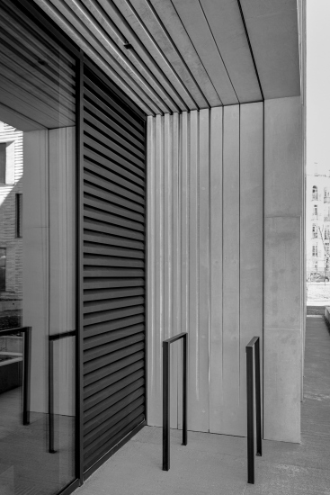
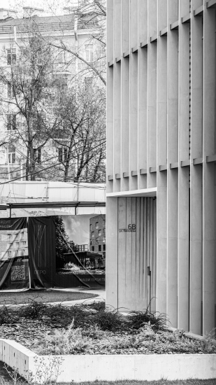
The idea of a “slice-off” is further picked up by the frames of the entrance portals: they are not monolithic but are dissected by thin slits overhead and by grooves that repeat them on the sides. This is also a kind of hatching, emphasizing the effect of stratification and neutralizing the visual massiveness; it makes the motif slightly less frozen and slightly lighter, as if “optional”. Moreover, it was convenient to embed technical devices into the gaps between the strips.
Meanwhile, if you look at the northern facades from a certain angle, their origin from modernist lamellae and ribs becomes obvious.
Returning to the “brick skin”, it should be noted that the southern façade, although it forms a single volume with the side ones and even “merges” with them thanks to the corners, is different. It is classically symmetrical; the mass of the brick prevails, and the chess rhythm of the windows borders on the brutal “self-assurance” – all this echoes with the "Stalinist" neighbors, but with a note mediated by some streamlining, the style of 1950s radio receivers. However, rounded corners are now a relevant retro shade.
The sidewalls, smoothly taking over the relay baton, imperceptibly change: the windows just around the corner receive wide and evenly beveled edges, always on one side; the chess arrangement loses its rigidity, and towards the northern edge, the wall thickens in anticipation of solid glass.
According to the architects, the solution to the side facades is designed for oblique light.
However, Sergey Skuratov emphasizes: he likes the implemented buildings, but the essence of the project is not in them.
Each individual house here is relatively “modest” – it is merely a part of the whole. The project covers about 7 hectares, has 21 residential buildings, and more than 30 sections. In such a large complex, individual houses should not claim to make a vivid statement – the general composition is more important.
The essence of the project lies in the proposed urban planning solutions, the organization of space, the principles of construction, and in how it should all work together.
The essence of the project lies in the proposed urban planning solutions, the organization of space, the principles of construction, and in how it should all work together.
So it is more important to consider the overall concept. It is contained in two concepts: the competition concept of 2018 and the refined concept of 2019.
Parallels and Meridians
Instead of choosing between a layout that follows the existing one and one that builds itself contrary to the established grid, Sergey Skuratov combines the two methods. Fortunately, the area of the territory – 7 hectares – allows for this.
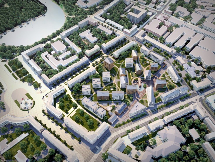
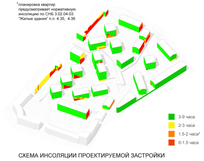
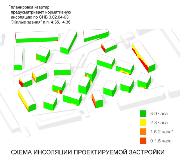
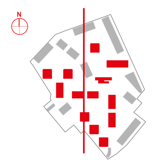
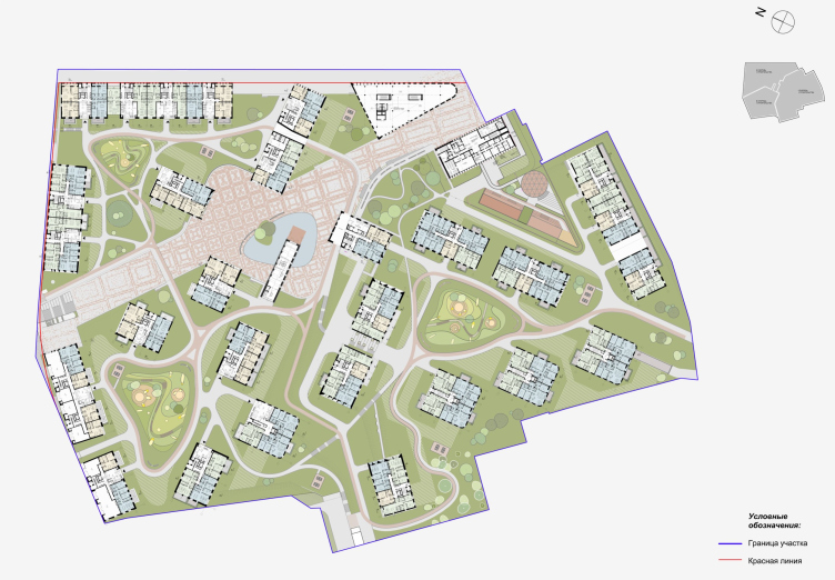
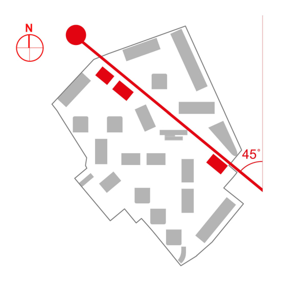
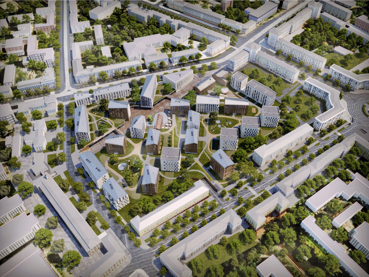
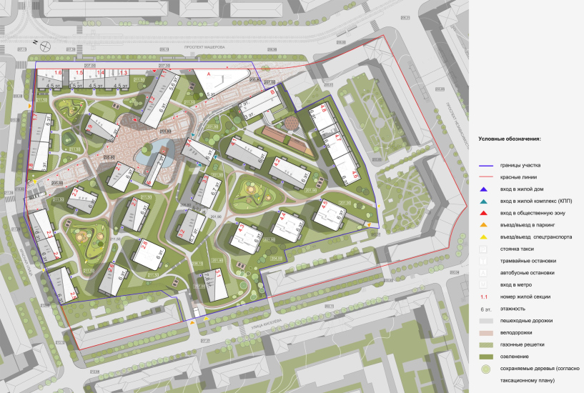
All the streets that delineate the plot run at different irregular angles, gravitating towards 45° angles, but Sergey Skuratov Architects primarily orient the main part of the buildings exactly according to the cardinal points, which is convenient for insolation. This is precisely why the three houses we discussed earlier, built in the southern part near Independence Avenue, ended up at an angle to the “Stalinist” development, stretching along the red line – they adhere to the logic and morphology of the new urban fabric.
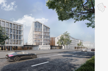
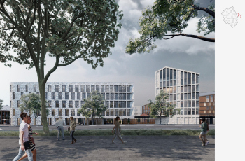
However, the new buildings, which are adjacent to the streets, are mostly built along the red lines and form a street front, which historically did not exist in a significant part of the territory’s contour – more precisely, its role was played by the fence of the tram depot.
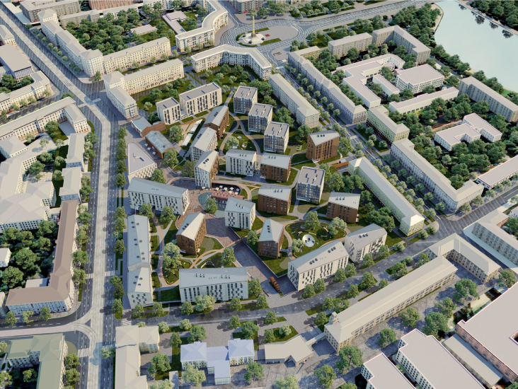
The Depo housing complex in Minsk, architectural concept, 2020
Copyright: © Sergey Skuratov ARCHITECTS
So, the format of development is mixed.
One could have delineated everything with meridional rows of houses, stretching along the north-south axis, ignoring the street lines, or just play with their angles, as was done in the 1970s; or, conversely, one could have followed the historical morphology of the urban fabric, outlining everything with block frames, echoing the directions of the streets, and build a new part of the city in the internal layout, adhering to the initial data and the conservative type of planning, as has been done for the last 15-20 years. This, by the way, is something that was drawn in the Detailed Planning Project, the Belarusian analogue of the Russian “Site Plan” or “Territory Planning Project.”
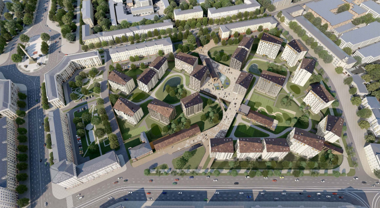
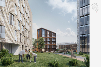
Sergey Skuratov acts more boldly but also more flexibly here. He does not chase only after insolation and elegant “stitches” of the houses, but he mixes meridional houses with latitudinal ones. Thus, a cross is formed, converging at the central public square with a pond. The solution is almost like in the “Garden Quarters”, but in the “Garden Quarters” it is the blocks that converge to the pond, and here we do not see any “blocks” in the traditional sense of this word.
The Depo housing complex in Minsk, architectural concept, 2020
Copyright: © Sergey Skuratov
Even the street front here is formed dispersively, with gaps.
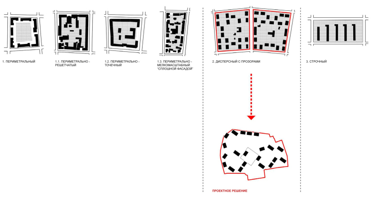
In other words, there are no extremes here, but the layout is far from ordinary. Nevertheless, for the decisions made, architects find a “connection” to the context: the type of development “dispersed with openings”, which is quite common in Minsk, including Independence Avenue.
Morphotypes of development existing in Minsk. Residential complex in Minsk: competition concept, 2018
Copyright: © Sergey Skuratov ARCHITECTS
The interpretation of the “Minsk” morphotype of construction is not the only contextual solution.
Equally important is the proposed extension of Masherova Avenue as a pedestrian street. Masherova Avenue is part of the inner ring of Minsk, comparable to Moscow’s Boulevard Ring or Garden Ring. At this point, the route deviates northward; historically, this was likely done to bypass the territory of the former depot. Now the task is the opposite – to create an in-city public space.
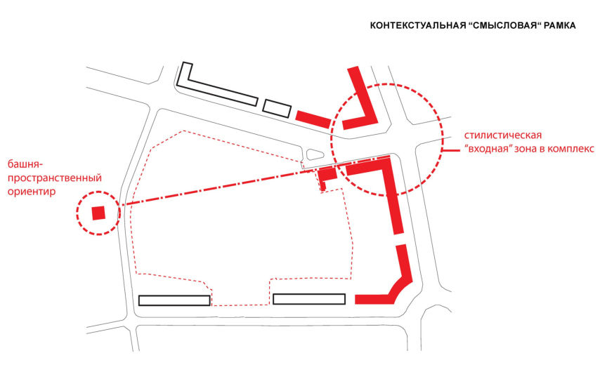
The architects emphasize that there are not enough shops on the ground floors of the outer contour; they do not sufficiently develop the space within the district. Therefore, the architects “channel” pedestrian traffic directly from the avenue. In the immediate vicinity, they also discover a small tower – on the building of the former radio factory, also built in the 1950s. Between Victory Square and this accent, which is quite small, a visual and conceptual axis emerges – a kind of thread by which the architects “semantically” connect the buildings of the 1950s and onto which, ultimately, the entire new block is strung.
The axis – the pedestrian street – logically stops not only at the tower but also at the turn of Red Street. Additionally, an angle is discovered: the pedestrian line approaches the meridian at exactly 45°, adding some regularity to the project.
However, the tower is an artistic but not very significant goal. There is another one. To the north of Red Street, on the territory of the former radio factory, now PTO “Horizon”, according to the Minsk master plan, reconstruction, construction, and the creation of a large public and cultural center are planned. Thus, the pedestrian street of the Depo residential complex will lead exactly in its direction.
However, the intrigue does not end here.
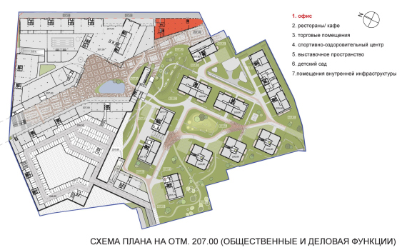
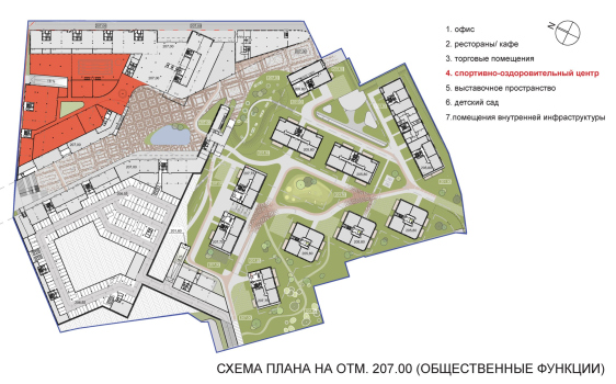
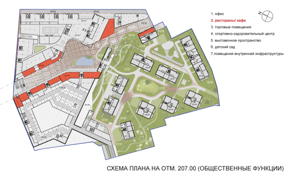
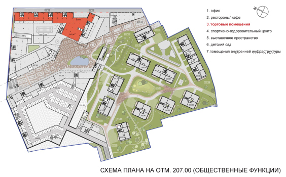
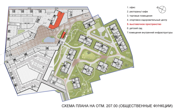
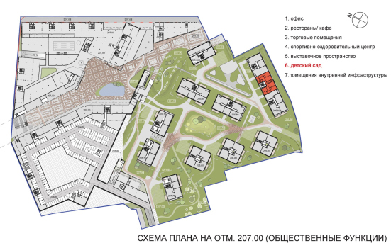
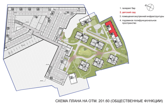
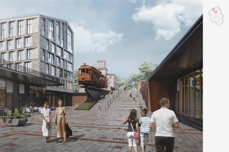
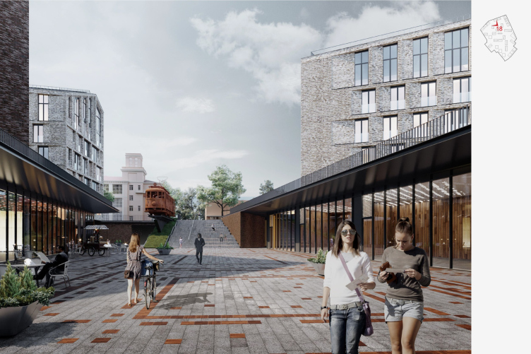
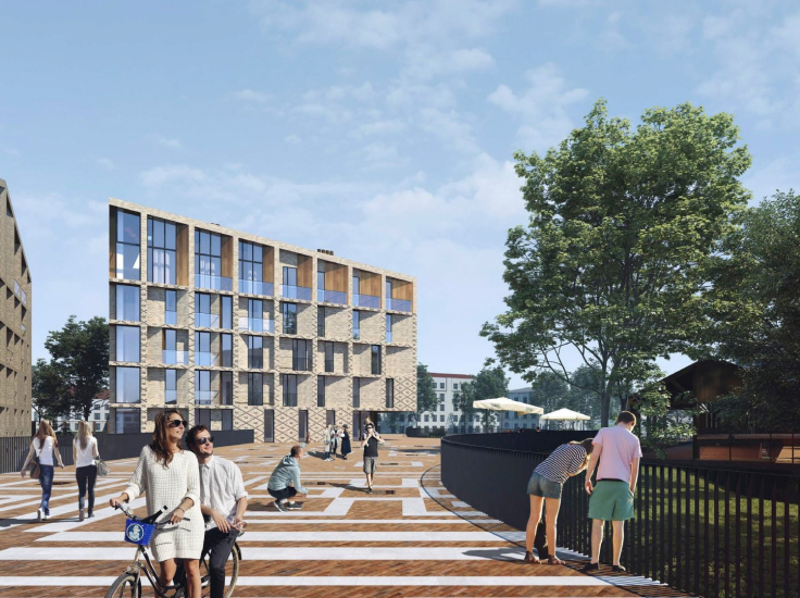
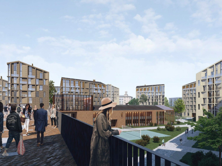
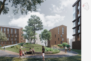
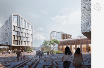
The height difference on the site is 13 meters from Red Street to Independence Avenue. And Skuratov uses it in his favorite way: he zones the space vertically. Private courtyards for residents are higher, while public ones are lower. This approach itself is not exactly a novelty in contemporary architecture – private courtyards on the roofs of podiums have been around for years. However, what makes Depo different is that this approach is integrated into the urban landscape. Private courtyards with artificial hills will remain at street level, while the street with cafes and shops placed along it – descends. It begins with a triangular office building on the right, its rounded “nose” is formed by that same 45° angle, and on the left, by the brick building of the former police station, built in 1911.
Above the street, two pedestrian bridges are thrown, connecting private courtyards at the top, while in the stylobate of the right-hand northern part – in the triangle cut off by the street – the architects suggested placing a fitness center, surrounded by shops on both sides, as this triangle is the “thinnest” part between two public streets – the avenue, and the new pedestrian one.
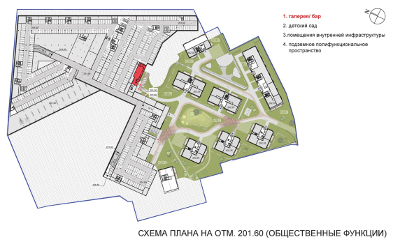
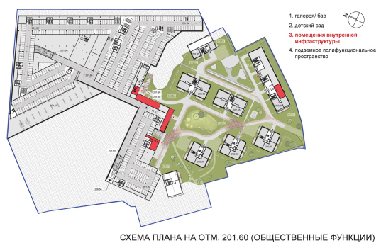
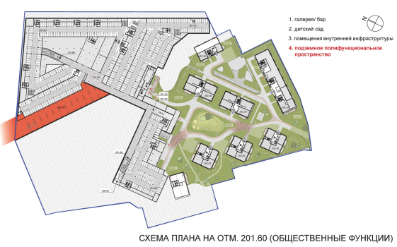
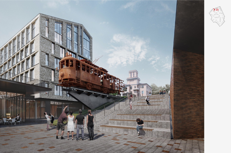
The street ends with a 5-meter high staircase, which leads up to the city, and an amphitheater. Underground, there is a multifunctional space, the rectangle of which extends northwest under Red Street.
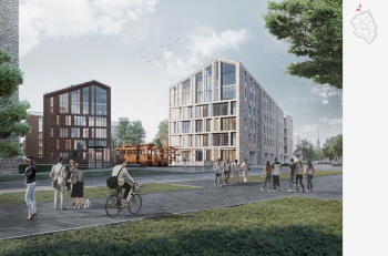
Above the staircase, Sergey Skuratov proposed installing an art object. In the original concept, it was a rusty tram – not a real one, but a sculpture made of Corten steel, which Sergey Skuratov loves as much as he does brick: the tram was supposed to decompose, deconstruct “in midair”, and there was an idea to invite sculptor Aleksey Kozyr to work on the tram.
The Depo housing complex in Minsk, architectural concept, 2020
Copyright: © Sergey Skuratov ARCHITECTS
The Depo housing complex in Minsk, architectural concept, 2020
Copyright: © Sergey Skuratov ARCHITECTS
The Depo housing complex in Minsk, architectural concept, 2020
Copyright: © Sergey Skuratov ARCHITECTS
Currently the developer does plan to preserve the space for the art object, but Belarusian artists will work on it.
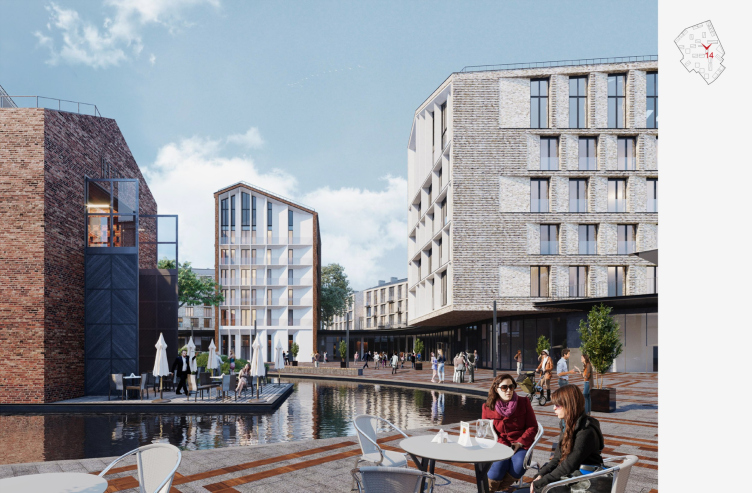
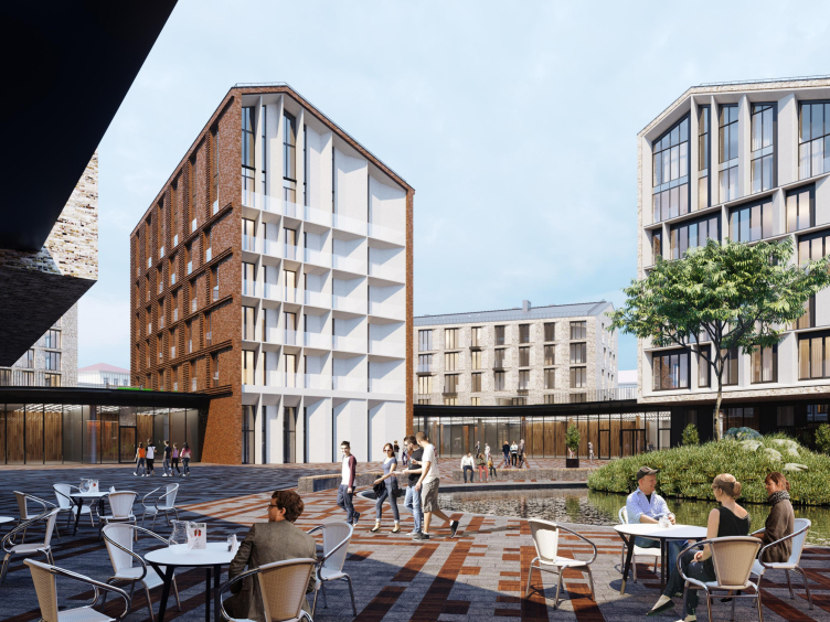
Finally, the apotheosis of public space should be the pond at the extension of the pedestrian street – the public square of the complex. As mentioned earlier, the houses oriented towards the cardinal points converge on it in a cross-shaped manner, creating a frame in the form of “curious faces” – views of the stained-glass facades.
The Depo housing complex in Minsk, architectural concept, 2020
Copyright: © Sergey Skuratov ARCHITECTS
The Depo housing complex in Minsk, architectural concept, 2020
Copyright: © Sergey Skuratov ARCHITECTS
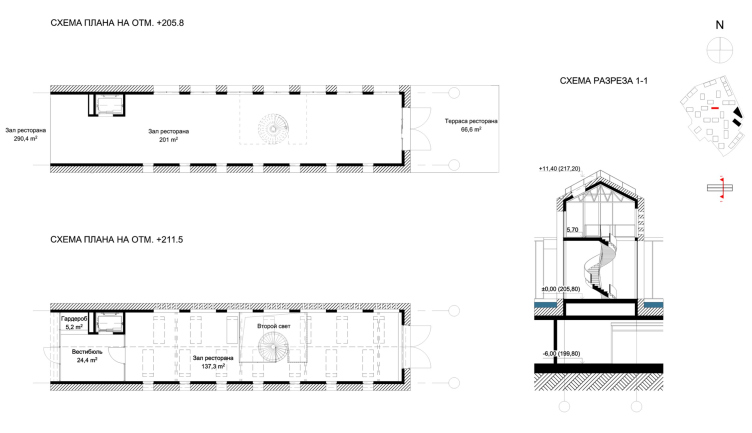
Above the pond, the architects plan to place a building for a bar/gallery/restaurant – a small public center; the architects proposed to assemble it from fragments of the depot’s car wash, also to preserve the memory of the place. However, even more interesting is the fact that this space is thin, long, and two stories high – a kind of “gravity poin” that attracts all the matter to itself, creating a pause around the pond and square. In short, this is the “small” that turns out to be significant as “large”, and therefore, presents a good spatial paradox.
Inside the “car wash” restaurant, two floors are connected by a spiral staircase.
The Depo housing complex in Minsk, architectural concept, 2020
Copyright: © Sergey Skuratov ARCHITECTS
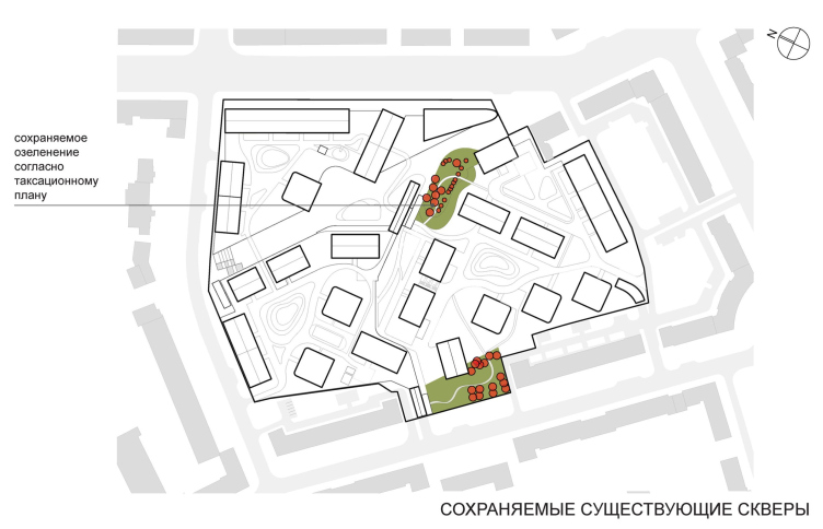
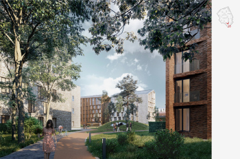
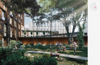
Interestingly, the contextual work doesn’t end with the outlined contour of the place, the car wash, or the axis, found by the architects. Additionally, Sergey Skuratov proposed to preserve two fragments of existing greenery: one at the beginning of the pedestrian street, and the other between the “Stalinist” buildings on Kiseleva Street.
The Depo housing complex in Minsk, architectural concept, 2019
Copyright: © Sergey Skuratov ARCHITECTS
Plus, new trees in the artificial hills, plus parterres in front of the apartments on the ground floor – some kind of green mini-balconies, raised above the ground by 60 centimeters, with a contour of green hedging.
Equally interesting is the fact that in the competition concept, the vertical zoning of the space was different.
There, the public promenade was located not below, but above the private courtyards, meaning it was a raised pedestrian esplanade, connecting Masherova Avenue and Kiseleva Street without stairs, on one single level.
The Depo housing complex in Minsk, competition concept, 2018
Copyright: © Sergey Skuratov ARCHITECTS
The competition concept also had more Belarusian ornaments: in the paving and on the façade. In the final project, these ornaments only remained in the paving, and they “dissolve”, gradually losing their rigidity – just the way Sergey Skuratov likes.
In short, the Minsk project is one of those that you need to contemplate and scrutinize to fully understand. Four years of work, four versions with changes and refinements. The albums with 150-250 pages in them constantly reveal new twists and meanings, which correspond to the architect’s signature style on different levels: from planning “in three dimensions’, with special attention to vertical zoning, which always has a significant impact on the perception of urban space, and ending with details such as preserving trees or fragments of the car wash building (!), asymmetric window slopes, and volumetric façade grid, diagonal roof ridges, or textured brickwork.
The only catch is that, as I was told in Minsk, the brick is probably going to be replaced with porcelain stoneware. However, the main spatial and planning ideas of the project do remain intact. Well, let’s watch this compelling story unfold.
The Depo housing complex in Minsk, architectural concept, 2020
Copyright: © Sergey Skuratov ARCHITECTS
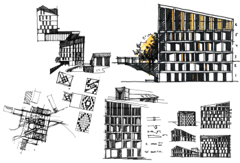
TSketches. The Depo housing complex in Minsk, competition concept, 2018
Copyright: © Sergey Skuratov ARCHITECTS

