По-русски

​Asimov’s Dream

A project by DNK ag won in a competition for the science campus of the National Center for Physics and Mathematics in the city of Sarov, conducted by ROSATOM corporation in collaboration with the Moscow State University, Russian Academy of Sciences, and the Kurchatov Institute.

03 September 2021
Contest Results
mainImg
The idea of creating the National City for Physics and Mathematics in the science city of Sarov was proposed by the president of the Russian Federation in November 2020. It is understood as a “new type science campus” situated beyond the confines of the Sarov nuclear station, its task being fundamental and applied research in the above-mentioned areas, as well as in the field of information technology. The result that is ultimately expected is “getting world-class results, training top-class scientists, strengthening the human resources of the nuclear weapons complex”.

The PM Mikhail Mishustin signed the decree on the creation of the NCFM on August 30, and the competition for the architectural and urban planning of the campus was held starting in the spring of 2021. The operator of the competition was Citymakers. The contestants were required to propose “an innovative sustainable architectural solution of space for future residents, combining opportunities for effective science and a comfortable life”. It was necessary to think through the layout of the territory, the organization of public spaces and the architecture of the buildings of the center.

The projects were developed by 6 architectural companies that reached the final: Timur Bashkaev, KAMEN Architects, Buromoscow, Kleinewelt Architekten, Studio 44, and DNK. The results were announced September 2, and the winner was the project submitted by DNK ag, developed by Natalia Sidorova, Daniel Lorentz, and Konstantin Khodnev. 

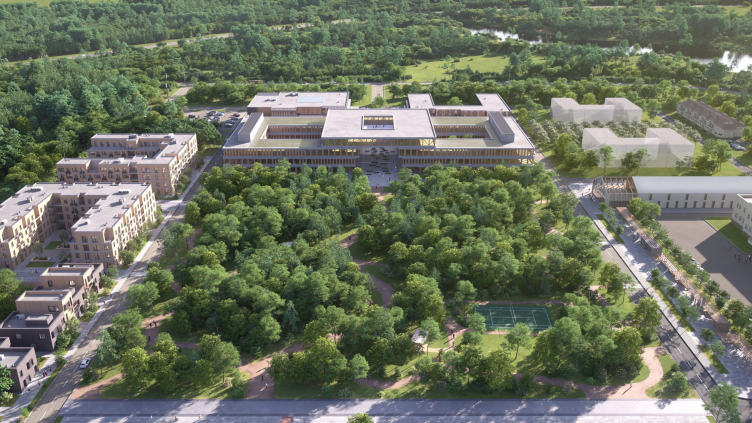
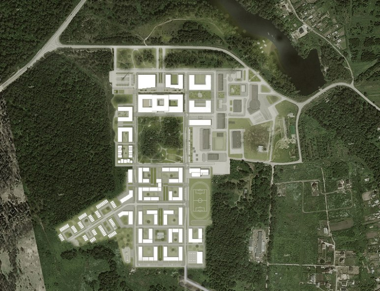
The center will be built on the territory of the Sarov technology park, north of Satis settlement. From the south side, both the settlement, and Sarov, located a little more to the east, are surrounded by the forests of the Mordovsky Natural Reserve – but then again, there is a forest stepping up to the very future center, and even now there is a rectangular strip of forestland on the future campus grounds, which the architects are planning to preserve, surrounding it with campus buildings.

Architectural and urban planning of the National Center for Physics and Mathematics in Sarov, the winning project September 9, 2021
Copyright: © DNK ag


The forest fragment, the natural environment, and the parallels with the wooden houses of the employees of the restricted-entrance town Arzamas-16 became the main conceptual basis of the winning project developed by DNK ag.

The low-rise buildings: the science and educational complex, the library, the dormitory, and the residents of the teachers and researchers, as well as the hotel and the cultural center – are grouped along the contour of the preserved forest rectangle, a peculiar “forest plaza” of sorts, then continue down south, sprouting a small branch in the southwest part. According to the authors, what appears on the inside is a walking-distance space with a string of interconnected public sub-spaces, designed for pedestrians and cyclists. The cyclists will be able to move around both inside the complex and reach the city of Sarov, which is about 5 kilometers away.

Architectural and urban planning of the National Center for Physics and Mathematics in Sarov, the winning project September 9, 2021
Copyright: © DNK ag


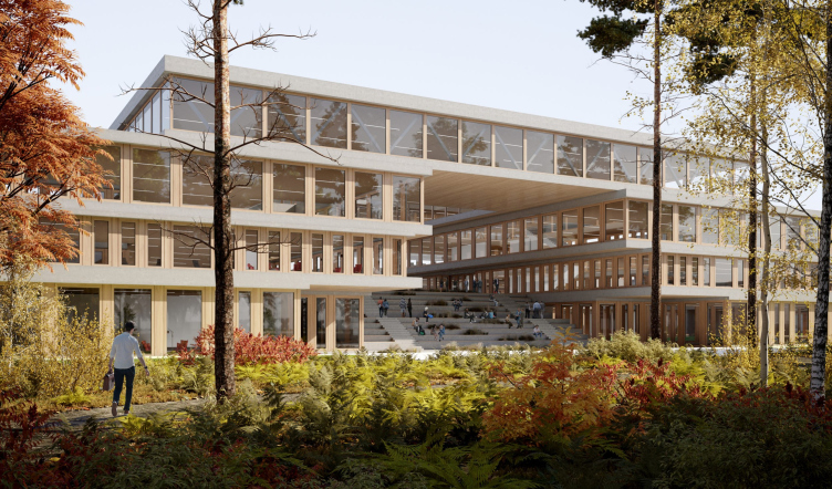
The main building – the research center – is located to the north of the forest area and was designed in a very curious way: on the one hand, it is spread out with a clear preference for horizontal, which is very suitable for the style of any modern scientific campus – it is customary to build them without obvious centerpieces. On the other hand, its silhouette is pyramidal, which, according to the authors of the project, is intended to remind of the famous skyscraper of Moscow University, one of the founders of the new center in Sarov.

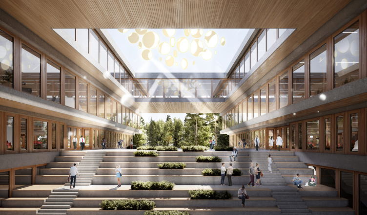
The pyramid is formed because the building consists of two three-story square volumes with large courtyards that accommodate auditoriums and laboratories, and one more, one-story square of the library, also with a hole in the center, installed on their “shoulders” along the central axis.

Architectural and urban planning of the National Center for Physics and Mathematics in Sarov, the winning project September 9, 2021
Copyright: © DNK ag


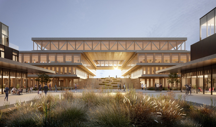
What it ends up being is a spectacular transparent link – a bridge floating in space between the two units of the main building. Below it, there is an amphitheater facing the forest – a place of communication, an almost indispensable element of modern educational and research spaces, welcoming, at the same time, to contemplate nature.

Architectural and urban planning of the National Center for Physics and Mathematics in Sarov, the winning project September 9, 2021
Copyright: © DNK ag


The building, transparent and light, rhymes with the natural environment and seems to even accentuate it, strives to be its continuation.

Architectural and urban planning of the National Center for Physics and Mathematics in Sarov, the winning project September 9, 2021
Copyright: © DNK ag


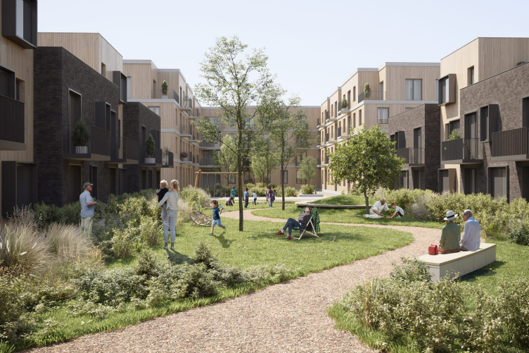
The facades of other buildings are also made of natural materials.

Architectural and urban planning of the National Center for Physics and Mathematics in Sarov, the winning project September 9, 2021
Copyright: © DNK ag


DNK ag architects define their project of the National Center for Physics and Mathematics as “a working model of the city of the future”. One can definitely agree with them: in the proposed imagery one can read an example of a campus that has been repeatedly described in fantastic literature: it is so high-tech that it can afford harmonious coexistence with nature, its preservation, admiration, contemplation, walks to “clear the registers” in front of the next brain by storm. A campus from the books of Isaac Asimov – when you go straight out of a transparent wall to the lawn or into the forest and start jogging – which has many examples of its embodiment in post-war modernist architecture, but in this case, adjusted for the relevance of the 21st century.

The project is scheduled to be implemented in 2024.

The judging panel:
Alexey Likhachev, General Director of the State Atomic Energy Corporation ROSATOM;
Victor Sadovnichy, President of Moscow State University;
Alexander Sergeev, President of the Russian Academy of Sciences;
Sergey Kuznetsov, Chief Architect of Moscow;
Anton Finogenov, Deputy General Director of the DOM.RF Foundation;
Andrey Gnezdilov, partner of the Ostozhenka architects;
Oleg Shapiro, co-founder of the WOWHAUS architects;
Alexey Novikov, President of Habidatum;
Sergey Zuev, President of the Moscow Higher School of Social and Economic Sciences;
Elena Bunina, General Director of Yandex Russia

03 September 2021

Headlines now
The Golden Crown
The concept for a dental clinic in Yekaterinburg, developed by CNTR Studio, revolves around the idea of a “mouth full of gold”: pristine white porcelain stoneware walls are complemented by matte brass details. To avoid an overly literal interpretation, the architects focused on the building’s proportions, skillfully navigating between sunlight requirements and fire safety regulations.
Flexibility and Integration
Not long ago, we covered the project for the fourth phase of the ÁLIA residential complex, designed by APEX. Now, we’ve been shown different fence concepts they developed to enclose the complex’s private courtyards, incorporating a variety of public functions. We believe that the sheer fact that the complex’s architects were involved in such a detail as fencing speaks volumes.
A Step Forward
The HIDE residential complex represents a major milestone for ADM architects and their leaders Andrey Romanov and Ekaterina Kuznetsova in their quest for a fresh high-rise aesthetic – one that is flexible and layered, capable of bringing vibrancy to mass and silhouette while shaping form. Over recent years, this approach has become ADM’s “signature style”, with the golden HIDE tower playing a pivotal role in its evolution. Here, we delve into the project’s story, explore the details of the complex’s design, and uncover its core essence.
Gold in the Sands
A new office for a transcontinental company specializing in resource extraction and processing has opened in Dubai. Designed by T+T Architects, masters of creating spaces that are contemporary, diverse, flexible, and original, this project exemplifies their expertise. On the executive floor, a massive brass-clad partition dominates, while layered textures of compressed earth create a contextually resonant backdrop.
Layers and Levels of Flight
This project goes way back – Reserve Union won this architectural competition at the end of 2011, and the building was completed in 2018, so it’s practically “archival”. However, despite being relatively unknown, the building can hardly be considered “dated” and remains a prime example of architectural expression, particularly in the headquarters genre. And it’s especially fitting for an aviation company office. In some ways, it resembles the Aeroflot headquarters at Sheremetyevo but with its own unique identity, following the signature style of Vladimir Plotkin. In this article, we take an in-depth look at the United Aircraft Corporation (UAC) headquarters in the Moscow agglomeration town of Zhukovsky, supplemented by recent photographs from Alexey Naroditsky – a shoot that became only recently possible due to the fact that improvements were finally made in the surrounding area.
Light and Shadow
In this article, we delve into the architectural design of the “Chaika” house by DNK ag architects, which was recently completed in 2023 as part of the collection of signature designs at ZILArt. As is well-known, all the buildings in this complex follow a design code, yet each one is distinct. This particular building stands out not only for its whiteness and minimalism but also for the refined use of a limited number of techniques that, together, create what can confidently be called synergy.
Casus Novae
A master plan was developed for a large residential area with a name of “DNS City”, but now that its implementation began, the plan has been arbitrarily reformatted and replaced with something that, while similar on the surface, is actually quite different. This is not the first time such a thing happens, but it’s always frustrating. With permission from the author, we are sharing Maria Elkina’s post.
Treasure Hunting
The GAFA bureau, in collaboration with Tegola and Arkhitail, organized an expedition to the island of Kilpola in Karelia as part of Moskomarkhitektura’s “Open City” festival. There, amidst moss and rocks, the students sought answers to questions like: what is the sacred, where does it dwell, and what sustains it? Assisting the participants in this quest were landscape engineer Evgeny Levin, artist Nicholas Roerich, a moose, and the lack of cellular connection. Here’s how the story unfolded.
Depths of the Earth, Streams of Water
In the Malaya Okhta district, the Akzent building, designed by Stepan Liphart, was constructed. It follows a classic tripartite structure, yet it’s what you might call “hand-drawn”: each façade is unique in its form and details, some of which aren’t immediately noticeable. In this article, we explore the context and, together with the architect, delve into how the form was developed.
Fir Tree Dynamics
The “Airports of Region” holding is planning to build an airport in Karachay-Cherkessia, aiming to make the Arkhyz and Dombay resorts more accessible to travelers. The project that won in an invitation-only competition, submitted by Sergey Nikeshkin’s KPLN, blends natural imagery inspired by the shape of a conifer seed, open-air waiting spaces, majestic large trees, and a green roof elevated on needle-like columns. The result is both nature-inspired and WOW.
​A Brick Shell
In the process of designing a clubhouse situated among pine trees in a prestigious suburban area near Moscow, the architectural firm “A.Len” did the façade design part. The combination of different types of brick and masonry correlates with the volumetric and plastique solutions, further enhanced by the inclusion of wood-painted fragments and metal “glazing”.
Word Forms
ATRIUM architects love ambitious challenges, and for the firm’s thirtieth anniversary, they boldly play a game of words with an exhibition that dives deep into a self-created vocabulary. They immerse their projects – especially art installations – into this glossary, as if plunging into a current of their own. You feel as if you’re flowing through the veins of pure art, immersed in a universe of vertical cities, educational spaces – of which the architects are true masters – and the cultural codes of various locations. But what truly captivates is the bold statement that Vera Butko and Anton Nadtochy make, both through their work and this exhibition: architecture, above all, is art – the art of working with form and space.
Flexibility and Acuteness of Modernity
Luxurious, fluid, large “kokoshniks” and spiral barrel columns, as if made from colorful chewing gum: there seem to be no other mansion like this in Moscow, designed in the “Neo-Russian-Modern” style. And the “Teremok” on Malaya Kaluzhskaya, previously somewhat obscure, has “come alive with new colors” and gained visibility after its restoration for the office of the “architectural ecosystem” as the architects love to call themselves. It’s evident that Julius Borisov and the architects at UNK put their hearts into finding this new office and bringing it up to date. Let’s delve into the paradoxes of this mansion’s history and its plasticity. Spoiler: two versions of modernity meet here, both balancing on the razor’s edge of “what’s current”.
Yuri Vissarionov: “A modular house does not belong to the land”
It belongs to space, or to the air... It turns out that 3D printing is more effective when combined with a modular approach: the house is built in a workshop and then adapted to the site, including on uneven terrain. Yuri Vissarionov shares his latest experience in designing tourist complexes, both in central Russia and in the south. These include houseboats, homes printed from lightweight concrete using a 3D printer, and, of course, frame houses.
​Moscow’s First
“The quality of education largely depends on the quality of the educational environment”. This principle of the last decade has been realized by Sergey Skuratov in the project for the First Moscow Gymnasium on Rostovskaya Embankment in the Khamovniki district. The building seamlessly integrates into the complex urban landscape, responding both to the pedestrian flow of the city and the quiet alleyways. It skillfully takes advantage of the height differences and aligns with modern trends in educational space design. Let’s take a closer look.
Looking at the Water
The site of Villa Sonata stretches from the road to the water’s edge, offering its own shoreline, pier, and a picturesque river panorama. To reveal these sweeping views, Roman Leonidov “cut” the façade diagonally parallel to the river, thus getting two main axes for the house and, consequently, “two heads”. The internal core – two double-height spaces, a living room and a conservatory, with a “bridge” above them – makes the house both “transparent” and filled with light.
The White Wing
Well, it’s not exactly white. It’s more of a beige, white-stone structure that plays with the color of limestone – smoother surfaces are lighter, while rougher ones are darker. This wing unites various elements: it absorbs and interprets the surrounding themes. It responds to everything, yet maintains a cohesive expression – a challenging task! – while also incorporating recognizable features of its own, such as the dynamic cuts at the bottom, top, and middle.
Urban Dunes
The XSA Ramps team designed and built a three-part sports hub for a park in Rostov-on-Don, welcoming people of all ages and fitness levels. The skate plaza, pump track, and playground are all meticulously crafted with details that attract a diverse range of visitors. The technical execution of the shapes and slopes transforms this space into a kind of sculptural composition.
Proportional Growth
The project for the fourth phase of the ÁLIA residential area has been announced. The buildings are situated on an elongated plot – almost a “ray” that shoots out from the center of the area towards the river. Their layout reflects both a response to Moscow’s architectural preferences over the past 15 years, shifting “from blocks to towers”, and an interpretation of the neighboring business park designed by SOM. Additionally, the best apartments here are not located at the very top but closer to the middle, forming a glowing “waistline”.
The “Staircase” Building
In designing the “Details” residential complex in New Moscow, Rais Baishev spiced up the now-popular Moscow theme of a “courtyard” building with an idea drawn from the surrealist drawings by Maurits Escher. He envisioned the stepped silhouettes and descending slopes as a metaphysical mega-staircase, creating a key void within the courtyard that gave the project an internal “spine”. This concept is felt both in the building’s silhouette and on its façades.
Projection of the Quarter
No one doubted that the building that Vladimir Plotkin designed as part of the “Garden Quarters” would be the most modernist of all. And it turned out just that way: while adhering to the common design code, the building successfully combines brick and white stone, rhythmically responding to the neighboring building designed by Ostozhenka, yet tactfully and persistently making a few statements of its own. This includes the projection of the ideal urban development composition “14–9–6”, which can be found right next door, mathematical calculations, including those for various types of terraces (and perhaps the only reminder of the Soviet past of the Kauchuk rubber factory!), and the white “cross-stitch” pattern of the façade grid.
Domus Aurea
In this issue, we examine the “Tessinsky-1” house, designed by Sergey Skuratov and completed in 2023. Located in the middle of the Serebryanicheskaya Embankment district, at the intersection of its main streets, this house assumes a sort of “nodal” role: it not only responds to everything around it and preserves many memories of the former EMA factory within itself, but it weaves all this into a newly directed pattern, reconciling bright “gold” and dark-colored brick, largely with the help of the new, modern-yet-archaic Columba brick, which, come to think about it, is the most precious element here.
The Chimney of Nikola-Lenivets
In this issue, we are examining the “Obelisk House” designed by KATARSIS and built for the Arkhstoyanie 2023 festival. However, it was only finished later on, and this is why we are examining it now. It seems to us that after the “Obelisk House” appeared in Nikola-Lenivets, a dialogue and a few inner connections appeared between the temporary structures built here. These houses no longer look like “accidental neighbors”, more of which below.
​Periscope by the Bay
The jury awarded the second place in the competition for a public and cultural center in Petropavlovsk-Kamchatsky to the companies GORA (“Mountain”) and M4. In the consortium’s proposal, the building resembles a sperm whale with a calf swimming next to it or a periscope, whose lenses capture the most spectacular views from the surrounding landscape.
From Arcs to Dolmens
While working on the competition project for Petropavlovsk-Kamchatsky, ASADOV Architects prioritized the value of the natural and urban environment, aiming to preserve the balance of the location while minimizing the resemblance of the volume that they designed to a “traditional building”. The task was challenging, and the architects created three versions, one of which having been developed after the competition, where their main proposal took third place. However, the point of interest here is not the competition result but the continuity of creative thinking.
Hide and Seek
The ID Moskovskiy house, designed by Stepan Liphart in St. Petersburg, in the courtyards near Moskovskiy Avenue beyond the Obvodny Canal and recently completed, is notable for several reasons. Firstly, it has been realized with considerable accuracy, which is particularly significant as this is the first building where the architect was responsible not only for the facades but also for the layouts, allowing for better integration between the two. On the other hand, this building is interesting as an example of the “germination” of new architecture in the city: it draws on the best examples from the neighborhood and becomes an improved and developed sum of ideas found by the architect in the surrounding context.
The Big Twelve
Yesterday, the winners of the Moscow Mayor’s Architecture Award were announced and honored. Let’s take a look at what was awarded and, in some cases, even critique this esteemed award. After all, there is always room for improvement, right?
Above the Golden Horn
The residential complex “Philosophy” designed by T+T architects in Vladivostok, is one of the new projects in the “Golubinaya Pad” area, changing its development philosophy (pun intended) from single houses to a comprehensive approach. The buildings are organized along public streets, varying in height and format, with one house even executed in gallery typology, featuring a cantilever leaning on an art object.
Nuanced Alternative
How can you rhyme a square and space? Easily! But to do so, you need to rhyme everything you can possibly think of: weave everything together, like in a tensegrity structure, and find your own optics too. The new exhibition at GES-2 does just that, offering its visitor a new perspective on the history of art spanning 150 years, infused with the hope for endless multiplicity of worlds and art histories. Read on to see how this is achieved and how the exhibition design by Evgeny Ace contributes to it.
Blinds for Ice
An ice arena has been constructed in Domodedovo based on a project by Yuri Vissarionov Architects. To prevent the long façade, a technical requirement for winter sports facilities, from appearing monotonous, the architects proposed the use of suspended structures with multidirectional slats. This design protects the ice from direct sunlight while giving the wall texture and detail.