По-русски

The Magic of Rhythm or Ornament as a Theme

Designed by Sergey Tchoban, the housing complex Veren Place in St. Petersburg is the perfect example of inserting a new building into a historical city, and one the cases of implementing the strategy that the architect presented a few years ago in the book, which he coauthored with Vladimir Sedov, called “30:70. Architecture as a Balance of Forces”.

24 December 2020
Object
mainImg
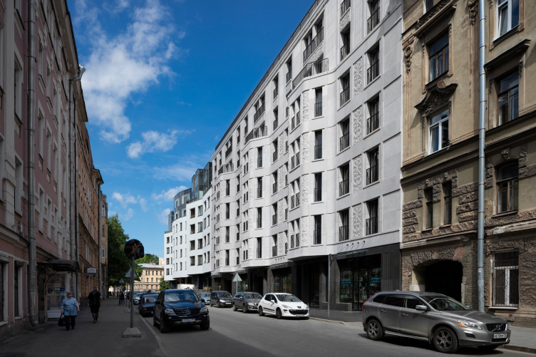
The Veren Place house is situated in the center of St. Petersburg, on the street that bears a “countryside” name of 10th Sovietskaya (I wonder how many hundreds of Sovietskaya (“Soviet”) streets have survived across Russia?), not far from the Nevskaya Clocktower, also designed by SPEECH. Back in the day, the ten “Soviet” streets used to be called “Rozhdestvenskaya” (“Nativity”), named in honor of the nearby Church of the Nativity of Christ built in the middle of the XVIII century, blown up by the Bolsheviks later on, and now being restored. Since 1990’s, there have been repeated attempts by the local preservation activists to rename these streets back into “Rozhdestvenskaya”.

Veren Place housing complex
Copyright: Photograph © Dmitry Chebanenko


Let’s, however, start off by making a small digression dedicated to the “30:70” strategy (the book “30:70. Architecture as a Balance of Forces” was out in 2017; Sergey Tchoban repeatedly presented it at his lectures both in Russia and abroad). One of the most important messages that it carries is that a harmonious city cannot consist of iconic buildings alone – they must constitute no more than 30% of it, the other buildings playing a background part, yet with thoroughly detailed facades. These need not, or rather, must not be of neoclassical architecture; instead, these should be different variations of Art Deco, but other options are also possible. 

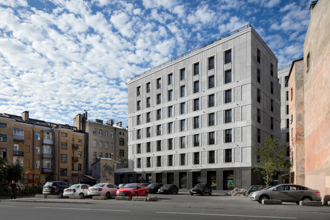
On the 10th Sovetskaya Street, which is not excessively long, there are two houses standing at the beginning and at the end. One of them, the corner one, iconic and modernist, was designed by Studio 44, headed by Nikita Yavein. According to Sergey Tchoban, this building is a typical corner dominant with an unusual floor plan and active forms. On the other corner of the 10th Sovetskaya, where it meets the Mytninskaya Street, stands the former Ivan Smirnov tenement (1902, designed by Andreev and Pavlov). Both houses occupy about a third of the street each. The land site between them was allotted for the construction of Veren Place. The complex is designed in the spirit of Art Deco, although with some clearly modern features, which means that the Veren Place building has joined the background construction of St. Petersburg, and the ratio of the houses on the street neared the 30:70 strategy. All the houses on the opposite side of the streets are tenements of the early XX century, moderately decorated and rather ordinary for their time, intercepted by a park at one point.

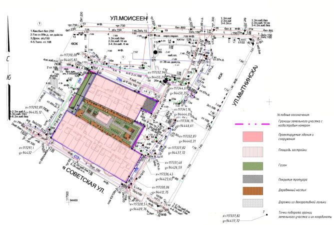
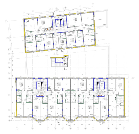
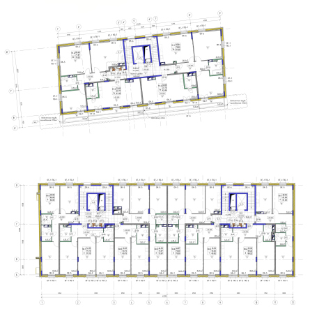
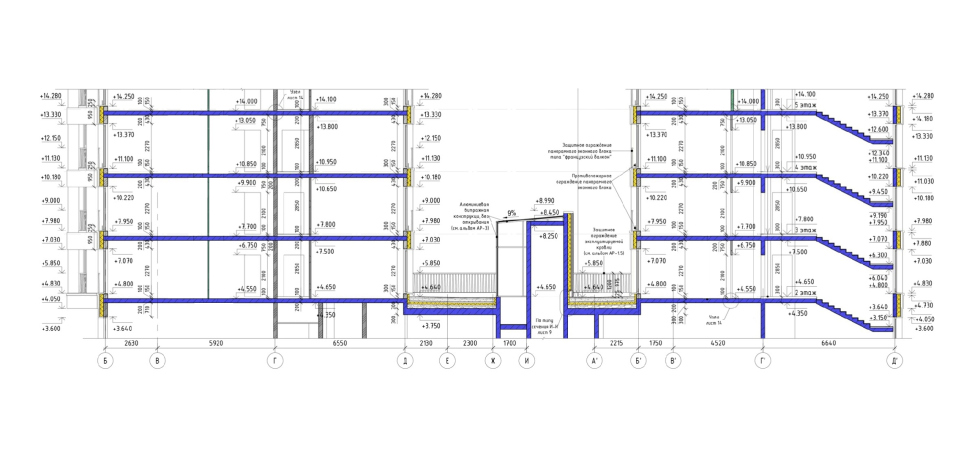
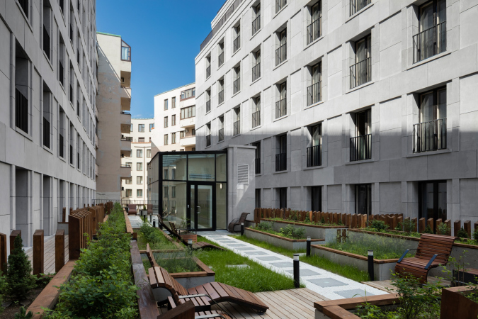
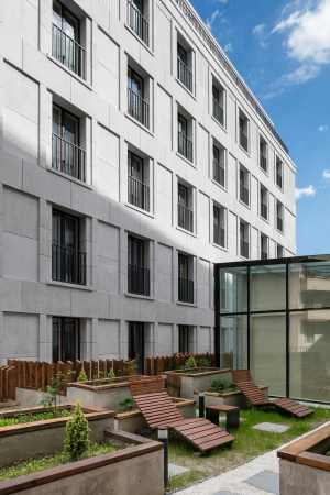
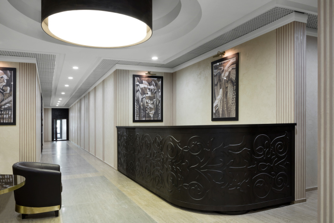
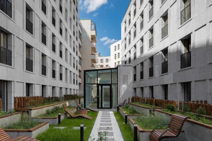
The housing complex Veren Place consists in fact of two buildings standing on a common stylobate: one unit stretches along the street, and the other stands almost parallel to it inside the block; between them, there is a private residents-only green yard on the roof of the parking garage. From the yard side, one gets through the glass grand entrance both into the hallway (whose design matches the overall artistic concept of the complex), and to the underground parking garage. In the cramped space of the historical city, the parking system features not a habitual ramp, but a special parking elevator. The house has 80 apartments and 45 parking places in it – this ratio is great for the environment. The apartment floor space ranges from 40 to 105 square meters.

  • zooming
    1 / 4
    The masterplan. Veren Place housing complex
    Copyright: © SPEECH
  • zooming
    2 / 4
    Plan of the 2nd floor. Veren Place housing complex
    Copyright: © SPEECH
  • zooming
    3 / 4
    Plan of the 7th floor. Veren Place housing complex
    Copyright: © SPEECH
  • zooming
    4 / 4
    Section view 3-3. Veren Place housing complex
    Copyright: © SPEECH


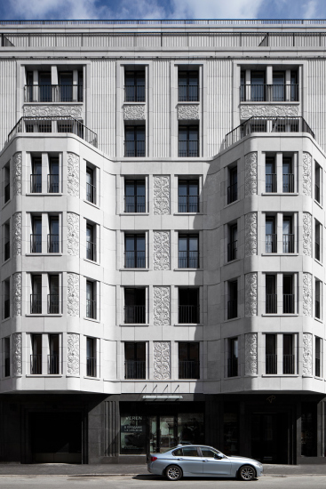
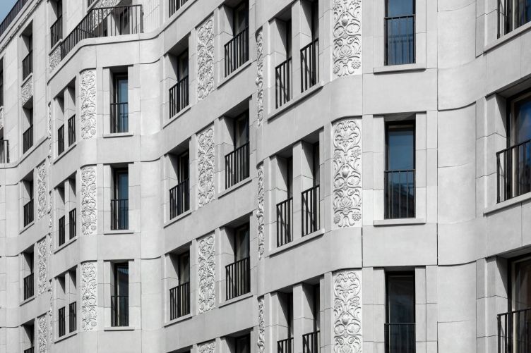
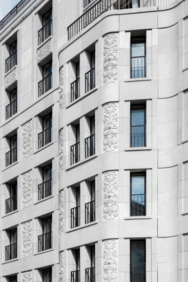
The outer building features a highly developed plastique with bay windows, characteristic of St. Petersburg houses. The inner building, which overlooks a mini park is without bay windows, yet with the same pattern structure.

  • zooming
    Veren Place housing complex
    Copyright: Photograph © Dmitry Chebanenko
  • zooming
    Veren Place housing complex
    Copyright: Photograph © Dmitry Chebanenko


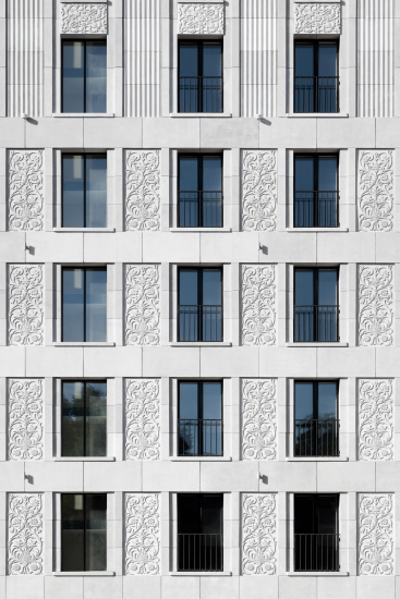
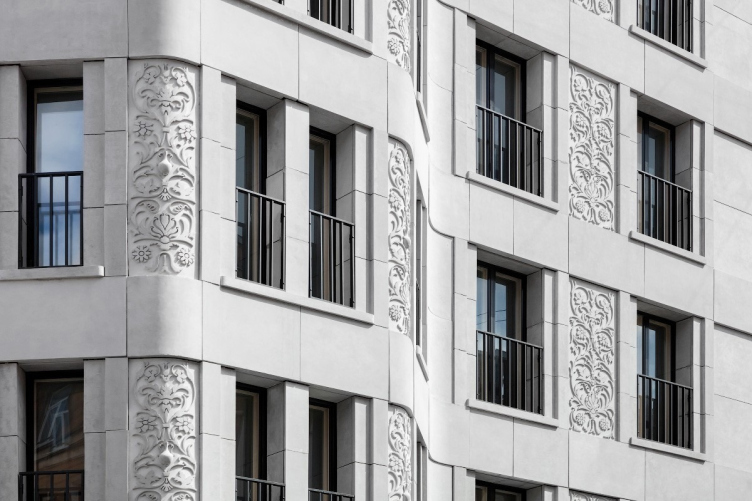
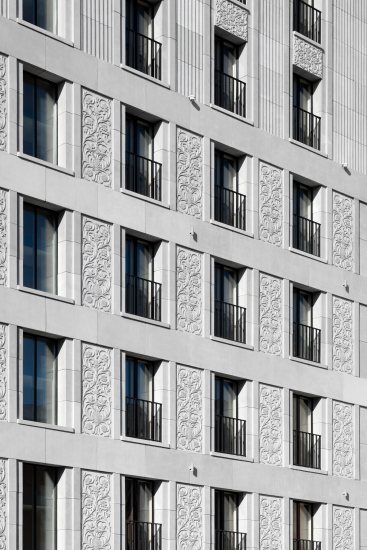
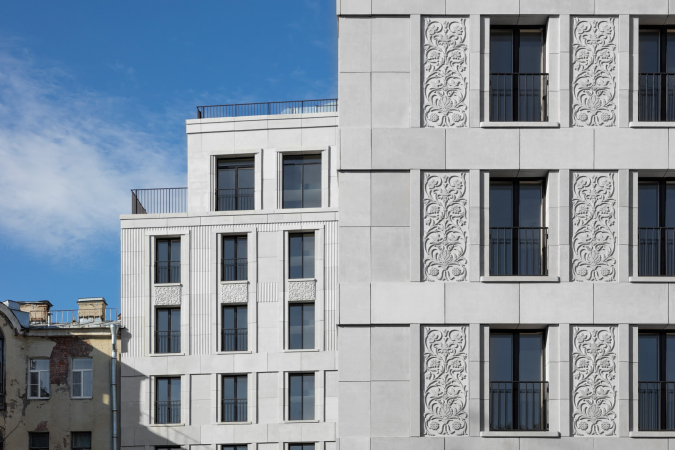
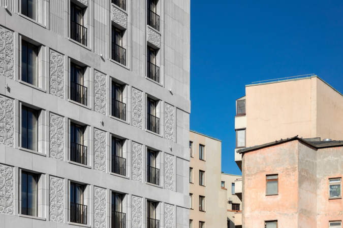
The traditional three-part vertical composition of the facades – bottom, middle and top (a basement floor, four mezzanine floors and two upper floors plus an attic) – is observed in both buildings. And, of course, another thing that they have in common is the ornaments on the piers. Here the architects used a musical principle: the overall form is subdivided into themes that sound and repeat, developing and changing slightly each time. Both grand facades are filled with details, while the yard facades are more reserved.

  • zooming
    1 / 3
    Veren Place housing complex
    Copyright: Photograph © Dmitry Chebanenko
  • zooming
    2 / 3
    Veren Place housing complex
    Copyright: Photograph © Dmitry Chebanenko
  • zooming
    3 / 3
    Veren Place housing complex
    Copyright: Photograph © Dmitry Chebanenko


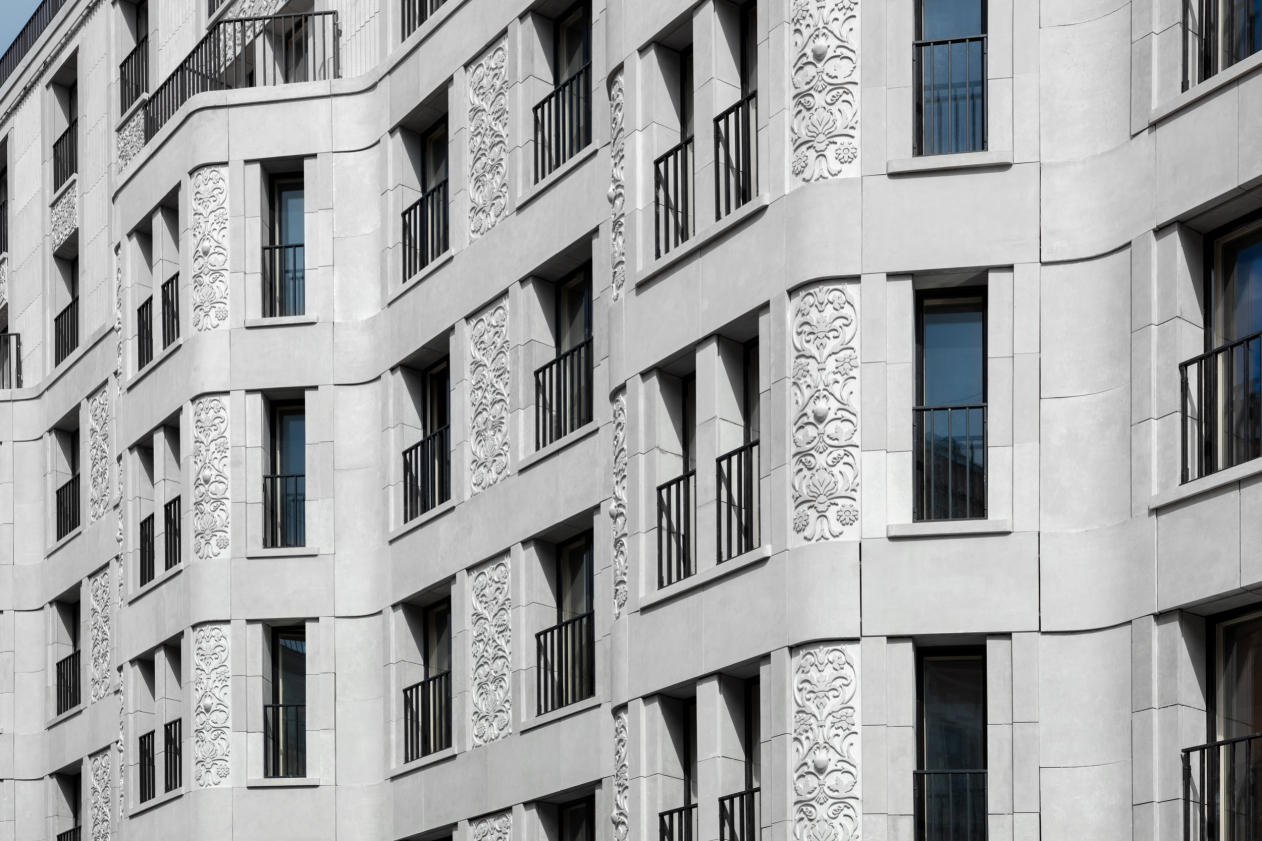
The main facade on the street side is organized by a large rhythm of three bay windows. The main thing, however, as was already said, is what this large form consists of, the themes and details. First of all, Veren Place politely bows to its neighbors. It is just as black and white as the house designed by Nikita Yavein (white top, black bottom), and it continues the wavy character of its neighbor in its trapeze-shaped bay windows, at the same time “calming it down” and bringing it to order. And the next tenement in line features bay windows on the corner that are even more austere and rectangular. The motif of two narrow windows that split the bay windows of Veren Place echoes the neighboring tenement as well. Such windows are characteristic for the Art Nouveau times; when they resurfaced in modern architecture, they took on a more austere shape. The other windows have a two-squares-side-by-side proportion, just like the windows of many other historical buildings in Saint Petersburg, the pleasant difference being that these are French windows reaching to the floor.

Veren Place housing complex
Copyright: Photograph © Dmitry Chebanenko


The traces of classical order architecture, even if visible at all, are latently present: Sergey Tchoban believes that the classics is akin to the Latin language – however beautiful it is, limiting yourself to classics alone is like cooking meals from just one ingredient. In the black “granite” (actually, fiber-concrete) plinth, only a hint of pilasters in grooved blades is left. The windows are separated by smooth horizontal bands, and in this particular context it does not make much difference whether the window rests on the band or the other way around, the band serving as the top framing for the window.

Veren Place housing complex
Copyright: Photograph © Dmitry Chebanenko


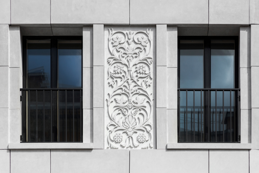
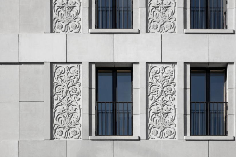
The design solution of the facade layers is indeed remarkable. On the one hand, the wall definitely has its plastique, layers, depth, and play of light and shade – all the qualities that a city house must possess to win people’s trust. On the other hand, it is not just an interpretation of the traditional wall. The layers are intertwined in a rather sophisticated way, making one want to examine them and take in the details. There is also a parallel with high fashion that occurred to me (with which Sergey Tchoban agreed), when it’s all only seemingly simple, but after you take a closer look, you find a lot of designer thought in there. For example, a simple black jacket features an unconventional construction – the lapel of the jacket goes into the pocket, as in a möbius strip: it was just an additional surface and suddenly became the main one. Accordingly, the facade of Veren Place has the wall level, and a level of frames superimposed on it: wide horizontal ribbons between the floors play the role of upper frames for windows (instead of a window casing), and vertical narrow rods become side frames (instead of pilasters). At the same time, these ribbons and molds are part of one surface, which divides the facade into cells. Some of the cells, spaced at regular intervals, have ornaments in them. The main surface of the wall, along with the molds, also flanks the windows. The outside window sills form yet another layer, which prominently stands out, accentuating the role of the windows upon the facade. As a result, one’s eye is always unraveling the riddle – where is the main surface, where is the secondary one, where is the protrusion, where is the depression, where is the background, and where is the frame. And this is just what Sergey Tchoban declares in his book: the human gaze must have something to hold on to. On the whole, what it ends up being is a shape that is harmonious and convincing. (Please read more about the efficiency of vertical windows in St. Petersburg in the interview).

  • zooming
    Veren Place housing complex
    Copyright: Photograph © Dmitry Chebanenko
  • zooming
    Veren Place housing complex
    Copyright: Photograph © Dmitry Chebanenko


The signature element of the building is the ornamental panel with florals, leaves, stars, and fruit (it is always worthwhile reminding the resident of a megalopolis about the Garden of Eden). A few types of repeating patterns in the piers look like “stone” carving, but in fact these are slabs of high-quality fiber-reinforced concrete about 5 cm thick, the depth of the ornament being 3 cm. In the comments and on social media people are discussing whether it is stone or not, which testifies to the creative success. The surface of the street part inherits the looks of the house at Granatny Lane, 8, which Sergey Tchoban designed back in 2008. In that house, the carved pattern covered the horizontals and verticals; the St. Petersburg house has more smooth surfaces, but the overall principle of ornaments, ribbons, and several layers, still holds.

  • zooming
    Veren Place housing complex
    Copyright: Photograph © Dmitry Chebanenko
  • zooming
    Veren Place housing complex
    Copyright: Photograph © Dmitry Chebanenko


I deliberately wrote about the semantics of the ornament, which is read by anyone, be that a kid or an old person, a man or a woman, a knowledgeable person or a layman, in a similar way. I have always been amazed at the sheer nerve of Adolf Loos, who more than a century ago denounced any ornament as an architectural atrocity and a sign of a savage, who is afraid of clean surfaces, despite the fact that magical protection is just one of the multiple meanings of the ornament, and not the most important nowadays, either. It is clear that there are other meanings – the connection to organic nature, flora and fauna symbols, the mathematical ratios within the rapport between the repeating patterns, and whatever else ornament may mean. Ornare means “to decorate” in Latin. Philosopher Hans Gadamer believes that the human need for decoration to be the source, and in some sense, the synonym of the beautiful. And in Greek, κοσμάτος (decorated) and κόσμος (order) are words that have the same root.

  • zooming
    1 / 4
    Veren Place housing complex
    Copyright: Photograph © Dmitry Chebanenko
  • zooming
    2 / 4
    Veren Place housing complex
    Copyright: Photograph © Dmitry Chebanenko
  • zooming
    3 / 4
    Veren Place housing complex
    Copyright: Photograph © Dmitry Chebanenko
  • zooming
    4 / 4
    Veren Place housing complex
    Copyright: Photograph © Dmitry Chebanenko


And it’s just great that Sergey Tchoban consistently implements his strategy. He proposes not just case-specific solutions but a whole new path that can be followed by many. Since the time “30:70” was written, his company completed such large-scale projects as Admiralteiskaya Sloboda in Kazan and a renovation bloc in Moscow’s Kuzminki. The recently completed architectural ensemble VTB Arena Park successfully combines Art Deco houses by Sergey Tchoban and modernist houses by Vladimir Plotkin, this being the perfect case of a common denominator for both styles: modernism with a tint of classics and Art Deco with a tint of modernism are brought together through the rhythm. According to Sergey Tchoban, it is the rhythm, and not the classical order details that produce this magical effect on the observer – and the observer ultimately is every person of this city, and not just the resident of this house. The duality of freedom of expression and order, felt in the colonnades, in the repeating ornaments, and in musical constructs, yields the desired magic of rhythm that heals the spirit and the eye. These qualities are a basis of the human perception of the city. But then again, it is the architecture of Sergey Tchoban that consistently revives the ornament, inscribing it into the logic of the modern facades: besides the “Byzantine House”, one can recall Wine House, the corner building at the crossroads of the Leningrad Highway and the Third Transport Ring, and the signature housing project “Tsarskaya Ploshchad”, where the blade pattern also borrows the motifs of the carving of the Teremny Palace of the Moscow Kremlin. 

In other words, ornamental facades by Sergey Tchoban can be already lined up in a whole new string, an individual narrative that the author has been developing for more than a decade as one of the directions of his work in search of new modern architecture, which would fit both a historical city and its resident. 

Veren Place is yet another step in this direction. It picks up the rhythm of the city that surrounds it, and embodies, on the one hand, traditionally, by maintaining the height and the rows, the sequence of bay windows and the classical logic of vertical arrangement. On the other hand, one must note that the house is very contemporary – to feel that, it is enough to take a look at the tenements across the street. In such opposition, the house does not even look as though it belongs with the “seventy percent” of the rank-and-file construction: in addition to respect for the context, modern construction in a historical center requires a rather high quality of execution and materials, as well as clear and crisp outlines. And this house – bright, based on the contrast between almost-white and black, dissected with partitions and ribbed “flutes”, yet at the same time “wrapped” in bay windows like in an ocean wave – does not in the least look like a replica of its neighbors, but rather presents a sum of modern technologies and the author’s beliefs about the conceptual and emotional value of the ornament. It is this specific role – that of a building that balances on the verge of modernist and historical St. Petersburg, and dictated, probably, not only by the proximity of a relatively new and a relatively old building – that this house plays best of all.

24 December 2020

Headlines now
The Golden Crown
The concept for a dental clinic in Yekaterinburg, developed by CNTR Studio, revolves around the idea of a “mouth full of gold”: pristine white porcelain stoneware walls are complemented by matte brass details. To avoid an overly literal interpretation, the architects focused on the building’s proportions, skillfully navigating between sunlight requirements and fire safety regulations.
Flexibility and Integration
Not long ago, we covered the project for the fourth phase of the ÁLIA residential complex, designed by APEX. Now, we’ve been shown different fence concepts they developed to enclose the complex’s private courtyards, incorporating a variety of public functions. We believe that the sheer fact that the complex’s architects were involved in such a detail as fencing speaks volumes.
A Step Forward
The HIDE residential complex represents a major milestone for ADM architects and their leaders Andrey Romanov and Ekaterina Kuznetsova in their quest for a fresh high-rise aesthetic – one that is flexible and layered, capable of bringing vibrancy to mass and silhouette while shaping form. Over recent years, this approach has become ADM’s “signature style”, with the golden HIDE tower playing a pivotal role in its evolution. Here, we delve into the project’s story, explore the details of the complex’s design, and uncover its core essence.
Gold in the Sands
A new office for a transcontinental company specializing in resource extraction and processing has opened in Dubai. Designed by T+T Architects, masters of creating spaces that are contemporary, diverse, flexible, and original, this project exemplifies their expertise. On the executive floor, a massive brass-clad partition dominates, while layered textures of compressed earth create a contextually resonant backdrop.
Layers and Levels of Flight
This project goes way back – Reserve Union won this architectural competition at the end of 2011, and the building was completed in 2018, so it’s practically “archival”. However, despite being relatively unknown, the building can hardly be considered “dated” and remains a prime example of architectural expression, particularly in the headquarters genre. And it’s especially fitting for an aviation company office. In some ways, it resembles the Aeroflot headquarters at Sheremetyevo but with its own unique identity, following the signature style of Vladimir Plotkin. In this article, we take an in-depth look at the United Aircraft Corporation (UAC) headquarters in the Moscow agglomeration town of Zhukovsky, supplemented by recent photographs from Alexey Naroditsky – a shoot that became only recently possible due to the fact that improvements were finally made in the surrounding area.
Light and Shadow
In this article, we delve into the architectural design of the “Chaika” house by DNK ag architects, which was recently completed in 2023 as part of the collection of signature designs at ZILArt. As is well-known, all the buildings in this complex follow a design code, yet each one is distinct. This particular building stands out not only for its whiteness and minimalism but also for the refined use of a limited number of techniques that, together, create what can confidently be called synergy.
Casus Novae
A master plan was developed for a large residential area with a name of “DNS City”, but now that its implementation began, the plan has been arbitrarily reformatted and replaced with something that, while similar on the surface, is actually quite different. This is not the first time such a thing happens, but it’s always frustrating. With permission from the author, we are sharing Maria Elkina’s post.
Treasure Hunting
The GAFA bureau, in collaboration with Tegola and Arkhitail, organized an expedition to the island of Kilpola in Karelia as part of Moskomarkhitektura’s “Open City” festival. There, amidst moss and rocks, the students sought answers to questions like: what is the sacred, where does it dwell, and what sustains it? Assisting the participants in this quest were landscape engineer Evgeny Levin, artist Nicholas Roerich, a moose, and the lack of cellular connection. Here’s how the story unfolded.
Depths of the Earth, Streams of Water
In the Malaya Okhta district, the Akzent building, designed by Stepan Liphart, was constructed. It follows a classic tripartite structure, yet it’s what you might call “hand-drawn”: each façade is unique in its form and details, some of which aren’t immediately noticeable. In this article, we explore the context and, together with the architect, delve into how the form was developed.
Fir Tree Dynamics
The “Airports of Region” holding is planning to build an airport in Karachay-Cherkessia, aiming to make the Arkhyz and Dombay resorts more accessible to travelers. The project that won in an invitation-only competition, submitted by Sergey Nikeshkin’s KPLN, blends natural imagery inspired by the shape of a conifer seed, open-air waiting spaces, majestic large trees, and a green roof elevated on needle-like columns. The result is both nature-inspired and WOW.
​A Brick Shell
In the process of designing a clubhouse situated among pine trees in a prestigious suburban area near Moscow, the architectural firm “A.Len” did the façade design part. The combination of different types of brick and masonry correlates with the volumetric and plastique solutions, further enhanced by the inclusion of wood-painted fragments and metal “glazing”.
Word Forms
ATRIUM architects love ambitious challenges, and for the firm’s thirtieth anniversary, they boldly play a game of words with an exhibition that dives deep into a self-created vocabulary. They immerse their projects – especially art installations – into this glossary, as if plunging into a current of their own. You feel as if you’re flowing through the veins of pure art, immersed in a universe of vertical cities, educational spaces – of which the architects are true masters – and the cultural codes of various locations. But what truly captivates is the bold statement that Vera Butko and Anton Nadtochy make, both through their work and this exhibition: architecture, above all, is art – the art of working with form and space.
Flexibility and Acuteness of Modernity
Luxurious, fluid, large “kokoshniks” and spiral barrel columns, as if made from colorful chewing gum: there seem to be no other mansion like this in Moscow, designed in the “Neo-Russian-Modern” style. And the “Teremok” on Malaya Kaluzhskaya, previously somewhat obscure, has “come alive with new colors” and gained visibility after its restoration for the office of the “architectural ecosystem” as the architects love to call themselves. It’s evident that Julius Borisov and the architects at UNK put their hearts into finding this new office and bringing it up to date. Let’s delve into the paradoxes of this mansion’s history and its plasticity. Spoiler: two versions of modernity meet here, both balancing on the razor’s edge of “what’s current”.
Yuri Vissarionov: “A modular house does not belong to the land”
It belongs to space, or to the air... It turns out that 3D printing is more effective when combined with a modular approach: the house is built in a workshop and then adapted to the site, including on uneven terrain. Yuri Vissarionov shares his latest experience in designing tourist complexes, both in central Russia and in the south. These include houseboats, homes printed from lightweight concrete using a 3D printer, and, of course, frame houses.
​Moscow’s First
“The quality of education largely depends on the quality of the educational environment”. This principle of the last decade has been realized by Sergey Skuratov in the project for the First Moscow Gymnasium on Rostovskaya Embankment in the Khamovniki district. The building seamlessly integrates into the complex urban landscape, responding both to the pedestrian flow of the city and the quiet alleyways. It skillfully takes advantage of the height differences and aligns with modern trends in educational space design. Let’s take a closer look.
Looking at the Water
The site of Villa Sonata stretches from the road to the water’s edge, offering its own shoreline, pier, and a picturesque river panorama. To reveal these sweeping views, Roman Leonidov “cut” the façade diagonally parallel to the river, thus getting two main axes for the house and, consequently, “two heads”. The internal core – two double-height spaces, a living room and a conservatory, with a “bridge” above them – makes the house both “transparent” and filled with light.
The White Wing
Well, it’s not exactly white. It’s more of a beige, white-stone structure that plays with the color of limestone – smoother surfaces are lighter, while rougher ones are darker. This wing unites various elements: it absorbs and interprets the surrounding themes. It responds to everything, yet maintains a cohesive expression – a challenging task! – while also incorporating recognizable features of its own, such as the dynamic cuts at the bottom, top, and middle.
Urban Dunes
The XSA Ramps team designed and built a three-part sports hub for a park in Rostov-on-Don, welcoming people of all ages and fitness levels. The skate plaza, pump track, and playground are all meticulously crafted with details that attract a diverse range of visitors. The technical execution of the shapes and slopes transforms this space into a kind of sculptural composition.
Proportional Growth
The project for the fourth phase of the ÁLIA residential area has been announced. The buildings are situated on an elongated plot – almost a “ray” that shoots out from the center of the area towards the river. Their layout reflects both a response to Moscow’s architectural preferences over the past 15 years, shifting “from blocks to towers”, and an interpretation of the neighboring business park designed by SOM. Additionally, the best apartments here are not located at the very top but closer to the middle, forming a glowing “waistline”.
The “Staircase” Building
In designing the “Details” residential complex in New Moscow, Rais Baishev spiced up the now-popular Moscow theme of a “courtyard” building with an idea drawn from the surrealist drawings by Maurits Escher. He envisioned the stepped silhouettes and descending slopes as a metaphysical mega-staircase, creating a key void within the courtyard that gave the project an internal “spine”. This concept is felt both in the building’s silhouette and on its façades.
Projection of the Quarter
No one doubted that the building that Vladimir Plotkin designed as part of the “Garden Quarters” would be the most modernist of all. And it turned out just that way: while adhering to the common design code, the building successfully combines brick and white stone, rhythmically responding to the neighboring building designed by Ostozhenka, yet tactfully and persistently making a few statements of its own. This includes the projection of the ideal urban development composition “14–9–6”, which can be found right next door, mathematical calculations, including those for various types of terraces (and perhaps the only reminder of the Soviet past of the Kauchuk rubber factory!), and the white “cross-stitch” pattern of the façade grid.
Domus Aurea
In this issue, we examine the “Tessinsky-1” house, designed by Sergey Skuratov and completed in 2023. Located in the middle of the Serebryanicheskaya Embankment district, at the intersection of its main streets, this house assumes a sort of “nodal” role: it not only responds to everything around it and preserves many memories of the former EMA factory within itself, but it weaves all this into a newly directed pattern, reconciling bright “gold” and dark-colored brick, largely with the help of the new, modern-yet-archaic Columba brick, which, come to think about it, is the most precious element here.
The Chimney of Nikola-Lenivets
In this issue, we are examining the “Obelisk House” designed by KATARSIS and built for the Arkhstoyanie 2023 festival. However, it was only finished later on, and this is why we are examining it now. It seems to us that after the “Obelisk House” appeared in Nikola-Lenivets, a dialogue and a few inner connections appeared between the temporary structures built here. These houses no longer look like “accidental neighbors”, more of which below.
​Periscope by the Bay
The jury awarded the second place in the competition for a public and cultural center in Petropavlovsk-Kamchatsky to the companies GORA (“Mountain”) and M4. In the consortium’s proposal, the building resembles a sperm whale with a calf swimming next to it or a periscope, whose lenses capture the most spectacular views from the surrounding landscape.
From Arcs to Dolmens
While working on the competition project for Petropavlovsk-Kamchatsky, ASADOV Architects prioritized the value of the natural and urban environment, aiming to preserve the balance of the location while minimizing the resemblance of the volume that they designed to a “traditional building”. The task was challenging, and the architects created three versions, one of which having been developed after the competition, where their main proposal took third place. However, the point of interest here is not the competition result but the continuity of creative thinking.
Hide and Seek
The ID Moskovskiy house, designed by Stepan Liphart in St. Petersburg, in the courtyards near Moskovskiy Avenue beyond the Obvodny Canal and recently completed, is notable for several reasons. Firstly, it has been realized with considerable accuracy, which is particularly significant as this is the first building where the architect was responsible not only for the facades but also for the layouts, allowing for better integration between the two. On the other hand, this building is interesting as an example of the “germination” of new architecture in the city: it draws on the best examples from the neighborhood and becomes an improved and developed sum of ideas found by the architect in the surrounding context.
The Big Twelve
Yesterday, the winners of the Moscow Mayor’s Architecture Award were announced and honored. Let’s take a look at what was awarded and, in some cases, even critique this esteemed award. After all, there is always room for improvement, right?
Above the Golden Horn
The residential complex “Philosophy” designed by T+T architects in Vladivostok, is one of the new projects in the “Golubinaya Pad” area, changing its development philosophy (pun intended) from single houses to a comprehensive approach. The buildings are organized along public streets, varying in height and format, with one house even executed in gallery typology, featuring a cantilever leaning on an art object.
Nuanced Alternative
How can you rhyme a square and space? Easily! But to do so, you need to rhyme everything you can possibly think of: weave everything together, like in a tensegrity structure, and find your own optics too. The new exhibition at GES-2 does just that, offering its visitor a new perspective on the history of art spanning 150 years, infused with the hope for endless multiplicity of worlds and art histories. Read on to see how this is achieved and how the exhibition design by Evgeny Ace contributes to it.
Blinds for Ice
An ice arena has been constructed in Domodedovo based on a project by Yuri Vissarionov Architects. To prevent the long façade, a technical requirement for winter sports facilities, from appearing monotonous, the architects proposed the use of suspended structures with multidirectional slats. This design protects the ice from direct sunlight while giving the wall texture and detail.