По-русски

The Terraces of the Crystal Cape

Proposed by Nikita Yavein, the concept of a museum, educational, and memorial complex to be built in the city of Sevastopol avoids straightforward accents and over-the-top dramatics, interpreting the history of this place along with the specifics of its landscape, and joining the public space of the operated stairway and amphitheaters with an imposing monument.

23 December 2019
Object
mainImg
The memorial complex to the defenders of Sevastopol from the Nazi siege of 1941-1942 on the Crystal Cape was conceived as far back as in the early 1970’s; the history of its implementation was about forty years long; the city got back to the concept in the mid 2000’s, yet all they could do was build two Soviet monuments: “Bayonet and Sail”, commemorating the awarding of Sevastopol with the status of “hero city” (1977) and “Soldier and Sailor” (1971-2007). Then they started designing the buildings of the complex, and even the foundations were laid, but the project never was completed. The new design period started in 2017 – in the exact same spot, on the territory of the former Munition Factory 54, the city decided to build first, in addition to the memorial complex, an opera and ballet theater: for a while, a project by Coop Himmelb(l)au was widely discussed, yet Wolf Prix publicly announced that he would not do this project in the early 2019. Right about that time, the foundation “National Cultural Legacy” ordered another two projects, yet not of the opera and ballet complex, but rather museum-type, consisting of two parts: the memorial of Glory of Sevastopol (to be built west of the “Soldier and Sailor” sculpture), and a museum/educational complex (to be built on a large land plot lying south, behind the Kapitanskaya Street). Still later on, in the summer of 2019, yet another project came about, then the lineup of construction companies changed, and now the plans for the future development of this area are more than uncertain (unlike two similar museum/educational complexes of federal importance in Kaliningrad and Vladivostok). It is still a mystery how the situation with the Sevastopol complex will unfold.

The project by Studio 44 is one of those that were proposed in the beginning of 2019. The fact that this architectural company was invited came as no surprise: its portfolio includes such famous federal-scale projects as the reconstruction of Saint Petersburg’s building of Joint Staff for the Hermitage collection or the “Sirius” school in Sochi – the company successfully did quite a few projects of museums, as well as educational institutions, from schools to universities. On the one hand, the authors based their concept on their extensive knowledge of the specifics of the functional typology of the complex, and, on the other hand, they made it reflect the collective image of the classic Crimea seaside scenery, partially reviving the images of the old paintings, for example, the landscape of the Artillery Bay, painted in the middle of the XIX century by Carlo Bossoli, which the architects chose as the opening slide for their project presentation.

zooming
Carlo Bossoli. Sevastopol. Vew from the north side of the city. The 1850′s. The opening slide of the project
Copyright: public domain


Such an approach endows the project of the museum building with lyrical delicacy, which presents a sharp contrast with the recently adopted vector of the “natural” development of the Artillery Bay, where obelisks and monuments freely alternate with Turkish hotels (vivid examples of the latter are the housing complexes “Cristal Beach” and “Mys Khrustalny”, situated directly on the sea shore).


What Nikita Yavein’s project did was turn this extensive trend at a 90 degree angle, towards the search of town planning identity – which would probably be quite a good thing.

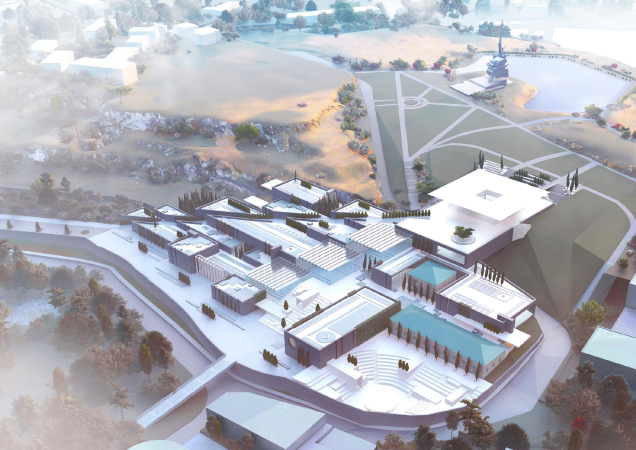
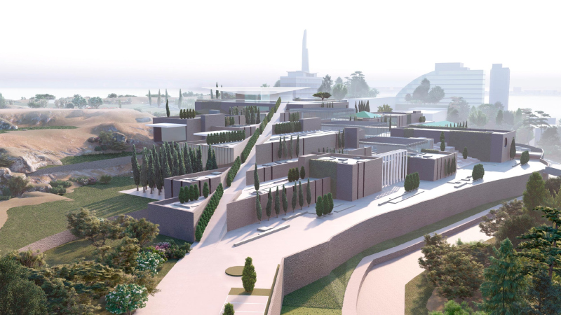
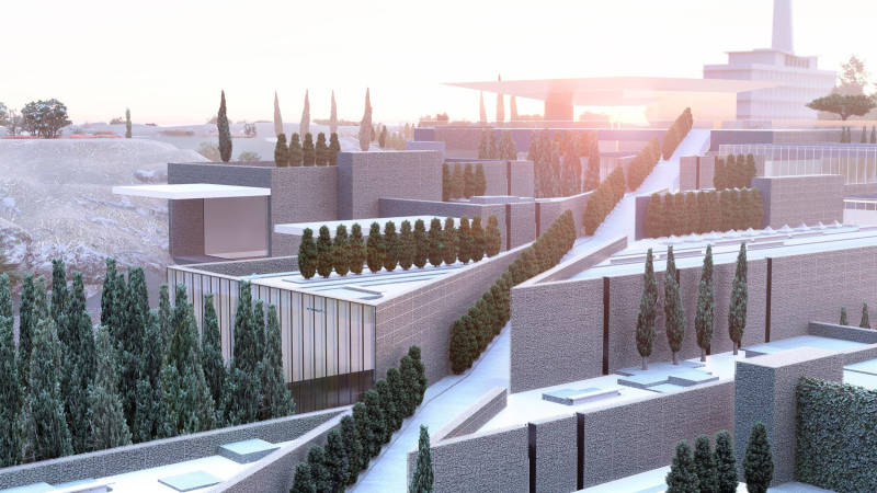
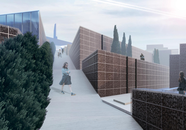
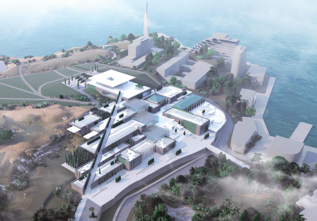
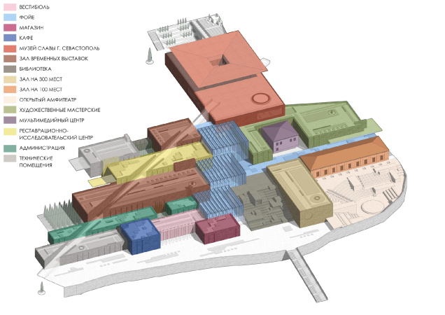
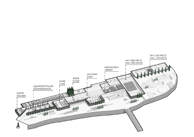
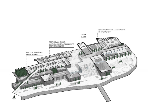
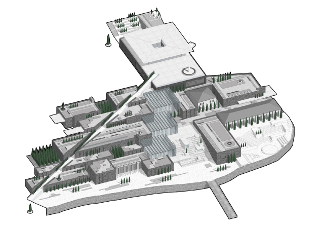
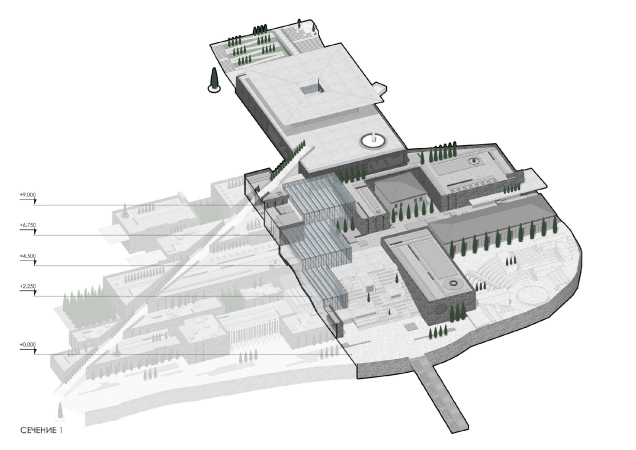
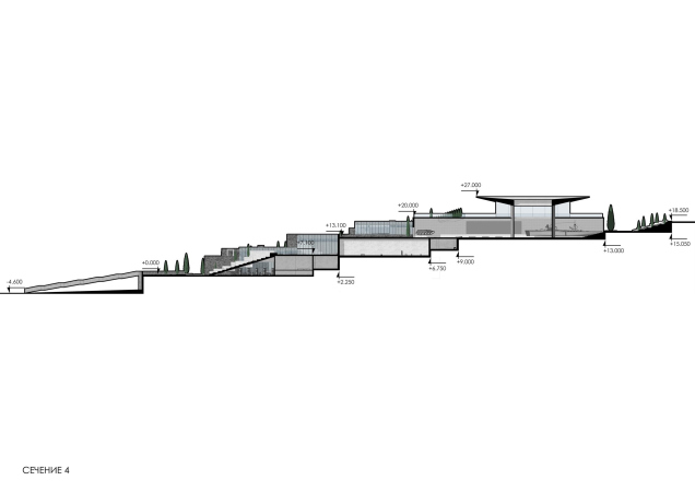
Some of the terraces already exist on the territory because it is situated on a hill with a height drop of about 15 meters, descending to the sea. The architects are keeping the retaining walls, reinforcing them with new ones, as well as adding mega-stairs of laconic volumes not more than two stories high. Each of these volumes performs a function of its own, and this conglomerate not only “looks” but also “works” as an independent town, in which each of the buildings, knit closely together, has its own task and its own size, conditioned both by its function and the surrounding terrain. The operated roofs will carry terraces gardens, meaning, the “town” will also be a park on a hill to a certain extent.

The museum and educational complex and the Museum of Fame of Sevastopol
Copyright: © Studio 44


The likeness to a city, which grows historically and gradually, is meant to be further enhanced by the two historical buildings of the barracks of the Menshikov Fort: originally, the project provided for keeping them intact, just as the remnants of the embrasured wall. Regretfully, during the past year, these buildings got torn down.

The historical and cultural survey
Copyright: © Studio 44


However, we will remind you at this point that the project only provided for preserving the historical buildings; from the visualizations, one can see that their roofs are hipped, with four sloping surfaces, the roofs of all of the other buildings being flat. The project is also generally connected with the history of the place. This history, of course, is of the warfare kind because from the earliest times the shore of Sevastopol chiefly consisted of fortifications, the remnants of many of which are still to be seen, and, let’s say, it will be a great thing if they survive into the future... Besides the Menshikov Fort, on the other side of the bay, there are the remnants of the Seventh Battery with its stone breastwork, and the arsenal cistern sunken into the ground – the architects are proposing to do archaeological excavations here, then hand over the discovered remnants to the museum, and tie them in with the educational complex, making yet another entrance from the seaside. This way, the museum complex begins to look like a southern seaside town, grown upon the old fortifications, and mastering the remnants of the fieldwork – something akin to the “imputed” plot, a technique that is popular nowadays; and, although the fortifications are by no means medieval – as Nikita Yavein aptly put it, “Sevastopol is a city that has been many times destroyed” – the end image does look like some Greek town on the Venetian bastions in the middle of the Mediterranean Sea. Because essentially this is one and the same culture; Sevastopol started its history as a colony of the Ancient Greeks, and the land plot in question even has a fragment of the vineyards of Hersones, even though the center of the antique town is situated pretty far away from here.

The museum and educational complex and the Museum of Fame of Sevastopol
Copyright: © Studio 44


Meanwhile, in spite of all the similarities between the allusions and silhouettes, the architects are not at all trying to create a “waxwork” of an old seaside town. They achieve the desired measure of abstraction not only by using their own artistic vision, not devoid of megalithic collectiveness, but also thanks to the avant-garde theme, which naturally springs from the project task. It is planned (or was it planned? hard to say) that one of the “anchor” operators of the museum complex will be the XX century department of the State Tretyakov Gallery, the one that is on Moscow’s Krymsky Val Street, which contains the Malevich “Black Square” painting and other fine specimens of avant-garde art. Hence, the list of prototypes includes the Malevich’s Architecton, and a composition that interprets the plan of the complex in a distinctly suprematist key.

Left: the suprematist composition on the theme of the project. Right: Malevich′s Architecton
Copyright: © Studio 44


The avant-garde becomes a lens or maybe a melting pot that allows us to “digest” all of the Antique, Medieval, Renaissance, and other allusions, bring them to one common denominator and a terminal degree of generalization, without losing – surprisingly – a single theme. Widening the circle of associations, one would want to remember that Corbusier used to justify his flat roofs with, among other things, the aesthetics of a near-east town, looking like a scatter of laconic building blocks from an erector set, the antipode of the pristine and thought-out Renaissance town. The avant-garde artists, just like their predecessors in general, used to draw inspiration from slums, as opposed to the glamorous palaces of the city center, and from the ancient primitive culture; partially because of that, the theme of the city, being molded upon a hill, which can be traced to the V, or maybe even the X century AD, makes such a perfect match for the examples of avant-garde art in general, and Malevich in particular. However, for all its love for the primitive and for the people, the avant-garde art is acutely personal and individual – and this is why its methods allow the artist to not just follow the masses but govern them. Or at least this is what they are meant to be doing.


In our specific instance, this is exactly the case. Fine-tuning their tools and prototypes, thoroughly enumerated in the project book, the architects set the measure for: asymmetrical / geometrically predictable, vernacular / regular, antique / modern. All of this is united in the “architecton”, yet it still allows of various interpretations, and causes, come to think of it, a lot of emotion.

The museum and educational complex and the Museum of Fame of Sevastopol
Copyright: © Studio 44


For example, the amphitheater, sunken into the bottom part of the slope, looks here like a totally antique “neo-Greek” solution (not even Roman because it follows the line of the hill, and does not stand on sub-structures). And the next volume of the “hall for 300 seats” is saluting, composition-wise, to the Temple of Athena Nike on the Acropolis, which the authors also neatly included into the list of analogies, yet the large circular window at once reminds us about a lot of constructivist buildings, i.e. brings us back to avant-garde. Following this method of free analogies, it brings us to the project of reconstructing the power plant in the center of Pskov developed by Studio 44 in 2016; but then again, it must be said that the circular window, something like a conditional sum of Renaissance and avant-garde, is generally one of the favorite stylistic devices of Nikita Yavein’s, he even has one in his studio.

The museum and educational complex and the Museum of Fame of Sevastopol
Copyright: © Studio 44


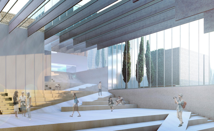
Before the hall with a circular window, the amphitheater gets rounded, but on the other side, along the Park of the 300th Anniversary of the Russian Fleet, it is continued by yet another one, stretched in a straight line. And, while the first one overlooks the bay, the second one is more focused in the direction of the city center and the Mayakovskogo Street ending here, whose axis, even if with a breakdown, is still pointed at the Vladimirsky Cathedral before the park with a monument to Lenin. In a word, this entrance, the one from the city side, is probably the main one; the amphitheater functions as the grand staircase of the museum, the only difference being that you can recline on it to watch the sunset. The stairs of both amphitheater’s are at times interrupted by asymmetric inclusions of the volumes that liven up the predictability of the ascent: as if this place got a fair share of chaotic outlaw construction, even though some of the parallelepipeds have stained glass windows: they lighten up the library situated behind the benches of the central amphitheater.

The museum and educational complex and the Museum of Fame of Sevastopol
Copyright: © Studio 44


Left and right of the dark closed volumes, appears a very light white portico before the glass entrance to the main lobby – actually, this is the official main entrance, with a cafe and the museum’s souvenir shop flanking it from the sides. From the foyer, the main staircase starts: it is covered by a succession of three striped glass volumes, diagonally ascending towards the memorial. The architects call this large roofed staircase “habitable”, and reserve for it the role of a large museum foyer, treating it as the main public space that unites the entire complex. The central amphitheater with a library inside is also nearby. Together, they look like the Hermitage staircase in the Joint Staff, which also serves for recreational activities and various events – but here the idea was even further developed, getting more space on the slope.

From the opposite side, the striped glass of the three volumes that cover the staircase emphasizes the contemporary design of the complex, slightly softening the brutalist look of the complex, often dull, designed in the image of retaining walls, and sometimes really growing from them. The main staircase – broad and spacious, covered in specks of sunlight – is essentially a hyper-pergola. Its crystal insert makes a perfect match for the name of the cape.

  • zooming
    1 / 3
    The museum and educational complex and the Museum of Fame of Sevastopol
    Copyright: © Studio 44
  • zooming
    2 / 3
    The museum and educational complex and the Museum of Fame of Sevastopol
    Copyright: © Studio 44
  • zooming
    3 / 3
    The museum and educational complex and the Museum of Fame of Sevastopol
    Copyright: © Studio 44


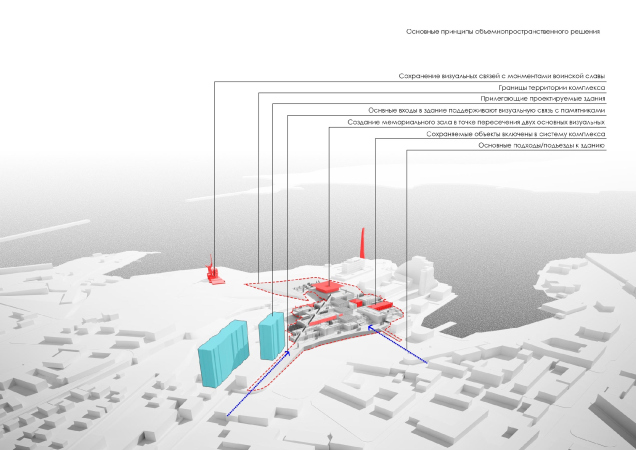
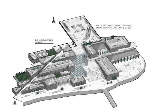
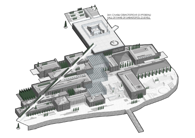
The other main staircase – conversely sharp and determined, like a spike or a rapier – leads from the south corner (and from the city’s central market) directly upwards, to the Sevastopol Hall of Fame, the silhouette of the “Bayonet and Sail” monument lurking in the distance.

This is an alternative direction and another connection to the city: on the imagery “avant-garde” master plan it looks like a long diagonal plaque. The “calm, cool, and collected” diagonal staircase can be interpreted as the Walk of Fame of sorts, implying the concentrated movement of ascent or descent, unlike the broad movement of the main staircase – the public space.

  • zooming
    1 / 4
    The museum and educational complex and the Museum of Fame of Sevastopol
    Copyright: © Studio 44
  • zooming
    2 / 4
    The museum and educational complex and the Museum of Fame of Sevastopol
    Copyright: © Studio 44
  • zooming
    3 / 4
    The museum and educational complex and the Museum of Fame of Sevastopol
    Copyright: © Studio 44
  • zooming
    4 / 4
    The museum and educational complex and the Museum of Fame of Sevastopol
    Copyright: © Studio 44


Actually, the Hall of Fame is quite a laconic construction that crowns the hill. It looks megalomaniac, yet at the same time lightweight, not soaring upwards but, as Nikita Yavein stressed, calmly occupying its place; it simply is. The four large pylons surrounded by a barely palpable contour of glass walls carry the “awning” roof with a skylight in its middle – something like an oculus or maybe a compluvium; together, the whole composition looks like a giant cup.

The hall becomes a logical continuation of the educational and museum center – its symmetry easily summarizes and balances out the conglomerate of the structures standing on the slopes, like the main temple of the ancient city would have.

The museum and educational complex and the Museum of Fame of Sevastopol
Copyright: © Studio 44


Yet, at the same time, the complex is also a park of sorts. One will be able to walk over the roofs of the volumes; strings of cypresses alternate with garden spaces, very much like the Egyptian hypostyle halls. This environment is designed for peaceful contemplation.

The park is an important constituent element of the project, and the very fact that it is not added somewhere on the side but permeates the complex from end to end, on the one hand, is giving it a semblance to the Renaissance palaces, where, wandering around the halls and passages, you suddenly find yourself in a little garden on the roof of the second, and sometimes even the third floor: let’s take, for example, the Mantova Palazzo Gonzaga, not forgetting, at the same time, that the prototypes of Renaissance palaces are antique ones, while the later reminiscences of them were reflected in the Crimean Emperor’s palaces.

  • zooming
    1 / 11
    The functional zones
    Copyright: © Studio 44
  • zooming
    2 / 11
    The volumetric solution
    Copyright: © Studio 44
  • zooming
    3 / 11
    Axonometric plan at elevation 2.250. The museum and educational complex and the Museum of Fame of Sevastopol
    Copyright: © Studio 44
  • zooming
    4 / 11
    Axonometric plan at elevation 6.750. The museum and educational complex and the Museum of Fame of Sevastopol
    Copyright: © Studio 44
  • zooming
    5 / 11
    Axonometric plan at elevation 13.00. The museum and educational complex and the Museum of Fame of Sevastopol
    Copyright: © Studio 44
  • zooming
    6 / 11
    Axonometric plan at elevation 20.00. The museum and educational complex and the Museum of Fame of Sevastopol
    Copyright: © Studio 44
  • zooming
    7 / 11
    Axonometric view of the museum and exhibition complex
    Copyright: © Studio 44
  • zooming
    8 / 11
    Section view 1. The museum and educational complex and the Museum of Fame of Sevastopol
    Copyright: © Studio 44
  • zooming
    9 / 11
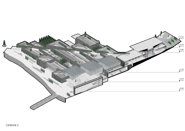
    Section view 2. The museum and educational complex and the Museum of Fame of Sevastopol
    Copyright: © Studio 44
  • zooming
    10 / 11
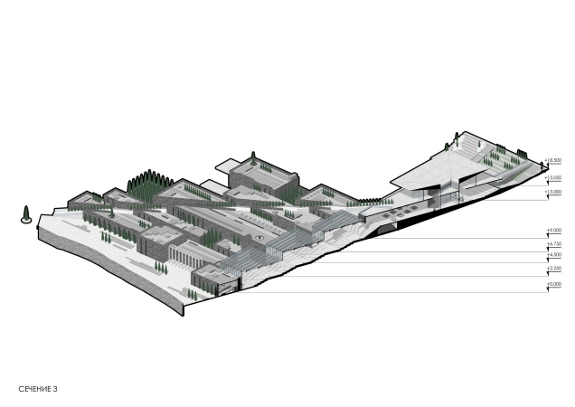
    Section view 3. The museum and educational complex and the Museum of Fame of Sevastopol
    Copyright: © Studio 44
  • zooming
    11 / 11
    Section view 4. The museum and educational complex and the Museum of Fame of Sevastopol
    Copyright: © Studio 44


On the one hand, the park constituent element, just as the public one, makes the project particularly relevant: the museum of avant-garde art, grown into the terraces park on the slope above the sea, comprising a whole number of functions meant to satisfy the tastes of all sorts of visitors, is as contemporary as it can ever get. And it’s also a great thing that contour-wise, and imminently, this version of contemporary architecture does not forget about its roots.

23 December 2019

Headlines now
The Golden Crown
The concept for a dental clinic in Yekaterinburg, developed by CNTR Studio, revolves around the idea of a “mouth full of gold”: pristine white porcelain stoneware walls are complemented by matte brass details. To avoid an overly literal interpretation, the architects focused on the building’s proportions, skillfully navigating between sunlight requirements and fire safety regulations.
Flexibility and Integration
Not long ago, we covered the project for the fourth phase of the ÁLIA residential complex, designed by APEX. Now, we’ve been shown different fence concepts they developed to enclose the complex’s private courtyards, incorporating a variety of public functions. We believe that the sheer fact that the complex’s architects were involved in such a detail as fencing speaks volumes.
A Step Forward
The HIDE residential complex represents a major milestone for ADM architects and their leaders Andrey Romanov and Ekaterina Kuznetsova in their quest for a fresh high-rise aesthetic – one that is flexible and layered, capable of bringing vibrancy to mass and silhouette while shaping form. Over recent years, this approach has become ADM’s “signature style”, with the golden HIDE tower playing a pivotal role in its evolution. Here, we delve into the project’s story, explore the details of the complex’s design, and uncover its core essence.
Gold in the Sands
A new office for a transcontinental company specializing in resource extraction and processing has opened in Dubai. Designed by T+T Architects, masters of creating spaces that are contemporary, diverse, flexible, and original, this project exemplifies their expertise. On the executive floor, a massive brass-clad partition dominates, while layered textures of compressed earth create a contextually resonant backdrop.
Layers and Levels of Flight
This project goes way back – Reserve Union won this architectural competition at the end of 2011, and the building was completed in 2018, so it’s practically “archival”. However, despite being relatively unknown, the building can hardly be considered “dated” and remains a prime example of architectural expression, particularly in the headquarters genre. And it’s especially fitting for an aviation company office. In some ways, it resembles the Aeroflot headquarters at Sheremetyevo but with its own unique identity, following the signature style of Vladimir Plotkin. In this article, we take an in-depth look at the United Aircraft Corporation (UAC) headquarters in the Moscow agglomeration town of Zhukovsky, supplemented by recent photographs from Alexey Naroditsky – a shoot that became only recently possible due to the fact that improvements were finally made in the surrounding area.
Light and Shadow
In this article, we delve into the architectural design of the “Chaika” house by DNK ag architects, which was recently completed in 2023 as part of the collection of signature designs at ZILArt. As is well-known, all the buildings in this complex follow a design code, yet each one is distinct. This particular building stands out not only for its whiteness and minimalism but also for the refined use of a limited number of techniques that, together, create what can confidently be called synergy.
Casus Novae
A master plan was developed for a large residential area with a name of “DNS City”, but now that its implementation began, the plan has been arbitrarily reformatted and replaced with something that, while similar on the surface, is actually quite different. This is not the first time such a thing happens, but it’s always frustrating. With permission from the author, we are sharing Maria Elkina’s post.
Treasure Hunting
The GAFA bureau, in collaboration with Tegola and Arkhitail, organized an expedition to the island of Kilpola in Karelia as part of Moskomarkhitektura’s “Open City” festival. There, amidst moss and rocks, the students sought answers to questions like: what is the sacred, where does it dwell, and what sustains it? Assisting the participants in this quest were landscape engineer Evgeny Levin, artist Nicholas Roerich, a moose, and the lack of cellular connection. Here’s how the story unfolded.
Depths of the Earth, Streams of Water
In the Malaya Okhta district, the Akzent building, designed by Stepan Liphart, was constructed. It follows a classic tripartite structure, yet it’s what you might call “hand-drawn”: each façade is unique in its form and details, some of which aren’t immediately noticeable. In this article, we explore the context and, together with the architect, delve into how the form was developed.
Fir Tree Dynamics
The “Airports of Region” holding is planning to build an airport in Karachay-Cherkessia, aiming to make the Arkhyz and Dombay resorts more accessible to travelers. The project that won in an invitation-only competition, submitted by Sergey Nikeshkin’s KPLN, blends natural imagery inspired by the shape of a conifer seed, open-air waiting spaces, majestic large trees, and a green roof elevated on needle-like columns. The result is both nature-inspired and WOW.
​A Brick Shell
In the process of designing a clubhouse situated among pine trees in a prestigious suburban area near Moscow, the architectural firm “A.Len” did the façade design part. The combination of different types of brick and masonry correlates with the volumetric and plastique solutions, further enhanced by the inclusion of wood-painted fragments and metal “glazing”.
Word Forms
ATRIUM architects love ambitious challenges, and for the firm’s thirtieth anniversary, they boldly play a game of words with an exhibition that dives deep into a self-created vocabulary. They immerse their projects – especially art installations – into this glossary, as if plunging into a current of their own. You feel as if you’re flowing through the veins of pure art, immersed in a universe of vertical cities, educational spaces – of which the architects are true masters – and the cultural codes of various locations. But what truly captivates is the bold statement that Vera Butko and Anton Nadtochy make, both through their work and this exhibition: architecture, above all, is art – the art of working with form and space.
Flexibility and Acuteness of Modernity
Luxurious, fluid, large “kokoshniks” and spiral barrel columns, as if made from colorful chewing gum: there seem to be no other mansion like this in Moscow, designed in the “Neo-Russian-Modern” style. And the “Teremok” on Malaya Kaluzhskaya, previously somewhat obscure, has “come alive with new colors” and gained visibility after its restoration for the office of the “architectural ecosystem” as the architects love to call themselves. It’s evident that Julius Borisov and the architects at UNK put their hearts into finding this new office and bringing it up to date. Let’s delve into the paradoxes of this mansion’s history and its plasticity. Spoiler: two versions of modernity meet here, both balancing on the razor’s edge of “what’s current”.
Yuri Vissarionov: “A modular house does not belong to the land”
It belongs to space, or to the air... It turns out that 3D printing is more effective when combined with a modular approach: the house is built in a workshop and then adapted to the site, including on uneven terrain. Yuri Vissarionov shares his latest experience in designing tourist complexes, both in central Russia and in the south. These include houseboats, homes printed from lightweight concrete using a 3D printer, and, of course, frame houses.
​Moscow’s First
“The quality of education largely depends on the quality of the educational environment”. This principle of the last decade has been realized by Sergey Skuratov in the project for the First Moscow Gymnasium on Rostovskaya Embankment in the Khamovniki district. The building seamlessly integrates into the complex urban landscape, responding both to the pedestrian flow of the city and the quiet alleyways. It skillfully takes advantage of the height differences and aligns with modern trends in educational space design. Let’s take a closer look.
Looking at the Water
The site of Villa Sonata stretches from the road to the water’s edge, offering its own shoreline, pier, and a picturesque river panorama. To reveal these sweeping views, Roman Leonidov “cut” the façade diagonally parallel to the river, thus getting two main axes for the house and, consequently, “two heads”. The internal core – two double-height spaces, a living room and a conservatory, with a “bridge” above them – makes the house both “transparent” and filled with light.
The White Wing
Well, it’s not exactly white. It’s more of a beige, white-stone structure that plays with the color of limestone – smoother surfaces are lighter, while rougher ones are darker. This wing unites various elements: it absorbs and interprets the surrounding themes. It responds to everything, yet maintains a cohesive expression – a challenging task! – while also incorporating recognizable features of its own, such as the dynamic cuts at the bottom, top, and middle.
Urban Dunes
The XSA Ramps team designed and built a three-part sports hub for a park in Rostov-on-Don, welcoming people of all ages and fitness levels. The skate plaza, pump track, and playground are all meticulously crafted with details that attract a diverse range of visitors. The technical execution of the shapes and slopes transforms this space into a kind of sculptural composition.
Proportional Growth
The project for the fourth phase of the ÁLIA residential area has been announced. The buildings are situated on an elongated plot – almost a “ray” that shoots out from the center of the area towards the river. Their layout reflects both a response to Moscow’s architectural preferences over the past 15 years, shifting “from blocks to towers”, and an interpretation of the neighboring business park designed by SOM. Additionally, the best apartments here are not located at the very top but closer to the middle, forming a glowing “waistline”.
The “Staircase” Building
In designing the “Details” residential complex in New Moscow, Rais Baishev spiced up the now-popular Moscow theme of a “courtyard” building with an idea drawn from the surrealist drawings by Maurits Escher. He envisioned the stepped silhouettes and descending slopes as a metaphysical mega-staircase, creating a key void within the courtyard that gave the project an internal “spine”. This concept is felt both in the building’s silhouette and on its façades.
Projection of the Quarter
No one doubted that the building that Vladimir Plotkin designed as part of the “Garden Quarters” would be the most modernist of all. And it turned out just that way: while adhering to the common design code, the building successfully combines brick and white stone, rhythmically responding to the neighboring building designed by Ostozhenka, yet tactfully and persistently making a few statements of its own. This includes the projection of the ideal urban development composition “14–9–6”, which can be found right next door, mathematical calculations, including those for various types of terraces (and perhaps the only reminder of the Soviet past of the Kauchuk rubber factory!), and the white “cross-stitch” pattern of the façade grid.
Domus Aurea
In this issue, we examine the “Tessinsky-1” house, designed by Sergey Skuratov and completed in 2023. Located in the middle of the Serebryanicheskaya Embankment district, at the intersection of its main streets, this house assumes a sort of “nodal” role: it not only responds to everything around it and preserves many memories of the former EMA factory within itself, but it weaves all this into a newly directed pattern, reconciling bright “gold” and dark-colored brick, largely with the help of the new, modern-yet-archaic Columba brick, which, come to think about it, is the most precious element here.
The Chimney of Nikola-Lenivets
In this issue, we are examining the “Obelisk House” designed by KATARSIS and built for the Arkhstoyanie 2023 festival. However, it was only finished later on, and this is why we are examining it now. It seems to us that after the “Obelisk House” appeared in Nikola-Lenivets, a dialogue and a few inner connections appeared between the temporary structures built here. These houses no longer look like “accidental neighbors”, more of which below.
​Periscope by the Bay
The jury awarded the second place in the competition for a public and cultural center in Petropavlovsk-Kamchatsky to the companies GORA (“Mountain”) and M4. In the consortium’s proposal, the building resembles a sperm whale with a calf swimming next to it or a periscope, whose lenses capture the most spectacular views from the surrounding landscape.
From Arcs to Dolmens
While working on the competition project for Petropavlovsk-Kamchatsky, ASADOV Architects prioritized the value of the natural and urban environment, aiming to preserve the balance of the location while minimizing the resemblance of the volume that they designed to a “traditional building”. The task was challenging, and the architects created three versions, one of which having been developed after the competition, where their main proposal took third place. However, the point of interest here is not the competition result but the continuity of creative thinking.
Hide and Seek
The ID Moskovskiy house, designed by Stepan Liphart in St. Petersburg, in the courtyards near Moskovskiy Avenue beyond the Obvodny Canal and recently completed, is notable for several reasons. Firstly, it has been realized with considerable accuracy, which is particularly significant as this is the first building where the architect was responsible not only for the facades but also for the layouts, allowing for better integration between the two. On the other hand, this building is interesting as an example of the “germination” of new architecture in the city: it draws on the best examples from the neighborhood and becomes an improved and developed sum of ideas found by the architect in the surrounding context.
The Big Twelve
Yesterday, the winners of the Moscow Mayor’s Architecture Award were announced and honored. Let’s take a look at what was awarded and, in some cases, even critique this esteemed award. After all, there is always room for improvement, right?
Above the Golden Horn
The residential complex “Philosophy” designed by T+T architects in Vladivostok, is one of the new projects in the “Golubinaya Pad” area, changing its development philosophy (pun intended) from single houses to a comprehensive approach. The buildings are organized along public streets, varying in height and format, with one house even executed in gallery typology, featuring a cantilever leaning on an art object.
Nuanced Alternative
How can you rhyme a square and space? Easily! But to do so, you need to rhyme everything you can possibly think of: weave everything together, like in a tensegrity structure, and find your own optics too. The new exhibition at GES-2 does just that, offering its visitor a new perspective on the history of art spanning 150 years, infused with the hope for endless multiplicity of worlds and art histories. Read on to see how this is achieved and how the exhibition design by Evgeny Ace contributes to it.
Blinds for Ice
An ice arena has been constructed in Domodedovo based on a project by Yuri Vissarionov Architects. To prevent the long façade, a technical requirement for winter sports facilities, from appearing monotonous, the architects proposed the use of suspended structures with multidirectional slats. This design protects the ice from direct sunlight while giving the wall texture and detail.