По-русски

Postindustrial Attraction

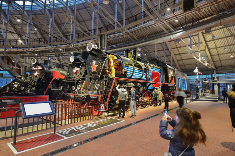
In the Russian Railway Museum, the architects of “Studio 44” were able to create a powerful and impressive space for a collection of more than a hundred of vintage steam engines and locomotives.

06 February 2018
Object
mainImg

The technical need

In a paradoxical way, this postindustrial epoch is leaving its mark on the urban construction and the mentality of the urban people. The industrial parks are falling into oblivion together with all of their infrastructural attributes to be replaced by the new market “leaders” – housing projects and public complexes that are in an acute need of locations close to the downtown area. And, while the city is ever more actively ousting its industrial facilities, its people start feeling a little bit nostalgic for their material and technical artifacts. The modern technologies and the ergonomic minimalist devices lack the rough, yet, at the same time, luxurious and even “arty and crafty” perfection of their predecessors created in those days when conquering yet another frontier of knowledge and inventing a new device was almost a miracle, and the use of their benefits gave people hope for the bright future for mankind. Around the world, technology museums enjoy great popularity, drawing crowds of children and adults alike by giving them an opportunity to take a few hours’ trip in time from the epoch of the first cast-iron tools to the future when they will be replaced by their polymer analogs. In Russia, this trend is only beginning to gain momentum. For seven years already, there has been going on the reconstruction of the Polytechnic Museum, which is meant to incorporate all of the latest museum techniques for showcasing machines and technologies. The VDNKH is soon opening the Space Museum. These are but some of the large-scale projects that are meant to satisfy Russians’ yearning for the technical heritage of the industrial era.

The Central Museum of the Oktyabrskaya Railway © Studio 44

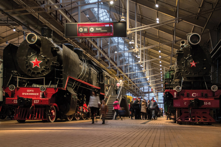
The project of the “Russian Railway Museum” is a vivid example of both trends: one of reforming industrial parks and the other of demand for educational formats for technical expositions. From the moment it was opened in November of 2017, the museum has been demonstrating a world-record turnout: it significantly exceeds the anticipated figures, thanks to which the exposition underwent an express test of being vandal-proof (not all of the exhibits came out unscathed, by the way). The record-breaking waiting lines of 10 thousand people a day only shrank when the museum announced the payable entry during the winter break.

The Central Museum of the Oktyabrskaya Railway © Studio 44


And as for the implementation of the museum project, it became possible thanks to a deal between the Russian Railways which own huge city territories occupied by railroad lines and railroad infrastructure projects all across the nation, and the developer company “Etalon Group”. The contract provided for handing a part of the land behind the Baltiysky Terminal over to the developer for the construction of “Galactica” housing complex, while in return Etalon Group would finance the construction of the railroad museum. Such a system of mutually beneficial exchange is rather common and has its pros and cons. Among the latter is the minimization of costs allotted by commercial companies for implementation of such “encumbrances” of their projects. To do “Etalon Group” justice, it must be said that the company, although it did not throw its money around, still did not take the mission of building this social and cultural project as some form of a tithe that you cannot avoid but you don’t have to pour your soul into.

The Central Museum of the Oktyabrskaya Railway © Studio 44


Between the tracks

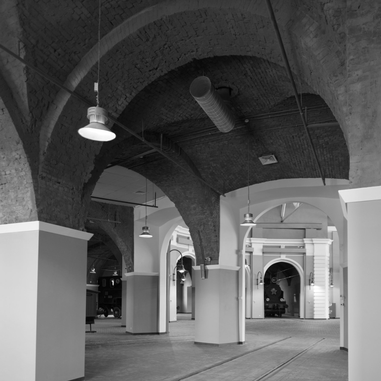
We already gave a detailed coverage of the Russian Railway Museum, which gives us an opportunity to limit ourselves to but a brief description of the main project solutions. The railroad museum has existed in Saint Petersburg since 1978, and over the last few years it has changed several locations, following the changes of the town planning and market policies. At the last turn in its history, which happened in 2012, the Russian Railways collection (which consists of a whopping hundred-plus locomotives and train cars of the XIX-XX centuries) was allotted a part of the territory of the former locomotive depot next to the Baltiysky railway station. When it was invited to design the museum, “Studio 44” proposed to keep intact the authentic depot, making it a part of the new exhibition complex.

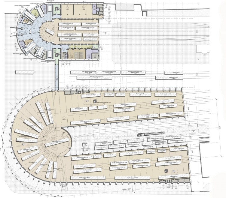
The Central Museum of the Oktyabrskaya Railway. Plan © Studio 44


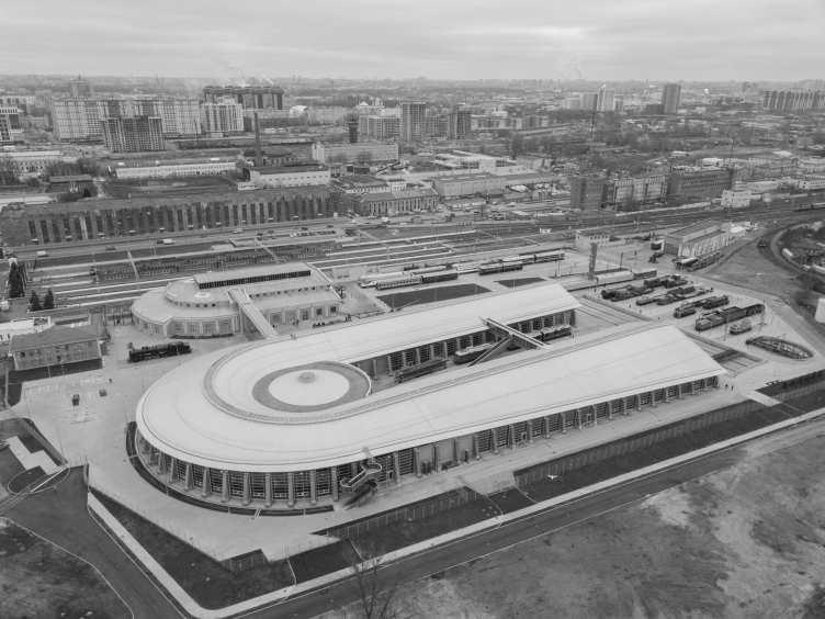
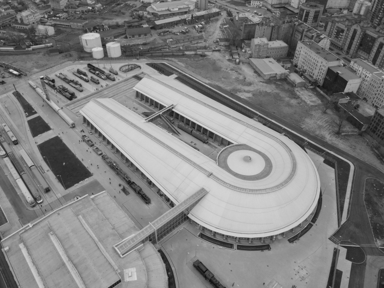
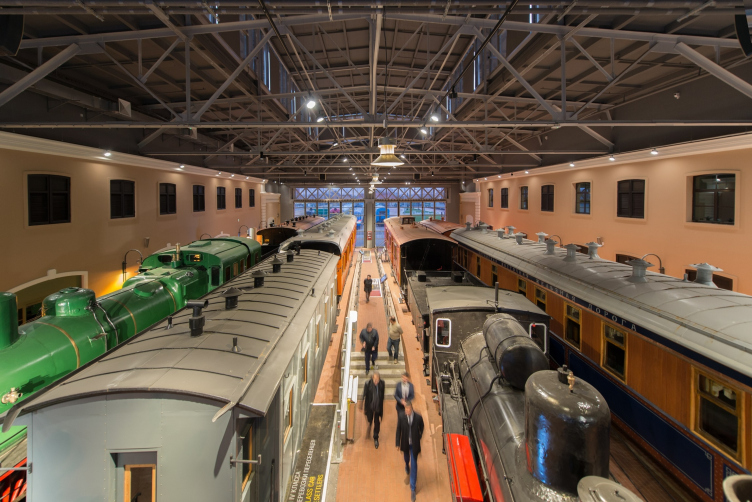
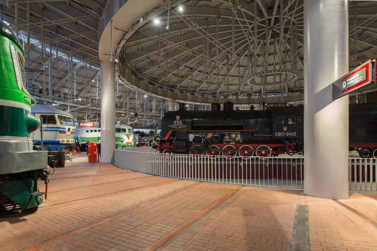
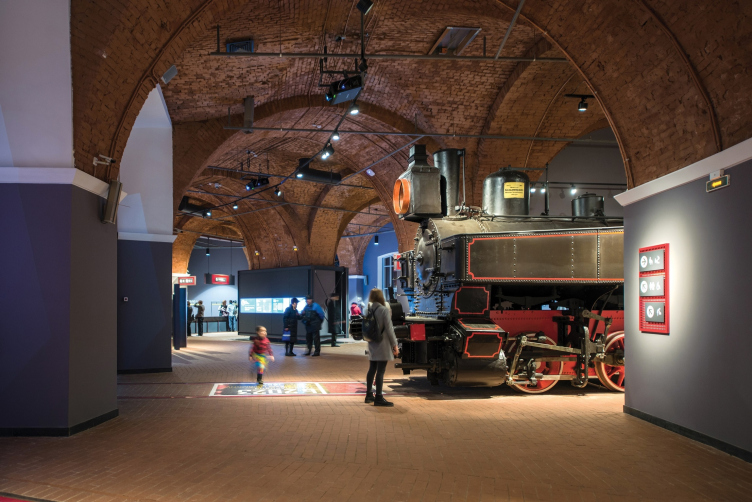
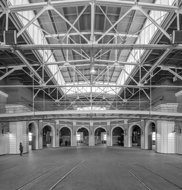
The structure of the old building – a hoof with a turntable in its center, equally suitable for the older functions and for solving the exhibition tasks – was repeated on a greater scale, where now most of the steam engine collection stands. As for the old building, it incorporates the service functions, such as a lobby, a café, a souvenir shop, a conference hall, a management section, and a few exhibition halls devoted to Russia's first railroads (Tsarskoselskaya, Warsaw-Wien, Saint Petersburg-Moscow, etc). And, as for the first floor of the depot, they will showcase the oldest exhibits, including the Stephenson steam engines.

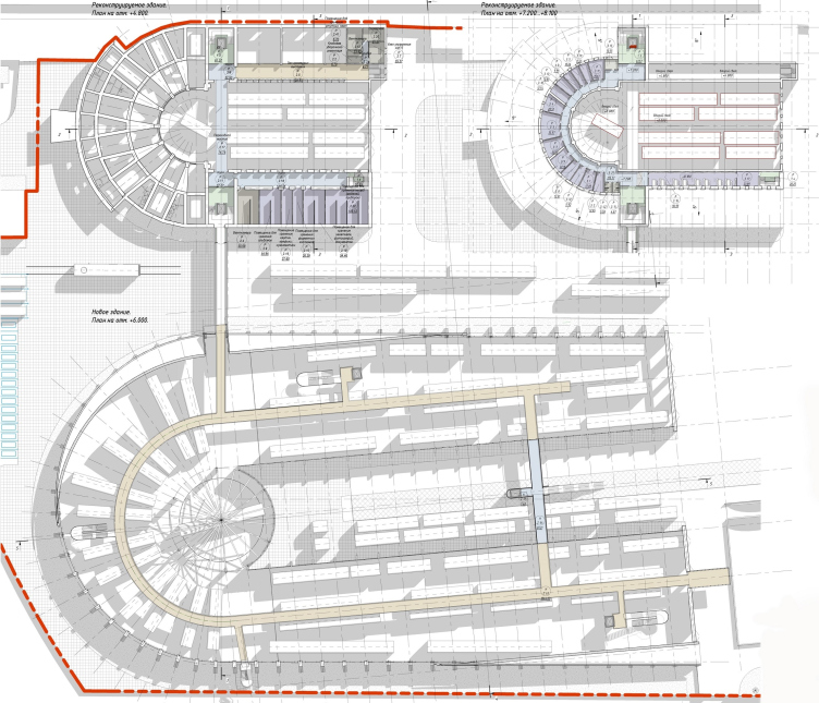
The Central Museum of the Oktyabrskaya Railway. Plan © Studio 44


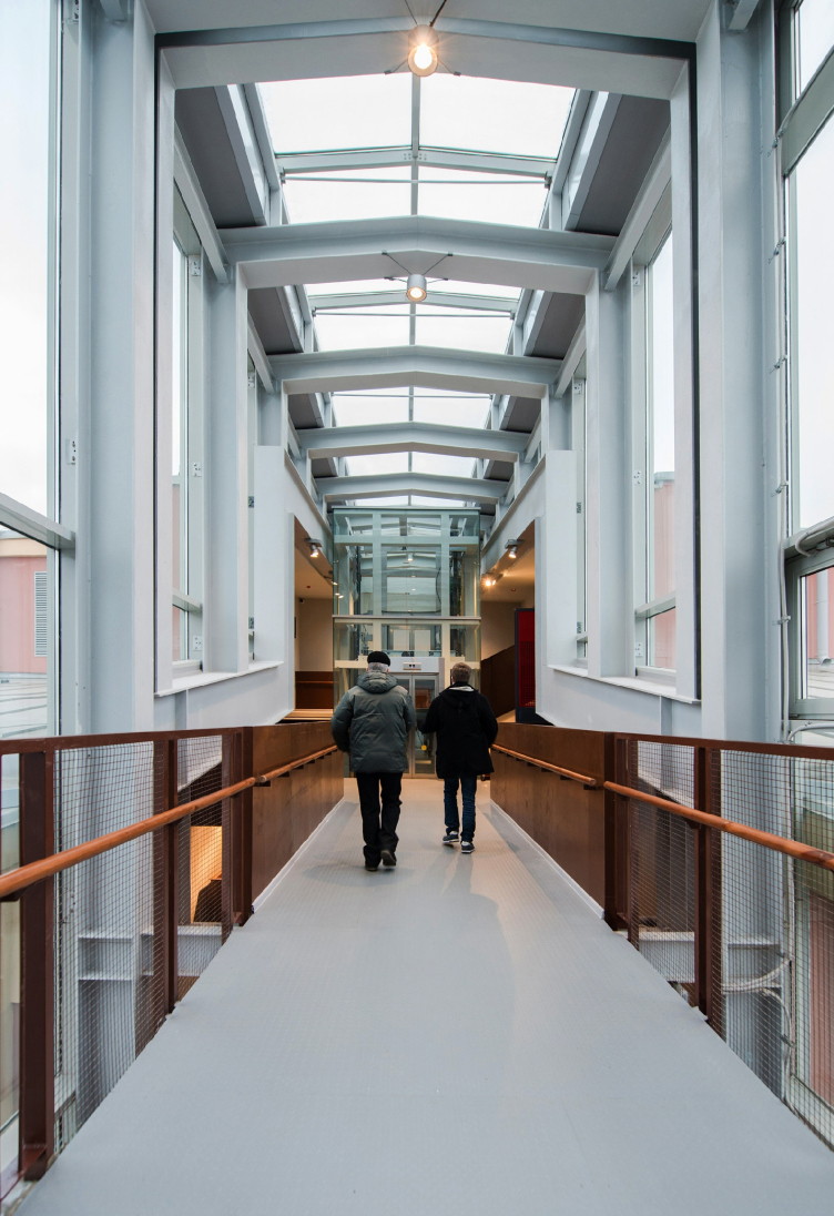
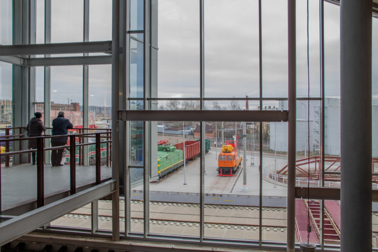
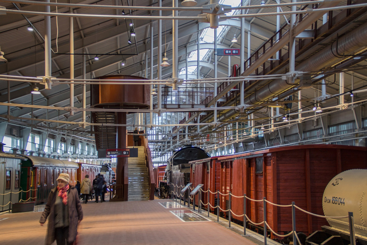
The two buildings are linked by a glass overpass running at the level of the second floor. The railroad tracks running between these two buildings also serve to demonstrate part of the collection that is impenetrable to the vagaries of the Saint Petersburg weather.

The Central Museum of the Oktyabrskaya Railway. The passage between the new and the old buildings © Studio 44


The Central Museum of the Oktyabrskaya Railway. The open-air exposition © Studio 44


Each of the elements of the museum ensemble and each fragment of its buildings is one way or another determined by the railroad specifics. At some places, you will see but a fleeting hint at the connection to the railroad theme, and you will have to look real hard in order unravel the mystery. For example, the design of the minor architectural forms of the museum uses railway sleepers, while the navigation posts are based on the rail profile. At some places, on the other hand, this interconnection is most direct, not to say strictly regulated. The museum is a structural subdivision of the Oktyabrskaya Railway, it formally belongs to the Russian Railways, and it is subject to the same system of rules and regulations, some of which have logical grounds, and some of which had to be taken as “givens”.

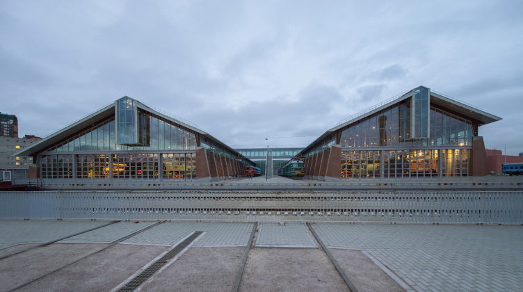
The former is represented by the problem of the railroad tracks direction. The thing is that the coordinate system of the preserved building and neighboring streets did not coincide with the direction of the railroad tracks, by which new “exhibits” would arrive to the museum. The difference was not that great – literally five degrees – but initially it looked insurmountable. Trains, just like chess pieces, can only move in a certain way, and the tracks can only make turns of one certain angle, namely, that of the railroad switch. “No "special technical conditions" reasoning or arguments that the new engines would arrive most frequently but once a year could solve this problem for us. We had two options to choose from. We either had to position the building diagonally – but then it would be unclear how to bring the locomotives to the old depot, turntables or special carts being of no help, or we could leave the complex standing within the coordinates of the street and the existing depot, and lay down the tracks at an angle, so that they would come to the corner of the new building. We chose the second option, and we ultimately came up with a very interesting "scheme"” – Nikita Yavein comments on one of the main challenges of the project and at the same time the main reason for the unusual design of the roof of the new building that became as much as the “visiting card” of the entire project.

zooming
The Central Museum of the Oktyabrskaya Railway © Studio 44


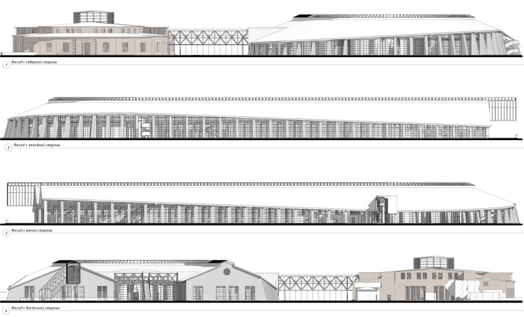
The Central Museum of the Oktyabrskaya Railway. Facades © Studio 44


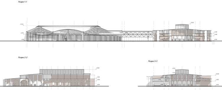
The Central Museum of the Oktyabrskaya Railway. Section view © Studio 44


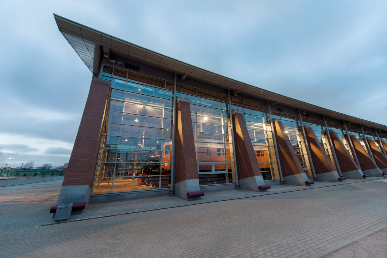
The crest of the double-pitched roof at the straight sections of the hoof-shaped building runs at an angle, which yields slanted slopes, while in the rounded part the roof forms a bold crease, enhanced by a row of triangular pylons standing outside the stained-glass window and supporting the whole upper structure.

The Central Museum of the Oktyabrskaya Railway. Pylons of the new building © Studio 44


The Central Museum of the Oktyabrskaya Railway. View of the new building from the transporter side © Studio 44


In order to distribute and arrange the “exhibits”, the architects had to install a transborder (also known as “traverser” or “transfer table”) in front of the new building that allows the locomotives and train cars to be moved sideways with the help of crosswise rails and special carts moving on them.

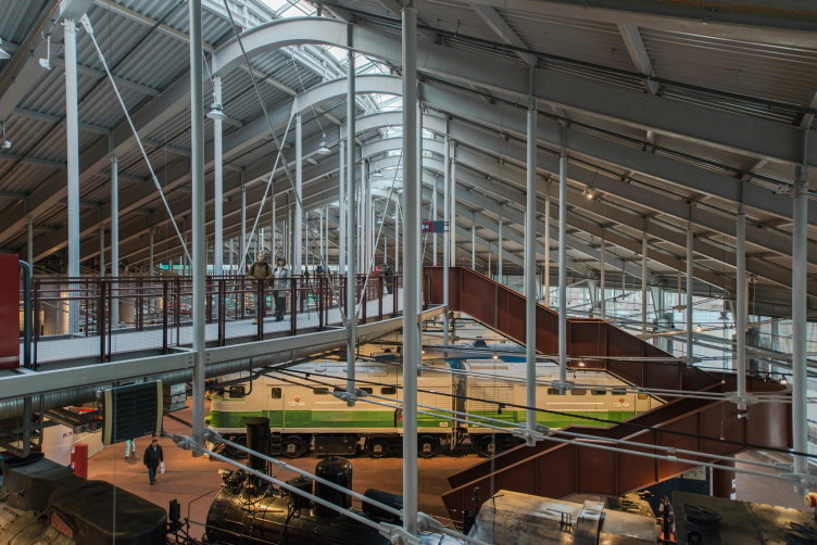
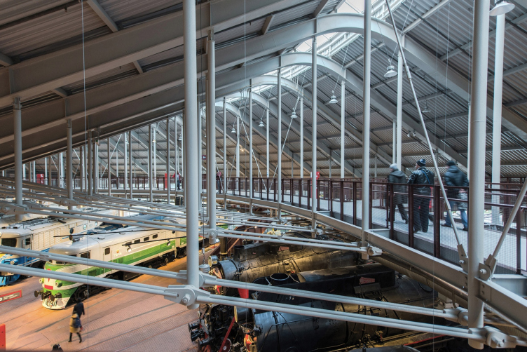
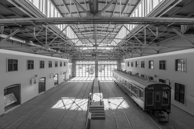
Such a dual system of coordinates and a slanted roof were necessary for creating, inside the new building, an extra viewing tier – a bridge-like structure running above the exhibits. The pedestrian bridges, together with the suspensions and trusses that fasten them to the large-span girders, are the indispensable part of the coverage structure that ensures its strength and rigidity. “These bridges do not just hang there – together with the girders, they are part of the bearing framework. If you take them out, the building will fall apart – Nikita Yavein explains – But what is still more important than their construction role is the fact that they make the coverage structure habitable”.

The Central Museum of the Oktyabrskaya Railway © Studio 44


The Central Museum of the Oktyabrskaya Railway. Interior of the reconstructed depot © Studio 44


In the first case, wandering among the rows of locomotives, a person quickly stops feeling like the “apex of creation”, wondering about the triumph of technical thought over the humanitarian values. But once you climb a little bit higher and cast your eye over the entire space of the main exhibition hall, you immediately recall getting acquainted with your first toy railway as a child, in which tracks would meander between model stations, you being the master of a small toy engine and a couple of cars. It’s funny but among all the photos made by amateurs and professionals alike the top angles enjoy particular popularity.

The Central Museum of the Oktyabrskaya Railway © Studio 44


The Central Museum of the Oktyabrskaya Railway. Interactive model of a steam engine © Studio 44


In addition to the therapeutic effect, the top tier shows to the best advantage the ingeniously designed space of the museum, as well as the merits of architectural and engineering solutions.

The Central Museum of the Oktyabrskaya Railway. The central turntable of the new building © Studio 44


The thorns of realization

The inner space of the museum is ruled by steam engines, locomotives and train cars. Their glossy multicolored bodies form a chaotic kaleidoscope-like picture, which, upon closer inspection, demonstrates a neatly organized sequence of the museum exposition (chronological as well as typological), filled with all the state-of-the-art tools for attracting and enchanting the young and grownup visitors.

The Central Museum of the Oktyabrskaya Railway. Exposition in the halls of the old depot © Studio 44


One should do justice to the exposition designers: they got real fancy and provided for options capable of satisfying the most demanding taste. Here you can take a close look at the models of the first steam engines and even put them in motion. Or look into the eyes of the transportation minister and examine the papers on his table. Next to the models, there is a real-life engine, only it is sliced lengthwise, thanks to which the visitors can examine the engine’s insides where the steam pushes the plungers that make the wheels spin. Here one will also see other simple and interactive exhibits that will evoke in each visitor thoughts about changing his or her career and becoming an engineer or at least a conductor of a long-distance train.

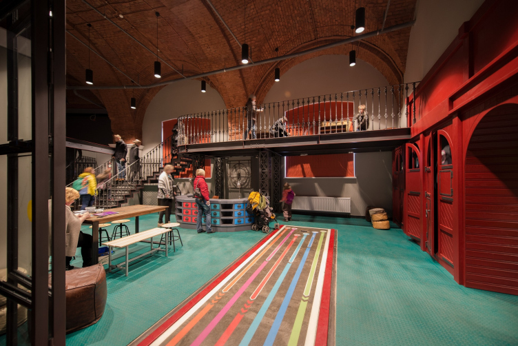
The Central Museum of the Oktyabrskaya Railway. Children's zone © Studio 44


Architecture is no match for such a powerful opponent, especially so if we are to consider the financing specifics of this project. Here’s how Nikita Yavein comments on the situation with the project implementation: “This museum is the first case in my practice when the implementation of the architectural and engineering part was financed almost in the same amount as the museum work itself. We had to work in the conditions of dire economic constraints in order to meet the budget of less than 1.5 B rubles, which, although this may sound like a lot of money, is not such a great amount for a 20 000 square meter project that also includes restoration of the historical building of the terminal”.

However, even in this situation one can easily see that a lion’s share of the exhibition's success belongs to the architects. The experience that “Studio 44” has in designing museum complexes and transport infrastructure projects helped the designers to address a lot of challenges while still in the concept stage, which allowed them to create an exposition of one of the best railway museums in Russia and the whole world. The thought-out planning, the two-tier system of viewing the exhibition, the optimum-style architectural and engineering solutions, which do not conflict with the brutalist exhibits but rather complement them - all of this was initially put into the project and then implemented with the best quality possible under these conditions.

Two in one

For an architectural firm, just as for any creative team, it is often difficult not to fall for the temptation of specialization. You do a successful project or two – and then you get a crowd of clients standing in line for getting a success guarantee, even if it comes at a price of sacrificing some of their identity. However, going beyond the framework of what’s offered is a risk that ultimately pays off in terms of greater creative freedom and new possibilities. 

The whole history of “Studio 44” can serve as an example of resisting the “specialty” temptation. Today, it's practically impossible to tell just what exactly the firm's specialty is about. Its portfolio includes tens, if not hundreds, of projects, many of which refer to reconstruction projects in a historical environment, but the portfolio is not limited to this specific kind – there are also town-planning concepts, housing projects, transportation infrastructure projects, cultural centers, museums, and whatnot. Such a broad range gives the team an advantage, letting it use the accumulated knowledge and combine the typologies in order to break beyond the limits of stereotypes.

The latter is exactly the case with the museum built upon the project by “Studio 44” for the Russian Railways in Saint Petersburg. In this project, the architects were able to combine their experience of designing railway terminals (in Saint Petersburg, Sochi, Tuapse, Astana and other cities) with the practice of developing concepts for such top-class museums as the Hermitage (the Joint Staff), the Museum of the Defense and Siege of Leningrad, and the Museum of the History of Kazakhstan.

The railroad infrastructure is a special genre that paradoxically combines the brutalism of the powerful structures and total submission to the laws of the tracks laid down once and for all with the inevitable literary and romantic connotations. And, in order to create the museum of a railway network, you need to let inside all of its power and all of its poetry, and then come up, based on a thought-out museum exposition scenario, with a just as powerful and bright architectural casing, capable of existing on a par with its contents and even enhancing the visitors” museum experience by giving them an opportunity to see the seemingly familiar world from a whole different angle.
The Central Museum of the Oktyabrskaya Railway © Studio 44

06 February 2018

Headlines now
Scheduled Evolution
ASADOV Architects unveiled the EvyCenter pavilion, a microcultural hub for fostering personal growth, organizing workshops, and doing gymnastics. Additionally, this pavilion serves as a prototype for a scalable country house, drawing inspiration from the “Loskutok” project, and constructed from CLT panels in a factory. This marks the beginning of a developer project initiated by the architectural firm (sic!), which is seeking partners to expand both small Evy settlements and even larger Evy cities, which are, according to Andrey Asadov, aimed at fostering the “evolutionary” development of the people who will inhabit them.
The Golden Crown
The concept for a dental clinic in Yekaterinburg, developed by CNTR Studio, revolves around the idea of a “mouth full of gold”: pristine white porcelain stoneware walls are complemented by matte brass details. To avoid an overly literal interpretation, the architects focused on the building’s proportions, skillfully navigating between sunlight requirements and fire safety regulations.
Flexibility and Integration
Not long ago, we covered the project for the fourth phase of the ÁLIA residential complex, designed by APEX. Now, we’ve been shown different fence concepts they developed to enclose the complex’s private courtyards, incorporating a variety of public functions. We believe that the sheer fact that the complex’s architects were involved in such a detail as fencing speaks volumes.
A Step Forward
The HIDE residential complex represents a major milestone for ADM architects and their leaders Andrey Romanov and Ekaterina Kuznetsova in their quest for a fresh high-rise aesthetic – one that is flexible and layered, capable of bringing vibrancy to mass and silhouette while shaping form. Over recent years, this approach has become ADM’s “signature style”, with the golden HIDE tower playing a pivotal role in its evolution. Here, we delve into the project’s story, explore the details of the complex’s design, and uncover its core essence.
Gold in the Sands
A new office for a transcontinental company specializing in resource extraction and processing has opened in Dubai. Designed by T+T Architects, masters of creating spaces that are contemporary, diverse, flexible, and original, this project exemplifies their expertise. On the executive floor, a massive brass-clad partition dominates, while layered textures of compressed earth create a contextually resonant backdrop.
Layers and Levels of Flight
This project goes way back – Reserve Union won this architectural competition at the end of 2011, and the building was completed in 2018, so it’s practically “archival”. However, despite being relatively unknown, the building can hardly be considered “dated” and remains a prime example of architectural expression, particularly in the headquarters genre. And it’s especially fitting for an aviation company office. In some ways, it resembles the Aeroflot headquarters at Sheremetyevo but with its own unique identity, following the signature style of Vladimir Plotkin. In this article, we take an in-depth look at the United Aircraft Corporation (UAC) headquarters in the Moscow agglomeration town of Zhukovsky, supplemented by recent photographs from Alexey Naroditsky – a shoot that became only recently possible due to the fact that improvements were finally made in the surrounding area.
Light and Shadow
In this article, we delve into the architectural design of the “Chaika” house by DNK ag architects, which was recently completed in 2023 as part of the collection of signature designs at ZILArt. As is well-known, all the buildings in this complex follow a design code, yet each one is distinct. This particular building stands out not only for its whiteness and minimalism but also for the refined use of a limited number of techniques that, together, create what can confidently be called synergy.
Casus Novae
A master plan was developed for a large residential area with a name of “DNS City”, but now that its implementation began, the plan has been arbitrarily reformatted and replaced with something that, while similar on the surface, is actually quite different. This is not the first time such a thing happens, but it’s always frustrating. With permission from the author, we are sharing Maria Elkina’s post.
Treasure Hunting
The GAFA bureau, in collaboration with Tegola and Arkhitail, organized an expedition to the island of Kilpola in Karelia as part of Moskomarkhitektura’s “Open City” festival. There, amidst moss and rocks, the students sought answers to questions like: what is the sacred, where does it dwell, and what sustains it? Assisting the participants in this quest were landscape engineer Evgeny Levin, artist Nicholas Roerich, a moose, and the lack of cellular connection. Here’s how the story unfolded.
Depths of the Earth, Streams of Water
In the Malaya Okhta district, the Akzent building, designed by Stepan Liphart, was constructed. It follows a classic tripartite structure, yet it’s what you might call “hand-drawn”: each façade is unique in its form and details, some of which aren’t immediately noticeable. In this article, we explore the context and, together with the architect, delve into how the form was developed.
Fir Tree Dynamics
The “Airports of Region” holding is planning to build an airport in Karachay-Cherkessia, aiming to make the Arkhyz and Dombay resorts more accessible to travelers. The project that won in an invitation-only competition, submitted by Sergey Nikeshkin’s KPLN, blends natural imagery inspired by the shape of a conifer seed, open-air waiting spaces, majestic large trees, and a green roof elevated on needle-like columns. The result is both nature-inspired and WOW.
​A Brick Shell
In the process of designing a clubhouse situated among pine trees in a prestigious suburban area near Moscow, the architectural firm “A.Len” did the façade design part. The combination of different types of brick and masonry correlates with the volumetric and plastique solutions, further enhanced by the inclusion of wood-painted fragments and metal “glazing”.
Word Forms
ATRIUM architects love ambitious challenges, and for the firm’s thirtieth anniversary, they boldly play a game of words with an exhibition that dives deep into a self-created vocabulary. They immerse their projects – especially art installations – into this glossary, as if plunging into a current of their own. You feel as if you’re flowing through the veins of pure art, immersed in a universe of vertical cities, educational spaces – of which the architects are true masters – and the cultural codes of various locations. But what truly captivates is the bold statement that Vera Butko and Anton Nadtochy make, both through their work and this exhibition: architecture, above all, is art – the art of working with form and space.
Flexibility and Acuteness of Modernity
Luxurious, fluid, large “kokoshniks” and spiral barrel columns, as if made from colorful chewing gum: there seem to be no other mansion like this in Moscow, designed in the “Neo-Russian-Modern” style. And the “Teremok” on Malaya Kaluzhskaya, previously somewhat obscure, has “come alive with new colors” and gained visibility after its restoration for the office of the “architectural ecosystem” as the architects love to call themselves. It’s evident that Julius Borisov and the architects at UNK put their hearts into finding this new office and bringing it up to date. Let’s delve into the paradoxes of this mansion’s history and its plasticity. Spoiler: two versions of modernity meet here, both balancing on the razor’s edge of “what’s current”.
Yuri Vissarionov: “A modular house does not belong to the land”
It belongs to space, or to the air... It turns out that 3D printing is more effective when combined with a modular approach: the house is built in a workshop and then adapted to the site, including on uneven terrain. Yuri Vissarionov shares his latest experience in designing tourist complexes, both in central Russia and in the south. These include houseboats, homes printed from lightweight concrete using a 3D printer, and, of course, frame houses.
​Moscow’s First
“The quality of education largely depends on the quality of the educational environment”. This principle of the last decade has been realized by Sergey Skuratov in the project for the First Moscow Gymnasium on Rostovskaya Embankment in the Khamovniki district. The building seamlessly integrates into the complex urban landscape, responding both to the pedestrian flow of the city and the quiet alleyways. It skillfully takes advantage of the height differences and aligns with modern trends in educational space design. Let’s take a closer look.
Looking at the Water
The site of Villa Sonata stretches from the road to the water’s edge, offering its own shoreline, pier, and a picturesque river panorama. To reveal these sweeping views, Roman Leonidov “cut” the façade diagonally parallel to the river, thus getting two main axes for the house and, consequently, “two heads”. The internal core – two double-height spaces, a living room and a conservatory, with a “bridge” above them – makes the house both “transparent” and filled with light.
The White Wing
Well, it’s not exactly white. It’s more of a beige, white-stone structure that plays with the color of limestone – smoother surfaces are lighter, while rougher ones are darker. This wing unites various elements: it absorbs and interprets the surrounding themes. It responds to everything, yet maintains a cohesive expression – a challenging task! – while also incorporating recognizable features of its own, such as the dynamic cuts at the bottom, top, and middle.
Urban Dunes
The XSA Ramps team designed and built a three-part sports hub for a park in Rostov-on-Don, welcoming people of all ages and fitness levels. The skate plaza, pump track, and playground are all meticulously crafted with details that attract a diverse range of visitors. The technical execution of the shapes and slopes transforms this space into a kind of sculptural composition.
Proportional Growth
The project for the fourth phase of the ÁLIA residential area has been announced. The buildings are situated on an elongated plot – almost a “ray” that shoots out from the center of the area towards the river. Their layout reflects both a response to Moscow’s architectural preferences over the past 15 years, shifting “from blocks to towers”, and an interpretation of the neighboring business park designed by SOM. Additionally, the best apartments here are not located at the very top but closer to the middle, forming a glowing “waistline”.
The “Staircase” Building
In designing the “Details” residential complex in New Moscow, Rais Baishev spiced up the now-popular Moscow theme of a “courtyard” building with an idea drawn from the surrealist drawings by Maurits Escher. He envisioned the stepped silhouettes and descending slopes as a metaphysical mega-staircase, creating a key void within the courtyard that gave the project an internal “spine”. This concept is felt both in the building’s silhouette and on its façades.
Projection of the Quarter
No one doubted that the building that Vladimir Plotkin designed as part of the “Garden Quarters” would be the most modernist of all. And it turned out just that way: while adhering to the common design code, the building successfully combines brick and white stone, rhythmically responding to the neighboring building designed by Ostozhenka, yet tactfully and persistently making a few statements of its own. This includes the projection of the ideal urban development composition “14–9–6”, which can be found right next door, mathematical calculations, including those for various types of terraces (and perhaps the only reminder of the Soviet past of the Kauchuk rubber factory!), and the white “cross-stitch” pattern of the façade grid.
Domus Aurea
In this issue, we examine the “Tessinsky-1” house, designed by Sergey Skuratov and completed in 2023. Located in the middle of the Serebryanicheskaya Embankment district, at the intersection of its main streets, this house assumes a sort of “nodal” role: it not only responds to everything around it and preserves many memories of the former EMA factory within itself, but it weaves all this into a newly directed pattern, reconciling bright “gold” and dark-colored brick, largely with the help of the new, modern-yet-archaic Columba brick, which, come to think about it, is the most precious element here.
The Chimney of Nikola-Lenivets
In this issue, we are examining the “Obelisk House” designed by KATARSIS and built for the Arkhstoyanie 2023 festival. However, it was only finished later on, and this is why we are examining it now. It seems to us that after the “Obelisk House” appeared in Nikola-Lenivets, a dialogue and a few inner connections appeared between the temporary structures built here. These houses no longer look like “accidental neighbors”, more of which below.
​Periscope by the Bay
The jury awarded the second place in the competition for a public and cultural center in Petropavlovsk-Kamchatsky to the companies GORA (“Mountain”) and M4. In the consortium’s proposal, the building resembles a sperm whale with a calf swimming next to it or a periscope, whose lenses capture the most spectacular views from the surrounding landscape.
From Arcs to Dolmens
While working on the competition project for Petropavlovsk-Kamchatsky, ASADOV Architects prioritized the value of the natural and urban environment, aiming to preserve the balance of the location while minimizing the resemblance of the volume that they designed to a “traditional building”. The task was challenging, and the architects created three versions, one of which having been developed after the competition, where their main proposal took third place. However, the point of interest here is not the competition result but the continuity of creative thinking.
Hide and Seek
The ID Moskovskiy house, designed by Stepan Liphart in St. Petersburg, in the courtyards near Moskovskiy Avenue beyond the Obvodny Canal and recently completed, is notable for several reasons. Firstly, it has been realized with considerable accuracy, which is particularly significant as this is the first building where the architect was responsible not only for the facades but also for the layouts, allowing for better integration between the two. On the other hand, this building is interesting as an example of the “germination” of new architecture in the city: it draws on the best examples from the neighborhood and becomes an improved and developed sum of ideas found by the architect in the surrounding context.
The Big Twelve
Yesterday, the winners of the Moscow Mayor’s Architecture Award were announced and honored. Let’s take a look at what was awarded and, in some cases, even critique this esteemed award. After all, there is always room for improvement, right?
Above the Golden Horn
The residential complex “Philosophy” designed by T+T architects in Vladivostok, is one of the new projects in the “Golubinaya Pad” area, changing its development philosophy (pun intended) from single houses to a comprehensive approach. The buildings are organized along public streets, varying in height and format, with one house even executed in gallery typology, featuring a cantilever leaning on an art object.
Nuanced Alternative
How can you rhyme a square and space? Easily! But to do so, you need to rhyme everything you can possibly think of: weave everything together, like in a tensegrity structure, and find your own optics too. The new exhibition at GES-2 does just that, offering its visitor a new perspective on the history of art spanning 150 years, infused with the hope for endless multiplicity of worlds and art histories. Read on to see how this is achieved and how the exhibition design by Evgeny Ace contributes to it.