По-русски

The Birth of a Crystal

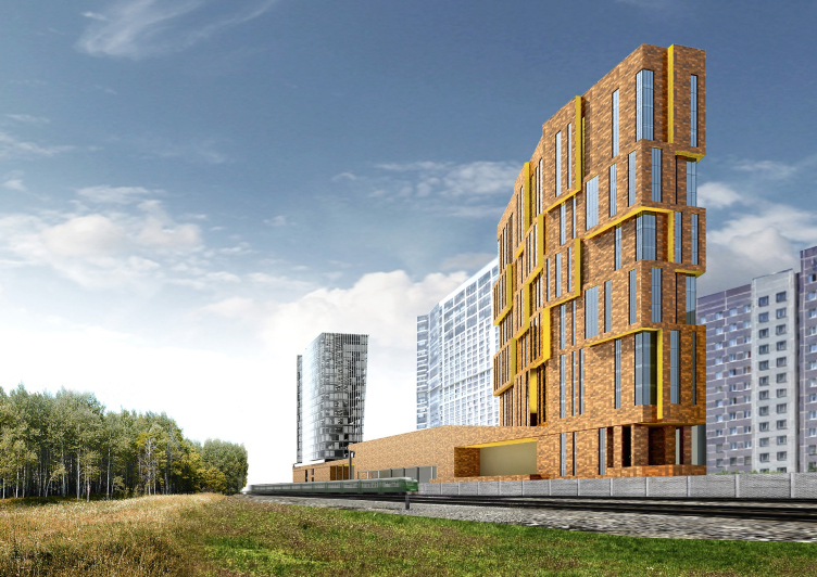
As one takes his first glance at the two residential and office towers of the new complex designed by "Asadov Architectural Bureau" next to the Timiryazevsky park, a flood of associations comes steaming in, one of them being that of primeval earth material, the other - of the crystal that it gave birth to.

09 February 2016
Object
mainImg

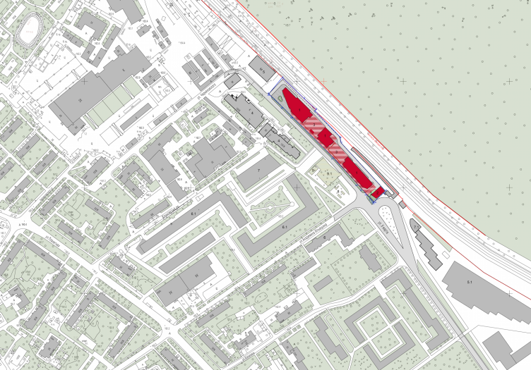
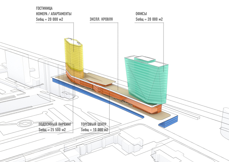
To do the project justice, one must mention straight away that the park of the Timiryazevskaya Agricultural Academy is only within an arm's reach on the master plan: in actuality, the park and the designed complex are separated by a bunch of railroad tracks. From its opposite side, the hectare-strong land site is propped by a driveway and the residential buildings of the Akademika Ilyushina street, and squeezing into it the required 50 000 square meters of usable space turned out to be quite a tough call. Out of these, 20 thousand square meters fall on the hotel and office function each, the remaining ten occupied by a shopping mall.

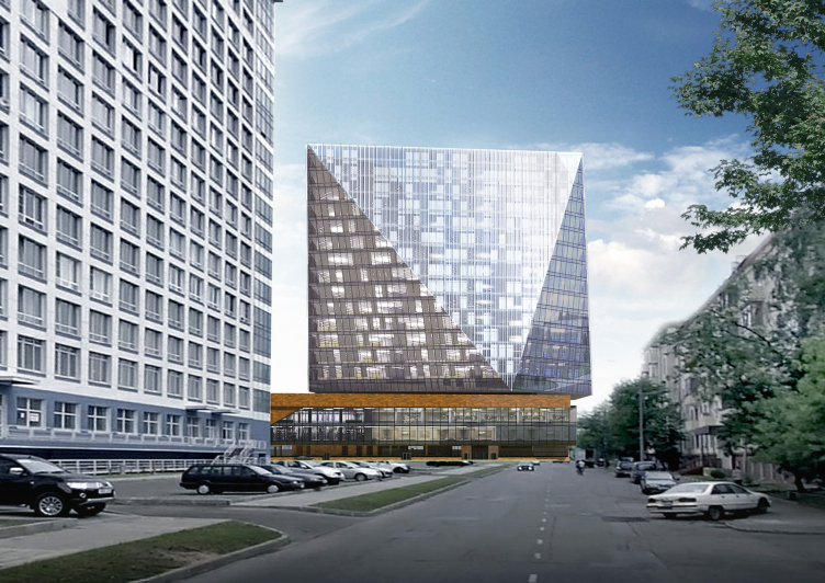
Multifunctional complex and shopping mall at the Akademika Ilyushina Street © Asadov Architectural Bureau
Multifunctional complex and shopping mall at the Akademika Ilyushina Street. Location plan © Asadov Architectural Bureau


"As a result, we got a very peculiar kind of "shoulder-yoke", a "dumbbell" building with two weights on its ends - the residential and the office towers - and the connecting bar of the stylobate that hosts a shopping mall" - Andrew Asadov comments on his concept. Probably, yes, the two volumes of equal height (75 meters maximally allowed here, to be precise) could indeed offset each other like buckets of water or barbell weights. 

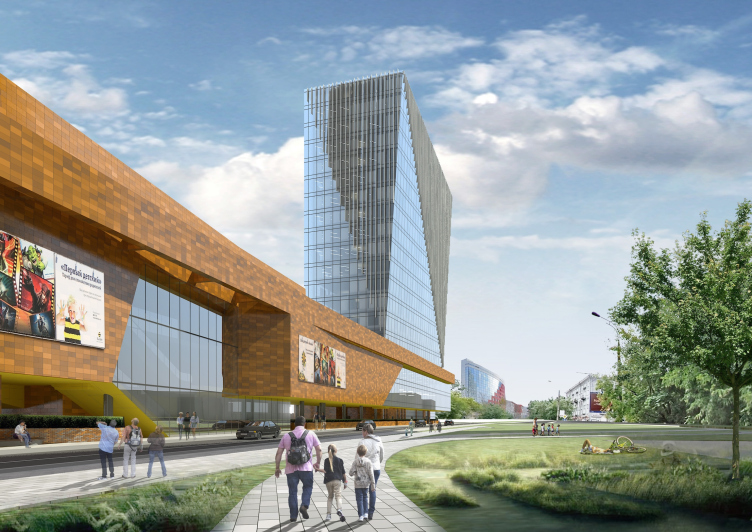
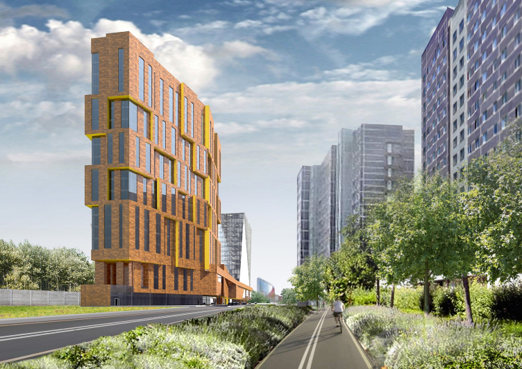
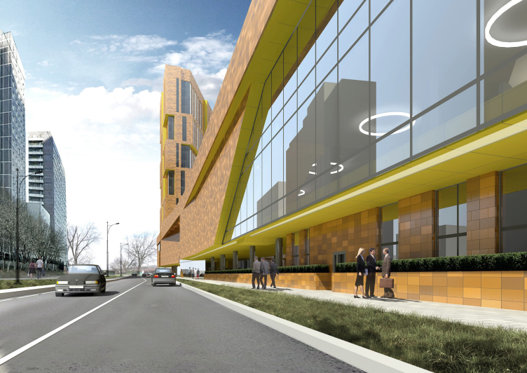
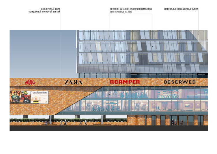
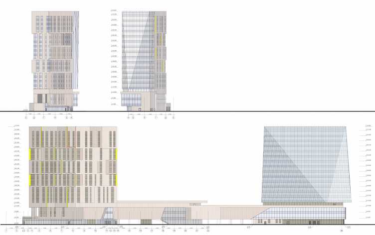
Not in the case of the Asadovs, though: the spirals, the intertwining bands, the snakes, the scallops, and the stars - this company's projects are almost always about large-scale voluminous figures that are prone to change beyond recognition when seen from different viewing angles. The narrow (in the literal sense of the word) constraints of the construction blueprint made the architects look for alternative ways of expressing their signature "breathtaking" dynamics - and that resulted in this meticulous (and at places even painstaking) work with the plastic of the façades. The close proximity of "Airbus" - the gigantic residential building designed by Vladimir Plotkin against the background of which the new residential complex stops looking all that massive - also left its mark on the Asadovs' project. "What we wanted to do was building, next to "Airbus", something that would be, on the one hand, proportionately large, and, on the other hand, more agile and dramatic in its material" - Andrew Asadov says. If we are to use stone (Flemish ceramics in this particular case) - then we use the rugged untreated type with cavities and concave spots, whose relief character is picked up by the line of the façades. If it's glass - then it's all about facets glittering in the sun". So the towers turned out to be far from identical: they are a family but not of the blood type - rather like husband and wife. As for the stylobate, from the standpoint of the facade materials, it has kept its "link" status: coated with the same Flemish ceramics, it also gets accents of large glass inserts.

Multifunctional complex and shopping mall at the Akademika Ilyushina Street © Asadov Architectural Bureau


Multifunctional complex and shopping mall at the Akademika Ilyushina Street © Asadov Architectural Bureau


Multifunctional complex and shopping mall at the Akademika Ilyushina Street © Asadov Architectural Bureau


Multifunctional complex and shopping mall at the Akademika Ilyushina Street © Asadov Architectural Bureau


So it turns out that the "living" earth material gives birth to a crystal of fine faceting - the architects planted it exactly at the junction of 8th of March and Akademika Ilyushina streets, at the spot where the glass 18-story volumes gets perfectly viewable from distant vantage points. The difference between the facade designs also highlighted the versatility of the complex: the residential tower is a stone "fortress", while the office one is more open and more transparent. Such prominent form of the crystal, by the way - and, as a consequence, the differences in the size and configuration of the floors - became possible thanks to the absence of necessity to zone the office premises all too strictly. Around the functional nucleus that is shifted a bit off-center, the offices are organized in accordance with the free planning principle.

Multifunctional complex and shopping mall at the Akademika Ilyushina Street © Asadov Architectural Bureau


Multifunctional complex and shopping mall at the Akademika Ilyushina Street. Details of the facade © Asadov Architectural Bureau


In the "stone" tower 21 stories high (the number of floors is different because of the difference of the thickness of the intermediate floors), the planning solutions are, on the contrary, strictly regulated. On the bottom floors, there will be a hotel with rooms from 35 to 90 square meters, while on the top floors - apartments (45-250 square meters), these apartments being not the kind that is often marketed as residential stock while in fact it is not but true long-stay apartments. 

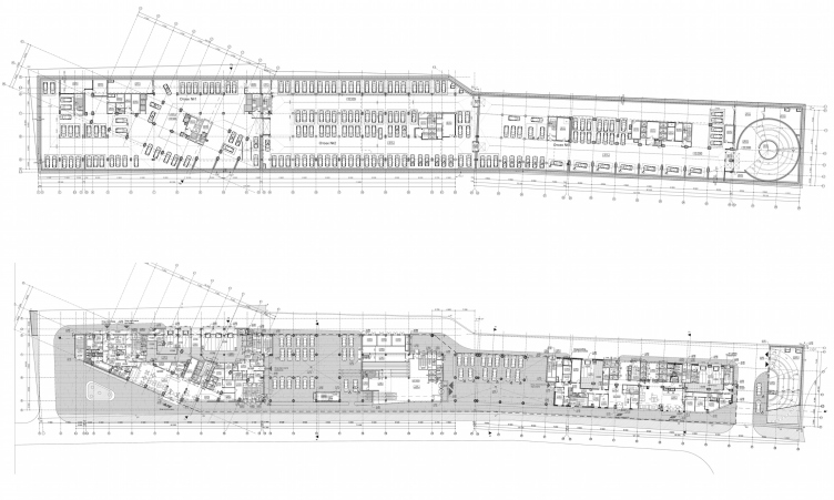
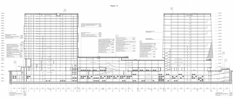
And, finally, the retail stores occupy the second, the third, and part of the fourth floor of the stylobate. As for the first floor, it is almost fully occupied by the parking garage. If we are to take a look at the section view, we will be sure to see just what a challenge it was for the architects to squeeze the required number of car stalls here. In spite of the fact that the garage stretched beneath all the units, two of its levels designed as having two sub-floors each, the three underground levels turned out not to be enough to allocate the required number. Ultimately, the architects had to engage some of the first floor for the parking garage needs as well (plus thirty places to the four hundred seventy). 

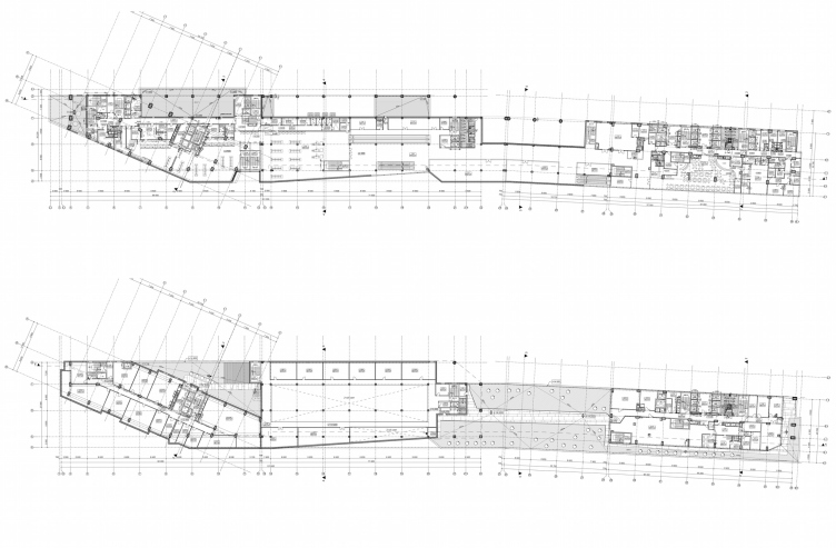
Multifunctional complex and shopping mall at the Akademika Ilyushina Street. Plans of the first and second floors © Asadov Architectural Bureau


Multifunctional complex and shopping mall at the Akademika Ilyushina Street. Plans of the second and third floors © Asadov Architectural Bureau


Considering just how little was left of the land site after the complex was built upon it, the architects designed for all the vacant street territories some or other landscaping solution. At some places, this is just asphalt or concrete pavement. Along the northeast border of the building, however, from the side of the designed driveway and the other complex entrances, the architects designed a green parkway, rows of benches, and streetlights. And, next to the hotel building, on the mini-"piazza" formed by the corner cutaway, there is a curvilinear cotoneaster hedgerow. 

The main "oasis", however, is situated not on the ground but on the green roof on the fourth floor of the shopping center. In the conditions of the densely packed buildings and the investors' understandable desire to extract profits from each square meter of this expensive ground, such green roofs become all but the cure-all solution. In our case, the office workers and the hotel guests get a fully-fledged green territory. And the district overbuilt with predominantly rank-and-file typical buildings gets a new interesting architectural centerpiece. 
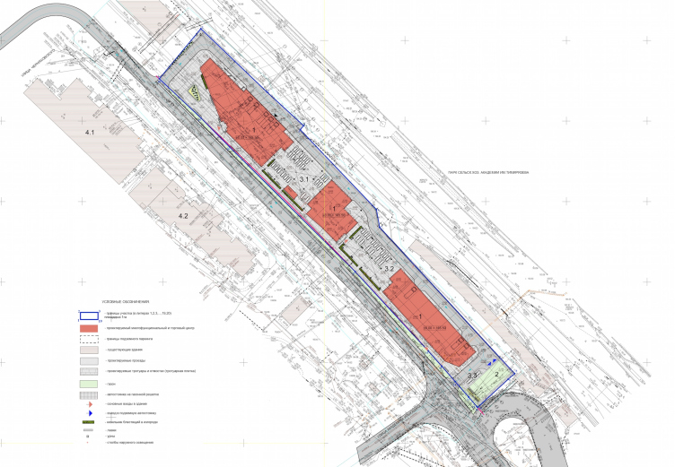
Multifunctional complex and shopping mall at the Akademika Ilyushina Street. General layout © Asadov Architectural Bureau
Multifunctional complex and shopping mall at the Akademika Ilyushina Street. Master plan © Asadov Architectural Bureau
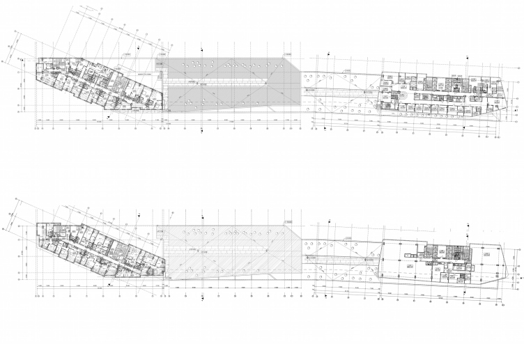
Multifunctional complex and shopping mall at the Akademika Ilyushina Street. Plans of 4-9 floors © Asadov Architectural Bureau
Multifunctional complex and shopping mall at the Akademika Ilyushina Street. Section view © Asadov Architectural Bureau
Multifunctional complex and shopping mall at the Akademika Ilyushina Street. Facades © Asadov Architectural Bureau

09 February 2016

Headlines now
Four Different Surveys
The “Explore the City” competition, organized this year by the Genplan Institute of Moscow, stands out as a pretty unconventional one for the architectural field but aligns perfectly well with the character of urban planning work. The winning project analyzed contemporary residential complexes, combining urban planning insights with a realtor’s perspective to propose a hybrid approach. Other entries explored public centers, motivations for car ownership, and housing vacancy rates. A fifth participant withdrew. Here’s a closer look at the four completed works.
Scheduled Evolution
ASADOV Architects unveiled the EvyCenter pavilion, a microcultural hub for fostering personal growth, organizing workshops, and doing gymnastics. Additionally, this pavilion serves as a prototype for a scalable country house, drawing inspiration from the “Loskutok” project, and constructed from CLT panels in a factory. This marks the beginning of a developer project initiated by the architectural firm (sic!), which is seeking partners to expand both small Evy settlements and even larger Evy cities, which are, according to Andrey Asadov, aimed at fostering the “evolutionary” development of the people who will inhabit them.
The Golden Crown
The concept for a dental clinic in Yekaterinburg, developed by CNTR Studio, revolves around the idea of a “mouth full of gold”: pristine white porcelain stoneware walls are complemented by matte brass details. To avoid an overly literal interpretation, the architects focused on the building’s proportions, skillfully navigating between sunlight requirements and fire safety regulations.
Flexibility and Integration
Not long ago, we covered the project for the fourth phase of the ÁLIA residential complex, designed by APEX. Now, we’ve been shown different fence concepts they developed to enclose the complex’s private courtyards, incorporating a variety of public functions. We believe that the sheer fact that the complex’s architects were involved in such a detail as fencing speaks volumes.
A Step Forward
The HIDE residential complex represents a major milestone for ADM architects and their leaders Andrey Romanov and Ekaterina Kuznetsova in their quest for a fresh high-rise aesthetic – one that is flexible and layered, capable of bringing vibrancy to mass and silhouette while shaping form. Over recent years, this approach has become ADM’s “signature style”, with the golden HIDE tower playing a pivotal role in its evolution. Here, we delve into the project’s story, explore the details of the complex’s design, and uncover its core essence.
Gold in the Sands
A new office for a transcontinental company specializing in resource extraction and processing has opened in Dubai. Designed by T+T Architects, masters of creating spaces that are contemporary, diverse, flexible, and original, this project exemplifies their expertise. On the executive floor, a massive brass-clad partition dominates, while layered textures of compressed earth create a contextually resonant backdrop.
Layers and Levels of Flight
This project goes way back – Reserve Union won this architectural competition at the end of 2011, and the building was completed in 2018, so it’s practically “archival”. However, despite being relatively unknown, the building can hardly be considered “dated” and remains a prime example of architectural expression, particularly in the headquarters genre. And it’s especially fitting for an aviation company office. In some ways, it resembles the Aeroflot headquarters at Sheremetyevo but with its own unique identity, following the signature style of Vladimir Plotkin. In this article, we take an in-depth look at the United Aircraft Corporation (UAC) headquarters in the Moscow agglomeration town of Zhukovsky, supplemented by recent photographs from Alexey Naroditsky – a shoot that became only recently possible due to the fact that improvements were finally made in the surrounding area.
Light and Shadow
In this article, we delve into the architectural design of the “Chaika” house by DNK ag architects, which was recently completed in 2023 as part of the collection of signature designs at ZILArt. As is well-known, all the buildings in this complex follow a design code, yet each one is distinct. This particular building stands out not only for its whiteness and minimalism but also for the refined use of a limited number of techniques that, together, create what can confidently be called synergy.
Casus Novae
A master plan was developed for a large residential area with a name of “DNS City”, but now that its implementation began, the plan has been arbitrarily reformatted and replaced with something that, while similar on the surface, is actually quite different. This is not the first time such a thing happens, but it’s always frustrating. With permission from the author, we are sharing Maria Elkina’s post.
Treasure Hunting
The GAFA bureau, in collaboration with Tegola and Arkhitail, organized an expedition to the island of Kilpola in Karelia as part of Moskomarkhitektura’s “Open City” festival. There, amidst moss and rocks, the students sought answers to questions like: what is the sacred, where does it dwell, and what sustains it? Assisting the participants in this quest were landscape engineer Evgeny Levin, artist Nicholas Roerich, a moose, and the lack of cellular connection. Here’s how the story unfolded.
Depths of the Earth, Streams of Water
In the Malaya Okhta district, the Akzent building, designed by Stepan Liphart, was constructed. It follows a classic tripartite structure, yet it’s what you might call “hand-drawn”: each façade is unique in its form and details, some of which aren’t immediately noticeable. In this article, we explore the context and, together with the architect, delve into how the form was developed.
Fir Tree Dynamics
The “Airports of Region” holding is planning to build an airport in Karachay-Cherkessia, aiming to make the Arkhyz and Dombay resorts more accessible to travelers. The project that won in an invitation-only competition, submitted by Sergey Nikeshkin’s KPLN, blends natural imagery inspired by the shape of a conifer seed, open-air waiting spaces, majestic large trees, and a green roof elevated on needle-like columns. The result is both nature-inspired and WOW.
​A Brick Shell
In the process of designing a clubhouse situated among pine trees in a prestigious suburban area near Moscow, the architectural firm “A.Len” did the façade design part. The combination of different types of brick and masonry correlates with the volumetric and plastique solutions, further enhanced by the inclusion of wood-painted fragments and metal “glazing”.
Word Forms
ATRIUM architects love ambitious challenges, and for the firm’s thirtieth anniversary, they boldly play a game of words with an exhibition that dives deep into a self-created vocabulary. They immerse their projects – especially art installations – into this glossary, as if plunging into a current of their own. You feel as if you’re flowing through the veins of pure art, immersed in a universe of vertical cities, educational spaces – of which the architects are true masters – and the cultural codes of various locations. But what truly captivates is the bold statement that Vera Butko and Anton Nadtochy make, both through their work and this exhibition: architecture, above all, is art – the art of working with form and space.
Flexibility and Acuteness of Modernity
Luxurious, fluid, large “kokoshniks” and spiral barrel columns, as if made from colorful chewing gum: there seem to be no other mansion like this in Moscow, designed in the “Neo-Russian-Modern” style. And the “Teremok” on Malaya Kaluzhskaya, previously somewhat obscure, has “come alive with new colors” and gained visibility after its restoration for the office of the “architectural ecosystem” as the architects love to call themselves. It’s evident that Julius Borisov and the architects at UNK put their hearts into finding this new office and bringing it up to date. Let’s delve into the paradoxes of this mansion’s history and its plasticity. Spoiler: two versions of modernity meet here, both balancing on the razor’s edge of “what’s current”.
Yuri Vissarionov: “A modular house does not belong to the land”
It belongs to space, or to the air... It turns out that 3D printing is more effective when combined with a modular approach: the house is built in a workshop and then adapted to the site, including on uneven terrain. Yuri Vissarionov shares his latest experience in designing tourist complexes, both in central Russia and in the south. These include houseboats, homes printed from lightweight concrete using a 3D printer, and, of course, frame houses.
​Moscow’s First
“The quality of education largely depends on the quality of the educational environment”. This principle of the last decade has been realized by Sergey Skuratov in the project for the First Moscow Gymnasium on Rostovskaya Embankment in the Khamovniki district. The building seamlessly integrates into the complex urban landscape, responding both to the pedestrian flow of the city and the quiet alleyways. It skillfully takes advantage of the height differences and aligns with modern trends in educational space design. Let’s take a closer look.
Looking at the Water
The site of Villa Sonata stretches from the road to the water’s edge, offering its own shoreline, pier, and a picturesque river panorama. To reveal these sweeping views, Roman Leonidov “cut” the façade diagonally parallel to the river, thus getting two main axes for the house and, consequently, “two heads”. The internal core – two double-height spaces, a living room and a conservatory, with a “bridge” above them – makes the house both “transparent” and filled with light.
The White Wing
Well, it’s not exactly white. It’s more of a beige, white-stone structure that plays with the color of limestone – smoother surfaces are lighter, while rougher ones are darker. This wing unites various elements: it absorbs and interprets the surrounding themes. It responds to everything, yet maintains a cohesive expression – a challenging task! – while also incorporating recognizable features of its own, such as the dynamic cuts at the bottom, top, and middle.
Urban Dunes
The XSA Ramps team designed and built a three-part sports hub for a park in Rostov-on-Don, welcoming people of all ages and fitness levels. The skate plaza, pump track, and playground are all meticulously crafted with details that attract a diverse range of visitors. The technical execution of the shapes and slopes transforms this space into a kind of sculptural composition.
Proportional Growth
The project for the fourth phase of the ÁLIA residential area has been announced. The buildings are situated on an elongated plot – almost a “ray” that shoots out from the center of the area towards the river. Their layout reflects both a response to Moscow’s architectural preferences over the past 15 years, shifting “from blocks to towers”, and an interpretation of the neighboring business park designed by SOM. Additionally, the best apartments here are not located at the very top but closer to the middle, forming a glowing “waistline”.
The “Staircase” Building
In designing the “Details” residential complex in New Moscow, Rais Baishev spiced up the now-popular Moscow theme of a “courtyard” building with an idea drawn from the surrealist drawings by Maurits Escher. He envisioned the stepped silhouettes and descending slopes as a metaphysical mega-staircase, creating a key void within the courtyard that gave the project an internal “spine”. This concept is felt both in the building’s silhouette and on its façades.
Projection of the Quarter
No one doubted that the building that Vladimir Plotkin designed as part of the “Garden Quarters” would be the most modernist of all. And it turned out just that way: while adhering to the common design code, the building successfully combines brick and white stone, rhythmically responding to the neighboring building designed by Ostozhenka, yet tactfully and persistently making a few statements of its own. This includes the projection of the ideal urban development composition “14–9–6”, which can be found right next door, mathematical calculations, including those for various types of terraces (and perhaps the only reminder of the Soviet past of the Kauchuk rubber factory!), and the white “cross-stitch” pattern of the façade grid.
Domus Aurea
In this issue, we examine the “Tessinsky-1” house, designed by Sergey Skuratov and completed in 2023. Located in the middle of the Serebryanicheskaya Embankment district, at the intersection of its main streets, this house assumes a sort of “nodal” role: it not only responds to everything around it and preserves many memories of the former EMA factory within itself, but it weaves all this into a newly directed pattern, reconciling bright “gold” and dark-colored brick, largely with the help of the new, modern-yet-archaic Columba brick, which, come to think about it, is the most precious element here.
The Chimney of Nikola-Lenivets
In this issue, we are examining the “Obelisk House” designed by KATARSIS and built for the Arkhstoyanie 2023 festival. However, it was only finished later on, and this is why we are examining it now. It seems to us that after the “Obelisk House” appeared in Nikola-Lenivets, a dialogue and a few inner connections appeared between the temporary structures built here. These houses no longer look like “accidental neighbors”, more of which below.
​Periscope by the Bay
The jury awarded the second place in the competition for a public and cultural center in Petropavlovsk-Kamchatsky to the companies GORA (“Mountain”) and M4. In the consortium’s proposal, the building resembles a sperm whale with a calf swimming next to it or a periscope, whose lenses capture the most spectacular views from the surrounding landscape.
From Arcs to Dolmens
While working on the competition project for Petropavlovsk-Kamchatsky, ASADOV Architects prioritized the value of the natural and urban environment, aiming to preserve the balance of the location while minimizing the resemblance of the volume that they designed to a “traditional building”. The task was challenging, and the architects created three versions, one of which having been developed after the competition, where their main proposal took third place. However, the point of interest here is not the competition result but the continuity of creative thinking.
Hide and Seek
The ID Moskovskiy house, designed by Stepan Liphart in St. Petersburg, in the courtyards near Moskovskiy Avenue beyond the Obvodny Canal and recently completed, is notable for several reasons. Firstly, it has been realized with considerable accuracy, which is particularly significant as this is the first building where the architect was responsible not only for the facades but also for the layouts, allowing for better integration between the two. On the other hand, this building is interesting as an example of the “germination” of new architecture in the city: it draws on the best examples from the neighborhood and becomes an improved and developed sum of ideas found by the architect in the surrounding context.
The Big Twelve
Yesterday, the winners of the Moscow Mayor’s Architecture Award were announced and honored. Let’s take a look at what was awarded and, in some cases, even critique this esteemed award. After all, there is always room for improvement, right?
Above the Golden Horn
The residential complex “Philosophy” designed by T+T architects in Vladivostok, is one of the new projects in the “Golubinaya Pad” area, changing its development philosophy (pun intended) from single houses to a comprehensive approach. The buildings are organized along public streets, varying in height and format, with one house even executed in gallery typology, featuring a cantilever leaning on an art object.