По-русски

Rais Baishev: "I am a space packer".

One of the cofounders of "Ostozhenka" architectural bureau and the chief architect of such projects as the building of International Moscow Bank, a Residential Complex in Odintsovo, and the residential complex "Water Colors" in Balashikha shares about the role of the chief architect of the project and about his personal preferences as opposed to what is considered to be modern and fashionable.

28 October 2015
Interview
mainImg

Archi.ru: 
You have worked with this company from the moment of its inception. The story of Ostozhenka is well known in the architectural community to the point of being a classic example. What did this mean to you in the very beginning? 

Rais Baishev: 
By that time, when we already made the transition from the state-run design bureaus to a free market economy, this country already had the prerequisites for the appearance of such private bureaus. By that time we also had a considerable working experience, and the new economic situation could not exempt us from our obligations before the profession. So, for me a little changed back then. As a matter of fact, greater freedom imposed greater responsibility on us - proportional to our initiative. We started working and soon the team came together. You can put it this way: we took what was most valuable to us from our "previous" life and carried it over to Ostozhenka, the main thing being our commitment to working as a team. This remains the main value for everyone of us up to the present day. 

Do you have any specialties within the framework of your bureau? 

You know, this always comes naturally when people work together as a team. Sooner or later it turns out that somebody can do something better than somebody else, and this becomes his specialty or the cross that he has to bear. The time may come when the person really dislikes it - I don't want to limit myself with this - I can do more, I can do better! Here is the thing with architecture, however - you only have as many specialties as you have real architects on your team. Look at the real big-time masters - can you ever confuse their works or take them for someone else's? Never! They are the manifestations of their personalities and those manifestations are truly unique. You cannot really give up your personality, but then again, you don't have to. 

And what is personally closer to you? 

Here is the thing - the chief architect of the project is literally responsible for everything. This work is very hard to do but it's very rewarding at the same time. Any work consists of analysis and construction. The broader is your vision of all the prerequisites and constituent parts of this work, the more vectors of influence you can see before you get down to it - and not only in the narrow professional sense - the more exact your solution will be. And it is only further on down the line that some of your personal preferences - or should I even say "sympathies" - may come into play. Some people like working with planes, some are into structures that appear in the process of work. I know my toolbox. Most of all, I am interested in the space, the plastics, and the interaction with the context. What is an architect's material? An artist has his canvas and his paints, a sculptor has, say, a piece of clay in his hands, and we as architects get to work with the space, the void, the emptiness! I once asked myself a question - what's my job about? I am a space packer. I pack spaces. I pack the emptiness in accordance with economic laws, in accordance with the existing rules and regulations, but, above all else, in accordance with the laws of harmony - something that we had drummed into our heads back in the school of architecture...

zooming
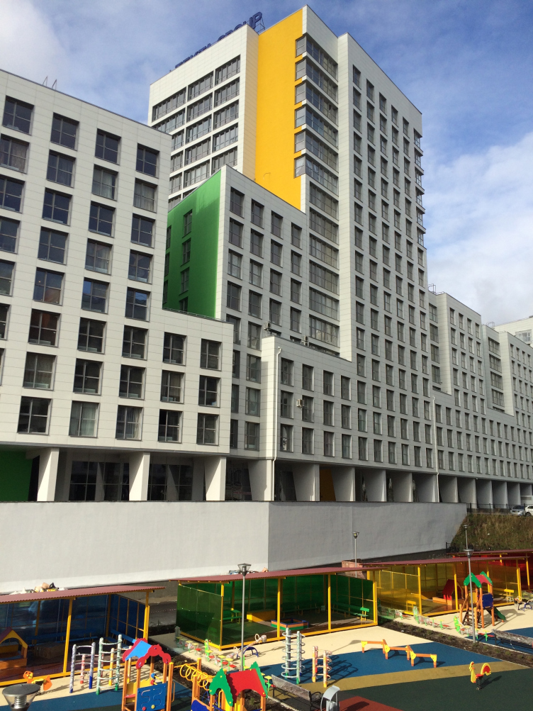
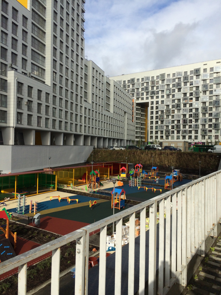
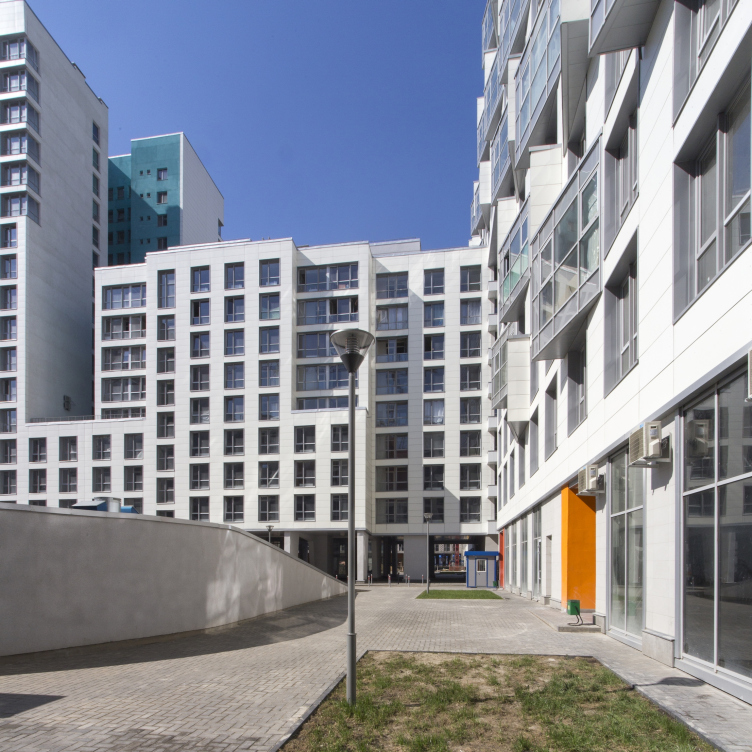
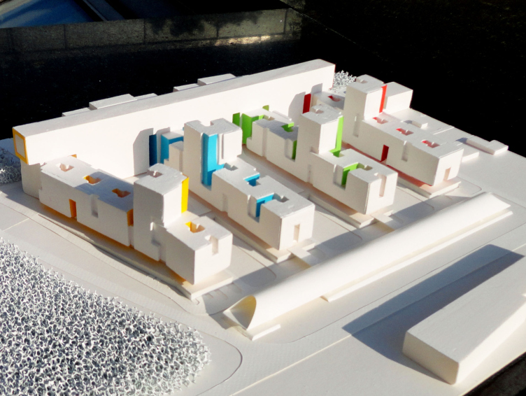
"Water Colors" residential complex © Ostozhenka


"Water Colors" residential complex. The multicolored inner courtyards. Project © Ostozhenka


And if we are to speak about Ostozhenka on the whole - does it have a market niche of its own?

The architectural genre that Ostozhenka is into has long since been formed for us. We, of course, try to push these limits and avoid burying ourselves inside this shell - but we are still aware what is ours and what is not. For each of us, designing a private residence is a lot more challenging than a two thousand apartments residential complex. One way or another, this gets broadcast to the world outside, and we get "our" commissions - as a rule, these are large-scale urban projects. Simply because you are always a hostage of your initial success! 

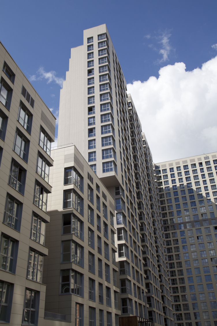
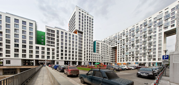
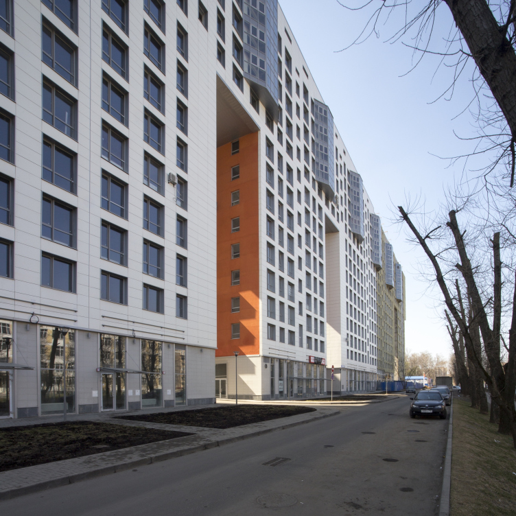
The residential complex in Odintsovo. The yard facades © Ostozhenka


The residential complex in Odintsovo. The yard facades © Ostozhenka


Do you have any particular stage of your working process that you like better than others? 

The most fascinating experience for me is when you are one on one with the uncertainty in the very beginning. This is the moment when you can lose yourself completely in the face of the vistas of the possible solutions that spread before you. I sometimes even have dreams about this stage. And sometimes I catch myself thinking: how long has it been since I had this feeling of weightlessness, this beautiful feeling that maybe kids get when they are anticipating a new and exciting game. And this fleeting moment of intuitive solution is followed by long design and implementation. 

Did you ever regret things that you did or did not do? Or did you ever look at one of your already implemented projects thinking that had you had the chance to start all over again you would have done it in a different way? 

I think that the very idea that you can redo something is pretty naive in the first place. Generally, I always anticipate the moment between the end of construction and the beginning of distortions done to my project - because it is at that period of time that I have to find the time to explain at least to myself just what and where I did wrong. This is when the realization comes. By the way, I've already been through a situation when a building that I designed got torn down - with all the good things that it had inside and all the soul I poured into it. A different function was required in this place - and they tore it down. Oddly enough, I don't really have a problem with it. Probably, you just want to take it philosophically - it's just another lesson that life teaches you. The longer you live the more temporary everything around you becomes. While back in the good old days things were made to last forever, now it's almost a public disgrace if you don't change your old television-car-smartphone with a new one. And this applies to architecture as well. Nowadays, you can change the facades as easily as you put on a new set of clothes - which used to be unthinkable. But then again, this must be the sign of our time and you have to live with it. 

I am sure that in your career of chief architect of the project there were occasions when you ran into these or those unexpected obstacles and had to get around them somehow...

What you are speaking about is called "anecdote", a real-life story, funny, or pathetic, or both. Once a customer comes to me, all excited, and he goes: "Look, the top floor is selling so well! Let's add another one on top of it!"

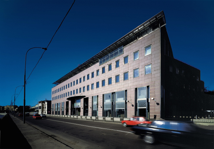
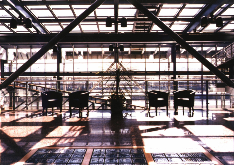
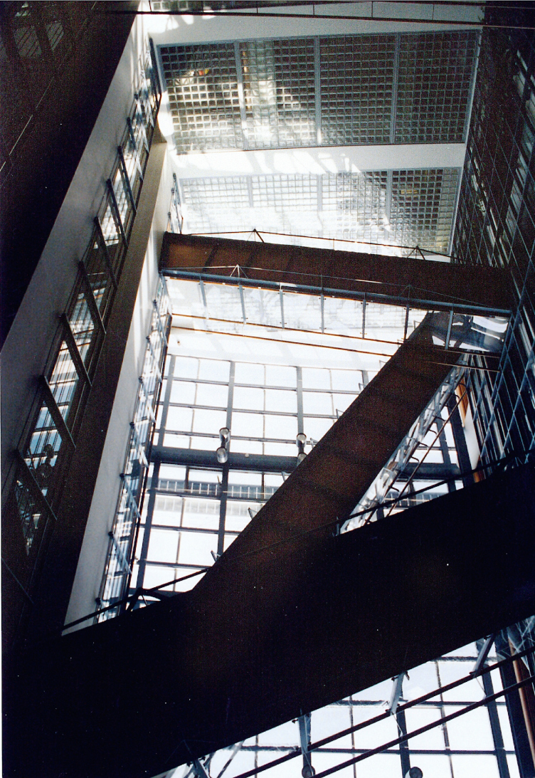
Or, for example, the well-known story of the glass "pocket" fenced by the terrace of Moscow International Bank (now UniCredit bank)? 

Oh, yes, this is also an "anecdote", I mean, in a good way. A proverb. But this is not my story altogether. And I know rather many interesting people who can share with you a lot of such stories from their life. Or, maybe, from mine...

UniCredit Bank on the Prechistenskaya Embankment © Ostozhenka


UniCredit Bank on the Prechistenskaya Embankment © Ostozhenka


UniCredit Bank on the Prechistenskaya Embankment © Ostozhenka


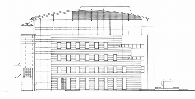
UniCredit Bank on the Prechistenskaya Embankment. Section view © Ostozhenka


Ok, then I will ask a more serious question - do you have any style preferences in architecture?

Quite a lot depends on what values we believe in and what we appreciate from the reality that was there before us. The 1920's, for example, when this country was at the cutting edge of the world's avant-grade architecture. We were lucky to learn from the masters who had created a new picture of the world back in those days. Just imagine how much they were through only to hand us down the legacy that the whole world now values so much! The dramatic history of Russian architecture, thanks to my teachers, became to me something personal when I was still in college. And it defined, just as any truth or revelation should, my priorities in life and profession.

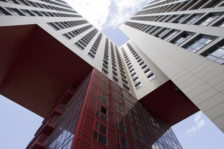
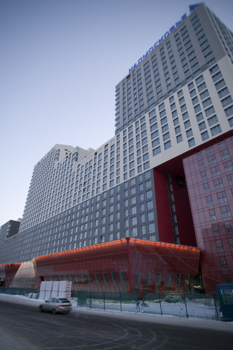
The residential complex in Odintsovo. The red arch that cuts the corner of the building; inside the arch, the same-type red residential building is placed © Ostozhenka
 

Could you put your creative principles in a nutshell?

Probably, they are still in the making. Of course, I have some certain beliefs; they come from my own practice and appreciation of everything that goes on around me. To me, it's very important that I create something new in the process of my work. All that we do is search for something that never was there before us. At the same time, what we try to do is avoid creating the so-called "fashionable" stuff. Because what is "fashionable", after all? It is something that is easily swallowed, easily copied and, ultimately, easily mass-produced. It is a lot more exciting if you can work at the level of typology of spaces, remembering that there is Heaven and Earth as God created them. 

What else is crucially important for you in your work? 

It is very important to build up the right kind of dialogue. First - with your customer. Then - with your colleagues. And ultimately there is a dialogue between your project and its context, and the project itself starts to dictate what is necessary for it. And if the city accepts what you've built, and your customer is willing to cooperate again - then you may say you've done a great job. But if something goes wrong at any of the levels, you cannot so much as pass the blame to anyone. All you can say is: "It's me who is the chief architect of the project. I take the responsibility!"

Aren't you afraid of that? 

As a matter of fact, no. You know, architecture is no place for cowards. 

Thank you very much for this conversation. Of course, I would like to ask what is there on your desktop at the moment. What are you working on now? 

More of the same, I guess. The good old space and their packaging. I think I will be doing this for the rest of my life. At least I sincerely hope I will. 
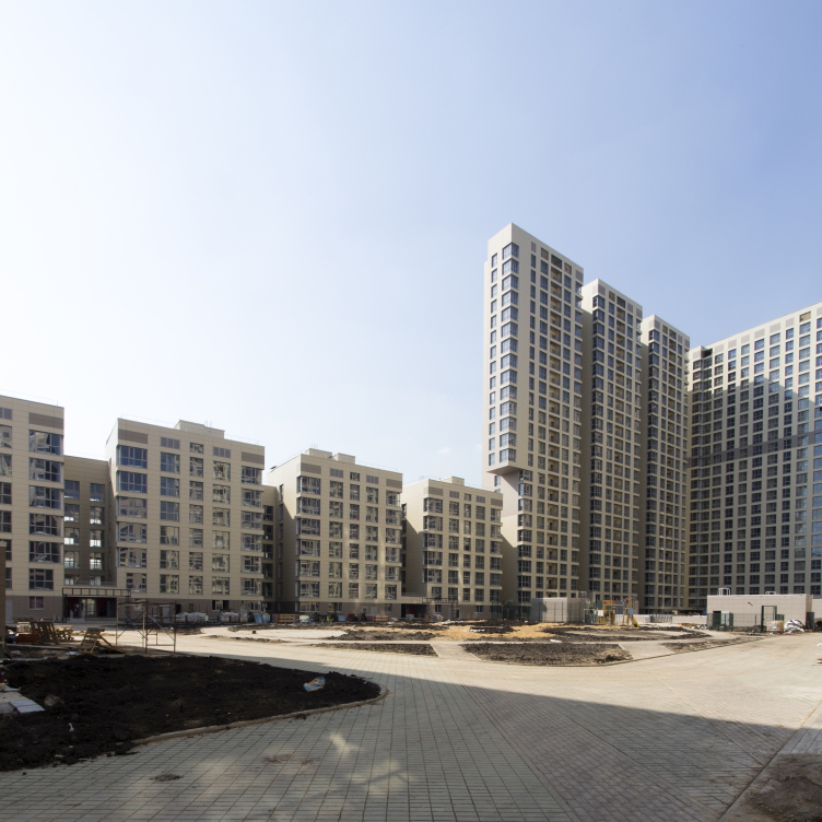
The residential complex in Odintsovo. Overview © Ostozhenka
"Water Colors" residential complex © Ostozhenka
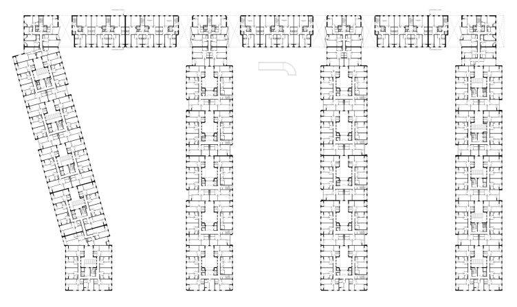
"Water Colors" residential complex. Plan of the first floor © Ostozhenka

28 October 2015

Headlines now
The Golden Crown
The concept for a dental clinic in Yekaterinburg, developed by CNTR Studio, revolves around the idea of a “mouth full of gold”: pristine white porcelain stoneware walls are complemented by matte brass details. To avoid an overly literal interpretation, the architects focused on the building’s proportions, skillfully navigating between sunlight requirements and fire safety regulations.
Flexibility and Integration
Not long ago, we covered the project for the fourth phase of the ÁLIA residential complex, designed by APEX. Now, we’ve been shown different fence concepts they developed to enclose the complex’s private courtyards, incorporating a variety of public functions. We believe that the sheer fact that the complex’s architects were involved in such a detail as fencing speaks volumes.
A Step Forward
The HIDE residential complex represents a major milestone for ADM architects and their leaders Andrey Romanov and Ekaterina Kuznetsova in their quest for a fresh high-rise aesthetic – one that is flexible and layered, capable of bringing vibrancy to mass and silhouette while shaping form. Over recent years, this approach has become ADM’s “signature style”, with the golden HIDE tower playing a pivotal role in its evolution. Here, we delve into the project’s story, explore the details of the complex’s design, and uncover its core essence.
Gold in the Sands
A new office for a transcontinental company specializing in resource extraction and processing has opened in Dubai. Designed by T+T Architects, masters of creating spaces that are contemporary, diverse, flexible, and original, this project exemplifies their expertise. On the executive floor, a massive brass-clad partition dominates, while layered textures of compressed earth create a contextually resonant backdrop.
Layers and Levels of Flight
This project goes way back – Reserve Union won this architectural competition at the end of 2011, and the building was completed in 2018, so it’s practically “archival”. However, despite being relatively unknown, the building can hardly be considered “dated” and remains a prime example of architectural expression, particularly in the headquarters genre. And it’s especially fitting for an aviation company office. In some ways, it resembles the Aeroflot headquarters at Sheremetyevo but with its own unique identity, following the signature style of Vladimir Plotkin. In this article, we take an in-depth look at the United Aircraft Corporation (UAC) headquarters in the Moscow agglomeration town of Zhukovsky, supplemented by recent photographs from Alexey Naroditsky – a shoot that became only recently possible due to the fact that improvements were finally made in the surrounding area.
Light and Shadow
In this article, we delve into the architectural design of the “Chaika” house by DNK ag architects, which was recently completed in 2023 as part of the collection of signature designs at ZILArt. As is well-known, all the buildings in this complex follow a design code, yet each one is distinct. This particular building stands out not only for its whiteness and minimalism but also for the refined use of a limited number of techniques that, together, create what can confidently be called synergy.
Casus Novae
A master plan was developed for a large residential area with a name of “DNS City”, but now that its implementation began, the plan has been arbitrarily reformatted and replaced with something that, while similar on the surface, is actually quite different. This is not the first time such a thing happens, but it’s always frustrating. With permission from the author, we are sharing Maria Elkina’s post.
Treasure Hunting
The GAFA bureau, in collaboration with Tegola and Arkhitail, organized an expedition to the island of Kilpola in Karelia as part of Moskomarkhitektura’s “Open City” festival. There, amidst moss and rocks, the students sought answers to questions like: what is the sacred, where does it dwell, and what sustains it? Assisting the participants in this quest were landscape engineer Evgeny Levin, artist Nicholas Roerich, a moose, and the lack of cellular connection. Here’s how the story unfolded.
Depths of the Earth, Streams of Water
In the Malaya Okhta district, the Akzent building, designed by Stepan Liphart, was constructed. It follows a classic tripartite structure, yet it’s what you might call “hand-drawn”: each façade is unique in its form and details, some of which aren’t immediately noticeable. In this article, we explore the context and, together with the architect, delve into how the form was developed.
Fir Tree Dynamics
The “Airports of Region” holding is planning to build an airport in Karachay-Cherkessia, aiming to make the Arkhyz and Dombay resorts more accessible to travelers. The project that won in an invitation-only competition, submitted by Sergey Nikeshkin’s KPLN, blends natural imagery inspired by the shape of a conifer seed, open-air waiting spaces, majestic large trees, and a green roof elevated on needle-like columns. The result is both nature-inspired and WOW.
​A Brick Shell
In the process of designing a clubhouse situated among pine trees in a prestigious suburban area near Moscow, the architectural firm “A.Len” did the façade design part. The combination of different types of brick and masonry correlates with the volumetric and plastique solutions, further enhanced by the inclusion of wood-painted fragments and metal “glazing”.
Word Forms
ATRIUM architects love ambitious challenges, and for the firm’s thirtieth anniversary, they boldly play a game of words with an exhibition that dives deep into a self-created vocabulary. They immerse their projects – especially art installations – into this glossary, as if plunging into a current of their own. You feel as if you’re flowing through the veins of pure art, immersed in a universe of vertical cities, educational spaces – of which the architects are true masters – and the cultural codes of various locations. But what truly captivates is the bold statement that Vera Butko and Anton Nadtochy make, both through their work and this exhibition: architecture, above all, is art – the art of working with form and space.
Flexibility and Acuteness of Modernity
Luxurious, fluid, large “kokoshniks” and spiral barrel columns, as if made from colorful chewing gum: there seem to be no other mansion like this in Moscow, designed in the “Neo-Russian-Modern” style. And the “Teremok” on Malaya Kaluzhskaya, previously somewhat obscure, has “come alive with new colors” and gained visibility after its restoration for the office of the “architectural ecosystem” as the architects love to call themselves. It’s evident that Julius Borisov and the architects at UNK put their hearts into finding this new office and bringing it up to date. Let’s delve into the paradoxes of this mansion’s history and its plasticity. Spoiler: two versions of modernity meet here, both balancing on the razor’s edge of “what’s current”.
Yuri Vissarionov: “A modular house does not belong to the land”
It belongs to space, or to the air... It turns out that 3D printing is more effective when combined with a modular approach: the house is built in a workshop and then adapted to the site, including on uneven terrain. Yuri Vissarionov shares his latest experience in designing tourist complexes, both in central Russia and in the south. These include houseboats, homes printed from lightweight concrete using a 3D printer, and, of course, frame houses.
​Moscow’s First
“The quality of education largely depends on the quality of the educational environment”. This principle of the last decade has been realized by Sergey Skuratov in the project for the First Moscow Gymnasium on Rostovskaya Embankment in the Khamovniki district. The building seamlessly integrates into the complex urban landscape, responding both to the pedestrian flow of the city and the quiet alleyways. It skillfully takes advantage of the height differences and aligns with modern trends in educational space design. Let’s take a closer look.
Looking at the Water
The site of Villa Sonata stretches from the road to the water’s edge, offering its own shoreline, pier, and a picturesque river panorama. To reveal these sweeping views, Roman Leonidov “cut” the façade diagonally parallel to the river, thus getting two main axes for the house and, consequently, “two heads”. The internal core – two double-height spaces, a living room and a conservatory, with a “bridge” above them – makes the house both “transparent” and filled with light.
The White Wing
Well, it’s not exactly white. It’s more of a beige, white-stone structure that plays with the color of limestone – smoother surfaces are lighter, while rougher ones are darker. This wing unites various elements: it absorbs and interprets the surrounding themes. It responds to everything, yet maintains a cohesive expression – a challenging task! – while also incorporating recognizable features of its own, such as the dynamic cuts at the bottom, top, and middle.
Urban Dunes
The XSA Ramps team designed and built a three-part sports hub for a park in Rostov-on-Don, welcoming people of all ages and fitness levels. The skate plaza, pump track, and playground are all meticulously crafted with details that attract a diverse range of visitors. The technical execution of the shapes and slopes transforms this space into a kind of sculptural composition.
Proportional Growth
The project for the fourth phase of the ÁLIA residential area has been announced. The buildings are situated on an elongated plot – almost a “ray” that shoots out from the center of the area towards the river. Their layout reflects both a response to Moscow’s architectural preferences over the past 15 years, shifting “from blocks to towers”, and an interpretation of the neighboring business park designed by SOM. Additionally, the best apartments here are not located at the very top but closer to the middle, forming a glowing “waistline”.
The “Staircase” Building
In designing the “Details” residential complex in New Moscow, Rais Baishev spiced up the now-popular Moscow theme of a “courtyard” building with an idea drawn from the surrealist drawings by Maurits Escher. He envisioned the stepped silhouettes and descending slopes as a metaphysical mega-staircase, creating a key void within the courtyard that gave the project an internal “spine”. This concept is felt both in the building’s silhouette and on its façades.
Projection of the Quarter
No one doubted that the building that Vladimir Plotkin designed as part of the “Garden Quarters” would be the most modernist of all. And it turned out just that way: while adhering to the common design code, the building successfully combines brick and white stone, rhythmically responding to the neighboring building designed by Ostozhenka, yet tactfully and persistently making a few statements of its own. This includes the projection of the ideal urban development composition “14–9–6”, which can be found right next door, mathematical calculations, including those for various types of terraces (and perhaps the only reminder of the Soviet past of the Kauchuk rubber factory!), and the white “cross-stitch” pattern of the façade grid.
Domus Aurea
In this issue, we examine the “Tessinsky-1” house, designed by Sergey Skuratov and completed in 2023. Located in the middle of the Serebryanicheskaya Embankment district, at the intersection of its main streets, this house assumes a sort of “nodal” role: it not only responds to everything around it and preserves many memories of the former EMA factory within itself, but it weaves all this into a newly directed pattern, reconciling bright “gold” and dark-colored brick, largely with the help of the new, modern-yet-archaic Columba brick, which, come to think about it, is the most precious element here.
The Chimney of Nikola-Lenivets
In this issue, we are examining the “Obelisk House” designed by KATARSIS and built for the Arkhstoyanie 2023 festival. However, it was only finished later on, and this is why we are examining it now. It seems to us that after the “Obelisk House” appeared in Nikola-Lenivets, a dialogue and a few inner connections appeared between the temporary structures built here. These houses no longer look like “accidental neighbors”, more of which below.
​Periscope by the Bay
The jury awarded the second place in the competition for a public and cultural center in Petropavlovsk-Kamchatsky to the companies GORA (“Mountain”) and M4. In the consortium’s proposal, the building resembles a sperm whale with a calf swimming next to it or a periscope, whose lenses capture the most spectacular views from the surrounding landscape.
From Arcs to Dolmens
While working on the competition project for Petropavlovsk-Kamchatsky, ASADOV Architects prioritized the value of the natural and urban environment, aiming to preserve the balance of the location while minimizing the resemblance of the volume that they designed to a “traditional building”. The task was challenging, and the architects created three versions, one of which having been developed after the competition, where their main proposal took third place. However, the point of interest here is not the competition result but the continuity of creative thinking.
Hide and Seek
The ID Moskovskiy house, designed by Stepan Liphart in St. Petersburg, in the courtyards near Moskovskiy Avenue beyond the Obvodny Canal and recently completed, is notable for several reasons. Firstly, it has been realized with considerable accuracy, which is particularly significant as this is the first building where the architect was responsible not only for the facades but also for the layouts, allowing for better integration between the two. On the other hand, this building is interesting as an example of the “germination” of new architecture in the city: it draws on the best examples from the neighborhood and becomes an improved and developed sum of ideas found by the architect in the surrounding context.
The Big Twelve
Yesterday, the winners of the Moscow Mayor’s Architecture Award were announced and honored. Let’s take a look at what was awarded and, in some cases, even critique this esteemed award. After all, there is always room for improvement, right?
Above the Golden Horn
The residential complex “Philosophy” designed by T+T architects in Vladivostok, is one of the new projects in the “Golubinaya Pad” area, changing its development philosophy (pun intended) from single houses to a comprehensive approach. The buildings are organized along public streets, varying in height and format, with one house even executed in gallery typology, featuring a cantilever leaning on an art object.
Nuanced Alternative
How can you rhyme a square and space? Easily! But to do so, you need to rhyme everything you can possibly think of: weave everything together, like in a tensegrity structure, and find your own optics too. The new exhibition at GES-2 does just that, offering its visitor a new perspective on the history of art spanning 150 years, infused with the hope for endless multiplicity of worlds and art histories. Read on to see how this is achieved and how the exhibition design by Evgeny Ace contributes to it.
Blinds for Ice
An ice arena has been constructed in Domodedovo based on a project by Yuri Vissarionov Architects. To prevent the long façade, a technical requirement for winter sports facilities, from appearing monotonous, the architects proposed the use of suspended structures with multidirectional slats. This design protects the ice from direct sunlight while giving the wall texture and detail.