По-русски

Urban Dunes

The XSA Ramps team designed and built a three-part sports hub for a park in Rostov-on-Don, welcoming people of all ages and fitness levels. The skate plaza, pump track, and playground are all meticulously crafted with details that attract a diverse range of visitors. The technical execution of the shapes and slopes transforms this space into a kind of sculptural composition.

23 August 2024
Object
mainImg
The sports hub, called “Dunes” by its creators, is one of the functional zones in the new park on the left bank of the Don River. The park is being developed adjacent to the Rostov Arena stadium as a citywide space and part of the infrastructure for the “Levoberezhye” (“Left Bank”) residential complex. It appears that the park was designed not just to look good in a sales brochure but with thoughtful consideration and benefit for the city. The area is set to include an ice arena, marsh gardens, a fountain promenade, an amphitheater, and other features that will provide diverse recreational opportunities for the complex’s residents and attract visitors from other parts of the city.


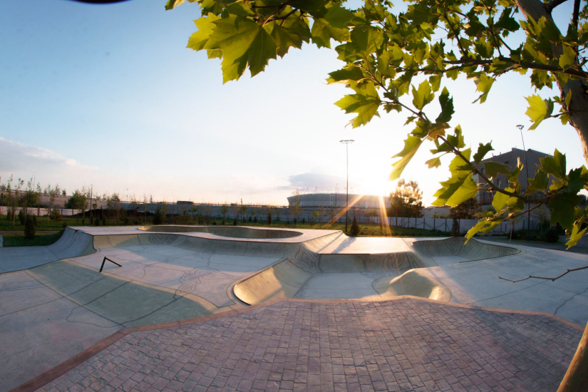
The “Dunes” skate plaza aims to attract a young and active audience, adding visual appeal and, importantly, making efficient use of the space near the road and parking lot – areas that would be challenging to utilize for any other purpose. Given 1,850 square meters, the XSA team created a “park within a park”: a versatile three-part space that fits the formula “from 8 to 80” – anyone, regardless of age or physical condition, can come here and have a great time.

The team had plenty of ideas and visions of what this project should be. Initially, the plan was to utilize 1,200 square meters. But as ideas and creativity began to layer upon each other, new lines for skating emerged as the main zones were being formed. The creative process swept everyone away, and ultimately, the client approved an expansion of the hub to 1,500 square meters!

Now, the residents of the “Levoberezhye” neighborhood have what might be the best sports hub in Russia practically right outside their windows. It’s always nice to be able to say that you live near that very cool spot, rather than just a store or market–it changes your sense of identity. And not just for the young people alone.


The aesthetic inspiration for the sports hub came from the memories of XSA founder and one of the project’s authors, Konstantin Taranov, who spent his childhood on the sandy shores of Levberdon, swimming across the river on a dare and absorbing the spirit of freedom and southern hospitality.


Skate Plaza with a Skate Bowl

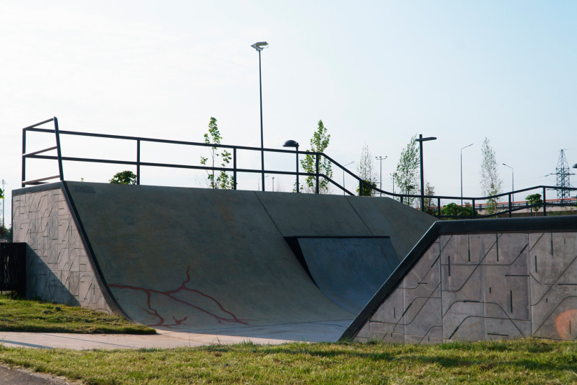
The first part of the hub is the so-called plaza – a space filled with various structures that mimic urban obstacles like stairs and railings, allowing skaters to practice tricks of varying levels of complexity. Many skaters, especially beginners, can feel self-conscious when constantly in the public eye. Therefore, it’s essential to create spaces where people can skate both “on stage” and “behind the scenes”, allowing newcomers to decide when they are ready to take their skills to a more dynamic level. The plaza at “Levoberezhye” was designed by XSA with a combination of elements that help some riders build confidence while offering others ample creative opportunities. The designers call this approach inclusive and apply it across all their projects.


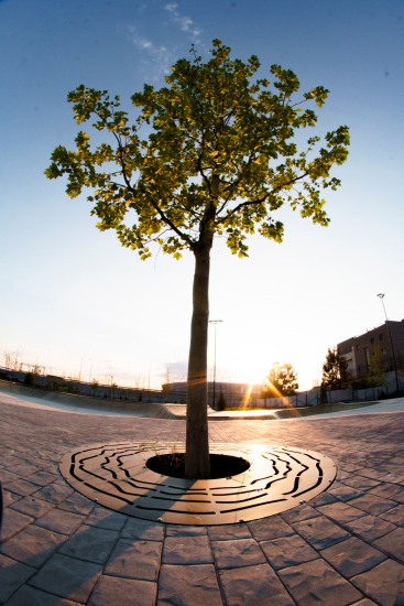
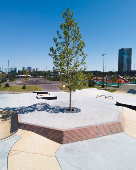
To safely get acquainted with the plaza, there’s a snake run – a beginner-friendly area where skaters can hone their skills before moving on to the bowl. Additionally, there is a “brick” octagon with a tree at its center – similar to a minor architectural form, a piece of urban furniture that has landed in the middle of the plaza. Riders can sit on it to take a break and observe others. Of course, it’s also perfect for pulling stunts – the steep ascent and rough surface present a challenge. The tree, integrated into the concrete plaza, not only provides shade but also alters the hub’s atmosphere with the changing seasons.


For more experienced riders, the bowl – a classic feature from the 1970s when American surfers, unable to catch waves due to drought, decided to skate in empty backyard pools – is the main attraction. Here, XSA has designed something like a “three-leaf clover”: the combination of hemispheres creates even more “waves”, and the pattern resembles sunlight reflecting on water. The bowl’s drainage system prevents rainwater from accumulating at the bottom, channeling it into the sewage system and away from the skate area.


The plaza is entirely constructed from concrete, with the XSA team using their own tried-and-tested mix recipe. Before each project, the factory produces a test batch. To achieve the perfect smoothness in transitions and radii, the concrete is hand-polished in several stages. The meditative nature of this process is captured in a short film.


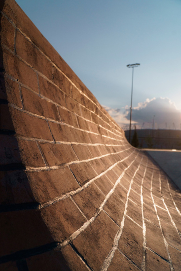
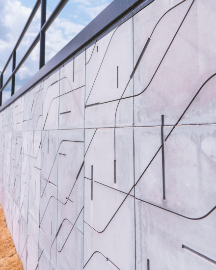
Since the plaza has a “hilly” terrain with peak heights often located on the periphery, slopes emerge that need to be integrated into the surrounding environment. The architects partially conceal these slopes with geoplastic forms, while some walls are clad in concrete slabs featuring patterns that evoke the look of sand dunes.


Black Dunes

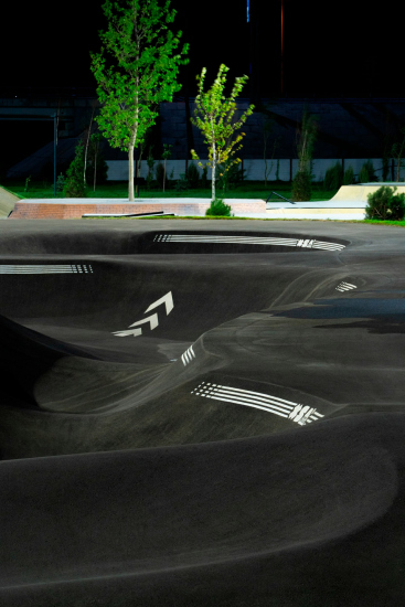
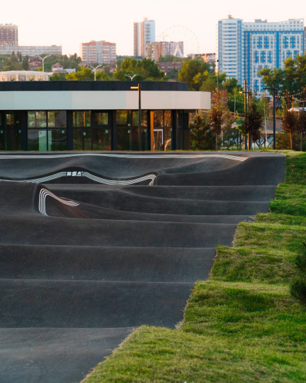
The plaza seamlessly connects to the asphalt pump track, a part of the hub designed for people of all skill levels. Here, anyone from a child on a scooter to an elderly “active retiree” on a bicycle can enjoy the space. XSA excels in crafting monolithic forms not only from concrete but also from asphalt. The black waves against the green grass resemble freshly tilled soil or solidified basalt.


The track is looped, and at the curve, it features two levels, allowing the riders to choose the radius that matches their skill level and gradually transition to more challenging trajectories. The double banking is marked with graphic white lines that aid in navigation and guide the rider’s movement. If desired, this part of the track even allows parallel riding on two different radii.


Musical Statues

The architects gave equal attention to the adjacent children’s playground. Here, essential skills for future riders are nurtured: balance, stability, speed, height awareness, and reasonable risk-taking, along with the ability to find like-minded peers and create their own play scenarios.


The space is safe and sufficiently abstract, yet richly stimulating. Children interact with various textures, colors, and volumes, subtly and imperceptibly training their bodies. The playground includes trampolines, slides, “humps”, various obstacles, and equipment for balance training. From a hill designed for older kids, one can easily observe what’s happening on the plaza and on the pump track. Parents haven’t been forgotten either – a long bench lines the perimeter of the playground for their comfort.


Contrary to the popular belief that extreme sports are a niche activity designed solely for those with exceptional physical fitness, “Dune” has become a universal space open to everyone. First and foremost, the place will attract riders – enthusiastic young men and women who will appreciate the “freedom of artistic expression” provided to them. Next, the most loyal audience will come: pre-teens and older children, who love scooters and bike tricks, and will be able to see an example for their own development. Younger children and their parents will be drawn to the bright and diverse playground. And for everyone else, the sports hub can serve as a sort of “sports theater” – virtually on any day of the week, one can come, find a seat in the “auditorium” and enjoy a spectacular show.


23 August 2024

Headlines now
Gold in the Sands
A new office for a transcontinental company specializing in resource extraction and processing has opened in Dubai. Designed by T+T Architects, masters of creating spaces that are contemporary, diverse, flexible, and original, this project exemplifies their expertise. On the executive floor, a massive brass-clad partition dominates, while layered textures of compressed earth create a contextually resonant backdrop.
Layers and Levels of Flight
This project goes way back – Reserve Union won this architectural competition at the end of 2011, and the building was completed in 2018, so it’s practically “archival”. However, despite being relatively unknown, the building can hardly be considered “dated” and remains a prime example of architectural expression, particularly in the headquarters genre. And it’s especially fitting for an aviation company office. In some ways, it resembles the Aeroflot headquarters at Sheremetyevo but with its own unique identity, following the signature style of Vladimir Plotkin. In this article, we take an in-depth look at the United Aircraft Corporation (UAC) headquarters in the Moscow agglomeration town of Zhukovsky, supplemented by recent photographs from Alexey Naroditsky – a shoot that became only recently possible due to the fact that improvements were finally made in the surrounding area.
Light and Shadow
In this article, we delve into the architectural design of the “Chaika” house by DNK ag architects, which was recently completed in 2023 as part of the collection of signature designs at ZILArt. As is well-known, all the buildings in this complex follow a design code, yet each one is distinct. This particular building stands out not only for its whiteness and minimalism but also for the refined use of a limited number of techniques that, together, create what can confidently be called synergy.
Casus Novae
A master plan was developed for a large residential area with a name of “DNS City”, but now that its implementation began, the plan has been arbitrarily reformatted and replaced with something that, while similar on the surface, is actually quite different. This is not the first time such a thing happens, but it’s always frustrating. With permission from the author, we are sharing Maria Elkina’s post.
Treasure Hunting
The GAFA bureau, in collaboration with Tegola and Arkhitail, organized an expedition to the island of Kilpola in Karelia as part of Moskomarkhitektura’s “Open City” festival. There, amidst moss and rocks, the students sought answers to questions like: what is the sacred, where does it dwell, and what sustains it? Assisting the participants in this quest were landscape engineer Evgeny Levin, artist Nicholas Roerich, a moose, and the lack of cellular connection. Here’s how the story unfolded.
Depths of the Earth, Streams of Water
In the Malaya Okhta district, the Akzent building, designed by Stepan Liphart, was constructed. It follows a classic tripartite structure, yet it’s what you might call “hand-drawn”: each façade is unique in its form and details, some of which aren’t immediately noticeable. In this article, we explore the context and, together with the architect, delve into how the form was developed.
Fir Tree Dynamics
The “Airports of Region” holding is planning to build an airport in Karachay-Cherkessia, aiming to make the Arkhyz and Dombay resorts more accessible to travelers. The project that won in an invitation-only competition, submitted by Sergey Nikeshkin’s KPLN, blends natural imagery inspired by the shape of a conifer seed, open-air waiting spaces, majestic large trees, and a green roof elevated on needle-like columns. The result is both nature-inspired and WOW.
​A Brick Shell
In the process of designing a clubhouse situated among pine trees in a prestigious suburban area near Moscow, the architectural firm “A.Len” did the façade design part. The combination of different types of brick and masonry correlates with the volumetric and plastique solutions, further enhanced by the inclusion of wood-painted fragments and metal “glazing”.
Word Forms
ATRIUM architects love ambitious challenges, and for the firm’s thirtieth anniversary, they boldly play a game of words with an exhibition that dives deep into a self-created vocabulary. They immerse their projects – especially art installations – into this glossary, as if plunging into a current of their own. You feel as if you’re flowing through the veins of pure art, immersed in a universe of vertical cities, educational spaces – of which the architects are true masters – and the cultural codes of various locations. But what truly captivates is the bold statement that Vera Butko and Anton Nadtochy make, both through their work and this exhibition: architecture, above all, is art – the art of working with form and space.
Flexibility and Acuteness of Modernity
Luxurious, fluid, large “kokoshniks” and spiral barrel columns, as if made from colorful chewing gum: there seem to be no other mansion like this in Moscow, designed in the “Neo-Russian-Modern” style. And the “Teremok” on Malaya Kaluzhskaya, previously somewhat obscure, has “come alive with new colors” and gained visibility after its restoration for the office of the “architectural ecosystem” as the architects love to call themselves. It’s evident that Julius Borisov and the architects at UNK put their hearts into finding this new office and bringing it up to date. Let’s delve into the paradoxes of this mansion’s history and its plasticity. Spoiler: two versions of modernity meet here, both balancing on the razor’s edge of “what’s current”.
Yuri Vissarionov: “A modular house does not belong to the land”
It belongs to space, or to the air... It turns out that 3D printing is more effective when combined with a modular approach: the house is built in a workshop and then adapted to the site, including on uneven terrain. Yuri Vissarionov shares his latest experience in designing tourist complexes, both in central Russia and in the south. These include houseboats, homes printed from lightweight concrete using a 3D printer, and, of course, frame houses.
​Moscow’s First
“The quality of education largely depends on the quality of the educational environment”. This principle of the last decade has been realized by Sergey Skuratov in the project for the First Moscow Gymnasium on Rostovskaya Embankment in the Khamovniki district. The building seamlessly integrates into the complex urban landscape, responding both to the pedestrian flow of the city and the quiet alleyways. It skillfully takes advantage of the height differences and aligns with modern trends in educational space design. Let’s take a closer look.
Looking at the Water
The site of Villa Sonata stretches from the road to the water’s edge, offering its own shoreline, pier, and a picturesque river panorama. To reveal these sweeping views, Roman Leonidov “cut” the façade diagonally parallel to the river, thus getting two main axes for the house and, consequently, “two heads”. The internal core – two double-height spaces, a living room and a conservatory, with a “bridge” above them – makes the house both “transparent” and filled with light.
The White Wing
Well, it’s not exactly white. It’s more of a beige, white-stone structure that plays with the color of limestone – smoother surfaces are lighter, while rougher ones are darker. This wing unites various elements: it absorbs and interprets the surrounding themes. It responds to everything, yet maintains a cohesive expression – a challenging task! – while also incorporating recognizable features of its own, such as the dynamic cuts at the bottom, top, and middle.
Urban Dunes
The XSA Ramps team designed and built a three-part sports hub for a park in Rostov-on-Don, welcoming people of all ages and fitness levels. The skate plaza, pump track, and playground are all meticulously crafted with details that attract a diverse range of visitors. The technical execution of the shapes and slopes transforms this space into a kind of sculptural composition.
Proportional Growth
The project for the fourth phase of the ÁLIA residential area has been announced. The buildings are situated on an elongated plot – almost a “ray” that shoots out from the center of the area towards the river. Their layout reflects both a response to Moscow’s architectural preferences over the past 15 years, shifting “from blocks to towers”, and an interpretation of the neighboring business park designed by SOM. Additionally, the best apartments here are not located at the very top but closer to the middle, forming a glowing “waistline”.
The “Staircase” Building
In designing the “Details” residential complex in New Moscow, Rais Baishev spiced up the now-popular Moscow theme of a “courtyard” building with an idea drawn from the surrealist drawings by Maurits Escher. He envisioned the stepped silhouettes and descending slopes as a metaphysical mega-staircase, creating a key void within the courtyard that gave the project an internal “spine”. This concept is felt both in the building’s silhouette and on its façades.
Projection of the Quarter
No one doubted that the building that Vladimir Plotkin designed as part of the “Garden Quarters” would be the most modernist of all. And it turned out just that way: while adhering to the common design code, the building successfully combines brick and white stone, rhythmically responding to the neighboring building designed by Ostozhenka, yet tactfully and persistently making a few statements of its own. This includes the projection of the ideal urban development composition “14–9–6”, which can be found right next door, mathematical calculations, including those for various types of terraces (and perhaps the only reminder of the Soviet past of the Kauchuk rubber factory!), and the white “cross-stitch” pattern of the façade grid.
Domus Aurea
In this issue, we examine the “Tessinsky-1” house, designed by Sergey Skuratov and completed in 2023. Located in the middle of the Serebryanicheskaya Embankment district, at the intersection of its main streets, this house assumes a sort of “nodal” role: it not only responds to everything around it and preserves many memories of the former EMA factory within itself, but it weaves all this into a newly directed pattern, reconciling bright “gold” and dark-colored brick, largely with the help of the new, modern-yet-archaic Columba brick, which, come to think about it, is the most precious element here.
The Chimney of Nikola-Lenivets
In this issue, we are examining the “Obelisk House” designed by KATARSIS and built for the Arkhstoyanie 2023 festival. However, it was only finished later on, and this is why we are examining it now. It seems to us that after the “Obelisk House” appeared in Nikola-Lenivets, a dialogue and a few inner connections appeared between the temporary structures built here. These houses no longer look like “accidental neighbors”, more of which below.
​Periscope by the Bay
The jury awarded the second place in the competition for a public and cultural center in Petropavlovsk-Kamchatsky to the companies GORA (“Mountain”) and M4. In the consortium’s proposal, the building resembles a sperm whale with a calf swimming next to it or a periscope, whose lenses capture the most spectacular views from the surrounding landscape.
From Arcs to Dolmens
While working on the competition project for Petropavlovsk-Kamchatsky, ASADOV Architects prioritized the value of the natural and urban environment, aiming to preserve the balance of the location while minimizing the resemblance of the volume that they designed to a “traditional building”. The task was challenging, and the architects created three versions, one of which having been developed after the competition, where their main proposal took third place. However, the point of interest here is not the competition result but the continuity of creative thinking.
Hide and Seek
The ID Moskovskiy house, designed by Stepan Liphart in St. Petersburg, in the courtyards near Moskovskiy Avenue beyond the Obvodny Canal and recently completed, is notable for several reasons. Firstly, it has been realized with considerable accuracy, which is particularly significant as this is the first building where the architect was responsible not only for the facades but also for the layouts, allowing for better integration between the two. On the other hand, this building is interesting as an example of the “germination” of new architecture in the city: it draws on the best examples from the neighborhood and becomes an improved and developed sum of ideas found by the architect in the surrounding context.
The Big Twelve
Yesterday, the winners of the Moscow Mayor’s Architecture Award were announced and honored. Let’s take a look at what was awarded and, in some cases, even critique this esteemed award. After all, there is always room for improvement, right?
Above the Golden Horn
The residential complex “Philosophy” designed by T+T architects in Vladivostok, is one of the new projects in the “Golubinaya Pad” area, changing its development philosophy (pun intended) from single houses to a comprehensive approach. The buildings are organized along public streets, varying in height and format, with one house even executed in gallery typology, featuring a cantilever leaning on an art object.
Nuanced Alternative
How can you rhyme a square and space? Easily! But to do so, you need to rhyme everything you can possibly think of: weave everything together, like in a tensegrity structure, and find your own optics too. The new exhibition at GES-2 does just that, offering its visitor a new perspective on the history of art spanning 150 years, infused with the hope for endless multiplicity of worlds and art histories. Read on to see how this is achieved and how the exhibition design by Evgeny Ace contributes to it.
Blinds for Ice
An ice arena has been constructed in Domodedovo based on a project by Yuri Vissarionov Architects. To prevent the long façade, a technical requirement for winter sports facilities, from appearing monotonous, the architects proposed the use of suspended structures with multidirectional slats. This design protects the ice from direct sunlight while giving the wall texture and detail.
Frozen Magma
A competition for the creation of a public and cultural center was held in Petropavlovsk-Kamchatsky. Three architectural companies made it to the final, and we consider it important to share about the work of each. Let’s start with the winner – the consortium led by Wowhaus.
Campus within a Day
In this article, we talk about what the participants of Genplan Institute of Moscow’s hackathon were doing at the MosComArchitecture booth at the “ArchMoscow” exhibition. We also discuss who won the prize and why, and what can be done with the territory of a small university on the outskirts of Moscow.
Vertical Civilization
Genpro considered the development of the vertical city concept and made it the theme of their pavilion at the “ArchMoscow” exhibition.