All of what I’ve just mentioned is present in the project, but let’s start with the location. The area known as “Golubinaya Pad” is one of the oldest in the city, located just a kilometer away from the historical center, and only 40 meters higher than it. The area is actively being renovated: it awaits “comprehensive renovation”, but already among industrial zones and low-rise buildings, several new 25-story residential towers of various designs have been built.
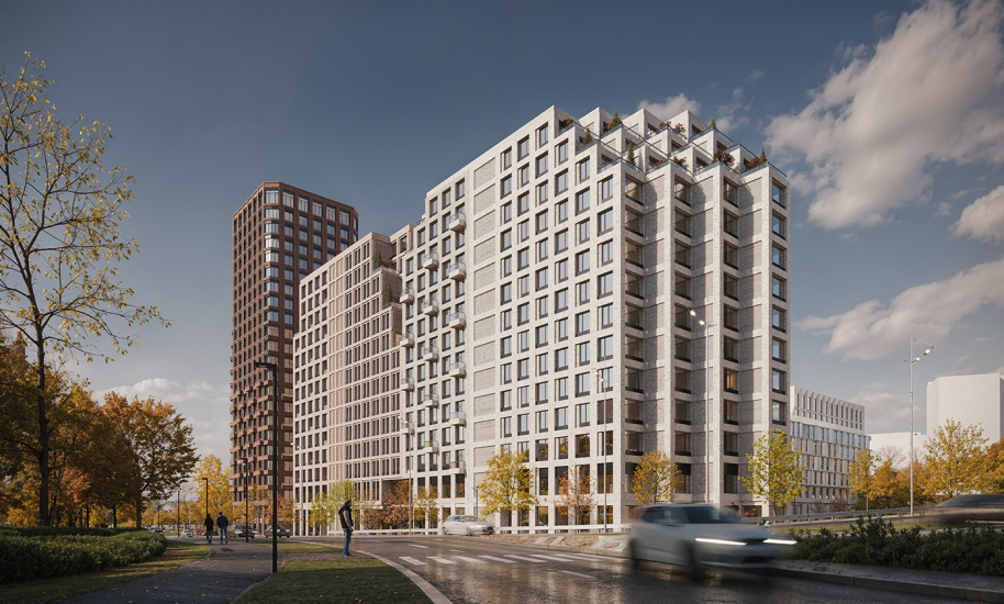
The “Philosophy” residential complex is situated in a very advantageous scenic location – at the intersection of roads leading from the cable-stayed bridge, constructed between 2008 and 2012 across the Golden Horn Bay. The bridge itself is beautiful, offering spectacular views of the bay – the surrounding panoramas alone provide much to the future complex.
“Philosophy” residential complex
Copyright: © Т+Т Architects
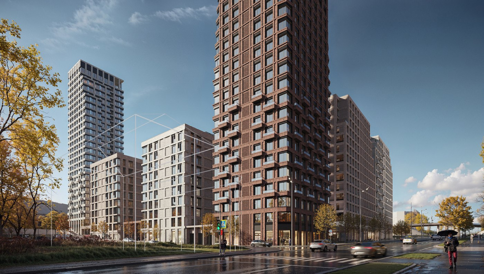
The project also considers views that open up from the highway: designed to enhance views and gradually increase massing, the complex is structured with lower volumes facing the bay and taller towers in the northern part. It lays out its plans akin to a Japanese painting and presents itself to the city as a composition of verticals and horizontals, walls, and towers.
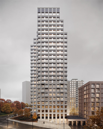
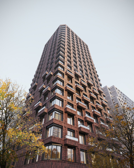
All the buildings here are distinct. Two towers, 23 and 26 stories high – a dark terracotta tower and an almost white one – are positioned at key corners like two rocks from a well-known ancient myth. The white tower, taller and closer to modernist prototypes, features its upper part articulated with large terraced steps. In contrast, the terracotta tower, leaning more towards allusions from red-brick industry buildings, is more dynamic due to its brick balconies on the lower part and thanks to the consistent optical “folding” of corners in its upper part.
These two dominant towers set the main themes: white and terracotta.
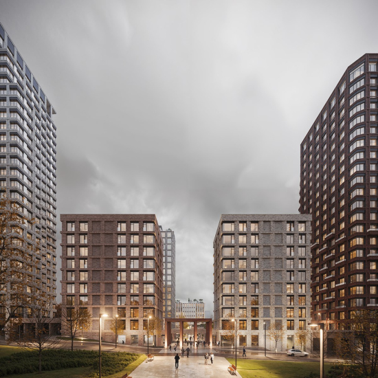
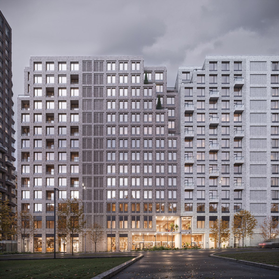
Between them stand 10-story tower-like buildings, currently referred to as “urban villas”, although the format resembles nine-story buildings from the 1970s – and why not? They have found answers to so many questions. These smaller towers perform a color “rook move” and hold the northern edge.
They act as propylaea, with a pylon-like entrance gate (a very classical solution) between them. Adjacent to them, on the sides, entrances lead to underground parking, following their rhythm.
Additionally, adjacent to the terracotta tower is a two-section plate of cascading form, featuring regular “cutouts” of terraces at the corners and at the junction, with a plate-like end and a pyramidal-stepped contour of the entrance lobby.
This slab completes the complex from the east, giving the entire composition the character of a block, not fully enclosed, but still a block, and protects against wind blowing from the mountains.
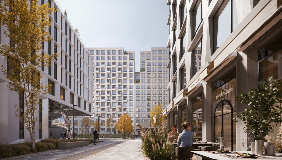
The third theme concerns the central tower and the southern 5-7 story building. Their facades are no longer brick but metallic and faceted – in the overall context, they are the flashiest ones. There is no doubt that, although the tall dominants are more noticeable from a distance and define the overall ensemble like two poles, these silvery buildings are visually more important and valuable.
But that’s not everything. The southern building not only opens views to the bay for its neighbors thanks to its slightly lower height – it also has a gallery typology.
“Philosophy” residential complex
Copyright: © Т+Т Architects
Over the past 20 years, in capital cities, many heated debates have been sparked about the possibility or impossibility of typological explorations within the framework of modern residential complexes rigidly defined by marketers. It seemed that the searches had stalled, leading to the discouraging conclusion of the optimality of towers and ordinary section buildings.
But no, these discussions, as it appears, haven’t died down; they’re ongoing. Here’s a gallery house for you. Yes, in Vladivostok.
Even more intriguing is a large cantilever with a polished surface and a shiny metal sphere as its support – an art object, but not just any art object; it’s seamlessly integrated into the architectural solution and functions as a practical support. Undoubtedly, a noticeable accent.
“Philosophy” residential complex
Copyright: © Т+Т Architects
The sphere support and northern propylaea present the complex to the city, not just as a silhouette or composition of volumes, but directly as a new part of it.
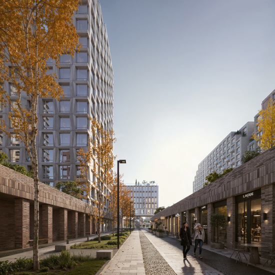
The plot is trapezoidal, almost square. It includes a public easement, T-shaped in plan, stretching along the central axis from west to east, plus an extension northward. Just in case: a public easement means that the land belongs to the owner, but their rights are restricted by law [Art. 23 of the Civil Code of the Russian Federation], and this area cannot be closed for public use. Thus, within the complex and considering the plot’s limitations, two interconnected urban streets are formed – an open space that, as known, enhances modern residential complexes, attracting buyers to shops and cafes.
At the same time, as we all remember, Vladivostok is a city of hills or even mountains, and the height difference on the plot is not radical by the standards of this city, being mere 10 meters. The architects use it to organize the complex’s interior space, primarily for gracefully separating public and private areas. Courtyards appear on stylobates, and in one place, they are connected by a bridge over the public street—a modern variation of the “metropolitan” approach to separating flows within a residential complex, especially since such an approach has been used in Moscow already more than once, making it a contemporary trend.
***
The FSK Group promises to complete the construction of the first phase of the complex, which includes a kindergarten, by the third quarter of 2026.


