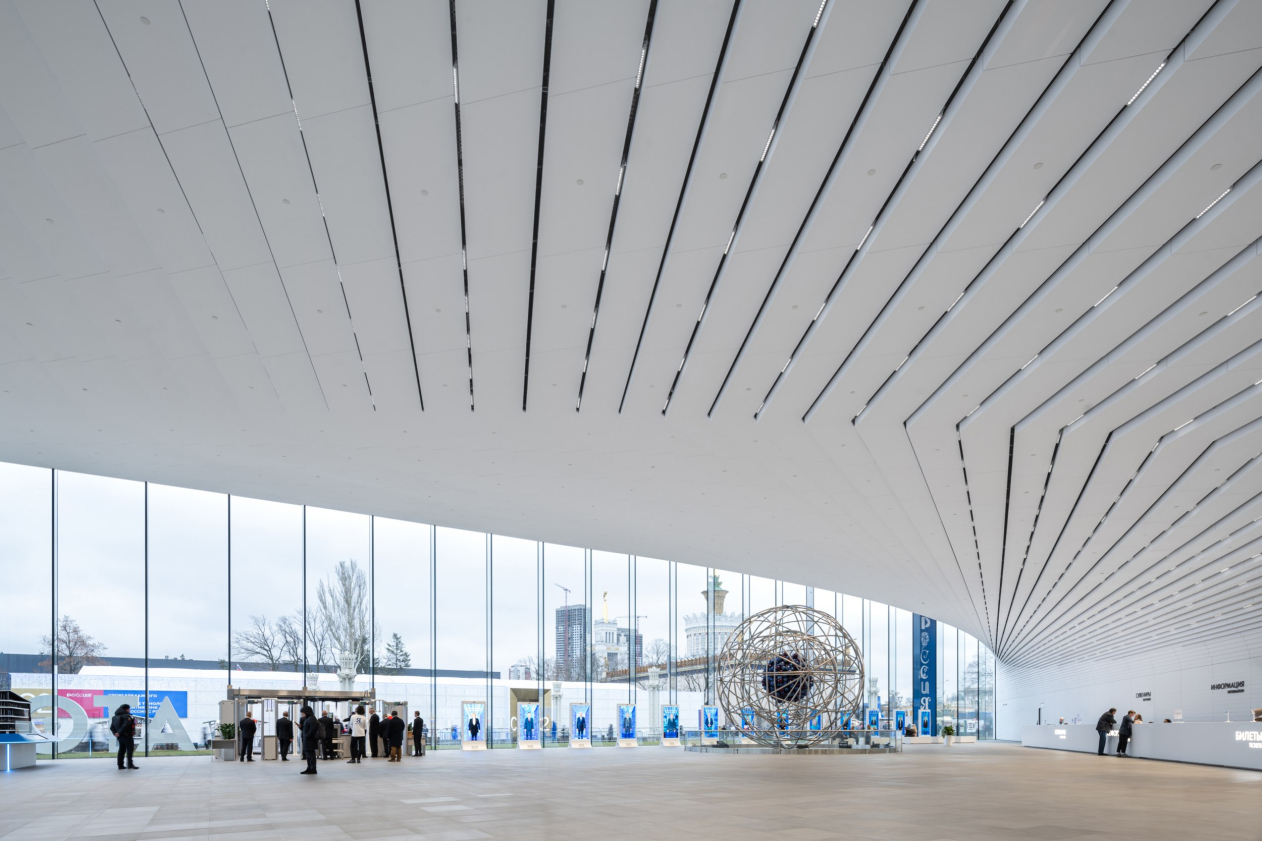
The architects interpret the foyer as a warm analogue of a town square. Its open space, flooded with light streaming through two entirely glass walls, is covered by a white cantilever. The space is full of light.
The ATOM pavilion at VDNKh
Copyright: Photograph © Ilia Ivanov / provided by UNK
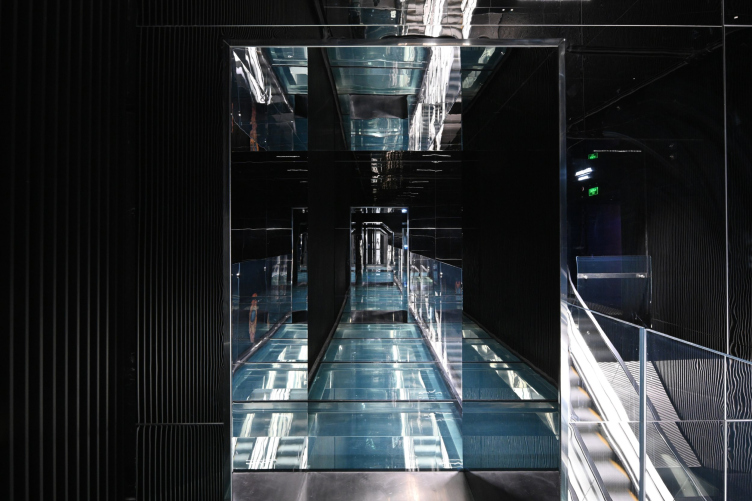
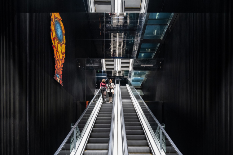
Upon entering the foyer, the visitor transitions into the space of what we called a “communication diagonal”, oriented transversely. It is approximately 7 meters high.
And this space, conversely, is entirely black.
The ATOM pavilion at VDNKh
Copyright: Photograph © Dmitry Chebanenko / provided by UNK
This was the architects’ intention – to build the pavilion on the maximum contrast of opposite things and emotions.
The communication diagonal connects two volumes of a triangular plan, which house the exposition areas (the exposition design was done by Lorem Ipsum) along with other functional spaces.
At the same time, on an emotional level, the space of the communication diagonal helps the visitor to feel the scale of the pavilion from the inside. “A visitor is transitioned from one space to another” the architects explain “Equally vast, cohesive, but different, contrasting with the first, and, again, without any noticeable supporting structures”.
Our “diagonal” is the place where the floor and ceiling visually disappear; it narrows and stretches the space, making it feel almost infinite.
Consequently, contrast was crucial for us, and it was important to execute it seamlessly at the perception level so that no inaccuracies would compromise the intended effect. The goal was to achieve a cohesive result: pure white and solid black. Our task extended beyond concealing technical details, where colleagues from Spectrum greatly assisted us. We also had to integrate mirrors into the overall system (they enhance the sense of infinity), and escalators, which also require technical lighting.
Our challenge didn’t end there – we had to put everything together and make sure there are no color discrepancies. The same RAL color, when applied to different surfaces, can appear with slight variations – sometimes greenish, sometimes brownish. Therefore, we meticulously reviewed everything, created numerous mock-ups, worked with paints and samples, aimed to unify the color temperature, and strived for the resulting shade to be as neutral as possible. We did this for both the black and white spaces, but working with black is known to be more challenging because every speck of dirt and dust is visible.
Speaking of cleaning, our interiors are designed to withstand constant cleaning combined a high flow of visitors. In our public areas – and I’m not referring here to the museum exhibition, which operates under different rules – everything is touchable, and visitors can run their hands over surfaces without causing damage. We have significant experience working with high-traffic spaces, whether in shopping centers or airports, so we understand the principles of their construction.
Lighting the black space also proved to be a significant challenge: we illuminate only at key navigation points – similar to a theater, you need to highlight the essential and dim the rest; otherwise, the space won’t remain black. It’s crucial not to overilluminate.
The ATOM pavilion at VDNKh. The cummunication core. Temporary expositions on the walls
Copyright: Photograph © Ilia Ivanov / provided by UNK
Speaking about light, currently the pavilion still has a very high flow of visitors, and the lighting, including the lighting inside the communication diagonal, is “cranked up” to 100% – whereas according to the architects’ recommendations, the lamps should shine at 60%, which will make the effect of black space more noticeable.
What is interesting about this whole story – and the pavilion as a whole, for that matter – is the sheer volume of the architects’ engineering solutions, both generally structural and those related to the interiors. Back at the presentation, I asked Julius Borisov if I could publish the information about the “nodes”, and he said yes.
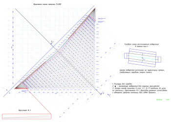
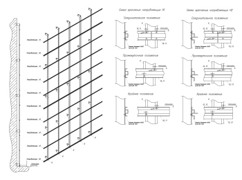
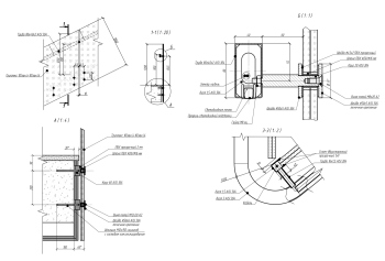
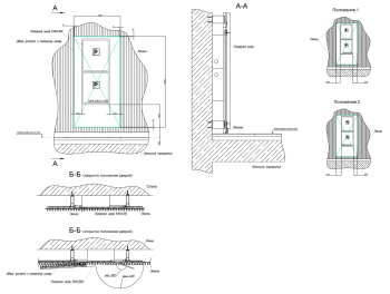
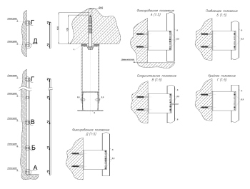
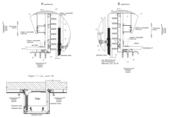
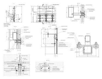
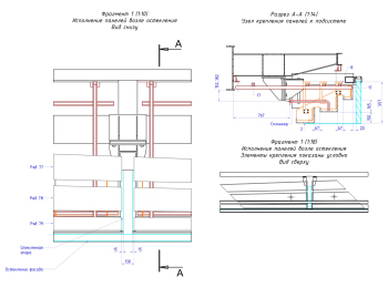
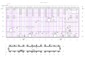
Now we have asked Julia Tryaskina for a few interior design assemblies – and she says that she considers such publications important – since her student years she has loved to look at the drawings of her colleagues’ design solutions. With the permission of the architects’ team, we publish below a few “nodes” related to interior constructions.
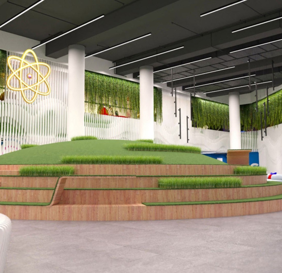
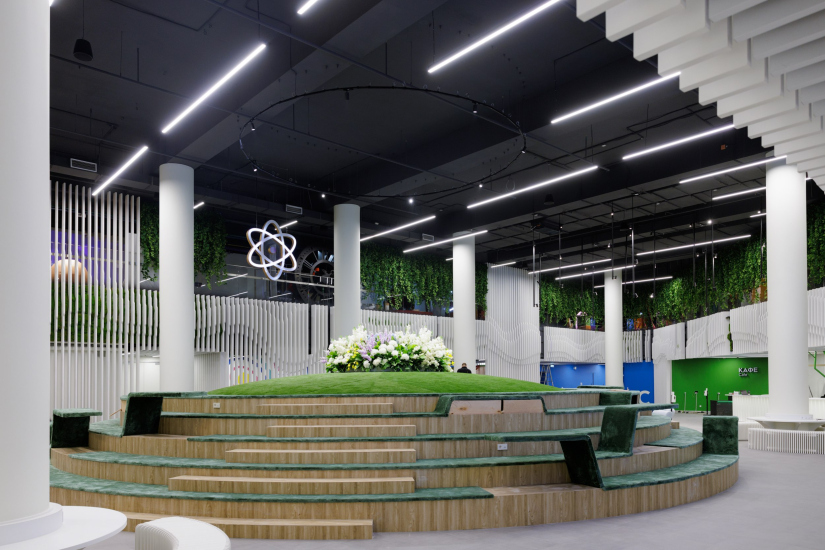
Another story unfolded during the design process and was related to the placement of a model of an atomic bomb in one of the exposition halls. Julia Tryaskina emphasizes that this is not even a model, but a real atom bomb shell made at the same production facility, and therefore life-size. Its dimensions escaped the architects’ attention at first, and then it turned out that in order to create a sufficiently spectacular hall with the bomb, it was necessary to raise the height of the hall by adding a dome, which resulted in a “bulge” in the atrium space above. After much discussion, it was decided to mask the “bulge” as a green ball, surrounded by the amphitheater. Here we see a public space, designed, among other things, for events and arrangement of tables in front of the conference hall. The library and the museum store are also located here, i.e. the atrium hosts the commercial premises of the pavilion.
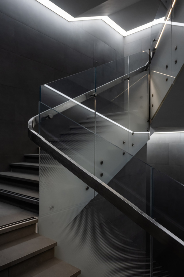
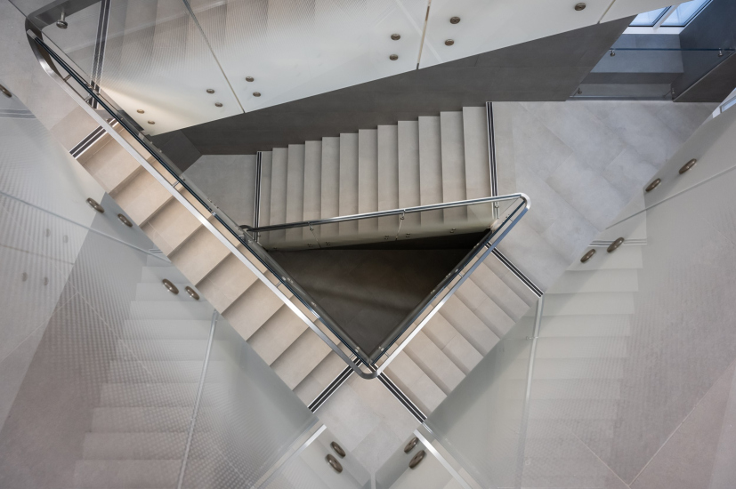
Another part of the pavilion’s public spaces are triangular staircases: gray concrete, printed glass, and steel handrails. Their shape, conditioned by the building’s structure – angles between the hypotenuse and cathetuses – brings to mind similar staircases arranged by UNK in the triangular building of the “Zemelny” business center, but in “Zemelny” they are in fact emergency staircases (although they are also very interesting), while here, in the ATOM pavilion, at least one of the staircases is actively used by visitors of the restaurant in the upper floor of the building.
Thus, the interiors of the public spaces of the ATOM pavilion, designed by UNK interiors, are primarily based on the contrast between the white wide space of the foyer and the black, narrow, yet seemingly infinite, space of the communication diagonal. To convey the key statement, the architects performed extensive work on details and nuances, refining mock-ups and paint finishes. As always, the miracle effect doesn’t just “happen” on its own.
In this case, this contrast is needed not only to “switch” the visitor’s perception, but it also has a semantic coloring – as Julia Tryaskina says, “there are no halftones, no indifferent people when it comes to nuclear energy. And there is no author’s opinion – it’s either white or it’s black”.
This statement is hard to dispute. And, on the other hand, it is clear why so much effort was put into the execution of this metaphor, internally graphic, yet, at the same time “speaking” and even “shouting” to some extent.
