По-русски

The Dairy Theme

The concept of an office of a cheese-making company, designed for the enclosed area of a dairy factory, at least partially refers to industrial architecture. Perhaps that is why this concept is very simple, which seems the appropriate thing to do here. The building is enlivened by literally a couple of “master strokes”: the turning of the corner accentuates the entrance, and the shade of glass responds to the theme of “milk rivers” from Russian fairy tales.

23 January 2024
Object
mainImg
A dairy plant in the Kaluga Oblast was set up about 10 years ago, primarily to produce soft cheeses. It was fine-tuned with the participation of specialists who had undergone training in Switzerland and Italy, it has strict sanitary rules, and its cheeses are sold in Moscow on the glamorous Kutuzovsky Avenue. Today, the dairy farm is expanding, and its owner, an old acquaintance of Roman Leonidov – many years ago the architect designed a private house for him – has asked the architect to come up with the concept of the entrance building.

Contrary to our expectations, the building’s function is more technical than representative: the building will host management offices, a café, changing rooms and rooms for sanitation, which the farm’s employees must rigorously undergo before their shift.

At the initial stage, we had to understand the technology and conditions of functioning of the spaces. Although we were given a precise list of the required spaces, we had to organize them optimally and build connections between them. We also had to strike a balance between simplicity and expressiveness.

I would define my idea in this nutshell: lightness, transparency, “milkiness”. Hence the combination of warm white with glass, with a certain percentage of mirroring on the outside, and milky glass behind it. “Milkiness” can also be emphasized with backlighting. In this case, electrochromic glass would have been the perfect solution, but it is prohibitively expensive. We will choose the material – as a rule, we choose from many samples, and we often choose it right at the construction site.


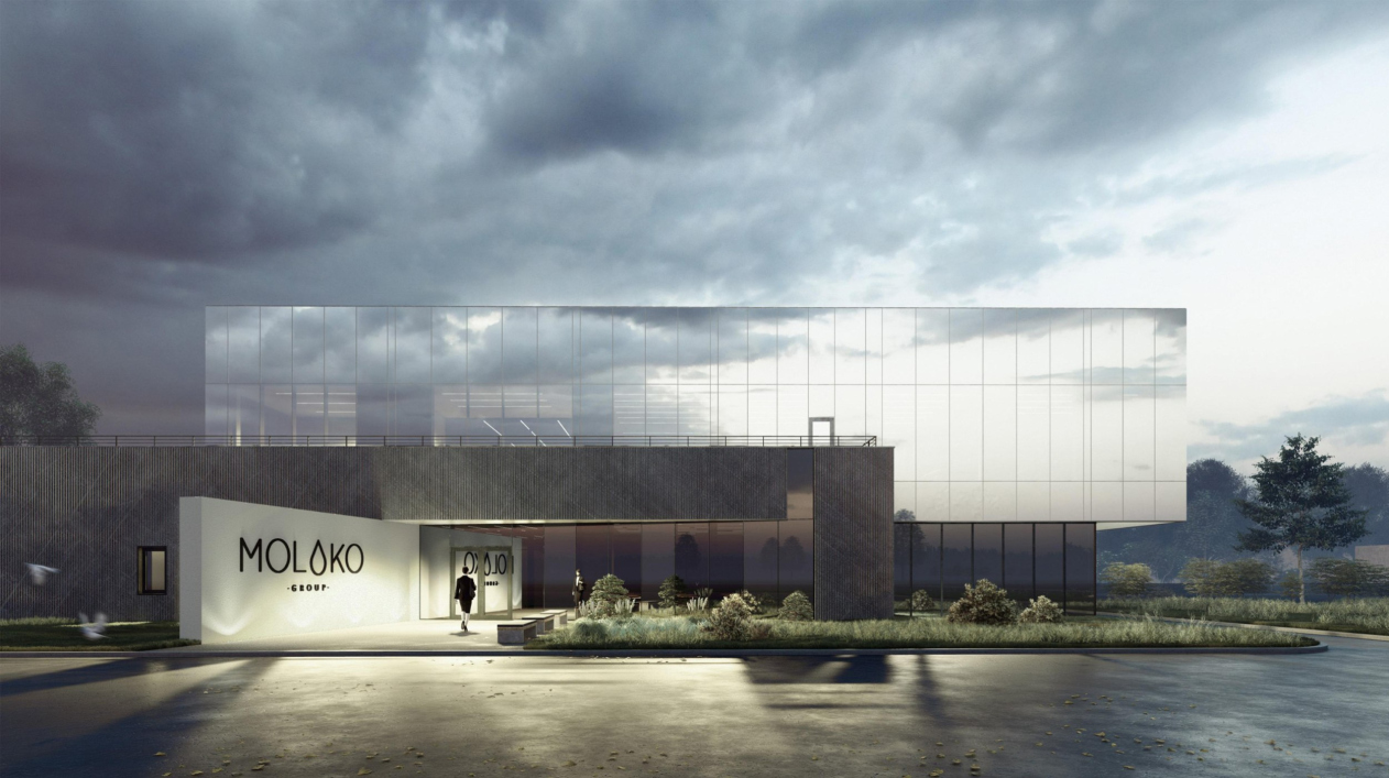
The building is indeed small and simple, which is quite normal and even required for industrial architecture in such a setting. It consists of two main volumes, with the upper one strongly shifted to the right when viewed from the entrance, so that it forms a rather prominent cantilever on one side and a spacious terrace on the other, which the occupants of the second-floor offices can access.

Moloko Group office building
Copyright: © Roman Leonidov


The facades. Moloko Group office building
Copyright: © Roman Leonidov


The upper floor is entirely glass, and its facades are not very economical, as they suggest structural glass with a percentage of mirroring and a “milky” tint – possibly, emphasized by backlighting. It should be visually dissolved, reflecting the sky, and in the evening it should rather symbolize the proverbial “milk rivers” from Russian fairy tales. However, if we look at the cover of the project displaying the image of the building with an imaginary cow, we can even see a rhyme between the spots on the hide of breeding cattle and the reflection of random clouds in the glass.

Moloko Group office building
Copyright: © Roman Leonidov


Thus, the whole building becomes in its own way a “cow”, only generalized to the point of complete abstraction. If you look really hard, you can see a head and a tail, but there is no naturalism.

And then there is – this is probably the cow’s leg, no less! – the beveled slab of the entrance. It forms half of the socket and then continues reflected in the glass, bearing the logo; its white color, on which, moreover, the MOLOKO logo is placed, leaves no doubt about the company’s profile. It will definitely have to echo the slightly “milky-white” glass of the building’s upper volume.

Moloko Group office building
Copyright: © Roman Leonidov


The reflection emphasizes the perspective, as if inviting you to come in. Needless to say, this is a well-tried, simple and almost sure-fire modernist technique. It is not surprising that it accentuates the entrance here – both the propylaea and the signboard – while the whiteness itself correlates not only with the color of the product, but also with the cleanliness that production requires.

In addition, it’s also a white spot – almost like the side of a cow.

The lower tier is long and dark; while the architect plans to choose high-quality glass for the top, he wants to cover the plate in front of the entrance with plaster: “High-quality plaster, mind! You can’t imagine how high-quality and durable plaster is available on the market nowadays” – then dark-gray striped fiber concrete is appropriate here, which, if we continue with the analogies already given here in abundance, may remind us of a cow hide. The natural roughness of the hide or earth also distinguishes it from the white and shiny conventional “milk” above, emphasizing the difference between the materials.

Moloko Group office building
Copyright: © Roman Leonidov


If we look at the building’s plan, we will see once again that the main accent – the one that’s at the entrance – is also made quite simple, with a single stroke: not just the white wall on the left is beveled, but also the glass of the entrance group; between them, there is a right angle, as if the entrance was taken and turned at a slight angle. However, this is exactly what allowed the architect to achieve a straight line of the perspective reflection, so successfully extending the white propylaea. Without this turn, it would probably not look as artistic.

  • zooming
    Plan of the 1 floor. Moloko Group office building
    Copyright: © Roman Leonidov
  • zooming
    Plan of the 2 floor. Moloko Group office building
    Copyright: © Roman Leonidov


On the first floor to the right of the entrance, there is a cafe and its continuation, a small conference room separated by a mobile curtain, and to the left are the staff changing rooms. The second floor hosts the administration offices.

23 January 2024

Headlines now
The Big Twelve
Yesterday, the winners of the Moscow Mayor’s Architecture Award were announced and honored. Let’s take a look at what was awarded and, in some cases, even critique this esteemed award. After all, there is always room for improvement, right?
Above the Golden Horn
The residential complex “Philosophy” designed by T+T architects in Vladivostok, is one of the new projects in the “Golubinaya Pad” area, changing its development philosophy (pun intended) from single houses to a comprehensive approach. The buildings are organized along public streets, varying in height and format, with one house even executed in gallery typology, featuring a cantilever leaning on an art object.
Nuanced Alternative
How can you rhyme a square and space? Easily! But to do so, you need to rhyme everything you can possibly think of: weave everything together, like in a tensegrity structure, and find your own optics too. The new exhibition at GES-2 does just that, offering its visitor a new perspective on the history of art spanning 150 years, infused with the hope for endless multiplicity of worlds and art histories. Read on to see how this is achieved and how the exhibition design by Evgeny Ace contributes to it.
Blinds for Ice
An ice arena has been constructed in Domodedovo based on a project by Yuri Vissarionov Architects. To prevent the long façade, a technical requirement for winter sports facilities, from appearing monotonous, the architects proposed the use of suspended structures with multidirectional slats. This design protects the ice from direct sunlight while giving the wall texture and detail.
Campus within a Day
In this article, we talk about what the participants of Genplan Institute of Moscow’s hackathon were doing at the MosComArchitecture booth at the “ArchMoscow” exhibition. We also discuss who won the prize and why, and what can be done with the territory of a small university on the outskirts of Moscow.
Vertical Civilization
Genpro considered the development of the vertical city concept and made it the theme of their pavilion at the “ArchMoscow” exhibition.
Marina Yegorova: “We think in terms of hectares, not square meters”
The career path of architect Marina Yegorova is quite impressive: MARHI, SPEECH, MosComArchitectura, the Genplan Institute of Moscow, and then her own architectural company. Its name Empate, which refers to the words “to draw” in Portuguese and “to empathize” in English, should not be misleading with its softness, as the firm freely works on different scales, including Integrated Territorial Development projects. We talked with Marina about various topics: urban planning experience, female leadership style, and even the love of architects for yachting.
Andrey Chuikov: “Optimum balance is achieved through economics”
The Yekaterinburg-based architectural company CNTR is in its mature stage: crystallization of principles, systematization, and standardization helped it make a qualitative leap, enhance competencies, and secure large contracts without sacrificing the aesthetic component. The head of the company, Andrey Chuikov, told us about building a business model and the bonuses that additional education in financial management provides for an architect.
The Fulcrum
Ostozhenka Architects have designed two astonishing towers practically on the edge of a slope above the Oka River in Nizhny Novgorod. These towers stand on 10-meter-tall weathered steel “legs”, with each floor offering panoramic views of the river and the city; all public spaces, including corridors, receive plenty of natural light. Here, we see a multitude of solutions that are unconventional for the residential routine of our day and age. Meanwhile, although these towers hark back to the typological explorations of the seventies, they are completely reinvented in a contemporary key. We admire Veren Group as the client – this is exactly how a “unique product” should be made – and we tell you exactly how our towers are arranged.
Crystal is Watching You
Right now, Museum Night has kicked off at the Museum of Architecture, featuring a fresh new addition – the “Crystal of Perception”, an installation by Sergey Kuznetsov, Ivan Grekov, and the KROST company, set up in the courtyard. It shimmers with light, it sings, it reacts to the approach of people, and who knows what else it can do.
The Secret Briton
The house is called “Little France”. Its composition follows the classical St. Petersburg style, with a palace-like courtyard. The decor is on the brink of Egyptian lotuses, neo-Greek acroteria, and classic 1930s “gears”; the recessed piers are Gothic, while the silhouette of the central part of the house is British. It’s quite interesting to examine all these details, attempting to understand which architectural direction they belong to. At the same time, however, the house fits like a glove in the context of the 20th line of St. Petersburg’s Vasilievsky Island; its elongated wings hold up the façade quite well.
The Wrap-Up
The competition project proposed by Treivas for the first 2021 competition for the Russian pavilion at EXPO 2025 concludes our series of publications on pavilion projects that will not be implemented. This particular proposal stands out for its detailed explanations and the idea of ecological responsibility: both the facades and the exhibition inside were intended to utilize recycled materials.
Birds and Streams
For the competition to design the Omsk airport, DNK ag formed a consortium, inviting VOX architects and Sila Sveta. Their project focuses on intersections, journeys, and flights – both of people and birds – as Omsk is known as a “transfer point” for bird migrations. The educational component is also carefully considered, and the building itself is filled with light, which seems to deconstruct the copper circle of the central entrance portal, spreading it into fantastic hyper-spatial “slices”.
Faraday Grid
The project of the Omsk airport by ASADOV Architects is another concept among the 14 finalists of a recent competition. It is called “The Bridge” and is inspired by both the West Siberian Exhibition of 1911 and the Trans-Siberian Railway bridge over the Irtysh River, built in 1896. On one hand, it carries a steampunk vibe, while on the other, there’s almost a sense of nostalgia for the heyday of 1913. However, the concept offers two variants, the second one devoid of nostalgia but featuring a parabola.
Midway upon the Journey of Our Life
Recently, Tatlin Publishing House released a book entitled “Architect Sergey Oreshkin. Selected Projects”. This book is not just a traditional book of the architectural company’s achievements, but rather a monograph of a more personal nature. The book includes 43 buildings as well as a section with architectural drawings. In this article, we reflect on the book as a way to take stock of an architect’s accomplishments.
Inverted Fortress
This year, there has been no shortage of intriguing architectural ideas around the Omsk airport. The project developed by the architectural company KPLN appeals to Omsk’s history as a wooden fortress that it was back in the day, but transforms the concept of a fortress beyond recognition: it “shaves off” the conical ends of “wooden logs”, then enlarges them, and then flips them over. The result is a hypostyle – a forest of conical columns on point supports, with skylights on top.
Transformation of Annenkirche
For Annenkirche (St. Anna Lutheran Church in St. Petersburg), Sergey Kuznetsov and the Kamen bureau have prepared a project that relies on the principles of the Venice Charter: the building is not restored to a specific date, historical layers are preserved, and modern elements do not mimic the authentic ones. Let’s delve into the details of these solutions.
The Paradox of the Temporary
The concept of the Russian pavilion for EXPO 2025 in Osaka, proposed by the Wowhaus architects, is the last of the six projects we gathered from the 2022 competition. It is again worth noting that the results of this competition were not finalized due to the cancellation of Russia’s participation in World Expo 2025. It should be mentioned that Wowhaus created three versions for this competition, but only one is being presented, and it can’t be said that this version is thoroughly developed – rather, it is done in the spirit of a “student assignment”. Nevertheless, the project is interesting in its paradoxical nature: the architects emphasized the temporary character of the pavilion, and in its bubble-like forms sought to reflect the paradoxes of space and time.
The Forum of Time
The competition project for the Russian Pavilion at EXPO 2025 in Osaka designed by Aleksey Orlov and Arena Project Institute consists of cones and conical funnels connected into a non-trivial composition, where one can feel the hand of architects who have worked extensively with stadiums and other sports facilities. It’s very interesting to delve into its logic, structurally built on the theme of clocks, hourglasses and even sundials. Additionally, the architects have turned the exhibition pavilion into a series of interconnected amphitheaters, which is also highly relevant for world exhibitions. We are reminding you that the competition results were never announced.
Mirrors Everywhere
The project by Sergey Nebotov, Anastasia Gritskova, and the architectural company “Novoe” was created for the Russian pavilion at EXPO 2025, but within the framework of another competition, which, as we learned, took place even earlier, in 2021. At that time, the competition theme was “digital twins”, and there was minimal time for work, so the project, according to the architect himself, was more of a “student assignment”. Nevertheless, this project is interesting for its plan bordering on similarity with Baroque projects and the emblem of the exhibition, as well as its diverse and comprehensive reflectiveness.
The Steppe Is Full of Beauty and Freedom
The goal of the exhibition “Dikoe Pole” (“Wild Field”) at the State Historical Museum was to move away from the archaeological listing of valuable items and to create an image of the steppe and nomads that was multidirectional and emotional – in other words, artistic. To achieve this goal, it was important to include works of contemporary art. One such work is the scenography of the exhibition space developed by CHART studio.
The Snowstorm Fish
The next project from the unfinished competition for the Russian Pavilion at EXPO 2025, which will be held in Osaka, Japan, is by Dashi Namdakov and Parsec Architects. The pavilion describes itself as an “architectural/sculptural” one, with its shape clearly reminiscent of abstract sculpture of the 1970s. It complements its program with a meditative hall named “Mendeleev’s Dreams”, and offers its visitors to slide from its roof at the end of the tour.
The Mirror of Your Soul
We continue to publish projects from the competition for the design of the Russian Pavilion at EXPO in Osaka 2025. We are reminding you that the results of the competition have not been announced, and hardly will ever be. The pavilion designed by ASADOV Architects combines a forest log cabin, the image of a hyper transition, and sculptures made of glowing threads – it focuses primarily on the scenography of the exhibition, which the pavilion builds sequentially like a string of impressions, dedicating it to the paradoxes of the Russian soul.
Part of the Ideal
In 2025, another World Expo will take place in Osaka, Japan, in which Russia will not participate. However, a competition for the Russian pavilion was indeed held, with six projects participating. The results were never announced as Russia’s participation was canceled; the competition has no winners. Nevertheless, Expo pavilion projects are typically designed for a bold and interesting architectural statement, so we’ve gathered all the six projects and will be publishing articles about them in random order. The first one is the project by Vladimir Plotkin and Reserve Union, which is distinguished by the clarity of its stereometric shape, the boldness of its structure, and the multiplicity of possible interpretations.
The Fortress by the River
ASADOV Architects have developed a concept for a new residential district in the center of Kemerovo. To combat the harsh climate and monotonous everyday life, the architects proposed a block type of development with dominant towers, good insolation, facades detailed at eye level, and event programming.
In the Rhombus Grid
Construction has begun on the building of the OMK (United Metallurgical Company) Corporate University in Nizhny Novgorod’s town of Vyksa, designed by Ostozhenka Architects. The most interesting aspect of the project is how the architects immersed it in the context: “extracting” a diagonal motif from the planning grid of Vyksa, they aligned the building, the square, and the park to match it. A truly masterful work with urban planning context on several different levels of perception has long since become the signature technique of Ostozhenka.
​Generational Connection
Another modern estate, designed by Roman Leonidov, is located in the Moscow region and brings together three generations of one family under one roof. To fit on a narrow plot without depriving anyone of personal space, the architects opted for a zigzag plan. The main volume in the house structure is accentuated by mezzanines with a reverse-sloped roof and ceilings featuring exposed beams.
Three Dimensions of the City
We began to delve into the project by Sergey Skuratov, the residential complex “Depo” in Minsk, located at Victory Square, and it fascinated us completely. The project has at least several dimensions to it: historical – at some point, the developer decided to discontinue further collaboration with Sergey Skuratov Architects, but the concept was approved, and its implementation continues, mostly in accordance with the proposed ideas. The spatial and urban planning dimension – the architects both argue with the city and play along with it, deciphering nuances, and finding axes. And, finally, the tactile dimension – the constructed buildings also have their own intriguing features. Thus, this article also has two parts: it dwells on what has been built and what was conceived
New “Flight”
Architects from “Mezonproject” have developed a project for the reconstruction of the regional youth center “Polyot”(“Flight”) in the city of Oryol. The summer youth center, built back in the late 1970s, will now become year-round and acquire many additional functions.
The Yauza Towers
In Moscow, there aren’t that many buildings or projects designed by Nikita Yavein and Studio 44. In this article, we present to you the concept of a large multifunctional complex on the Yauza River, located between two parks, featuring a promenade, a crossroads of two pedestrian streets, a highly developed public space, and an original architectural solution. This solution combines a sophisticated, asymmetric façade grid, reminiscent of a game of fifteen puzzle, and bold protrusions of the upper parts of the buildings, completely masking the technical floors and sculpting the complex’s silhouette.