По-русски

The Ensemble at the Mosque

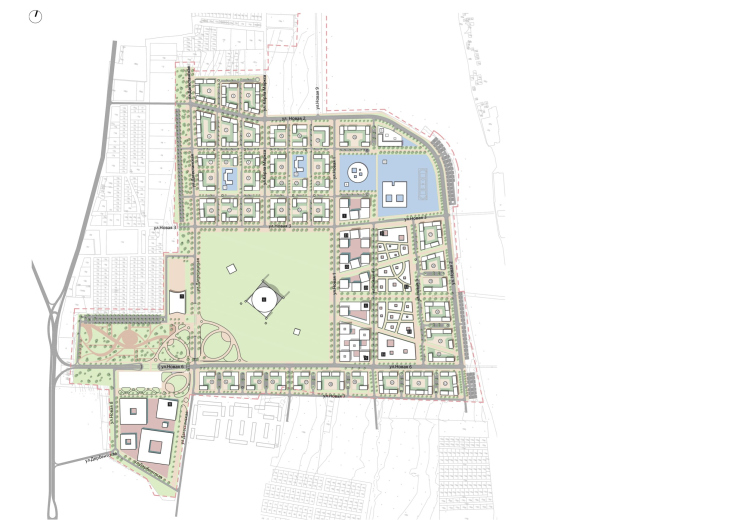
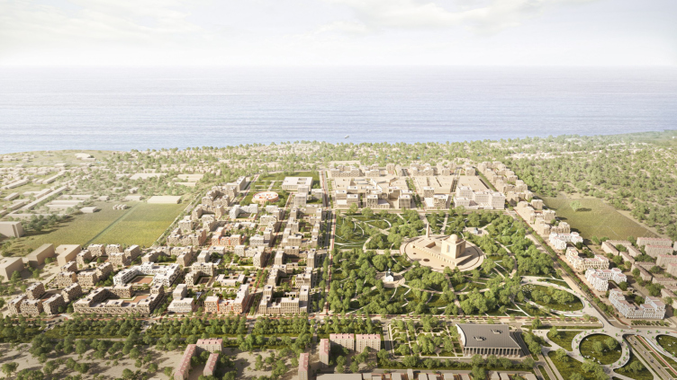
OSA prepared a master plan for a district in the southern part of Derbent. The main task of the master plan is to initiate the formation of a modern comfortable environment in this city. The organization of residential areas is subordinated to the city’s spiritual center: depending on the location relative to the cathedral mosque, the houses are distinguished by façade and plastique solutions. The program also includes a “hospitality center”, administrative buildings, an educational cluster, and even an air bridge.

08 February 2024
Object
mainImg
Inhabited Vineyard

Derbent is not only the oldest city in Russia, but also the first one to start implementing such a master plan. The competition for its development was held in 2019; currently, much of the project developed by the winning consortium has already been implemented: a section of the seaside boulevard has been improved, the ancient quarters of Magala have been tidied up, the “Tourist Mile” route has connected the tourist attractions, parks and public gardens have been opened, and a sports palace is under construction. There are still many projects ahead to turn the city into a sought-after resort, but already now the city is clearly attractive not only for tourists, but also for investors.

One of the activities of the master plan is the so-called New Derbent: a residential neighborhood in the southern part of the city that will occupy 160 hectares of former vineyards between the Caspian Sea and the mountain slopes.

The initiative to create such a district came from the city administration and the city’s chief architect Isa Magomedov, who was extremely involved in the transformation, so the program far exceeded the standard development one: in addition to housing and schools, there will be a spiritual center, a marriage palace, an educational cluster, and other projects, which together will represent a piece of exemplary modern Derbent. With this project, the city administration has streamlined the arrival of investors in the city: for the city center, they duly introduced height restrictions and façade regulations, and the developers were offered a free territory, which was further regulated by its own master plan, which defined the parameters of the development and its design code. This is quite an appropriate step, given the kind of high-rise neighborhoods that have begun to appear on the outskirts of Derbent in recent years.

The first to work with the land site were the foreign practices WATG and Tanmiya. Then OSA – with extensive experience in preparing similar projects – was involved in the work.

Three Centerpieces

From the very beginning, it was determined that the heart of the new district – both semantic and spatial – would be the Spiritual Center, for which a 36-hectare square land site, clearly visible from the Kavkaz highway, was allocated. Given the significance and scale of the project, a competition was held for it in 2021: the concept included a mosque named “Mother’s Tears” for 40,000 worshippers, an Orthodox church and a synagogue, as well as the improvement of the park with the creation of a library and a museum. None of the submitted competition projects fully satisfied the administration, and it is likely that another competition will be held in the future.

The “Southern” district
Copyright: © OSA


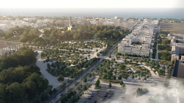
The mosque as the main object of the spiritual center becomes the point of reference for building the composition of the entire neighborhood, which corresponds to the classical approach to urban planning based on the centric system and the system of axes. The mosque determined the location of the new streets, as well as the hierarchy of neighborhoods: the closer to it, the more solemn and austere the facades are.

Two more public clusters are being built together with the mosque in a diagonal pattern. At the entrance to the new district from the “Kavkaz” highway, there is a Hospitality Center: here worshippers and tourists will be able to leave their cars, rent a hotel room, have a snack, and get the necessary information. Across the road from it, there is a marriage palace. The opposite corner includes educational institutions: a university building, a school, an educational center, and a medical center.

The “Southern” district
Copyright: © OSA


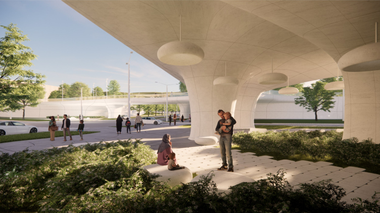
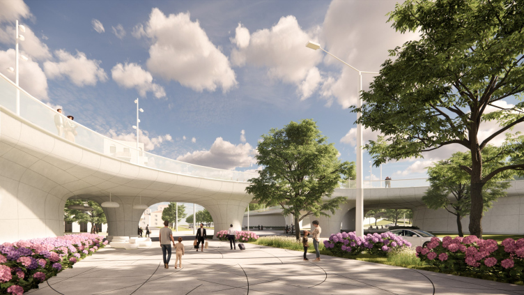
The connecting link between all three clusters and the entry point for visitors is a pedestrian bridge, which forms an extensive system of barrier-free promenades. The office held an internal competition to find the shape of this element.

The “Southern” district
Copyright: © OSA


The bridge is supposed to be spanning three artificial hills, so that its canvas smoothly rises and falls, opening up views of the mountains, the sea and the spiritual center. The second level increases pedestrian space and also provides shaded areas. When viewed from above, the curves of the aerial promenades resemble Arabic ligature. There is already a similar bridge in the center of Derbent, connecting the “Tourist Mile” with Nizami Park – it is invariably popular among citizens and tourists.

The “Southern” district
Copyright: © OSA


The “Southern” district
Copyright: © OSA


A Street With a Design Code

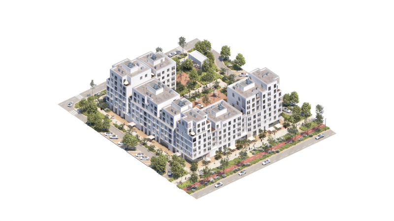
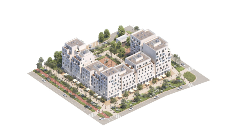
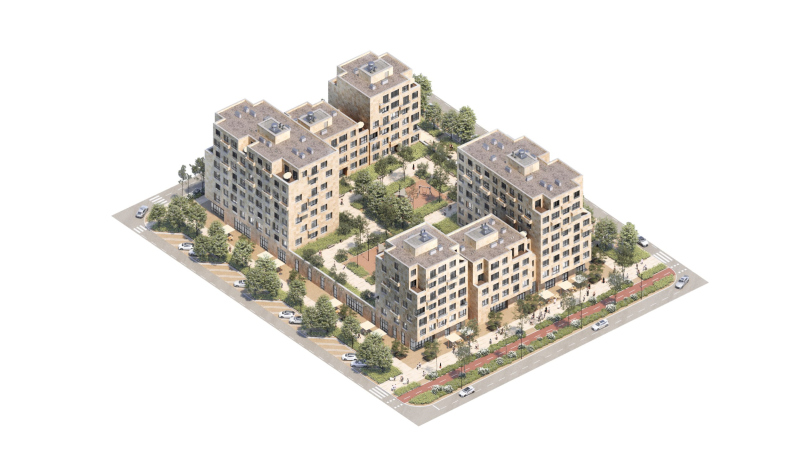
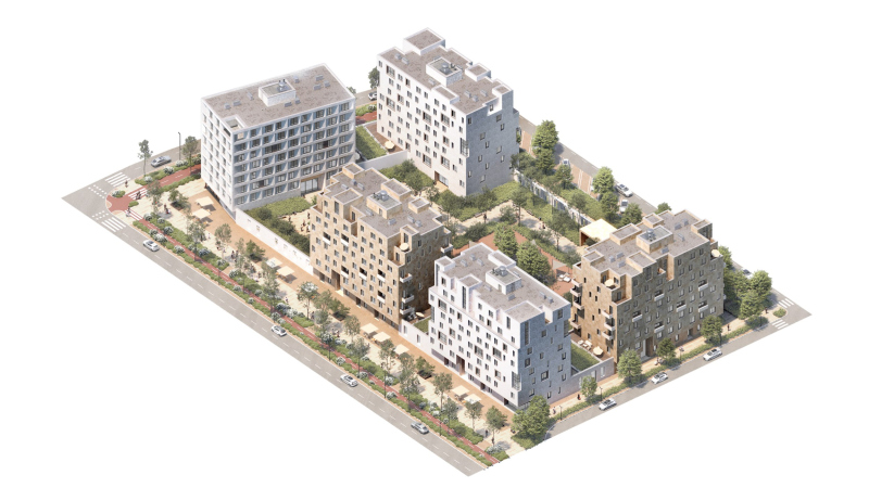
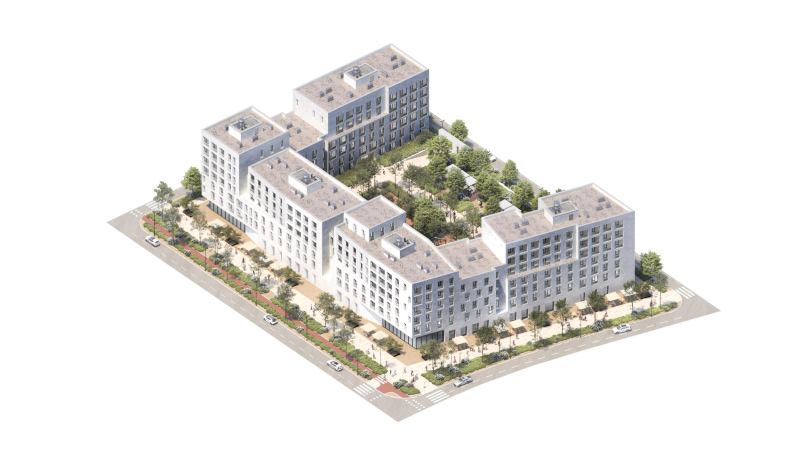
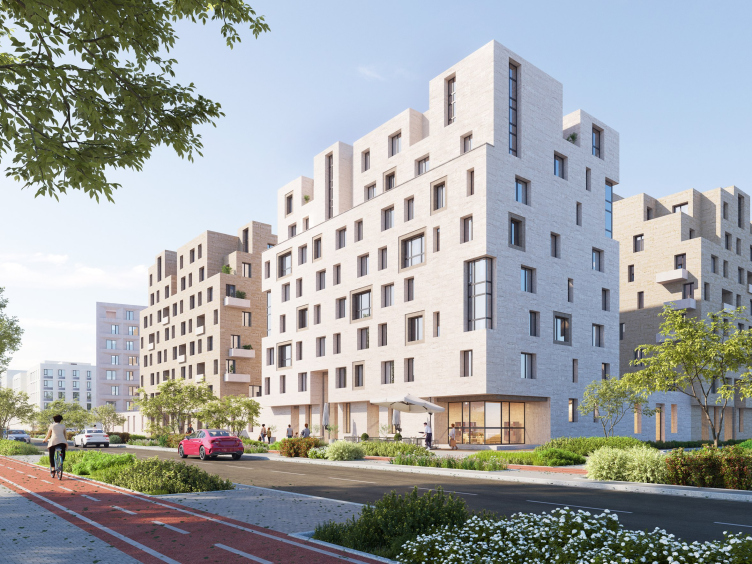
The rest of the space is filled by mid-rise residential areas and the business center. As was already mentioned, they are subordinated to a hierarchy, the determining role in which is played by proximity to the spiritual center. The architects emphasize the typology of each block with the help of plastique and decorative solutions stipulated in the design code. Another influential factor is the sunshine, which can be very hot indeed here: to keep the rooms from overheating, the architects varied the depth of the chamfers, the pattern of balconies and the height of sections. Terraces are found more as an exception in order to diversify the apartment range and form a more expressive silhouette: according to OCA, people in Russia do not use summer rooms very often, even in regions with a hot climate.

  • zooming
    1 / 5
    The “Southern” district
    Copyright: © OSA
  • zooming
    2 / 5
    The “Southern” district
    Copyright: © OSA
  • zooming
    3 / 5
    The “Southern” district
    Copyright: © OSA
  • zooming
    4 / 5
    The “Southern” district
    Copyright: © OSA
  • zooming
    5 / 5
    The “Southern” district
    Copyright: © OSA


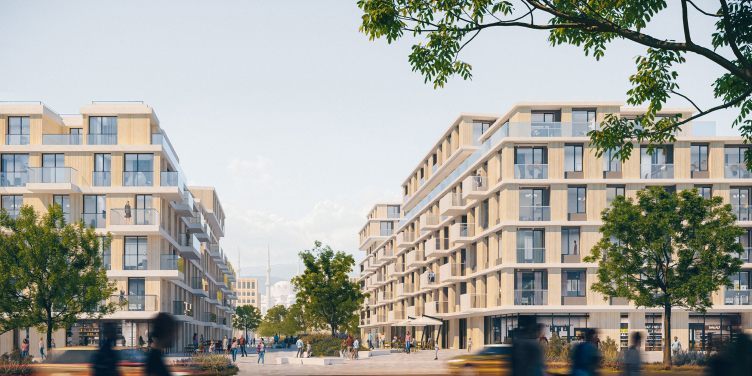
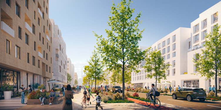
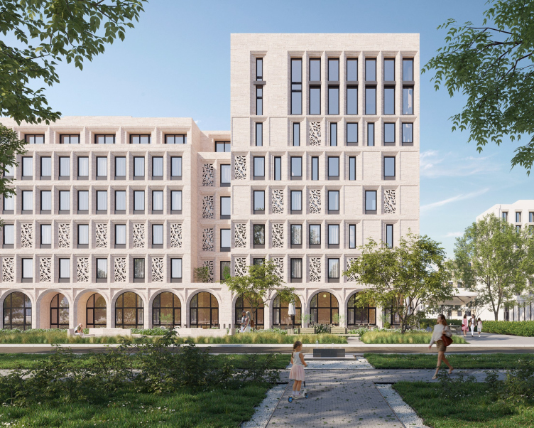
The southern residential areas, located along the main latitudinal street with the project name of Izobilnaya (“Plentiful”), overlook the garden of the Spiritual Center and welcome visitors, including motorcades of officials. Therefore, the facades are austere and grand, but at the same time authentic, faced with Derbent stone, and there are no balconies or loggias on the street side. The blocks stretch all the way to the border of the site, where the railroad runs, and the sea view opens up.

The “Southern” district
Copyright: © OSA


The “Southern” district
Copyright: © OSA


The most representative front of the development is the eastern one, formed by administration buildings and business centers. Compositions of cubic blocks, not resembling ordinary residential neighborhoods, enriched the overall silhouette of the construction. Behind them, there are a hotel, shopping centers and an open-air market, without which it is impossible to imagine any southern city.

The “Southern” district
Copyright: © OSA


The last line is composed of the seaside residential blocks, where residents have the opportunity to admire the sea views: there are more terraces, more balconies, and a larger glazing area than in the other areas. The entire eastern quarter is cut by three beams of streets, in the perspective of which you can see either the sea or the mosque looming against the mountains. Peter the Great, who once traveled to Derbent, would have appreciated this solution – the three beams definitely remind one of the “Neva Trident” converging at the Admiralty.

The “Southern” district
Copyright: © OSA


The “Southern” district
Copyright: © OSA


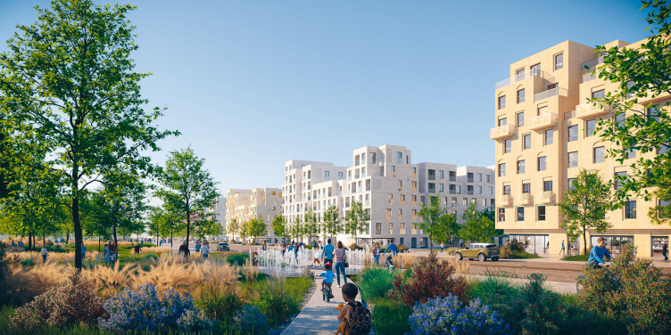
The northern areas also overlook the garden of the Spiritual Center, but gradually dissolve into the existing development. Here, houses are compactly grouped around kindergartens, forming semi- enclosed city blocks whose courtyards form a network of green pedestrian routes. In the finishing of facades, plaster is allowed; as you get further away from the mosque their plastique becomes less tense. It is from this part of the district that the implementation of the master plan began – the residential complex “Granatovy” is being built on the border with the existing development, which the architects of the master plan assess positively: the developer uses the set of techniques laid down by them, and the design code works.

Flexible Links

The street and road network takes into account the variety of possible scenarios in the new neighborhood. A transportation semicircle makes it possible to connect the new district to the already existing streets, and a regular block grid allows for variation of daily routes and flexible traffic diversion without compromising the comfort of residents – for example, in the case of Friday prayers, which attract many worshippers, or the visit of top officials to the administrative block, when traffic restrictions are unavoidable.

The master plan includes overpasses that will connect the three beams of the streets in the eastern city block with the coast. Currently, the access to the sea is blocked by the railroad bed – as in almost the entire city: getting to the water in Derbent is not so easy yet; however, it is obvious that this will change in time. Building a railway station platform near the new district is not yet planned.

***
It is enough to spend just one hour in Derbent to understand that its southern districts will become a new stage in its urban history. Currently, the city does not have the thought-out ensemble quality and transparent hierarchy of streets that the new master plan offers. At the same time, the new blocks do not look alien: they are rooted not only in Derbent’s stone, ornaments and massive volumes, but also in a relatively low density, small number of stories and diverse silhouette. There are new houses that do not aspire to be taller than the religious buildings, streets from which one can see the horizon, the sea and the mountains, and gardens under the windows – such an environment is organic to a city with a population of a few more than a hundred thousand people.

Simultaneously with modern urban planning solutions, the southern district brings a new lifestyle to Derbent. And this, perhaps, is the only thing that raises questions. After the master plan began to be implemented, the cost per square meter of housing in the city has increased dramatically, while the income of residents has largely remained at the same level, pretty low. It is not clear who will populate the new residential areas in this case – the residents of Derbent, or still more affluent residents of the capitals, who will have a new place for wintering and an interesting option for investment.


08 February 2024

Headlines now
The Golden Crown
The concept for a dental clinic in Yekaterinburg, developed by CNTR Studio, revolves around the idea of a “mouth full of gold”: pristine white porcelain stoneware walls are complemented by matte brass details. To avoid an overly literal interpretation, the architects focused on the building’s proportions, skillfully navigating between sunlight requirements and fire safety regulations.
Flexibility and Integration
Not long ago, we covered the project for the fourth phase of the ÁLIA residential complex, designed by APEX. Now, we’ve been shown different fence concepts they developed to enclose the complex’s private courtyards, incorporating a variety of public functions. We believe that the sheer fact that the complex’s architects were involved in such a detail as fencing speaks volumes.
A Step Forward
The HIDE residential complex represents a major milestone for ADM architects and their leaders Andrey Romanov and Ekaterina Kuznetsova in their quest for a fresh high-rise aesthetic – one that is flexible and layered, capable of bringing vibrancy to mass and silhouette while shaping form. Over recent years, this approach has become ADM’s “signature style”, with the golden HIDE tower playing a pivotal role in its evolution. Here, we delve into the project’s story, explore the details of the complex’s design, and uncover its core essence.
Gold in the Sands
A new office for a transcontinental company specializing in resource extraction and processing has opened in Dubai. Designed by T+T Architects, masters of creating spaces that are contemporary, diverse, flexible, and original, this project exemplifies their expertise. On the executive floor, a massive brass-clad partition dominates, while layered textures of compressed earth create a contextually resonant backdrop.
Layers and Levels of Flight
This project goes way back – Reserve Union won this architectural competition at the end of 2011, and the building was completed in 2018, so it’s practically “archival”. However, despite being relatively unknown, the building can hardly be considered “dated” and remains a prime example of architectural expression, particularly in the headquarters genre. And it’s especially fitting for an aviation company office. In some ways, it resembles the Aeroflot headquarters at Sheremetyevo but with its own unique identity, following the signature style of Vladimir Plotkin. In this article, we take an in-depth look at the United Aircraft Corporation (UAC) headquarters in the Moscow agglomeration town of Zhukovsky, supplemented by recent photographs from Alexey Naroditsky – a shoot that became only recently possible due to the fact that improvements were finally made in the surrounding area.
Light and Shadow
In this article, we delve into the architectural design of the “Chaika” house by DNK ag architects, which was recently completed in 2023 as part of the collection of signature designs at ZILArt. As is well-known, all the buildings in this complex follow a design code, yet each one is distinct. This particular building stands out not only for its whiteness and minimalism but also for the refined use of a limited number of techniques that, together, create what can confidently be called synergy.
Casus Novae
A master plan was developed for a large residential area with a name of “DNS City”, but now that its implementation began, the plan has been arbitrarily reformatted and replaced with something that, while similar on the surface, is actually quite different. This is not the first time such a thing happens, but it’s always frustrating. With permission from the author, we are sharing Maria Elkina’s post.
Treasure Hunting
The GAFA bureau, in collaboration with Tegola and Arkhitail, organized an expedition to the island of Kilpola in Karelia as part of Moskomarkhitektura’s “Open City” festival. There, amidst moss and rocks, the students sought answers to questions like: what is the sacred, where does it dwell, and what sustains it? Assisting the participants in this quest were landscape engineer Evgeny Levin, artist Nicholas Roerich, a moose, and the lack of cellular connection. Here’s how the story unfolded.
Depths of the Earth, Streams of Water
In the Malaya Okhta district, the Akzent building, designed by Stepan Liphart, was constructed. It follows a classic tripartite structure, yet it’s what you might call “hand-drawn”: each façade is unique in its form and details, some of which aren’t immediately noticeable. In this article, we explore the context and, together with the architect, delve into how the form was developed.
Fir Tree Dynamics
The “Airports of Region” holding is planning to build an airport in Karachay-Cherkessia, aiming to make the Arkhyz and Dombay resorts more accessible to travelers. The project that won in an invitation-only competition, submitted by Sergey Nikeshkin’s KPLN, blends natural imagery inspired by the shape of a conifer seed, open-air waiting spaces, majestic large trees, and a green roof elevated on needle-like columns. The result is both nature-inspired and WOW.
​A Brick Shell
In the process of designing a clubhouse situated among pine trees in a prestigious suburban area near Moscow, the architectural firm “A.Len” did the façade design part. The combination of different types of brick and masonry correlates with the volumetric and plastique solutions, further enhanced by the inclusion of wood-painted fragments and metal “glazing”.
Word Forms
ATRIUM architects love ambitious challenges, and for the firm’s thirtieth anniversary, they boldly play a game of words with an exhibition that dives deep into a self-created vocabulary. They immerse their projects – especially art installations – into this glossary, as if plunging into a current of their own. You feel as if you’re flowing through the veins of pure art, immersed in a universe of vertical cities, educational spaces – of which the architects are true masters – and the cultural codes of various locations. But what truly captivates is the bold statement that Vera Butko and Anton Nadtochy make, both through their work and this exhibition: architecture, above all, is art – the art of working with form and space.
Flexibility and Acuteness of Modernity
Luxurious, fluid, large “kokoshniks” and spiral barrel columns, as if made from colorful chewing gum: there seem to be no other mansion like this in Moscow, designed in the “Neo-Russian-Modern” style. And the “Teremok” on Malaya Kaluzhskaya, previously somewhat obscure, has “come alive with new colors” and gained visibility after its restoration for the office of the “architectural ecosystem” as the architects love to call themselves. It’s evident that Julius Borisov and the architects at UNK put their hearts into finding this new office and bringing it up to date. Let’s delve into the paradoxes of this mansion’s history and its plasticity. Spoiler: two versions of modernity meet here, both balancing on the razor’s edge of “what’s current”.
Yuri Vissarionov: “A modular house does not belong to the land”
It belongs to space, or to the air... It turns out that 3D printing is more effective when combined with a modular approach: the house is built in a workshop and then adapted to the site, including on uneven terrain. Yuri Vissarionov shares his latest experience in designing tourist complexes, both in central Russia and in the south. These include houseboats, homes printed from lightweight concrete using a 3D printer, and, of course, frame houses.
​Moscow’s First
“The quality of education largely depends on the quality of the educational environment”. This principle of the last decade has been realized by Sergey Skuratov in the project for the First Moscow Gymnasium on Rostovskaya Embankment in the Khamovniki district. The building seamlessly integrates into the complex urban landscape, responding both to the pedestrian flow of the city and the quiet alleyways. It skillfully takes advantage of the height differences and aligns with modern trends in educational space design. Let’s take a closer look.
Looking at the Water
The site of Villa Sonata stretches from the road to the water’s edge, offering its own shoreline, pier, and a picturesque river panorama. To reveal these sweeping views, Roman Leonidov “cut” the façade diagonally parallel to the river, thus getting two main axes for the house and, consequently, “two heads”. The internal core – two double-height spaces, a living room and a conservatory, with a “bridge” above them – makes the house both “transparent” and filled with light.
The White Wing
Well, it’s not exactly white. It’s more of a beige, white-stone structure that plays with the color of limestone – smoother surfaces are lighter, while rougher ones are darker. This wing unites various elements: it absorbs and interprets the surrounding themes. It responds to everything, yet maintains a cohesive expression – a challenging task! – while also incorporating recognizable features of its own, such as the dynamic cuts at the bottom, top, and middle.
Urban Dunes
The XSA Ramps team designed and built a three-part sports hub for a park in Rostov-on-Don, welcoming people of all ages and fitness levels. The skate plaza, pump track, and playground are all meticulously crafted with details that attract a diverse range of visitors. The technical execution of the shapes and slopes transforms this space into a kind of sculptural composition.
Proportional Growth
The project for the fourth phase of the ÁLIA residential area has been announced. The buildings are situated on an elongated plot – almost a “ray” that shoots out from the center of the area towards the river. Their layout reflects both a response to Moscow’s architectural preferences over the past 15 years, shifting “from blocks to towers”, and an interpretation of the neighboring business park designed by SOM. Additionally, the best apartments here are not located at the very top but closer to the middle, forming a glowing “waistline”.
The “Staircase” Building
In designing the “Details” residential complex in New Moscow, Rais Baishev spiced up the now-popular Moscow theme of a “courtyard” building with an idea drawn from the surrealist drawings by Maurits Escher. He envisioned the stepped silhouettes and descending slopes as a metaphysical mega-staircase, creating a key void within the courtyard that gave the project an internal “spine”. This concept is felt both in the building’s silhouette and on its façades.
Projection of the Quarter
No one doubted that the building that Vladimir Plotkin designed as part of the “Garden Quarters” would be the most modernist of all. And it turned out just that way: while adhering to the common design code, the building successfully combines brick and white stone, rhythmically responding to the neighboring building designed by Ostozhenka, yet tactfully and persistently making a few statements of its own. This includes the projection of the ideal urban development composition “14–9–6”, which can be found right next door, mathematical calculations, including those for various types of terraces (and perhaps the only reminder of the Soviet past of the Kauchuk rubber factory!), and the white “cross-stitch” pattern of the façade grid.
Domus Aurea
In this issue, we examine the “Tessinsky-1” house, designed by Sergey Skuratov and completed in 2023. Located in the middle of the Serebryanicheskaya Embankment district, at the intersection of its main streets, this house assumes a sort of “nodal” role: it not only responds to everything around it and preserves many memories of the former EMA factory within itself, but it weaves all this into a newly directed pattern, reconciling bright “gold” and dark-colored brick, largely with the help of the new, modern-yet-archaic Columba brick, which, come to think about it, is the most precious element here.
The Chimney of Nikola-Lenivets
In this issue, we are examining the “Obelisk House” designed by KATARSIS and built for the Arkhstoyanie 2023 festival. However, it was only finished later on, and this is why we are examining it now. It seems to us that after the “Obelisk House” appeared in Nikola-Lenivets, a dialogue and a few inner connections appeared between the temporary structures built here. These houses no longer look like “accidental neighbors”, more of which below.
​Periscope by the Bay
The jury awarded the second place in the competition for a public and cultural center in Petropavlovsk-Kamchatsky to the companies GORA (“Mountain”) and M4. In the consortium’s proposal, the building resembles a sperm whale with a calf swimming next to it or a periscope, whose lenses capture the most spectacular views from the surrounding landscape.
From Arcs to Dolmens
While working on the competition project for Petropavlovsk-Kamchatsky, ASADOV Architects prioritized the value of the natural and urban environment, aiming to preserve the balance of the location while minimizing the resemblance of the volume that they designed to a “traditional building”. The task was challenging, and the architects created three versions, one of which having been developed after the competition, where their main proposal took third place. However, the point of interest here is not the competition result but the continuity of creative thinking.
Hide and Seek
The ID Moskovskiy house, designed by Stepan Liphart in St. Petersburg, in the courtyards near Moskovskiy Avenue beyond the Obvodny Canal and recently completed, is notable for several reasons. Firstly, it has been realized with considerable accuracy, which is particularly significant as this is the first building where the architect was responsible not only for the facades but also for the layouts, allowing for better integration between the two. On the other hand, this building is interesting as an example of the “germination” of new architecture in the city: it draws on the best examples from the neighborhood and becomes an improved and developed sum of ideas found by the architect in the surrounding context.
The Big Twelve
Yesterday, the winners of the Moscow Mayor’s Architecture Award were announced and honored. Let’s take a look at what was awarded and, in some cases, even critique this esteemed award. After all, there is always room for improvement, right?
Above the Golden Horn
The residential complex “Philosophy” designed by T+T architects in Vladivostok, is one of the new projects in the “Golubinaya Pad” area, changing its development philosophy (pun intended) from single houses to a comprehensive approach. The buildings are organized along public streets, varying in height and format, with one house even executed in gallery typology, featuring a cantilever leaning on an art object.
Nuanced Alternative
How can you rhyme a square and space? Easily! But to do so, you need to rhyme everything you can possibly think of: weave everything together, like in a tensegrity structure, and find your own optics too. The new exhibition at GES-2 does just that, offering its visitor a new perspective on the history of art spanning 150 years, infused with the hope for endless multiplicity of worlds and art histories. Read on to see how this is achieved and how the exhibition design by Evgeny Ace contributes to it.
Blinds for Ice
An ice arena has been constructed in Domodedovo based on a project by Yuri Vissarionov Architects. To prevent the long façade, a technical requirement for winter sports facilities, from appearing monotonous, the architects proposed the use of suspended structures with multidirectional slats. This design protects the ice from direct sunlight while giving the wall texture and detail.