По-русски

The Magic Carpet

The anniversary exhibition of Totan Kuzembaev’s drawings named “Event Horizons” shows both very old drawings made by the architect in the formative 1980’s, and now extracted from the Museum of Architecture, as well as quite a few pictures from the “Weightlessness” series that Totan Kuzembaev drew specifically for this exhibition in 2023. It seemed to us that the architect represented reality from the point of view of someone levitating in space, and sometimes even upside down, like a magic carpet with multiple layers.

04 August 2023
Report
mainImg
The exhibition of Totan Kuzembaev’s works named “Event Horizons”, organized in the Museum of Architecture, is an anniversary one – recently, the architect turned 70 – and the exhibition can be regarded, on one hand, as a retrospective, and, on the other hand, as a “statement” show, with a beginning and an end. However, strictly speaking, this exhibition is neither of these things – this is an exhibition of works by a “paper” architect, a participant of Japanese contests of the 1980’s, who developed, over his 40-plus-year career a unique and very recognizable manner of drawing, and who over the recent years has been extremely busy transforming it: while it used to be white linear graphics with confident and carefully drawn cities in perspective, always shown slightly from above, now it is being gradually replaced by blackness.

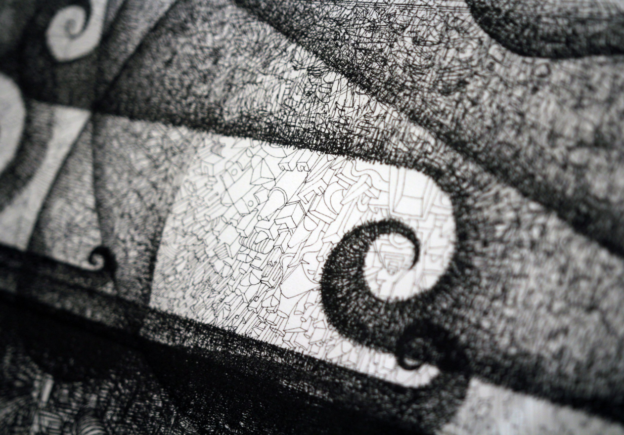
The blackness that we see here is of two kinds: the graphics itself thickens, the contours become shallower and are overlaid on each other in layers to the point of complete unreadability – as rightly said in the manifesto of the exhibition’s curator Julia Shishalova, plunged into “black holes”, formations with strange overconsolidated matter, of which our universe consists by 70%. This is a very meticulous and labor-intensive approach to blackness, and it would be strange if it were not complemented by another – a felt-tip pen, as if by rain, easily releasing shadowy energy.

The exhibition of Totan Kuzembaev′s works “Event Horizons”, 2023, Museum of Architecture


Actually, it is this path from “light” to “dark” graphics that presents the driving idea, which turns the exhibition into a continuous statement-like installation. This very driving idea began to unfold a little bit earlier, with a small “prototype” exhibition that took place at ArchMoscow in May: back then, seven X-shaped wooden stands displayed 24 sheets. The stands, whose sum (if we take the X to be a Latin 10) gave the anniversary 70, were arranged in a semicircle in the arc of the amphitheater, and, with a little bit of imagination, you could see a solar clock in them, counting the time from light to dark.

Now there are 56 sheets. The X-shaped wooden stands from ArchMoscow are complemented by slimmer plywood stands; the exhibition begins and ends in two “lanterns”, one of them light, standing in the museum’s yard, the other one dark, in the last exposition hall of the enfilade. Both of them, following the plastique ideas of ASNOVA, consist of two mutually penetrating pyramids, and give two triangular spots of light, upwards and downwards. The message is rather obvious: they mark the light point of the beginning and the dark point of the end.

The exhibition of Totan Kuzembaev′s works “Event Horizons”, 2023, Museum of Architecture


Everything else is sandwiched and distributed between these two points: the “horizon”, depicted as a simple straight line drawn on a white sheet of paper in the first hall, and lots of “whirlpools” of trees and waves. In this juxtaposition of light and dark on can you easily guess yin and yang – things that are opposite, yet inseparable.

The exhibition of Totan Kuzembaev′s works “Event Horizons”, 2023, Museum of Architecture


The exhibition of Totan Kuzembaev′s works “Event Horizons”, 2023, Museum of Architecture
Copyright: Photograph © Julia Tarabarina, Archi.ru


The exhibition of Totan Kuzembaev′s works “Event Horizons”, 2023, Museum of Architecture
Copyright: Photograph © Julia Tarabarina, Archi.ru


Most of the exhibition consists of the Weightlessness series, 44 sheets out of 56, which was in fact started back in 1988. My personal favorite was “Kazakhs in Space”. I cannot say that it was drastically different from the others, but it did have a unique signature.

I also cannot say that there’s anything particularly Kazakh about Totan Kuzembaev’s graphics, even though the architect does enjoy remembering his origin now and then, and his drawings often feature yurtas and camels; Andrey Ivanov’s annotation to the exhibition also begins with a scene where little Totan lies in a steppe watching the stars. However, Kuzembaev artist and Kuzembaev architect is quite European, and it seems to me that his passion for avant-garde is more important for him than the steppe, and the Occident is presented in his works through western techniques: not for nothing, for example, in the proto-graphics of the 1980s from the collection of the Museum of Architecture, the head of Mephistopheles is the most similar to all that followed.

At the same time, the stability of Kuzembayev’s mature graphics is built not only on shallow linear drawing. It is everywhere – a linear image of cities from above, composed in perspective, but generalized, so that the building becomes like a dense carpet. There are houses with courtyards, ziggurats like the Tower of Babel, but in general it is a homogeneous space. At some point, quite soon, the “carpet” plane begins to be perceived as a pattern, a kind of lace, or a fabric – it is not difficult to tear it into shaggy, horny curls and protuberances, just as one layer can be overlaid with another.

Space in this graphic is reduced, as if as a joke, to a plane, with which you can do anything. Perhaps this is the secret of “Weightlessness”: either we are flying on a kind of magic carpet, high enough for the three-dimensionality of the endless city to become frivolous and malleable for transformations, or this fractional perspective itself is the magic carpet, and we, stuck in its lint, are already being carried somewhere on it.

The exhibition of Totan Kuzembaev′s works “Event Horizons”, 2023, Museum of Architecture
Copyright: Photograph © Julia Tarabarina, Archi.ru


The exhibition of Totan Kuzembaev′s works “Event Horizons”, 2023, Museum of Architecture
Copyright: Photograph © Julia Tarabarina, Archi.ru


Serious additions to the exhibition are the enlarged printouts of the graphics, finalized by the author by hand, right there before the opening of the exhibition. They are a good way to immerse yourself in the context. In general, enlarging something small to a greater size that is not typical of is a technique that works well nowadays.

The exhibition of Totan Kuzembaev′s works “Event Horizons”, 2023, Museum of Architecture
Copyright: Photograph © Julia Tarabarina, Archi.ru


Another peculiarity is that the exhibition is prefaced by sheets from the Museum of Architecture, the architect’s works from the 1980’s, including those related to the design for Zelenograd. Some of them are quite different – collages, grid structures in which one can barely distinguish bus stops and steles of the science city – a search for a mannerism, something forty years old, now turned into museum exhibits. You can also see graphics, in which prototypes of “Weightlessness” can be found – linear, but still intricately composed.

The exhibition of Totan Kuzembaev′s works “Event Horizons”, 2023, Museum of Architecture
Copyright: Photograph © Julia Tarabarina, Archi.ru


And, finally, the exhibition has not just one, but three manifests. Not every exhibition is that lucky! 

The exhibition curator Julia Shishalova’s manifesto is the most lengthy and clear; it explains the most and gives the most hope, which is important in our time. Andrei Ivanov’s text plunges into the context of Cy Twombly and Pierre Soulages – someone may hear these names for the first time. The words of Mark Hakobyan, the museum’s curator, who produced the old works from the collection, remind us of the experiments by avant-garde masters, which is also important and appropriate, since Totan Kuzembaev is one of such masters of “paper architecture” who at times do show a special passion for avant-garde art.

The exhibition of Totan Kuzembaev′s works “Event Horizons”, 2023, Museum of Architecture
Copyright: Photograph © Julia Tarabarina, Archi.ru


04 August 2023

Headlines now
A Deep, Crystal Shine
A new luxury residential development by ADM architects is set to rise in the Patriarch’s Ponds district, not far from Novopushkinsky Square. It will replace three buildings erected in the early 1990s. The project authors, Andrey Romanov and Ekaterina Kuznetsova, have placed their bets on the variety among the three volumes, modern design solutions, and attention to detail: one of the buildings will feature smoothly curved balconies with a ceramic sheen on their undersides, while another will be accented by glass “sculpture” columns.
A Roadside Picnic of Urban Planning Theorists
Marina Egorova, head of Empate Architectural Bureau, brought together urban planning theorists – the successors of Alexey Gutnov and Vyacheslav Glazychev – to revive the substance and depth of professional discourse. At the first meeting, much ground was covered: the participants revisited the theoretical foundations, aligned their values, examined a cutting-edge case of the Kazan agglomeration, and concluded with the unfathomable intricacies of Russian land demarcation. Below, we present key takeaways from all the presentations.
Perspective View
CNTR Architects has designed a business center for a new district in Yekaterinburg, aiming to reduce the need for commuting and make the residential environment more diverse. The architectural solutions are equally focused on creating spatial flexibility, comfortable working conditions, and a memorable image that could allow the building to become a spatial landmark of the district.
Malevich and Bathhouses, Nature and High-Tech
The Malevich Bathhouse complex is scheduled to open in the fall of 2025 on the Rublyovo-Uspenskoye Highway. The project, designed by DBA-GROUP under the leadership of Vladislav Andreev, is an example of an unconventional approach to the image of a spa in general and of a bathhouse in particular. Deliberately avoiding any kind of allusion, the architects opted for streamlined forms with characteristic rounded corners, a combination of wood with bent glass, and restrained contemporary shapes – both inside and out. Let’s take a closer look at the project.
Rather, a Tablecloth and a Glass!
After many years, the long-abandoned Horse Guards Department building in St. Petersburg has finally received the attention it deserves: according to a design by Studio 44, the first restoration and adaptation works are scheduled to begin this year. Both the intended function and the general scope of works imply minimal alteration to the complex, which has preserved traces of its three-century history. All solutions are reversible and aimed, above all, at opening the monument to the city and immersing it in a lively social scene – hence the choice of a cultural center scenario with a strong gastronomic component.
​Materialization of Airflows
The Nikolai Kamov International Airport in Tomsk opened at the end of August last year. We have already written about the project – now we are taking a look at the completed building. Its functionality is reinforced by symbolic undertones: the architects at ASADOV sought to reflect local identity in the architecture as fully as possible.
The City as a Narrative
Sergey Skuratov’s approach to large urban plots could best be described as a “total design code”. The architect pays equal attention to the overall composition and the smallest of details, striving to ensure that every aspect is thoroughly thought out and subordinated to the original vision. It’s a Renaissance-like approach, really – a titanic effort demanding remarkable willpower and perseverance. The results are likewise grand – architecture that makes a statement. This article looks at the revived concept for the central section of the Seventh Heaven residential district in Kazan, a composition so thoroughly considered that even the “gradient of visual emphasis” (sic!) across the facades has been carefully worked out. It also touches on the narrative idea behind the project – and even the architect’s own doubts about it.
A Garden of Hope for Freedom
In October, at the Spaso-Evfimiev Monastery in Suzdal, the Prison Yard Garden opened on the site that had served as a prison from the 18th century until the Khrushchev Thaw. The architectural concept was developed by NOῨD Short Film, and the landscape design by the MOX landscape bureau. In fact, there are two gardens here – very different ones. We try to understand whether they evoke the right emotions in visitors, while also showing the beauty of June’s ruderal plants in bloom.
A Laconic Image of Time
The Time Square residential complex, built on the northern edge of St. Petersburg, appears more concise and efficient than its neighbor and predecessor, the New Time complex. Nevertheless, the architect’s hand is clearly felt: themes of “black and white”, “inside and outside”, and most notably, the “lamellar” quality of the facades that seems to visibly “eat away” at the buildings’ mass – everything is played out like a well-written score. One is reminded of both classical modernism and the so-called “post-constructivism”.
The Flower of the Lake
The prototype for the building of the Kamal Theater in Kazan is an ice flower: a rare and fragile natural phenomenon of Lake Kaban “froze” in the large, soaring outlines of the glass screens enclosing the main volume, shaping its silhouette and shielding the stained-glass windows from the sun. The project, led by the Wowhaus consortium and including global architecture “star” Kengo Kuma, won the 2021/2022 competition and was realized close to the original concept in a short – very short – period of time. The theater opened in early 2025. It was Kengo Kuma who proposed the image of an ice flower and the contraposition of cold on the outside and warmth on the inside. Between 2022 and 2024, Wowhaus did everything possible to bring this vision to life, practically living on-site. Now we are taking a closer look at this landmark building and its captivating story.
Peaceful Integration on Mira Avenue
The MIRA residential complex (the word mir means “peace” in Russian), perched above the steep banks of the Yauza River and Mira Avenue, lives up to its name not only technically, but also visually and conceptually. Sleek, high-rise, and glass-clad, it responds both to Zholtovsky’s classicism and to the modernism of the nearby “House on Stilts”. Drawing on features from its neighbors, it reconciles them within a shared architectural language rooted in contemporary façade design. Let’s take a closer look at how this is done.
An Interior for a New Format of Education
The design of the new building for Tyumen State University (TyumSU) was initially developed before the pandemic but later revised to meet new educational requirements. The university has adopted a “2+2+2” system, which eliminates traditional divisions into groups and academic streams in favor of individualized study programs. These changes were implemented swiftly – right at the start of construction. Now that the building is complete, we are taking a closer look.
Penthouses and Kokoshniks
A new residential complex designed by ASADOV Architects for the Krasnaya Roza business district responds to its proximity to 17th-century landmarks – the chambers of the Hamovny Dvor and St. Nicholas Church – as well as to the need to preserve valuable façades of a historic rental house built in the Russian Revival style. The architects proposed a set of buildings of varying heights, whose façades reference ecclesiastical architecture. But we were also able to detect other associations.
Centipede Town
The new school campus designed by ATRIUM Architects, located on the shores of a protected lake in the Imeretian Lowland Ornithological Reserve, represents an important and ambitious undertaking for the team: this is not just a school, but a Presidential Lyceum for the comprehensive development of gifted children – 2,500 students from age 3 through high school. At the same time, it is also envisioned as a new civic hub for the entire Sirius territory. In this article, we unpack the structure and architecture of this “lyceum town”.
Warm Black and White
The second phase of “Quarter 31”, designed by KPLN and built in the Moscow suburb town of Pushkino, reveals a multifaceted character. At first glance, the complex appears to be defined by geometry and a monochrome palette. But a closer look reveals a number of “irregular” details: a gradient of glazing and flared window frames, a hierarchy of façades, volumetric brickwork, and even architectural references to natural phenomena. We explore all the rules – and exceptions – that we were able to discover here.
​Skylights and Staircase
Photos from March show the nearly completed headquarters of FSK Group on Shenogina Street. The building’s exterior is calm and minimalist; the interior is engaging and multi-layered. The conical skylights of the executive office, cast in raw concrete, and the sweeping spiral staircase leading to it, are particularly striking. In fact, there’s more than one spiral staircase here, and the first two floors effectively form a small shopping center. More below.
The Whale of Future Identity
Or is it a veil? Or a snow-covered plain? Vera Butko, Anton Nadtochy, and the architects of ATRIUM faced a complex and momentous task: to propose a design for the “Russia” National Center. It had to be contemporary, yet firmly rooted in cultural codes. Unique, and yet subtly reminiscent of many things at once. It must be said – the task found the right authors. Let’s explore in detail the image they envisioned.
Greater Altai: A Systemic Development Plan
The master plan for tourism development in Greater Altai encompasses three regions: Kuzbass, the Altai Republic, and Altai Krai. It is one of twelve projects developed as part of the large-scale state program bearing the simple name of “Tourism Development”. The project’s slogan reads: “Greater Altai – a place of strength, health, and spirit in the very heart of Siberia”. What are the proposed growth points, and how will the plan help increase the flow of both domestic and international tourists? Read on to find out.
The Colorful City
While working on a large-scale project in Moscow’s Kuntsevo district – one that has yet to be given a name – Kleinewelt Architekten proposed not only a diverse array of tower silhouettes in “Empire-style” hues and a thoughtful mix of building heights, creating a six-story “neo-urbanist” city with a block-based layout at ground level, but also rooted their design in historical and contextual reasoning. The project includes the reconstruction of several Stalin-era residential buildings that remain from the postwar town of Kuntsevo, as well as the reconstruction of a 1953 railway station that was demolished in 2017.
In Orbit of Moscow City
The Orbital business center is both simple and complex. Simple in its minimalist form and optimal office layout solution: a central core, a light-filled façade, plenty of glass; and from the unusual side – a technical floor cleverly placed at the building’s side ends. Complex – well, if only because it resembles a celestial body hovering on metallic legs near Magistralnaya Street. Why this specific shape, what it consists of, and what makes this “boutique” office building (purchased immediately after its completion) so unique – all of this and more is covered in our story.
The Altai Ornament
The architectural company Empate has developed the concept for an eco-settlement located on a remote site in Altai. The master plan, which resembles a traditional ornament or even a utopian city, forms a clear system of public and private spaces. The architects also designed six types of houses for the settlement, drawing inspiration from the region’s culture, folklore, and vernacular building practices.
Pro Forma
Photos have emerged of the newly completed whisky distillery in Chernyakhovsk, designed by TOTEMENT / PAPER – a continuation of their earlier work on the nearby Cognac Museum. From what is, in essence, a merely technical and utilitarian volume and space, the architects have created a fully-fledged theatre of impressions. Let’s take a closer look. We highly recommend a visit to what may look like a factory, but is in fact an experiment in theatricalizing the process of strong spirit production – and not only that, but also of “pure art”, capable of evolving anywhere.
The Arch and the Triangle
The new Stone Mnevniki business center by Kleinewelt Architekten – designed for the same client as their projects in Khodynka – bears certain similarities to those earlier developments, but not entirely. In Mnevniki, there are more angular elements, and the architects themselves describe the project as being built on contrast. Indeed, while the first phase contains subtle references to classical architecture – light touches like arches, both upright and inverted, evoking the spirit of the 1980s – the second phase draws more distantly on the modernism of the 1970s. What unites them is a boldly expressive public space design, a kaleidoscope of rays and triangles.
Health Factory
While working on a wellness and tourist complex on the banks of the Yenisei River, the architects at Vissarionov Studio set out to create healing spaces that would amplify the benefits of nature and medical treatments for both body and soul. The spatial solutions are designed to encourage interaction between the guests and the landscape, as well as each other.
The Blooming Mechanics of a Glass Forest
The Savvinskaya 27 apartment complex built by Level Group, currently nearing completion on an elongated riverfront site next to the Novodevichy Convent, boasts a form that’s daring even by modern Moscow standards. Visually, it resembles the collaborative creation of a glassblower and a sculptor: a kind of glass-and-concrete jungle, rhythmically structured yet growing energetically and vividly. Bringing such an idea to life was by no means an easy task. In this article, we discuss the concept by ODA and the methods used by APEX architects to implement it, along with a look at the building’s main units and detailing.
Grace and Unity
Villa “Grace”, designed by Roman Leonidov’s studio and built in the Moscow suburbs, strikes a balance between elegant minimalism and the expansive gestures of the Russian soul. The main house is conceived as a sequence of four self-contained volumes – each could exist independently, yet it chooses to be part of a whole. Unity is achieved through color and a system of shared spaces, while the rich plasticity of the forms – refined throughout the construction process – compensates for the near-total absence of decorative elements.
Daring Brilliance
In this article, we are exploring “New Vision”, the first school built in the past 25 years in Moscow’s Khamovniki. The building has three main features: it is designed in accordance with the universal principles of modern education, fostering learning through interaction and more; second, the façades combine structural molded glass and metallic glazed ceramics – expensive and technologically advanced materials. Third, this is the school of Garden Quarters, the latest addition to Moscow’s iconic Khamovniki district. Both a costly and, in its way, audacious acquisition, it carries a youthful boldness in its statement. Let’s explore how the school is designed and where the contrasts lie.
A Twist of the Core
A clever and concise sculptural solution – rotating each floor by N degrees – has created an ensemble of “dancing” towers: similar yet different, simple yet complex. The designers meticulously refined a single structural node and spent considerable effort on the column construction – after that, “everything else was easy”. The architects also rotated the core walls on each floor to maximize the efficiency of the office spaces.
The Sculpting of Spring Forest Matter
We’ve been observing this building for a couple of years now: seemingly simple, perhaps even unassuming, it fits in remarkably well with the micro-district context shaped by the Moscow MCD road junctions. This building sticks in the memory of everyone who drives along the highway, even occasionally. In our opinion, Sergey Nikeshkin, by blending popular architectural techniques and approaches of the 2010s, managed to turn a seemingly simple structure into a statement “on the theme of a house as such”. Let’s figure out how this happened.