По-русски

The Light for the Island

For the first time around, we are examining a lighting project designed for a housing complex; but then again, the authors of the nighttime lighting of the Ostrov housing complex, UNK lighting, proudly admit that this project is not just the largest in their portfolio, but also the largest in this country. They describe their approach as a European one, its chief principles being smoothness of transitions, comfort to the eye, and the concentration of most of the light at the “bottom” level – meaning, it “works” first of all for pedestrians.

17 July 2023
Object
mainImg
Architectural illumination projects in the city are not a new thing – they have been around for decades – but over the last 10-12 years they have reached, as it seems, a whole new level. In any case, driving through Moscow in the evening, it is hard not to pay attention to the brightly lit tops of both Stalin-era houses and modernist “slabs”, which makes the city look different at night from the daytime. One way or another, the evening light has a serious effect on us: it calms us down, assuring the passerby’s feelings of the city’s safety, and it sets accents, creating some kind of its own agenda and dictating some kind of a “melody” of its own.

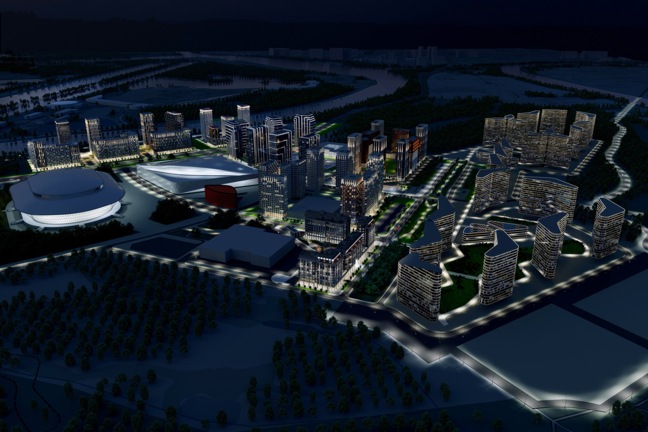
This is why it makes perfect sense that working with a considerable portion of the grand-scale housing complex Ostrov, situated in the Mnevniki Floodplain, the UNK architects – which for more than a year already is not a just company but an ecosystem consisting of different companies with different specializations – setting for themselves a task to apply an integrated and diverse approach to designing their part of the complex, paid a great deal of attention to the lighting part.

The lighting project was developed by UNK Lighting, which meant ten blocks of housing stock and public spaces, for the territory that is just under 40 hectares.

"Ostrov« (»Island") housing complex. The concept of architectural lighting
Copyright: © UNK


The task of the project was not only to unite the whole complex with an integrated lighting solution in the evenings, but also to create for the “new city” its own image, with its own subtleties and peculiarities, and a recognizable one, too.

Александра Ушакова, UNK lighting

Alexandra Ushakova, UNK lighting

This project is unique not only for us – after all, it consists of 10 full-fledged city blocks – but, I would say, for Moscow and Russia as well. In all the projects we work with, we strive to offer integrated solutions, to link different elements, landscape, public places, small architectural forms, and so on. We fine-tune energy efficiency. However, this project is the biggest and the most complex we’ve done so far.

We started by working on references: we studied the works of the world’s leading lighting designers, for example, the lighting of the Wilkinson Air apartment complex in the gas holders at King’s Cross, or Smart City in Qatar, as it is, just like ours, a brand-new city, and there is a lighting design code there. We categorized the approaches into three types: American, Asian and European. In the U.S., a lot of attention is paid to advertising and illumination of the upper parts of high-rise buildings; Asian lighting is very bright, multicolor for the full range of RGB equipment, and dynamic. In Europe, maximum attention is paid to landscape and art objects, everything that is at human level, and buildings are illuminated only when they are true monuments of architecture.


The UNK architects are inspired by the European approach, when the buildings are designed to be perceived from the pedestrian’s point of view; in addition, the predominance of lighting in the lower tier correlates well with the urban galleries conceived in the lower floors – the new residential areas should be pleasant to move around in, creating both a cozy and lively boulevard atmosphere, which is most reminiscent of the Haussmannian style in Paris, or maybe some Pissarro painting.

"Ostrov« (»Island") housing complex. Block #3
Copyright: © UNK


In the courtyards, the urban bustle of the streets gives way to an emphasis on the natural component, flexible paths and hills; here the lighting is noticeably calmer and more restrained: the architects avoid blinding lights and use more of reflected light. However, all the paths are still illuminated and the navigation is obvious. The contrast between external urban and internal courtyard spaces is especially noticeable when comparing the streets of Block 3 and the courtyard that was intended, say, for Block 7 (it will probably not be implemented). But all the courtyards are somehow distinguished by the fluidity of forms and the “park-like” restraint of lighting.

Block #7. The Ostrov landscaping project
Copyright: © UNK landscape


Of course, we are first of all interested in the architects’ approaches to lighting the architecture itself: there are quite a lot of different facades here, and the authorship of the facades belongs to different architectural companies. Did UNK Lighting manage to emphasize the peculiarities of the different blocks while uniting them at the same time?

If we take, for example, Block 2, designed by Filipp Nikandrov, with its giant stripes on the volumes – its difference immediately catches the eye, both in the daytime and in the evening, it is hard to argue with it, although, as far as we can tell, the authors of the illumination project avoided excessive brightness of the stripes, and these stripes, again, very much like the paths in the courtyards, shine with reflected light, which should, to some extent, immerse the hyperactive statement in the context of the melancholy of an evening walk. The lines grow brighter as we go upwards, but ever so smoothly.

Ostrov housing complex: the concept of architectural lighting
Copyright: © UNK


Ostrov housing complex: the concept of architectural lighting
Copyright: © UNK


In the other blocks, the architects of light also proceeded from combining their own preferences with the peculiarities of local architecture. Thus, Block 6, designed by UNK, with a copper tower proposed by Julius Borisov, is obviously “central” – it is both large and regular – but not without some playfulness, not for nothing do the architects compare it with popular games, especially Minecraft. Here, the emphasized graphic character and large ornamentation of the facades is balanced off by the mobility of the form: it descends or rises in steps, balancing on the edge of regularity and unpredictability with a bias towards the former. The illumination of the attic levels is also appropriate here. The light makes the towers look very much like the ones on the Garden Ring. And in the main copper tower, on the contrary, the light marks only a part of the elements of the pattern, which makes its external lattice acquire a different tone, more complex and less “defined” than it would have been in the sunlight.

Ostrov housing complex: the concept of architectural lighting
Copyright: © UNK


Ostrov housing complex: the concept of architectural lighting
Copyright: © UNK


In general, however, the essence of the concept of lighting the buildings, according to its authors, is to make the illumination soft and the transitions smooth, without sudden leaps. In addition to their soft spot for a delicate European type of evening lighting, it is also motivated by the fact that the new area is predominantly residential, so people should be comfortable in the first place. Although, according to the architects, the technique allows for several different scenarios, and they have developed several scenarios for the client, including a festive one, all of these scenarios stay within a certain restraint – none of them is excessively bright.

Ostrov housing complex: the concept of architectural lighting
Copyright: © UNK


Ostrov housing complex: the concept of architectural lighting
Copyright: © UNK


“The project meets all the appropriate regulations” – emphasizes Alexandra Ushakova. This means, in particular, that the temperature of street lighting is standard for Moscow, which is 2700 K. Meanwhile, a slightly cooler shade – 3000 K – has been chosen for the illumination of buildings. But it is applied to the facades, which follow the “warm” design code, where quite a significant place is occupied by a grayish-beige shade and, most importantly, copper color, so the result is a kind of “hybrid”: the warmer tone, one way or another, prevails. “It is characteristic of evening Moscow”-the architects note.

In this regard, it is interesting to observe how the backlighting in the project “lightens up” the copper partitions in Block 5 (facade authors ASADOV Architects, design code UNK). The piers flare up like torches, as if showing the potential of internal combustion, intensifying the depth of the copper shade, rhythmically harmonizing it with the asymmetric “flames” on the light part of the walls. This red is the deepest and most intense here.

Ostrov housing complex: the concept of architectural lighting
Copyright: © UNK


Ostrov housing complex: the concept of architectural lighting
Copyright: © UNK


There is no doubt about the integrity of the result, the delicacy of the lighting project as a whole and the amount of labor invested in it. And yet the most interesting thing is to see how the authors of the lighting project respond to the facade concepts. Nowhere do they just “follow” the original idea, do not reveal it in its entirety, and somewhere they even enter into a dialog with it: they sometimes mask something, and sometimes supplement something with their asymmetrical light shading, i.e. they fully participate in the creative process. And it is surprising just how radically the light is able to change the perception of architecture. After all, when looking at the backlighting project, sometimes you can easily guess the “original” project, and sometimes you have to look real hard.

Ostrov housing complex: the concept of architectural lighting
Copyright: © UNK


Ostrov housing complex: the concept of architectural lighting
Copyright: © UNK


17 July 2023

Headlines now
​The Power of Lines
The building at the very beginning of New Arbat is the result of long deliberations over how to replace the former House of Communication. Contemporary, dynamic, and even somewhat zoomorphic in character, it is structured around a large diagonal grid. The building has become a striking accent both in the perspective of the former Kalinin Avenue and in the panorama of Arbat Square. Yet, unfortunately, the original concept was not fully realized. In 2020, the Moscow ArchCouncil approved a design featuring an exoskeleton – an external load-bearing structure, which eventually turned into a purely decorative element. Still, the power of the supergraphic “holds” the building, giving it the qualities of a new urban landmark with iconic potential. How this concept took shape, what unexpected associations might underlie the grid’s form, and why the exoskeleton was never built – all this is explored in our article.
Resort on the Kama River
Wowhaus has developed a project for the reconstruction of Korabelnaya Roshcha (“Mast Grove”), a wellness resort located on the banks of the Kama River.
Nests in Primorye
The eco-park project “Nests”, designed by Aleksey Polishchuk and the company Power Technologies, received first prize at the Eco-Coast 2025 festival, organized by the Union of Architects of Russia. For a glamping site in Filinskaya Bay, the authors proposed bird-shaped houses, treehouses, and a nest-shaped observation platform, topping it all with an entrance pavilion executed in the shape of an owl.
The Angle of String Tension
The House of Music, designed by Vladimir Plotkin and the architects of TPO Reserve, resembles a harp, and when seen from above, even a bass clef. But if only it were that simple! The architecture of the complex fuses two distinct expressive languages: the lattice-like, transparent, permeable vocabulary of “classical” modernism and the sculptural, ribbon-like volumes so beloved by today’s neo-modernism. How it all works – where the catharsis lies, which compositional axes underpin the design, where the project resembles Zaryadye Concert Hall and where it does not – read in the article below.
How Historic Tobolsk Becomes a Portal to the Future
Over the past decade, the architectural company Wowhaus has developed urban strategies for several Russian cities – Vyksa, Tula, and Nizhnekamsk, to name but a few. Against this backdrop, the Tobolsk master plan stands out both for its scale – the territory under transformation covers more than 220 square kilometers – and for its complexity.
St. Petersburg vs Rome
The center of St. Petersburg is, as we know, sacred – but few people can say with certainty where this “sacred place” actually begins and ends. It’s not about the formal boundaries, “from the Obvodny Canal to the Bolshaya Nevka”, but about the vibe that feels true to the city center. With the Nevskaya Ratusha complex – built to a design that won an international competition – Evgeny Gerasimov and Sergei Tchoban created an “image of the center” within its territory. And not so much the image of St. Petersburg itself, as that of a global metropolis. This is something new, something that hasn’t appeared in the city for a long time. In this article, we study the atmosphere, recall precedents, and even reflect on who and when first called St. Petersburg the “new Rome”. Clearly, the idea is alive for a reason.
On the Wave
The project of transforming the river port and embankment in the city of Cheboksary, developed by the ATRIUM Architects, involves one of the city’s key areas. The Volga embankment is to be turned into a riverside boulevard – a multifunctional, comfortable, and expressive space for work and leisure activities. The authors propose creating a new link with the city’s main Krasnaya (“Red”) Square, as well as erecting several residential towers inspired by the shape of the traditional national women’s headdress – these towers are likely to become striking accents on the Volga panorama.
Valery Kanyashin: “We Were Given a Free Hand”
The Headliner residential complex, the main part of which was recently completed just across from Moscow City, is a kind of neighbor to the MIBC that doesn’t “play along” with it. On the contrary, the new complex is entirely built on contrast: like a city of differently scaled buildings that seems to have emerged naturally over the past 20 years – which is a hugely popular trend nowadays! And yet here – perhaps only here – such a project has been realized to its full potential. Yes, high-rises dominate, but all these slender, delicate profiles, all these exciting perspectives! And most importantly – how everything is mixed and composed together... We spoke with the project’s leader Valery Kanyashin.
​The Keystone
Until quite recently, premium residential and office complexes in Moscow were seen as the exclusive privilege of the city center. Today the situation is changing: high-quality architecture is moving beyond the confines of the Third Ring Road and appearing on the outskirts. The STONE Kaluzhskaya business center is one such example. Projects like this help decentralize the megalopolis, making life and work prestigious in any part of the city.
Perpetuum Mobile
The interior of the headquarters of Natsproektstroy, created by the IND studio team, vividly and effectively reflects the client’s field of activity – it is one of Russia’s largest infrastructure companies, responsible for logistics and transport communications of every kind you can possibly think of.
Water and Light
Church art is full of symbolism, and part of it is truly canonical, while another part is shaped by tradition and is perceived by some as obligatory. Because of this kind of “false conservatism”, contemporary church architecture develops slowly compared to other genres, and rarely looks contemporary. Nevertheless, there are enthusiasts in this field out there: the cemetery church of Archangel Michael in Apatity, designed by Dmitry Ostroumov and Prokhram bureau, combines tradition and experiment. This is not an experiment for its own sake, however – rather, the considered work of a contemporary architect with the symbolism of space, volume, and, above all, light.
Champions’ Cup
At first glance, the Bell skyscraper on 1st Yamskogo Polya Street, 12, appears strict and laconic – though by no means modest. Its economical stereometry is built on a form close to an oval, one of UNK architects’ favorite themes. The streamlined surface of the main volume, clad in metal louvers, is sliced twice with glass incisions that graphically reveal the essence of the original shape: both its simplicity and its complexity. At the same time, dozens of highly complex engineering puzzles have been solved here.
Semi-Digital Environment
In the town of Innopolis, a satellite of Kazan, the first 4-star hotel designed by MAD Architects has opened. The interiors of the hotel combine elegance with irony, and technology with comfort, evoking the atmosphere of a computer game or maybe a sci-fi movie about the near future.
History never ends
The old railway station in Kapan, a city in southern Armenia, has been given new life by the Paris-based design firm Normal Studio. Today, it serves as a TUMO center.
A Deep, Crystal Shine
A new luxury residential development by ADM architects is set to rise in the Patriarch’s Ponds district, not far from Novopushkinsky Square. It will replace three buildings erected in the early 1990s. The project authors, Andrey Romanov and Ekaterina Kuznetsova, have placed their bets on the variety among the three volumes, modern design solutions, and attention to detail: one of the buildings will feature smoothly curved balconies with a ceramic sheen on their undersides, while another will be accented by glass “sculpture” columns.
Grigory Revzin: “What we should do with the architecture of the seventies”
Soviet modernism came in two flavors: the good, author-driven kind, and the bad, standardized kind. The good kind was “on the periphery”, while the bad kind was in the center – geographically, in terms of attention, scale, and everything else. Can we demolish it? “That would be destroying public consensus out of thin air”. So what should we do? Preserve it, but creatively: “Bring architecture into places where it hasn’t yet appeared”. Treat these buildings not as monuments, but as urban landscape. Read our interview with Grigory Revzin on the pressing topic of saving modernism – where he proposes a controversial, yet really intriguing, way of preserving 1970s buildings.
A Roadside Picnic of Urban Planning Theorists
Marina Egorova, head of Empate Architectural Bureau, brought together urban planning theorists – the successors of Alexey Gutnov and Vyacheslav Glazychev – to revive the substance and depth of professional discourse. At the first meeting, much ground was covered: the participants revisited the theoretical foundations, aligned their values, examined a cutting-edge case of the Kazan agglomeration, and concluded with the unfathomable intricacies of Russian land demarcation. Below, we present key takeaways from all the presentations.
Perspective View
CNTR Architects has designed a business center for a new district in Yekaterinburg, aiming to reduce the need for commuting and make the residential environment more diverse. The architectural solutions are equally focused on creating spatial flexibility, comfortable working conditions, and a memorable image that could allow the building to become a spatial landmark of the district.
Malevich and Bathhouses, Nature and High-Tech
The Malevich Bathhouse complex is scheduled to open in the fall of 2025 on the Rublyovo-Uspenskoye Highway. The project, designed by DBA-GROUP under the leadership of Vladislav Andreev, is an example of an unconventional approach to the image of a spa in general and of a bathhouse in particular. Deliberately avoiding any kind of allusion, the architects opted for streamlined forms with characteristic rounded corners, a combination of wood with bent glass, and restrained contemporary shapes – both inside and out. Let’s take a closer look at the project.
Rather, a Tablecloth and a Glass!
After many years, the long-abandoned Horse Guards Department building in St. Petersburg has finally received the attention it deserves: according to a design by Studio 44, the first restoration and adaptation works are scheduled to begin this year. Both the intended function and the general scope of works imply minimal alteration to the complex, which has preserved traces of its three-century history. All solutions are reversible and aimed, above all, at opening the monument to the city and immersing it in a lively social scene – hence the choice of a cultural center scenario with a strong gastronomic component.
​Materialization of Airflows
The Nikolai Kamov International Airport in Tomsk opened at the end of August last year. We have already written about the project – now we are taking a look at the completed building. Its functionality is reinforced by symbolic undertones: the architects at ASADOV sought to reflect local identity in the architecture as fully as possible.
The City as a Narrative
Sergey Skuratov’s approach to large urban plots could best be described as a “total design code”. The architect pays equal attention to the overall composition and the smallest of details, striving to ensure that every aspect is thoroughly thought out and subordinated to the original vision. It’s a Renaissance-like approach, really – a titanic effort demanding remarkable willpower and perseverance. The results are likewise grand – architecture that makes a statement. This article looks at the revived concept for the central section of the Seventh Heaven residential district in Kazan, a composition so thoroughly considered that even the “gradient of visual emphasis” (sic!) across the facades has been carefully worked out. It also touches on the narrative idea behind the project – and even the architect’s own doubts about it.
A Garden of Hope for Freedom
In October, at the Spaso-Evfimiev Monastery in Suzdal, the Prison Yard Garden opened on the site that had served as a prison from the 18th century until the Khrushchev Thaw. The architectural concept was developed by NOῨD Short Film, and the landscape design by the MOX landscape bureau. In fact, there are two gardens here – very different ones. We try to understand whether they evoke the right emotions in visitors, while also showing the beauty of June’s ruderal plants in bloom.
A Laconic Image of Time
The Time Square residential complex, built on the northern edge of St. Petersburg, appears more concise and efficient than its neighbor and predecessor, the New Time complex. Nevertheless, the architect’s hand is clearly felt: themes of “black and white”, “inside and outside”, and most notably, the “lamellar” quality of the facades that seems to visibly “eat away” at the buildings’ mass – everything is played out like a well-written score. One is reminded of both classical modernism and the so-called “post-constructivism”.
The Flower of the Lake
The prototype for the building of the Kamal Theater in Kazan is an ice flower: a rare and fragile natural phenomenon of Lake Kaban “froze” in the large, soaring outlines of the glass screens enclosing the main volume, shaping its silhouette and shielding the stained-glass windows from the sun. The project, led by the Wowhaus consortium and including global architecture “star” Kengo Kuma, won the 2021/2022 competition and was realized close to the original concept in a short – very short – period of time. The theater opened in early 2025. It was Kengo Kuma who proposed the image of an ice flower and the contraposition of cold on the outside and warmth on the inside. Between 2022 and 2024, Wowhaus did everything possible to bring this vision to life, practically living on-site. Now we are taking a closer look at this landmark building and its captivating story.
Peaceful Integration on Mira Avenue
The MIRA residential complex (the word mir means “peace” in Russian), perched above the steep banks of the Yauza River and Mira Avenue, lives up to its name not only technically, but also visually and conceptually. Sleek, high-rise, and glass-clad, it responds both to Zholtovsky’s classicism and to the modernism of the nearby “House on Stilts”. Drawing on features from its neighbors, it reconciles them within a shared architectural language rooted in contemporary façade design. Let’s take a closer look at how this is done.
An Interior for a New Format of Education
The design of the new building for Tyumen State University (TyumSU) was initially developed before the pandemic but later revised to meet new educational requirements. The university has adopted a “2+2+2” system, which eliminates traditional divisions into groups and academic streams in favor of individualized study programs. These changes were implemented swiftly – right at the start of construction. Now that the building is complete, we are taking a closer look.
Penthouses and Kokoshniks
A new residential complex designed by ASADOV Architects for the Krasnaya Roza business district responds to its proximity to 17th-century landmarks – the chambers of the Hamovny Dvor and St. Nicholas Church – as well as to the need to preserve valuable façades of a historic rental house built in the Russian Revival style. The architects proposed a set of buildings of varying heights, whose façades reference ecclesiastical architecture. But we were also able to detect other associations.
Centipede Town
The new school campus designed by ATRIUM Architects, located on the shores of a protected lake in the Imeretian Lowland Ornithological Reserve, represents an important and ambitious undertaking for the team: this is not just a school, but a Presidential Lyceum for the comprehensive development of gifted children – 2,500 students from age 3 through high school. At the same time, it is also envisioned as a new civic hub for the entire Sirius territory. In this article, we unpack the structure and architecture of this “lyceum town”.