По-русски

The Black Mountain

The project of reconstructing the Krasnoyarsk Opera and Ballet theater developed by Wowhaus, which won the competition, proposed a total demolition and new construction, as well as considerable expansion (up to 8 floors) – and transformable multifunctional spaces. The new project, however, does retain the recognizable elements and the image of the old theater. As for the main spectator hall, it is turned – figuratively speaking, of course – into a semblance of a black volcano.

09 June 2023
Contest Results
mainImg
The competition for the reconstruction of the Krasnoyarsk Opera and Ballet Theater named after Khvorostovsky was conducted in early 2023. The prize fund was 3 million rubles: 1.5 million for first place, 1 million for the second, and 500 thousand rubles for third. The results were announced in April; the winner was the Wowhaus project, second place went to Studio 44, and third place went to a consortium of Krasnoyarsk bureau A2 and Moscow NVP. However, a working group is being formed, which should summarize the ideas of “not only the winning company, but also other participants in the competition”. The projects are published on the website of the contest and on the website of its operator, the Institute of Urban Development in Krasnoyarsk. We plan to showcase the winning projects one by one because it was a major competition for a significant public building in the city center, and moreover, providing for the reconstruction of a modernist theater.

The theater was built in 1966-1978 upon the project by Ivan Mikhalev, and, curiously, he designed it specifically as a music theater before it was ever completed, it was turned into an “opera and ballet theater”, which, according to its current director Svetlana Guziy, presupposes a staff twice as large. This effectively means that the troupe would have found themselves in close quarters by default. Over the recent decades, as the requirements for the theatrical art grew stricter, the space became even more cramped. Accordingly, the reconstruction, designed and supported by the Nornickel company, provides for a considerable expansion, but the brief specifically stipulated the necessity for keeping up the image of the old theater and the square in front of it: “The theater square must come to our descendants in the state it was devised 45 years ago”.

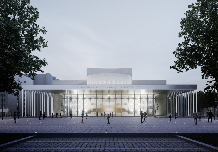
Concept of reconstruction of the Krasnoyarsk State Opera and Ballet Theater named after D.A. Khvorostovsky
Copyright: © WOWHAUS


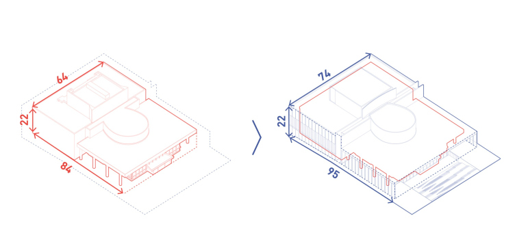
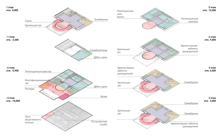
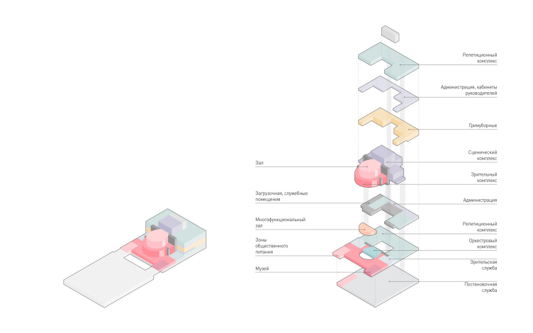
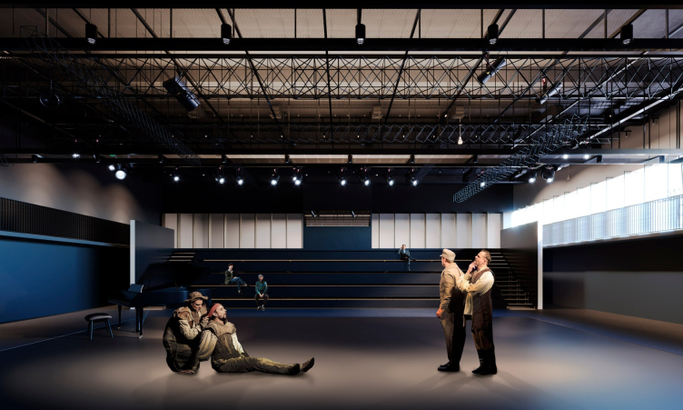
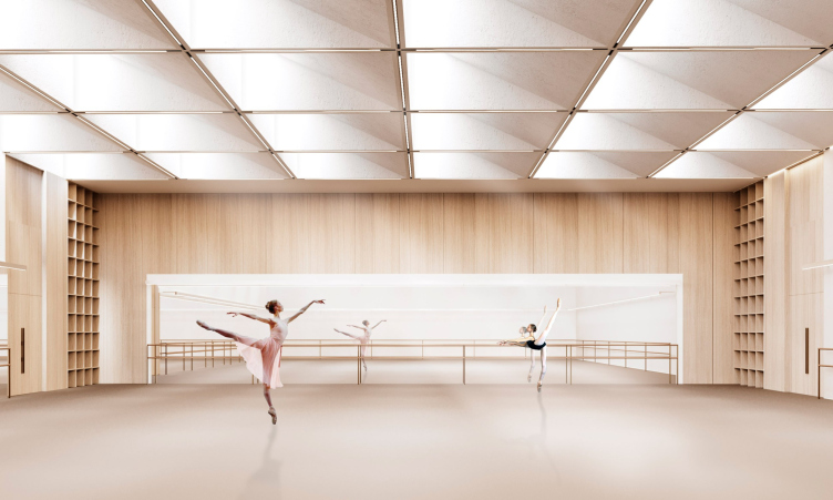
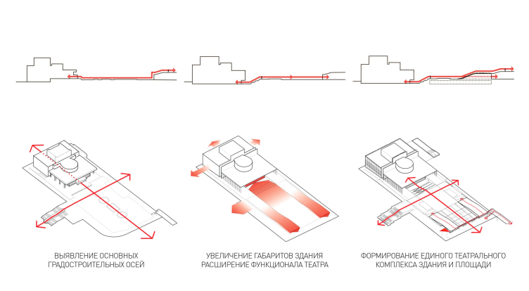
The concept by Wowhaus includes demolition and new construction: on the plan, the building is expanded 11 meters length-wise and 10 meters width-wise. The height remains the same, but the building gets underground floors – below the zero elevation, the architects are placing a restaurant, a foyer, and a museum, about which – the authors emphasize – the theater has long since dreamed. The new theater building will have a total of 8 levels, which will make it possible to include everything you need, including dressing rooms on all the three floors, rehearsal halls, a duplicate stage for dress rehearsals and small-stage performances, and a hall for the children’s theater studio.

Concept of reconstruction of the Krasnoyarsk State Opera and Ballet Theater named after D.A. Khvorostovsky. The change of dimensions
Copyright: © WOWHAUS


Concept of reconstruction of the Krasnoyarsk State Opera and Ballet Theater named after D.A. Khvorostovsky. Plans
Copyright: © WOWHAUS


Concept of reconstruction of the Krasnoyarsk State Opera and Ballet Theater named after D.A. Khvorostovsky. The functional zoning
Copyright: © WOWHAUS


Despite the fact that the new building is built from scratch [UPD 21.06.223: in the project, the architects retain the grand auditorium, the stage, and its pockets], the architects liken it to the old one as part of the image retention. For example, in the project the volume is also composed of two parallelepipeds with the upper projection of the columns; the architects reproduce the star-cross-shaped “cosmic” pattern of the concrete lattice of the stained glass window, the horseshoe-shaped volume of the hall, sculpturally protruding from outside, and even the colonnades on the sides – only with increasing scale the columns lose their solidity and turn into a series of thin supports; the pauses between them and the center increase. Even the inscription on the frieze is similar, although, obeying the new scale, it too has become smaller and thinner. Everything is similar, but different, and, executed in modern materials, looks recognizably unrecognizable. Maybe this approach even better embodies the idea, which was in the 1960s limited by the material base, even though you never can tell. A similar experiment to turn a 1950s building into a larger one was carried out by UNK architects in their work on the Palace of Water Sports, which replaced the Luzhniki swimming pool. What we are seeing is an enlarged paraphrase, but not a copy.

The architects save – in the original material – two sculptural groups of the “Muses”, carrying them over from the central location to the sides of the main entrance, i.e. to the side ends of the galleries.

Concept of reconstruction of the Krasnoyarsk State Opera and Ballet Theater named after D.A. Khvorostovsky
Copyright: © WOWHAUS


The “Muses” sculpture is moved from the facade to the side ends of the gallery. Concept of reconstruction of the Krasnoyarsk State Opera and Ballet Theater named after D.A. Khvorostovsky
Copyright: © WOWHAUS


  • zooming
    Concept of reconstruction of the Krasnoyarsk State Opera and Ballet Theater named after D.A. Khvorostovsky. The identity
    Copyright: © WOWHAUS
  • zooming
    Concept of reconstruction of the Krasnoyarsk State Opera and Ballet Theater named after D.A. Khvorostovsky. The basic principles
    Copyright: © WOWHAUS


  • zooming
    Concept of reconstruction of the Krasnoyarsk State Opera and Ballet Theater named after D.A. Khvorostovsky
    Copyright: © WOWHAUS
  • zooming
    Concept of reconstruction of the Krasnoyarsk State Opera and Ballet Theater named after D.A. Khvorostovsky
    Copyright: © WOWHAUS


It’s a rather curious experience watching how one turns into the other. In the new project, the following happens: the entrance group disappears or becomes all but invisible (how does it look on the 3D renders, I wonder?); and this entrance group cuts significantly into the starry stained-glass window of the original building. [UPD 21.06.2023: according to the architects, the entrance group was rebuilt many times, and the one that exists now does not refer to the original project]. At the same time, what appears behind the glass is a whirl of the spectator area and balconies, from which one will be able to get to different stage levels – looks a bit like Wright’s Guggenheim – it continues the “horseshoe” volume of the amphitheater, situated higher up: now, the parallelepiped has not just one volume inserted into it, but two.

Concept of reconstruction of the Krasnoyarsk State Opera and Ballet Theater named after D.A. Khvorostovsky
Copyright: © WOWHAUS


The theater now:

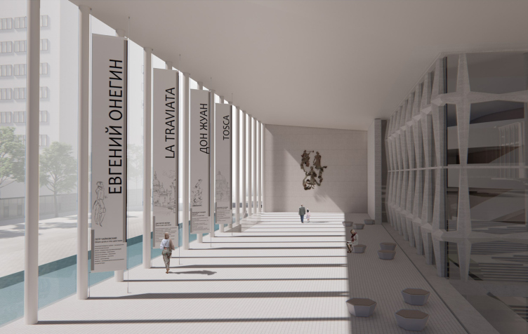
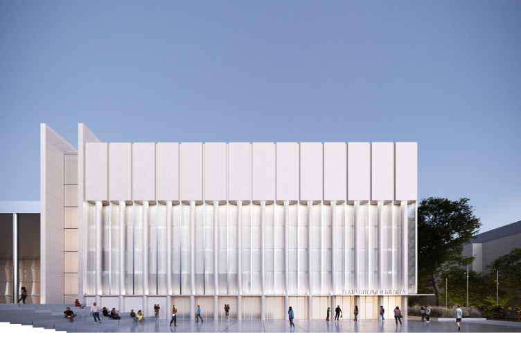
Now in the existing building the columns line the sides of the eastern volume of the foyer, while the western “stage” volume is designed laconically, like a crate. In the project, the foyer’s colonnades become, as we remember, more delicate and thin, and in the western part they also receive a continuation – in the form of tie rods inserted into the ledges of large grooves; the wall receives a meaningful relief, which was not present in the original building, it brings a note of Art Deco in the context of its basically modernist project (which quite suddenly echoes the Palace of Water Sports, where, however, the Art Deco component is original). At the junction of the two volumes evacuation stairs are situated – here there is a narrow transverse “layer”, sandwiched between the walls.

The decorative colonnade of the side volume. Concept of reconstruction of the Krasnoyarsk State Opera and Ballet Theater named after D.A. Khvorostovsky
Copyright: © WOWHAUS


The sidewall now:

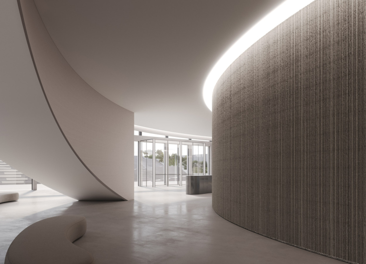
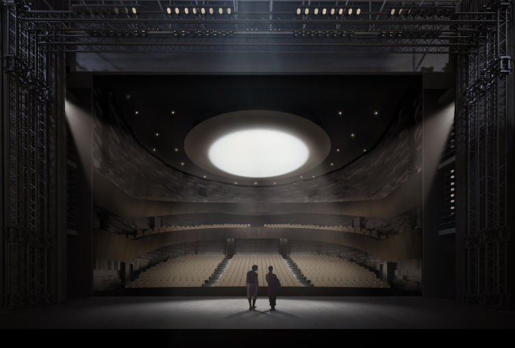
The new scale, the new fragility and thinness of the building, which inherits the ideas of the modernist theater, but not its proportions, receives a contrasting response in the image of the main hall: it is clearly inspired by the memory of one of the main landmarks of the region, the extinct volcano “Black Mountain” – the audience, figuratively of course, but judging by the pictures, still quite tangibly, is placed “inside” a black volcano with a rounded, rough and dark wall surface: the image rhymes well with the acoustic panels. The glowing circle of the main chandelier is likened to the vent of the volcano, at which we are looking, therefore, from within. On the whole, it is obvious that the blackness of the new hall, convenient for performances, becomes a contrast to the light whiteness of the facades and foyer.

Concept of reconstruction of the Krasnoyarsk State Opera and Ballet Theater named after D.A. Khvorostovsky
Copyright: © WOWHAUS


The minor hall and the duplicating halls will be designed in a slightly simpler way because you can’t peddle the idea of the “core” everywhere, and the rehearsal halls will be even lighter.

Concept of reconstruction of the Krasnoyarsk State Opera and Ballet Theater named after D.A. Khvorostovsky
Copyright: © WOWHAUS


Concept of reconstruction of the Krasnoyarsk State Opera and Ballet Theater named after D.A. Khvorostovsky
Copyright: © WOWHAUS


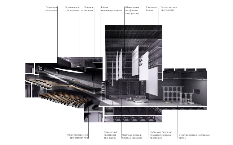
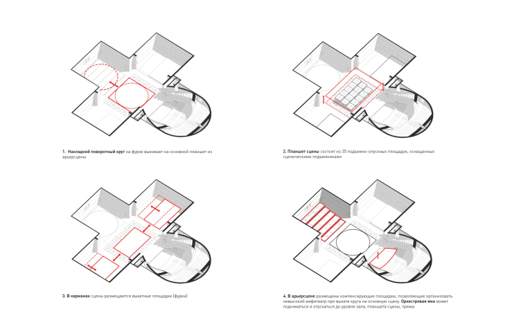
The main stage is equipped with mechanisms and is designed to be transformed. It is planned in a cross shape, like an Egyptian “Ankh” symbol, with the auditorium “loop” at the base. In the center; there are 35 sliding cubic podiums; from the rear stage at the top of the cross, the turntable can be moved out, and when it moves out it creates the possibility to build an additional “rear” amphitheater behind the rear stage, seating the audience on both sides of the stage. Several more mobile platforms are parked in the side wings, and the orchestra pit can be elevated to three different levels.

The grand auditorium: the cross-sectio view and axonometry. Concept of reconstruction of the Krasnoyarsk State Opera and Ballet Theater named after D.A. Khvorostovsky
Copyright: © WOWHAUS


The grand auditorium: the transformations. Concept of reconstruction of the Krasnoyarsk State Opera and Ballet Theater named after D.A. Khvorostovsky
Copyright: © WOWHAUS


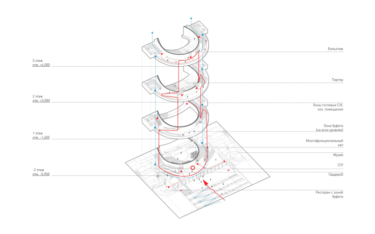
The tiers of the public areas around the grand auditorium. Concept of reconstruction of the Krasnoyarsk State Opera and Ballet Theater named after D.A. Khvorostovsky
Copyright: © WOWHAUS


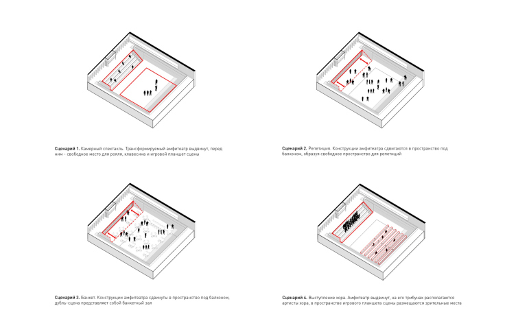
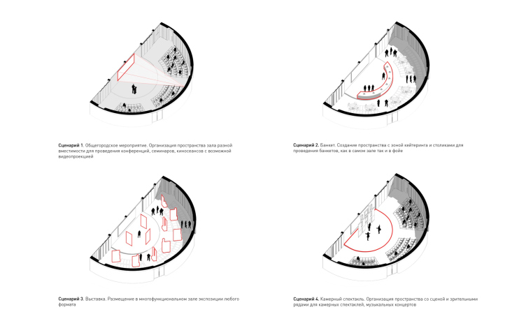
An additional stage is located in the northern part, to the right, and occupies the -1 and -2 floors. Its rectangular space is transformable thanks to a collapsible amphitheater. The other multi-purpose hall is semi-circular, situated directly under the main stage; here the multi-functionality is ensured by different variants of furniture arrangement.

Concept of reconstruction of the Krasnoyarsk State Opera and Ballet Theater named after D.A. Khvorostovsky. Transformations of the duplicating stage
Copyright: © WOWHAUS


Concept of reconstruction of the Krasnoyarsk State Opera and Ballet Theater named after D.A. Khvorostovsky. Transformations of the multifunctional auditorium
Copyright: © WOWHAUS


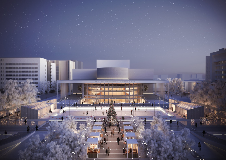
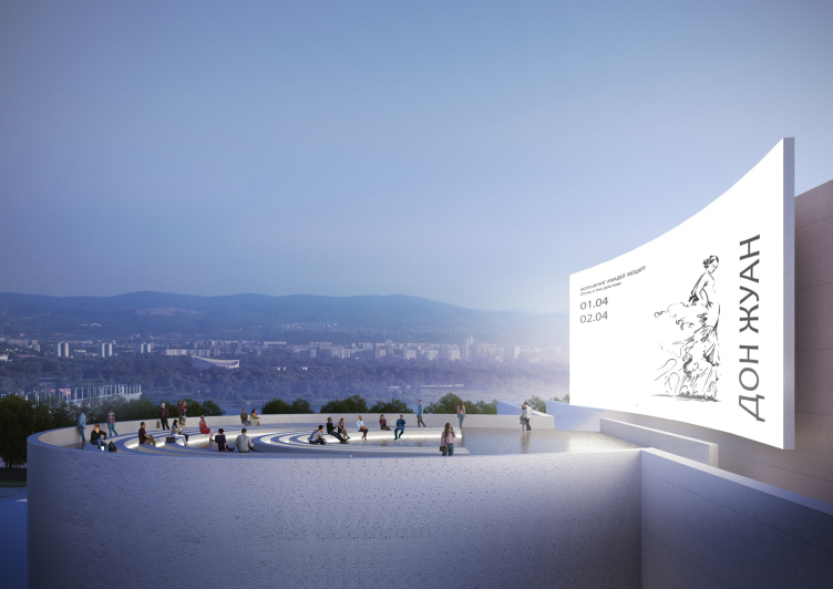
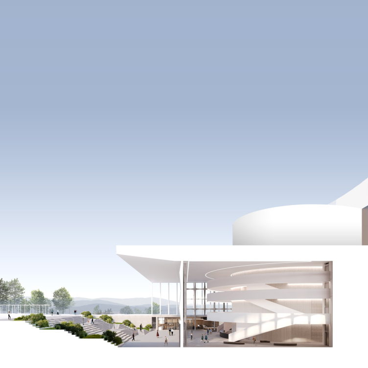
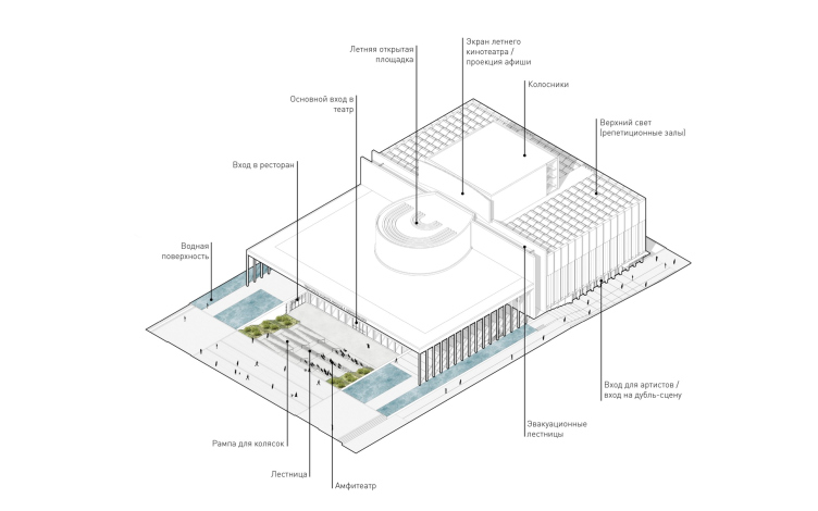
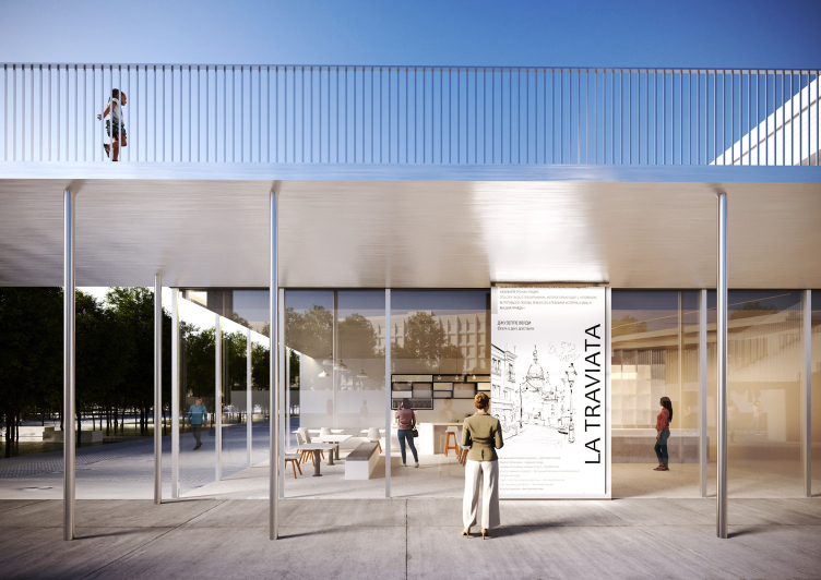
One of the important features of the project is the highly developed system of public spaces, both around the theater and on the roof of the auditorium. Additional performances and film screenings are also possible on the roof, and in front of the entrance to the foyer under a large canopy.

The venue on the roof of the grand auditorium. Concept of reconstruction of the Krasnoyarsk State Opera and Ballet Theater named after D.A. Khvorostovsky. Transformations of the duplicating stage
Copyright: © WOWHAUS


The foyer entrance, a cross-section view. Concept of reconstruction of the Krasnoyarsk State Opera and Ballet Theater named after D.A. Khvorostovsky. Transformations of the duplicating stage
Copyright: © WOWHAUS


Concept of reconstruction of the Krasnoyarsk State Opera and Ballet Theater named after D.A. Khvorostovsky. Transformations of the duplicating stage
Copyright: © WOWHAUS


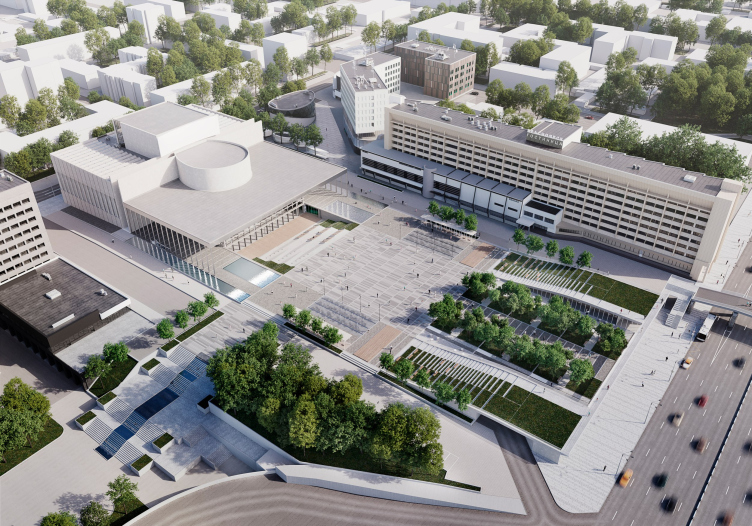
The architects completely revise the square in front of the theater: it is already big as it is, 140 meters long; it has three fountains on it, a sculpture of Apollo, a couple of lions at the entrance, a certain quantity of trees on the perimeter, but otherwise the square is empty. 

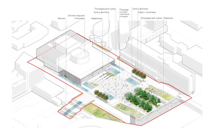
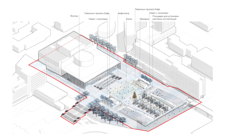
This square gets a lot of attention in the project. The square is multilevel: first, already now in its southern part, to the left and closer to the Yenisei river, where the height difference is from 4 to 5 meters, there is a four-level cascading staircase – the architects use it, preserving the fountain in the middle. Second, the area in front of the entrance is deepened and is accessed by a green city amphitheater with a zigzag-shaped ramp – Wowhaus already designed and built a similar one at the eastern entrance to Moscow’s Gorky Park; as a matter of fact, the amphitheater will make it possible to organize open-air performances.

Concept of reconstruction of the Krasnoyarsk State Opera and Ballet Theater named after D.A. Khvorostovsky
Copyright: © WOWHAUS


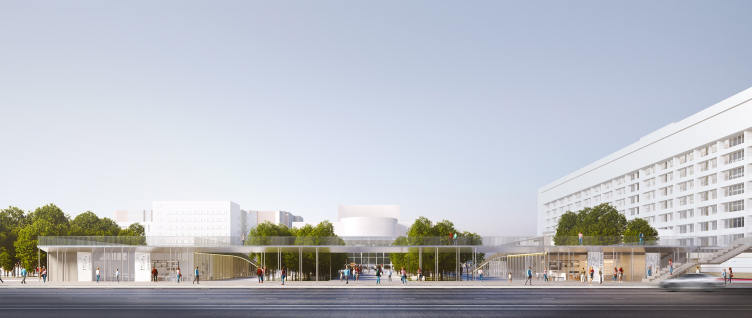
Finally, on the sides of the square closer to Weinbaum Street, the architects propose two pavilions with terraced roofs, which also descend by steps toward the theater – so it turns out that all the surfaces consistently build up toward the city and descend to the entrance of the theater.

Concept of reconstruction of the Krasnoyarsk State Opera and Ballet Theater named after D.A. Khvorostovsky. The formation of the square
Copyright: © WOWHAUS


Concept of reconstruction of the Krasnoyarsk State Opera and Ballet Theater named after D.A. Khvorostovsky. The summer scenario
Copyright: © WOWHAUS


Concept of reconstruction of the Krasnoyarsk State Opera and Ballet Theater named after D.A. Khvorostovsky. The winter scenario
Copyright: © WOWHAUS

 
In addition, quite a lot of water is provided, a dry fountain, a cascade, ponds, as well as a winter scenario of using the square as an ice rink.
 
The pavilions are united with a canopy on thin metal supports – this peculiar standing portico marks the border of the square and somewhat levels the protrusions of the ends; besides, it reminds of the same entrance to Gorky Park from Leninsky Prospekt in Moscow.

Concept of reconstruction of the Krasnoyarsk State Opera and Ballet Theater named after D.A. Khvorostovsky
Copyright: © WOWHAUS


Concept of reconstruction of the Krasnoyarsk State Opera and Ballet Theater named after D.A. Khvorostovsky
Copyright: © WOWHAUS


As we can see, the project has the trademark Wowhaus style, and it is made according to the rules of modern theater buildings: grand-scale, transformable, and multifunctional. The task of turning the space around the theater and inside of it into a point of attraction for the urban community has been solved here at different levels and with the expectation for different audiences.
 
Some doubt is caused by the fact that the building becomes an elegant but still replica of the former theater, that is, it sort of freezes halfway, provoking the question: what do you ultimately need, the old building or the new one?

***
The judging panel of the competition:

Konstantin Shumov, Honorary Architect of the Russian Federation, Head of the Krasnoyarsk Krai Urban Planning Control Service; Chief Architect of the Krasnoyarsk Krai, Chairman of the Judging Panel

Arkady Zinov, Honored Artist of the Russian Federation, Minister of Culture of the Krasnoyarsk region, Deputy Chairman of the Judging Panel 

Dmitry Bertman, General Director; Artistic Director of the Moscow Musical Theater Helikon Opera

Andrey Bokov, People’s Architect of the Russian Federation, Honorary President of the Union of Architects of Russia, Vice-President of the International Academy of Architecture, President of the Moscow branch of the International Academy of Architecture, Member of the Russian Academy of Architecture and Building Sciences, Corresponding Member of the Russian Academy of Arts

Andrey Borisov, Director of the Moscow Stanislavsky and Nemirovich-Danchenko Academic Musical Theater

Sergey Geraschenko, Honorary Architect of the Russian Federation, Professor of the Department of Urban Planning at the Institute of Architecture and Design of Siberian Federal University

Sergey Gnedovsky, People’s Architect of the Russian Federation, Vice-President of the Union of Architects of Russia, Academician of the Russian Academy of Architecture and Building Sciences

Elena Grigorieva, honored architect of the Russian Federation, vice president of the Union of Architects of Russia, member of the International Academy of Architecture, corresponding member of the Russian Academy of Architecture and Construction Sciences, editor-in-chief of Project Baikal

Svetlana Guziy, Director of the D.A. Khvorostovsky Krasnoyarsk State Theater of Opera and Ballet 

Georgy Isaakyan, Artistic Director of the Natalia Satz Moscow State Academic Children’s Musical Theater, Laureate of the State Prizes of the Russian Federation, Laureate of the President Prize of the Russian Federation, Honored Art Worker of the Russian Federation, Professor

Irina Korobina, professor of the Moscow Architectural Institute (State Academy), PhD in architecture, member of the International Academy of Architecture, member of the National Academy of Design, honorary member of the Russian Academy of Arts

Vladislav Loginov, Head of Krasnoyarsk

Yuri Oleynikov, Advisor to the Vice President of MMC Norilsk Nickel

Mikhail Rabushko, Minister of Construction of the Krasnoyarsk Territory


09 June 2023

Headlines now
The Golden Crown
The concept for a dental clinic in Yekaterinburg, developed by CNTR Studio, revolves around the idea of a “mouth full of gold”: pristine white porcelain stoneware walls are complemented by matte brass details. To avoid an overly literal interpretation, the architects focused on the building’s proportions, skillfully navigating between sunlight requirements and fire safety regulations.
Flexibility and Integration
Not long ago, we covered the project for the fourth phase of the ÁLIA residential complex, designed by APEX. Now, we’ve been shown different fence concepts they developed to enclose the complex’s private courtyards, incorporating a variety of public functions. We believe that the sheer fact that the complex’s architects were involved in such a detail as fencing speaks volumes.
A Step Forward
The HIDE residential complex represents a major milestone for ADM architects and their leaders Andrey Romanov and Ekaterina Kuznetsova in their quest for a fresh high-rise aesthetic – one that is flexible and layered, capable of bringing vibrancy to mass and silhouette while shaping form. Over recent years, this approach has become ADM’s “signature style”, with the golden HIDE tower playing a pivotal role in its evolution. Here, we delve into the project’s story, explore the details of the complex’s design, and uncover its core essence.
Gold in the Sands
A new office for a transcontinental company specializing in resource extraction and processing has opened in Dubai. Designed by T+T Architects, masters of creating spaces that are contemporary, diverse, flexible, and original, this project exemplifies their expertise. On the executive floor, a massive brass-clad partition dominates, while layered textures of compressed earth create a contextually resonant backdrop.
Layers and Levels of Flight
This project goes way back – Reserve Union won this architectural competition at the end of 2011, and the building was completed in 2018, so it’s practically “archival”. However, despite being relatively unknown, the building can hardly be considered “dated” and remains a prime example of architectural expression, particularly in the headquarters genre. And it’s especially fitting for an aviation company office. In some ways, it resembles the Aeroflot headquarters at Sheremetyevo but with its own unique identity, following the signature style of Vladimir Plotkin. In this article, we take an in-depth look at the United Aircraft Corporation (UAC) headquarters in the Moscow agglomeration town of Zhukovsky, supplemented by recent photographs from Alexey Naroditsky – a shoot that became only recently possible due to the fact that improvements were finally made in the surrounding area.
Light and Shadow
In this article, we delve into the architectural design of the “Chaika” house by DNK ag architects, which was recently completed in 2023 as part of the collection of signature designs at ZILArt. As is well-known, all the buildings in this complex follow a design code, yet each one is distinct. This particular building stands out not only for its whiteness and minimalism but also for the refined use of a limited number of techniques that, together, create what can confidently be called synergy.
Casus Novae
A master plan was developed for a large residential area with a name of “DNS City”, but now that its implementation began, the plan has been arbitrarily reformatted and replaced with something that, while similar on the surface, is actually quite different. This is not the first time such a thing happens, but it’s always frustrating. With permission from the author, we are sharing Maria Elkina’s post.
Treasure Hunting
The GAFA bureau, in collaboration with Tegola and Arkhitail, organized an expedition to the island of Kilpola in Karelia as part of Moskomarkhitektura’s “Open City” festival. There, amidst moss and rocks, the students sought answers to questions like: what is the sacred, where does it dwell, and what sustains it? Assisting the participants in this quest were landscape engineer Evgeny Levin, artist Nicholas Roerich, a moose, and the lack of cellular connection. Here’s how the story unfolded.
Depths of the Earth, Streams of Water
In the Malaya Okhta district, the Akzent building, designed by Stepan Liphart, was constructed. It follows a classic tripartite structure, yet it’s what you might call “hand-drawn”: each façade is unique in its form and details, some of which aren’t immediately noticeable. In this article, we explore the context and, together with the architect, delve into how the form was developed.
Fir Tree Dynamics
The “Airports of Region” holding is planning to build an airport in Karachay-Cherkessia, aiming to make the Arkhyz and Dombay resorts more accessible to travelers. The project that won in an invitation-only competition, submitted by Sergey Nikeshkin’s KPLN, blends natural imagery inspired by the shape of a conifer seed, open-air waiting spaces, majestic large trees, and a green roof elevated on needle-like columns. The result is both nature-inspired and WOW.
​A Brick Shell
In the process of designing a clubhouse situated among pine trees in a prestigious suburban area near Moscow, the architectural firm “A.Len” did the façade design part. The combination of different types of brick and masonry correlates with the volumetric and plastique solutions, further enhanced by the inclusion of wood-painted fragments and metal “glazing”.
Word Forms
ATRIUM architects love ambitious challenges, and for the firm’s thirtieth anniversary, they boldly play a game of words with an exhibition that dives deep into a self-created vocabulary. They immerse their projects – especially art installations – into this glossary, as if plunging into a current of their own. You feel as if you’re flowing through the veins of pure art, immersed in a universe of vertical cities, educational spaces – of which the architects are true masters – and the cultural codes of various locations. But what truly captivates is the bold statement that Vera Butko and Anton Nadtochy make, both through their work and this exhibition: architecture, above all, is art – the art of working with form and space.
Flexibility and Acuteness of Modernity
Luxurious, fluid, large “kokoshniks” and spiral barrel columns, as if made from colorful chewing gum: there seem to be no other mansion like this in Moscow, designed in the “Neo-Russian-Modern” style. And the “Teremok” on Malaya Kaluzhskaya, previously somewhat obscure, has “come alive with new colors” and gained visibility after its restoration for the office of the “architectural ecosystem” as the architects love to call themselves. It’s evident that Julius Borisov and the architects at UNK put their hearts into finding this new office and bringing it up to date. Let’s delve into the paradoxes of this mansion’s history and its plasticity. Spoiler: two versions of modernity meet here, both balancing on the razor’s edge of “what’s current”.
Yuri Vissarionov: “A modular house does not belong to the land”
It belongs to space, or to the air... It turns out that 3D printing is more effective when combined with a modular approach: the house is built in a workshop and then adapted to the site, including on uneven terrain. Yuri Vissarionov shares his latest experience in designing tourist complexes, both in central Russia and in the south. These include houseboats, homes printed from lightweight concrete using a 3D printer, and, of course, frame houses.
​Moscow’s First
“The quality of education largely depends on the quality of the educational environment”. This principle of the last decade has been realized by Sergey Skuratov in the project for the First Moscow Gymnasium on Rostovskaya Embankment in the Khamovniki district. The building seamlessly integrates into the complex urban landscape, responding both to the pedestrian flow of the city and the quiet alleyways. It skillfully takes advantage of the height differences and aligns with modern trends in educational space design. Let’s take a closer look.
Looking at the Water
The site of Villa Sonata stretches from the road to the water’s edge, offering its own shoreline, pier, and a picturesque river panorama. To reveal these sweeping views, Roman Leonidov “cut” the façade diagonally parallel to the river, thus getting two main axes for the house and, consequently, “two heads”. The internal core – two double-height spaces, a living room and a conservatory, with a “bridge” above them – makes the house both “transparent” and filled with light.
The White Wing
Well, it’s not exactly white. It’s more of a beige, white-stone structure that plays with the color of limestone – smoother surfaces are lighter, while rougher ones are darker. This wing unites various elements: it absorbs and interprets the surrounding themes. It responds to everything, yet maintains a cohesive expression – a challenging task! – while also incorporating recognizable features of its own, such as the dynamic cuts at the bottom, top, and middle.
Urban Dunes
The XSA Ramps team designed and built a three-part sports hub for a park in Rostov-on-Don, welcoming people of all ages and fitness levels. The skate plaza, pump track, and playground are all meticulously crafted with details that attract a diverse range of visitors. The technical execution of the shapes and slopes transforms this space into a kind of sculptural composition.
Proportional Growth
The project for the fourth phase of the ÁLIA residential area has been announced. The buildings are situated on an elongated plot – almost a “ray” that shoots out from the center of the area towards the river. Their layout reflects both a response to Moscow’s architectural preferences over the past 15 years, shifting “from blocks to towers”, and an interpretation of the neighboring business park designed by SOM. Additionally, the best apartments here are not located at the very top but closer to the middle, forming a glowing “waistline”.
The “Staircase” Building
In designing the “Details” residential complex in New Moscow, Rais Baishev spiced up the now-popular Moscow theme of a “courtyard” building with an idea drawn from the surrealist drawings by Maurits Escher. He envisioned the stepped silhouettes and descending slopes as a metaphysical mega-staircase, creating a key void within the courtyard that gave the project an internal “spine”. This concept is felt both in the building’s silhouette and on its façades.
Projection of the Quarter
No one doubted that the building that Vladimir Plotkin designed as part of the “Garden Quarters” would be the most modernist of all. And it turned out just that way: while adhering to the common design code, the building successfully combines brick and white stone, rhythmically responding to the neighboring building designed by Ostozhenka, yet tactfully and persistently making a few statements of its own. This includes the projection of the ideal urban development composition “14–9–6”, which can be found right next door, mathematical calculations, including those for various types of terraces (and perhaps the only reminder of the Soviet past of the Kauchuk rubber factory!), and the white “cross-stitch” pattern of the façade grid.
Domus Aurea
In this issue, we examine the “Tessinsky-1” house, designed by Sergey Skuratov and completed in 2023. Located in the middle of the Serebryanicheskaya Embankment district, at the intersection of its main streets, this house assumes a sort of “nodal” role: it not only responds to everything around it and preserves many memories of the former EMA factory within itself, but it weaves all this into a newly directed pattern, reconciling bright “gold” and dark-colored brick, largely with the help of the new, modern-yet-archaic Columba brick, which, come to think about it, is the most precious element here.
The Chimney of Nikola-Lenivets
In this issue, we are examining the “Obelisk House” designed by KATARSIS and built for the Arkhstoyanie 2023 festival. However, it was only finished later on, and this is why we are examining it now. It seems to us that after the “Obelisk House” appeared in Nikola-Lenivets, a dialogue and a few inner connections appeared between the temporary structures built here. These houses no longer look like “accidental neighbors”, more of which below.
​Periscope by the Bay
The jury awarded the second place in the competition for a public and cultural center in Petropavlovsk-Kamchatsky to the companies GORA (“Mountain”) and M4. In the consortium’s proposal, the building resembles a sperm whale with a calf swimming next to it or a periscope, whose lenses capture the most spectacular views from the surrounding landscape.
From Arcs to Dolmens
While working on the competition project for Petropavlovsk-Kamchatsky, ASADOV Architects prioritized the value of the natural and urban environment, aiming to preserve the balance of the location while minimizing the resemblance of the volume that they designed to a “traditional building”. The task was challenging, and the architects created three versions, one of which having been developed after the competition, where their main proposal took third place. However, the point of interest here is not the competition result but the continuity of creative thinking.
Hide and Seek
The ID Moskovskiy house, designed by Stepan Liphart in St. Petersburg, in the courtyards near Moskovskiy Avenue beyond the Obvodny Canal and recently completed, is notable for several reasons. Firstly, it has been realized with considerable accuracy, which is particularly significant as this is the first building where the architect was responsible not only for the facades but also for the layouts, allowing for better integration between the two. On the other hand, this building is interesting as an example of the “germination” of new architecture in the city: it draws on the best examples from the neighborhood and becomes an improved and developed sum of ideas found by the architect in the surrounding context.
The Big Twelve
Yesterday, the winners of the Moscow Mayor’s Architecture Award were announced and honored. Let’s take a look at what was awarded and, in some cases, even critique this esteemed award. After all, there is always room for improvement, right?
Above the Golden Horn
The residential complex “Philosophy” designed by T+T architects in Vladivostok, is one of the new projects in the “Golubinaya Pad” area, changing its development philosophy (pun intended) from single houses to a comprehensive approach. The buildings are organized along public streets, varying in height and format, with one house even executed in gallery typology, featuring a cantilever leaning on an art object.
Nuanced Alternative
How can you rhyme a square and space? Easily! But to do so, you need to rhyme everything you can possibly think of: weave everything together, like in a tensegrity structure, and find your own optics too. The new exhibition at GES-2 does just that, offering its visitor a new perspective on the history of art spanning 150 years, infused with the hope for endless multiplicity of worlds and art histories. Read on to see how this is achieved and how the exhibition design by Evgeny Ace contributes to it.
Blinds for Ice
An ice arena has been constructed in Domodedovo based on a project by Yuri Vissarionov Architects. To prevent the long façade, a technical requirement for winter sports facilities, from appearing monotonous, the architects proposed the use of suspended structures with multidirectional slats. This design protects the ice from direct sunlight while giving the wall texture and detail.