По-русски

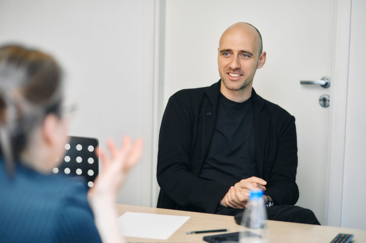
Ivan Grekov: “A client that wants to make a building that is “about architecture” is a big value and big luck”

In this article, we are talking to Ivan Grekov, the leader of the architectural company KAMEN (translates as “stone”), the author of many high-profile projects that have been built in Moscow in the recent years, about the history of his company, about different approaches to form making, about different meanings of volume and facade, and about “layers” in working with the environment – at the example of two projects by Osnova Group. These are the MIRAPOLIS complex on the Mira Avenue in Rostokino, whose construction began at the end of last year, and the multifunctional complex in the 2nd Silikatny Proezd on the Zvenigorodsky Highway; recently, it received all the required approvals.

20 June 2023
Interview
mainImg
Archi.ru
You won the closed-door competitions for these two projects, right?

Ivan Grekov, KAMEN Architects: 
Yes, in 2020, we first won the competition that Osnova Group conducted for the 2nd Silicatny, and then we won the Mira Avenue competition (MIRAPOLIS complex) – both competitions involved three or four companies. Being inspired by the case of Osnova’s collaboration with MVRDV in the RED7 project, we really wanted to try and work for this company, and we gave maximum attention to our contest proposals. We met several times to discuss our approach to developing this land site; it was a multi-iteration work. At some point, we were finally able to find bright and memorable images, and an approach that was productive in terms of integrating the hybrid function and transforming objects.

Ivan Grekov, KAMEN
Copyright: Photograph © Pavel Khomenko / provided by Osnova Group


Our hopes were justified – first, in both cases the client opted for the version that we considered the best, and, second, the projects are developing in the right direction, and virtually without any changes made to the core idea (a few minor things aside). For us, it’s really a breakthrough. Very often a beautiful idea gets horrendously simplified during the actual implementation. Luckily, this is not our case!

Yes, the shapes that you create are always very impressive. How do you come up with them? Are they function-based? 

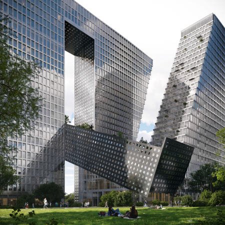
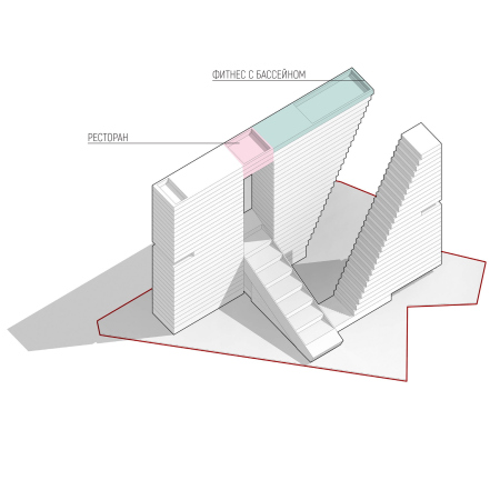
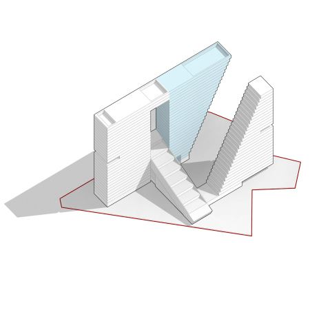
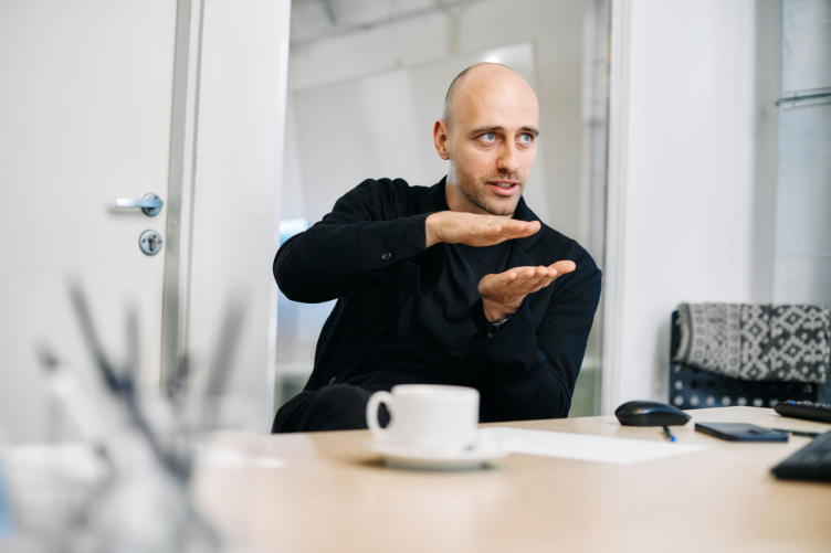
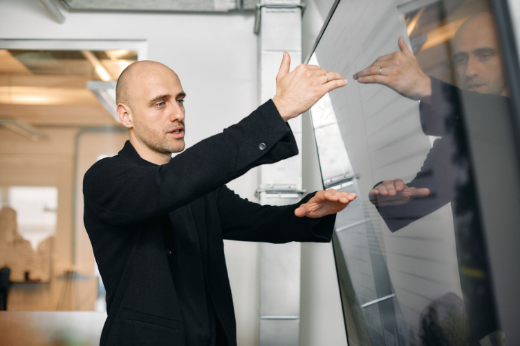
The volume is positioned quite successfully – it organizes the yard environment without any unwanted extra surfaces; it is terminally effective. I call this approach “architectural origami”: this is a stereometric task – you need to create a three-dimensional structure. This is like a sewing pattern where you cannot take away or add anything – nothing is left to chance. We value such an approach very much because many of our projects have to do with the physical properties and with searching for the right form with regard to some tectonic peculiarities, natural environment, and expected functions.

Ivan Grekov, KAMEN
Copyright: Photograph © Pavel Khomenko / provided by Osnova Group


What do you mean when your projects have to do with “physical properties”?

As for physical properties, it is the interaction that matters – the way the facade or even the whole building reacts to a sunrise or sunset, to sunny or overcast weather.

What makes a sculpture different from a building, what is the first thing that comes to mind? The windows! You look at something, see windows, and your brain tells you – this is a building. What if there are no windows? Some kind of mystery appears! What is this? Some kind of urban megalith! We have one large-scale project on the bank of the Moskva River, where we managed to make a facade, which, if you defocus your vision, starts disappearing and reflecting the environment. There are “architectural narratives” about volumes, about “sculptural-ness”, and about proportions. There is also a narrative about organizing the functions. And there is also a task to create some connection to the environment, with shadows, abr and with reflections. We also call this physics.

Ivan Grekov, KAMEN
Copyright: Photograph © Pavel Khomenko / provided by Osnova Group


What does the environment mean to you?

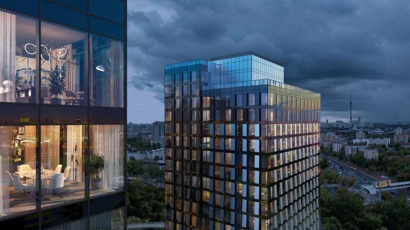
Environment is a volumetric notion to us, and we dissect it into layers. There are layers of perception: close vantage points, remote vantage points, and so on. You also need to know how you interact with the building if you are in motion. The next layer is the atmosphere, the air around the building. Essentially, the building connects the earth and the air, and our projects are like transistors that endure this connection. We see our missing in creating the environment on the earth level; then the next level up includes beacons that hover up high and react to the sky and the clouds.

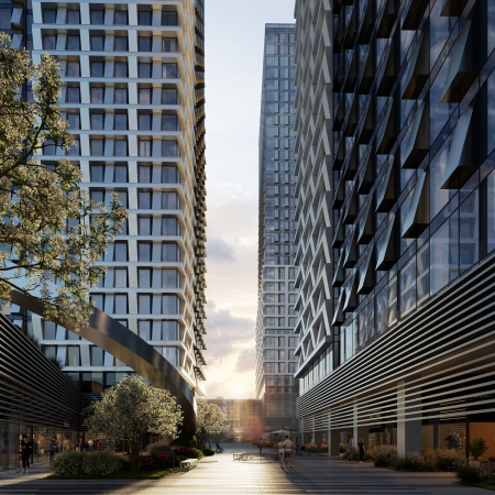
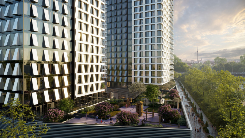
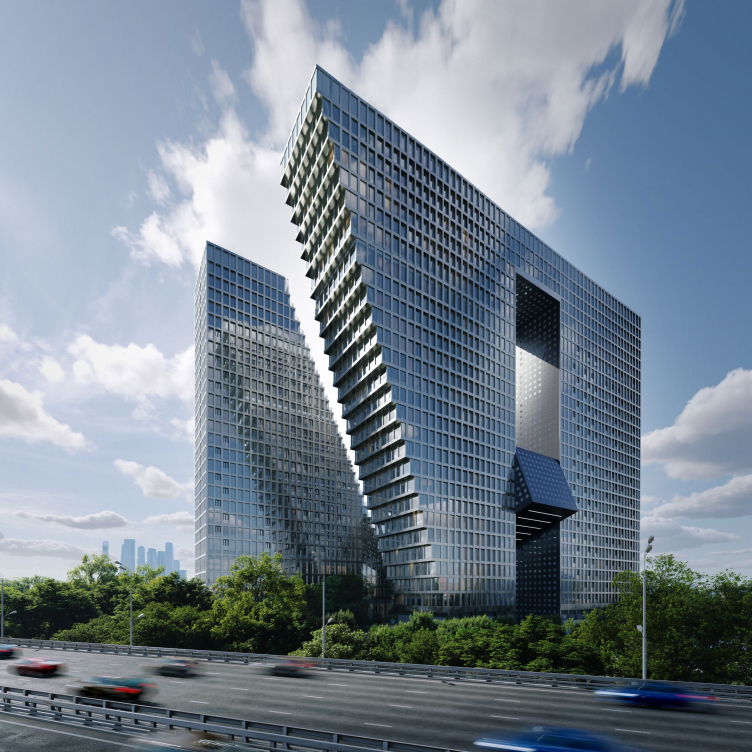
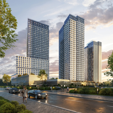
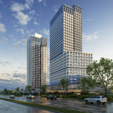
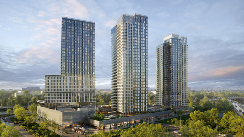
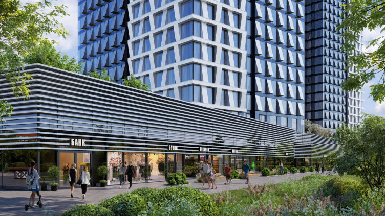
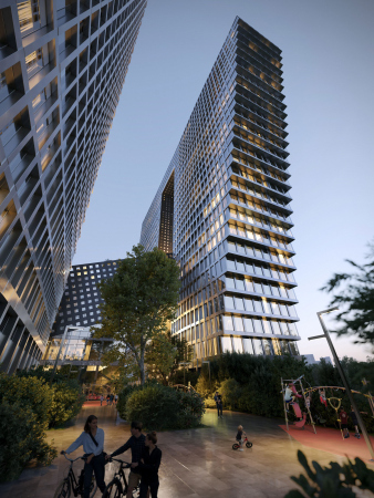
If we are to speak about the Rostokino project, the MIRAPOLIS complex, the dialog unfolds inside the complex. There is a highly saturated transport infrastructure around it: public roads, highways, and pedestrian walks too. Inside, the buildings stand rather densely, and the dialogue takes place between the volumes inside the complex.

  • zooming
    1 / 7
    MIRAPOLIS housing complex
    Copyright: © KAMEN / provided by Osnova Group
  • zooming
    2 / 7
    MIRAPOLIS housing complex
    Copyright: © KAMEN / provided by Osnova Group
  • zooming
    3 / 7
    MIRAPOLIS housing complex
    Copyright: © KAMEN Architects
  • zooming
    4 / 7
    MIRAPOLIS housing complex
    Copyright: © KAMEN / provided by Osnova Group
  • zooming
    5 / 7
    MIRAPOLIS housing complex
    Copyright: © KAMEN Architects
  • zooming
    6 / 7
    MIRAPOLIS housing complex
    Copyright: © KAMEN / provided by Osnova Group
  • zooming
    7 / 7
    MIRAPOLIS housing complex
    Copyright: © KAMEN / provided by Osnova Group


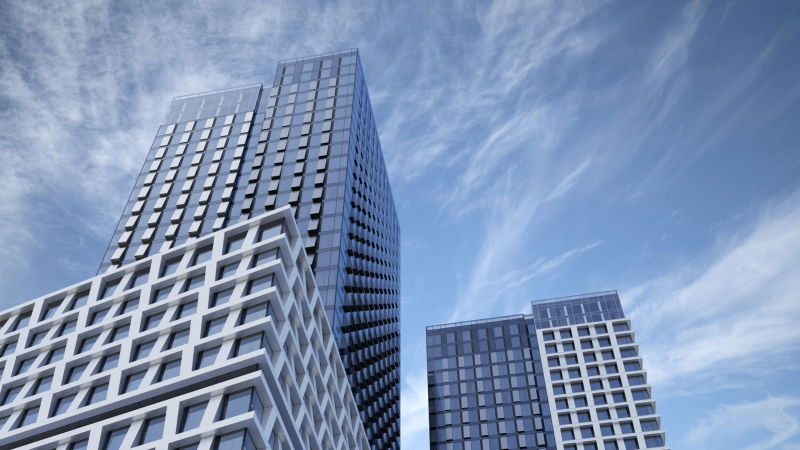
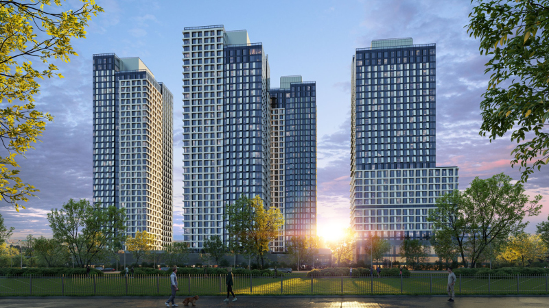
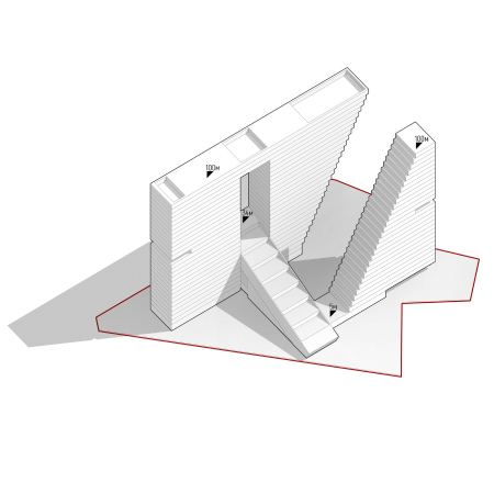
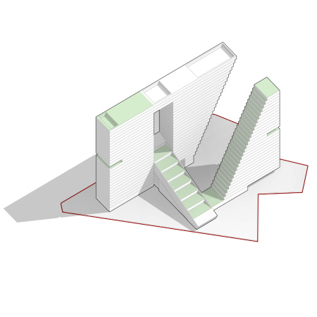
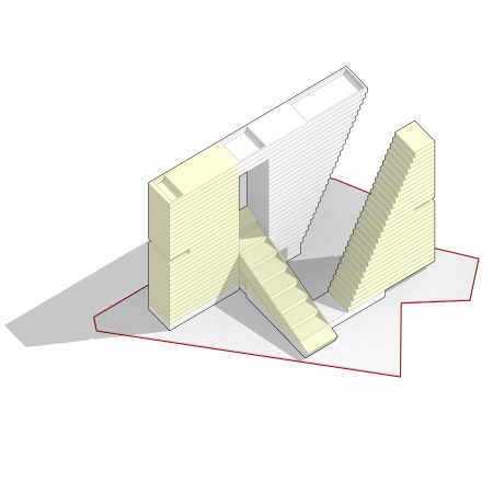
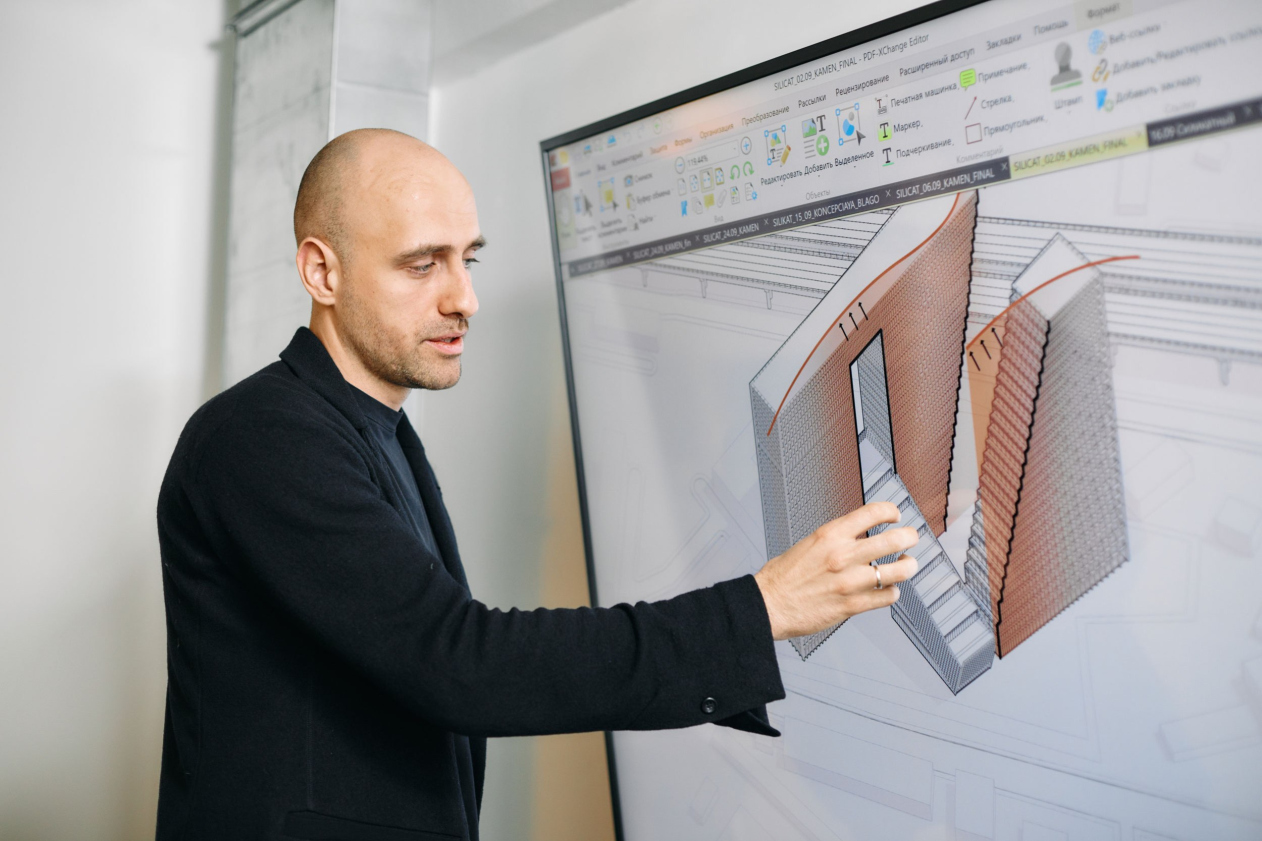
If we are to speak about the 2nd Silikatny – here we rather designed “a thing in itself” because the development around it is still in the making; we decided to invent some sort of an “inner dialogue” – in a broad sense, we perceive it as a welcoming element of the Big City.

Concept of developing the land st 2nd Silikatny Proezd, 8
Copyright: © KAMEN / provided by Osnova Group


Can these projects of yours thus be interpreted as examples of a “vertical city” or “poly-centers”, like self-contained multifunctional complexes?

Yes, you can totally call them that! In both cases, we combine apartments with a highly developed office function and diverse public infrastructure.

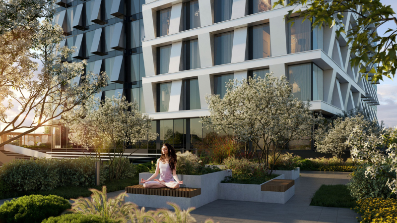
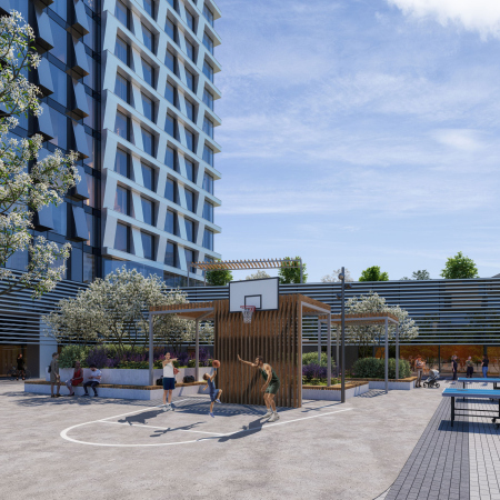
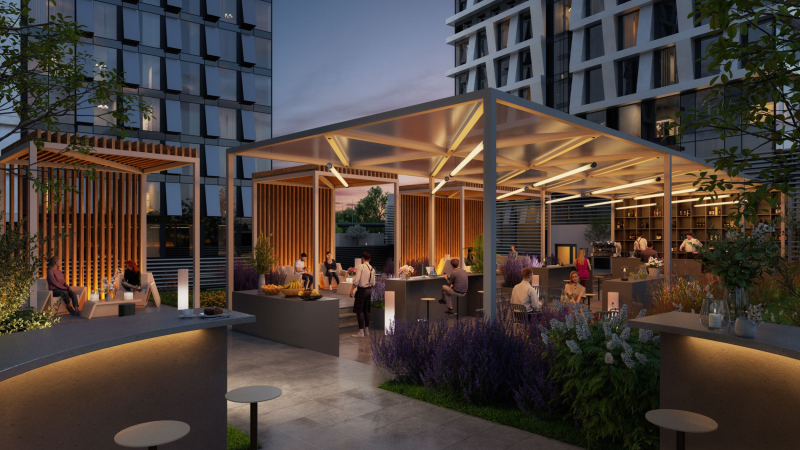
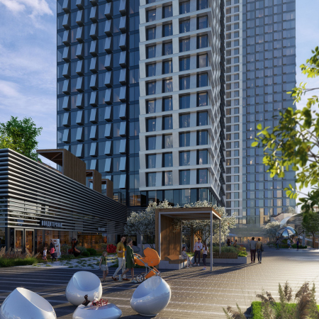
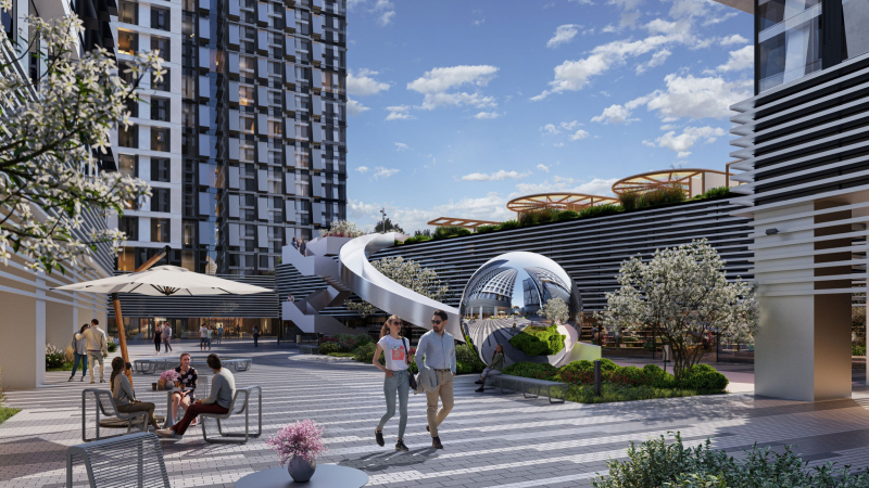
MIRAPOLIS is a vivid example of how a project can create a self-contained environment inside of it, at the same time harmoniously integrating itself in the life of the city around it. What do I mean? There is a prominent perimeter that performs a sophisticated public function: a shopping mall, a fitness center, cafes and restaurants… We also have a children’s center, a few stores, a food court, and a covered “street” passage inside. Catering for both outside front and the city, all of this activates various spaces, and makes the most of the transport infrastructure as well. On the other hand, we do have a stylobate there – it provides protection for the future residents and ensures a comfortable environment on the inside. In a sense, it is a “fortress wall” that protects you from the noise outside and from unwanted visitors. On the inside, we get a comfortable space for the residents, a private protected yard, and a park. The infrastructure in MIRAPOLIS occupies 20,000 square meters, which is about 10% of the total useful space.

  • zooming
    1 / 7
    MIRAPOLIS housing complex
    Copyright: © KAMEN Architects
  • zooming
    2 / 7
    MIRAPOLIS housing complex
    Copyright: © KAMEN / provided by Osnova Group
  • zooming
    3 / 7
    MIRAPOLIS housing complex
    Copyright: © KAMEN / provided by Osnova Group
  • zooming
    4 / 7
    MIRAPOLIS housing complex
    Copyright: © KAMEN / provided by Osnova Group
  • zooming
    5 / 7
    MIRAPOLIS housing complex
    Copyright: © KAMEN / provided by Osnova Group
  • zooming
    6 / 7
    MIRAPOLIS housing complex
    Copyright: © KAMEN / provided by Osnova Group
  • zooming
    7 / 7
    MIRAPOLIS housing complex
    Copyright: © KAMEN / provided by Osnova Group


The vertical character of the city manifests itself in the functional layers of this project. The first layer is the pure public city function. Then we have a mix of the office and residential functions, which develops vertically as the floors grow higher, and is mixed evenly in one of the towers. Plus we are using the roofs of the stylobate and the terraces up high.

Yes, MIRAPOLIS is situated not exactly in the city center, but it is itself a center in its own right, so it totally meets the concept of a polycentric city.

MIRAPOLIS housing complex
Copyright: © KAMEN / provided by Osnova Group


I’ve heard that you’ve been actively working with the client to finalize the project on Mira Avenue. What has changed in relation to the original bid?

The process of the post-competition life of your project is always very eventful, and there is nothing wrong with that. When you get down to practical implementation, you need to consider a whole number of factors and requirements: your apartment range may change, or the key commercial tenants may come with his requirements… The bigger the project, the more changes. At the architectural competition for this project, we offered Osnova Group 12 versions of this project, and the buildings were higher – the exceeded the 120-meter limit. There were two public streets running across our yard, and the towers were interpreted as situated in the “thaw patches” of the stylobate. The city life went on down below, and the inner life of the complex began a little bit higher up; the yards were accessed from the second floor. Meanwhile, the key points of the concept did remain. I cannot say that any radical changes were made to the project.

What is your approach to facade design? In MIRAPOLIS, I see sculptural prisms in the piers, you know, of such “bristling” kind, and there are brick pylons in Silikatny…

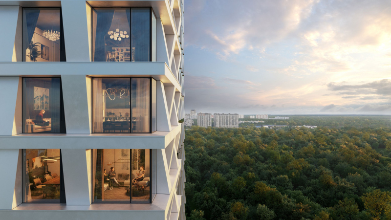
Yes, in the Rostokino project, we explored the “imprint” idea: sometimes you see relief protrusions, and sometimes you see indents of the same shape. In addition, as you go higher, this opposition becomes less acute, as if honed down by the wind, but, yes, down below they are indeed “bristling”. We divided each tower into four such parts to make them look more slender.

As for the 2nd Silikatny, we do not even consider the facades to be the main part of the project – quite the opposite, we try to design it in such a way that either details or materials would not become the key part of the architectural solution. You know that many things may happen over the life of the project, the economic situation may change, and so on, and we see plenty of examples when something got in the way, the facades were not constructed the way they should have been – and the project was ruined. This is why we work on our projects in such a way as to ensure that their shell is not their main part; preferably, it should not influence the main architectural statement at all. The building is a sculpture, and the facade is like clothing – it should not affect the architectural statement too much.

  • zooming
    1 / 7
    Concept of developing the land st 2nd Silikatny Proezd, 8
    Copyright: © KAMEN / provided by Osnova Group
  • zooming
    2 / 7
    Concept of developing the land st 2nd Silikatny Proezd, 8
    Copyright: © KAMEN Architects
  • zooming
    3 / 7
    Concept of developing the land st 2nd Silikatny Proezd, 8
    Copyright: © KAMEN Architects
  • zooming
    4 / 7
    Concept of developing the land st 2nd Silikatny Proezd, 8
    Copyright: © KAMEN Architects
  • zooming
    5 / 7
    Concept of developing the land st 2nd Silikatny Proezd, 8
    Copyright: © KAMEN Architects
  • zooming
    6 / 7
    Concept of developing the land st 2nd Silikatny Proezd, 8
    Copyright: © KAMEN Architects
  • zooming
    7 / 7
    Concept of developing the land st 2nd Silikatny Proezd, 8
    Copyright: © KAMEN / provided by Osnova Group


But then again, in this specific case we don’t have any doubt that the client will ensure high-quality implementation of the project.

Your portfolio includes a large number of high-rise projects – how many, by the way? 

They are all at different stages of competition, so I cannot give you an exact figure. There are also projects of master plans that already include a large number of high-rise dominants.

Do you still take on small-scale projects?

Yes, we still love working with small-scale projects – we have countryside villas and residences that we mostly do for our intellectual environment, they are by no means commercial. However, they do help us to continue a certain creative search. Our company was founded by my father, Vadim Grekov, back in 1993. Hitherto, he had been involved in some countryside construction. Today, we work in any typology you can possibly think of, from small countryside residences to grand-scale master plans.

When did you have your breakthrough?

It was about 7 or 8 years ago when we started doing our first city projects. Before that, I was working for Stephen Hall in New York, and I just came back to Moscow. And my father became the director of Mosproject-4.

There was a time when we further collaborated with Stephen Hall and did a few projects in Moscow – the Golden Island, and the State Museum of Modern Art. We won the Tushino competition – and it was at that moment that we decided to focus more on the city projects. Unfortunately, the Tushino project was never implemented due to various circumstances. I think that the client very early on underestimated the economic costs, and, of course, specifics of working with Stephen Hall. Few clients can digest that.

Ivan Grekov, KAMEN
Copyright: Photograph © Pavel Khomenko / provided by Osnova Group


What is the main problem that the architect is facing today? The housing typology sets very rigid constraints – you cannot do anything outstanding. And the demand for any other typologies is virtually nonexistent. You are very lucky if you do land such a project. For us, such a lucky project was the Moscow State University project that we did with Sergey Kuznetsov.

So, unfortunately, you cannot really distinguish yourself in designing housing projects, even though my colleagues now and then do achieve the impossible, breaking the traditional frames. Moscow has a few such examples. Thank God, the mayor and the Chief Architect of Moscow support us in this.

Can you name these examples?

Definitely the Badaevsky and definitely RED7! And I am pretty sure that Silikatny will become another such project. But it still has to be implemented, and it will be a challenging task.

This complex in the 2nd Silikatny Proezd – is it your boldest project so far? 

Well, this may not be the boldest project, but I really hope that this is the most interesting idea that stands a fair chance of being implemented. The client is literally fearless there. Osnova Group is a brave company – its RED7 project alone, designed by MVRDV on Sakharov Avenue, is sufficient proof of that. We have long since wanted to work with this developer, and we are very happy to have two projects with them. A client that can and wants to make a building that is “about architecture” is a big value and big luck.

Apart from Steven Hall, who do you consider to be your teachers?

Even before university, I was very much influenced by Vladislav Kirpichev. Sadly, I didn’t really hit it off with the Moscow Institute of Architecture… Then I enrolled at MARCH school, the very first course, then I studied at Sergey Skuratov studio, and this was an invaluable experience. And, of course, my dad, Vadim Grekov – we both live on architecture, and we’ve been heatedly discussing various projects ever since I was a kid.

And you still do now?

All the time! This really gives me an impulse. We are now running parallel courses, mostly criticizing each other, but this is not a bad thing. We all miss competent constructive criticism.

How would you describe “competent constructive criticism”?

That is a difficult topic. When I get criticized, I never take offense. Criticism is always good for you. You may not agree with the criticism but you still may find some valuable points in it. I think of criticism as something that’s going to make you better, not bitter, and, in addition, you don’t have to agree with everything they tell you. But, seriously, if it wasn’t for criticism, you would miss out on a lot of things.

But criticism is often taste-driven, isn’t it?

Yes, criticism is always test driven. The only way to effectively confront it is having a clear cut concept, when you are absolutely sure why you do these things, and why you don’t do other things, for example, look, you cannot make two white facades here, it’s like peeling an orange or sausage – it looks one way on the outside, and a different way on the inside. And when you are 100% sure of what you are doing, your critic will say “OK, you have a point!” But what if you really missed something? If you have this facade white, and this facade black, and you can’t explain why? If they say “Change this!”, and you cannot say why you cannot change it, this means that this thing escaped your attention, and you have to think harder.

Ivan Grekov, KAMEN
Copyright: Photograph © Pavel Khomenko / provided by Osnova Group
 

How “author” or “original” is your company? Do you delegate tasks?

Our company is definitely an “author” one, but the role of the team is hard to overestimate. Of course, this is a collective creative activity. We create some sort of a common philosophy inside, but we generate it together, and the team is very important here. No matter who says what, we are all about teamwork. However, out of the 150 people that we have, only 5 or 10 generate new ideas. We have a conceptual division. We have plans for mixing up our team, but these are plans for the future. So far, this does not go well together with our philosophy.

And what is your philosophy about? What do you want to get from your architecture?

First, we are trying to get maximum customization from every project. We have an approach of our own that allows us to achieve that. But then again, pretty much everyone else does the same. When we start a project, we do a lot of research: the history of the place, the spirit of the place, the economic performance expectations, the functions, and so on. However, our next main task is to create a clear structure, a hierarchy, and to form the idea. Then we get some locomotive idea that usually consists of five bullet points at most. And we try to make sure that these five bullet points are different from project to project, unique for their place and their task. Hence, the task of designing unique things suggests itself. And then, there is also a goal that is important for any architect – you need to develop your personal formal lexicon. We are just groping for it. But, the way I see it, something is already in the pipeline.

20 June 2023

Headlines now
The Golden Crown
The concept for a dental clinic in Yekaterinburg, developed by CNTR Studio, revolves around the idea of a “mouth full of gold”: pristine white porcelain stoneware walls are complemented by matte brass details. To avoid an overly literal interpretation, the architects focused on the building’s proportions, skillfully navigating between sunlight requirements and fire safety regulations.
Flexibility and Integration
Not long ago, we covered the project for the fourth phase of the ÁLIA residential complex, designed by APEX. Now, we’ve been shown different fence concepts they developed to enclose the complex’s private courtyards, incorporating a variety of public functions. We believe that the sheer fact that the complex’s architects were involved in such a detail as fencing speaks volumes.
A Step Forward
The HIDE residential complex represents a major milestone for ADM architects and their leaders Andrey Romanov and Ekaterina Kuznetsova in their quest for a fresh high-rise aesthetic – one that is flexible and layered, capable of bringing vibrancy to mass and silhouette while shaping form. Over recent years, this approach has become ADM’s “signature style”, with the golden HIDE tower playing a pivotal role in its evolution. Here, we delve into the project’s story, explore the details of the complex’s design, and uncover its core essence.
Gold in the Sands
A new office for a transcontinental company specializing in resource extraction and processing has opened in Dubai. Designed by T+T Architects, masters of creating spaces that are contemporary, diverse, flexible, and original, this project exemplifies their expertise. On the executive floor, a massive brass-clad partition dominates, while layered textures of compressed earth create a contextually resonant backdrop.
Layers and Levels of Flight
This project goes way back – Reserve Union won this architectural competition at the end of 2011, and the building was completed in 2018, so it’s practically “archival”. However, despite being relatively unknown, the building can hardly be considered “dated” and remains a prime example of architectural expression, particularly in the headquarters genre. And it’s especially fitting for an aviation company office. In some ways, it resembles the Aeroflot headquarters at Sheremetyevo but with its own unique identity, following the signature style of Vladimir Plotkin. In this article, we take an in-depth look at the United Aircraft Corporation (UAC) headquarters in the Moscow agglomeration town of Zhukovsky, supplemented by recent photographs from Alexey Naroditsky – a shoot that became only recently possible due to the fact that improvements were finally made in the surrounding area.
Light and Shadow
In this article, we delve into the architectural design of the “Chaika” house by DNK ag architects, which was recently completed in 2023 as part of the collection of signature designs at ZILArt. As is well-known, all the buildings in this complex follow a design code, yet each one is distinct. This particular building stands out not only for its whiteness and minimalism but also for the refined use of a limited number of techniques that, together, create what can confidently be called synergy.
Casus Novae
A master plan was developed for a large residential area with a name of “DNS City”, but now that its implementation began, the plan has been arbitrarily reformatted and replaced with something that, while similar on the surface, is actually quite different. This is not the first time such a thing happens, but it’s always frustrating. With permission from the author, we are sharing Maria Elkina’s post.
Treasure Hunting
The GAFA bureau, in collaboration with Tegola and Arkhitail, organized an expedition to the island of Kilpola in Karelia as part of Moskomarkhitektura’s “Open City” festival. There, amidst moss and rocks, the students sought answers to questions like: what is the sacred, where does it dwell, and what sustains it? Assisting the participants in this quest were landscape engineer Evgeny Levin, artist Nicholas Roerich, a moose, and the lack of cellular connection. Here’s how the story unfolded.
Depths of the Earth, Streams of Water
In the Malaya Okhta district, the Akzent building, designed by Stepan Liphart, was constructed. It follows a classic tripartite structure, yet it’s what you might call “hand-drawn”: each façade is unique in its form and details, some of which aren’t immediately noticeable. In this article, we explore the context and, together with the architect, delve into how the form was developed.
Fir Tree Dynamics
The “Airports of Region” holding is planning to build an airport in Karachay-Cherkessia, aiming to make the Arkhyz and Dombay resorts more accessible to travelers. The project that won in an invitation-only competition, submitted by Sergey Nikeshkin’s KPLN, blends natural imagery inspired by the shape of a conifer seed, open-air waiting spaces, majestic large trees, and a green roof elevated on needle-like columns. The result is both nature-inspired and WOW.
​A Brick Shell
In the process of designing a clubhouse situated among pine trees in a prestigious suburban area near Moscow, the architectural firm “A.Len” did the façade design part. The combination of different types of brick and masonry correlates with the volumetric and plastique solutions, further enhanced by the inclusion of wood-painted fragments and metal “glazing”.
Word Forms
ATRIUM architects love ambitious challenges, and for the firm’s thirtieth anniversary, they boldly play a game of words with an exhibition that dives deep into a self-created vocabulary. They immerse their projects – especially art installations – into this glossary, as if plunging into a current of their own. You feel as if you’re flowing through the veins of pure art, immersed in a universe of vertical cities, educational spaces – of which the architects are true masters – and the cultural codes of various locations. But what truly captivates is the bold statement that Vera Butko and Anton Nadtochy make, both through their work and this exhibition: architecture, above all, is art – the art of working with form and space.
Flexibility and Acuteness of Modernity
Luxurious, fluid, large “kokoshniks” and spiral barrel columns, as if made from colorful chewing gum: there seem to be no other mansion like this in Moscow, designed in the “Neo-Russian-Modern” style. And the “Teremok” on Malaya Kaluzhskaya, previously somewhat obscure, has “come alive with new colors” and gained visibility after its restoration for the office of the “architectural ecosystem” as the architects love to call themselves. It’s evident that Julius Borisov and the architects at UNK put their hearts into finding this new office and bringing it up to date. Let’s delve into the paradoxes of this mansion’s history and its plasticity. Spoiler: two versions of modernity meet here, both balancing on the razor’s edge of “what’s current”.
Yuri Vissarionov: “A modular house does not belong to the land”
It belongs to space, or to the air... It turns out that 3D printing is more effective when combined with a modular approach: the house is built in a workshop and then adapted to the site, including on uneven terrain. Yuri Vissarionov shares his latest experience in designing tourist complexes, both in central Russia and in the south. These include houseboats, homes printed from lightweight concrete using a 3D printer, and, of course, frame houses.
​Moscow’s First
“The quality of education largely depends on the quality of the educational environment”. This principle of the last decade has been realized by Sergey Skuratov in the project for the First Moscow Gymnasium on Rostovskaya Embankment in the Khamovniki district. The building seamlessly integrates into the complex urban landscape, responding both to the pedestrian flow of the city and the quiet alleyways. It skillfully takes advantage of the height differences and aligns with modern trends in educational space design. Let’s take a closer look.
Looking at the Water
The site of Villa Sonata stretches from the road to the water’s edge, offering its own shoreline, pier, and a picturesque river panorama. To reveal these sweeping views, Roman Leonidov “cut” the façade diagonally parallel to the river, thus getting two main axes for the house and, consequently, “two heads”. The internal core – two double-height spaces, a living room and a conservatory, with a “bridge” above them – makes the house both “transparent” and filled with light.
The White Wing
Well, it’s not exactly white. It’s more of a beige, white-stone structure that plays with the color of limestone – smoother surfaces are lighter, while rougher ones are darker. This wing unites various elements: it absorbs and interprets the surrounding themes. It responds to everything, yet maintains a cohesive expression – a challenging task! – while also incorporating recognizable features of its own, such as the dynamic cuts at the bottom, top, and middle.
Urban Dunes
The XSA Ramps team designed and built a three-part sports hub for a park in Rostov-on-Don, welcoming people of all ages and fitness levels. The skate plaza, pump track, and playground are all meticulously crafted with details that attract a diverse range of visitors. The technical execution of the shapes and slopes transforms this space into a kind of sculptural composition.
Proportional Growth
The project for the fourth phase of the ÁLIA residential area has been announced. The buildings are situated on an elongated plot – almost a “ray” that shoots out from the center of the area towards the river. Their layout reflects both a response to Moscow’s architectural preferences over the past 15 years, shifting “from blocks to towers”, and an interpretation of the neighboring business park designed by SOM. Additionally, the best apartments here are not located at the very top but closer to the middle, forming a glowing “waistline”.
The “Staircase” Building
In designing the “Details” residential complex in New Moscow, Rais Baishev spiced up the now-popular Moscow theme of a “courtyard” building with an idea drawn from the surrealist drawings by Maurits Escher. He envisioned the stepped silhouettes and descending slopes as a metaphysical mega-staircase, creating a key void within the courtyard that gave the project an internal “spine”. This concept is felt both in the building’s silhouette and on its façades.
Projection of the Quarter
No one doubted that the building that Vladimir Plotkin designed as part of the “Garden Quarters” would be the most modernist of all. And it turned out just that way: while adhering to the common design code, the building successfully combines brick and white stone, rhythmically responding to the neighboring building designed by Ostozhenka, yet tactfully and persistently making a few statements of its own. This includes the projection of the ideal urban development composition “14–9–6”, which can be found right next door, mathematical calculations, including those for various types of terraces (and perhaps the only reminder of the Soviet past of the Kauchuk rubber factory!), and the white “cross-stitch” pattern of the façade grid.
Domus Aurea
In this issue, we examine the “Tessinsky-1” house, designed by Sergey Skuratov and completed in 2023. Located in the middle of the Serebryanicheskaya Embankment district, at the intersection of its main streets, this house assumes a sort of “nodal” role: it not only responds to everything around it and preserves many memories of the former EMA factory within itself, but it weaves all this into a newly directed pattern, reconciling bright “gold” and dark-colored brick, largely with the help of the new, modern-yet-archaic Columba brick, which, come to think about it, is the most precious element here.
The Chimney of Nikola-Lenivets
In this issue, we are examining the “Obelisk House” designed by KATARSIS and built for the Arkhstoyanie 2023 festival. However, it was only finished later on, and this is why we are examining it now. It seems to us that after the “Obelisk House” appeared in Nikola-Lenivets, a dialogue and a few inner connections appeared between the temporary structures built here. These houses no longer look like “accidental neighbors”, more of which below.
​Periscope by the Bay
The jury awarded the second place in the competition for a public and cultural center in Petropavlovsk-Kamchatsky to the companies GORA (“Mountain”) and M4. In the consortium’s proposal, the building resembles a sperm whale with a calf swimming next to it or a periscope, whose lenses capture the most spectacular views from the surrounding landscape.
From Arcs to Dolmens
While working on the competition project for Petropavlovsk-Kamchatsky, ASADOV Architects prioritized the value of the natural and urban environment, aiming to preserve the balance of the location while minimizing the resemblance of the volume that they designed to a “traditional building”. The task was challenging, and the architects created three versions, one of which having been developed after the competition, where their main proposal took third place. However, the point of interest here is not the competition result but the continuity of creative thinking.
Hide and Seek
The ID Moskovskiy house, designed by Stepan Liphart in St. Petersburg, in the courtyards near Moskovskiy Avenue beyond the Obvodny Canal and recently completed, is notable for several reasons. Firstly, it has been realized with considerable accuracy, which is particularly significant as this is the first building where the architect was responsible not only for the facades but also for the layouts, allowing for better integration between the two. On the other hand, this building is interesting as an example of the “germination” of new architecture in the city: it draws on the best examples from the neighborhood and becomes an improved and developed sum of ideas found by the architect in the surrounding context.
The Big Twelve
Yesterday, the winners of the Moscow Mayor’s Architecture Award were announced and honored. Let’s take a look at what was awarded and, in some cases, even critique this esteemed award. After all, there is always room for improvement, right?
Above the Golden Horn
The residential complex “Philosophy” designed by T+T architects in Vladivostok, is one of the new projects in the “Golubinaya Pad” area, changing its development philosophy (pun intended) from single houses to a comprehensive approach. The buildings are organized along public streets, varying in height and format, with one house even executed in gallery typology, featuring a cantilever leaning on an art object.
Nuanced Alternative
How can you rhyme a square and space? Easily! But to do so, you need to rhyme everything you can possibly think of: weave everything together, like in a tensegrity structure, and find your own optics too. The new exhibition at GES-2 does just that, offering its visitor a new perspective on the history of art spanning 150 years, infused with the hope for endless multiplicity of worlds and art histories. Read on to see how this is achieved and how the exhibition design by Evgeny Ace contributes to it.
Blinds for Ice
An ice arena has been constructed in Domodedovo based on a project by Yuri Vissarionov Architects. To prevent the long façade, a technical requirement for winter sports facilities, from appearing monotonous, the architects proposed the use of suspended structures with multidirectional slats. This design protects the ice from direct sunlight while giving the wall texture and detail.