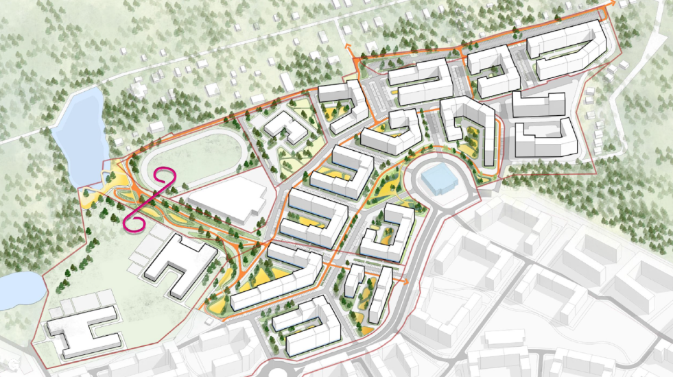
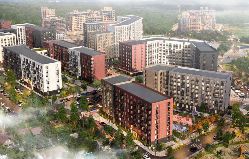
Genpro began working with the territory near the Moscow-region town of Odintsovo several years ago, initially as part of the creation of a master plan for the site with a total area of 27.41 hectares. The site borders Laikovo village from the west, the southeastern part is adjacent to the Krasnogorskoye highway – Vlasikha village, which is being reconstructed, and the northern and eastern parts are bounded by a wooded area. The developer, Samolet Group, intends to build this new residential area in four stages.
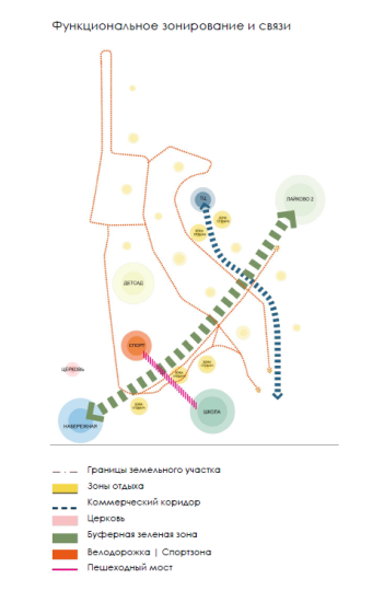
The master plan provides for the general balance of development and the distribution of functional zones: it is planned to create a full-fledged mix-use environment that includes all the necessary infrastructure, from social/shopping/entertainment facilities to parking lots and recreational areas. As the area develops, there are plans to connect it to the larger network of bicycle routes of Odintsovsky District.
In addition, the master plan reflects the architects’ bias towards lowering the height of the construction down to mid-rise, and organized into city blocks – despite the fact that nearby the same developer, Samolet Group, is building high-rises. As a result, at this stage Genpro formed housing groups of multi-sectional buildings with semi-closed yards of different shapes, chiefly gazing towards the woodland. In addition, the street-road network has been defined, which involves a park and two linear walking zones that lead to the bodies of water that are there on the site: one goes along the border with the residential area, the other – along the planned shopping mall. This shopping mall, in turn, forms the central area of the residential community, although at the moment there is no concept for it yet.
The plan also shows the location of the school with a stadium and kindergarten in the western part of the site. Locations of recreational areas and flat parking lots have been identified as well. In addition, the master plan partially began to write the design code, including several types of facades: “standard”, uniting the four mini-quarters in the northern part and assuming differentiation at the level of different stacking elements for different houses; “central front” – facades of the buildings that stand along the main arteries and overlook the square, with more unified solutions; “green alley” – facades with a greater saturation of decorative elements, designed for increased pedestrian flow along the boulevards; and “perimeter front” – external facades of residential groups in the south-eastern part, bordering with the second stage of “Laikovo-2”.
Actually, this logic – namely, that of differentiating architectural techniques on the facades as a tool for solving compositional tasks – was something that Genpro projected to the next stage of the project, which was handled by another team of architects from the same company. The main task of the project, about which we are sharing now, was the development of the facade concept.
Laikovo 1 housing complex. Development of the facade complex: the ideology
Copyright: © Genpro
Plumage Colors
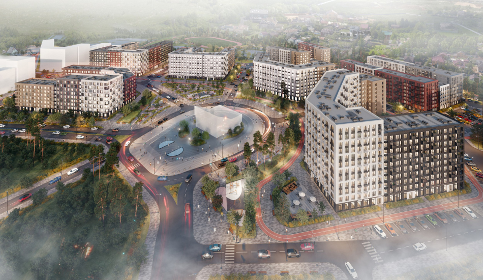
One should note that in the framework of this particular task Genpro had to work with a rigidly set planning and volumetric structure stipulated in the site plan: they could not change the arrangement of the houses and their number of floors, nor could they change the structure of motoring and pedestrian connections. The architects did not fully agree with all of the planning solutions that they had to work with: specifically, the central plaza with a shopping mall built upon it is closer in scale to high-rise construction, and is a little bit too bulky for mid-rise construction of 12-14 floors. However, since it was impossible to introduce changes of any kind, the architects focused on the facade solutions.
Thus, the architects set themselves the task of harmonizing the given parameters by “decorative means”. In this, the architects partly returned to the principle of typological differentiation of solutions for different sections, depending on their role in the overall structure of the district; but they developed the idea in more detail.
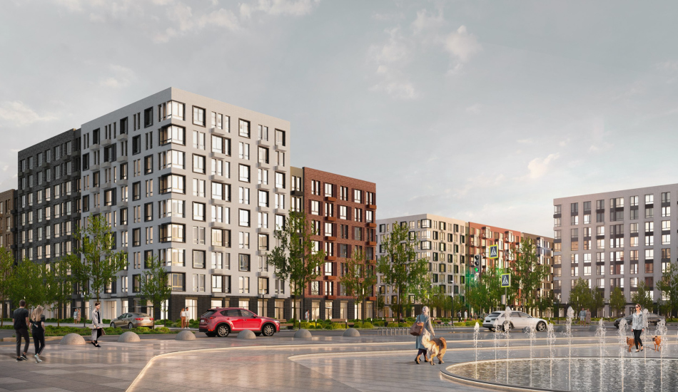
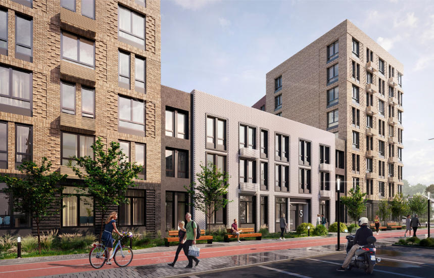
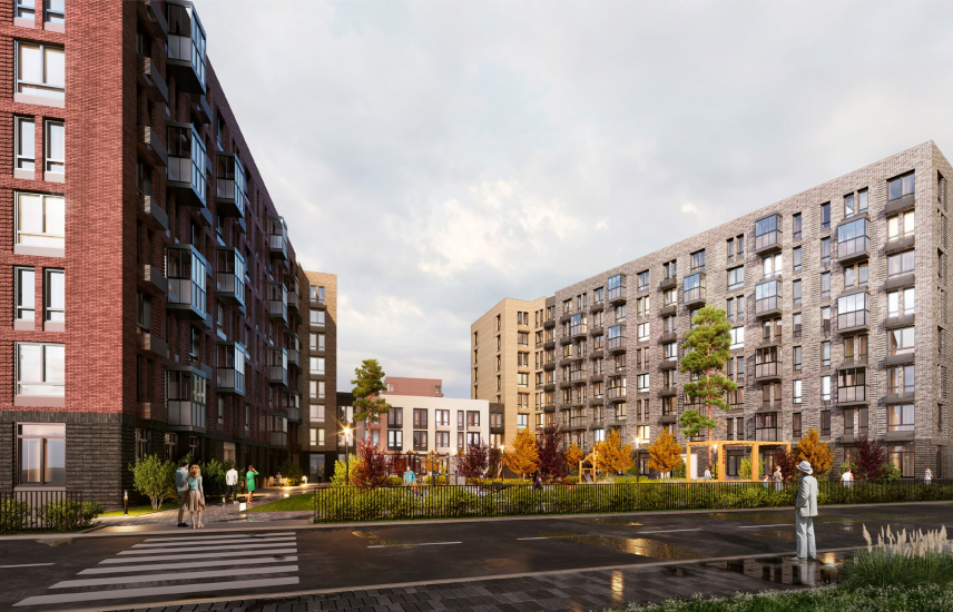
Sometimes, the accents had to be camouflaged, and sometimes they needed to be enhanced. For example, the facades that overlook quiet and peaceful yards, received enhanced plastique thanks to the increased number of balconies (relocating the pylons so as to diversify the window and balcony patterns was all that the architects could change at this stage. The first floors of the outer facades were united with decorative brickwork into a plinth to emphasize the main axes and functional zones: the locations of the retail, central square and boulevards.
According to Evgeny Zelenov, the main architect of the project, by changing the tone of decoration and the richness of architectural techniques, the architects wanted to form an intuitive navigation, leading people to the hallway entrances, indicating the positions of recreational areas, commercial areas, and so on.
Евгений Зеленов, главный архитектор проекта
Evgeny Zelenov, Chief Architect of the Project
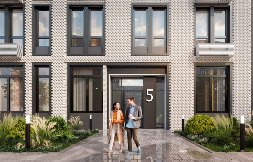
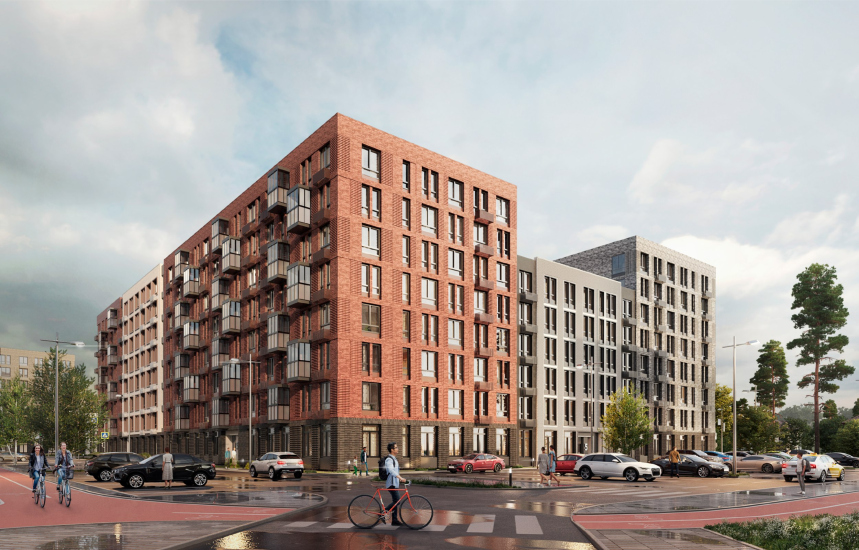
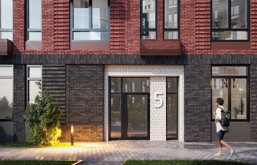
We emphasized the corners of our buildings with color or décor, accentuating the movement of a person toward the boulevard. In the same architectural way, we brought back the scale of the environment – by combining several floors and adding decor along the stylobate. We were not afraid of working with brick; we used a lot of techniques and types of masonry. At our entrances, for example, we use glazed bricks turned ninety degrees, and the central square is shaped by the light facades as a light – white – space that “collects” the entire neighborhood around it.
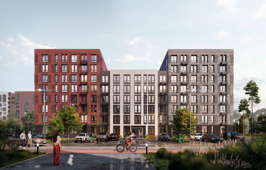
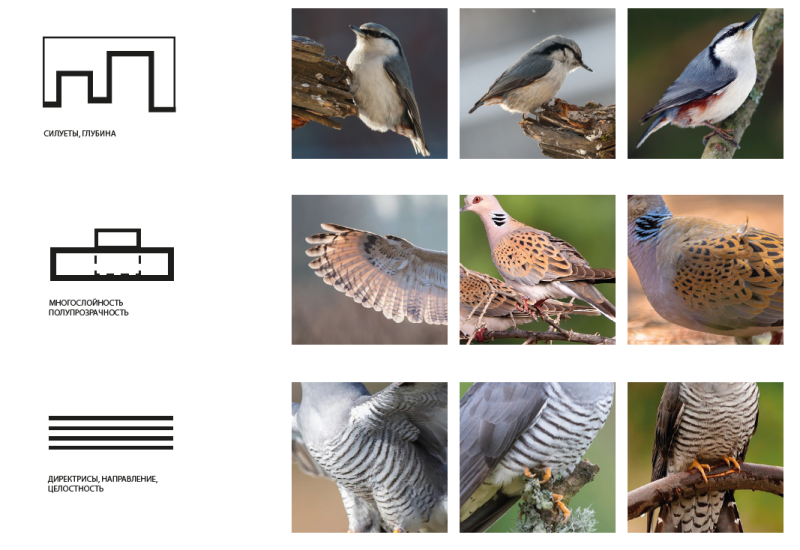
In the absence of any context, aside from the natural one, the architects built the design code on the basis of natural colors, inspired by the plumage of birds found in the Moscow region. This image generated a few basic techniques, which include a focus on pastel tones of the facade cladding, pronounced horizontal character in the facade fracturing, active use of color for articulating the plastique, and the abundance of decorative techniques when working with bricks.
The Main Material
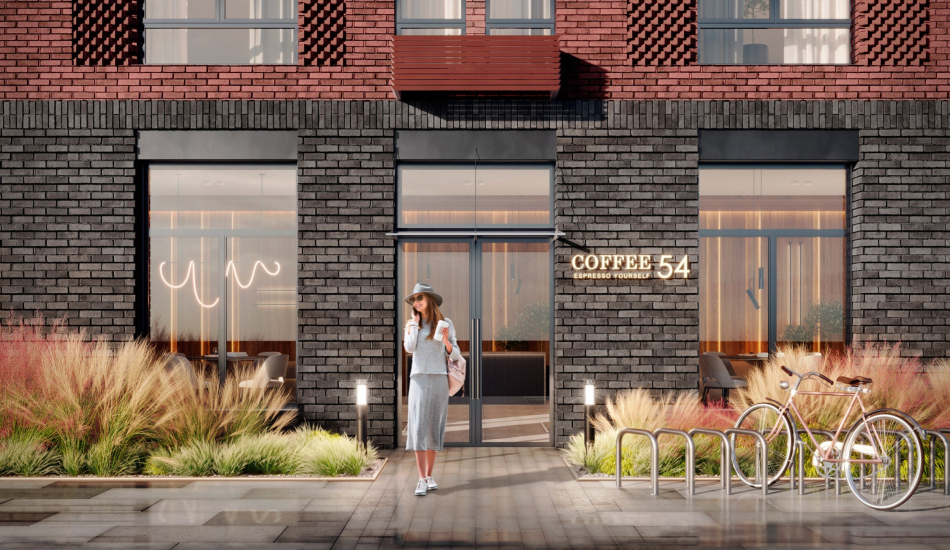
Why do architects love brick? First and foremost, for its vast decorative possibilities to take a project to a new level. Being constrained in the field of shaping, Genpro used all the possibilities of this alternative way for the sake of getting the desired level of architecture. Many shades, formats and types of brickwork are used here, as well as ornamental inserts, niches, changing patterns, in particular on the corner sections. For example, the authors actively use inserts with half-brick relief masonry, emphasizing the size of the windows, decorative chamfered belts with vertical masonry, gradient and shaped masonry.
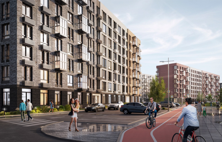
Due to the fact that some of the sections are rather lengthy, the architects had a task of fracturing the volumes by plastique means. To combat the monotony issue, the architects single out a few modular blocks of varying width with decorative patterns of their own. Such a block can, in particular, be solved by accentuating a group of windows or by using within a single facade block its own color palette.
Special attention was given to the bottom floors, situated on the level of “tactile” perception of architecture. In this instance, the role of plastique accents is played by the entrance groups themselves, designed as recessed balconies.
Together with the pairing of sections having different numbers of floors, as well as the compositional solutions of the buildings themselves, where turnaround sections are also present, the overall look of the neighborhood is quite picturesque and diverse. It “European” character is not only due to its mid-rise height, but also due to the abundance of fine details: the facade-decorating techniques are so numerous that this area is subliminally perceived as a group of custom-designed buildings, drawn up within a framework of some unified design code. Hence the impression that this architecture was “tailored to order”, and that it is different from its rank-and-file analogues.
Евгений Зеленов, главный архитектор проекта
Evgeny Zelenov, Chief Architect of the Project
This project is a story of how to make something interesting under very tough conditions. We managed to get a very high quality and elaborated facade drawing, which defined the image of the entire district. Our task was to create a quality environmental development in an international style, the kind of look you see on the outskirts of some European city.
I must say that working with decorative bricks is not very typical for comfort-class housing outside Moscow, but the approach was so convincing that the developer agreed to increase the budget for the facades, knowing that in the end it raises the class of the housing, which is something that we ultimately achieved.
I must say that working with decorative bricks is not very typical for comfort-class housing outside Moscow, but the approach was so convincing that the developer agreed to increase the budget for the facades, knowing that in the end it raises the class of the housing, which is something that we ultimately achieved.


