По-русски

The White Fitness Center

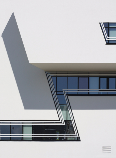
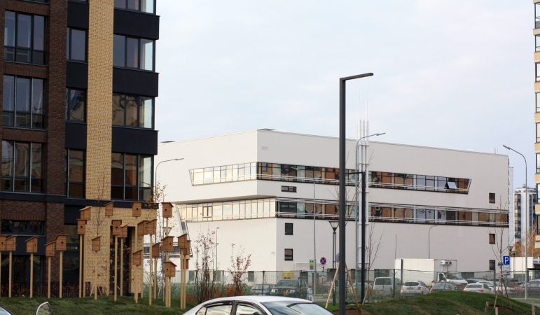
The white health and fitness center, designed by Futura Architects at the entrance to St. Petersburg’s New Piter residential complex, provides the developing area not only with functional but also with sculptural diversity, livening up the rows of the brick city blocks with the whiteness of its seamless facades, cantilevered structures, and dynamic inclined lines.

08 February 2023
Object
mainImg
This health and fitness center is part of the public “agenda” of New Piter, more of which we covered here. Futura Architects, we will remind you, designed several buildings for it: a residential building, a business center, and finally the health and fitness center.

New Piter is a large residential area located just outside St. Petersburg’s Ring Road (technically, outside of the city), not far away from Strelna. At the same time, this is a comparatively rare, by the standards of suburban St. Petersburg, example of an all-rounded approach to land development: the “lots” of the houses are introduced here concurrently to the infrastructure and various public projects. Approximately in the middle, the area is crossed by the pedestrian White Nights “park” boulevard; it runs between the school and kindergarten, and, like some kind of central string, it holds greenery, artificial hills, a stadium, and playgrounds strung upon it. The boulevard was also designed by Oleg Manov.

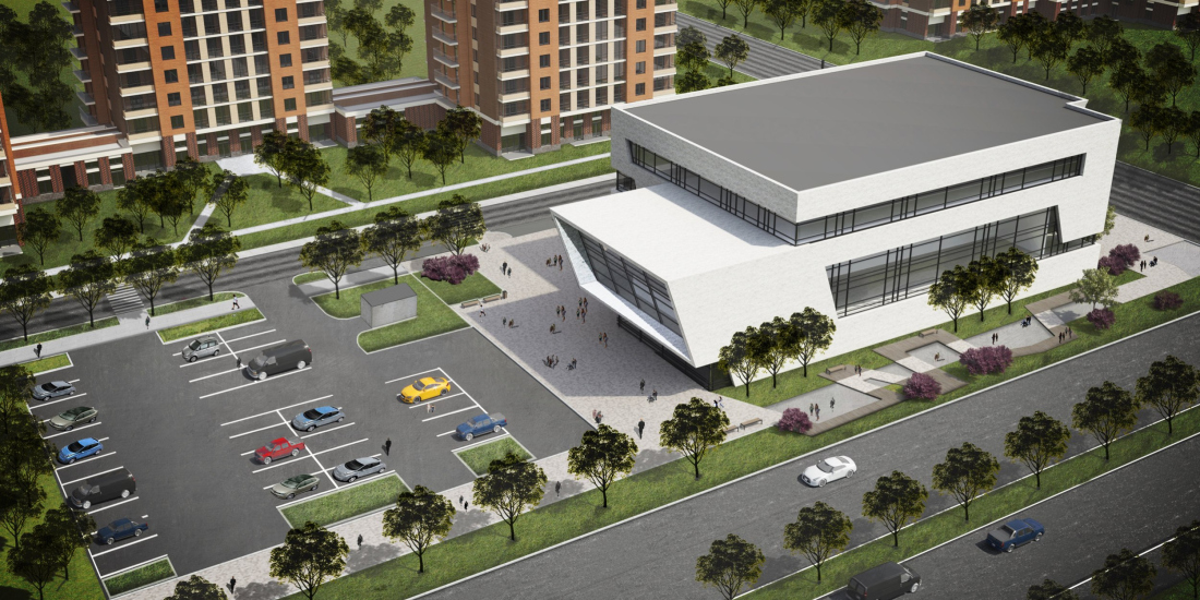
Larger public infrastructure projects have been moved closer to the Krasnoselskoe Highway: this ensures better transport accessibility, while the residential buildings stand rather far away from the highway (about 80 meters), and are protected from the noise, all the more so because the string of public and commercial buildings is separated from the residential blocks by yet another linear park: a wavy pedestrian trail that allows pedestrians to cruise around New Piter, bypassing the highway.

The health and fitness center in New Piter housing complex: location
Copyright: © FUTURA-ARCHITECTS


The fitness center received the key site at the crossing of Krasnoselskoe Highway and Nevskaya Street. This point can be considered to be the main driving/pedestrian entrance to the area.

New Piter has been in construction for a few years already, and the original concept underwent a few changes. Specifically, the standard projects were replaced by “lots”, whose image solution was proposed by different architectural companies, which is definitely a plus.

Other changes can be interpreted in the key of adapting to the ever-changing reality. Originally, it was planned that between the business center (situated on the northwest corner of the complex, at the driving entrance from the Ring Road) and the fitness center (situated two hundred meters south), there would be more vacant space. For this reason, Futura Architects designed them as an ensemble of two noticeable volumes marking the presence of the complex in the city and welcoming the cars coming from the Krasnoselskoe Highway – like a “gate” or a “facade” of the new part of the city. At the first stage of design, both volumes had brick facades – just like the rest of the complex – but they sported an integral energetic shape, literally “shooting” north in the direction of the Ring Road and the Gulf of Finland. An important part in the composition was played by the business center with a powerful sidewall chamfer and a 12-meter cantilever.

The business center in Novoselye, in the northwest corner of New Piter housing complex
Copyright: © FUTURA-ARCHITECTS


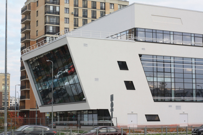
The health and fitness center, situated, as we remember, further south, before the crossing of the highway and Nevskaya Street, echoed the chamfer of the north cantilever and developed the related plastique of the large and dynamic form, but showed a slightly greater interest to diagonal and jagged lines.

The health and fitness center in New Piter housing complex
Copyright: © FUTURA-ARCHITECTS


Later on, it was decided to build two multilevel parking garages between the business center and the fitness center, and the town planning “rest” became blurred – but we must realize that the residents have to park their cars somewhere, so this decision is after all motivated. The “southward dash” also became a little less obvious: the parking garages were designed by a different company, and they are essentially static crystalline parallelepipeds, even though we must give them credit for their beautiful glitter.

The brick surface of the walls of the fitness center was also something that the architects had to sacrifice: the COVID pandemic got in the way, supply chains were disrupted, the budget was cut, and the walls became stucco. For economic reasons, the architects also sacrificed the deep jambs of the stained glass windows – they were partially replaced by thin metallic lamellae that trace the lines of the stained glass windows, the plastique is formed solely by cantilevers.

  • zooming
    The health and fitness center in New Piter housing complex
    Copyright: © FUTURA-ARCHITECTS
  • zooming
    The health and fitness center in New Piter housing complex
    Copyright: © FUTURA-ARCHITECTS


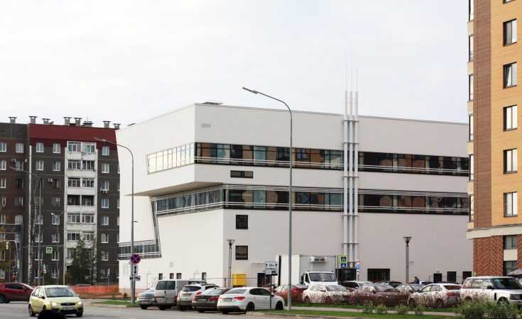
Nevertheless, after all the changes the building preserved the main thing about it, the purity of lines, and the whiteness of the facades made it even more noticeable, accentuating both the function and the town planning meaning of the sports complex against the background of the residential blocks. The bright pure color, the sloping lines, and the inclined lines and place do attract attention.

The health and fitness center in New Piter housing complex
Copyright: © FUTURA-ARCHITECTS


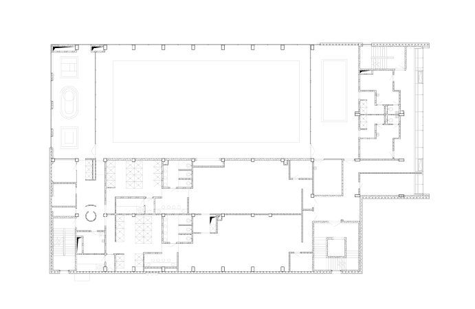
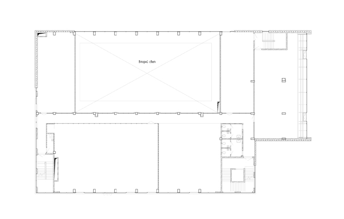
The volumes and contrastive glazing planes, which protrude from the building, mark the functional blocks. The central part of the building is occupied by the swimming pool, its grand-scale stained glass window turned in the direction of the Krasnoselskoe Highway. Closer to the end of the building, the stained glass window narrows down to a band, which makes a zigzag on the sidewall and ascends from the second floor to the third – to continue above the main entrance. This “band” marks the location of the spa zone and multifunctional gyms.

The health and fitness center in New Piter housing complex
Copyright: © FUTURA-ARCHITECTS


The inclined “monitor” of the cantilever turned in the direction of the gulf – as well as yet another smaller cantilever on the opposite side – both include training facilities and management offices. The entire fourth floor is occupied by gyms. This place also has an exit to the cantilever’s roof, where in good weather training sessions can be organized, or maybe just recreation: you cannot really see the Gulf of Finland from here but the roof does command sweeping views.

  • zooming
    1 / 3
    The health and fitness center in New Piter housing complex
    Copyright: © FUTURA-ARCHITECTS
  • zooming
    2 / 3
    The health and fitness center in New Piter housing complex
    Copyright: © FUTURA-ARCHITECTS
  • zooming
    3 / 3
    The health and fitness center in New Piter housing complex
    Copyright: © FUTURA-ARCHITECTS


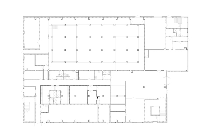
Since the building is not sunken in the ground, the basin, together with all the technical rooms and communications, occupies almost the entire ground floor.

It must be said that engineering communications always present a serious challenge for a building that aims at brilliant purity of dynamic forms. In this particular instance, the architects were able to hide as much of the ventilation system as possible on the roof, neatly arranging the “fifth facade”, keeping in mind that it would be visible from the higher floors of the buildings that surround the fitness center. Against this background, the cooling grids on white facades can be ignored – such inclusions are to be seen on many buildings, and our eyes are used to ignoring them. All the rest, even the pipes from the yard side, are agreed upon and inscribed into the general concept. As for the interiors, the utility lines remain literally exposed, or even exhibited, covered by glass and backlit.

The architects also provided on the facade a recession for the logo of the future operator – in the most noticeable point, from the side of the Krasnoselskoe Highway.

Thus, the health and fitness center, designed by Futura Architects, righteously occupies the key location at the entrance to this large residential complex at the outskirts of St. Petersburg. The building of the fitness center supports not just the multifunctional nature of the new area but also ensures architectural diversity. The brick city blocks, although not exactly “stylized”, bear a rather traditional look, just as the orthogonal plan. However, this light-colored and dynamic inclusion livens up the regular array of the houses with bold fresh spots. Not to mention the fact that the contrast of shape also emphasizes the difference of function, saving the building from “drowning” in the context of the new housing complex. In this sense, the plaster surface of the walls, a measure that initially appeared out of necessity, turned out to be the best solution – the plaster made it possible to make the facades seamless, and the color bright white.

One more thing: the building of the center also responds to a concrete object in the north part of the White Nights Boulevard – a sculptural bench, or, rather, a sign that the same architect, Oleg Manov, designed five or more years ago for this complex. Mind, you cannot see one object standing next to the other – they are about half a kilometer apart – but, come to think of it, both objects, big and small, charge the whole territory with some neo-modernist cheerfulness. And they also reveal the trademark style of Futura Architects just as vividly.

  • zooming
    1 / 5
    The health and fitness center in New Piter housing complex. Plan of the 1 floor
    Copyright: © FUTURA-ARCHITECTS
  • zooming
    2 / 5
    The health and fitness center in New Piter housing complex. Plan of the 2 floor
    Copyright: © FUTURA-ARCHITECTS
  • zooming
    3 / 5
    The health and fitness center in New Piter housing complex. Plam of the 3 floor
    Copyright: © FUTURA-ARCHITECTS
  • zooming
    4 / 5
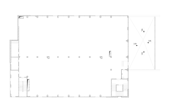
    The health and fitness center in New Piter housing complex. Plan of the 4 floor
    Copyright: © FUTURA-ARCHITECTS
  • zooming
    5 / 5
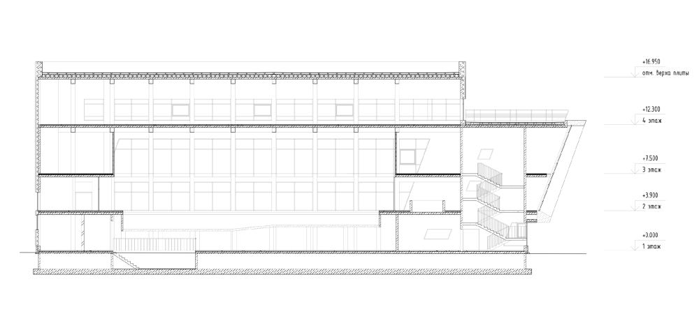
    The health and fitness center in New Piter housing complex. Cross section view 1-1
    Copyright: © FUTURA-ARCHITECTS


08 February 2023

Headlines now
The Golden Crown
The concept for a dental clinic in Yekaterinburg, developed by CNTR Studio, revolves around the idea of a “mouth full of gold”: pristine white porcelain stoneware walls are complemented by matte brass details. To avoid an overly literal interpretation, the architects focused on the building’s proportions, skillfully navigating between sunlight requirements and fire safety regulations.
Flexibility and Integration
Not long ago, we covered the project for the fourth phase of the ÁLIA residential complex, designed by APEX. Now, we’ve been shown different fence concepts they developed to enclose the complex’s private courtyards, incorporating a variety of public functions. We believe that the sheer fact that the complex’s architects were involved in such a detail as fencing speaks volumes.
A Step Forward
The HIDE residential complex represents a major milestone for ADM architects and their leaders Andrey Romanov and Ekaterina Kuznetsova in their quest for a fresh high-rise aesthetic – one that is flexible and layered, capable of bringing vibrancy to mass and silhouette while shaping form. Over recent years, this approach has become ADM’s “signature style”, with the golden HIDE tower playing a pivotal role in its evolution. Here, we delve into the project’s story, explore the details of the complex’s design, and uncover its core essence.
Gold in the Sands
A new office for a transcontinental company specializing in resource extraction and processing has opened in Dubai. Designed by T+T Architects, masters of creating spaces that are contemporary, diverse, flexible, and original, this project exemplifies their expertise. On the executive floor, a massive brass-clad partition dominates, while layered textures of compressed earth create a contextually resonant backdrop.
Layers and Levels of Flight
This project goes way back – Reserve Union won this architectural competition at the end of 2011, and the building was completed in 2018, so it’s practically “archival”. However, despite being relatively unknown, the building can hardly be considered “dated” and remains a prime example of architectural expression, particularly in the headquarters genre. And it’s especially fitting for an aviation company office. In some ways, it resembles the Aeroflot headquarters at Sheremetyevo but with its own unique identity, following the signature style of Vladimir Plotkin. In this article, we take an in-depth look at the United Aircraft Corporation (UAC) headquarters in the Moscow agglomeration town of Zhukovsky, supplemented by recent photographs from Alexey Naroditsky – a shoot that became only recently possible due to the fact that improvements were finally made in the surrounding area.
Light and Shadow
In this article, we delve into the architectural design of the “Chaika” house by DNK ag architects, which was recently completed in 2023 as part of the collection of signature designs at ZILArt. As is well-known, all the buildings in this complex follow a design code, yet each one is distinct. This particular building stands out not only for its whiteness and minimalism but also for the refined use of a limited number of techniques that, together, create what can confidently be called synergy.
Casus Novae
A master plan was developed for a large residential area with a name of “DNS City”, but now that its implementation began, the plan has been arbitrarily reformatted and replaced with something that, while similar on the surface, is actually quite different. This is not the first time such a thing happens, but it’s always frustrating. With permission from the author, we are sharing Maria Elkina’s post.
Treasure Hunting
The GAFA bureau, in collaboration with Tegola and Arkhitail, organized an expedition to the island of Kilpola in Karelia as part of Moskomarkhitektura’s “Open City” festival. There, amidst moss and rocks, the students sought answers to questions like: what is the sacred, where does it dwell, and what sustains it? Assisting the participants in this quest were landscape engineer Evgeny Levin, artist Nicholas Roerich, a moose, and the lack of cellular connection. Here’s how the story unfolded.
Depths of the Earth, Streams of Water
In the Malaya Okhta district, the Akzent building, designed by Stepan Liphart, was constructed. It follows a classic tripartite structure, yet it’s what you might call “hand-drawn”: each façade is unique in its form and details, some of which aren’t immediately noticeable. In this article, we explore the context and, together with the architect, delve into how the form was developed.
Fir Tree Dynamics
The “Airports of Region” holding is planning to build an airport in Karachay-Cherkessia, aiming to make the Arkhyz and Dombay resorts more accessible to travelers. The project that won in an invitation-only competition, submitted by Sergey Nikeshkin’s KPLN, blends natural imagery inspired by the shape of a conifer seed, open-air waiting spaces, majestic large trees, and a green roof elevated on needle-like columns. The result is both nature-inspired and WOW.
​A Brick Shell
In the process of designing a clubhouse situated among pine trees in a prestigious suburban area near Moscow, the architectural firm “A.Len” did the façade design part. The combination of different types of brick and masonry correlates with the volumetric and plastique solutions, further enhanced by the inclusion of wood-painted fragments and metal “glazing”.
Word Forms
ATRIUM architects love ambitious challenges, and for the firm’s thirtieth anniversary, they boldly play a game of words with an exhibition that dives deep into a self-created vocabulary. They immerse their projects – especially art installations – into this glossary, as if plunging into a current of their own. You feel as if you’re flowing through the veins of pure art, immersed in a universe of vertical cities, educational spaces – of which the architects are true masters – and the cultural codes of various locations. But what truly captivates is the bold statement that Vera Butko and Anton Nadtochy make, both through their work and this exhibition: architecture, above all, is art – the art of working with form and space.
Flexibility and Acuteness of Modernity
Luxurious, fluid, large “kokoshniks” and spiral barrel columns, as if made from colorful chewing gum: there seem to be no other mansion like this in Moscow, designed in the “Neo-Russian-Modern” style. And the “Teremok” on Malaya Kaluzhskaya, previously somewhat obscure, has “come alive with new colors” and gained visibility after its restoration for the office of the “architectural ecosystem” as the architects love to call themselves. It’s evident that Julius Borisov and the architects at UNK put their hearts into finding this new office and bringing it up to date. Let’s delve into the paradoxes of this mansion’s history and its plasticity. Spoiler: two versions of modernity meet here, both balancing on the razor’s edge of “what’s current”.
Yuri Vissarionov: “A modular house does not belong to the land”
It belongs to space, or to the air... It turns out that 3D printing is more effective when combined with a modular approach: the house is built in a workshop and then adapted to the site, including on uneven terrain. Yuri Vissarionov shares his latest experience in designing tourist complexes, both in central Russia and in the south. These include houseboats, homes printed from lightweight concrete using a 3D printer, and, of course, frame houses.
​Moscow’s First
“The quality of education largely depends on the quality of the educational environment”. This principle of the last decade has been realized by Sergey Skuratov in the project for the First Moscow Gymnasium on Rostovskaya Embankment in the Khamovniki district. The building seamlessly integrates into the complex urban landscape, responding both to the pedestrian flow of the city and the quiet alleyways. It skillfully takes advantage of the height differences and aligns with modern trends in educational space design. Let’s take a closer look.
Looking at the Water
The site of Villa Sonata stretches from the road to the water’s edge, offering its own shoreline, pier, and a picturesque river panorama. To reveal these sweeping views, Roman Leonidov “cut” the façade diagonally parallel to the river, thus getting two main axes for the house and, consequently, “two heads”. The internal core – two double-height spaces, a living room and a conservatory, with a “bridge” above them – makes the house both “transparent” and filled with light.
The White Wing
Well, it’s not exactly white. It’s more of a beige, white-stone structure that plays with the color of limestone – smoother surfaces are lighter, while rougher ones are darker. This wing unites various elements: it absorbs and interprets the surrounding themes. It responds to everything, yet maintains a cohesive expression – a challenging task! – while also incorporating recognizable features of its own, such as the dynamic cuts at the bottom, top, and middle.
Urban Dunes
The XSA Ramps team designed and built a three-part sports hub for a park in Rostov-on-Don, welcoming people of all ages and fitness levels. The skate plaza, pump track, and playground are all meticulously crafted with details that attract a diverse range of visitors. The technical execution of the shapes and slopes transforms this space into a kind of sculptural composition.
Proportional Growth
The project for the fourth phase of the ÁLIA residential area has been announced. The buildings are situated on an elongated plot – almost a “ray” that shoots out from the center of the area towards the river. Their layout reflects both a response to Moscow’s architectural preferences over the past 15 years, shifting “from blocks to towers”, and an interpretation of the neighboring business park designed by SOM. Additionally, the best apartments here are not located at the very top but closer to the middle, forming a glowing “waistline”.
The “Staircase” Building
In designing the “Details” residential complex in New Moscow, Rais Baishev spiced up the now-popular Moscow theme of a “courtyard” building with an idea drawn from the surrealist drawings by Maurits Escher. He envisioned the stepped silhouettes and descending slopes as a metaphysical mega-staircase, creating a key void within the courtyard that gave the project an internal “spine”. This concept is felt both in the building’s silhouette and on its façades.
Projection of the Quarter
No one doubted that the building that Vladimir Plotkin designed as part of the “Garden Quarters” would be the most modernist of all. And it turned out just that way: while adhering to the common design code, the building successfully combines brick and white stone, rhythmically responding to the neighboring building designed by Ostozhenka, yet tactfully and persistently making a few statements of its own. This includes the projection of the ideal urban development composition “14–9–6”, which can be found right next door, mathematical calculations, including those for various types of terraces (and perhaps the only reminder of the Soviet past of the Kauchuk rubber factory!), and the white “cross-stitch” pattern of the façade grid.
Domus Aurea
In this issue, we examine the “Tessinsky-1” house, designed by Sergey Skuratov and completed in 2023. Located in the middle of the Serebryanicheskaya Embankment district, at the intersection of its main streets, this house assumes a sort of “nodal” role: it not only responds to everything around it and preserves many memories of the former EMA factory within itself, but it weaves all this into a newly directed pattern, reconciling bright “gold” and dark-colored brick, largely with the help of the new, modern-yet-archaic Columba brick, which, come to think about it, is the most precious element here.
The Chimney of Nikola-Lenivets
In this issue, we are examining the “Obelisk House” designed by KATARSIS and built for the Arkhstoyanie 2023 festival. However, it was only finished later on, and this is why we are examining it now. It seems to us that after the “Obelisk House” appeared in Nikola-Lenivets, a dialogue and a few inner connections appeared between the temporary structures built here. These houses no longer look like “accidental neighbors”, more of which below.
​Periscope by the Bay
The jury awarded the second place in the competition for a public and cultural center in Petropavlovsk-Kamchatsky to the companies GORA (“Mountain”) and M4. In the consortium’s proposal, the building resembles a sperm whale with a calf swimming next to it or a periscope, whose lenses capture the most spectacular views from the surrounding landscape.
From Arcs to Dolmens
While working on the competition project for Petropavlovsk-Kamchatsky, ASADOV Architects prioritized the value of the natural and urban environment, aiming to preserve the balance of the location while minimizing the resemblance of the volume that they designed to a “traditional building”. The task was challenging, and the architects created three versions, one of which having been developed after the competition, where their main proposal took third place. However, the point of interest here is not the competition result but the continuity of creative thinking.
Hide and Seek
The ID Moskovskiy house, designed by Stepan Liphart in St. Petersburg, in the courtyards near Moskovskiy Avenue beyond the Obvodny Canal and recently completed, is notable for several reasons. Firstly, it has been realized with considerable accuracy, which is particularly significant as this is the first building where the architect was responsible not only for the facades but also for the layouts, allowing for better integration between the two. On the other hand, this building is interesting as an example of the “germination” of new architecture in the city: it draws on the best examples from the neighborhood and becomes an improved and developed sum of ideas found by the architect in the surrounding context.
The Big Twelve
Yesterday, the winners of the Moscow Mayor’s Architecture Award were announced and honored. Let’s take a look at what was awarded and, in some cases, even critique this esteemed award. After all, there is always room for improvement, right?
Above the Golden Horn
The residential complex “Philosophy” designed by T+T architects in Vladivostok, is one of the new projects in the “Golubinaya Pad” area, changing its development philosophy (pun intended) from single houses to a comprehensive approach. The buildings are organized along public streets, varying in height and format, with one house even executed in gallery typology, featuring a cantilever leaning on an art object.
Nuanced Alternative
How can you rhyme a square and space? Easily! But to do so, you need to rhyme everything you can possibly think of: weave everything together, like in a tensegrity structure, and find your own optics too. The new exhibition at GES-2 does just that, offering its visitor a new perspective on the history of art spanning 150 years, infused with the hope for endless multiplicity of worlds and art histories. Read on to see how this is achieved and how the exhibition design by Evgeny Ace contributes to it.
Blinds for Ice
An ice arena has been constructed in Domodedovo based on a project by Yuri Vissarionov Architects. To prevent the long façade, a technical requirement for winter sports facilities, from appearing monotonous, the architects proposed the use of suspended structures with multidirectional slats. This design protects the ice from direct sunlight while giving the wall texture and detail.