По-русски

The Crystal of the City Block

The typology and plastique of large housing complexes move with the times, and you can sometimes find new subtleties in the scope of seemingly familiar solutions. The Sky Garden complex combines two well-known themes, forming a giant residential area consisting of tall slender towers, placed at the perimeter of a large yard, in which a crossroads of two pedestrian promenades is “dissolved”.

27 January 2023
Object
mainImg
The Sky Garden housing complex, which is being built by FSK in Moscow’s Tushino, is one of the grand-scale projects, characteristic for today’s Moscow, where numerous industrial parks give way to modern housing complexes. This circumstance turns the search for the right format of a high-density housing complex into a relevant task. The list of popular solutions includes towers, from three to five, standing on a common podium; yet another option is large-scale city blocks with private yards and “dominant” buildings at the corners.
 
The solution, proposed by Aleksey Ginzburg Architects, is essentially a hybrid of the two.
 
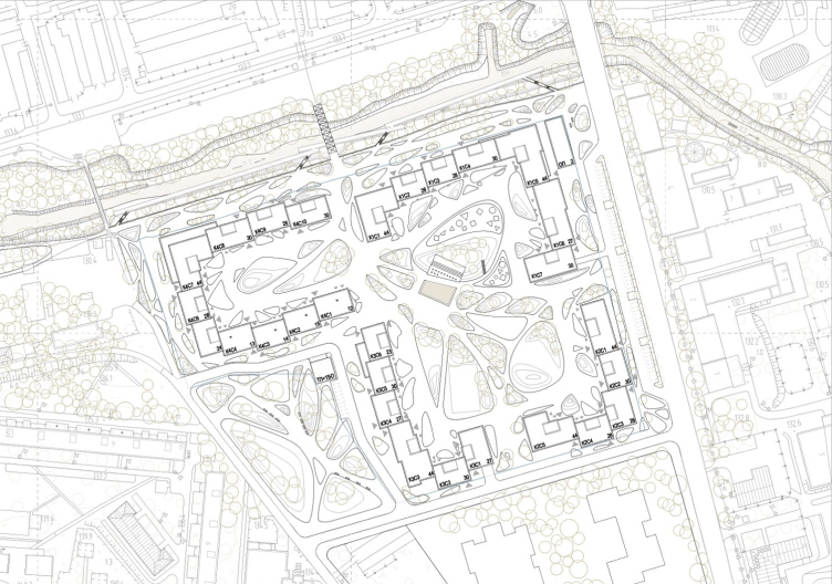
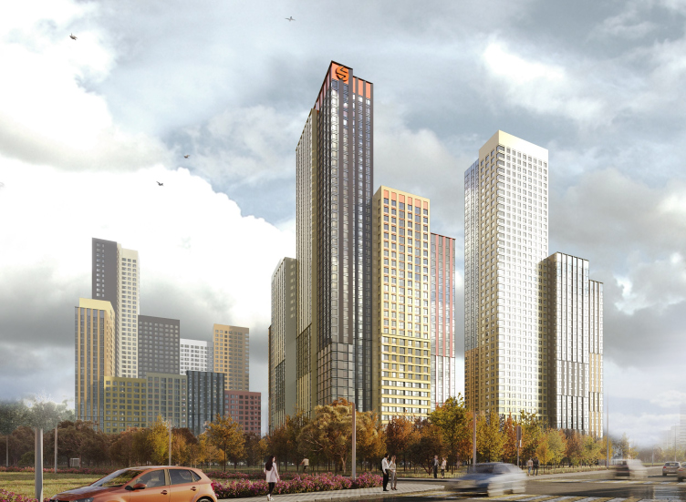
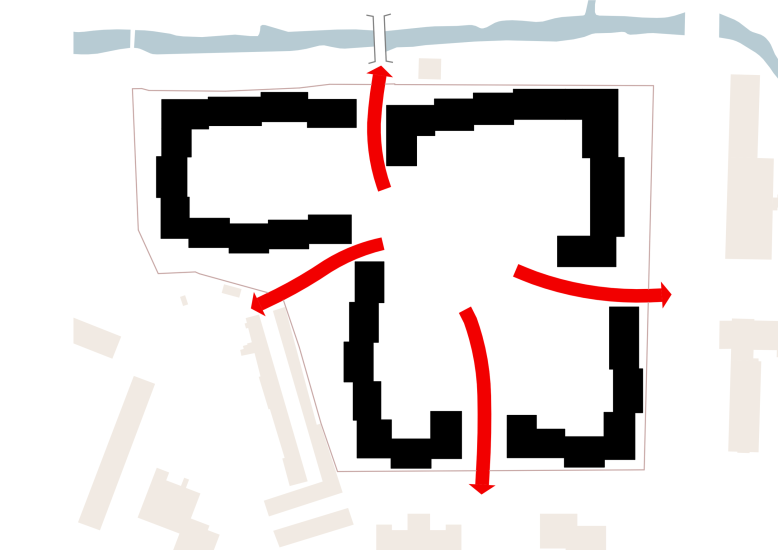
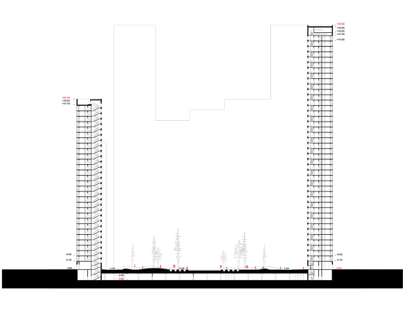
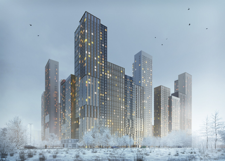
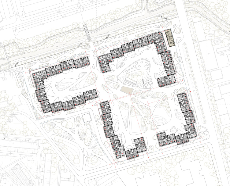
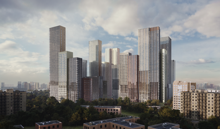
The first feature that sets it apart is that the volumes are not governed by a rigid orthogonal grid. The sections form long “daisy chains” running along the perimeter of the territory, yet all the volumes are slightly shifted in respect to their neighbors. The contour is lively and free, and the self-contained character of each of the towers – from 40 to 150 meters high – is deliberately emphasized. This is not so much a “front wall” of the city block, as a group of towers, standing in a row.

Sky Garden housing complex. The master plan
Copyright: Ginzburg Architects


Sky Garden housing complex
Copyright: Ginzburg Architects

 
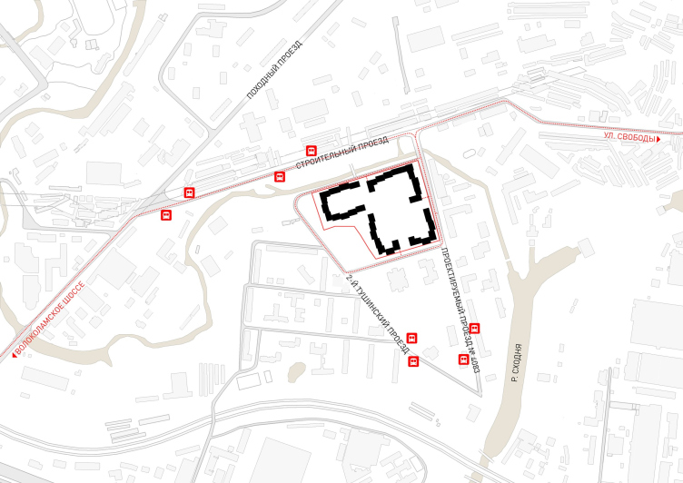
The architects say that their solution is context-based. The land site is an irregular L, but it is spacious. It is a former industrial park, the territory of the former Tushino Reinforced Concrete Plant. Next to it, further north, there are many other industrial parks, but southeast of it, two large companies are already developing the territory of the former Tushino airfield. 
 
The immediate surroundings, however, consist of residential houses, both of the low-rise postwar kind and prefabricated nine-story ones, as well as two schools and a clinic. South of the area, there are a few bus stops. The entire complex is surrounded by the semicircle of the Skhodnya River, which in the northern part comes really close to the complex boundary: there are two pedestrian and one automotive bridges thrown across the river.

Sky Garden housing complex
Copyright: Ginzburg Architects

 
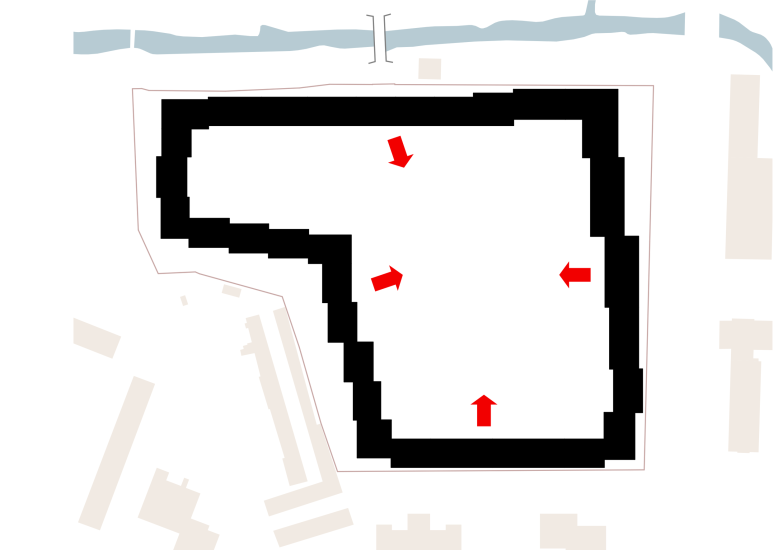
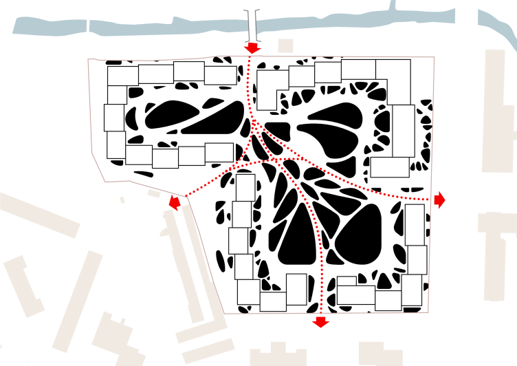
Thus, the architects “tear” the contour of the building in four directions: to the river and the pedestrian bridge, to nine-story buildings and schools, to the postwar houses, and to the bus stops. Pedestrian flows are distributed – approximately – by the cardinal points and intersect in the spacious courtyard.

  • zooming
    Sky Garden housing complex
    Copyright: Ginzburg Architects
  • zooming
    Sky Garden housing complex
    Copyright: Ginzburg Architects

 
One should think that if the architects had followed the “classical” quarterly layout, they would have placed here at least four closed circuits with private yards and a cross of public boulevards between them. But in this case, the density of the construction and the height is such that a freer composition turned out to be a better choice – the authors immersed the boulevards into the courtyard space, although they did not completely dissolved them in it, but rather embedded in an asymmetric parametric grid. When viewed from above, the “fifth facade” will look like a bionic network: either streaks on a leaf, or a maybe a mycelium.

Sky Garden housing complex
Copyright: Ginzburg Architects

 
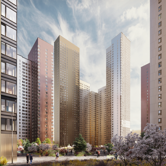
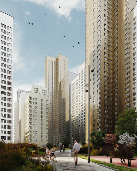
The four yards came together to form a space that is half private and half public – a park that relates to all the buildings of the housing complex. Of course, in the eyes of a “spoiled” Muscovite, a “park” is something that’s really big, like Losinka or Sokolniki, but here it does feel like a “park”. The yard righteously echoes the river banks.
 
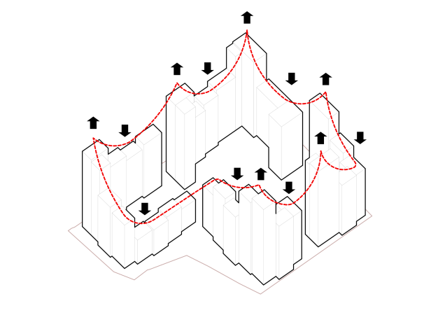
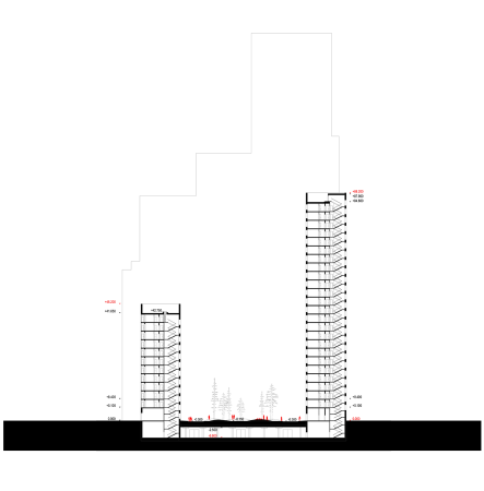
We will remind you that the “glued” towers vary in their height – this allows you to avoid the monotonous effect of a “Great Wall of China”, and it also allows to implement the principle of recognizable blocks of flats.
 
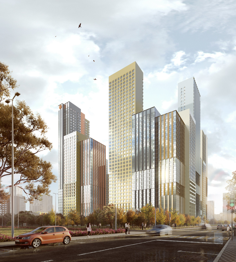
Meanwhile, the height does not change arbitrarily, but depends on the location of the tower: the buildings grow lower closer to the gaps, and they grow higher closer to the corners – not symmetrically, but according to a pattern that takes into account a number of factors. For example, the highest buildings are situated at the corner near the automobile bridge, at the city highway. This is one of the “facades” of the complex.

  • zooming
    1 / 3
    Sky Garden housing complex
    Copyright: Ginzburg Architects
  • zooming
    2 / 3
    Sky Garden housing complex
    Copyright: Ginzburg Architects
  • zooming
    3 / 3
    Sky Garden housing complex
    Copyright: Ginzburg Architects

 
The facades combine vertical lines and squares, while the materials vary from white and dark-gray to metal or natural tones – gold, silver and copper. However, you will not see terracotta or stone here – the image is eventually “metallic” and glittering.

  • zooming
    Sky Garden housing complex. The yard and the yard facade
    Copyright: Ginzburg Architects
  • zooming
    Sky Garden housing complex. The yard and the yard facade
    Copyright: Ginzburg Architects

 
In many cases, vertical volumes are intersected by wide horizontal belts of the same shade, but with a different pattern: somewhere there is one insert, somewhere there are two, somewhere there are none at all (in the courtyards there are none at all), and they are located at different heights, which knocks down the scale and enlivens the composition at a level slightly higher than the human line of vision.

Sky Garden housing complex
Copyright: Ginzburg Architects


Sky Garden housing complex
Copyright: Ginzburg Architects

 
There are 19 types of apartments in the complex, ranging from 24 to 120 square meters. The peculiarity is that each apartment has a recessed balcony with a place for the air conditioning unit, and, in addition, all the apartments with an area of more than 54 square meters, that is, having two or more rooms, have a two-way orientation for through ventilation and various lighting during the day. The decision is modernist and humane; it is now accepted to refute the need for through ventilation and the value of enhanced insolation for hygiene; which may be true. However, it is difficult to deny that both are pleasant for life. In addition, the two-sided orientation and moderate, not very deep proportions of the rooms made the proportions of the towers slender and elegant. There are no stair and elevator cores in the center of the volume: they are all adjacent to the courtyard facades, so, again, the buildings remain slender.

Sky Garden housing complex. The plan
Copyright: Ginzburg Architects

 
The architectural solution of a residential complex of such high density and scale is always quite a difficult task. You need to fit in everything you need and overcome the pressure of scale, as well as the two main temptations of monotony and diversity. But the hybrid typology – a form “on the verge” of two well–known approaches – allowed the architects to find a reasonable balance between pragmatics and recognizability of the architectural solution. 
 
Currently, the construction of the first stage and the design of the second is underway.
Sky Garden housing complex
Copyright: Ginzburg Architects


27 January 2023

Headlines now
The Golden Crown
The concept for a dental clinic in Yekaterinburg, developed by CNTR Studio, revolves around the idea of a “mouth full of gold”: pristine white porcelain stoneware walls are complemented by matte brass details. To avoid an overly literal interpretation, the architects focused on the building’s proportions, skillfully navigating between sunlight requirements and fire safety regulations.
Flexibility and Integration
Not long ago, we covered the project for the fourth phase of the ÁLIA residential complex, designed by APEX. Now, we’ve been shown different fence concepts they developed to enclose the complex’s private courtyards, incorporating a variety of public functions. We believe that the sheer fact that the complex’s architects were involved in such a detail as fencing speaks volumes.
A Step Forward
The HIDE residential complex represents a major milestone for ADM architects and their leaders Andrey Romanov and Ekaterina Kuznetsova in their quest for a fresh high-rise aesthetic – one that is flexible and layered, capable of bringing vibrancy to mass and silhouette while shaping form. Over recent years, this approach has become ADM’s “signature style”, with the golden HIDE tower playing a pivotal role in its evolution. Here, we delve into the project’s story, explore the details of the complex’s design, and uncover its core essence.
Gold in the Sands
A new office for a transcontinental company specializing in resource extraction and processing has opened in Dubai. Designed by T+T Architects, masters of creating spaces that are contemporary, diverse, flexible, and original, this project exemplifies their expertise. On the executive floor, a massive brass-clad partition dominates, while layered textures of compressed earth create a contextually resonant backdrop.
Layers and Levels of Flight
This project goes way back – Reserve Union won this architectural competition at the end of 2011, and the building was completed in 2018, so it’s practically “archival”. However, despite being relatively unknown, the building can hardly be considered “dated” and remains a prime example of architectural expression, particularly in the headquarters genre. And it’s especially fitting for an aviation company office. In some ways, it resembles the Aeroflot headquarters at Sheremetyevo but with its own unique identity, following the signature style of Vladimir Plotkin. In this article, we take an in-depth look at the United Aircraft Corporation (UAC) headquarters in the Moscow agglomeration town of Zhukovsky, supplemented by recent photographs from Alexey Naroditsky – a shoot that became only recently possible due to the fact that improvements were finally made in the surrounding area.
Light and Shadow
In this article, we delve into the architectural design of the “Chaika” house by DNK ag architects, which was recently completed in 2023 as part of the collection of signature designs at ZILArt. As is well-known, all the buildings in this complex follow a design code, yet each one is distinct. This particular building stands out not only for its whiteness and minimalism but also for the refined use of a limited number of techniques that, together, create what can confidently be called synergy.
Casus Novae
A master plan was developed for a large residential area with a name of “DNS City”, but now that its implementation began, the plan has been arbitrarily reformatted and replaced with something that, while similar on the surface, is actually quite different. This is not the first time such a thing happens, but it’s always frustrating. With permission from the author, we are sharing Maria Elkina’s post.
Treasure Hunting
The GAFA bureau, in collaboration with Tegola and Arkhitail, organized an expedition to the island of Kilpola in Karelia as part of Moskomarkhitektura’s “Open City” festival. There, amidst moss and rocks, the students sought answers to questions like: what is the sacred, where does it dwell, and what sustains it? Assisting the participants in this quest were landscape engineer Evgeny Levin, artist Nicholas Roerich, a moose, and the lack of cellular connection. Here’s how the story unfolded.
Depths of the Earth, Streams of Water
In the Malaya Okhta district, the Akzent building, designed by Stepan Liphart, was constructed. It follows a classic tripartite structure, yet it’s what you might call “hand-drawn”: each façade is unique in its form and details, some of which aren’t immediately noticeable. In this article, we explore the context and, together with the architect, delve into how the form was developed.
Fir Tree Dynamics
The “Airports of Region” holding is planning to build an airport in Karachay-Cherkessia, aiming to make the Arkhyz and Dombay resorts more accessible to travelers. The project that won in an invitation-only competition, submitted by Sergey Nikeshkin’s KPLN, blends natural imagery inspired by the shape of a conifer seed, open-air waiting spaces, majestic large trees, and a green roof elevated on needle-like columns. The result is both nature-inspired and WOW.
​A Brick Shell
In the process of designing a clubhouse situated among pine trees in a prestigious suburban area near Moscow, the architectural firm “A.Len” did the façade design part. The combination of different types of brick and masonry correlates with the volumetric and plastique solutions, further enhanced by the inclusion of wood-painted fragments and metal “glazing”.
Word Forms
ATRIUM architects love ambitious challenges, and for the firm’s thirtieth anniversary, they boldly play a game of words with an exhibition that dives deep into a self-created vocabulary. They immerse their projects – especially art installations – into this glossary, as if plunging into a current of their own. You feel as if you’re flowing through the veins of pure art, immersed in a universe of vertical cities, educational spaces – of which the architects are true masters – and the cultural codes of various locations. But what truly captivates is the bold statement that Vera Butko and Anton Nadtochy make, both through their work and this exhibition: architecture, above all, is art – the art of working with form and space.
Flexibility and Acuteness of Modernity
Luxurious, fluid, large “kokoshniks” and spiral barrel columns, as if made from colorful chewing gum: there seem to be no other mansion like this in Moscow, designed in the “Neo-Russian-Modern” style. And the “Teremok” on Malaya Kaluzhskaya, previously somewhat obscure, has “come alive with new colors” and gained visibility after its restoration for the office of the “architectural ecosystem” as the architects love to call themselves. It’s evident that Julius Borisov and the architects at UNK put their hearts into finding this new office and bringing it up to date. Let’s delve into the paradoxes of this mansion’s history and its plasticity. Spoiler: two versions of modernity meet here, both balancing on the razor’s edge of “what’s current”.
Yuri Vissarionov: “A modular house does not belong to the land”
It belongs to space, or to the air... It turns out that 3D printing is more effective when combined with a modular approach: the house is built in a workshop and then adapted to the site, including on uneven terrain. Yuri Vissarionov shares his latest experience in designing tourist complexes, both in central Russia and in the south. These include houseboats, homes printed from lightweight concrete using a 3D printer, and, of course, frame houses.
​Moscow’s First
“The quality of education largely depends on the quality of the educational environment”. This principle of the last decade has been realized by Sergey Skuratov in the project for the First Moscow Gymnasium on Rostovskaya Embankment in the Khamovniki district. The building seamlessly integrates into the complex urban landscape, responding both to the pedestrian flow of the city and the quiet alleyways. It skillfully takes advantage of the height differences and aligns with modern trends in educational space design. Let’s take a closer look.
Looking at the Water
The site of Villa Sonata stretches from the road to the water’s edge, offering its own shoreline, pier, and a picturesque river panorama. To reveal these sweeping views, Roman Leonidov “cut” the façade diagonally parallel to the river, thus getting two main axes for the house and, consequently, “two heads”. The internal core – two double-height spaces, a living room and a conservatory, with a “bridge” above them – makes the house both “transparent” and filled with light.
The White Wing
Well, it’s not exactly white. It’s more of a beige, white-stone structure that plays with the color of limestone – smoother surfaces are lighter, while rougher ones are darker. This wing unites various elements: it absorbs and interprets the surrounding themes. It responds to everything, yet maintains a cohesive expression – a challenging task! – while also incorporating recognizable features of its own, such as the dynamic cuts at the bottom, top, and middle.
Urban Dunes
The XSA Ramps team designed and built a three-part sports hub for a park in Rostov-on-Don, welcoming people of all ages and fitness levels. The skate plaza, pump track, and playground are all meticulously crafted with details that attract a diverse range of visitors. The technical execution of the shapes and slopes transforms this space into a kind of sculptural composition.
Proportional Growth
The project for the fourth phase of the ÁLIA residential area has been announced. The buildings are situated on an elongated plot – almost a “ray” that shoots out from the center of the area towards the river. Their layout reflects both a response to Moscow’s architectural preferences over the past 15 years, shifting “from blocks to towers”, and an interpretation of the neighboring business park designed by SOM. Additionally, the best apartments here are not located at the very top but closer to the middle, forming a glowing “waistline”.
The “Staircase” Building
In designing the “Details” residential complex in New Moscow, Rais Baishev spiced up the now-popular Moscow theme of a “courtyard” building with an idea drawn from the surrealist drawings by Maurits Escher. He envisioned the stepped silhouettes and descending slopes as a metaphysical mega-staircase, creating a key void within the courtyard that gave the project an internal “spine”. This concept is felt both in the building’s silhouette and on its façades.
Projection of the Quarter
No one doubted that the building that Vladimir Plotkin designed as part of the “Garden Quarters” would be the most modernist of all. And it turned out just that way: while adhering to the common design code, the building successfully combines brick and white stone, rhythmically responding to the neighboring building designed by Ostozhenka, yet tactfully and persistently making a few statements of its own. This includes the projection of the ideal urban development composition “14–9–6”, which can be found right next door, mathematical calculations, including those for various types of terraces (and perhaps the only reminder of the Soviet past of the Kauchuk rubber factory!), and the white “cross-stitch” pattern of the façade grid.
Domus Aurea
In this issue, we examine the “Tessinsky-1” house, designed by Sergey Skuratov and completed in 2023. Located in the middle of the Serebryanicheskaya Embankment district, at the intersection of its main streets, this house assumes a sort of “nodal” role: it not only responds to everything around it and preserves many memories of the former EMA factory within itself, but it weaves all this into a newly directed pattern, reconciling bright “gold” and dark-colored brick, largely with the help of the new, modern-yet-archaic Columba brick, which, come to think about it, is the most precious element here.
The Chimney of Nikola-Lenivets
In this issue, we are examining the “Obelisk House” designed by KATARSIS and built for the Arkhstoyanie 2023 festival. However, it was only finished later on, and this is why we are examining it now. It seems to us that after the “Obelisk House” appeared in Nikola-Lenivets, a dialogue and a few inner connections appeared between the temporary structures built here. These houses no longer look like “accidental neighbors”, more of which below.
​Periscope by the Bay
The jury awarded the second place in the competition for a public and cultural center in Petropavlovsk-Kamchatsky to the companies GORA (“Mountain”) and M4. In the consortium’s proposal, the building resembles a sperm whale with a calf swimming next to it or a periscope, whose lenses capture the most spectacular views from the surrounding landscape.
From Arcs to Dolmens
While working on the competition project for Petropavlovsk-Kamchatsky, ASADOV Architects prioritized the value of the natural and urban environment, aiming to preserve the balance of the location while minimizing the resemblance of the volume that they designed to a “traditional building”. The task was challenging, and the architects created three versions, one of which having been developed after the competition, where their main proposal took third place. However, the point of interest here is not the competition result but the continuity of creative thinking.
Hide and Seek
The ID Moskovskiy house, designed by Stepan Liphart in St. Petersburg, in the courtyards near Moskovskiy Avenue beyond the Obvodny Canal and recently completed, is notable for several reasons. Firstly, it has been realized with considerable accuracy, which is particularly significant as this is the first building where the architect was responsible not only for the facades but also for the layouts, allowing for better integration between the two. On the other hand, this building is interesting as an example of the “germination” of new architecture in the city: it draws on the best examples from the neighborhood and becomes an improved and developed sum of ideas found by the architect in the surrounding context.
The Big Twelve
Yesterday, the winners of the Moscow Mayor’s Architecture Award were announced and honored. Let’s take a look at what was awarded and, in some cases, even critique this esteemed award. After all, there is always room for improvement, right?
Above the Golden Horn
The residential complex “Philosophy” designed by T+T architects in Vladivostok, is one of the new projects in the “Golubinaya Pad” area, changing its development philosophy (pun intended) from single houses to a comprehensive approach. The buildings are organized along public streets, varying in height and format, with one house even executed in gallery typology, featuring a cantilever leaning on an art object.
Nuanced Alternative
How can you rhyme a square and space? Easily! But to do so, you need to rhyme everything you can possibly think of: weave everything together, like in a tensegrity structure, and find your own optics too. The new exhibition at GES-2 does just that, offering its visitor a new perspective on the history of art spanning 150 years, infused with the hope for endless multiplicity of worlds and art histories. Read on to see how this is achieved and how the exhibition design by Evgeny Ace contributes to it.
Blinds for Ice
An ice arena has been constructed in Domodedovo based on a project by Yuri Vissarionov Architects. To prevent the long façade, a technical requirement for winter sports facilities, from appearing monotonous, the architects proposed the use of suspended structures with multidirectional slats. This design protects the ice from direct sunlight while giving the wall texture and detail.