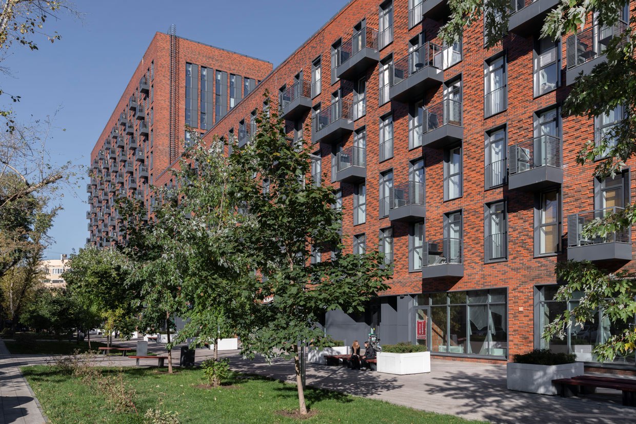
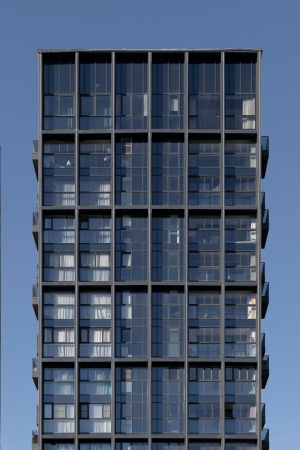
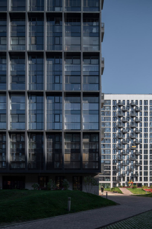
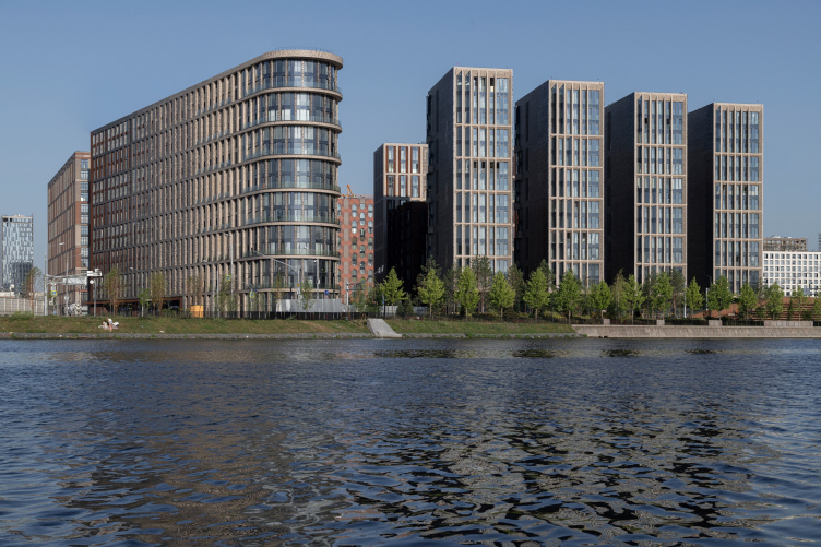
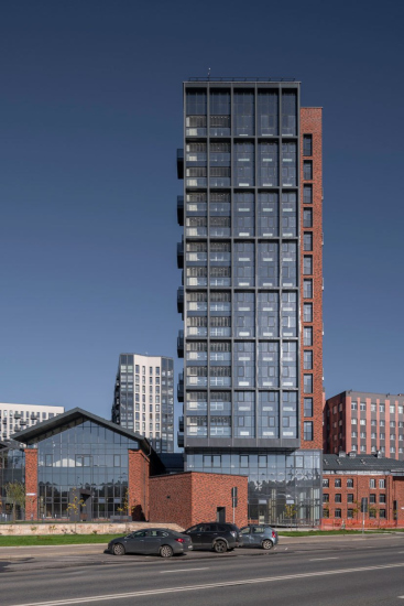
There are two exceptions, however: in the beginning of your journey, you can see the “Music House” on Paveletskaya. At the end of your journey, before the Third Transport Ring, you see another recently-built project – as if pushing away the post-Soviet office buildings, the glass-and-metal towers of Composers’ Residences, designed and built by Sergey Skuratov, make their presence known. As one can easily guess, its name is a nod towards the Music House.
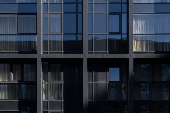
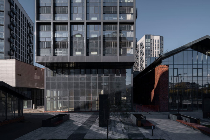
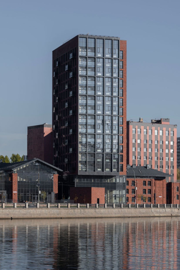
The slender sidewalls of the towers, dominated by a volumetric metal grid of vertical proportions, attract one’s attention by their “not quite local” appearance, even though the combination of metal and brick does hint at the industrial past of this area. The buildings are slender and uptight, they are not brazen, but they do make a statement about the new city fabric growing through the old one.
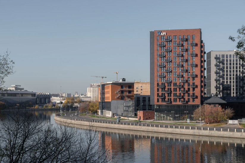
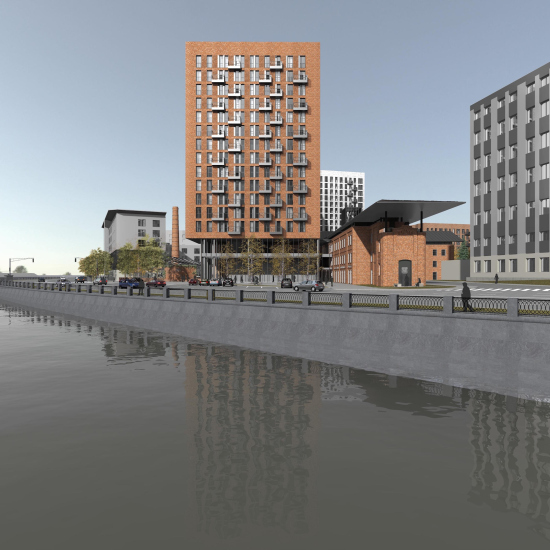
The buildings are clearly visible from the opposite bank of the river, they “hold” the river bank, and they “gaze” almost directly south, yet with a slight turn eastward – i.e. they look at the water, the power station, and then, past the former ZIL plant, and further on to Kolomenskoe, whose faraway lands can be seen from the top floors.
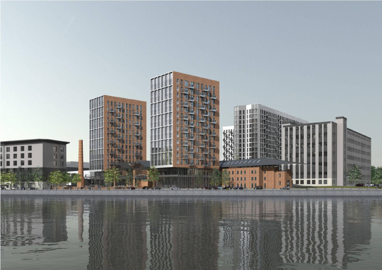
Project of the multi-functional residential complex on the Paveletskaya Embankment. Designer: Sergey Skuratov Architects. Customer: Moscow Printing and Publishing Intergrated Works.
Copyright: © Sergey Skuratov Architects, 2014
By the way, these are not the only houses designed and built by Sergey Skuratov that actively interact with the river in such a way. The two first lots of the neighboring ZILART also overlook the water with their sidewalls – only they gaze not southward but westward. In both cases, we are seeing buildings of a “city” scale but of moderate size – 15 or 16 floors high – but the volumetric planning solution charges them with energy, in which one can see the architect’s trademark technique of communicating with the river.
We will note here that the composition of “Composers” (no pun intended) was to a large extent dictated by the configuration of the land site and the cardboard factory that used to be here. Its western border was essentially a straight line running up to the river, and the territory itself stretched perpendicularly to the river bend. I can assume that it was here that the technique of positioning the volumes crosswise was “spied” by Skuratov, based upon the town planning situation (2011-2014), and was perfected a year later on the ZIL (2015-2016) – in that instance, the buildings stood “unhindered”, but on Paveletskaya they have to peek from the sloppy houses of the first line.
ZILART, Lots 1 and 2
Copyright: Photograph © Daniel Annenkov / provided by SSA
Project of the multi-functional residential complex on the Paveletskaya Embankment. Designer: Sergey Skuratov Architects. Customer: Moscow Printing and Publishing Intergrated Works.
Copyright: © Sergey Skuratov Architects, 2014
Project of the multi-functional residential complex on the Paveletskaya Embankment
Copyright: © Sergey Skuratov Architects, 2014
So! The project of “Composers’ Residences”, unanimously approved by the architectural council at the end of 2014, was built in three stages. Today, in 2023, this complex has been completed, and it can be viewed in its entirety.
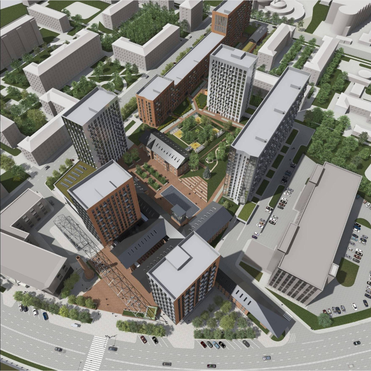
Let’s start with the fact that it exhibits virtually the full set of principles that were consistently implemented in Moscow’s town planning policy for the last 10 or 15 years. These principles finally settled 5 or 7 years ago, and thus, the Residences stand somewhere in the beginning of the process. Car-free yards, multifunctional ground floors, a boulevard with city retail, and a square with swings, differently-sized volumes ranging from “overpasses” to full-size towers, landscaping and geoplastics, multiple levels and diverse morphology, amphitheaters, public zones, and open city spaces.
All the more interesting are the nuances that literally reflect the history of this topic.
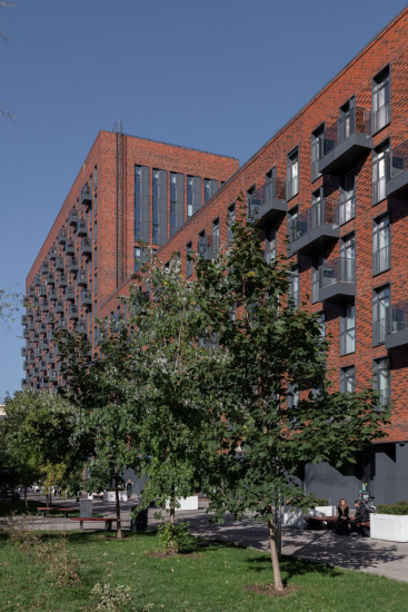
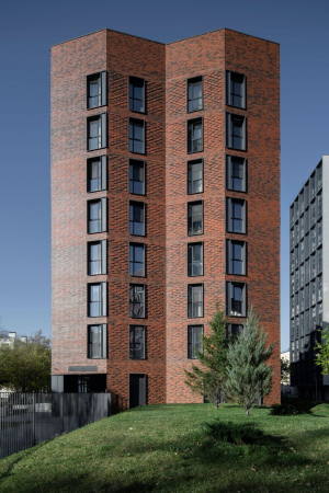
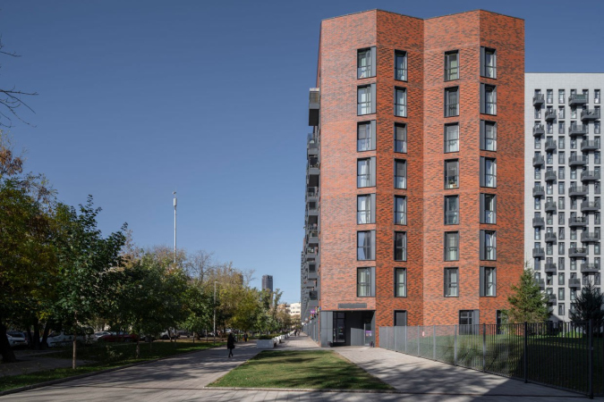
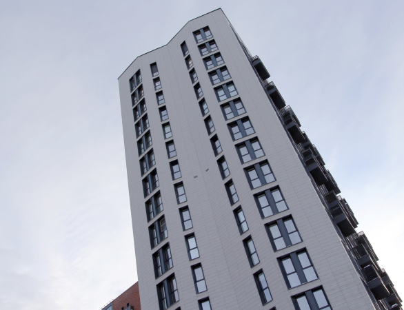
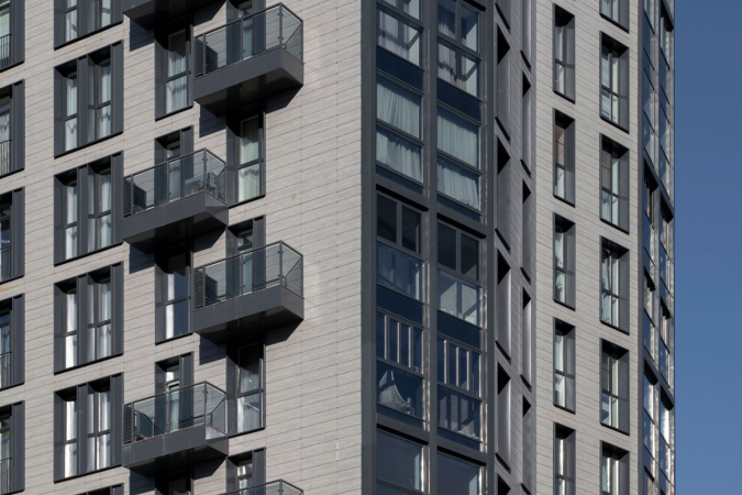
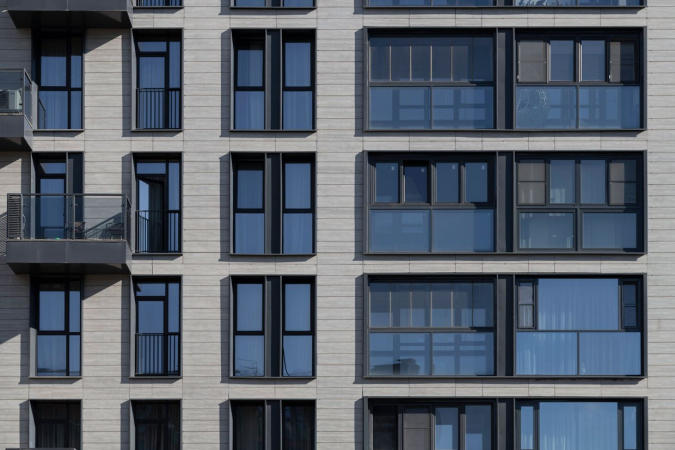
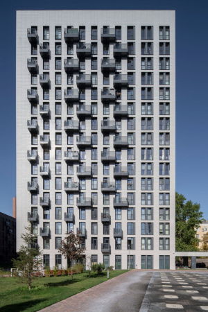
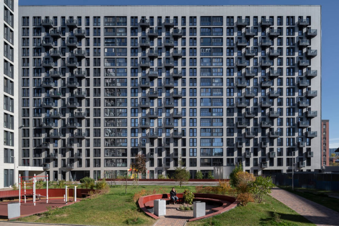
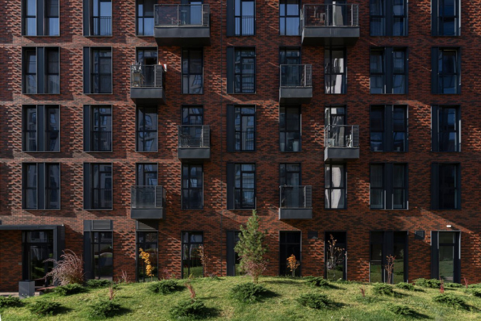
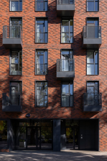
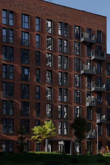
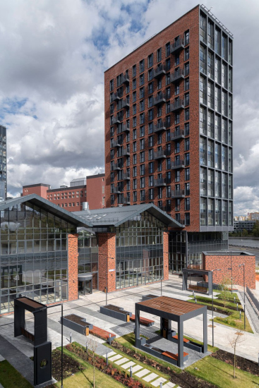
The plastique solution of the buildings displays a lot of original ideas, characteristic of Sergey Skuratov. If we are to proceed from the opposite, we will not see, for example, the “entanglement of colored grids”, popular in the 2010, just as we will not see excessive vertical merging of the windows. The grid binds together each two floors only on the sidewalls that are turned on the city. The distribution of the colors is one of the architect’s personal favorites: some of the houses are red-brick (these stand closer to the river and on the boulevard), and some are almost white (located deeper in the site).
Another curious technique is the zigzag sidewalls of the inner buildings looking like bellows. On the entrance from the boulevard side, they firm asymmetric “propylaea” that stand widely apart- probably, only an art historian will see the hint at this kind of gate. It is obvious, however, that it is the more austere facades that overlook the city, the metallized crystalline grids, and on the inside we see more lively “folding” shapes.
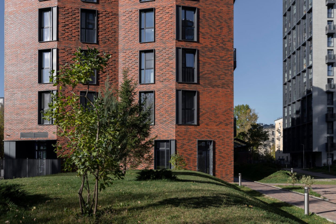
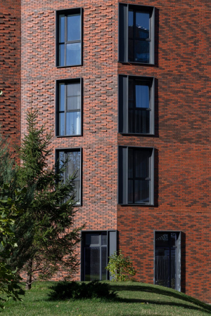
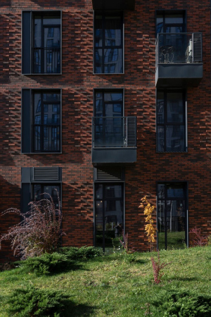
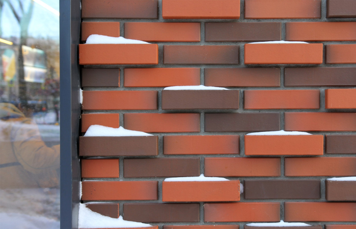
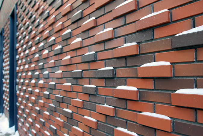
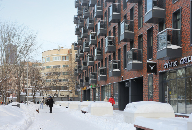
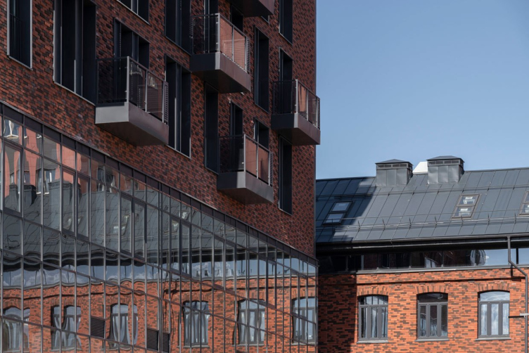
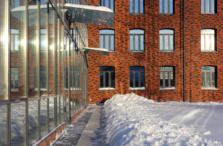
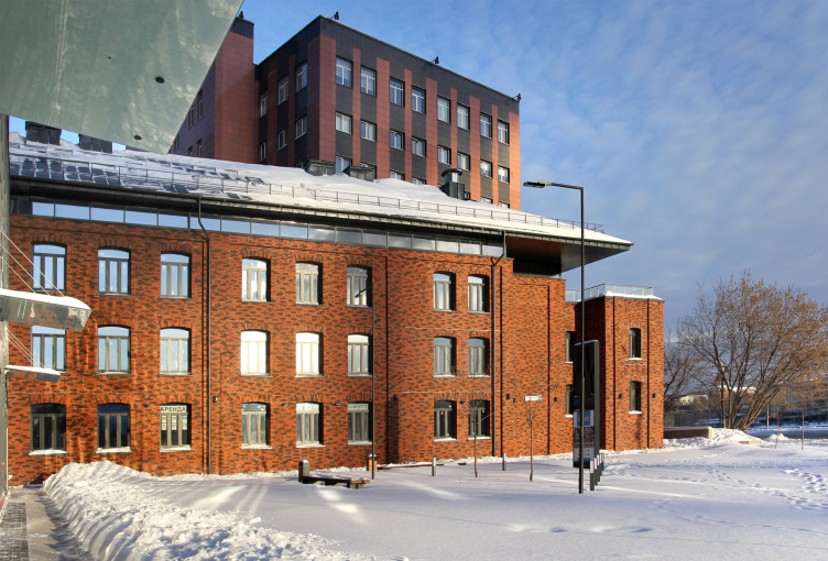
The brick facades, although made of economic LSR bricks, are still differently toned and texturized. The terracotta red neighbors on brown; often a pattern is used, in which the bricks stand out from the surface in a checkered fashion. The relief supports the “Bavarian” pattern, the overall tone becomes darker, and the surface lightens up, especially in slanting lights. In winter, the relief is harmoniously enhanced by “snowcaps” (you can see the same kind in the Tessinsky lane, but here they are subjected to strict discipline).
The relief is echoed by black metallic window frames and little balconies – not just boxes for air conditioning units but small balconies that you can walk into. In the northwest building, which chiefly includes studios, they cover the entire wall, in the other houses they line up in checkered verticals, but always liven up the facades.
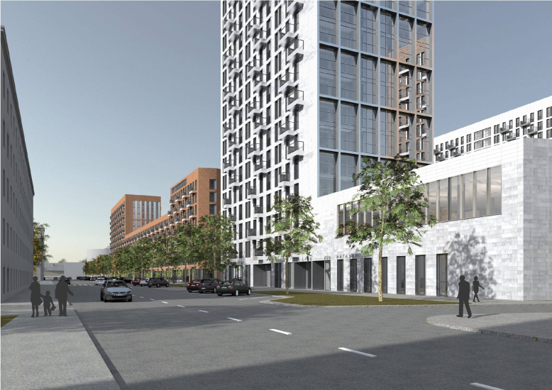
The boulevard deserves special attention: it appeared on the site of the street separating the factory from the residential buildings, and it is very wide – the western side of the street is ordinary, and on the eastern side there are several sidewalks – the smaller ones closer to the street and larger to the shops. There are a lot of trees, both new, planted, and old. It is a real city promenade, there are quite a lot of people here, people stroll, walk their dogs, and have fun outside.
Composers′ Residences housing complex
Copyright: © Sergey Skuratov Architects, 2014
In the boulevard’s perspective, you can see the city’s landmark, Bread Factory #7, one of the five circular bread factories that were built in Moscow by the system invented by engineer Marsakov. Its circular side, even if surrounded by a barbed wire fence, makes the place suddenly cozy.
The boulevard and the bread factory in the perspective. Composers′ Residences housing complex
Copyright: Photograph: Julia Tarabarina, Archi.ru
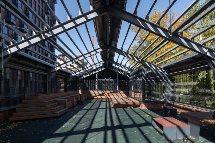
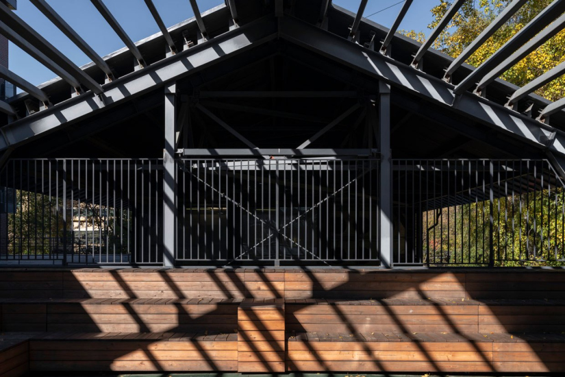
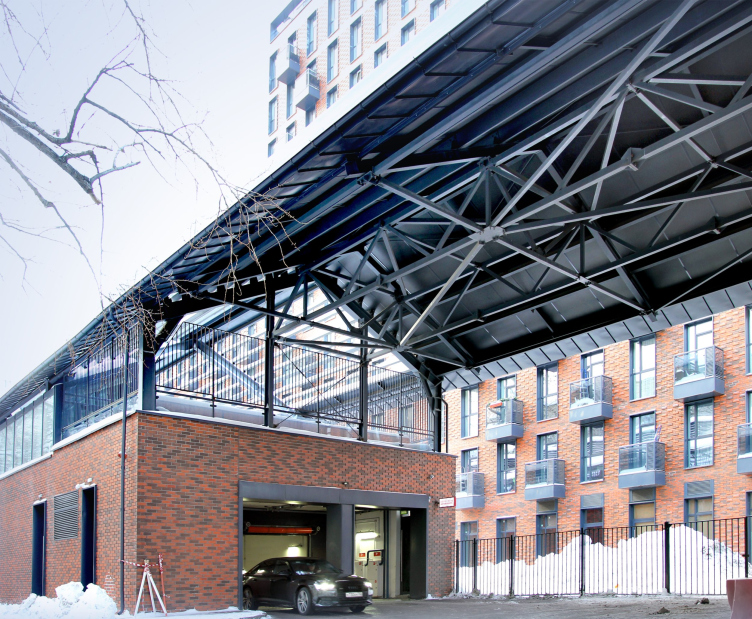
On the opposite, north, side, there is an “inner” public space with amphitheaters on the roof of the entrance to the underground parking garage under a gable metallic pergola: a “second level” of the private yard.
Above the driving/pedestrian entrance, the pergola is continued as a metallic roof, which yields an extended traverse marquee that looks slightly like a factory gate – i.e. also contextual.
The entrance to the parking garage and the marquee. Composers′ Residences housing complex
Copyright: Photograph: Julia Tarabarina, Archi.ru
In short, the complex is quite fit for its place and time. It is what you may call “appropriate” – you can find a lot of interesting things in it, restaurants, and places for recreation. It is elegant with its relief layout of bricks, rhythm, folded ends, but it does not contradict the neighboring, cozy brick blocks of the 1960s in its own way; every single house there is painted yellow, here the contrast of brick and light tone. The complex is fun to examine. This is one of the high-quality Moscow residential complexes of the mid-2010s with signs of the author’s trademark techniques. True, it misses the grand scale of “Garden Quarters”, which would have been impossible here, and even without some gloss of ZILART with its posh cantilevered structures, but it is recognizable.
However, this is not the most important thing.
The most important thing is that the factory was destroyed, and destroyed without the architect’s knowledge. And the project was fully designed based upon the assumption that some of the factory buildings would be preserved. They were its heart and soul. Now the heart and soul are gone.
We worked on this project for several years, and from the very beginning I insisted on preserving the buildings of the Schlichterman factory, although they did not have the status of a cultural heritage site, but were only a “valuable city-forming complex”. The Department of Cultural Heritage and the Moskomarkhitektura supported me in this. The preservation of the factory buildings was included in the project, which won an international competition back in 2011. The project, based on the preservation of historical buildings, was unanimously approved by the Architectural Council in 2014.
Then, after we developed the working documents, the author’s supervision was no longer accessible to us – this is something that happens pretty often. Now we could only be passive spectators. The houses of the first and second stages were built quite well, even if in a slightly simplified way: my project provided for lighter metal, thinner and lighter profiles, and a larger step of imposts, especially with the glazing of the first floors facing the embankment. All of this was sacrificed for the sake of cost effectiveness. On the other hand, the cantilevered structures were indeed implemented; the masonry pattern generally corresponds to the project, as well as the volumetric construction.
But my main disappointment was that all the historical buildings, whose reconstruction was attributed to the third stage, were demolished and replaced by new simulations, and rather crude ones. They were demolished at some point in in 2019 and built of concrete over underground parking lots. The details simply repeat the historical ones, and most importantly, the concrete volumes are decorated with exactly the same simple modern brick as our residential buildings. So ultimately it is unclear what all these buildings are doing here at all, why they are there, where they are from, and why they are like this! However, even if the details were recreated pretty accurately, it is important in itself that these buildings are imitations.
The forgery stripped the whole project of its meaning, all our techniques and contrasting comparisons now made no sense. The project was designed to work with genuine matter, it was built based on the fact that the surface of the old brick of the XIX century is preserved, which we planned to clean from the paint. All the additions, stained glass windows, metal structures – all this was supposed to emphasize the material of the historical walls, enter into a dialogue with it, form a certain logic, which then spread to the entire quarter. The new buildings responded to the old buildings, the whole architectural solution was determined by the proximity to the factory. Now that it is gone, and the historical buildings are reproduced so approximately that they are not even particularly recognizable, everything looks, to put it mildly, strange and not very justified.
If we hadn’t planned the preservation and hadn’t started from it as the main idea, the project would have been different.
And this is where a slightly different story begins.
The complex was built on the territory of the former industrial park of the cardboard factory that was founded by Egor Schlichterman as a spinning and dyeing factory – in 1925 it was nationalized and turned into a cardboard/crate-making one, and later, in 1968, it was turned into a printing factory (see more details in this article by Konstantin Mikhailov, who already in 2014 knew that everything could go wrong).
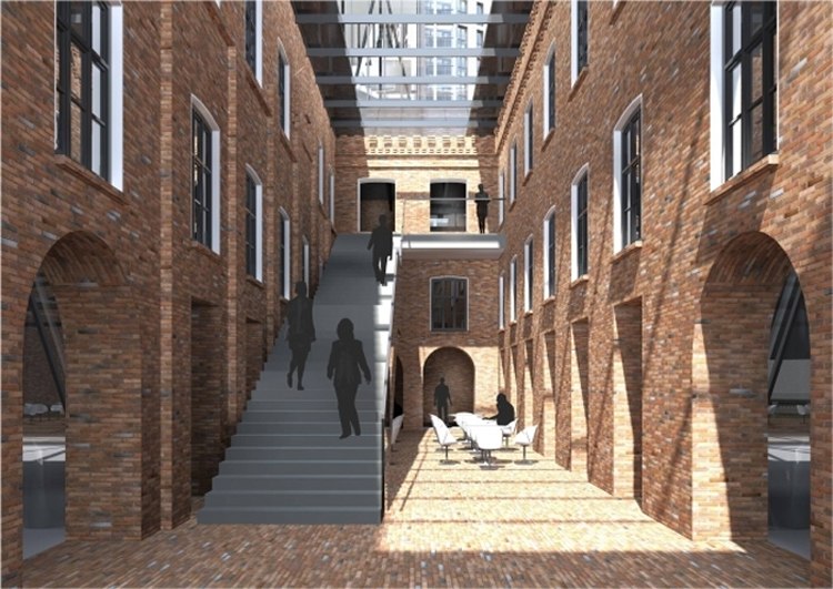
It was planned to save two buildings: one long, stretching from west to east, with transverse wings, aisle arches and two internal corridors – the main building of the factory. It was demolished in 2019.
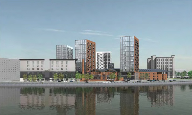
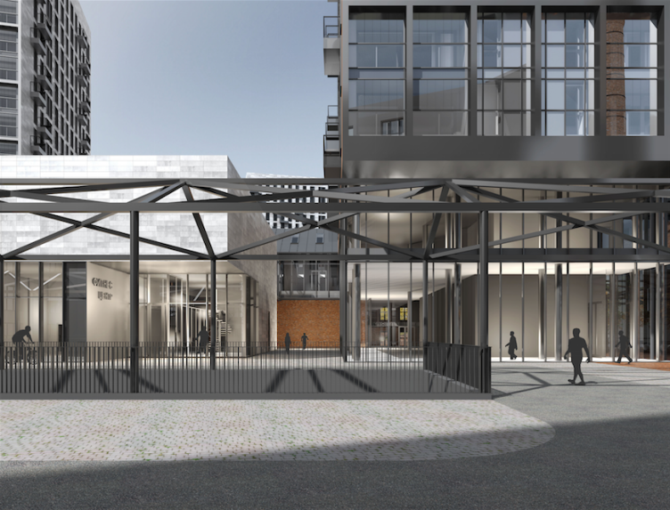
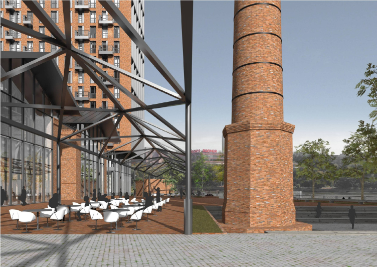
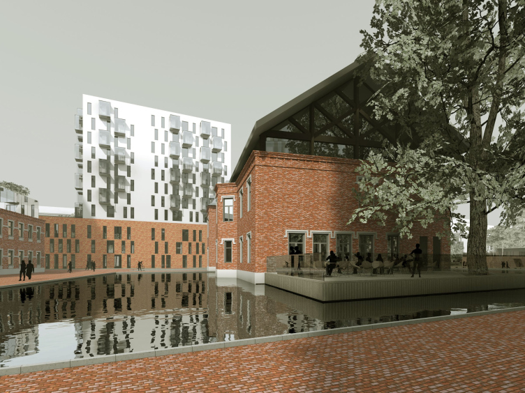
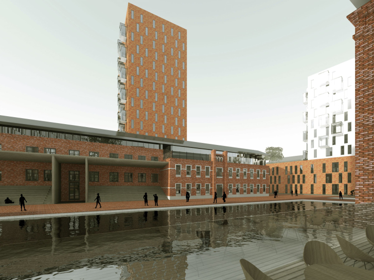
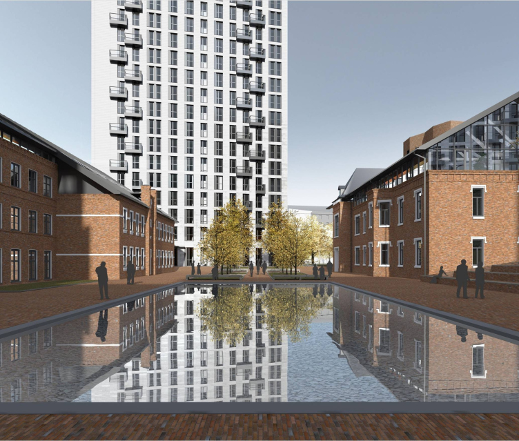
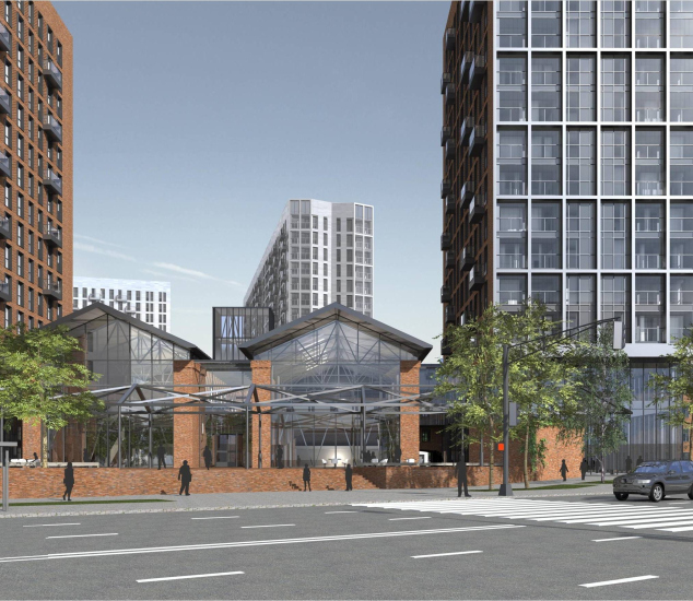
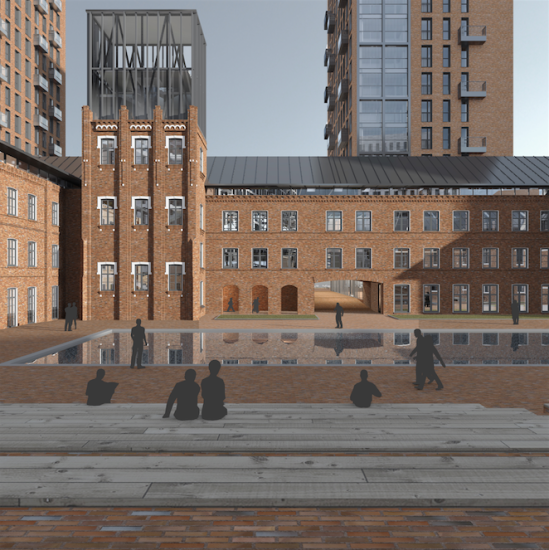
According to the project, it included public spaces, some sort of a “hub on Lesnaya” with brick walls, multilevel “atrium” corridor, glass-and-metal ceilings, and sidewall wings. In front of it, from the river bank side, it was planned to make a transparent metallic “gallery”, which marked the city square on the river side; the factory chimney was also included in it. This was not detailed preservation of the entire building “down to the last nail” on its roof – this was a combination of old walls with cutting-edge new ones with hi-tech forms and materials, which, according to the architect – we remind you here – accentuated and supported each other.
The playground and public space on the roof of the entrance to the underground parking lot
Copyright: © Sergey Skuratov Architects, 2014
The playground and public space on the roof of the entrance to the underground parking lot
Copyright: © Sergey Skuratov Architects, 2014
Project of the multi-functional residential complex on the Paveletskaya Embankment. Designer: Sergey Skuratov Architects. Customer: Moscow Printing and Publishing Intergrated Works.
Copyright: © Sergey Skuratov Architects, 2014
The other building – the manager’s house – was situated in the yard. It was torn down in November 2018.
The first project provided for a pond being made on three of its sides, and by 2014 the planned pond was moved to the factory’s main building. It was planned that the manager’s house would now host a kindergarten. There is indeed a kindergarten there now, but there is yet another little detail: the space between the factory buildings was to become a public square, and the kindergarten grounds were pushed further into the yard. Ultimately, everything was done the other way around: the children’s territory was moved southward, and the public one was placed in the center. The pond was taken out altogether.
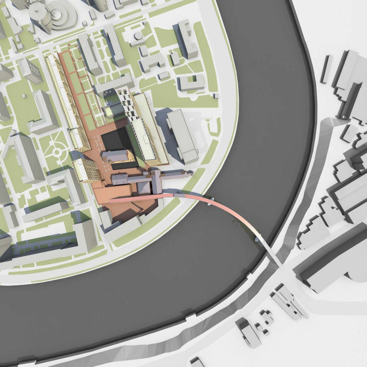
Composers′ Residences housing complex, the competition project 2011
Copyright: © Sergey Skuratov Architects, 2014
Composers′ Residences housing complex, the competition project 2011
Copyright: © Sergey Skuratov Architects, 2014
Project of the multi-functional residential complex on the Paveletskaya Embankment. Designer: Sergey Skuratov Architects. Customer: Moscow Printing and Publishing Intergrated Works.
Copyright: © Sergey Skuratov Architects, 2014
The stained glass windows of the sidewalls facing the river, which also belong to the main facade, are easy to compare visually in the 2014 project and in the implementation: the glazing has become smaller, the plane of the glass in the project is deepened and moved forward. The conceived hi-tech gloss is now gone.
As for the tower next to the next building… Things aren’t black and white either.
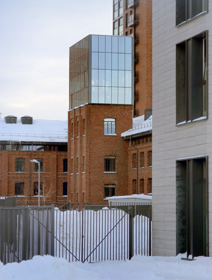
The authentic tower was torn down in 2019, as MoskvitchMag writes, under the pretext of “careening into the construction pit”. The top part of the completed tower looks very different from the one in the project, where the glass was transparent and had a prominent grid of the outside framework, with metallic structures behind it. The glass part also seems to have grown as well.
Also, Sergey Skuratov shared with us an interesting story about the corner of the northwest residential tower – it is something that budding architects should know. The house was devised as a twin of the west tower; the river is overlooked by two factory wings, and these are flanked by two new houses – not a classic, yet symmetrical paired composition. On the whole, it was indeed implemented that way, but it turned out that the west corner slightly overhung above the municipal land and violated the official boundaries of the complex. In Moscow, it is crucially important not to overhang above anything: the corner was cut away during the design process. This is how the right hand house received an accidental brick “ear”.
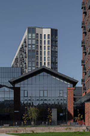
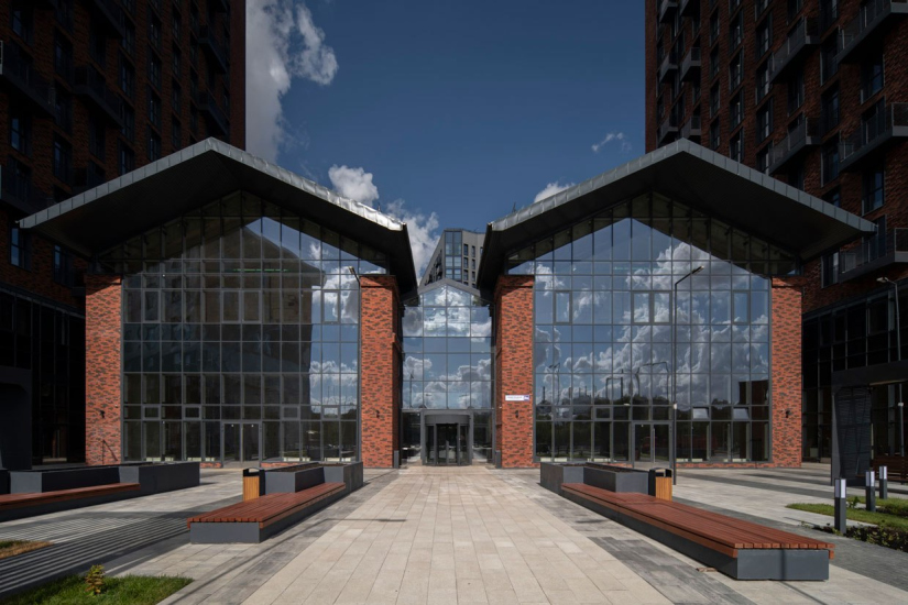
The fact that the imitation factory buildings are faced with the same brick as the new houses, is, of course, remarkable. Indeed, you look at them and think: why are they designed this way? Why such planning, such corners, such arches? If the brick was old, everything would make perfect sense: the new brick would surround it as some sort of a “given”, some kind of object that is related and alien at the same time. The old brick brick would be reflected in the new glass together with the new brick above it, and it would be a whole encyclopedia of textures – modern and historical ones.
Today, of course, if you take someone who saw XIX-century buildings at least once, it will be next to impossible to convince them that this upbeat garishness really refers to the lost factory. One must admit that such an approach has numerous “relations” in Moscow of the 2000’s, but, of course, it pains me to see it in “Residences”, I thought it would be beneath such a complex.
Composers′ Residences housing complex
Copyright: Photograph © Daniel Annenkov / provided by SSA
Composers′ Residences housing complex
Copyright: Photograph: Julia Tarabarina, Archi.ru
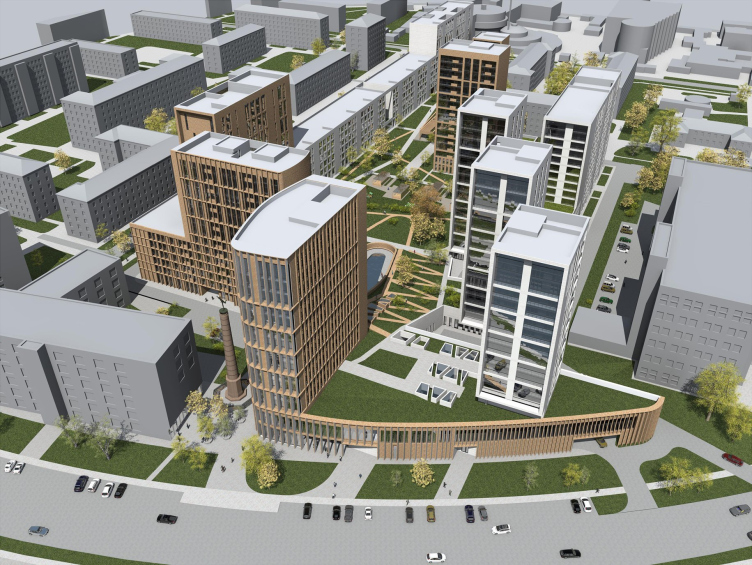
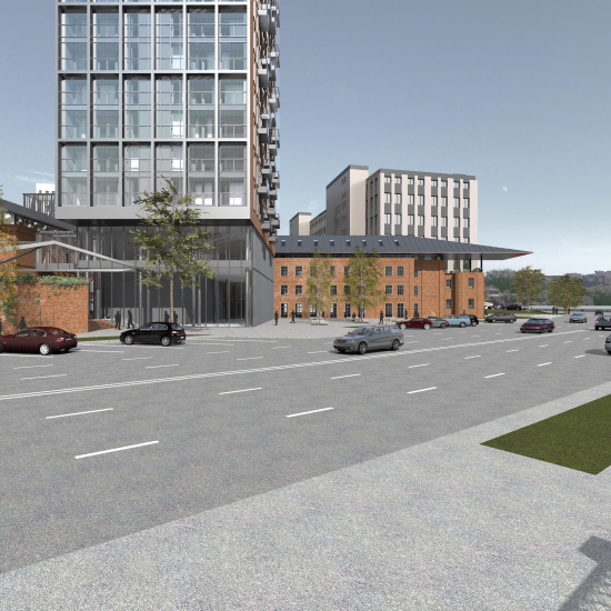
Let us pay attention to Sergey Skuratov’s words that without the idea of preservation the project would have been different. And it was indeed different – in 2014, at the client’s request, the architect proposed an alternative version that implied the demolition. In that version, quite predictably, the architect works with the space and levels. In the stylobate, the fitness center is moved to the waterfront line in an asymmetric “water drop”; its roof can be accessed by a slope that starts in the yard. Nearby, there is the only element that is preserved in this version – a factory chimney with a Mercury statue on top.
Composers′ Residences housing complex, the 2014 versio without the preservation of the factory buildings
Copyright: © Sergey Skuratov Architects, 2014
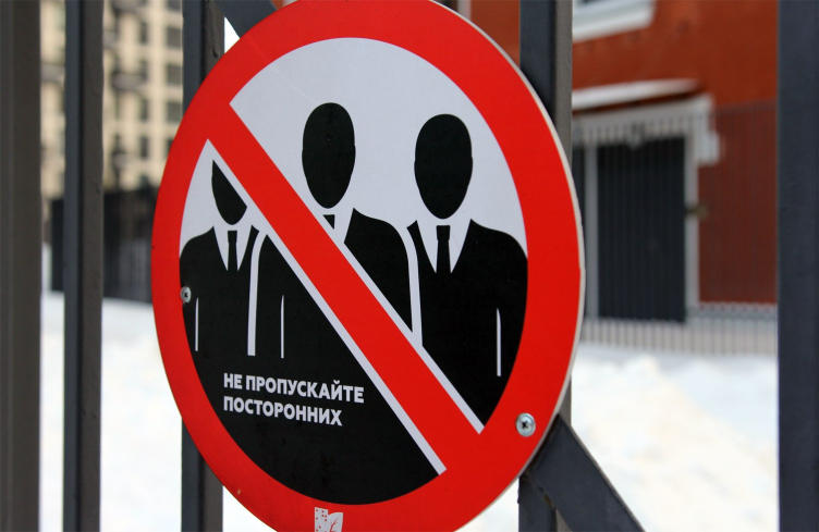
There is yet another subtlety, in addition to the demolition of the old buildings, that I would term as “creeping status growth”. The Transport accessibility of the location is not terribly good, and the complex was originally designed as economy class (see more details here), designed for the younger buyer, hence the fine “fracturing” of studio apartments and numerous public spaces for hanging out. This contained some, albeit not exactly visible, social message, which, the way I see it, palpably shrank. What I mean to say is that the fine fracturing of the apartments remained in the brick building of the first stage, but the public spaces mysteriously disappeared. In the process of construction, the class of housing grew up to “business”. The property in the bottom floors on the embankment side is awaiting for the tenants, and it is yet unclear what the space on the inside will look like. So far, we can only see the circular concrete columns and high ceilings, but the type of function looks more like the regular service one, so, any special space for communication is unlikely to appear here. The setting is not conducive to it either: it is hard to say exactly when this happened, but at some point the territory was fully wrapped up in a tall fence with scary “Don’t let unauthorized people in” signs. Seriously, this is the first time I see something like this. Yes, the residents do need privacy and safety, but these harsh signs do not seem to go well together with the “friendly” idea of public city spaces.
The scary sign on the fence. Composers′ Residences housing complex
Copyright: Photograph: Julia Tarabarina, Archi.ru
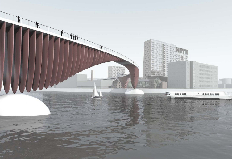
Yet another “heritage” of the earlier projects is the micro-marquee on the pseudo-historical building. It reminds us in a very remote way about the grand-scale idea of the competition project: it had a pedestrian bridge thrown over the Moskva River to the Simonov side. It turned out later on that the master plan of Moscow did have plans of such bridges, distantly similar to this one. The bridge was canceled very early on, still in 2011.
Sergey Skuratov. Reconstruction project of the Moscow cardboard and printing factory. The original version
Copyright: © Sergey Skuratov Architects, 2014
Sergey Skuratov. Reconstruction project of the Moscow cardboard and printing factory. The original version
Copyright: © Sergey Skuratov Architects, 2014
As if in memory of the bridge idea, in 2014 the project received a long metallic marquee above the main factory building, “soaring” above the terraced brick volume in the direction of the river, saluting it in its own way, in the direction that is transversal to the towers’ sidewalls, in the direction of the “Barrel” tower of the Simonovsky Monastery.
But alas! This marquee was cut off as well.
A shortened marquee over the building, imitating the factory of the XIX century.
Copyright: Photograph: Julia Tarabarina, Archi.ru
And the brick chimney was trashed as well! What has it done wrong, I wonder? It was a great artifact. Even in the “demolition” project 2014 it was planned to preserve it. The answer suggests itself – so that it does not collapse by accident. For safety reasons.
Sergey Skuratov likens what happened here with the pensive song by Novella Matveeva about a nail’s shadow – if we are to regard it not so much as a song about an ill-starred romance, but as a story about how we gradually lose things that are dear to us, and how our memories refuse to let go, fighting the reality. If we are to translate this into the language of architecture, you could say that the city has indeed a few trends: for preservation, for obliteration, and for recreation. The recreation is clear – it is hot and popular today, particularly preservation of buildings that do not have a protected status (because if the building does have a protected status in Moscow, you cannot tear it down, this is next to impossible). The fashion for preserving XIX century buildings is at least 50 years old, and the well-known Factory and Tate Modern are kind of a trivia. In Moscow, this fashion also developed further, from Arma to the recently-opened interior of Bread Factory #5 with Zotov Center for Constructivist Studies. More and more renovation projects with preservation are receiving various awards, the recent being the Dezeen Award bestowed on the Argo Factory Museum of Modern Art in Tehran, hosted in a 1920s brewery. There are many examples, reconstruction with the preservation of buildings that were once condemned to demolition by definition, is gaining strength as a powerful movement.
The downside to this story is that in Moscow the realization of such ideas often goes wrong. One of the classic, even if old, examples, is the “Red Rose” business center, which first hosted an art cluster in sawtooth buildings, and then these were destroyed to be replaced by copies. A similar thing can be seen here. Not always can the architect influence the client’s decisions – and all he can do is watch the ups and downs of the final implementation.
Could Moskomarkhitektura and the Moscow Heritage Committee, who agreed on the project in 2014 on the terms of preservation, have done something in such a situation? We know for sure that such cases – for example, when the Department for Cultural Heritage demanded to preserve a house that had no protected status, and it was indeed preserved: the walls were “hung out” using some huge amount of metal for rescue structures. Something similar should have been done here – they could have reinforced the brick walls with metal in order to bring the underground parking lot under the factory buildings. Could the agencies demand that and persist in their demands? Did they even want to?
But then again, it seems to me that the general public also distanced themselves from this story: if in 2014 Konstantin Mikhailov lamented the fact that the number of buildings meant for preservation dramatically shrank in the original project, in 2018 Arkhnadzor put the manager’s house on the demolition list, and in 2019 the main building. In the beginning of 2019, Rustam Rakhmatullin in his interview to MK warned that the factory was in danger of being demolished. However, this did not stir any significant public concern. But then again, who is to blame for this? The main job of the Department of Cultural Heritage is protection of Cultural Heritage sites and including new buildings in their lists. All the rest is not exactly out of the agency’s competence, but rather the question of goodwill and mutual interest of the agency and the client. The fact of being considered at the architectural council does not matter much either – as is known, the official status has the agreed set of architectural and town planning solutions. And as for Arkhnadzor, you cannot blame them either: the 2018 and 2019 lists included 21 demolished buildings each, and you cannot protect each one of them with your own body.
Until 2015, the matters of historical buildings without the cultural heritage status was handled by a committee with a very long name, which was nicknamed by the city preservation activists as a “demolition” one, even though during the last few years of its existence it did protect a few valuable historical buildings without the heritage status.
Here you can read about how this committee was terminated. Maybe they should consider restoring it?
Thus, the story of designing and building “Composers’ Residences”, stretching for 11 years from the international competition to the demolition of the factory buildings, is very exemplary. It is like the mirror of the decade.
This story, however, is fun to consider from two points of view simultaneously. First of all, the outlook, formed by the city preservation activists, according to which “only demolished buildings are truly beautiful”, is, of course, supercilious. One thing you need to realize is that both historical and modern buildings can be as beautiful as they can be ugly, and this is something that depends upon the artistic quality of the project. Somehow, we are accustomed to liking either historical or modern architecture – i.e. staying within one of the two comfort zones, not noticing (or even despising) the other. In my opinion, this is totally abnormal, and it even looks like a trace of some collective ethical trauma.
There are cases, however (and they are becoming more and more numerous) when preservation becomes the key to modern architecture – and what we are seeing here is exactly one of such cases. If you go and take out this key at the last moment, this will literally be the end of everything.

