По-русски

A Single-Industry Town

Kola MMC and Nornickel are building a residential neighborhood in Monchegorsk for their future employees. It is based on a project by an international team that won the 2021 competition. The project offers a number of solutions meant to combat the main “demons” of any northern city: wind, grayness and boredom.

20 December 2023
Object
mainImg
Monchegorsk is a single-industry town that was formed back in 1937 due to the discovery of copper and nickel deposits and the opening of the Kola Mining and Metallurgical Company, which is now part of Nornickel. Until recently, this place was a bit scary to live in: industrial emissions caused the concentration of sulfur compounds and other substances in the air to be such that hectares of forest on the leeward side were dying. However, Nornickel is gradually modernizing its production, making it more environmentally friendly, and shifting towards “white metallurgy”. For example, in 2021, the copper shop in Monchegorsk was shut down to be replaced with a new copper refining plant; its environmental impact is expected to be minimal.

To attract specialists for the new production facility, Nornickel plans to build housing of its own. Two years ago, a competition was held for the project. We told you about the competition quite a long time ago, and now we have an opportunity to take a closer look at the winning project – it has some interesting solutions in it. The authors of the project are a consortium of NIIPI Gradplan of Moscow, Dialectica (Spectrum Group) and the Dutch company Atelier PRO.

Metallurgists in the tundra

The name of the city comes from the Sami word “moncha”, which means “beautiful”, but this definition so far refers exclusively to the surrounding nature. Monchegorsk is located far above the Arctic Circle, between the Lapland Reserve and Lake Bolshaya Imandra, in the Monchetundra and Chunatundra mountain ranges. It is surrounded by hills and rocks, rivers and lakes.

Monchegorsk itself essentially consists of the Kola MMC, which occupies almost a third of the city, five-story Khrushchev-era buildings and wide streets blown through by an icy wind. There are also many water bodies within the city limits – lakes of various sizes and, again, the Moncha River. The neighborhood of the natural and man-made is reflected in the names of the streets: near Metallurgov Avenue and Nickel Highway there are Moroshkovaya (a kind of local berry) and Lesnaya (“Forest”) Streets.

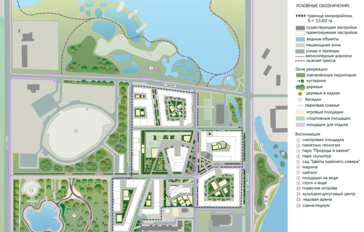
The residential complex will occupy a plot of land that is now empty and divides the established neighborhoods. It is planned to build a cultural and leisure center and an ice arena in the same quarter – the city is very fond of sports. There are a lot of trees growing on the site; on three sides it is surrounded by water bodies, which gives ample opportunities for the arrangement of recreational areas. If all the projects are implemented, the site will claim the status of a central location, including in terms of concentration of public functions – which will be the right thing, as it is located in the layout center of Monchegorsk.

Each consortium member had its own tasks. NIIPI Gradplan was in charge of territory planning, while Dialectica, together with Atelier PRO, was responsible for the master plan and architecture. Spectrum Group, of which Dialectica is a part, helped with the structural design, soil studies, insolation and the “wind blowing” factor, which played a role in the jury’s choice of this project. It takes into account the main “challenges” of the city: icy winds, monotonous buildings and lack of public spaces.

Against the wind

One of the significant factors that influenced the layout of the neighborhood was the wind, which affects the residents of Monchegorsk. Because of this, the authors immediately turned to perimeter development and placed a kindergarten and a school in the center of the future micro-district, thus creating an area protected from the wind and endowed with urban significance: the school is planned to be used as a community center during extracurricular hours, and events for children and adults will be held there.

Luckily, there are no through streets where the wind could pick up any serious speed, the air flows are crushed by the frontal buildings of the outer perimeter, while inside they are separated and regulated by stylobates. On the other hand, it was necessary not only to protect the interior spaces from the wind, but also to ensure constant ventilation: since, as we remember, the ecological situation in the city is still far from ideal, it is important to avoid stagnation of industrial emissions. For ventilation, air corridors were provided, which are planned to be formed with the help of natural terrain, minor architectural objects, and green spaces.

After all the preliminary calculations – and this is where it gets interesting – modern technologies were involved: Spectrum Group “blew” the layout options in the Ansys software environment until it calmed down the air flows in all pedestrian spaces and courtyards. The calculations also involved the insolation factor – the architects started by making a “shadow map” of the city, which helped them to determine the best location of residential facades and playgrounds; parking lots and covered pavilions were also placed on shaded areas.

Our task was to offer a comfortable and compact urban environment, designed for pedestrian accessibility of services and social infrastructure, with a highly developed system of public spaces, and with a recognizable urban silhouette and eye-catching highlights. At the same time, we had to take into account the specifics of the climate and environmental situation, minimize the negative aspects, and enhance the positive ones. This approach will create a synergetic effect that can attract potential new residents and reduce population decline. Calculations to increase the economic potential of territories are one of the important skills of the consortium’s specialists.

I think our solution could become an example of developing Arctic single-industry towns according to the methodology of reducing the impact of harsh climatic conditions – and at the same time designing a modern image.


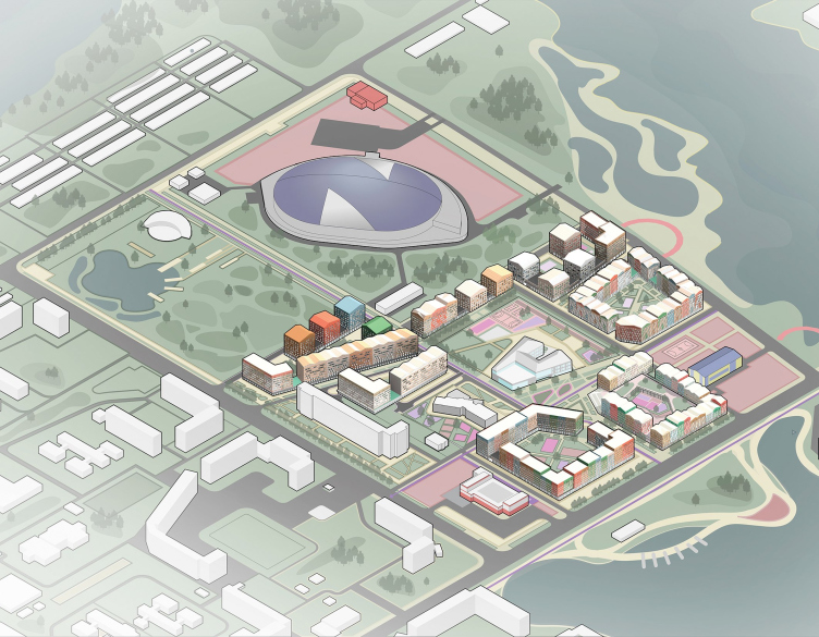
The architects also took into account the landscape features, height differences and existing surroundings – primarily the Umka sports complex to the north of the site and the Magnit supermarket to the south.

Architectural and urban planning concept of a micro-district in Monchegorsk. Axonometry of the project proposal
Copyright: © NIIPI Gradplan of Moscow, Dialectica Spectrum, Atelier PRO


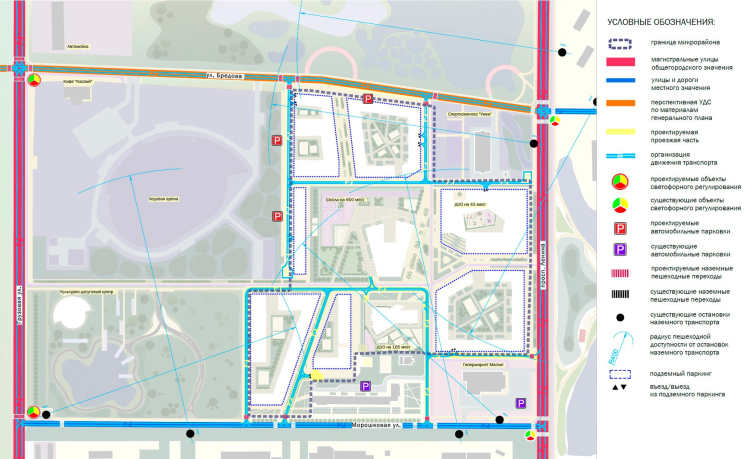
Architectural and urban planning concept of a micro-district in Monchegorsk. Scheme of transportation service of the territory
Copyright: © NIIPI Gradplan of Moscow, Dialectica Spectrum, Atelier PRO


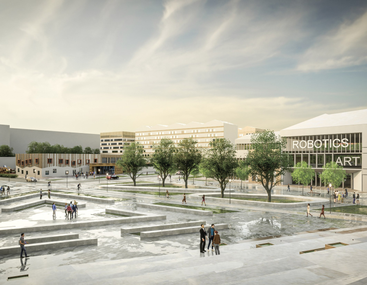
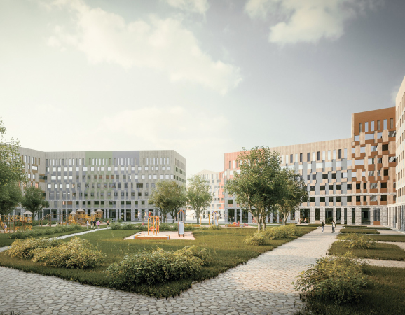
The houses are grouped into several residential clusters that form the outer contour of streets, large courtyards and a system of internal public spaces – streets, little parks, sports facilities, and playgrounds. The heart of the neighborhood is a spacious central square next to the school and kindergarten, a place for meetings and celebrations, as well as lessons or exercising in the fresh air. Another preschool facility is “hiding” in the stylobate of the corner block, the center of which is “carved out” to host a playground. An amphitheater staircase leads here, oriented towards the main square.

Architectural and urban planning concept of a micro-district in Monchegorsk.
Copyright: © NIIPI Gradplan of Moscow, Dialectica Spectrum, Atelier PRO


Architectural and urban planning concept of a micro-district in Monchegorsk.
Copyright: © NIIPI Gradplan of Moscow, Dialectica Spectrum, Atelier PRO


Against the grayness

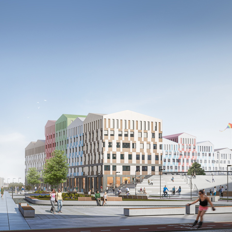
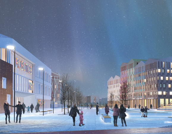
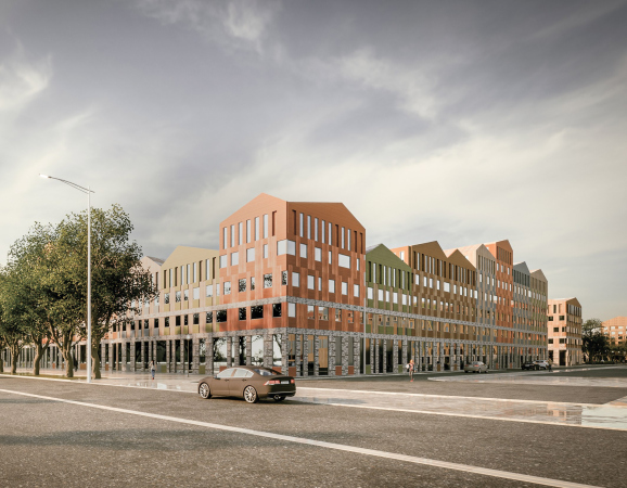
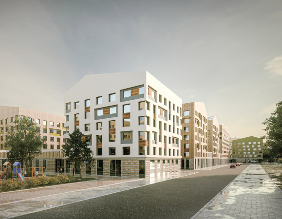
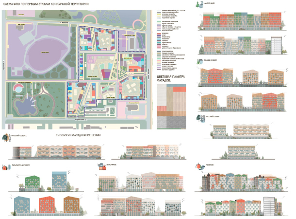
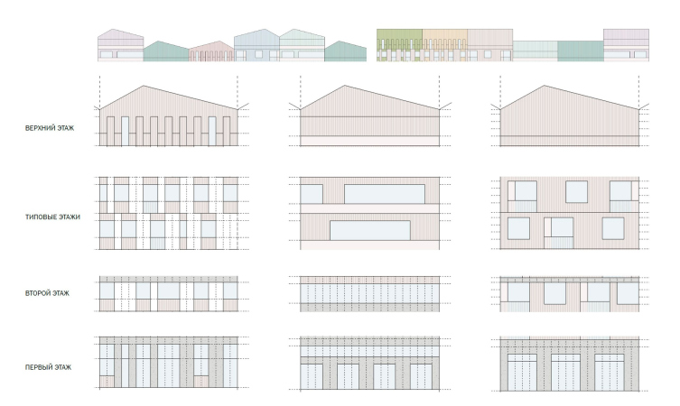
Another peculiarity of Monchegorsk is the monotonous uniformity of the existing buildings, which is further aggravated by overcast weather and polar night. For this reason, the authors turned to the idea of colored sections of houses: by changing the height, configuration and finish of the facades, as well as the coloristic solution, it is possible to mitigate the perceived scale and come to the desired diversity of the environment. In another place, the “gingerbread-like” quality of some angles might seem excessive, but the garishness is offset here by monochrome inclusions and the structure common to all the neighborhoods: there is a first floor gallery, there are variations for the “body” of the building, and there is an increased height of the last floor with a usually pitched roof. And in general, in Monchegorsk, where gray prevails on the streets, the eye wants to rest on something colorful.

  • zooming
    1 / 4
    Architectural and urban planning concept of a micro-district in Monchegorsk.
    Copyright: © NIIPI Gradplan of Moscow, Dialectica Spectrum, Atelier PRO
  • zooming
    2 / 4
    Architectural and urban planning concept of a micro-district in Monchegorsk.
    Copyright: © NIIPI Gradplan of Moscow, Dialectica Spectrum, Atelier PRO
  • zooming
    3 / 4
    Architectural and urban planning concept of a micro-district in Monchegorsk.
    Copyright: © NIIPI Gradplan of Moscow, Dialectica Spectrum, Atelier PRO
  • zooming
    4 / 4
    Architectural and urban planning concept of a micro-district in Monchegorsk.
    Copyright: © NIIPI Gradplan of Moscow, Dialectica Spectrum, Atelier PRO


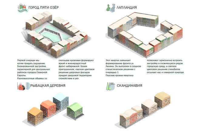
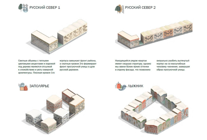
Each residential cluster – there are seven of them in total – received its own reception and name. For example, “City of Five Lakes” is characterized by houses with pitched roofs and two-level courtyard space; “Russian North” has predominantly light-colored finishes with wooden accents.

“Fishermen’s Village” and “Scandinavia” are not enclosed in a block, but consist of separate sections resting on a stylobate – each has a color of its own; the houses are placed at bigger intervals, as they are closer to green areas.

When selecting shades, the architects were inspired by the nature of the Kola Peninsula: combinations of warm shades of forests, moss, dried grass and cold shades of rocks and lakes, emphasizing the contrast of warm and cold.

  • zooming
    1 / 6
    Architectural and urban planning concept of a micro-district in Monchegorsk.
    Copyright: © NIIPI Gradplan of Moscow, Dialectica Spectrum, Atelier PRO
  • zooming
    2 / 6
    Architectural and urban planning concept of a micro-district in Monchegorsk. Variability of architectural solution
    Copyright: © NIIPI Gradplan of Moscow, Dialectica Spectrum, Atelier PRO
  • zooming
    3 / 6
    Architectural and urban planning concept of a micro-district in Monchegorsk. Variability of architectural solutions
    Copyright: © NIIPI Gradplan of Moscow, Dialectica Spectrum, Atelier PRO
  • zooming
    4 / 6
    Architectural and urban planning concept of a micro-district in Monchegorsk. Functional levels
    Copyright: © NIIPI Gradplan of Moscow, Dialectica Spectrum, Atelier PRO
  • zooming
    5 / 6
    Architectural and urban planning concept of a micro-district in Monchegorsk. Fundamental solutions
    Copyright: © NIIPI Gradplan of Moscow, Dialectica Spectrum, Atelier PRO
  • zooming
    6 / 6
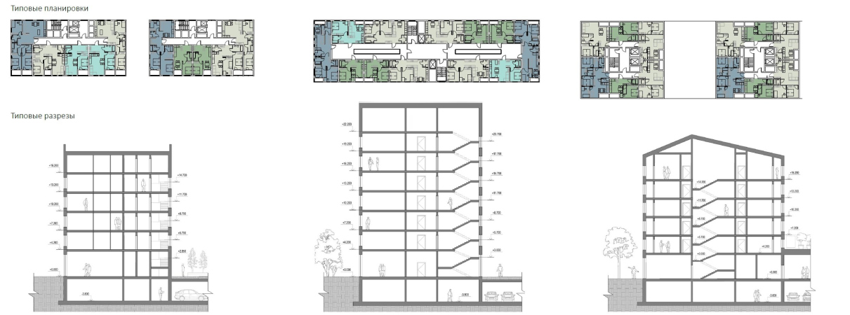
    Architectural and urban planning concept of a micro-district in Monchegorsk. Differentiation of housing types
    Copyright: © NIIPI Gradplan of Moscow, Dialectica Spectrum, Atelier PRO


The diversity of houses will also affect the apartment layouts. The climate does not allow adding front gardens to the first floors, but the upper floors have higher ceilings and mezzanine apartments. In total, there will be about 2000 apartments in the new microdistrict, the range of their typology proposed in the project is designed for different social groups.

Against boredom

Not only in Monchegorsk, but also in any small town, it can be difficult to find an alternative to going to the store as a leisure activity, so it was important to offer people different scenarios. As already mentioned, an ice arena is planned on the territory of the neighborhood, the Umka Sports and Recreation Center with a swimming pool is also located nearby, and the architects tried to satisfy other demands.

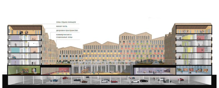
Architectural and urban planning concept of a micro-district in Monchegorsk. The basic section view of the first phase
Copyright: © NIIPI Gradplan of Moscow, Dialectica Spectrum, Atelier PRO


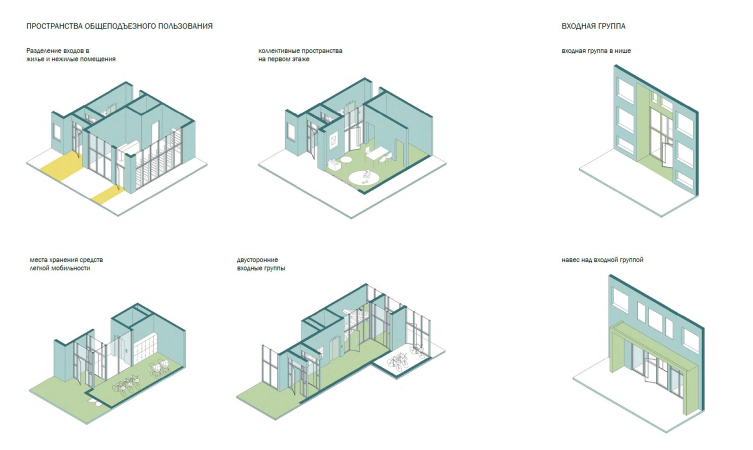
The entire area between the houses works as a public space: human-scale pedestrian shopping streets lead to a public garden or square. Commercial spaces are planned in the first floors: cafes, stores, pharmacies, beauty salons, bank branches, as well as a children’s medical center, co-working space, media center, social and sports clubs. Since all residents of the neighborhood will work at the same enterprise and most likely will have common interests, it was necessary to provide a place for informal, yet at the same time corporate communication.

The community center located in the stylobate of the residential cluster of the first stage of the City of Five Lakes became such a place. Its space is aimed at residents of the new district, but it will also be open to all residents of Monchegorsk. The community center is complemented by mini-zones for residents to socialize: somewhere they are located in the stylobates, and sometimes in the upper floors, the very ones with high ceilings.

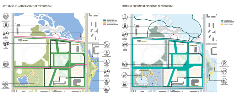
Architectural and urban planning concept of a micro-district in Monchegorsk. Scenarios of territory development
Copyright: © NIIPI Gradplan of Moscow, Dialectica Spectrum, Atelier PRO


Improvement of the territory around the neighborhood will give the residents of the city an opportunity to take long walks, do sports and contemplate the discreet but expressive nature of the Polar region. In the north and east, where the houses are adjacent to water bodies, a natural park with observation platforms, approaches to the water and infrastructure for active recreation on the water is proposed, such as a kite station, which, thanks to the wind and snow cover, can operate all year round. The cultural and leisure center will be complemented by a garden with flowers of the far north and a pond that turns into a skating rink in winter. A bicycle path runs through the network of recreational spaces, and a cross-country ski trail appears in winter.

In addition to landscaping, as part of the competition's terms of reference, the team offered their thoughts on the direction of recreational development outside the design site, thus thinking through its connections with its surroundings.


Architectural and urban planning concept of a micro-district in Monchegorsk. Landscape and architectural organization of the territory
Copyright: © NIIPI Gradplan of Moscow, Dialectica Spectrum, Atelier PRO

20 December 2023

Headlines now
Flexibility and Integration
Not long ago, we covered the project for the fourth phase of the ÁLIA residential complex, designed by APEX. Now, we’ve been shown different fence concepts they developed to enclose the complex’s private courtyards, incorporating a variety of public functions. We believe that the sheer fact that the complex’s architects were involved in such a detail as fencing speaks volumes.
A Step Forward
The HIDE residential complex represents a major milestone for ADM architects and their leaders Andrey Romanov and Ekaterina Kuznetsova in their quest for a fresh high-rise aesthetic – one that is flexible and layered, capable of bringing vibrancy to mass and silhouette while shaping form. Over recent years, this approach has become ADM’s “signature style”, with the golden HIDE tower playing a pivotal role in its evolution. Here, we delve into the project’s story, explore the details of the complex’s design, and uncover its core essence.
Gold in the Sands
A new office for a transcontinental company specializing in resource extraction and processing has opened in Dubai. Designed by T+T Architects, masters of creating spaces that are contemporary, diverse, flexible, and original, this project exemplifies their expertise. On the executive floor, a massive brass-clad partition dominates, while layered textures of compressed earth create a contextually resonant backdrop.
Layers and Levels of Flight
This project goes way back – Reserve Union won this architectural competition at the end of 2011, and the building was completed in 2018, so it’s practically “archival”. However, despite being relatively unknown, the building can hardly be considered “dated” and remains a prime example of architectural expression, particularly in the headquarters genre. And it’s especially fitting for an aviation company office. In some ways, it resembles the Aeroflot headquarters at Sheremetyevo but with its own unique identity, following the signature style of Vladimir Plotkin. In this article, we take an in-depth look at the United Aircraft Corporation (UAC) headquarters in the Moscow agglomeration town of Zhukovsky, supplemented by recent photographs from Alexey Naroditsky – a shoot that became only recently possible due to the fact that improvements were finally made in the surrounding area.
Light and Shadow
In this article, we delve into the architectural design of the “Chaika” house by DNK ag architects, which was recently completed in 2023 as part of the collection of signature designs at ZILArt. As is well-known, all the buildings in this complex follow a design code, yet each one is distinct. This particular building stands out not only for its whiteness and minimalism but also for the refined use of a limited number of techniques that, together, create what can confidently be called synergy.
Casus Novae
A master plan was developed for a large residential area with a name of “DNS City”, but now that its implementation began, the plan has been arbitrarily reformatted and replaced with something that, while similar on the surface, is actually quite different. This is not the first time such a thing happens, but it’s always frustrating. With permission from the author, we are sharing Maria Elkina’s post.
Treasure Hunting
The GAFA bureau, in collaboration with Tegola and Arkhitail, organized an expedition to the island of Kilpola in Karelia as part of Moskomarkhitektura’s “Open City” festival. There, amidst moss and rocks, the students sought answers to questions like: what is the sacred, where does it dwell, and what sustains it? Assisting the participants in this quest were landscape engineer Evgeny Levin, artist Nicholas Roerich, a moose, and the lack of cellular connection. Here’s how the story unfolded.
Depths of the Earth, Streams of Water
In the Malaya Okhta district, the Akzent building, designed by Stepan Liphart, was constructed. It follows a classic tripartite structure, yet it’s what you might call “hand-drawn”: each façade is unique in its form and details, some of which aren’t immediately noticeable. In this article, we explore the context and, together with the architect, delve into how the form was developed.
Fir Tree Dynamics
The “Airports of Region” holding is planning to build an airport in Karachay-Cherkessia, aiming to make the Arkhyz and Dombay resorts more accessible to travelers. The project that won in an invitation-only competition, submitted by Sergey Nikeshkin’s KPLN, blends natural imagery inspired by the shape of a conifer seed, open-air waiting spaces, majestic large trees, and a green roof elevated on needle-like columns. The result is both nature-inspired and WOW.
​A Brick Shell
In the process of designing a clubhouse situated among pine trees in a prestigious suburban area near Moscow, the architectural firm “A.Len” did the façade design part. The combination of different types of brick and masonry correlates with the volumetric and plastique solutions, further enhanced by the inclusion of wood-painted fragments and metal “glazing”.
Word Forms
ATRIUM architects love ambitious challenges, and for the firm’s thirtieth anniversary, they boldly play a game of words with an exhibition that dives deep into a self-created vocabulary. They immerse their projects – especially art installations – into this glossary, as if plunging into a current of their own. You feel as if you’re flowing through the veins of pure art, immersed in a universe of vertical cities, educational spaces – of which the architects are true masters – and the cultural codes of various locations. But what truly captivates is the bold statement that Vera Butko and Anton Nadtochy make, both through their work and this exhibition: architecture, above all, is art – the art of working with form and space.
Flexibility and Acuteness of Modernity
Luxurious, fluid, large “kokoshniks” and spiral barrel columns, as if made from colorful chewing gum: there seem to be no other mansion like this in Moscow, designed in the “Neo-Russian-Modern” style. And the “Teremok” on Malaya Kaluzhskaya, previously somewhat obscure, has “come alive with new colors” and gained visibility after its restoration for the office of the “architectural ecosystem” as the architects love to call themselves. It’s evident that Julius Borisov and the architects at UNK put their hearts into finding this new office and bringing it up to date. Let’s delve into the paradoxes of this mansion’s history and its plasticity. Spoiler: two versions of modernity meet here, both balancing on the razor’s edge of “what’s current”.
Yuri Vissarionov: “A modular house does not belong to the land”
It belongs to space, or to the air... It turns out that 3D printing is more effective when combined with a modular approach: the house is built in a workshop and then adapted to the site, including on uneven terrain. Yuri Vissarionov shares his latest experience in designing tourist complexes, both in central Russia and in the south. These include houseboats, homes printed from lightweight concrete using a 3D printer, and, of course, frame houses.
​Moscow’s First
“The quality of education largely depends on the quality of the educational environment”. This principle of the last decade has been realized by Sergey Skuratov in the project for the First Moscow Gymnasium on Rostovskaya Embankment in the Khamovniki district. The building seamlessly integrates into the complex urban landscape, responding both to the pedestrian flow of the city and the quiet alleyways. It skillfully takes advantage of the height differences and aligns with modern trends in educational space design. Let’s take a closer look.
Looking at the Water
The site of Villa Sonata stretches from the road to the water’s edge, offering its own shoreline, pier, and a picturesque river panorama. To reveal these sweeping views, Roman Leonidov “cut” the façade diagonally parallel to the river, thus getting two main axes for the house and, consequently, “two heads”. The internal core – two double-height spaces, a living room and a conservatory, with a “bridge” above them – makes the house both “transparent” and filled with light.
The White Wing
Well, it’s not exactly white. It’s more of a beige, white-stone structure that plays with the color of limestone – smoother surfaces are lighter, while rougher ones are darker. This wing unites various elements: it absorbs and interprets the surrounding themes. It responds to everything, yet maintains a cohesive expression – a challenging task! – while also incorporating recognizable features of its own, such as the dynamic cuts at the bottom, top, and middle.
Urban Dunes
The XSA Ramps team designed and built a three-part sports hub for a park in Rostov-on-Don, welcoming people of all ages and fitness levels. The skate plaza, pump track, and playground are all meticulously crafted with details that attract a diverse range of visitors. The technical execution of the shapes and slopes transforms this space into a kind of sculptural composition.
Proportional Growth
The project for the fourth phase of the ÁLIA residential area has been announced. The buildings are situated on an elongated plot – almost a “ray” that shoots out from the center of the area towards the river. Their layout reflects both a response to Moscow’s architectural preferences over the past 15 years, shifting “from blocks to towers”, and an interpretation of the neighboring business park designed by SOM. Additionally, the best apartments here are not located at the very top but closer to the middle, forming a glowing “waistline”.
The “Staircase” Building
In designing the “Details” residential complex in New Moscow, Rais Baishev spiced up the now-popular Moscow theme of a “courtyard” building with an idea drawn from the surrealist drawings by Maurits Escher. He envisioned the stepped silhouettes and descending slopes as a metaphysical mega-staircase, creating a key void within the courtyard that gave the project an internal “spine”. This concept is felt both in the building’s silhouette and on its façades.
Projection of the Quarter
No one doubted that the building that Vladimir Plotkin designed as part of the “Garden Quarters” would be the most modernist of all. And it turned out just that way: while adhering to the common design code, the building successfully combines brick and white stone, rhythmically responding to the neighboring building designed by Ostozhenka, yet tactfully and persistently making a few statements of its own. This includes the projection of the ideal urban development composition “14–9–6”, which can be found right next door, mathematical calculations, including those for various types of terraces (and perhaps the only reminder of the Soviet past of the Kauchuk rubber factory!), and the white “cross-stitch” pattern of the façade grid.
Domus Aurea
In this issue, we examine the “Tessinsky-1” house, designed by Sergey Skuratov and completed in 2023. Located in the middle of the Serebryanicheskaya Embankment district, at the intersection of its main streets, this house assumes a sort of “nodal” role: it not only responds to everything around it and preserves many memories of the former EMA factory within itself, but it weaves all this into a newly directed pattern, reconciling bright “gold” and dark-colored brick, largely with the help of the new, modern-yet-archaic Columba brick, which, come to think about it, is the most precious element here.
The Chimney of Nikola-Lenivets
In this issue, we are examining the “Obelisk House” designed by KATARSIS and built for the Arkhstoyanie 2023 festival. However, it was only finished later on, and this is why we are examining it now. It seems to us that after the “Obelisk House” appeared in Nikola-Lenivets, a dialogue and a few inner connections appeared between the temporary structures built here. These houses no longer look like “accidental neighbors”, more of which below.
​Periscope by the Bay
The jury awarded the second place in the competition for a public and cultural center in Petropavlovsk-Kamchatsky to the companies GORA (“Mountain”) and M4. In the consortium’s proposal, the building resembles a sperm whale with a calf swimming next to it or a periscope, whose lenses capture the most spectacular views from the surrounding landscape.
From Arcs to Dolmens
While working on the competition project for Petropavlovsk-Kamchatsky, ASADOV Architects prioritized the value of the natural and urban environment, aiming to preserve the balance of the location while minimizing the resemblance of the volume that they designed to a “traditional building”. The task was challenging, and the architects created three versions, one of which having been developed after the competition, where their main proposal took third place. However, the point of interest here is not the competition result but the continuity of creative thinking.
Hide and Seek
The ID Moskovskiy house, designed by Stepan Liphart in St. Petersburg, in the courtyards near Moskovskiy Avenue beyond the Obvodny Canal and recently completed, is notable for several reasons. Firstly, it has been realized with considerable accuracy, which is particularly significant as this is the first building where the architect was responsible not only for the facades but also for the layouts, allowing for better integration between the two. On the other hand, this building is interesting as an example of the “germination” of new architecture in the city: it draws on the best examples from the neighborhood and becomes an improved and developed sum of ideas found by the architect in the surrounding context.
The Big Twelve
Yesterday, the winners of the Moscow Mayor’s Architecture Award were announced and honored. Let’s take a look at what was awarded and, in some cases, even critique this esteemed award. After all, there is always room for improvement, right?
Above the Golden Horn
The residential complex “Philosophy” designed by T+T architects in Vladivostok, is one of the new projects in the “Golubinaya Pad” area, changing its development philosophy (pun intended) from single houses to a comprehensive approach. The buildings are organized along public streets, varying in height and format, with one house even executed in gallery typology, featuring a cantilever leaning on an art object.
Nuanced Alternative
How can you rhyme a square and space? Easily! But to do so, you need to rhyme everything you can possibly think of: weave everything together, like in a tensegrity structure, and find your own optics too. The new exhibition at GES-2 does just that, offering its visitor a new perspective on the history of art spanning 150 years, infused with the hope for endless multiplicity of worlds and art histories. Read on to see how this is achieved and how the exhibition design by Evgeny Ace contributes to it.
Blinds for Ice
An ice arena has been constructed in Domodedovo based on a project by Yuri Vissarionov Architects. To prevent the long façade, a technical requirement for winter sports facilities, from appearing monotonous, the architects proposed the use of suspended structures with multidirectional slats. This design protects the ice from direct sunlight while giving the wall texture and detail.
Frozen Magma
A competition for the creation of a public and cultural center was held in Petropavlovsk-Kamchatsky. Three architectural companies made it to the final, and we consider it important to share about the work of each. Let’s start with the winner – the consortium led by Wowhaus.