A joke suggests itself that after such a grand inauguration the topic of the bread factory can be considered exhausted. However, there is no such thing as an exhausted topic – even though the building itself, as well as the history of “bread provision” appears to be much clearer. And, in addition, the meaning of the “constructivism” term, more known and more spread in the west, hopefully, will be methodically and consistently explained to the audience of the new public center.
A fragment of the badge on the cover. The book "Automated Bread Factory #5. The Masterpieces of avant-garde", Moscow, VTB Cultural Center, 2022
Copyright: Photograph: Julia Tarabarina, Archi.ru
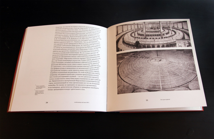
As for the archive of engineer Marsakov, as we learn from the new book, it was at some point misplaced. The engineer himself, not devoid of some architectural talent and having a passion for circular forms (he also designed a circular cafeteria and a circular town), only to die in obscurity because his restless personality became the reason for the fact that he was ultimately exiled to a remote city of Bilimbai. Things do happen. Moscow inherited from Marsakov five circular bread factories, and St. Petersburg inherited two, which, specifically, fed the city during the Nazi siege of Leningrad.
The book "Automated Bread Factory #5. The Masterpieces of avant-garde", Moscow, VTB Cultural Center, 2022
Copyright: Photograph: Julia Tarabarina, Archi.ru
We, however, are interested in the approaches to restoration, readjustment, and, even broader – to the city ensemble, represented in this particular case in the SPEECH project.
The building of Bread Factory #5 received a protected status as a regional heritage site thanks to the efforts of the architect Tatiana Tsareva back in 2004. This is the only bread factory building with a “hard assembled line” in Moscow that has a protected status. In 2006, the production of bread was shut down, and the lane site was bought out by the Coalco company that originally planned to build an office complex here, and then, after the financial crisis of 2008, it was decided to build a housing complex here. The chronology of both construction and restoration are described in the book in detail.
It must be said that the economic performance indicators on the comparatively small site of the bread factory were set as very high from the very start, which spelled grand-size buildings. At the same time, it was only possible to build them on the territory of the 17 later additions in the depth of the site, giving a wide berth to the territory of the factory, which, as we remember, had a protected status asa heritage site.
The search resulted in the Presnya City housing complex; Sergey Tchoban has been designing it since 2014 – three 44-story towers 156 meters high were completed by 2018. The key idea of the project is the ensemble composition: it is constructed around the factory building in its center, and it responds to the town-planning context, which was addressed (upon a closer look) still in the Marsakov building.
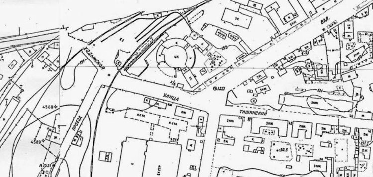
Map of the Presnenskaya Zastava district, fragment-quote of the Moscow map of 1937
Copyright: retromap.ru
In this spot, four streets converge: two of them form the corner of the former Kamer-Kollezhsky Val, the third one is a city side-street, and the fourth one is a former suburban road. Marsakov oriented the axis of the administration building directly on the corner, finding an “arithmetic mean” among the lines of all the roads, thus creating a new beam between the then-new and the then-old town. Although, as we know, the circular building of the factory is subjugated to the pragmatic purpose of the effective conveyor line, the cylindrical shape has a quite self-contained, and quite obvious, plastique expression. The rounded sides of the building arrest one’s gaze, they are distinctly unusual, and they look like tholos temples the size of the Pantheon, yet at the same time they are resemblant of thick fortress towers. If we are to remember that this cylinder is situated on the corner of the former city wall, this is quite a reference to the fortress that once stood here. But then again, we don’t know for sure whether or not Marsakov thought about it. But the fact that he felt the expressiveness of the form and composition is pretty obvious. Thus, the experimental factory is indeed a work of architectural art, not devoid of its unique imagery, although it does not openly admit it – it is not just a conveyor line. Incidentally, such a combination is quite often found in constructivist works, because they could declare breaking away from aesthetics all they wanted but they had a fair bit of artistic taste nonetheless.
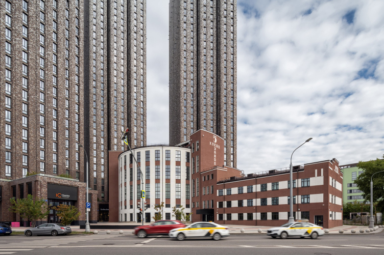
Zotov center for constructivist studies (Bread Factory #5")
Copyright: Photograph © Ilia Ivanov / provided by SPEECH
Sergey Tchoban developed this theme: he continued Marsakov’s “beam” northwest, splitting it into three “slab” towers. The slender ledgy sidewalls of these towers overlook the crossroads; there are openings between them, particularly visible if you look from the center of the city, thanks to which the towers may look like open doors or a gate open wide – which is also not devoid of an underlying meaning because back in the old days, when the Kamer-Kollezhsky Val street still existed here, the Presnya Outpost, one of the main entrances to the city, was situated nearby. Sergey Tchoban interpreted the theme of the city gate on a new scale and on a new level of abstraction, orchestrating an image transition through this accent: from one part of Moscow to another, from the old scale to the new one.
The giant houses stand back from the heritage building with maximum respect and at the same time emphasize its role as a spatial pivot – the key element of the entire ensemble, built at different points in time, but masterfully organized.
The importance of the bread factory building remains unquestionable: it is definitely the king if it has such a suite.
Regarding the function of the heritage building, the book says that the idea of making an exhibition center in the circular part appeared rather early on, but initially the exposition center neighbored on offices, shops, and a restaurant. Sergey Tchoban supported the idea of cultural content of the heritage building, and, for all intents and purposes, apparently, applied considerable perseverance and influence for its implementation, because now, as we can see, the plan has been fully implemented: the entire building has become an exhibition center. A significant part in this was played by VTB Bank that bought out Bakery No. 5 from developer Coalco in 2018. The Bank plans to take part in the development of the Constructivism Center, considering it not just as a sponsorship, but as a philanthropic project, which was announced at the exhibition’s opening ceremony.
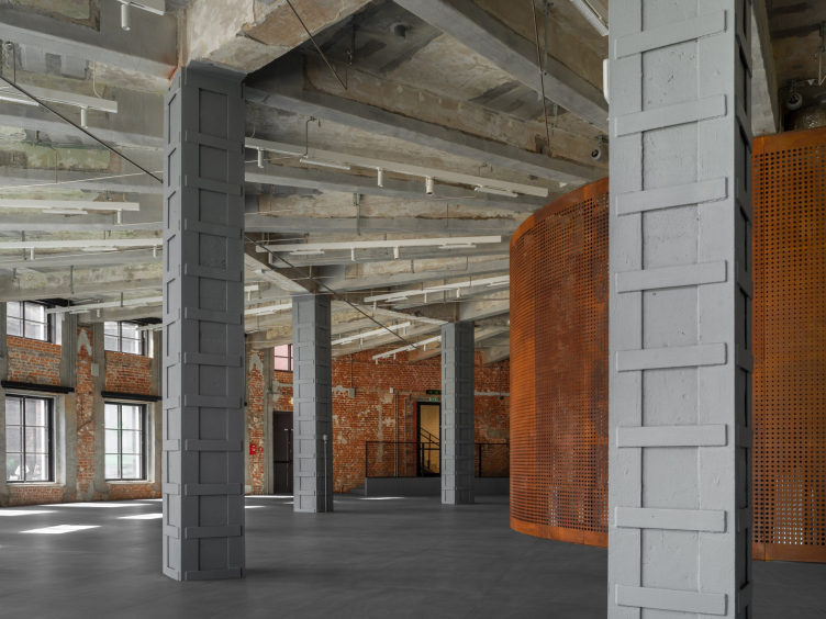
Meanwhile, it must be noted that the approaches to restoring the bread factory were slightly different before and after 2018. In 2015-2018, the restoration project was done by the Center for Integrative Development: its specialist replaced the boards on the roof of the top floor that was damaged in the fire of 2007, and reinforced the bearing structures and the framework columns by encasing them into metal casings. The gray paint of the columns on the first floor was also the Center’s decision.
Zotov center for constructivist studies (Bread Factory #5")
Copyright: Photograph © Ilia Ivanov / provided by SPEECH
In addition, before 2018, the facades were restored. According to the authors of the book, they were restored in the historically correct color pattern with a vertical rhythm of the cylindrical volume and the horizontal pattern of the administration building. In actuality, as far as I understand, we do not know the exact color of the original paint – we can only make judgements by black and white photos. The facades have been covered with a significant amount of stucco (for all intents and purposes, of the cement kind), and a “masonry” pattern was indented into it with gray seams and colored surface, reddish-brown and white. The result looks very neat – Muscovites like neatness – but on the outside the building now looks like a tenement of the beginning of the XX century with its inevitable glazed tiles, i.e. like one of its bourgeois predecessors. Historically, the outer walls of bread factories were brick, painted or smoothly stuccoed. Before the restoration, Bread Factory 5 was carmine-red. As for painting, let alone relief notching to create a masonry effect, these things were not characteristic for the monuments of constructivism. The same is equally applicable to the brown terra cotta color – yes, today it goes well with the towers, but it is hardly historically correct.
Meanwhile, the restoration of the facades was something that the SPEECH architects had nothing to do with, and for working with the interiors Sergey Tchoban proposed a reverse principle.
We made a fundamental decision to preserve the interiors of the bakery building in the state that we received them at the beginning of our work, in 2018, with all the losses and all the layers added later on. Trying to recreate an interior the way it was at some point in its life is an attempt that is by definition doomed to failure because there is no way of knowing what the spaces exactly looked like in the 1930’s – any additional arrangement would be more or less a fantasy.
I consider the full conservation approach to be the most relevant and promising. It has been tested many times in recent decades; specifically, according to my project in the 1990’s, the Java Tower in Hamburg was restored in this way. In the case of conservation, the interior seems to freeze at the moment of its transformation into a museum or cultural space and – in this case – also becomes part of the exposition, since the constructivism research center is now located in it, in the architectural monument of constructivism.
I consider the full conservation approach to be the most relevant and promising. It has been tested many times in recent decades; specifically, according to my project in the 1990’s, the Java Tower in Hamburg was restored in this way. In the case of conservation, the interior seems to freeze at the moment of its transformation into a museum or cultural space and – in this case – also becomes part of the exposition, since the constructivism research center is now located in it, in the architectural monument of constructivism.
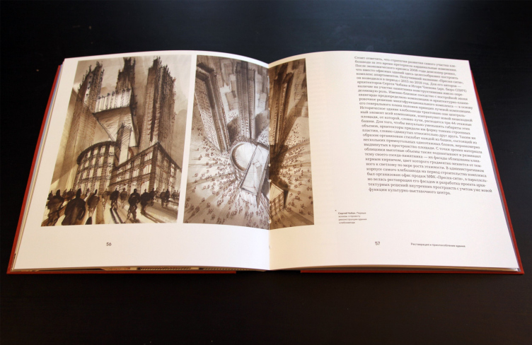
Interestingly, the first sketches done by the architect that we, again, see in the book, there are constructs, in which there is a cantilevered volume that is strung on the factory’s staircase tower a la a horizontal skyscraper – which would have looked bold and beautiful, yet, alas, at odds with the architectural monument. We will emphasize, however, that this graphics, just as many other drawings by Sergey Tchoban, belong in the genre of architectural fantasy; they are more of a meditation than an actual project, even though you can indeed see in this drawing the reflection of the axes of the residential towers.
The book "Automated Bread Factory #5. The Masterpieces of avant-garde", Moscow, VTB Cultural Center, 2022
Copyright: Photograph: Julia Tarabarina, Archi.ru
Anyway, on the inside the preserved the aforementioned glazed tiles, cracked at the edges, white and green, blotched with age and still bearing traces of Soviet paint – on the walls. Another thing that was restored and fitted back in place was the six-faced tiles on the floor of the staircase; the empty spaces were filled with colored cement, so that, on the one hand one could walk on it with no problem, and, on the other hand, the historical losses would be evident.
The new inclusions are conditioned by modern requirements and the exhibition function. One of the factory elevators was damaged beyond repair, and it was replaced by a black chute with ventilation equipment. Another elevator was added for hoisting the exhibits and limited mobility visitors. In order to avoid disturbing the wall tiles once again, water and electricity were routed through metallic pipes – the architects call them “the organ”, and they do look like this musical instrument.
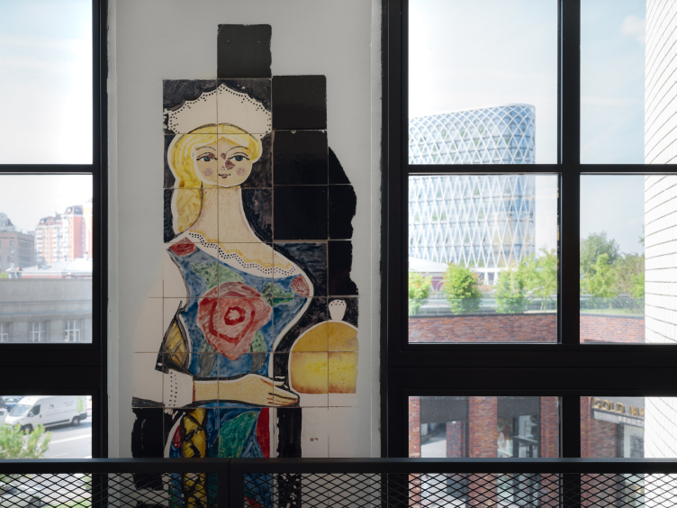
The beauty offering a loaf of bread painted on the wall of the staircase’s third floor – a later addition painted by an unknown artist (around 1979, according to the latest reports) – was preserved, again, along with all the chips and the historically formed blotch on the nose.
Zotov center for constructivist studies (Bread Factory #5")
Copyright: Photograph © Dmitry Chebenenko / provided by SPEECH
Alina Granovskaya, SPEECH, chief architect of the restoration and adaptation project of the bakery building No. 5
Our first thought was: we will not touch anything here – we will preserve all of this unique beauty. We considered the peeling ceiling as some kind of beautiful pictorial abstraction. It was important for us to preserve the surface of the brick in its entirety, and to create a living museum of that time – and not only of the 1930’s, when the building was actually constructed, but also of subsequent periods: the 1950’s, 1960’s, 1970’s... Each generation brought something of its own here, we wanted to preserve all this and show the audience a true picture of the life history of the building.
A lot was done in the process of author’s supervision, in manual mode. In this case, we could not just provide drafts of nodes or a painting pattern and consider our work to be finished. For two years, my colleague Yulia Verbitskaya and I were present at the construction site, discussing every fragment, every square meter.
A lot was done in the process of author’s supervision, in manual mode. In this case, we could not just provide drafts of nodes or a painting pattern and consider our work to be finished. For two years, my colleague Yulia Verbitskaya and I were present at the construction site, discussing every fragment, every square meter.
On the first floor, where the free-entrance public space of the Cultural Forum is situated, the architects uncovered the original brick walls with multiple traces of later repairs and the concrete floor, which also had obviously seen much service, with radius ribs of the beams. The columns, reinforced by metal and painted gray, were kept in the 2018 state. The apertures of some of the windows have been widened to reach down to the floor, so that in summer one could open them and enter thought them from the street outside – because this is an open space, much like a roofed plaza.
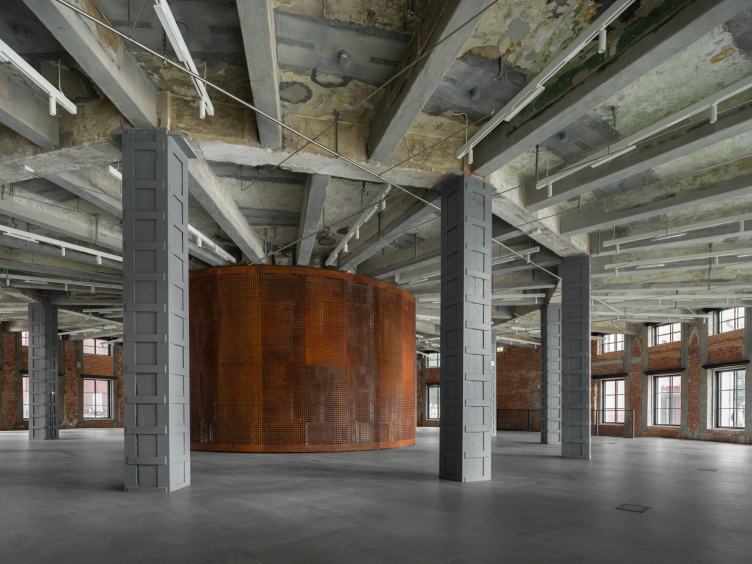
The floor is raised, just as on all the other floors, to make room for utility lines, and this made it possible to expose the ceilings. In the center, we are seeing a cylinder of perforated Corten steel: it covers ventilation and other equipment that is first of all necessary for maintaining a museum climate in the halls. Historically, the central shaft hosted a communication core that connected the conveyor lines of all the four floors of the factory – its size turned out to be too small for the lower tiers, and this is how a volume of a slightly larger diameter appeared, covered in circular openings, which, on the one hand, provide cooling for the equipment, and, on the other hand, allow the curios to peek inside. On the inside, among the casings of the modern equipment, the historical columns are still preserved.
The space of the first floor is picturesque in a Falk-esque way: the gray ceiling, floor, and columns resonate with each other, and the old brick walls exchange “salutes” with the modern Corten core. Strictly speaking, there are two main colors here, gray and terra cotta, but these, on the one hand, dissolve in shades and natural gradients, and, on the other hand, the place is equipped with a backlighting system that can provide any color – installations with be staged here, including light ones. Thus, the space can be any color you like. But it is already picturesque and packed with emotional triggers.
Zotov center for constructivist studies (Bread Factory #5")
Copyright: Photograph © Dmitry Chebenenko / provided by SPEECH
The two halls on the next floor, designed for exhibitions – it is in them that the museum-grade climate is maintained – are designed in approximately the same way, as though they were a monochromatic “replica” of the first tier. The walls are covered with drywall, ventilation outlets are located in the window chamfers, and niches with access to the equipment are provided in the piers. The floors also contain engineering equipment, and are raised by 40-60 cm everywhere. Before the concrete ribs of the ceilings, there are slender structures for mounting spotlights and hanging exhibits. Historically, the third floor was slightly less tall than the second, but the windows were identical, and because of this the difference in height is felt particularly acutely: on the third floor, the windows almost reach down to the floor.
The topmost 4th floor is also a public space; you can get here ticket-free but by prior registration. This place hosts a lecture hall and two movie halls. One does not need as much equipment here, so there is no metallic cylinder in the middle; what we are seeing is the original factory core with the remains of the tiles and traces of former apertures, which starts us wondering where and how they fed the flour: it was hoisted upwards to this point, and the whole process developed from here and downwards. The framework here has also been reinforced, but the ceiling is made of wood, and the columns are slender, so the interior became particularly free and full of light. The brick walls and the ceiling are painted in one layer of white, which helps preserve the textures; the hall of the fourth floor seems to be a hybrid between the color design of the first tier and the neutral whiteness of the exposition spaces.
It was not accidental that these spaces were shown to journalists before they were filled with exhibitions or installations – they are interesting in their own right. Particularly good is the natural light. The windows are situated in a circle, and on a sunny day it produces quite a stunning effect: the stripes of light remind of a sundial, the rounded halls are mesmerizing, and you want to freeze in them forever – like in the early Christmas rotunda temples. However, since most modern expositions require controllable artificial light, and not every exhibit favors sunlight, the halls, of course, provide an opportunity to shut the windows down.
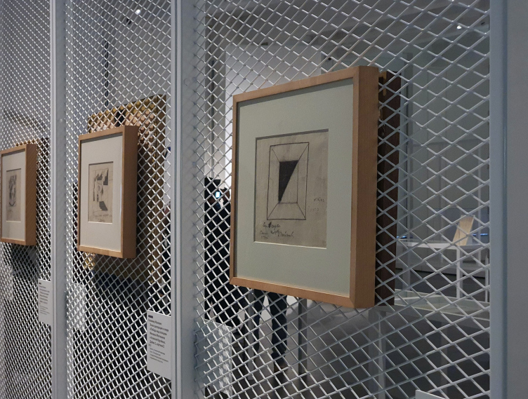
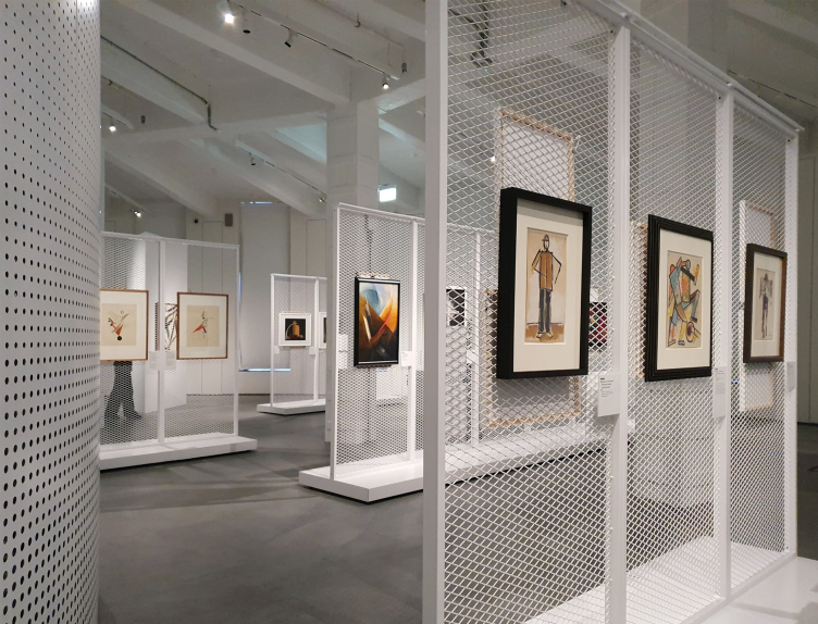
What is also significant is the fact that the same architects – Sergey Tchoban, Alina Garnovskaya, and Alexandra Sheiner – also designed the first exhibition, dedicated to the beginning of the constructivist movement and its backstory. The architects proposed white modular showcases made of metallic mesh, so, when looking at one picture, we sometimes see the back of another, sometimes with a signature. The showcases are mounted on casters, you can easily roll them around or daisy chain them. They also have a feature of covering the mesh with a thin screen, making the partition non-transparent. The signature plates are mounted on magnetic fasteners, they can be easily moved to any place; according to the same principle, some of the plates are designed inside the Center, including the QR-code ones that accompany the tour.
The exhibition "1922. Constructivism. The inception" in the Zotov center for constructivist studies (Bread Factory #5")
Copyright: Photograph: Julia Tarabarina, Archi.ru
The reusable showcases will be used during the future exhibitions, which makes them particularly convenient and environmentally friendly. Currently, the thin planes of the “carriers” are arranged mostly in a fan-like fashion, with beams converging in the center, and Alina Garnovskaya confirms that this solution helped the designers to cope with the beautiful, yet challenging for expo design, circular space of the halls. The same metallic mesh, yet black, was used to make the barriers for the staircases and ramps, i.e. the composition is flesh and blood of the interior.
The exhibition "1922. Constructivism. The inception" in the Zotov center for constructivist studies (Bread Factory #5")
Copyright: Photograph: Julia Tarabarina, Archi.ru
In other words, the architects “followed through” with the project, starting from the housing complex and ending with restoration of the interiors, designing the program of the Center, publishing a book about the building and the first exhibition, and even providing the project with a modular expo construction set.
This all seems to be some kind of Gesamtkunstwerk, a synthetic work of art: from a housing complex to a museum exposition. And it was done in an integrated, careful, and passionate way. This is something that is rarely seen in Moscow; as a rule, too much depends on circumstances here, and the clients are somehow able to separate facades from the floor plans and entrance groups. In this particular case, however, the heart and soul of the whole story is the architect, which is pretty much like a dream come true. Unbelievable.
At this point, we must remember that Sergey Tchoban is not quite a usual architect: specifically, he built his own Museum for Architectural Drawing in Berlin, he organizes exhibitions, does expo design, and publishes books – his initiatives are pretty numerous. And, to a certain degree, it was him who “injected” this “synthetic” approach into Moscow architectural tradition. In the context of his authorship, this bread factory building story looks like a quite logical continuation of the architect’s initiatives.
On the other hand, we can remember that this year Sergey Tchoban completed the reconstruction of not just one but two buildings with a cultural function. The first one is the project of Nizhny Novgorod warehouses, and the second one is Zotov in Moscow – these two are fun to compare. In each of them, only a part of the original something is preserved, and every time through no fault of the architect. The walls of the warehouses were dismantled in 2017, and the facades of the bread factory were stuccoed by 2018. In both cases, Sergey Tchoban works on the task of exhibiting what was left of the buildings before the start of his work, and it must be admitted, exhibits this without any compositional additions, really exhibiting what he received, making a record of the historical state.
Besides, both projects are based on a mix of two exhibition ideas of modern days: a big white box of a former industrial origin that is used to present modern art.
And what we see in both cases is a carefully staged tension between the old and the new. The difference is that in the case of the Nizhny Novgorod warehouses the tension is between the old metal structures and their reflections in polished steel, and this tension is very acute and articulated. Zotov, however, is a more complex story that involves the city, the towers of Presnya City, modern technology inclusions on the inside, and a just as modern approach to preserving all the layers of the heritage building, even, and maybe especially, those that nobody formally requested to preserve.
Thus, the word “layer” becomes the clue for understanding the project: not only does it preserve the multiple layers of different Soviet decades in the interior – they can also be quite easily read. You suddenly give a start – sometimes because of the large-scale contrast on the outside, and sometimes because of Zotov’s glossy facades. Once you get inside, at some point you get scared of the Soviet reality of the preserved fragments surrounding you, as if you are in a dream and still back at school at the factory labor practice. Then at last you realize that you are in the postindustrial reality, where you need to feel things and not show heroic labor results; realize that the past is indeed the past, and you can study it now. This sets your mind on the right track at the subtle level of emotional perception, and, surprisingly, it works against nostalgia and in favor of distancing yourself from these things. This “contrast shower” alone is enough of a reason for such a thorough conservation that was performed here.
So, there isn’t any paradox here – just a vector of global development of cultural mentality – and one should think this development cannot be stopped. This is why the project inspires hope.


