По-русски

The “Snake” Mountain

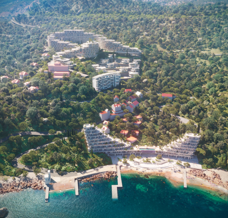
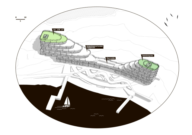
The competition project for the seaside resort complex “Serpentine” combines several typologies: apartments of different classes, villas, and hotel rooms. For each of these typologies, the KPLN architects employ one of the images that are drawn from the natural environment – a serpentine road, a mountain stream, and rolling waves.

29 February 2024
send.project
mainImg
The project participated in a closed-door competition held in 2022. The timeline for its execution is currently unknown, and we are not disclosing the exact location at the client’s request.

However, we have sufficient information about the context of this project. The “Serpentine” complex is planned to be built in Crimea on the outskirts of a well-known seaside resort village, quite typical for the southern coast: it stretches across the slopes of a green strip between the sea and relatively bare mountain ridges. The cape where the complex will appear is situated pretty far away from the classic resort “activities” and therefore looks private and more “local” than touristy. This area is mostly built with mansions featuring red tiled roofs, only disrupted by a seven-story “slab” of apartments. Although the place is quite lively, the infrastructure is somewhat scarce, with houses hidden behind trees, and nature gradually consuming a few unfinished constructions. The attractiveness of the location is evident, as a sleek white villa, designed by an Italian/English architect, stands right by the shore.

Apartment complex on the South Coast of Crimea
Copyright: © KPLN


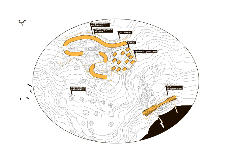
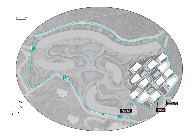
What makes the project unique is the fact that it is situated on two separate land sites. The smaller one is situated on the first line from the sea, while the larger one is closer to the South Coast Highway. Both territories are former Soviet seaside resort complexes with almost no remnants of their history. The composition of the new complex is diverse, including apartments of different classes, villas, a certain number of hotel rooms, and accompanying infrastructure that would allow owners and tenants to access all services without leaving the cape.

Apartment complex on the South Coast of Crimea. The location plan
Copyright: © KPLN


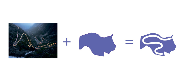
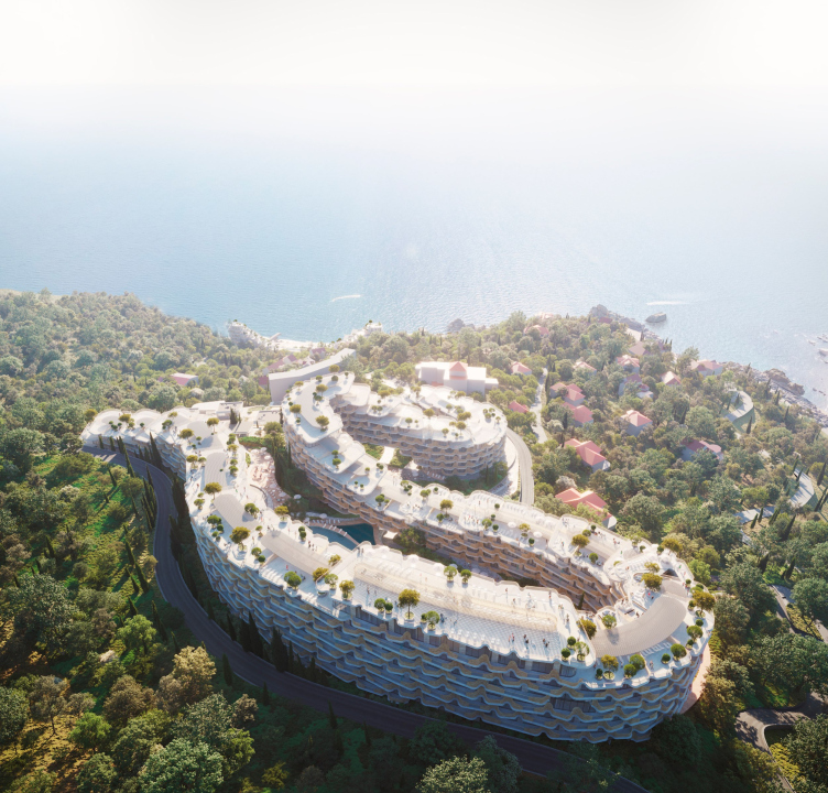
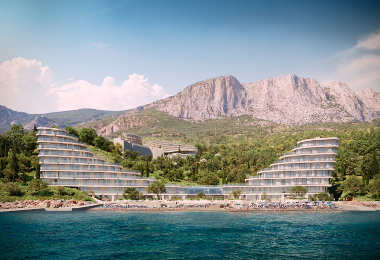
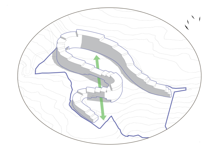
At the core of the concept proposed by KPLN architects lies the idea of a mountain serpentine: terraced buildings cascade down from the mountains to the sea, with each point and turn revealing a new view.

Apartment complex on the South Coast of Crimea. The idea
Copyright: © KPLN


The “Snake” Mountain

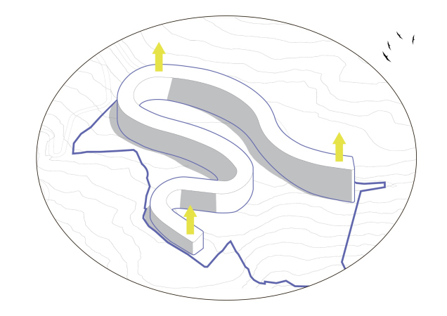
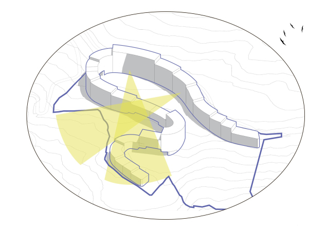
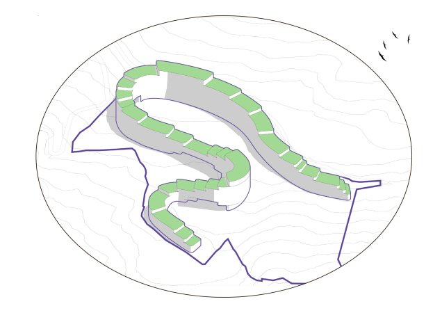
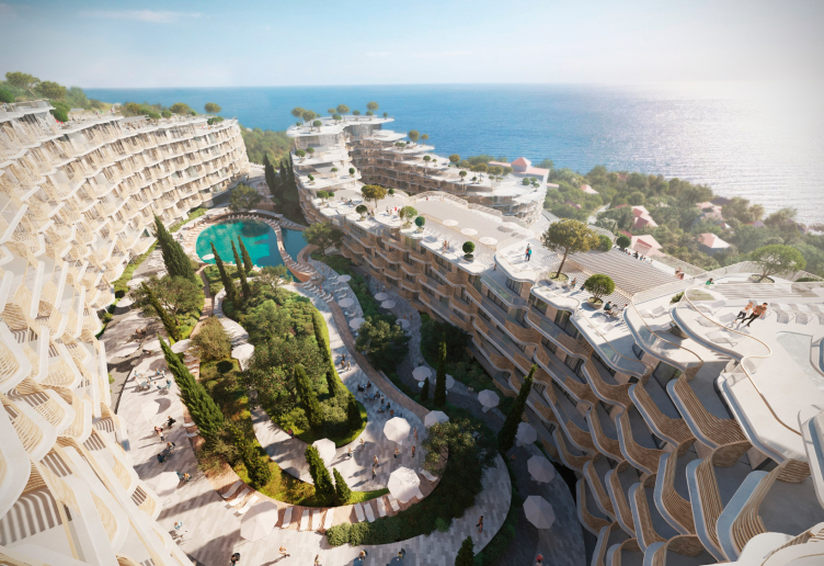
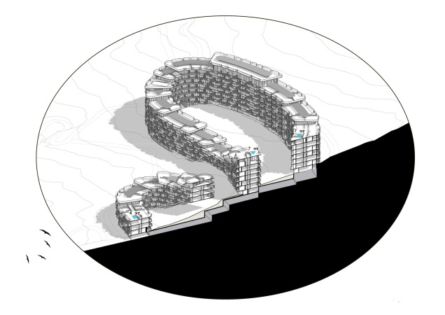
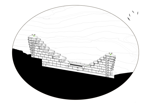
The “serpentine” concept is most prominently developed in the apartment building. In this plot, the architects “lay down” the road like a ribbon, adapting it to the terrain on one hand and gaining sufficient construction volume on the other. This allowed the architects to effectively manipulate the silhouette: the turns of the road accentuate the taller sections, with the floor levels decreasing towards the edges of the plot, ensuring everyone can enjoy the mountain and sea views.

  • zooming
    1 / 3
    Apartment complex on the South Coast of Crimea. The form making
    Copyright: © KPLN
  • zooming
    2 / 3
    Apartment complex on the South Coast of Crimea. Regulation of the number of floors
    Copyright: © KPLN
  • zooming
    3 / 3
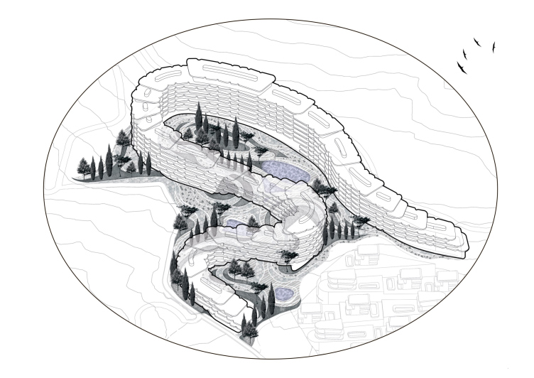
    Apartment complex on the South Coast of Crimea. 8000 m2 of private terraces
    Copyright: © KPLN


Achieving a sufficiently fragmented division into sections, the architects then soften the effect, articulating horizontal divisions in the buildings. As a result, the observer sees not so much sections as layers, which look like plates of limestone deposits or exposed sinkhole formations. At the bottom of the building, there are four layers, while the highest one has eight. The similarity to a wind-blown mountain, where swallows can comfortably nest in the crevices, is enhanced by the notched outline of terraces and balconies.

Apartment complex on the South Coast of Crimea. Forming the extra plastique of the facades
Copyright: © KPLN


The “scales” of overlapping terraces, the convergence of “rings”, the flat “head” and “tail”, as well as the building’s thickening towards the center – all contribute to the building’s resemblance to a snake, basking in the sun after a successful hunt, eventually turning into stone – much like a cat or a bear. This analogy is indicated by the “Serpentine” name of the complex. Continuing the search for analogies, one can also point to a reference to the Genoese fortress in Sudak, with its serrated walls and towers obediently following the vagaries of the terrain.

Apartment complex on the South Coast of Crimea
Copyright: © KPLN


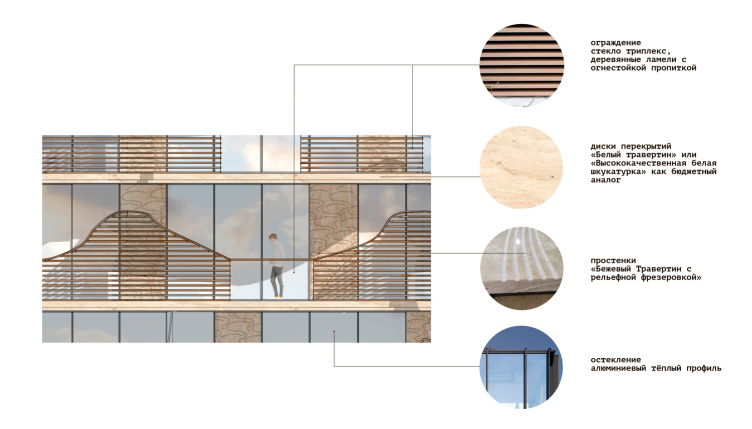
For the façade finishes, the architects propose using materials that would bring the building closer to the surrounding nature: travertine or glass-fiber-reinforced concrete with relief milling, wooden slats, and triple-layered glass for the balcony railings.

Apartment complex on the South Coast of Crimea. A facade fragment. Version 1
Copyright: © KPLN


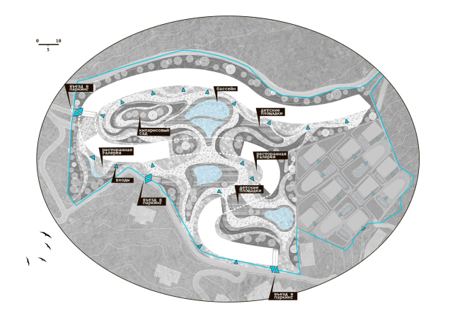
The curves of the building form a private courtyard and two cozy squares. These spaces are intended for children’s playgrounds, restaurant terraces, swimming pools, promenades, and gardens for relaxation and sunbathing.

Apartment complex on the South Coast of Crimea
Copyright: © KPLN


Apartment complex on the South Coast of Crimea
Copyright: © KPLN


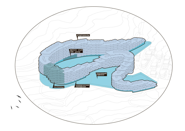
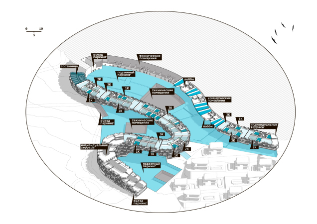
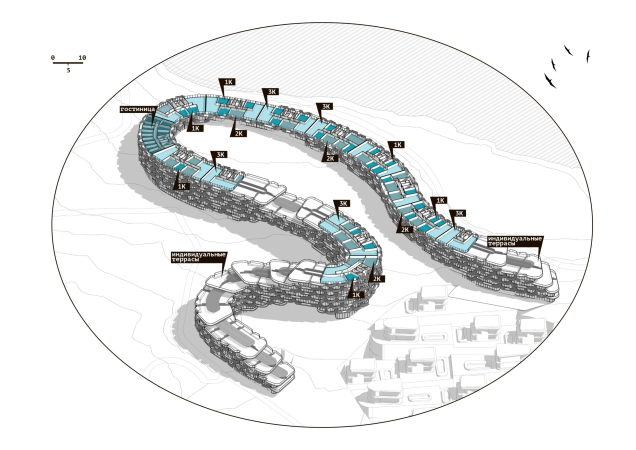
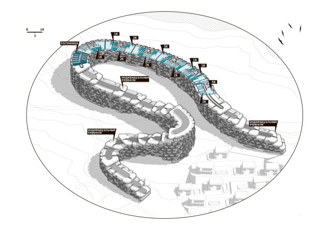
The contour of the first floor will mainly house technical and commercial premises; smaller sections are allocated for a fitness center and a hotel block. In total, “Serpentine” will comprise approximately 900 apartments ranging from 35 to 100 square meters. Those on the upper floors have access to a rooftop terrace. An underground parking garage for 182 cars is provided.

  • zooming
    1 / 6
    Apartment complex on the South Coast of Crimea. THe master plan (simplified)
    Copyright: © KPLN
  • zooming
    2 / 6
    Apartment complex on the South Coast of Crimea. The functional zones
    Copyright: © KPLN
  • zooming
    3 / 6
    Apartment complex on the South Coast of Crimea. Entrance level plan including parking lot
    Copyright: © KPLN
  • zooming
    4 / 6
    Apartment complex on the South Coast of Crimea. Plan of the standard floor
    Copyright: © KPLN
  • zooming
    5 / 6
    Apartment complex on the South Coast of Crimea. Plan of the upper standard floor
    Copyright: © KPLN
  • zooming
    6 / 6
    Apartment complex on the South Coast of Crimea. A section view
    Copyright: © KPLN


The Water Cascades

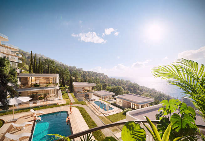
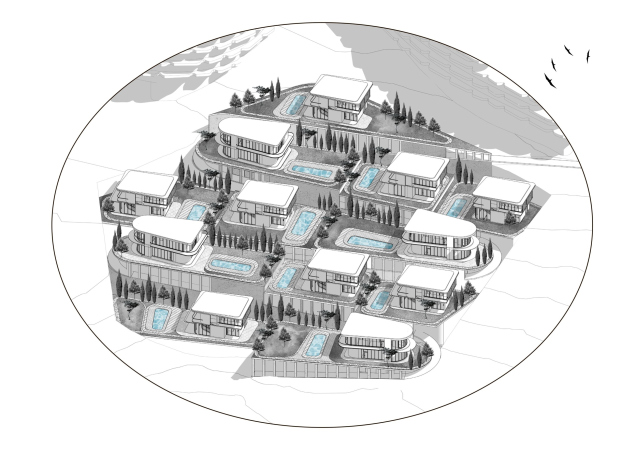
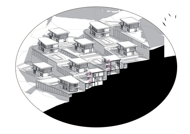
Not only serpentine roads descend from the mountains, but also streams that carve their winding path. This imagery aligns more with the concept of twelve villas situated on the same plot as the apartments, but lower down the slope, standing closely together. The pronounced relief allows for sufficient privacy: each “terrace” accommodates from one to three villas, separated by swimming pools. All villas are organized similarly, comprising two above-ground floors and one underground floor with a parking garage, but some boast a larger area – up to 400 m2. The finishing materials are the same as those used in the apartment building.

  • zooming
    1 / 4
    Apartment complex on the South Coast of Crimea
    Copyright: © KPLN
  • zooming
    2 / 4
    Apartment complex on the South Coast of Crimea. The villas
    Copyright: © KPLN
  • zooming
    3 / 4
    Apartment complex on the South Coast of Crimea. A section view
    Copyright: © KPLN
  • zooming
    4 / 4
    Apartment complex on the South Coast of Crimea. The master plan (simplified)
    Copyright: © KPLN


The Rolling Waves

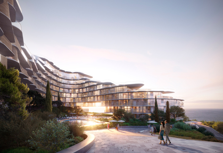
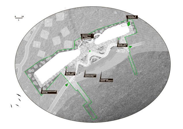
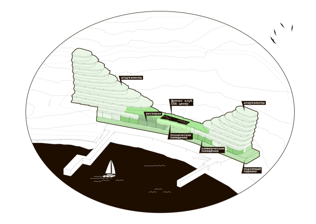
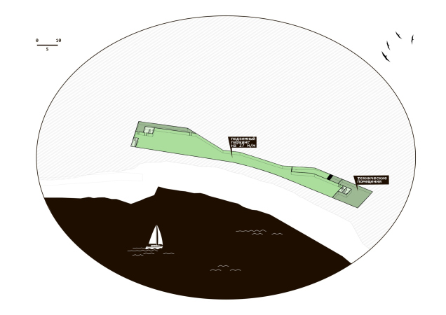
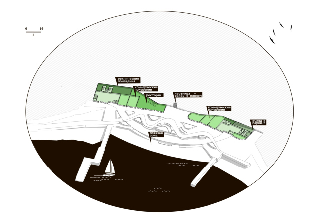
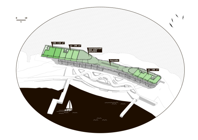
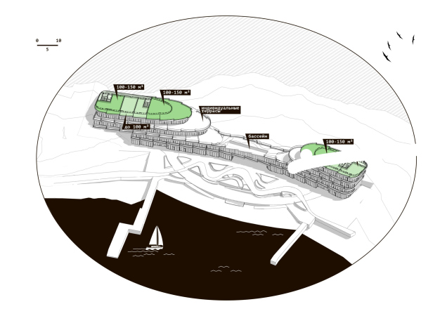
The architects place the hotel building right at the water’s edge, promising guests exceptional views of the sea expanse. It is constructed from the same structural units as the apartments: terraces and layers, uneven edges of terraces, travertine, wood, and stucco. However, the imagery for this building is entirely different: it resembles parting waters rather than rocky soil. The space between the two structures leaves the mountain panorama from the sea side open – significant for both those bathing in the sea and the swimming pool and for the passing ships.

Apartment complex on the South Coast of Crimea
Copyright: © KPLN


The two buildings feature a total of 44 apartments, starting from 100 m2 and larger. They are connected by a stylobate with a restaurant, a fitness center, a swimming pool, and shops. The high-class real estate necessitates an underground parking for 27 cars. In front of the building, a promenade and square with spaces for relaxation and contemplation of the sea are planned.

  • zooming
    1 / 8
    Apartment complex on the South Coast of Crimea. The master plan (simplified)
    Copyright: © KPLN
  • zooming
    2 / 8
    Apartment complex on the South Coast of Crimea. The functional zones
    Copyright: © KPLN
  • zooming
    3 / 8
    Apartment complex on the South Coast of Crimea. Plan on the -1 floor level
    Copyright: © KPLN
  • zooming
    4 / 8
    Apartment complex on the South Coast of Crimea. Plan on the 1 floor level
    Copyright: © KPLN
  • zooming
    5 / 8
    Apartment complex on the South Coast of Crimea. Plan on the 3 floor level
    Copyright: © KPLN
  • zooming
    6 / 8
    Apartment complex on the South Coast of Crimea. Plan on the 5 floor level
    Copyright: © KPLN
  • zooming
    7 / 8
    Apartment complex on the South Coast of Crimea. Plan on the 5 floor level
    Copyright: © KPLN
  • zooming
    8 / 8
    Apartment complex on the South Coast of Crimea. A section view
    Copyright: © KPLN


The Forest Trails

Considering the significant distance between the two plots, the architects have also wisely designed connections between different parts of the complex and laid pedestrian routes to the sea. Arches, passageways, galleries, cantilevers, and stairs unite the landscaped environment and make it much more transparent. The main entrance and access to the complex are located closer from the side of the highway.

Apartment complex on the South Coast of Crimea. THe transparency of the courtyards. Access to the sea
Copyright: © KPLN


29 February 2024

Headlines now
Flexibility and Integration
Not long ago, we covered the project for the fourth phase of the ÁLIA residential complex, designed by APEX. Now, we’ve been shown different fence concepts they developed to enclose the complex’s private courtyards, incorporating a variety of public functions. We believe that the sheer fact that the complex’s architects were involved in such a detail as fencing speaks volumes.
A Step Forward
The HIDE residential complex represents a major milestone for ADM architects and their leaders Andrey Romanov and Ekaterina Kuznetsova in their quest for a fresh high-rise aesthetic – one that is flexible and layered, capable of bringing vibrancy to mass and silhouette while shaping form. Over recent years, this approach has become ADM’s “signature style”, with the golden HIDE tower playing a pivotal role in its evolution. Here, we delve into the project’s story, explore the details of the complex’s design, and uncover its core essence.
Gold in the Sands
A new office for a transcontinental company specializing in resource extraction and processing has opened in Dubai. Designed by T+T Architects, masters of creating spaces that are contemporary, diverse, flexible, and original, this project exemplifies their expertise. On the executive floor, a massive brass-clad partition dominates, while layered textures of compressed earth create a contextually resonant backdrop.
Layers and Levels of Flight
This project goes way back – Reserve Union won this architectural competition at the end of 2011, and the building was completed in 2018, so it’s practically “archival”. However, despite being relatively unknown, the building can hardly be considered “dated” and remains a prime example of architectural expression, particularly in the headquarters genre. And it’s especially fitting for an aviation company office. In some ways, it resembles the Aeroflot headquarters at Sheremetyevo but with its own unique identity, following the signature style of Vladimir Plotkin. In this article, we take an in-depth look at the United Aircraft Corporation (UAC) headquarters in the Moscow agglomeration town of Zhukovsky, supplemented by recent photographs from Alexey Naroditsky – a shoot that became only recently possible due to the fact that improvements were finally made in the surrounding area.
Light and Shadow
In this article, we delve into the architectural design of the “Chaika” house by DNK ag architects, which was recently completed in 2023 as part of the collection of signature designs at ZILArt. As is well-known, all the buildings in this complex follow a design code, yet each one is distinct. This particular building stands out not only for its whiteness and minimalism but also for the refined use of a limited number of techniques that, together, create what can confidently be called synergy.
Casus Novae
A master plan was developed for a large residential area with a name of “DNS City”, but now that its implementation began, the plan has been arbitrarily reformatted and replaced with something that, while similar on the surface, is actually quite different. This is not the first time such a thing happens, but it’s always frustrating. With permission from the author, we are sharing Maria Elkina’s post.
Treasure Hunting
The GAFA bureau, in collaboration with Tegola and Arkhitail, organized an expedition to the island of Kilpola in Karelia as part of Moskomarkhitektura’s “Open City” festival. There, amidst moss and rocks, the students sought answers to questions like: what is the sacred, where does it dwell, and what sustains it? Assisting the participants in this quest were landscape engineer Evgeny Levin, artist Nicholas Roerich, a moose, and the lack of cellular connection. Here’s how the story unfolded.
Depths of the Earth, Streams of Water
In the Malaya Okhta district, the Akzent building, designed by Stepan Liphart, was constructed. It follows a classic tripartite structure, yet it’s what you might call “hand-drawn”: each façade is unique in its form and details, some of which aren’t immediately noticeable. In this article, we explore the context and, together with the architect, delve into how the form was developed.
Fir Tree Dynamics
The “Airports of Region” holding is planning to build an airport in Karachay-Cherkessia, aiming to make the Arkhyz and Dombay resorts more accessible to travelers. The project that won in an invitation-only competition, submitted by Sergey Nikeshkin’s KPLN, blends natural imagery inspired by the shape of a conifer seed, open-air waiting spaces, majestic large trees, and a green roof elevated on needle-like columns. The result is both nature-inspired and WOW.
​A Brick Shell
In the process of designing a clubhouse situated among pine trees in a prestigious suburban area near Moscow, the architectural firm “A.Len” did the façade design part. The combination of different types of brick and masonry correlates with the volumetric and plastique solutions, further enhanced by the inclusion of wood-painted fragments and metal “glazing”.
Word Forms
ATRIUM architects love ambitious challenges, and for the firm’s thirtieth anniversary, they boldly play a game of words with an exhibition that dives deep into a self-created vocabulary. They immerse their projects – especially art installations – into this glossary, as if plunging into a current of their own. You feel as if you’re flowing through the veins of pure art, immersed in a universe of vertical cities, educational spaces – of which the architects are true masters – and the cultural codes of various locations. But what truly captivates is the bold statement that Vera Butko and Anton Nadtochy make, both through their work and this exhibition: architecture, above all, is art – the art of working with form and space.
Flexibility and Acuteness of Modernity
Luxurious, fluid, large “kokoshniks” and spiral barrel columns, as if made from colorful chewing gum: there seem to be no other mansion like this in Moscow, designed in the “Neo-Russian-Modern” style. And the “Teremok” on Malaya Kaluzhskaya, previously somewhat obscure, has “come alive with new colors” and gained visibility after its restoration for the office of the “architectural ecosystem” as the architects love to call themselves. It’s evident that Julius Borisov and the architects at UNK put their hearts into finding this new office and bringing it up to date. Let’s delve into the paradoxes of this mansion’s history and its plasticity. Spoiler: two versions of modernity meet here, both balancing on the razor’s edge of “what’s current”.
Yuri Vissarionov: “A modular house does not belong to the land”
It belongs to space, or to the air... It turns out that 3D printing is more effective when combined with a modular approach: the house is built in a workshop and then adapted to the site, including on uneven terrain. Yuri Vissarionov shares his latest experience in designing tourist complexes, both in central Russia and in the south. These include houseboats, homes printed from lightweight concrete using a 3D printer, and, of course, frame houses.
​Moscow’s First
“The quality of education largely depends on the quality of the educational environment”. This principle of the last decade has been realized by Sergey Skuratov in the project for the First Moscow Gymnasium on Rostovskaya Embankment in the Khamovniki district. The building seamlessly integrates into the complex urban landscape, responding both to the pedestrian flow of the city and the quiet alleyways. It skillfully takes advantage of the height differences and aligns with modern trends in educational space design. Let’s take a closer look.
Looking at the Water
The site of Villa Sonata stretches from the road to the water’s edge, offering its own shoreline, pier, and a picturesque river panorama. To reveal these sweeping views, Roman Leonidov “cut” the façade diagonally parallel to the river, thus getting two main axes for the house and, consequently, “two heads”. The internal core – two double-height spaces, a living room and a conservatory, with a “bridge” above them – makes the house both “transparent” and filled with light.
The White Wing
Well, it’s not exactly white. It’s more of a beige, white-stone structure that plays with the color of limestone – smoother surfaces are lighter, while rougher ones are darker. This wing unites various elements: it absorbs and interprets the surrounding themes. It responds to everything, yet maintains a cohesive expression – a challenging task! – while also incorporating recognizable features of its own, such as the dynamic cuts at the bottom, top, and middle.
Urban Dunes
The XSA Ramps team designed and built a three-part sports hub for a park in Rostov-on-Don, welcoming people of all ages and fitness levels. The skate plaza, pump track, and playground are all meticulously crafted with details that attract a diverse range of visitors. The technical execution of the shapes and slopes transforms this space into a kind of sculptural composition.
Proportional Growth
The project for the fourth phase of the ÁLIA residential area has been announced. The buildings are situated on an elongated plot – almost a “ray” that shoots out from the center of the area towards the river. Their layout reflects both a response to Moscow’s architectural preferences over the past 15 years, shifting “from blocks to towers”, and an interpretation of the neighboring business park designed by SOM. Additionally, the best apartments here are not located at the very top but closer to the middle, forming a glowing “waistline”.
The “Staircase” Building
In designing the “Details” residential complex in New Moscow, Rais Baishev spiced up the now-popular Moscow theme of a “courtyard” building with an idea drawn from the surrealist drawings by Maurits Escher. He envisioned the stepped silhouettes and descending slopes as a metaphysical mega-staircase, creating a key void within the courtyard that gave the project an internal “spine”. This concept is felt both in the building’s silhouette and on its façades.
Projection of the Quarter
No one doubted that the building that Vladimir Plotkin designed as part of the “Garden Quarters” would be the most modernist of all. And it turned out just that way: while adhering to the common design code, the building successfully combines brick and white stone, rhythmically responding to the neighboring building designed by Ostozhenka, yet tactfully and persistently making a few statements of its own. This includes the projection of the ideal urban development composition “14–9–6”, which can be found right next door, mathematical calculations, including those for various types of terraces (and perhaps the only reminder of the Soviet past of the Kauchuk rubber factory!), and the white “cross-stitch” pattern of the façade grid.
Domus Aurea
In this issue, we examine the “Tessinsky-1” house, designed by Sergey Skuratov and completed in 2023. Located in the middle of the Serebryanicheskaya Embankment district, at the intersection of its main streets, this house assumes a sort of “nodal” role: it not only responds to everything around it and preserves many memories of the former EMA factory within itself, but it weaves all this into a newly directed pattern, reconciling bright “gold” and dark-colored brick, largely with the help of the new, modern-yet-archaic Columba brick, which, come to think about it, is the most precious element here.
The Chimney of Nikola-Lenivets
In this issue, we are examining the “Obelisk House” designed by KATARSIS and built for the Arkhstoyanie 2023 festival. However, it was only finished later on, and this is why we are examining it now. It seems to us that after the “Obelisk House” appeared in Nikola-Lenivets, a dialogue and a few inner connections appeared between the temporary structures built here. These houses no longer look like “accidental neighbors”, more of which below.
​Periscope by the Bay
The jury awarded the second place in the competition for a public and cultural center in Petropavlovsk-Kamchatsky to the companies GORA (“Mountain”) and M4. In the consortium’s proposal, the building resembles a sperm whale with a calf swimming next to it or a periscope, whose lenses capture the most spectacular views from the surrounding landscape.
From Arcs to Dolmens
While working on the competition project for Petropavlovsk-Kamchatsky, ASADOV Architects prioritized the value of the natural and urban environment, aiming to preserve the balance of the location while minimizing the resemblance of the volume that they designed to a “traditional building”. The task was challenging, and the architects created three versions, one of which having been developed after the competition, where their main proposal took third place. However, the point of interest here is not the competition result but the continuity of creative thinking.
Hide and Seek
The ID Moskovskiy house, designed by Stepan Liphart in St. Petersburg, in the courtyards near Moskovskiy Avenue beyond the Obvodny Canal and recently completed, is notable for several reasons. Firstly, it has been realized with considerable accuracy, which is particularly significant as this is the first building where the architect was responsible not only for the facades but also for the layouts, allowing for better integration between the two. On the other hand, this building is interesting as an example of the “germination” of new architecture in the city: it draws on the best examples from the neighborhood and becomes an improved and developed sum of ideas found by the architect in the surrounding context.
The Big Twelve
Yesterday, the winners of the Moscow Mayor’s Architecture Award were announced and honored. Let’s take a look at what was awarded and, in some cases, even critique this esteemed award. After all, there is always room for improvement, right?
Above the Golden Horn
The residential complex “Philosophy” designed by T+T architects in Vladivostok, is one of the new projects in the “Golubinaya Pad” area, changing its development philosophy (pun intended) from single houses to a comprehensive approach. The buildings are organized along public streets, varying in height and format, with one house even executed in gallery typology, featuring a cantilever leaning on an art object.
Nuanced Alternative
How can you rhyme a square and space? Easily! But to do so, you need to rhyme everything you can possibly think of: weave everything together, like in a tensegrity structure, and find your own optics too. The new exhibition at GES-2 does just that, offering its visitor a new perspective on the history of art spanning 150 years, infused with the hope for endless multiplicity of worlds and art histories. Read on to see how this is achieved and how the exhibition design by Evgeny Ace contributes to it.
Blinds for Ice
An ice arena has been constructed in Domodedovo based on a project by Yuri Vissarionov Architects. To prevent the long façade, a technical requirement for winter sports facilities, from appearing monotonous, the architects proposed the use of suspended structures with multidirectional slats. This design protects the ice from direct sunlight while giving the wall texture and detail.
Frozen Magma
A competition for the creation of a public and cultural center was held in Petropavlovsk-Kamchatsky. Three architectural companies made it to the final, and we consider it important to share about the work of each. Let’s start with the winner – the consortium led by Wowhaus.