По-русски

A Tectonic Shift

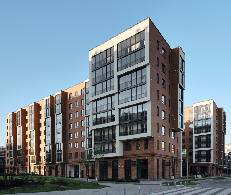
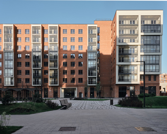
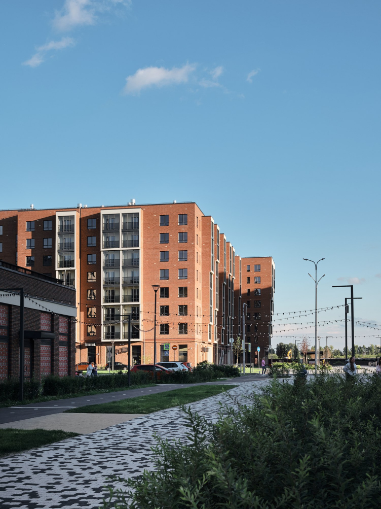
For several years now, Futura Architects have been working with the “New Peter” residential area in the south of St. Petersburg. In this article, we are covering their most recent project – a house, in which the architects’ architectural ideas peacefully coexist with the limitations of comfort-class housing, producing a “multilayered” effect that looks very attractive for this typology.

14 October 2022
Object
mainImg
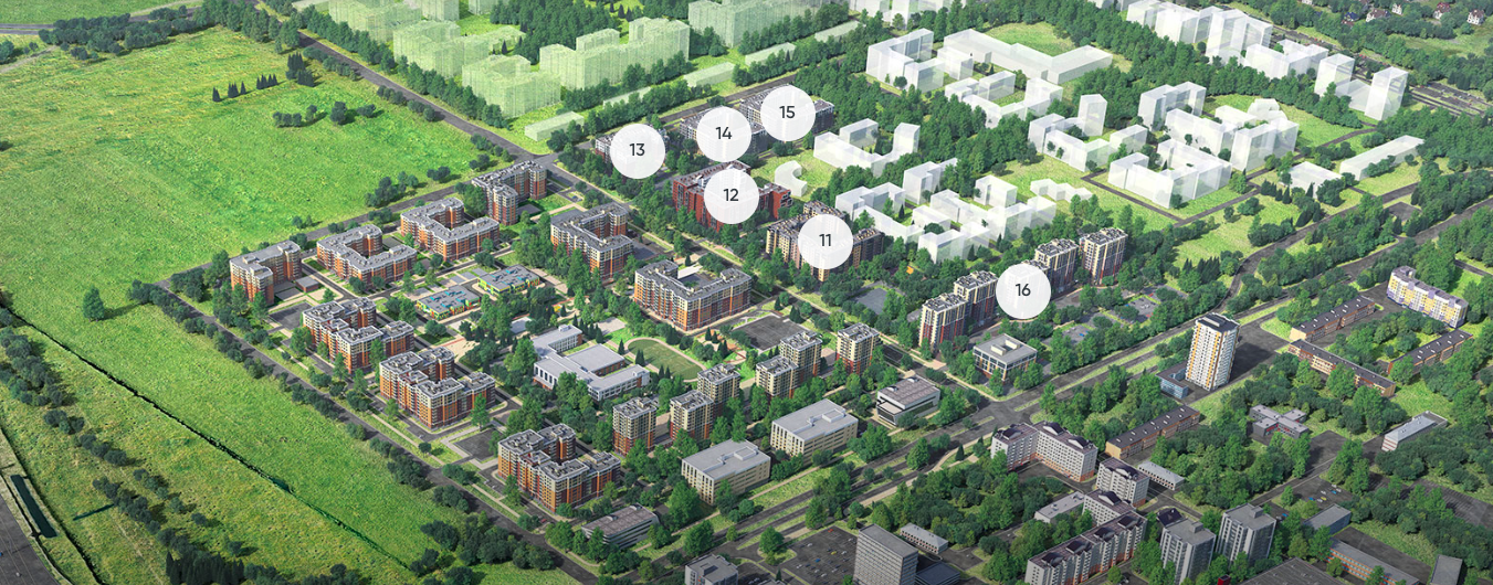
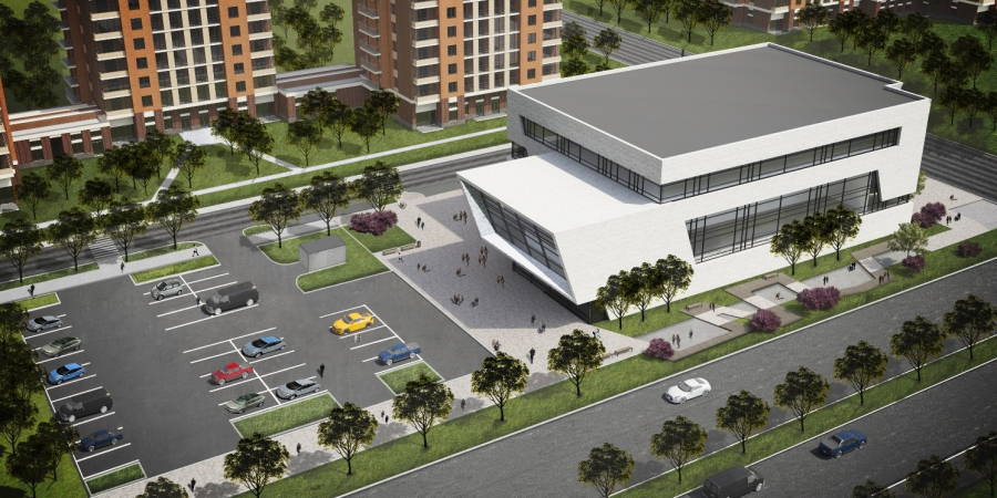
The “New Peter” area is a grand-scale project by the development company “Stroitelny Trest “ (“Construction Trust”) located in the settlement of Novoselie: in total, it is expected to contain about 40 houses standing on 87 hectares of former farmland, about a third of which has already been developed. The residential blocks will stretch the whole length of the local Krasnoselskoe Highway, east of which new roads are currently being built – names have already been assigned to Pitersky Avenue and Nevskaya Street. From the north, New Peter is pushed by the St. Petersburg Ring Road, whose junction partially makes up for the remote location of Novoselye, hinted at by the very name of this place (literally “New Settlement”) – behind it, the multistory buildings stop short, giving way to forestland interspersed with country homes.

zooming
The master plan of New Peter residential area
Copyright: © Photo courtesy by Construction Trust


New Peter residential area
Copyright: Photograph © Dmitry Tsyrenshchikov / provided FUTURA-ARCHITECTS


The project has been developing since 2014, and, for its time and location, and even for St. Petersburg, it has a whole number of innovative solutions. For example, all the houses have brick external walls, and there are no studios in them – the area of the apartments starts from 35 square meters, the height of the buildings does not exceed 12 floors, and the master plan, developed by the architectural studio M4, in addition to schools and kindergartens, has public life facilities in it – a linear park several kilometers long, a business center, and a sports and fitness complex. The first houses were also built by M4 projects, and in the more recent stages the developer went even further – they divided the land sites into lots and began inviting different architects to design them.

New Peter residential area
Copyright: Photograph © Dmitry Tsyrenshchikov / provided FUTURA-ARCHITECTS


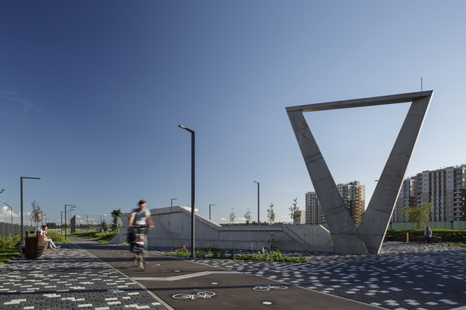
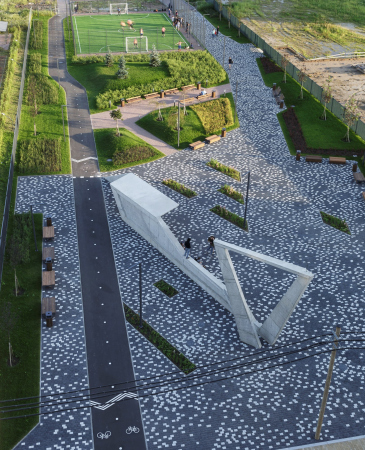
The commission to design Lot 12 was scored by Futura Architects, which was preceded by a rather lengthy story. The architects began working with New Peter still in 2014 from the White Nights Boulevard – a linear park that will run through all the segments of the complex. A part of the boulevard has already been built, and its beginning is marked by an abstract figure of an abstract sign – the already recognized “signature” of Futura Architects. In 2017, the boulevard received the Silver Sign award at Zodchestvo festival, after which the architects received an order for a fitness center and a business center – both are at different stages of completion.

  • zooming
    1 / 4
    The entrance sign at the White Nights boulevard
    Copyright: © FUTURA-Architects
  • zooming
    2 / 4
    The White Nights Boulevard
    Copyright: © FUTURA-Architects
  • zooming
    3 / 4
    The business center. New Peter residential area
    Copyright: © FUTURA-Architects
  • zooming
    4 / 4
    The fitness center. New Peter residential area
    Copyright: © FUTURA-Architects


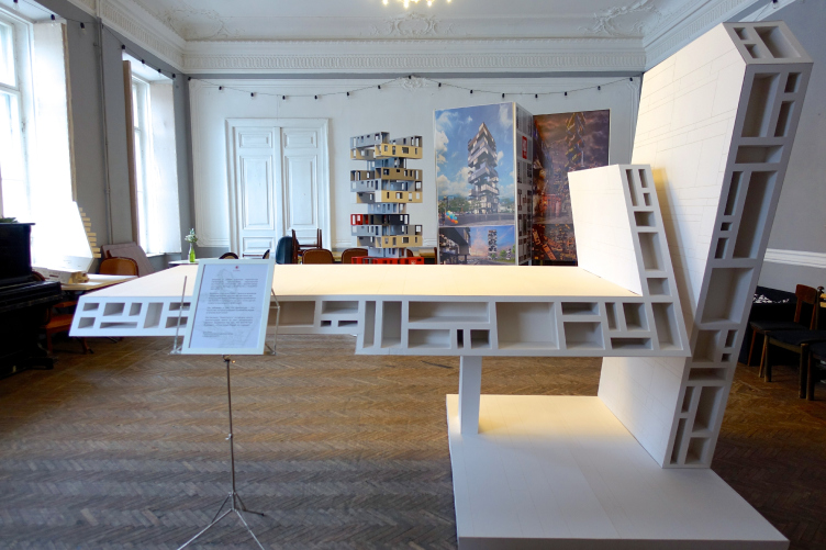
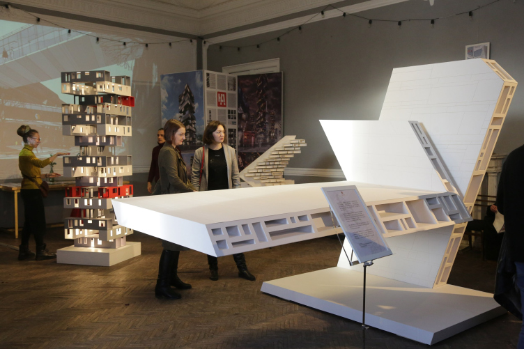
In 2019, Futura Architects made for the “Manifesto” exhibition, which took place within the framework of the St. Petersburg Architectural Biennale, an installation that impressed the developer and became the basis of the future house.

Manifesto Exhibition
Copyright: Photograph © Alena Kuznetsova, Archi.ru


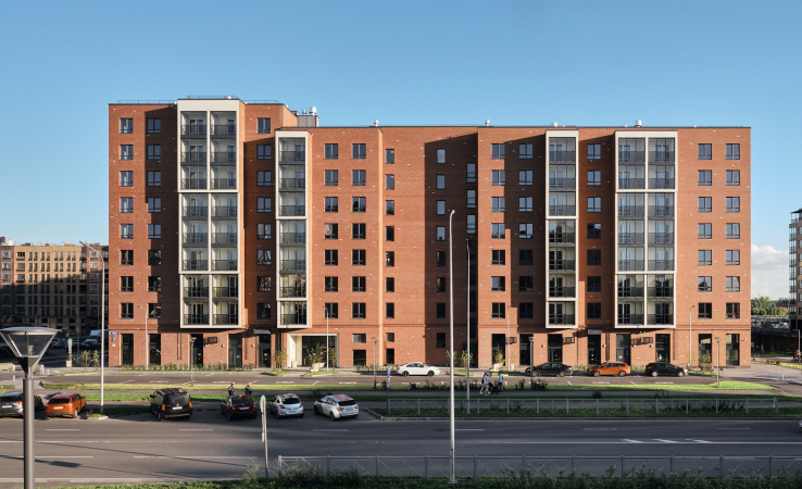
Lot 12 occupies an important place in the structure of this area – it is situated at the crossing of Nevskaya Street and White Nights Boulevard; it is clearly viewable from the main square and remote vantage points of the boulevard park. This inspired the architects to design this house as a landmark. However, since the input parameters and the measurements of all the houses were identical, this task had to be solved by color and plastique means.

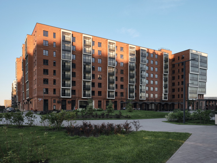
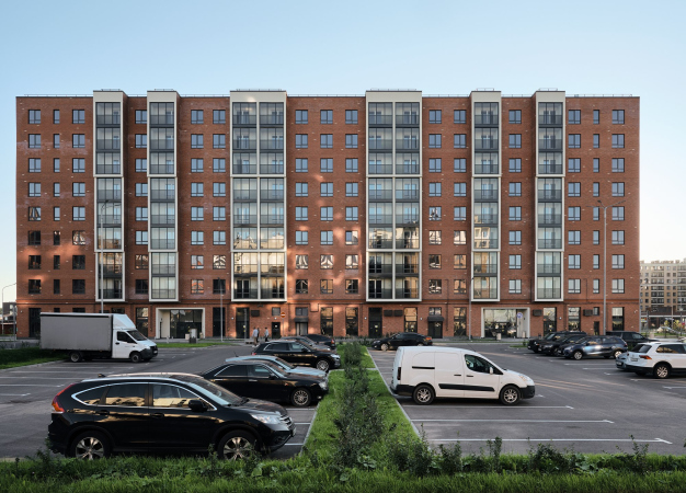
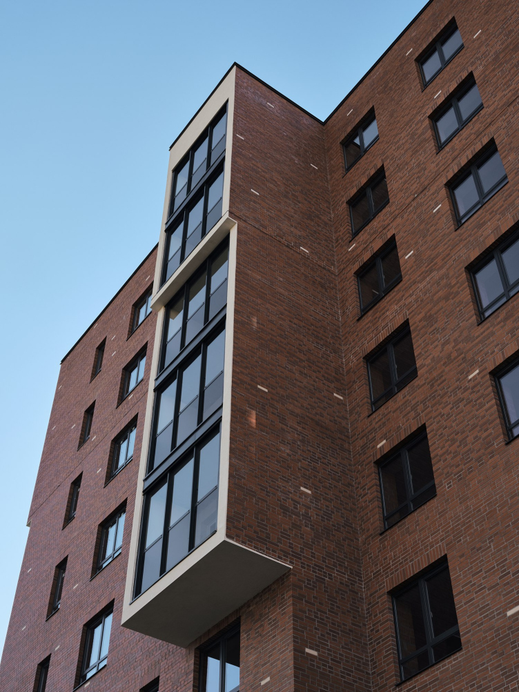
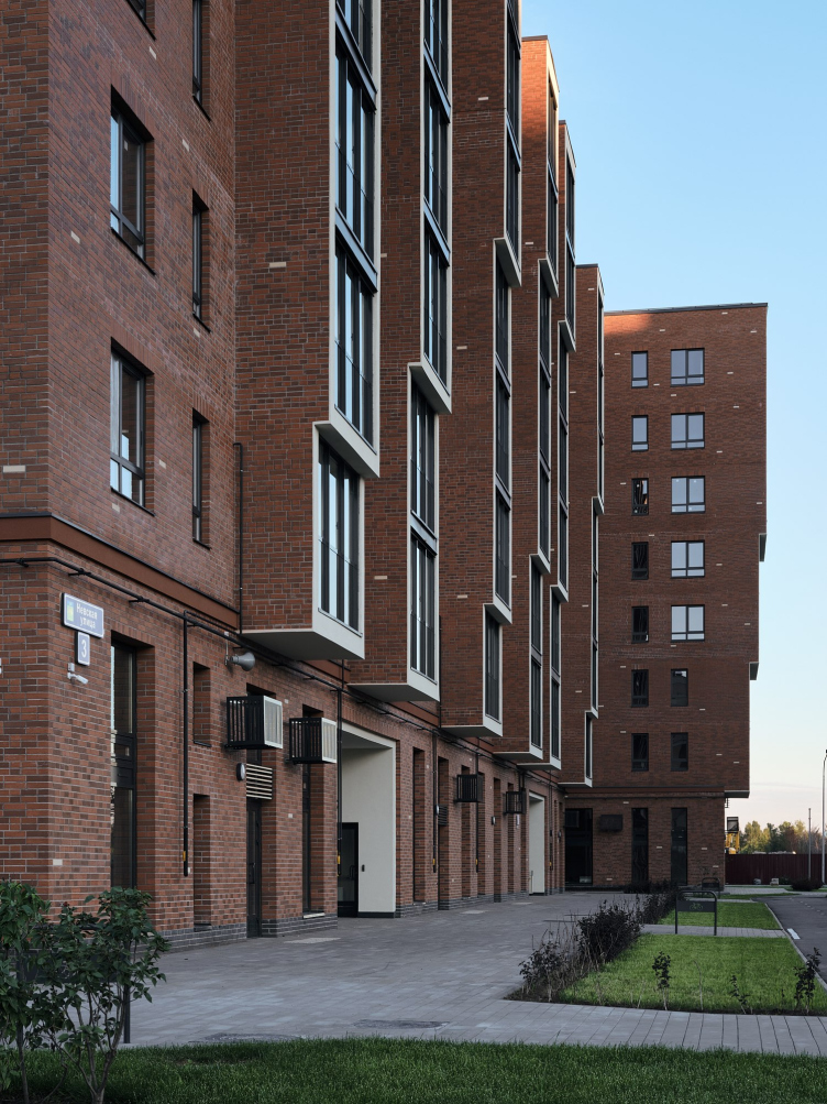
The idea to make “the most brick” building on the block was something that the client liked at once. The terra cotta color, clear-cut and simple shapes of the bay windows, clad in brick, and the random pattern of white bricks on the façade that look like falling snowflakes – all of this let us tear the project from the context and make it even more colorful and daring.


New Peter residential area
Copyright: Photograph © Dmitry Tsyrenshchikov / provided FUTURA-ARCHITECTS


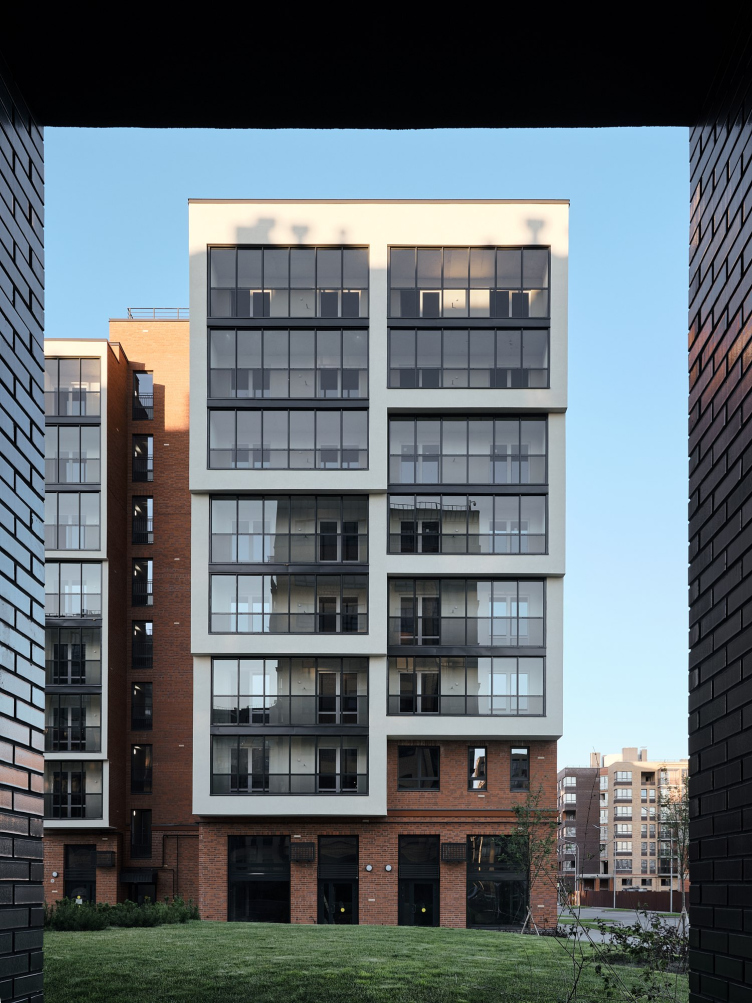
The plastique solutions were based on that same installation from the Manifesto exhibition. Yes, one must recognize that the similarity between this installation and the house is not really obvious, yet upon a closer look everything is readable quite clearly. The combination of a slender tower and a cantilever, which looks like a horizontal skyscraper, transformed into a contrast between the squatting brick masonry and the soaring white cascades of bay windows and recessed balconies. The cells of the apartments, so diverse in the installation, became more uniformed to a certain degree but they still show through in the cascades that stand out from the volume at different depths.

Installation at the Manifesto Exhibition
Copyright: © FUTURA-Architects


New Peter residential area
Copyright: © FUTURA-Architects


New Peter residential area
Copyright: Photograph © Dmitry Tsyrenshchikov / provided FUTURA-ARCHITECTS


Comparing the installation and the actual house tempts one to make jokes in the spirit of “expectation vs reality”, like, this is what happens to the architect’s dreams when they hit the heartless market. This joke, however, will be pretty shallow because the project and its subsequent implementation were not done by chance, naivety or lack of experience. When faced with the task of designing comfort class housing in Novoselie, the architect made a reality something that they had been inwardly longing for. In architecture, just as in theater, there must not be “small” roles – you have to put a piece of your soul in every project.

New Peter residential area
Copyright: Photograph © Dmitry Tsyrenshchikov / provided FUTURA-ARCHITECTS


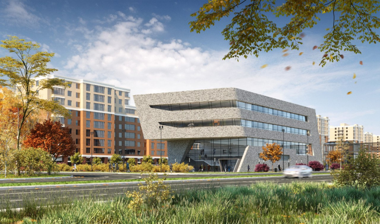
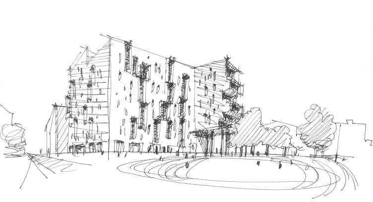
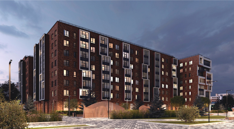
The absence of accidental solutions is clearly seen if you compare the 3D render and the ready house. One can see that the things that are gone are the “dancing” shift of the bay windows and the “cell-like” quality of the bay windows; one can also see the struggle for the cascades that could have easily been arrayed in one plane – but on the whole the pictures are similar.

New Peter residential area
Copyright: © FUTURA-Architects


New Peter residential area
Copyright: Photograph © Dmitry Tsyrenshchikov / provided FUTURA-ARCHITECTS


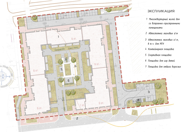
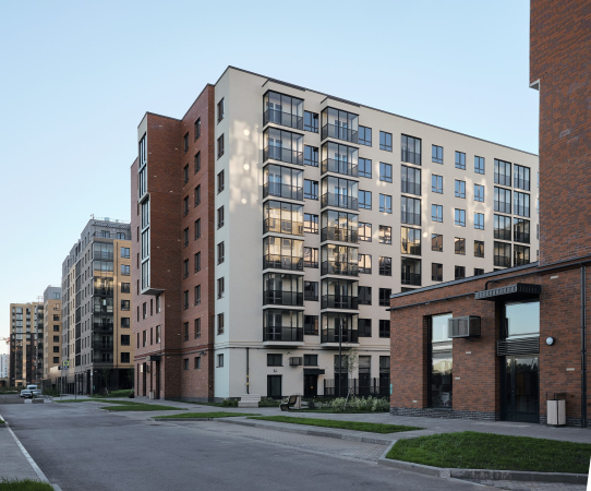
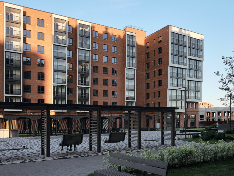
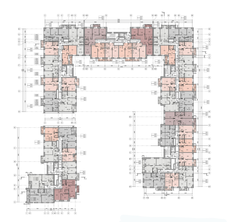
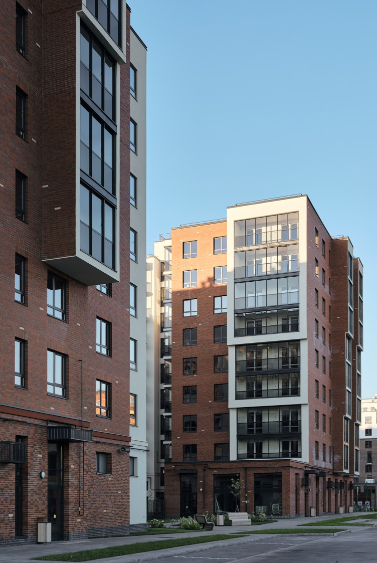
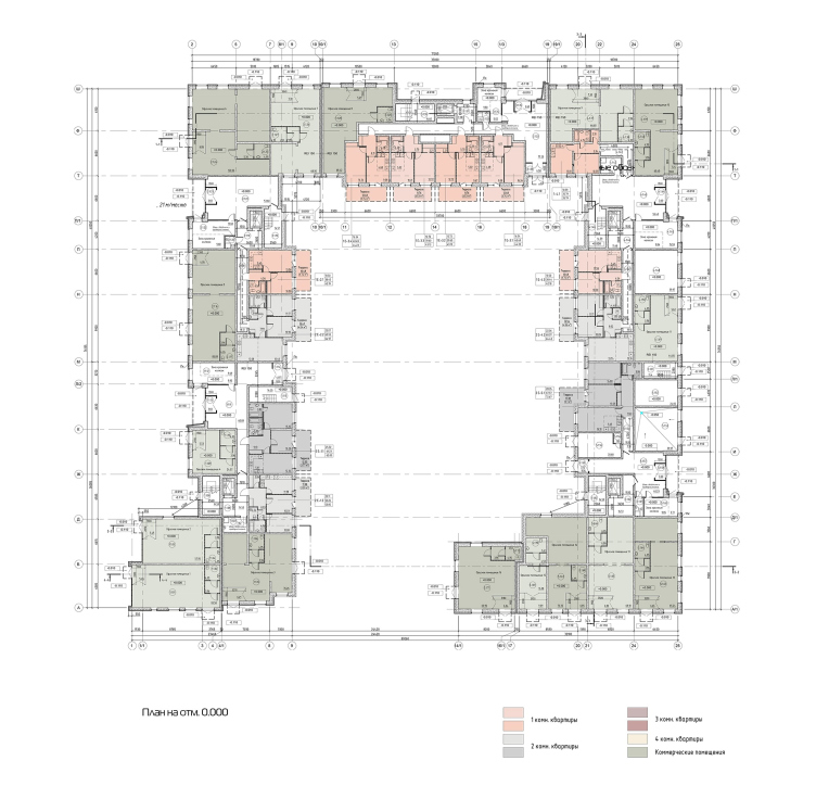
On the plan, the building is essentially a courtyard that opens up southward – in the direction of the future kindergarten. The volumes of the bay windows and recessed balconies, as well as the recessions and the increase of one of the sections from eight to nine floors make all the three street facades “working” and slightly different in their structure. The side wall from the side of the White Nights Boulevard could have been interpreted as a firewall in other circumstances, but here it turned into a textured “fracture” that makes one remember the concept of metabolism – its openness to the outside world will inevitably start a dialogue with the neighboring building.

The master plan. New Peter residential area
Copyright: © FUTURA-Architects


  • zooming
    1 / 4
    New Peter residential area
    Copyright: Photograph © Dmitry Tsyrenshchikov / provided FUTURA-ARCHITECTS
  • zooming
    2 / 4
    New Peter residential area
    Copyright: Photograph © Dmitry Tsyrenshchikov / provided FUTURA-ARCHITECTS
  • zooming
    3 / 4
    New Peter residential area
    Copyright: Photograph © Dmitry Tsyrenshchikov / provided FUTURA-ARCHITECTS
  • zooming
    4 / 4
    New Peter residential area
    Copyright: Photograph © Dmitry Tsyrenshchikov / provided FUTURA-ARCHITECTS


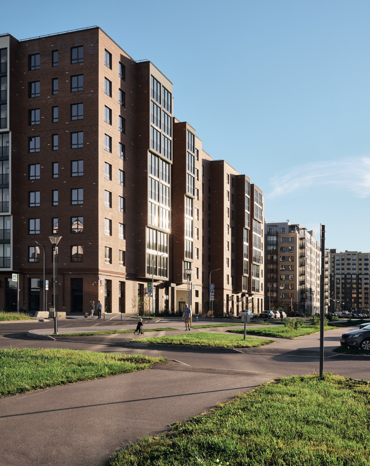
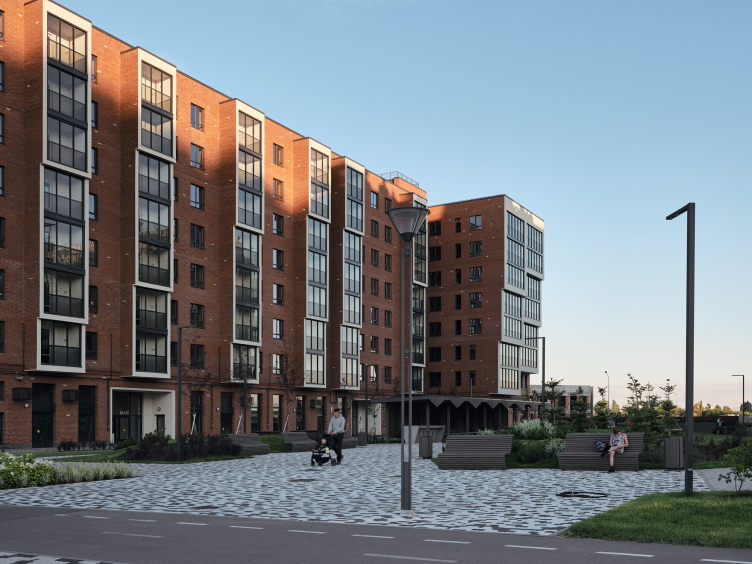
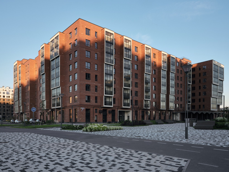
When you examine the viewing angles created and the materials used, you see the architects’ adherence to the “old school” fundamentals: the building must look attractive from 200, 20, and 2 meters away. From the remote perspectives, the house attracts the observer with its colors, a cascades silhouette, and a mass that was able to avoid being fractured by horizontal details – and this is what makes it different from the surroundings. From the square next to Nevskaya street, the house opens up with its entire length and intrigues the observer with its bay windows and recessed balconies; inclusions of white brick become visible that echo the paving pattern.

New Peter residential area
Copyright: Photograph © Dmitry Tsyrenshchikov / provided FUTURA-ARCHITECTS


Crossing the street, the observer will see an intricate pattern of terra cotta brick: it has a curious logic of its own, not Bavarian, not bonder, and not all-stretcher.

The masons were given detailed technological maps for laying red bricks, yet at the same time we allowed a possibility of moving away from these charts now and then. Thus, each new floor and each new section took on a unique character of their own. In the masonry, you can notice a horizontal stretching of the pattern, or, conversely, a very frequent change of color – sometimes, it is even an ancient Celtic pattern with rhombuses and crosses. Someone may see symbols in these drawings, someone may see a reflection of wildlife, but one thing is for sure – it is impossible to build another such building. The pattern is as diverse as our society is. Thus, the builders took a full part in the formation of a truly authentic project.


New Peter residential area
Copyright: Photograph © Dmitry Tsyrenshchikov / provided FUTURA-ARCHITECTS


The “laying bare” of the white color in the body of the building gives it a second layer – not material but rather of a conceptual nature. While the brick is perceived as the “skin” or the “shell” of the building, the white stucco is perceived in different ways depending on the viewing angle: from the outside – as from the outside – as the exit of ancient geological rocks to the surface or as living tissues ready to grow further, from the inside – as pulp or as a lining.

New Peter residential area
Copyright: Photograph © Dmitry Tsyrenshchikov / provided FUTURA-ARCHITECTS


New Peter residential area
Copyright: Photograph © Dmitry Tsyrenshchikov / provided FUTURA-ARCHITECTS


New Peter residential area
Copyright: Photograph © Dmitry Tsyrenshchikov / provided FUTURA-ARCHITECTS


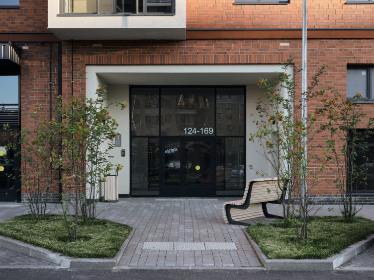
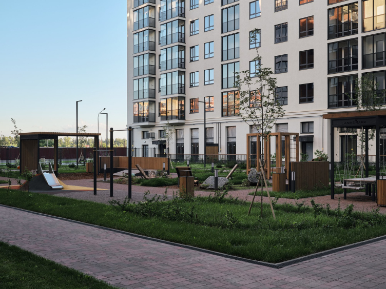
The yards in “New Peter” are closed-door and they differ from one another – according to the developer’s plan, this must encourage the residents to meet and then visit one another more often. A special feature of Lot 12 is a small Zen garden with sun loungers, a gazebo, and a communal table under a canopy. The ground floor apartments facing the courtyard have quite spacious terraces. Outside, the outline of the building is occupied by commercial premises. From the second to the ninth floors there are 1-3 room apartments ranging from 35 to 82 square meters.

New Peter residential area
Copyright: Photograph © Dmitry Tsyrenshchikov / provided FUTURA-ARCHITECTS
New Peter residential area
Copyright: Photograph © Dmitry Tsyrenshchikov / provided FUTURA-ARCHITECTS
Plan of the 1st floor. New Peter residential area
Copyright: © FUTURA-Architects
Plan of the standard floor. New Peter residential area
Copyright: © FUTURA-Architects


14 October 2022

Headlines now
The Golden Crown
The concept for a dental clinic in Yekaterinburg, developed by CNTR Studio, revolves around the idea of a “mouth full of gold”: pristine white porcelain stoneware walls are complemented by matte brass details. To avoid an overly literal interpretation, the architects focused on the building’s proportions, skillfully navigating between sunlight requirements and fire safety regulations.
Flexibility and Integration
Not long ago, we covered the project for the fourth phase of the ÁLIA residential complex, designed by APEX. Now, we’ve been shown different fence concepts they developed to enclose the complex’s private courtyards, incorporating a variety of public functions. We believe that the sheer fact that the complex’s architects were involved in such a detail as fencing speaks volumes.
A Step Forward
The HIDE residential complex represents a major milestone for ADM architects and their leaders Andrey Romanov and Ekaterina Kuznetsova in their quest for a fresh high-rise aesthetic – one that is flexible and layered, capable of bringing vibrancy to mass and silhouette while shaping form. Over recent years, this approach has become ADM’s “signature style”, with the golden HIDE tower playing a pivotal role in its evolution. Here, we delve into the project’s story, explore the details of the complex’s design, and uncover its core essence.
Gold in the Sands
A new office for a transcontinental company specializing in resource extraction and processing has opened in Dubai. Designed by T+T Architects, masters of creating spaces that are contemporary, diverse, flexible, and original, this project exemplifies their expertise. On the executive floor, a massive brass-clad partition dominates, while layered textures of compressed earth create a contextually resonant backdrop.
Layers and Levels of Flight
This project goes way back – Reserve Union won this architectural competition at the end of 2011, and the building was completed in 2018, so it’s practically “archival”. However, despite being relatively unknown, the building can hardly be considered “dated” and remains a prime example of architectural expression, particularly in the headquarters genre. And it’s especially fitting for an aviation company office. In some ways, it resembles the Aeroflot headquarters at Sheremetyevo but with its own unique identity, following the signature style of Vladimir Plotkin. In this article, we take an in-depth look at the United Aircraft Corporation (UAC) headquarters in the Moscow agglomeration town of Zhukovsky, supplemented by recent photographs from Alexey Naroditsky – a shoot that became only recently possible due to the fact that improvements were finally made in the surrounding area.
Light and Shadow
In this article, we delve into the architectural design of the “Chaika” house by DNK ag architects, which was recently completed in 2023 as part of the collection of signature designs at ZILArt. As is well-known, all the buildings in this complex follow a design code, yet each one is distinct. This particular building stands out not only for its whiteness and minimalism but also for the refined use of a limited number of techniques that, together, create what can confidently be called synergy.
Casus Novae
A master plan was developed for a large residential area with a name of “DNS City”, but now that its implementation began, the plan has been arbitrarily reformatted and replaced with something that, while similar on the surface, is actually quite different. This is not the first time such a thing happens, but it’s always frustrating. With permission from the author, we are sharing Maria Elkina’s post.
Treasure Hunting
The GAFA bureau, in collaboration with Tegola and Arkhitail, organized an expedition to the island of Kilpola in Karelia as part of Moskomarkhitektura’s “Open City” festival. There, amidst moss and rocks, the students sought answers to questions like: what is the sacred, where does it dwell, and what sustains it? Assisting the participants in this quest were landscape engineer Evgeny Levin, artist Nicholas Roerich, a moose, and the lack of cellular connection. Here’s how the story unfolded.
Depths of the Earth, Streams of Water
In the Malaya Okhta district, the Akzent building, designed by Stepan Liphart, was constructed. It follows a classic tripartite structure, yet it’s what you might call “hand-drawn”: each façade is unique in its form and details, some of which aren’t immediately noticeable. In this article, we explore the context and, together with the architect, delve into how the form was developed.
Fir Tree Dynamics
The “Airports of Region” holding is planning to build an airport in Karachay-Cherkessia, aiming to make the Arkhyz and Dombay resorts more accessible to travelers. The project that won in an invitation-only competition, submitted by Sergey Nikeshkin’s KPLN, blends natural imagery inspired by the shape of a conifer seed, open-air waiting spaces, majestic large trees, and a green roof elevated on needle-like columns. The result is both nature-inspired and WOW.
​A Brick Shell
In the process of designing a clubhouse situated among pine trees in a prestigious suburban area near Moscow, the architectural firm “A.Len” did the façade design part. The combination of different types of brick and masonry correlates with the volumetric and plastique solutions, further enhanced by the inclusion of wood-painted fragments and metal “glazing”.
Word Forms
ATRIUM architects love ambitious challenges, and for the firm’s thirtieth anniversary, they boldly play a game of words with an exhibition that dives deep into a self-created vocabulary. They immerse their projects – especially art installations – into this glossary, as if plunging into a current of their own. You feel as if you’re flowing through the veins of pure art, immersed in a universe of vertical cities, educational spaces – of which the architects are true masters – and the cultural codes of various locations. But what truly captivates is the bold statement that Vera Butko and Anton Nadtochy make, both through their work and this exhibition: architecture, above all, is art – the art of working with form and space.
Flexibility and Acuteness of Modernity
Luxurious, fluid, large “kokoshniks” and spiral barrel columns, as if made from colorful chewing gum: there seem to be no other mansion like this in Moscow, designed in the “Neo-Russian-Modern” style. And the “Teremok” on Malaya Kaluzhskaya, previously somewhat obscure, has “come alive with new colors” and gained visibility after its restoration for the office of the “architectural ecosystem” as the architects love to call themselves. It’s evident that Julius Borisov and the architects at UNK put their hearts into finding this new office and bringing it up to date. Let’s delve into the paradoxes of this mansion’s history and its plasticity. Spoiler: two versions of modernity meet here, both balancing on the razor’s edge of “what’s current”.
Yuri Vissarionov: “A modular house does not belong to the land”
It belongs to space, or to the air... It turns out that 3D printing is more effective when combined with a modular approach: the house is built in a workshop and then adapted to the site, including on uneven terrain. Yuri Vissarionov shares his latest experience in designing tourist complexes, both in central Russia and in the south. These include houseboats, homes printed from lightweight concrete using a 3D printer, and, of course, frame houses.
​Moscow’s First
“The quality of education largely depends on the quality of the educational environment”. This principle of the last decade has been realized by Sergey Skuratov in the project for the First Moscow Gymnasium on Rostovskaya Embankment in the Khamovniki district. The building seamlessly integrates into the complex urban landscape, responding both to the pedestrian flow of the city and the quiet alleyways. It skillfully takes advantage of the height differences and aligns with modern trends in educational space design. Let’s take a closer look.
Looking at the Water
The site of Villa Sonata stretches from the road to the water’s edge, offering its own shoreline, pier, and a picturesque river panorama. To reveal these sweeping views, Roman Leonidov “cut” the façade diagonally parallel to the river, thus getting two main axes for the house and, consequently, “two heads”. The internal core – two double-height spaces, a living room and a conservatory, with a “bridge” above them – makes the house both “transparent” and filled with light.
The White Wing
Well, it’s not exactly white. It’s more of a beige, white-stone structure that plays with the color of limestone – smoother surfaces are lighter, while rougher ones are darker. This wing unites various elements: it absorbs and interprets the surrounding themes. It responds to everything, yet maintains a cohesive expression – a challenging task! – while also incorporating recognizable features of its own, such as the dynamic cuts at the bottom, top, and middle.
Urban Dunes
The XSA Ramps team designed and built a three-part sports hub for a park in Rostov-on-Don, welcoming people of all ages and fitness levels. The skate plaza, pump track, and playground are all meticulously crafted with details that attract a diverse range of visitors. The technical execution of the shapes and slopes transforms this space into a kind of sculptural composition.
Proportional Growth
The project for the fourth phase of the ÁLIA residential area has been announced. The buildings are situated on an elongated plot – almost a “ray” that shoots out from the center of the area towards the river. Their layout reflects both a response to Moscow’s architectural preferences over the past 15 years, shifting “from blocks to towers”, and an interpretation of the neighboring business park designed by SOM. Additionally, the best apartments here are not located at the very top but closer to the middle, forming a glowing “waistline”.
The “Staircase” Building
In designing the “Details” residential complex in New Moscow, Rais Baishev spiced up the now-popular Moscow theme of a “courtyard” building with an idea drawn from the surrealist drawings by Maurits Escher. He envisioned the stepped silhouettes and descending slopes as a metaphysical mega-staircase, creating a key void within the courtyard that gave the project an internal “spine”. This concept is felt both in the building’s silhouette and on its façades.
Projection of the Quarter
No one doubted that the building that Vladimir Plotkin designed as part of the “Garden Quarters” would be the most modernist of all. And it turned out just that way: while adhering to the common design code, the building successfully combines brick and white stone, rhythmically responding to the neighboring building designed by Ostozhenka, yet tactfully and persistently making a few statements of its own. This includes the projection of the ideal urban development composition “14–9–6”, which can be found right next door, mathematical calculations, including those for various types of terraces (and perhaps the only reminder of the Soviet past of the Kauchuk rubber factory!), and the white “cross-stitch” pattern of the façade grid.
Domus Aurea
In this issue, we examine the “Tessinsky-1” house, designed by Sergey Skuratov and completed in 2023. Located in the middle of the Serebryanicheskaya Embankment district, at the intersection of its main streets, this house assumes a sort of “nodal” role: it not only responds to everything around it and preserves many memories of the former EMA factory within itself, but it weaves all this into a newly directed pattern, reconciling bright “gold” and dark-colored brick, largely with the help of the new, modern-yet-archaic Columba brick, which, come to think about it, is the most precious element here.
The Chimney of Nikola-Lenivets
In this issue, we are examining the “Obelisk House” designed by KATARSIS and built for the Arkhstoyanie 2023 festival. However, it was only finished later on, and this is why we are examining it now. It seems to us that after the “Obelisk House” appeared in Nikola-Lenivets, a dialogue and a few inner connections appeared between the temporary structures built here. These houses no longer look like “accidental neighbors”, more of which below.
​Periscope by the Bay
The jury awarded the second place in the competition for a public and cultural center in Petropavlovsk-Kamchatsky to the companies GORA (“Mountain”) and M4. In the consortium’s proposal, the building resembles a sperm whale with a calf swimming next to it or a periscope, whose lenses capture the most spectacular views from the surrounding landscape.
From Arcs to Dolmens
While working on the competition project for Petropavlovsk-Kamchatsky, ASADOV Architects prioritized the value of the natural and urban environment, aiming to preserve the balance of the location while minimizing the resemblance of the volume that they designed to a “traditional building”. The task was challenging, and the architects created three versions, one of which having been developed after the competition, where their main proposal took third place. However, the point of interest here is not the competition result but the continuity of creative thinking.
Hide and Seek
The ID Moskovskiy house, designed by Stepan Liphart in St. Petersburg, in the courtyards near Moskovskiy Avenue beyond the Obvodny Canal and recently completed, is notable for several reasons. Firstly, it has been realized with considerable accuracy, which is particularly significant as this is the first building where the architect was responsible not only for the facades but also for the layouts, allowing for better integration between the two. On the other hand, this building is interesting as an example of the “germination” of new architecture in the city: it draws on the best examples from the neighborhood and becomes an improved and developed sum of ideas found by the architect in the surrounding context.
The Big Twelve
Yesterday, the winners of the Moscow Mayor’s Architecture Award were announced and honored. Let’s take a look at what was awarded and, in some cases, even critique this esteemed award. After all, there is always room for improvement, right?
Above the Golden Horn
The residential complex “Philosophy” designed by T+T architects in Vladivostok, is one of the new projects in the “Golubinaya Pad” area, changing its development philosophy (pun intended) from single houses to a comprehensive approach. The buildings are organized along public streets, varying in height and format, with one house even executed in gallery typology, featuring a cantilever leaning on an art object.
Nuanced Alternative
How can you rhyme a square and space? Easily! But to do so, you need to rhyme everything you can possibly think of: weave everything together, like in a tensegrity structure, and find your own optics too. The new exhibition at GES-2 does just that, offering its visitor a new perspective on the history of art spanning 150 years, infused with the hope for endless multiplicity of worlds and art histories. Read on to see how this is achieved and how the exhibition design by Evgeny Ace contributes to it.
Blinds for Ice
An ice arena has been constructed in Domodedovo based on a project by Yuri Vissarionov Architects. To prevent the long façade, a technical requirement for winter sports facilities, from appearing monotonous, the architects proposed the use of suspended structures with multidirectional slats. This design protects the ice from direct sunlight while giving the wall texture and detail.