По-русски

​A Circular Arrangement

The project by UNK interiors, which won in the competition for the “Zagorye” metro station, is resonant to the ideas of the surrounding industrial and housing construction thanks to its modular laconic shapes. At the same time, the station is “all metal”, which is a nod towards the name of the nearby Lipetskaya Street because Lipetsk is a metallurgical center. One could expect that the authors would fall for the brutal images of metallurgy and blast furnaces but the project turned out to be light and laconic – we are examining why.

25 August 2022
Contest Results
mainImg
The results of the competition, which was conducted for not just one but two stations of the new Biryulevo line at once, were announced on August 3. Five finalists worked on the architectural image of the Ostrov Mechty (you can read more about the winner here), the other five – on the Zagorye station. And here the competition was won by the team of architects of UNK interiors led by Julia Tryaskina.

“Zagorye” metro station. The competition project 2022
Copyright: © UNK


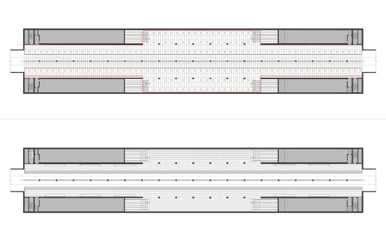
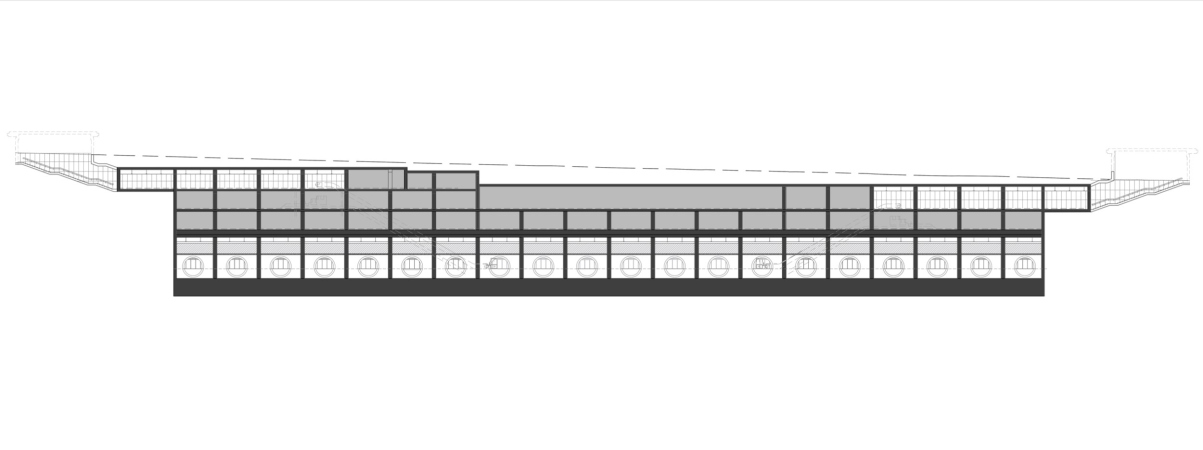
The Zagorye station is shallow, but still it is underground, with two vestibules on the sides of the tracks assembled in the central part. Such a type of platform is often seen, for example, in Paris and Rome but it is not quite habitual for Moscow – one of the examples could be the Arbatskaya station of the Fili line, but on the whole we are used to the central “island” platform with tracks running on either side and a sturdy wall with the name of the station behind the cars of the passing train.

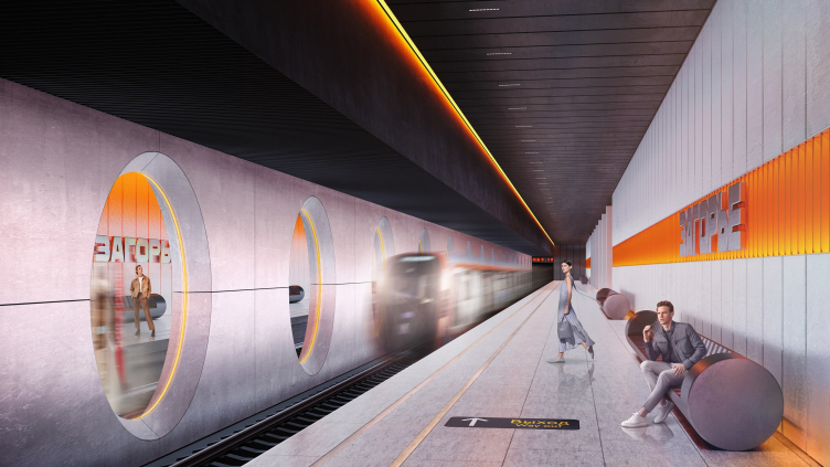
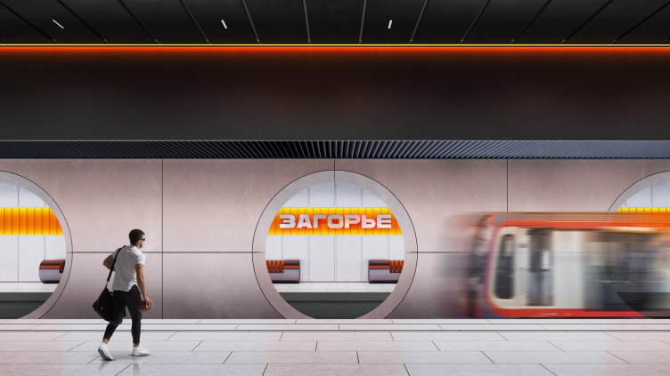
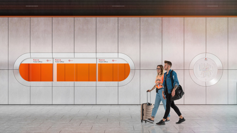
Maybe this was the reason the authors of the winning project divided the space between the two tracks by a partition. It masks a row of supports between the trains, and it clearly divides the “spheres of influence” of these two platforms, to and from the center, visually and psychologically. The wall is not blind: it has large wide openings in them with elegant chamfers and circles of backlighting; through them, you can see the opposite platform, the trains, and large inscriptions of the station name on the walls – but it is thus “gaze through the frame” turns the space on the “other side” into a semblance of a picture on the wall. On the one hand, the perspective is open and we can gaze rather deep. On the other hand, “our” part of the platform is delineated in a quite definitive way – and, on the whole this probably provides a certain balance of comfort and openness: it is not too close, and not too open either.

“Zagorye” metro station. The competition project 2022
Copyright: © UNK


“Zagorye” metro station. The competition project 2022
Copyright: © UNK


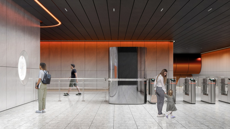
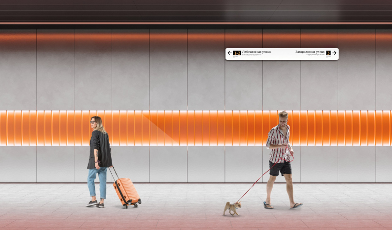
According to the authors, they drew the main idea of the project from the name and the direction of the Lipetsksya Street: Lipetsk is a metallurgy city, and this is why the main theme became metal. Black ceiling, silver walls, orange inclusions and illumination hint at the color of the incandescent casting. The platforms are different in their shades of color: the one riding downtown is backlit with warm light; the one riding uptown is designed in cool tones. Interestingly, the difference is built in the illumination alone, meaning it is not too obvious. However, when you look from the “warm” platform to the “cold” one, then, thanks to the superposition of the “pictures”, the difference will be probably very well readable.

“Zagorye” metro station. The competition project 2022
Copyright: © UNK


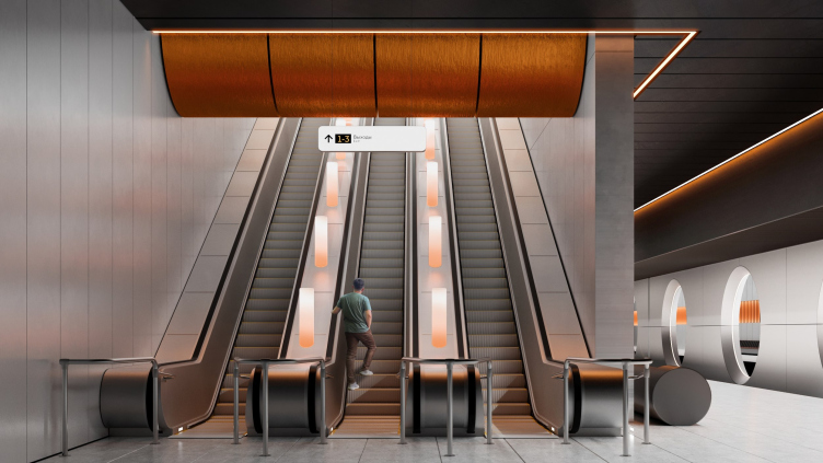
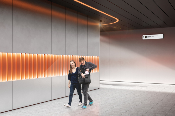
The theme of hot metal is supported by the station's decor elements – there are few of them, which works for the expressiveness of each. Across the black ceiling, run orange linear lights that look like streaks of hot metal. The lamps on the escalators are colored from below by an orange gradient, as if they grew incandescent in front of your eyes. The same effect is provided by the reddish illumination on the ceiling’s contour. The massive seats on the platform are designed as cylindrical “slugs” of metal with brutal cutaways.

“Zagorye” metro station. The competition project 2022
Copyright: © UNK


“Zagorye” metro station. The competition project 2022
Copyright: © UNK


Meanwhile, you cannot say that emotionally the theme of incandescent metal, or the image of a blast furnace prevails – not in the least. Rather, its flames “accentuate” the austere and generally cool surface of the walls.
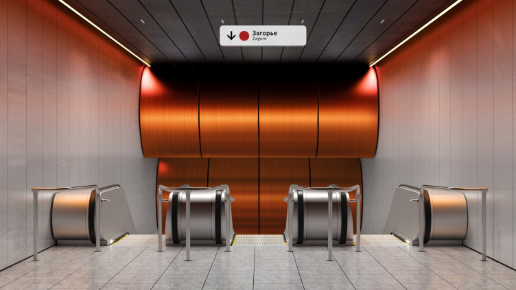
What becomes more important is the texture of the metal, or, rather, of metals. The main milky and silvery hue is sometimes complemented by polished mirror-like surfaces, most of them being copper: these are to be seen in the decorative ribbons on the walls and – particularly – above the escalators.

“Zagorye” metro station. The competition project 2022
Copyright: © UNK


The “copper” surfaces above the escalators are particularly beautiful. Everyone knows that when we ride an escalator we usually feel bored, and often examine the ceiling. Maybe this is the reason why in the new stations, particularly in those that feature author architecture, ceilings and escalators are given a lot of attention. Here, if you look upwards, you will see large traversal cylinders of copper color – they resemble either coils with copper wire or some sci-fi steam rollers. If you turn on your imagination, you may think that there is another escalator up above that gets “spun” on these cylinders. How often do we wonder about what is beneath the moving stairs and what actually makes them move? And here it looks as though we were given a hint. In a word, the industrial aesthetics of the ceiling is far from trivial.

  • zooming
    1 / 3
    “Zagorye” metro station. The competition project 2022
    Copyright: © UNK
  • zooming
    2 / 3
    “Zagorye” metro station. The competition project 2022
    Copyright: © UNK
  • zooming
    3 / 3
    “Zagorye” metro station. The competition project 2022
    Copyright: © UNK


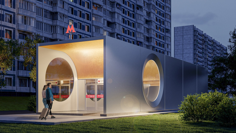
In the entrance pavilions the bulgy “coils” turn into concave depressions of the same profile, this time golden. It looks as though some sort of underground reddish mold resurfaced here as a piece of jewelry designed not for the underground but for the city – because it is the entrance pavilions that make a statement about the presence of the metro station.

“Zagorye” metro station. The competition project 2022
Copyright: © UNK


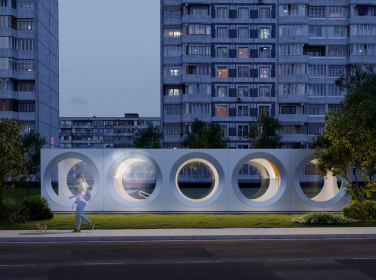
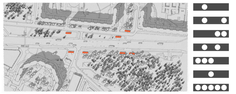
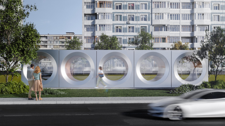
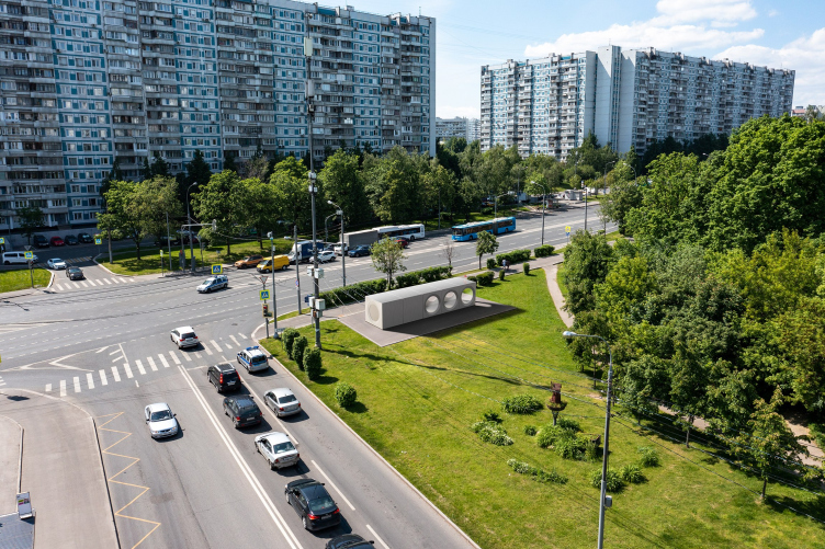
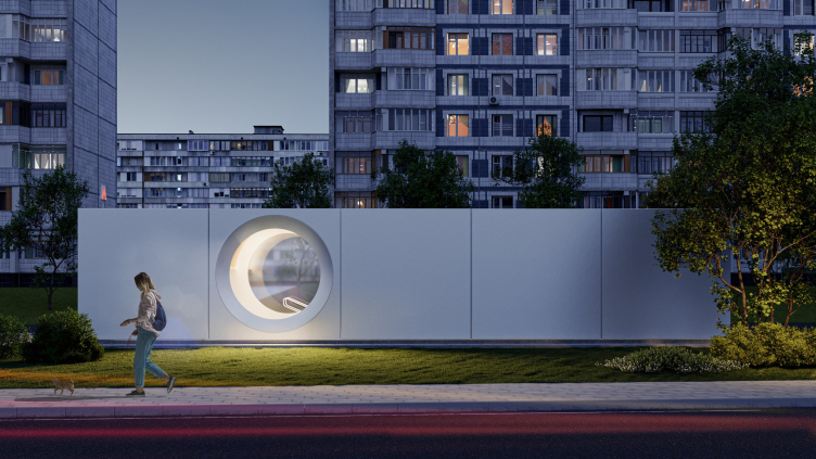
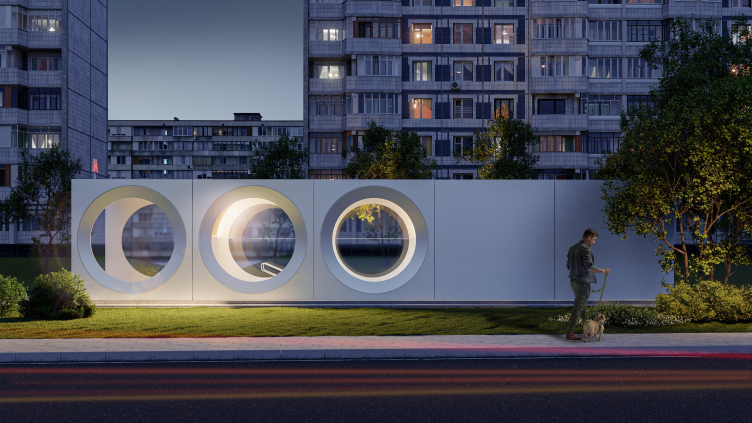
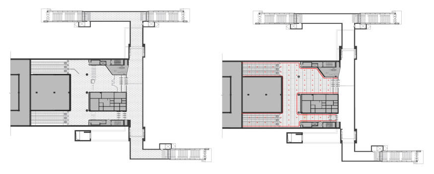
There are seven overland pavilions, and all of them are subjugated to the common module of a circle within a square – this is how the architects emphasize the flexibility of the designed modular system, at the same time proposing to mark the differences between the volumes to better orient the passengers. There is a pavilion, all walls of which are composed of circular windows, and there are pavilions with two or three openings.

“Zagorye” metro station. The competition project 2022
Copyright: © UNK


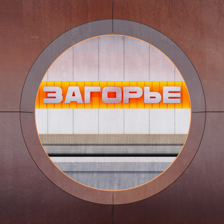
Looking at the pavilions, you begin to realize that, of course, the main uniting motif of the entire project is not so much metal (although metal does play an important part) as a circle. Curiously, although the avant-garde architecture claims that it borrowed the circular window from steamers and airplanes and industrial chimneys, in actuality it has inherited the circular window from the gothic and renaissance architecture. But then again, it was avant-garde architects who proposed placing several circular windows in a row. Circles are all over the place here: at the station, in the entrance pavilions, and in the information graphics design, where they sometimes turn into ellipses. The combination of metal and large circular openings refer not so much to avant-garde as to the design search for the optimum “cosmic” shape of the sixties: bull’s eyes, circular hatches, and such like – what else do you need metallurgy for if not to help humans penetrate new and unfamiliar environments, be that outer space, or underground, or, more specifically, metro.

“Zagorye” metro station. The competition project 2022
Copyright: © UNK


Hence this simple and light form – as if from the sixties – modular and shining noble silver. Also, this is something that is relevant today, and something that rhymes with the industrial scenery of the Lipetskaya Street – at the same time without conflicting with the greenery of the Biryulevo Park on its opposite side.

“Zagorye” metro station. The competition project 2022
Copyright: © UNK


Such a “Pavilion Futura”, strictly speaking, can adapt to any kind of environment, sometimes thanks to its lightens and simplicity, and sometimes by contrast. By day, the silvery surface and the large diameter of the openings will work for easier perception of their construction, as if aluminum, as if brought here by accident and placed here and there. By night, however, they will glow from the inside, accentuating golden waves of the ceilings, yet not excluding the see-through gaze.

“Zagorye” metro station. The competition project 2022
Copyright: © UNK


“Zagorye” metro station. The competition project 2022
Copyright: © UNK


The design solution is light and austere, modular and diverse at the same time, clearly motivated by the location and filled with occasional, and because of that even more “tasty” details, as well as texture and color inclusions. Neither the reference to the avant-garde, nor the “spaceship” imagery, nor the “metallurgical” theme prevail and do not suppress – on the contrary, everything is simple and easy, optimistic, as in the sixties, which I recognize as an obvious strong side of the project.
  • zooming
    1 / 3
    Plan of the vestibules. “Zagorye” metro station. The competition project 2022
    Copyright: © UNK
  • zooming
    2 / 3
    Plans of the platform. “Zagorye” metro station. The competition project 2022
    Copyright: © UNK
  • zooming
    3 / 3
    Longitudinal section view of the platform. “Zagorye” metro station. The competition project 2022
    Copyright: © UNK


25 August 2022

Headlines now
The Golden Crown
The concept for a dental clinic in Yekaterinburg, developed by CNTR Studio, revolves around the idea of a “mouth full of gold”: pristine white porcelain stoneware walls are complemented by matte brass details. To avoid an overly literal interpretation, the architects focused on the building’s proportions, skillfully navigating between sunlight requirements and fire safety regulations.
Flexibility and Integration
Not long ago, we covered the project for the fourth phase of the ÁLIA residential complex, designed by APEX. Now, we’ve been shown different fence concepts they developed to enclose the complex’s private courtyards, incorporating a variety of public functions. We believe that the sheer fact that the complex’s architects were involved in such a detail as fencing speaks volumes.
A Step Forward
The HIDE residential complex represents a major milestone for ADM architects and their leaders Andrey Romanov and Ekaterina Kuznetsova in their quest for a fresh high-rise aesthetic – one that is flexible and layered, capable of bringing vibrancy to mass and silhouette while shaping form. Over recent years, this approach has become ADM’s “signature style”, with the golden HIDE tower playing a pivotal role in its evolution. Here, we delve into the project’s story, explore the details of the complex’s design, and uncover its core essence.
Gold in the Sands
A new office for a transcontinental company specializing in resource extraction and processing has opened in Dubai. Designed by T+T Architects, masters of creating spaces that are contemporary, diverse, flexible, and original, this project exemplifies their expertise. On the executive floor, a massive brass-clad partition dominates, while layered textures of compressed earth create a contextually resonant backdrop.
Layers and Levels of Flight
This project goes way back – Reserve Union won this architectural competition at the end of 2011, and the building was completed in 2018, so it’s practically “archival”. However, despite being relatively unknown, the building can hardly be considered “dated” and remains a prime example of architectural expression, particularly in the headquarters genre. And it’s especially fitting for an aviation company office. In some ways, it resembles the Aeroflot headquarters at Sheremetyevo but with its own unique identity, following the signature style of Vladimir Plotkin. In this article, we take an in-depth look at the United Aircraft Corporation (UAC) headquarters in the Moscow agglomeration town of Zhukovsky, supplemented by recent photographs from Alexey Naroditsky – a shoot that became only recently possible due to the fact that improvements were finally made in the surrounding area.
Light and Shadow
In this article, we delve into the architectural design of the “Chaika” house by DNK ag architects, which was recently completed in 2023 as part of the collection of signature designs at ZILArt. As is well-known, all the buildings in this complex follow a design code, yet each one is distinct. This particular building stands out not only for its whiteness and minimalism but also for the refined use of a limited number of techniques that, together, create what can confidently be called synergy.
Casus Novae
A master plan was developed for a large residential area with a name of “DNS City”, but now that its implementation began, the plan has been arbitrarily reformatted and replaced with something that, while similar on the surface, is actually quite different. This is not the first time such a thing happens, but it’s always frustrating. With permission from the author, we are sharing Maria Elkina’s post.
Treasure Hunting
The GAFA bureau, in collaboration with Tegola and Arkhitail, organized an expedition to the island of Kilpola in Karelia as part of Moskomarkhitektura’s “Open City” festival. There, amidst moss and rocks, the students sought answers to questions like: what is the sacred, where does it dwell, and what sustains it? Assisting the participants in this quest were landscape engineer Evgeny Levin, artist Nicholas Roerich, a moose, and the lack of cellular connection. Here’s how the story unfolded.
Depths of the Earth, Streams of Water
In the Malaya Okhta district, the Akzent building, designed by Stepan Liphart, was constructed. It follows a classic tripartite structure, yet it’s what you might call “hand-drawn”: each façade is unique in its form and details, some of which aren’t immediately noticeable. In this article, we explore the context and, together with the architect, delve into how the form was developed.
Fir Tree Dynamics
The “Airports of Region” holding is planning to build an airport in Karachay-Cherkessia, aiming to make the Arkhyz and Dombay resorts more accessible to travelers. The project that won in an invitation-only competition, submitted by Sergey Nikeshkin’s KPLN, blends natural imagery inspired by the shape of a conifer seed, open-air waiting spaces, majestic large trees, and a green roof elevated on needle-like columns. The result is both nature-inspired and WOW.
​A Brick Shell
In the process of designing a clubhouse situated among pine trees in a prestigious suburban area near Moscow, the architectural firm “A.Len” did the façade design part. The combination of different types of brick and masonry correlates with the volumetric and plastique solutions, further enhanced by the inclusion of wood-painted fragments and metal “glazing”.
Word Forms
ATRIUM architects love ambitious challenges, and for the firm’s thirtieth anniversary, they boldly play a game of words with an exhibition that dives deep into a self-created vocabulary. They immerse their projects – especially art installations – into this glossary, as if plunging into a current of their own. You feel as if you’re flowing through the veins of pure art, immersed in a universe of vertical cities, educational spaces – of which the architects are true masters – and the cultural codes of various locations. But what truly captivates is the bold statement that Vera Butko and Anton Nadtochy make, both through their work and this exhibition: architecture, above all, is art – the art of working with form and space.
Flexibility and Acuteness of Modernity
Luxurious, fluid, large “kokoshniks” and spiral barrel columns, as if made from colorful chewing gum: there seem to be no other mansion like this in Moscow, designed in the “Neo-Russian-Modern” style. And the “Teremok” on Malaya Kaluzhskaya, previously somewhat obscure, has “come alive with new colors” and gained visibility after its restoration for the office of the “architectural ecosystem” as the architects love to call themselves. It’s evident that Julius Borisov and the architects at UNK put their hearts into finding this new office and bringing it up to date. Let’s delve into the paradoxes of this mansion’s history and its plasticity. Spoiler: two versions of modernity meet here, both balancing on the razor’s edge of “what’s current”.
Yuri Vissarionov: “A modular house does not belong to the land”
It belongs to space, or to the air... It turns out that 3D printing is more effective when combined with a modular approach: the house is built in a workshop and then adapted to the site, including on uneven terrain. Yuri Vissarionov shares his latest experience in designing tourist complexes, both in central Russia and in the south. These include houseboats, homes printed from lightweight concrete using a 3D printer, and, of course, frame houses.
​Moscow’s First
“The quality of education largely depends on the quality of the educational environment”. This principle of the last decade has been realized by Sergey Skuratov in the project for the First Moscow Gymnasium on Rostovskaya Embankment in the Khamovniki district. The building seamlessly integrates into the complex urban landscape, responding both to the pedestrian flow of the city and the quiet alleyways. It skillfully takes advantage of the height differences and aligns with modern trends in educational space design. Let’s take a closer look.
Looking at the Water
The site of Villa Sonata stretches from the road to the water’s edge, offering its own shoreline, pier, and a picturesque river panorama. To reveal these sweeping views, Roman Leonidov “cut” the façade diagonally parallel to the river, thus getting two main axes for the house and, consequently, “two heads”. The internal core – two double-height spaces, a living room and a conservatory, with a “bridge” above them – makes the house both “transparent” and filled with light.
The White Wing
Well, it’s not exactly white. It’s more of a beige, white-stone structure that plays with the color of limestone – smoother surfaces are lighter, while rougher ones are darker. This wing unites various elements: it absorbs and interprets the surrounding themes. It responds to everything, yet maintains a cohesive expression – a challenging task! – while also incorporating recognizable features of its own, such as the dynamic cuts at the bottom, top, and middle.
Urban Dunes
The XSA Ramps team designed and built a three-part sports hub for a park in Rostov-on-Don, welcoming people of all ages and fitness levels. The skate plaza, pump track, and playground are all meticulously crafted with details that attract a diverse range of visitors. The technical execution of the shapes and slopes transforms this space into a kind of sculptural composition.
Proportional Growth
The project for the fourth phase of the ÁLIA residential area has been announced. The buildings are situated on an elongated plot – almost a “ray” that shoots out from the center of the area towards the river. Their layout reflects both a response to Moscow’s architectural preferences over the past 15 years, shifting “from blocks to towers”, and an interpretation of the neighboring business park designed by SOM. Additionally, the best apartments here are not located at the very top but closer to the middle, forming a glowing “waistline”.
The “Staircase” Building
In designing the “Details” residential complex in New Moscow, Rais Baishev spiced up the now-popular Moscow theme of a “courtyard” building with an idea drawn from the surrealist drawings by Maurits Escher. He envisioned the stepped silhouettes and descending slopes as a metaphysical mega-staircase, creating a key void within the courtyard that gave the project an internal “spine”. This concept is felt both in the building’s silhouette and on its façades.
Projection of the Quarter
No one doubted that the building that Vladimir Plotkin designed as part of the “Garden Quarters” would be the most modernist of all. And it turned out just that way: while adhering to the common design code, the building successfully combines brick and white stone, rhythmically responding to the neighboring building designed by Ostozhenka, yet tactfully and persistently making a few statements of its own. This includes the projection of the ideal urban development composition “14–9–6”, which can be found right next door, mathematical calculations, including those for various types of terraces (and perhaps the only reminder of the Soviet past of the Kauchuk rubber factory!), and the white “cross-stitch” pattern of the façade grid.
Domus Aurea
In this issue, we examine the “Tessinsky-1” house, designed by Sergey Skuratov and completed in 2023. Located in the middle of the Serebryanicheskaya Embankment district, at the intersection of its main streets, this house assumes a sort of “nodal” role: it not only responds to everything around it and preserves many memories of the former EMA factory within itself, but it weaves all this into a newly directed pattern, reconciling bright “gold” and dark-colored brick, largely with the help of the new, modern-yet-archaic Columba brick, which, come to think about it, is the most precious element here.
The Chimney of Nikola-Lenivets
In this issue, we are examining the “Obelisk House” designed by KATARSIS and built for the Arkhstoyanie 2023 festival. However, it was only finished later on, and this is why we are examining it now. It seems to us that after the “Obelisk House” appeared in Nikola-Lenivets, a dialogue and a few inner connections appeared between the temporary structures built here. These houses no longer look like “accidental neighbors”, more of which below.
​Periscope by the Bay
The jury awarded the second place in the competition for a public and cultural center in Petropavlovsk-Kamchatsky to the companies GORA (“Mountain”) and M4. In the consortium’s proposal, the building resembles a sperm whale with a calf swimming next to it or a periscope, whose lenses capture the most spectacular views from the surrounding landscape.
From Arcs to Dolmens
While working on the competition project for Petropavlovsk-Kamchatsky, ASADOV Architects prioritized the value of the natural and urban environment, aiming to preserve the balance of the location while minimizing the resemblance of the volume that they designed to a “traditional building”. The task was challenging, and the architects created three versions, one of which having been developed after the competition, where their main proposal took third place. However, the point of interest here is not the competition result but the continuity of creative thinking.
Hide and Seek
The ID Moskovskiy house, designed by Stepan Liphart in St. Petersburg, in the courtyards near Moskovskiy Avenue beyond the Obvodny Canal and recently completed, is notable for several reasons. Firstly, it has been realized with considerable accuracy, which is particularly significant as this is the first building where the architect was responsible not only for the facades but also for the layouts, allowing for better integration between the two. On the other hand, this building is interesting as an example of the “germination” of new architecture in the city: it draws on the best examples from the neighborhood and becomes an improved and developed sum of ideas found by the architect in the surrounding context.
The Big Twelve
Yesterday, the winners of the Moscow Mayor’s Architecture Award were announced and honored. Let’s take a look at what was awarded and, in some cases, even critique this esteemed award. After all, there is always room for improvement, right?
Above the Golden Horn
The residential complex “Philosophy” designed by T+T architects in Vladivostok, is one of the new projects in the “Golubinaya Pad” area, changing its development philosophy (pun intended) from single houses to a comprehensive approach. The buildings are organized along public streets, varying in height and format, with one house even executed in gallery typology, featuring a cantilever leaning on an art object.
Nuanced Alternative
How can you rhyme a square and space? Easily! But to do so, you need to rhyme everything you can possibly think of: weave everything together, like in a tensegrity structure, and find your own optics too. The new exhibition at GES-2 does just that, offering its visitor a new perspective on the history of art spanning 150 years, infused with the hope for endless multiplicity of worlds and art histories. Read on to see how this is achieved and how the exhibition design by Evgeny Ace contributes to it.
Blinds for Ice
An ice arena has been constructed in Domodedovo based on a project by Yuri Vissarionov Architects. To prevent the long façade, a technical requirement for winter sports facilities, from appearing monotonous, the architects proposed the use of suspended structures with multidirectional slats. This design protects the ice from direct sunlight while giving the wall texture and detail.