По-русски

​A Circular Arrangement

The project by UNK interiors, which won in the competition for the “Zagorye” metro station, is resonant to the ideas of the surrounding industrial and housing construction thanks to its modular laconic shapes. At the same time, the station is “all metal”, which is a nod towards the name of the nearby Lipetskaya Street because Lipetsk is a metallurgical center. One could expect that the authors would fall for the brutal images of metallurgy and blast furnaces but the project turned out to be light and laconic – we are examining why.

Julia Tarabarina

Written by:
Julia Tarabarina
Translated by:
Anton Mizonov

25 August 2022
Contest Results
mainImg
The results of the competition, which was conducted for not just one but two stations of the new Biryulevo line at once, were announced on August 3. Five finalists worked on the architectural image of the Ostrov Mechty (you can read more about the winner here), the other five – on the Zagorye station. And here the competition was won by the team of architects of UNK interiors led by Julia Tryaskina.

“Zagorye” metro station. The competition project 2022
Copyright: © UNK


The Zagorye station is shallow, but still it is underground, with two vestibules on the sides of the tracks assembled in the central part. Such a type of platform is often seen, for example, in Paris and Rome but it is not quite habitual for Moscow – one of the examples could be the Arbatskaya station of the Fili line, but on the whole we are used to the central “island” platform with tracks running on either side and a sturdy wall with the name of the station behind the cars of the passing train.

Maybe this was the reason the authors of the winning project divided the space between the two tracks by a partition. It masks a row of supports between the trains, and it clearly divides the “spheres of influence” of these two platforms, to and from the center, visually and psychologically. The wall is not blind: it has large wide openings in them with elegant chamfers and circles of backlighting; through them, you can see the opposite platform, the trains, and large inscriptions of the station name on the walls – but it is thus “gaze through the frame” turns the space on the “other side” into a semblance of a picture on the wall. On the one hand, the perspective is open and we can gaze rather deep. On the other hand, “our” part of the platform is delineated in a quite definitive way – and, on the whole this probably provides a certain balance of comfort and openness: it is not too close, and not too open either.

“Zagorye” metro station. The competition project 2022
Copyright: © UNK


“Zagorye” metro station. The competition project 2022
Copyright: © UNK


According to the authors, they drew the main idea of the project from the name and the direction of the Lipetsksya Street: Lipetsk is a metallurgy city, and this is why the main theme became metal. Black ceiling, silver walls, orange inclusions and illumination hint at the color of the incandescent casting. The platforms are different in their shades of color: the one riding downtown is backlit with warm light; the one riding uptown is designed in cool tones. Interestingly, the difference is built in the illumination alone, meaning it is not too obvious. However, when you look from the “warm” platform to the “cold” one, then, thanks to the superposition of the “pictures”, the difference will be probably very well readable.

“Zagorye” metro station. The competition project 2022
Copyright: © UNK


The theme of hot metal is supported by the station's decor elements – there are few of them, which works for the expressiveness of each. Across the black ceiling, run orange linear lights that look like streaks of hot metal. The lamps on the escalators are colored from below by an orange gradient, as if they grew incandescent in front of your eyes. The same effect is provided by the reddish illumination on the ceiling’s contour. The massive seats on the platform are designed as cylindrical “slugs” of metal with brutal cutaways.

“Zagorye” metro station. The competition project 2022
Copyright: © UNK


“Zagorye” metro station. The competition project 2022
Copyright: © UNK


Meanwhile, you cannot say that emotionally the theme of incandescent metal, or the image of a blast furnace prevails – not in the least. Rather, its flames “accentuate” the austere and generally cool surface of the walls.
What becomes more important is the texture of the metal, or, rather, of metals. The main milky and silvery hue is sometimes complemented by polished mirror-like surfaces, most of them being copper: these are to be seen in the decorative ribbons on the walls and – particularly – above the escalators.

“Zagorye” metro station. The competition project 2022
Copyright: © UNK


The “copper” surfaces above the escalators are particularly beautiful. Everyone knows that when we ride an escalator we usually feel bored, and often examine the ceiling. Maybe this is the reason why in the new stations, particularly in those that feature author architecture, ceilings and escalators are given a lot of attention. Here, if you look upwards, you will see large traversal cylinders of copper color – they resemble either coils with copper wire or some sci-fi steam rollers. If you turn on your imagination, you may think that there is another escalator up above that gets “spun” on these cylinders. How often do we wonder about what is beneath the moving stairs and what actually makes them move? And here it looks as though we were given a hint. In a word, the industrial aesthetics of the ceiling is far from trivial.

  • zooming
    1 / 3
    “Zagorye” metro station. The competition project 2022
    Copyright: © UNK
  • zooming
    2 / 3
    “Zagorye” metro station. The competition project 2022
    Copyright: © UNK
  • zooming
    3 / 3
    “Zagorye” metro station. The competition project 2022
    Copyright: © UNK


In the entrance pavilions the bulgy “coils” turn into concave depressions of the same profile, this time golden. It looks as though some sort of underground reddish mold resurfaced here as a piece of jewelry designed not for the underground but for the city – because it is the entrance pavilions that make a statement about the presence of the metro station.

“Zagorye” metro station. The competition project 2022
Copyright: © UNK


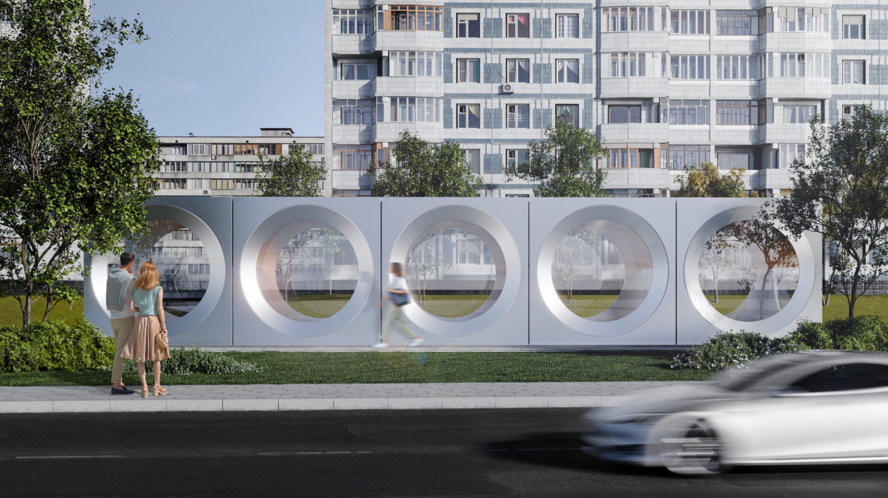
There are seven overland pavilions, and all of them are subjugated to the common module of a circle within a square – this is how the architects emphasize the flexibility of the designed modular system, at the same time proposing to mark the differences between the volumes to better orient the passengers. There is a pavilion, all walls of which are composed of circular windows, and there are pavilions with two or three openings.

“Zagorye” metro station. The competition project 2022
Copyright: © UNK


Looking at the pavilions, you begin to realize that, of course, the main uniting motif of the entire project is not so much metal (although metal does play an important part) as a circle. Curiously, although the avant-garde architecture claims that it borrowed the circular window from steamers and airplanes and industrial chimneys, in actuality it has inherited the circular window from the gothic and renaissance architecture. But then again, it was avant-garde architects who proposed placing several circular windows in a row. Circles are all over the place here: at the station, in the entrance pavilions, and in the information graphics design, where they sometimes turn into ellipses. The combination of metal and large circular openings refer not so much to avant-garde as to the design search for the optimum “cosmic” shape of the sixties: bull’s eyes, circular hatches, and such like – what else do you need metallurgy for if not to help humans penetrate new and unfamiliar environments, be that outer space, or underground, or, more specifically, metro.

“Zagorye” metro station. The competition project 2022
Copyright: © UNK


Hence this simple and light form – as if from the sixties – modular and shining noble silver. Also, this is something that is relevant today, and something that rhymes with the industrial scenery of the Lipetskaya Street – at the same time without conflicting with the greenery of the Biryulevo Park on its opposite side.

“Zagorye” metro station. The competition project 2022
Copyright: © UNK


Such a “Pavilion Futura”, strictly speaking, can adapt to any kind of environment, sometimes thanks to its lightens and simplicity, and sometimes by contrast. By day, the silvery surface and the large diameter of the openings will work for easier perception of their construction, as if aluminum, as if brought here by accident and placed here and there. By night, however, they will glow from the inside, accentuating golden waves of the ceilings, yet not excluding the see-through gaze.

“Zagorye” metro station. The competition project 2022
Copyright: © UNK


“Zagorye” metro station. The competition project 2022
Copyright: © UNK


The design solution is light and austere, modular and diverse at the same time, clearly motivated by the location and filled with occasional, and because of that even more “tasty” details, as well as texture and color inclusions. Neither the reference to the avant-garde, nor the “spaceship” imagery, nor the “metallurgical” theme prevail and do not suppress – on the contrary, everything is simple and easy, optimistic, as in the sixties, which I recognize as an obvious strong side of the project.
  • zooming
    1 / 3
    Plan of the vestibules. “Zagorye” metro station. The competition project 2022
    Copyright: © UNK
  • zooming
    2 / 3
    Plans of the platform. “Zagorye” metro station. The competition project 2022
    Copyright: © UNK
  • zooming
    3 / 3
    Longitudinal section view of the platform. “Zagorye” metro station. The competition project 2022
    Copyright: © UNK


25 August 2022

Julia Tarabarina

Written by:

Julia Tarabarina
Translated by:
Anton Mizonov
Headlines now
Our Everything
Who is Alexey Shchusev? In the last couple of weeks, since the architect’s 150th birthday, different individuals have answered this question differently. The most detailed, illustrated, and elegantly presented response is an exhibition held in two buildings of the Museum of Architecture on Vozdvizhenka. Four curators, a year and a half of work performed by the entire museum, and exhibition design by Sergey Tchoban and Alexandra Sheiner – in this article, we take you on a tour of the exhibition and show what’s what in it.
Gold Embroidery
A five-story housing complex designed by Stepan Liphart in Kazan, responds to the stylistically diverse context with its form, both integral and agile, and as for the vicinity of the “Ekiyat” movie theater, the complex responds to it with a semblance of theater curtain folds, and active plastique of its balconies, that bear some resemblance to theater boxes. Even if excessively pompous a little bit, the complex does look fresh and modern. One will have a hard time finding Art Deco elements in it, even though the spirit of the 1930s, run through the filter of neo-modernism, is still clearly felt, just as a twist of the Occident.
Reconciliation
The restoration of the Salt Warehouse for the Zvenigorod Museum, on the one hand, was quite accurately implemented according to the design of the People’s Architect, and, on the other hand, it was not without some extra research and adjustments, which, in this case, was quite beneficial for the project. The architects discovered the original paint color, details of the facades, and studied the history of rebuilds of this building. As a result, the imposing character of the empire building, the oldest one in the city, and the differences of later additions were accurately revealed. Most importantly, however, the city got a new cultural and public space, which is already “working” in full swing.
From Moscow to Khabarovsk
This year, the works submitted by the students of the Genplan Institute of Moscow included a proposal for revitalizing Moscow’s “Pravda” complex with its structures designed by Ilia Golosov, landscaping an East Siberian town, located a 12-hour drive away from the nearest big city, and three versions of turning a derelict “pioneer camp” into an educational hub, similar to “Sirius”. Two sites out of three have an interested client, so chances are that the students’ works will be ultimately implemented.
Harmonization of Intentions
We met and talked with the chief architect of Genplan Institute of Moscow Grigory Mustafin and the chief architect of Yuzhno-Sakhalinsk Maxim Efanov – about how the master plan of the city is formed. The key to success: gathering data, digital simulation, working with the city people, thinking infrastructure, and presentation.
​Cité for Naro-Fominsk
The new neighborhood on an island in the center of Naro-Fominsk continues the ideas of developing the territory of the silk-weaving factory, around which the city actually formed. The authors skillfully mix different formats of mid-rise development and make the most of the island location, offering a variety of formats of interaction with water, available to all citizens. No wonder that the project is considered exemplary and worthy of duplication in the region. It is also an example of rare synergy between the client and the architects.
A Tower and a Manor House
The concept of a high-density residential district replacing a set of outdated privately owned houses in Yekaterinburg preserves the street grid and, in some cases, even the scale of construction. OSA Architects combine towers with townhouses and other types of housing, orienting the silhouette composition towards a pedestrian boulevard. Through non-linear routes and spatial diversity, the residents will see their neighborhood in a new way every day.
​The Warm Stone
The housing complex in Zelenogorsk is interpreted by Mayak architects as a scatter of stones. The unconventional outline of houses with a pentagon plan not only helped to form the image part of the project, but also facilitated the architects’ work with the density of construction and insolation of the apartments.
For All Times
The modular technology combined with the building material of glued wood allows the architectural company Rhizome to create quick-mount hotels (no less!) that are highly rated by the architectural community: last week, the new hotel “Vremena Goda. Igora” scored three awards. Below, we are examining the project in detail.
The Other Way Around
Few awards instead of many, the award ceremony conducted on the first day instead of last, projections instead of sketch boards, trees inside and art objects outside – the renewal of the Architecton festival seemingly took the sure-fire path of turning all the professional traditions upside down – or at least those that happened to be within the scope of the organizers’ attention. There’s certainly a lot to pick on, but the exhibition does feel fresh and improvisational. It looks that pretty soon these guys will set trends for Moscow as well. We shared with you about some elements of the festival in our Telegram channel, and now we are examining the whole thing.
ArchiWOOD-14: Building Bridges
This season, the festival’s jury decided not to award a grand prize: judging by the fact that the shortlist included several projects that had not reached the award in previous years, and the “best house” was pronounced to be an undoubtedly beautiful but mass-produced model, the “harvest” of wooden buildings in 2023 was not too abundant. However, there were many unusual typologies among the finalists, and restoration and revitalization projects received their share of recognition. Let’s take a look at all the finalists.
The Chinese Symphony
The construction of the Chinese center “Huaming Park” has been a long story that came to fruition relatively recently. The building is adjacent to a traditional Chinese garden, but it is very modern, laconic and technological, and the simple-in-form, yet spectacular, white lamellae promise to someday be incorporated as a media facade. This complex is also truly multifunctional: it contains different types of living spaces, offices, a large fitness center, conference halls and restaurants – all wrapped in one volume. You can comfortably hold international forums in it, having everything you may possibly need at your fingertips, and going outside only to take a walk. In this article, we are examining this complex in detail.
Ensemble of Individualities
Construction of the first phase of the INDY Towers multifunctional complex on Kuusinen Street, designed by Ostozhenka, has started. The project opens new angles of similarity between the column and the skyscraper, and we examine the nuances and parallels.
Black and Red
Kazakov Grand Loft received its name for a reason: responding to the client’s brief and proceeding from the historical industrial architecture of its immediate surroundings, Valery Kanyashin and Ostozhenka architects proposed a new version of a modern house designed in the fashionable “loft” style. What makes this building different is the fact that the bricks here are dark gray, and the facades of the romantic “fortress” towers blossom with magnificent glazing of the windows in the upper part. The main highlight of the complex, however, is the multiple open air terraces situated on different levels.
Icy Hospitality
Mezonproject has won the national architectural and town planning competition for designing a hotel and a water recreation center in the city of Irkutsk. The architects chose hummocks of Baikal ice as a visual image.
The Mastery of Counterpoint
In the sculpture of Classical Greece, counterpoint was first invented: the ability to position the human body as if it were about to take a step, imbuing it with a hint of the energy of future movement, and with hidden dynamics. For architecture, especially in the 20th century and now, this is also one of the main techniques, and the ATRIUM architects implement it diligently, consistently – and always slightly differently. The new residential complex “Richard” is a good example of such exploration, based on the understanding of contrasts in the urban environment, which was fused into the semblance of a living being.
Countryside Avant-Garde
The project of the museum of Aleksey Gastev, the ideologist of scientific organization of work, located in his hometown of Suzdal, is inscribed in multiple contexts: the contest of a small town, the context of avant-garde design, the context of “lean production”, and the context of the creative quest of Nikolai Lyzlov’s minimalist architecture – and it seems to us that this project even reveals a distant memory of the fact that Aleksey Gastev learned his craft in France.
On the Hills
In the project by Studio 44, the “distributed” IT campus of Nizhny Novgorod is based on well-balanced contracts. Sometimes it is hovering, sometimes undulating, sometimes towering over a rock. For every task, the architects found appropriate form and logic: the hotels are based on a square module, the academic buildings are based on a “flying” one, and so on. Modernist prototypes, specifically, Convent Sainte-Marie de La Tourette, stand next to references to the antique Forum and the tower of a medieval university – as well as next to contextual allusions that help inscribe the buildings of the future campus into the landscape of the city hills with their dominants, high slopes, breathtaking river views, the historical city center, and the Nizhny Novgorod University.
The Magic Carpet
The anniversary exhibition of Totan Kuzembaev’s drawings named “Event Horizons” shows both very old drawings made by the architect in the formative 1980’s, and now extracted from the Museum of Architecture, as well as quite a few pictures from the “Weightlessness” series that Totan Kuzembaev drew specifically for this exhibition in 2023. It seemed to us that the architect represented reality from the point of view of someone levitating in space, and sometimes even upside down, like a magic carpet with multiple layers.
​A Copper Step
Block 5, designed by ASADOV architects as part of the “Ostrov” (“Island”) housing complex, is at the same time grand-scale, conspicuous thanks to its central location – and contextual. It does not “outshout” the solutions used in the neighboring buildings, but rather gives a very balanced implementation of the design code: combining brick and metal in light and dark shades and large copper surfaces, orthogonal geometry on the outside and flexible lines in the courtyard.
The Light for the Island
For the first time around, we are examining a lighting project designed for a housing complex; but then again, the authors of the nighttime lighting of the Ostrov housing complex, UNK lighting, proudly admit that this project is not just the largest in their portfolio, but also the largest in this country. They describe their approach as a European one, its chief principles being smoothness of transitions, comfort to the eye, and the concentration of most of the light at the “bottom” level – meaning, it “works” first of all for pedestrians.
Spots of Light
A new housing complex in Tyumen designed by Aukett Swanke is a very eye-pleasing example of mid-rise construction: using simple means of architectural expression, such as stucco, pitched roofs, and height changes, the architects achieve a “human-friendly” environment, which becomes a significant addition to the nearby park and forest.
Ledges and Swirls
The housing complex “Novaya Zarya” (“New Dawn”) designed by ASADOV Architects will become one of the examples of integrated land development in Vladivostok. The residential area will be characterized by various typologies of its housing sections, and a multitude of functions – in addition to the social infrastructure, the complex will include pedestrian promenades, shopping malls, office buildings, and recreational facilities. The complex is “inscribed” in a relief with a whopping 40-meter height difference, and overlooks the Amur Bay.
Agglomeration on an Island
Recently, an approval came for the master plan of the Yuzhno-Sakhalinsk agglomeration, which was developed by a consortium headed by the Genplan Institute of Moscow. The document provides for the creation of 12 clusters, the totality of which will give the region a qualitative leap in development and make the island more self-sufficient, more accessible, and less dependent on the mainland. We are inviting you to examine the details.
Ivan Grekov: “A client that wants to make a building that is “about architecture” is...
In this article, we are talking to Ivan Grekov, the leader of the architectural company KAMEN (translates as “stone”), the author of many high-profile projects that have been built in Moscow in the recent years, about the history of his company, about different approaches to form making, about different meanings of volume and facade, and about “layers” in working with the environment – at the example of two projects by Osnova Group. These are the MIRAPOLIS complex on the Mira Avenue in Rostokino, whose construction began at the end of last year, and the multifunctional complex in the 2nd Silikatny Proezd on the Zvenigorodsky Highway; recently, it received all the required approvals.
Grasping and Formulating
The special project “Tezisy” (“Abstracts”), showcased at Arch Moscow exhibition in Moscow’s Gostiny Dvor, brought together eight young “rock stars of architecture”, the headliner being Vladislav Kirpichev, founder of the EDAS school. In this article, we share our impressions of the installations and the perspectives of the new generation of architects.
The White Tulip
Currently, there are two relevant projects for the Great Cathedral Mosque in Kazan, which was transferred to a land site in Admiralteiskaya Sloboda in February. One of them, designed by TsLP, was recently showcased at Arch Moscow. In this article, we are covering another project, which was proposed during the same period for the same land site. Its author is Aleksey Ginzburg, the winner of the 2022 competition, but now the project is completely different. Today, it is a sculptural “flower” dome symbolizing a white tulip.
ATRIUM’s Metaverse
The architectural company ATRIUM opened a gallery of its own in a metaverse. Inside, one can examine the company’s approach and main achievements, as well as get some emotional experience. The gallery is already hosting cyberspace business meetings and corporate events.
​From Darkness to Light
Responding to a lengthy list of limitations and a lengthy – by the standards of a small building – list of functions, Vladimir Plotkin turned the project of the Novodevichy Monastery into a light, yet dynamic statement of modern interpretation of historical context, or, perhaps, even interpretation of light and darkness.