По-русски

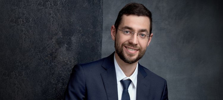
Oleg Manov: “There is no “happy medium” – you need to constantly either prove or create it”

Oleg Manov shares about how FURURA ARCHITECTS turned from a young architectural company to an established one: through being faithful to the idea of creating something new and unseen before, through architecture-related activities, through attention to drawings and models, and studying the relationship between new buildings and their surroundings.

25 May 2022
Interview
mainImg
Archi.ru
How did you become an architect?

Oleg Manov: 
I decided to become an architect still as a child because my father worked in “Project Institute #1”, and my mother in Lenproekt. We lived in a shared apartment on Moika, overlooking the Capella, and I went to a primary school on the Palace Embankment. When we sometimes went to the “sleeping belt” areas full of faceless multi-apartment buildings, I was very surprised and kept asking my mom how people could live there. I thought that it was a great social injustice that some people live in the city center, and some people have to huddle in small apartments, in which for some reason the ceilings were lowered.

zooming
Oleg Manov
Copyright: © FUTURA-ARCHITECTS


Parallel to the regular school, I also graduated from the art school, and then I entered the architectural department of the Academy of Fine Arts. In the Academy, I wanted to design houses different from the rest, and different from what my parents were doing – I had a total feeling that they were running in circles. If we recall the 1980’s, we all wore the same clothes, read the same newspapers, and in the Academy I was also faced with “sameness”: many of the students took the line of the least resistance, borrowing the solutions used by their predecessors. We had a great stockpile of albums full of lookalike projects, dragging from year to year. My love for new things cost me my grades.

It was then that I realized that it wouldn’t be a walkover. When I worked for Evgeny Gerasimov, I was already often faced with a situation when our clients would say: “We will not do it because we never did it”, and the builders would say: “This is impossible”. Little has changed since then, and to me this is a constant challenge. I know that when people say “We don’t know how to do it because we never did it” we are on the right track because this is exactly what we are going to do right now.

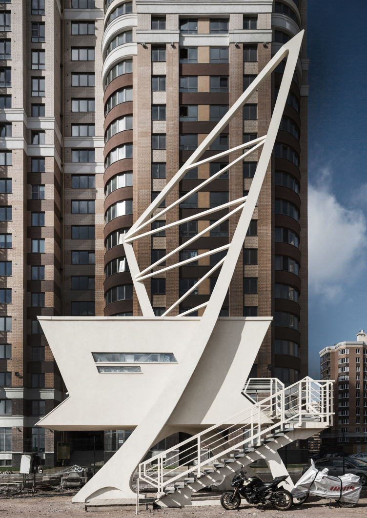
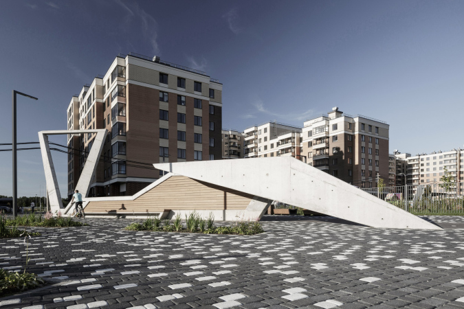
An architectural installation for a checkpoint
Copyright: © FUTURA-ARCHITECTS


Could you please share more about working for Evgeny Gerasimov? 

I came to work for Evgeny Gerasimov almost immediately after I graduated from the Academy of Fine Arts, and I worked for him for almost nine years. I was choosing the company that I would work for based on their projects – back then, there were already websites where you could see what the company was doing. People kept telling me that working there would be hard, that I would have to work overtime, but this was what I was looking for because I wanted to grow professionally. As for high-profile projects, I took part in designing the hotel at the Ostrovsky Square, “Nevskaya Ratusha”, the “Venice” house, and the housing complex in the Kovensky Lane.

How did you come to the decision to create your own company?

My urge to make something that’s different from what was there before never left me, and ultimately led me to creating a company of my own. We started a firm with my partner Dmitry – he is responsible for the development, and I am responsible for the creative process, design, HR, and client relationship.

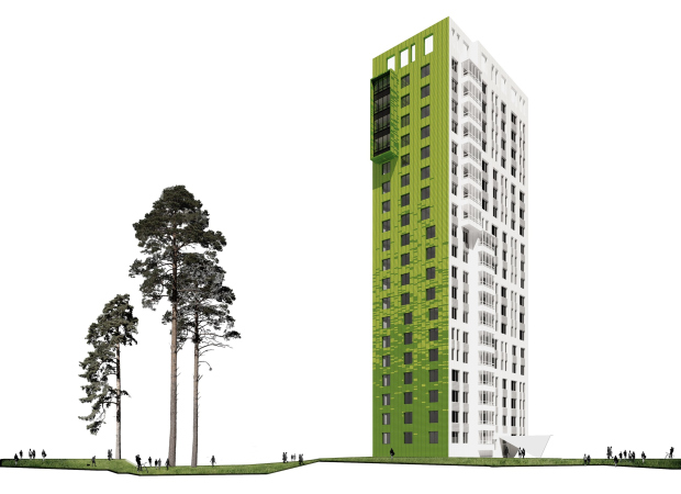
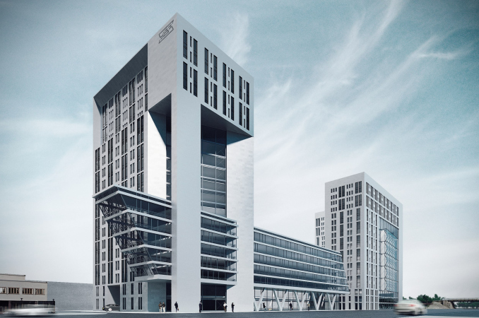
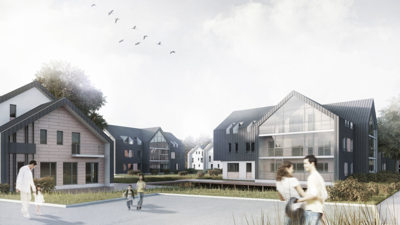
Today, we are purposefully trying to make projects that are different from everything that is already there. Young and ambitious clients are usually ready for this, and it’s much harder to convince well-established developer companies of such concepts, but we still offer them anyway – as a result, we did projects for such development giants as LSR, RBI, and UIT. Being different and being unique does not necessarily manifest itself in the building’s shape or its relationship with the context. It can be hidden in the materials, interior design, or other details.

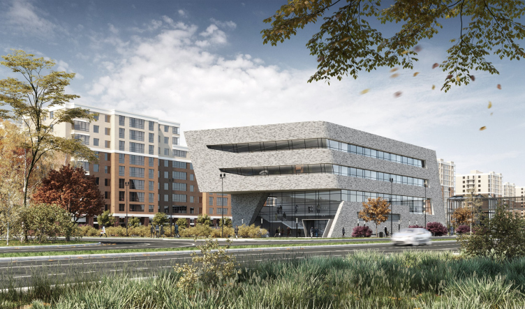
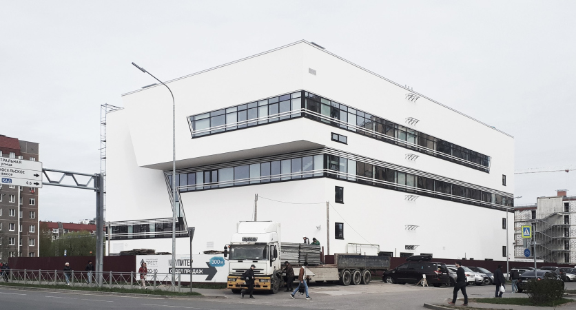
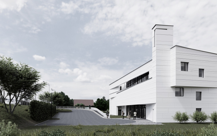
The Novoselye community center
Copyright: © FUTURA-ARCHITECTS


What were the first projects done by FUTURA-ARCHITECTS?

Our first large-scale project was the “New Farm” museum center in the state-owned reserve-museum “Peterhof”. This project developed really fast: less than a year elapsed from the initial negotiations to the opening, and this considering the fact that it was a very diverse task: the program of the center was devised for children of different ages, and we had to design various facilities – from a movie hall to a laboratory.

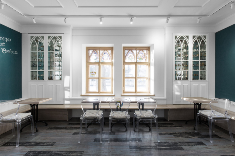
The museum center “New Farm” in teh state reserve/museum Peterhof
Copyright: © FUTURA-ARCHITECTS


You found this client thanks to us publishing our own magazine [where all the pictures were hand-drawn – editor’s note.] Could you please share more about how architecture-related activities moved your career forward? 

The magazine, the exhibitions, manifestos, and arch meetings – all these are different ways to express ourselves, and, yes, find clients as well. I organized exhibitions as I still went to the Academy, trying to search for different ways of realizing my creative insights. I can still remember that once I completed a large order – I was then doing odd jobs piecing together architectural models – I went to travel through Europe and visited Paris, Berlin, Brussels, and Amsterdam. As a result of my trip, I made a photo exhibition; it was very interesting back then.

In FUTURA-ARCHITECTS, we also tried to find possible points of contact with the colleagues, clients, and everyone who cares for architecture. As an option, we settled for a magazine – we did three issues [you can see it here – editor’s note]. When we were preparing materials for it, we got acquainted with art experts who did the “New Farm”, and this is how we landed the commission. Later on we realized that publishing a full-fledged magazine is too much of a task for an architectural company, because you had to open a special division for it. Exhibiting at trade shows is less labor-consuming, you can do this parallel to your main work. Now we have made a decision that when we have an opportunity to fully engage our resources with projects, we do not get distracted with exhibitions. 

Did you develop your special love for architectural drawing in the Academy of Fine Arts? Is hand drawing always an indispensable part of your creative process? How is the creative process organized in your studio?

I do not think with my pencil, as I am sure many others do: even in our studio I often see this picture: a person goes away from their desk for a second, and their desk is absolutely covered in drawings. This is not how I do it. I first think up everything in my head, and then the drawing for me is just a tool, with which I check the proportions, or the object’s views from different sides. Sometimes you have an opportunity to make a model, sometimes you don’t; sometimes things happen so fast that you have to start from drawing your details in the AutoCADCivil, like it actually was with the house on Gastello Street.

The house on Gastello Street
Copyright: © FUTURA-ARCHITECTS


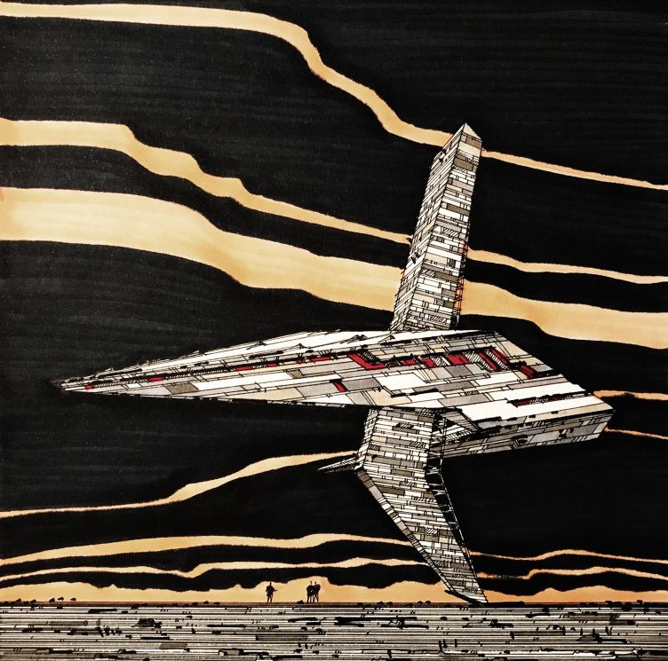
However, we normally do sketches, models, and BIM models – we test every project from all sides. We have quite a lot of material. At the end of 2019, we were approached by the Shchusev Museum – first they asked us to work for their auction, and then they took for their archives sketches of complete or in-construction projects – there were about 40 of them. One of our drawings has long since been exhibited in the Sergei Tchoban Museum of Architectural Drawing, of which I am very proud.

The “Weightlessness” drawing kept in the museum of architectural drawing in Berlin
Copyright: © FUTURA-ARCHITECTS


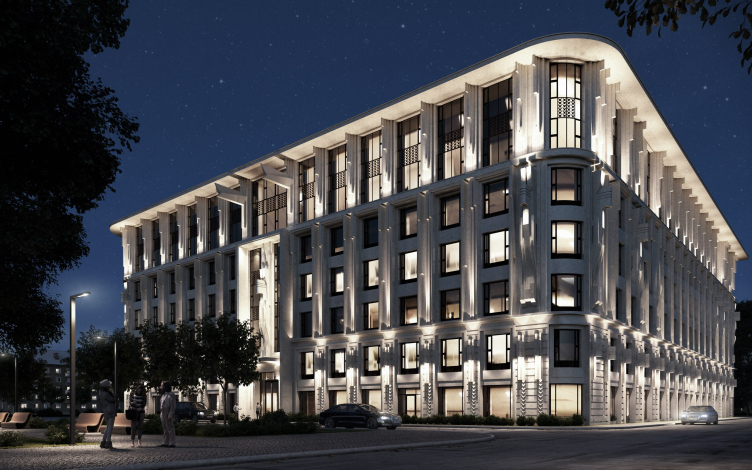
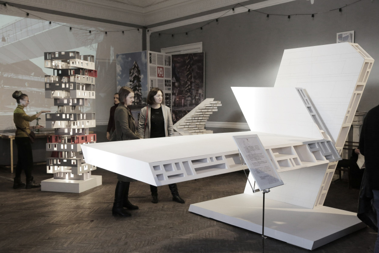
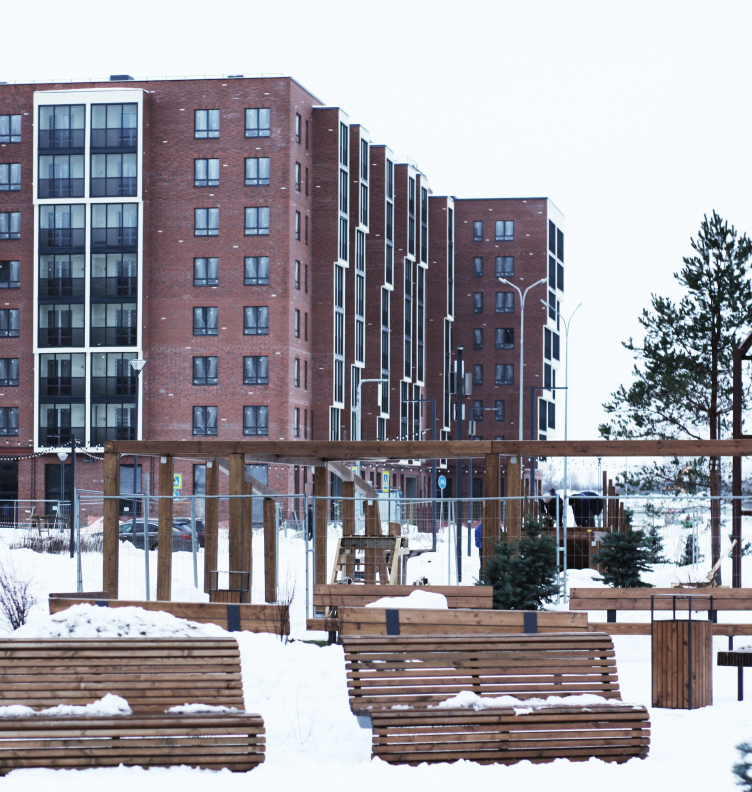
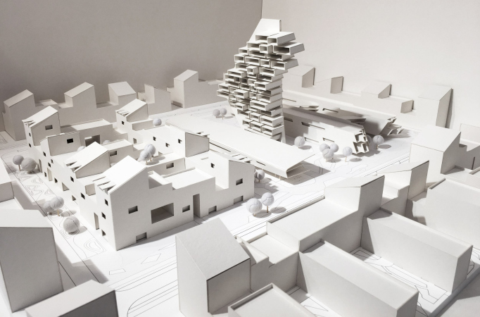
Since we do know how to make convincing visualizations, as well as have a desire to participate in trade shows and interact with our colleagues, I only do drawings for myself, in order to test this or that idea. When there is a similar situation when we have to come up with a quick proposal, a turn to these sketches, and the form turns into a real object. The brick housing complex “New Piter” was born exactly this way – only not from a sketch but from an installation that we did for the exhibition of the Union of Creative Studios in “Golitsyn Loft” with Ilia Yusupov.

The installation for the OAM exhibition in Golitsyn Loft.
Copyright: © FUTURA-ARCHITECTS


The New Piter housing complex
Copyright: © FUTURA-ARCHITECTS


Your company is already ten years old – what are your main achievements? How did the company develop? 

We kept a team of 15 people for about five years. Today, our team is also relatively small – from 20 to 25 people, but this allows us to do from 2 to 4 projects simultaneously, which is important. Given the reality of today, you cannot afford to do just one project because it can stop at any moment, but having more than 5 projects going at the same time will compromise quality.

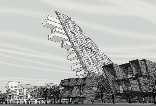
After the “New Farm”, we did interior design projects, landscape design, and the development concept for the Flandria Plaza business center. Our housing block proposal came second at the First Young Architectural Biennale in Kazan. This gave us an opportunity to secure yet another contract, the one for the Salavat Kupere housing complex, which we did together with the two other winners – Citizenstudio and KPLN. This is meant to be a social housing project, and the developer wanted us to add some extra value to it. The large-scale project “Uralvagonzavod” got agreed by three chief architects: Oleg Rybin, Yuri Mityurev, and Vladimir Grigoryev. Everything was ready for the expertise but the project was eventually frozen. The same thing happened to the competition project for the village of Yukka, where we developed the residential housing, administrative buildings, a shopping mall, and a few privately owned houses. One of the first projects that we did for LSR was the residential building on Gastello Street that was not implemented solely because of the fact that the site was bought out by another developer.

  • zooming
    1 / 7
    The proposal of a housing complex for the first Young Architecture Biennale in Kazan
    Copyright: © FUTURA-ARCHITECTS
  • zooming
    2 / 7
    The proposal of a housing complex for the first Young Architecture Biennale in Kazan
    Copyright: © FUTURA-ARCHITECTS
  • zooming
    3 / 7
    “Salavat Kupere” housing complex
    Copyright: © FUTURA-ARCHITECTS
  • zooming
    4 / 7
    “Salavat Kupere” housing complex
    Copyright: © FUTURA-ARCHITECTS
  • zooming
    5 / 7
    “Salavat Kupere” housing complex
    Copyright: © FUTURA-ARCHITECTS
  • zooming
    6 / 7
    “Uralvagonzavod” R&D center
    Copyright: © FUTURA-ARCHITECTS
  • zooming
    7 / 7
    The project of renovating the village of Yukka
    Copyright: © FUTURA-ARCHITECTS


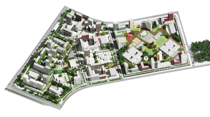
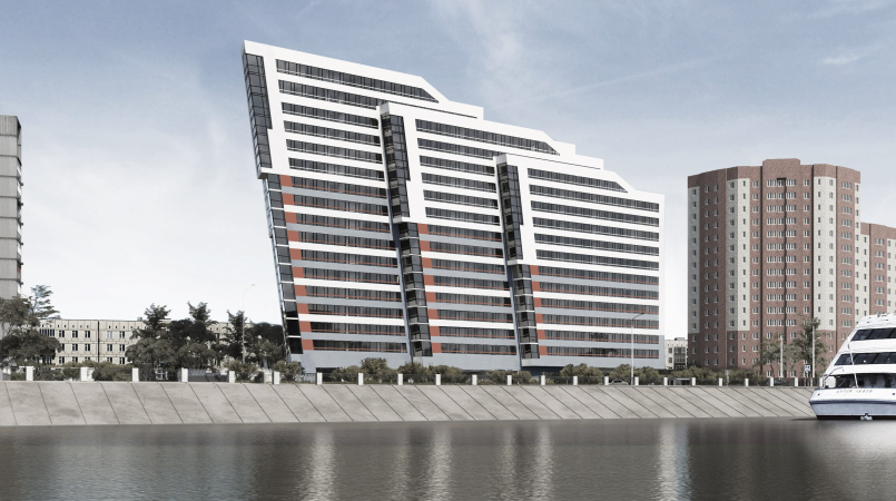
In the final stage are now the businesses center and the fitness center in Novoselye, a sports center in Ozerki, and this summer the “New Piter” complex will be put into operation. The housing complex on the Oktyabrskaya Embankment has received the Architectural and Town Planning approval, and has passed the expertise; another project that we also did for LSR on the Moskovsky Avenue is also in expertise.

  • zooming
    1 / 4
    A fitness an sports center in Novoselye
    Copyright: © FUTURA-ARCHITECTS
  • zooming
    2 / 4
    The sports center on the Vyborg Highway
    Copyright: © FUTURA-ARCHITECTS
  • zooming
    3 / 4
    The housing complex on the Oktyabrskaya Embankment
    Copyright: © FUTURA-ARCHITECTS
  • zooming
    4 / 4
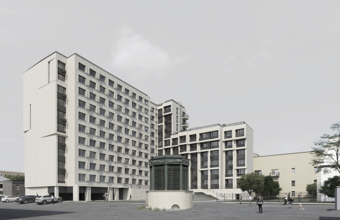
    The house on Egorova Street
    Copyright: © FUTURA-ARCHITECTS


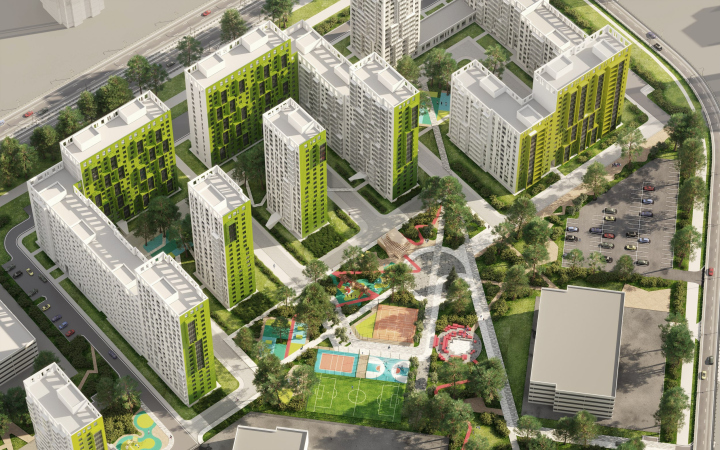
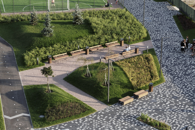
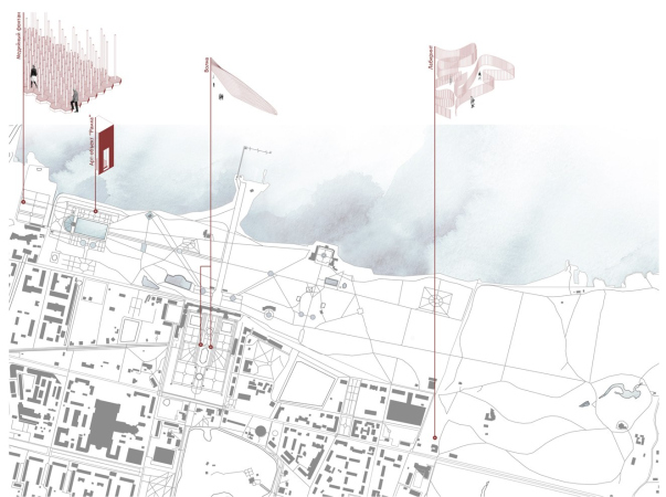
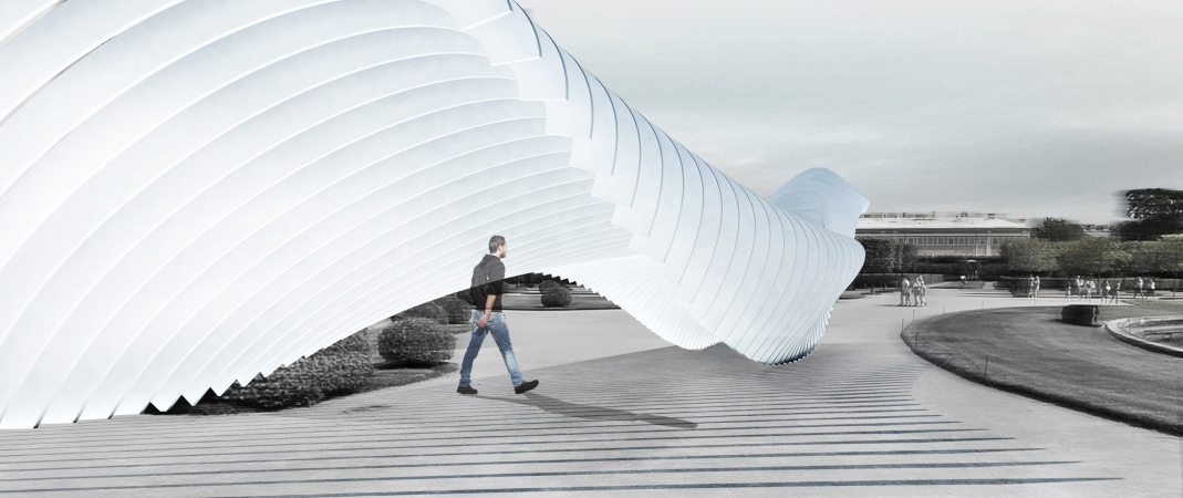
About 50% is complete of the “White Nights” pedestrian boulevard that runs through New Piter. We did about five landscaping projects for RBI. We also continued cooperation with the Peterhof Museum / Reserve – we came up with a quest intended to lure the visitors into the remote corners of the park, as well as an installation, in which you can make exhibitions in front of the palace.

  • zooming
    1 / 5
    The “White Nights” boulevard in the New Peter housing complex
    Copyright: © FUTURA-ARCHITECTS
  • zooming
    2 / 5
    The “White Nights” boulevard in the New Peter housing complex
    Copyright: © FUTURA-ARCHITECTS
  • zooming
    3 / 5
    The “Peterhof of the Future” installation series
    Copyright: © FUTURA-ARCHITECTS
  • zooming
    4 / 5
    The “Peterhof of the Future” installation series
    Copyright: © FUTURA-ARCHITECTS
  • zooming
    5 / 5
    The “Peterhof of the Future” installation series
    Copyright: © FUTURA-ARCHITECTS


Currently, we are cutting down the number of our branches, trying to focus more on general design, because our resources and brand awareness have grown. Sometimes, however, if a super-unusual proposal comes in, we agree to do interiors or landscaping.

At which point in time did FUTURA-ARCHITECTS stop being a “young company”?

After you’ve been working for ten years, you definitely cannot call your company “young”. However, the clients keep it simple and divide all the architects into two categories: the young ones who are good at making 3D renders, and the experienced ones who can do projects as general designers. There is no “happy medium” in this division – you need to either constantly prove or create it. Companies that are full of ideas, can be general designers, and are young at the same time, are few and far between.

Since 2016, you have been a member of the Board of the St. Petersburg Union of Architects, since 2021 – in the Association of Architectural Firms (OAM) – what are the benefits?

We have long since wanted this, and we were happy to be invited. OAM is a club for legal entities, not private persons. Right now there are 16 of them, and the membership gives us an opportunity to discuss professional topics and broadcast our opinions on the outside. These meetings can give impetus to transformations, for example, in legislative norms – we can collectively make a proposal to the Committee for City Planning and Architecture  or the Committee on State Control, Use and Protection of Historical and Cultural Landmarks.

In what direction will FUTURA-ARCHITECTS develop? 

We are most of all interested in doing two things. One: the questions of interrelationship between a new building and its context. Virtually any shape of the building you can conceive of has been posted online, you cannot dream up much in that respect – but the options for its interrelation with the surrounding context are endless. To give but one example: we are currently working on the headquarters of a large company, which will be located in a courtyard – it must look presentable, yet almost visible from any of the nearby streets. Two: how a person interacts with a building at the level of detail and material. Both of these moments can be felt only by being in a specific place – by seeing the building with your own eyes, approaching it from different sides, and peeking inside.

25 May 2022

Headlines now
The Golden Crown
The concept for a dental clinic in Yekaterinburg, developed by CNTR Studio, revolves around the idea of a “mouth full of gold”: pristine white porcelain stoneware walls are complemented by matte brass details. To avoid an overly literal interpretation, the architects focused on the building’s proportions, skillfully navigating between sunlight requirements and fire safety regulations.
Flexibility and Integration
Not long ago, we covered the project for the fourth phase of the ÁLIA residential complex, designed by APEX. Now, we’ve been shown different fence concepts they developed to enclose the complex’s private courtyards, incorporating a variety of public functions. We believe that the sheer fact that the complex’s architects were involved in such a detail as fencing speaks volumes.
A Step Forward
The HIDE residential complex represents a major milestone for ADM architects and their leaders Andrey Romanov and Ekaterina Kuznetsova in their quest for a fresh high-rise aesthetic – one that is flexible and layered, capable of bringing vibrancy to mass and silhouette while shaping form. Over recent years, this approach has become ADM’s “signature style”, with the golden HIDE tower playing a pivotal role in its evolution. Here, we delve into the project’s story, explore the details of the complex’s design, and uncover its core essence.
Gold in the Sands
A new office for a transcontinental company specializing in resource extraction and processing has opened in Dubai. Designed by T+T Architects, masters of creating spaces that are contemporary, diverse, flexible, and original, this project exemplifies their expertise. On the executive floor, a massive brass-clad partition dominates, while layered textures of compressed earth create a contextually resonant backdrop.
Layers and Levels of Flight
This project goes way back – Reserve Union won this architectural competition at the end of 2011, and the building was completed in 2018, so it’s practically “archival”. However, despite being relatively unknown, the building can hardly be considered “dated” and remains a prime example of architectural expression, particularly in the headquarters genre. And it’s especially fitting for an aviation company office. In some ways, it resembles the Aeroflot headquarters at Sheremetyevo but with its own unique identity, following the signature style of Vladimir Plotkin. In this article, we take an in-depth look at the United Aircraft Corporation (UAC) headquarters in the Moscow agglomeration town of Zhukovsky, supplemented by recent photographs from Alexey Naroditsky – a shoot that became only recently possible due to the fact that improvements were finally made in the surrounding area.
Light and Shadow
In this article, we delve into the architectural design of the “Chaika” house by DNK ag architects, which was recently completed in 2023 as part of the collection of signature designs at ZILArt. As is well-known, all the buildings in this complex follow a design code, yet each one is distinct. This particular building stands out not only for its whiteness and minimalism but also for the refined use of a limited number of techniques that, together, create what can confidently be called synergy.
Casus Novae
A master plan was developed for a large residential area with a name of “DNS City”, but now that its implementation began, the plan has been arbitrarily reformatted and replaced with something that, while similar on the surface, is actually quite different. This is not the first time such a thing happens, but it’s always frustrating. With permission from the author, we are sharing Maria Elkina’s post.
Treasure Hunting
The GAFA bureau, in collaboration with Tegola and Arkhitail, organized an expedition to the island of Kilpola in Karelia as part of Moskomarkhitektura’s “Open City” festival. There, amidst moss and rocks, the students sought answers to questions like: what is the sacred, where does it dwell, and what sustains it? Assisting the participants in this quest were landscape engineer Evgeny Levin, artist Nicholas Roerich, a moose, and the lack of cellular connection. Here’s how the story unfolded.
Depths of the Earth, Streams of Water
In the Malaya Okhta district, the Akzent building, designed by Stepan Liphart, was constructed. It follows a classic tripartite structure, yet it’s what you might call “hand-drawn”: each façade is unique in its form and details, some of which aren’t immediately noticeable. In this article, we explore the context and, together with the architect, delve into how the form was developed.
Fir Tree Dynamics
The “Airports of Region” holding is planning to build an airport in Karachay-Cherkessia, aiming to make the Arkhyz and Dombay resorts more accessible to travelers. The project that won in an invitation-only competition, submitted by Sergey Nikeshkin’s KPLN, blends natural imagery inspired by the shape of a conifer seed, open-air waiting spaces, majestic large trees, and a green roof elevated on needle-like columns. The result is both nature-inspired and WOW.
​A Brick Shell
In the process of designing a clubhouse situated among pine trees in a prestigious suburban area near Moscow, the architectural firm “A.Len” did the façade design part. The combination of different types of brick and masonry correlates with the volumetric and plastique solutions, further enhanced by the inclusion of wood-painted fragments and metal “glazing”.
Word Forms
ATRIUM architects love ambitious challenges, and for the firm’s thirtieth anniversary, they boldly play a game of words with an exhibition that dives deep into a self-created vocabulary. They immerse their projects – especially art installations – into this glossary, as if plunging into a current of their own. You feel as if you’re flowing through the veins of pure art, immersed in a universe of vertical cities, educational spaces – of which the architects are true masters – and the cultural codes of various locations. But what truly captivates is the bold statement that Vera Butko and Anton Nadtochy make, both through their work and this exhibition: architecture, above all, is art – the art of working with form and space.
Flexibility and Acuteness of Modernity
Luxurious, fluid, large “kokoshniks” and spiral barrel columns, as if made from colorful chewing gum: there seem to be no other mansion like this in Moscow, designed in the “Neo-Russian-Modern” style. And the “Teremok” on Malaya Kaluzhskaya, previously somewhat obscure, has “come alive with new colors” and gained visibility after its restoration for the office of the “architectural ecosystem” as the architects love to call themselves. It’s evident that Julius Borisov and the architects at UNK put their hearts into finding this new office and bringing it up to date. Let’s delve into the paradoxes of this mansion’s history and its plasticity. Spoiler: two versions of modernity meet here, both balancing on the razor’s edge of “what’s current”.
Yuri Vissarionov: “A modular house does not belong to the land”
It belongs to space, or to the air... It turns out that 3D printing is more effective when combined with a modular approach: the house is built in a workshop and then adapted to the site, including on uneven terrain. Yuri Vissarionov shares his latest experience in designing tourist complexes, both in central Russia and in the south. These include houseboats, homes printed from lightweight concrete using a 3D printer, and, of course, frame houses.
​Moscow’s First
“The quality of education largely depends on the quality of the educational environment”. This principle of the last decade has been realized by Sergey Skuratov in the project for the First Moscow Gymnasium on Rostovskaya Embankment in the Khamovniki district. The building seamlessly integrates into the complex urban landscape, responding both to the pedestrian flow of the city and the quiet alleyways. It skillfully takes advantage of the height differences and aligns with modern trends in educational space design. Let’s take a closer look.
Looking at the Water
The site of Villa Sonata stretches from the road to the water’s edge, offering its own shoreline, pier, and a picturesque river panorama. To reveal these sweeping views, Roman Leonidov “cut” the façade diagonally parallel to the river, thus getting two main axes for the house and, consequently, “two heads”. The internal core – two double-height spaces, a living room and a conservatory, with a “bridge” above them – makes the house both “transparent” and filled with light.
The White Wing
Well, it’s not exactly white. It’s more of a beige, white-stone structure that plays with the color of limestone – smoother surfaces are lighter, while rougher ones are darker. This wing unites various elements: it absorbs and interprets the surrounding themes. It responds to everything, yet maintains a cohesive expression – a challenging task! – while also incorporating recognizable features of its own, such as the dynamic cuts at the bottom, top, and middle.
Urban Dunes
The XSA Ramps team designed and built a three-part sports hub for a park in Rostov-on-Don, welcoming people of all ages and fitness levels. The skate plaza, pump track, and playground are all meticulously crafted with details that attract a diverse range of visitors. The technical execution of the shapes and slopes transforms this space into a kind of sculptural composition.
Proportional Growth
The project for the fourth phase of the ÁLIA residential area has been announced. The buildings are situated on an elongated plot – almost a “ray” that shoots out from the center of the area towards the river. Their layout reflects both a response to Moscow’s architectural preferences over the past 15 years, shifting “from blocks to towers”, and an interpretation of the neighboring business park designed by SOM. Additionally, the best apartments here are not located at the very top but closer to the middle, forming a glowing “waistline”.
The “Staircase” Building
In designing the “Details” residential complex in New Moscow, Rais Baishev spiced up the now-popular Moscow theme of a “courtyard” building with an idea drawn from the surrealist drawings by Maurits Escher. He envisioned the stepped silhouettes and descending slopes as a metaphysical mega-staircase, creating a key void within the courtyard that gave the project an internal “spine”. This concept is felt both in the building’s silhouette and on its façades.
Projection of the Quarter
No one doubted that the building that Vladimir Plotkin designed as part of the “Garden Quarters” would be the most modernist of all. And it turned out just that way: while adhering to the common design code, the building successfully combines brick and white stone, rhythmically responding to the neighboring building designed by Ostozhenka, yet tactfully and persistently making a few statements of its own. This includes the projection of the ideal urban development composition “14–9–6”, which can be found right next door, mathematical calculations, including those for various types of terraces (and perhaps the only reminder of the Soviet past of the Kauchuk rubber factory!), and the white “cross-stitch” pattern of the façade grid.
Domus Aurea
In this issue, we examine the “Tessinsky-1” house, designed by Sergey Skuratov and completed in 2023. Located in the middle of the Serebryanicheskaya Embankment district, at the intersection of its main streets, this house assumes a sort of “nodal” role: it not only responds to everything around it and preserves many memories of the former EMA factory within itself, but it weaves all this into a newly directed pattern, reconciling bright “gold” and dark-colored brick, largely with the help of the new, modern-yet-archaic Columba brick, which, come to think about it, is the most precious element here.
The Chimney of Nikola-Lenivets
In this issue, we are examining the “Obelisk House” designed by KATARSIS and built for the Arkhstoyanie 2023 festival. However, it was only finished later on, and this is why we are examining it now. It seems to us that after the “Obelisk House” appeared in Nikola-Lenivets, a dialogue and a few inner connections appeared between the temporary structures built here. These houses no longer look like “accidental neighbors”, more of which below.
​Periscope by the Bay
The jury awarded the second place in the competition for a public and cultural center in Petropavlovsk-Kamchatsky to the companies GORA (“Mountain”) and M4. In the consortium’s proposal, the building resembles a sperm whale with a calf swimming next to it or a periscope, whose lenses capture the most spectacular views from the surrounding landscape.
From Arcs to Dolmens
While working on the competition project for Petropavlovsk-Kamchatsky, ASADOV Architects prioritized the value of the natural and urban environment, aiming to preserve the balance of the location while minimizing the resemblance of the volume that they designed to a “traditional building”. The task was challenging, and the architects created three versions, one of which having been developed after the competition, where their main proposal took third place. However, the point of interest here is not the competition result but the continuity of creative thinking.
Hide and Seek
The ID Moskovskiy house, designed by Stepan Liphart in St. Petersburg, in the courtyards near Moskovskiy Avenue beyond the Obvodny Canal and recently completed, is notable for several reasons. Firstly, it has been realized with considerable accuracy, which is particularly significant as this is the first building where the architect was responsible not only for the facades but also for the layouts, allowing for better integration between the two. On the other hand, this building is interesting as an example of the “germination” of new architecture in the city: it draws on the best examples from the neighborhood and becomes an improved and developed sum of ideas found by the architect in the surrounding context.
The Big Twelve
Yesterday, the winners of the Moscow Mayor’s Architecture Award were announced and honored. Let’s take a look at what was awarded and, in some cases, even critique this esteemed award. After all, there is always room for improvement, right?
Above the Golden Horn
The residential complex “Philosophy” designed by T+T architects in Vladivostok, is one of the new projects in the “Golubinaya Pad” area, changing its development philosophy (pun intended) from single houses to a comprehensive approach. The buildings are organized along public streets, varying in height and format, with one house even executed in gallery typology, featuring a cantilever leaning on an art object.
Nuanced Alternative
How can you rhyme a square and space? Easily! But to do so, you need to rhyme everything you can possibly think of: weave everything together, like in a tensegrity structure, and find your own optics too. The new exhibition at GES-2 does just that, offering its visitor a new perspective on the history of art spanning 150 years, infused with the hope for endless multiplicity of worlds and art histories. Read on to see how this is achieved and how the exhibition design by Evgeny Ace contributes to it.
Blinds for Ice
An ice arena has been constructed in Domodedovo based on a project by Yuri Vissarionov Architects. To prevent the long façade, a technical requirement for winter sports facilities, from appearing monotonous, the architects proposed the use of suspended structures with multidirectional slats. This design protects the ice from direct sunlight while giving the wall texture and detail.