In 2021, responding to the trend of Moscow’s high-rise growth, we launched a series of publications dedicated to high-density construction. Then at one point we started having doubts whether this agenda was still relevant, but the April session of Moscow’s Architectural Council, among other things, showed that, yes, it still was. This issue is a complex one because it is about infrastructure, technology, economy, ethics, sociology, and even politics. So, how can an architect find his place in this process of “squeezing”, as Rem Koolhaas put it, useful square meters out of the land site?
Vladimir Plotkin
Well, “squeezing” square meters out of the land site within the framework of the agreed and accepted plan is one of the architect’s basic professional competences. So, I am opposed to all this fancy talk about the architect’s “social” or “humanitarian” mission that is ostensibly all about keeping the construction “within the limits”, or stopping some architectural atrocities – that is, it course, if we are not talking about something totally unacceptable and carrying an existential threat to humanity or some given territory. However, I have not seen such “existential threats” so far within the scope of my personal responsibility or in my practice, for that matter.
But don’t you have a feeling that the architect ultimately ends up carrying responsibility for decisions that he does not make? Like it is him that came up with all this high-rise construction?
For the record, I am neither an advocate nor a critic of high-rise buildings.
However, if we do take up a project, this means that we are accepting its parameters and look for the best possible answers to all of the challenges that it poses, understanding that people will lay the blame on us for decisions that was not ours to make in any event. But then again, I would not say that somebody will hold us “accountable” for that – this, I will stress again, is what the architect’s job is about.
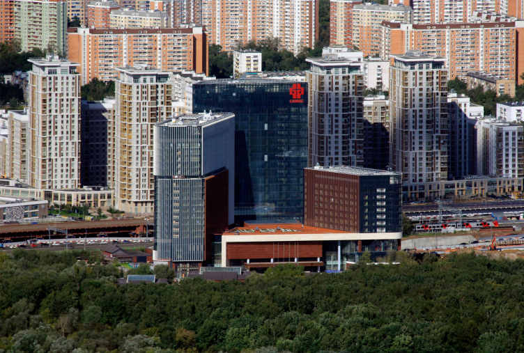
View from the Ostankino TV tower. The “Huamin” center on the Vilgelma Pika Street / TPO Reserve (in the center) against the background of the housing construction on the Serebryakova Drive
Copyright: Photograph: Julia tarabarina, Archi.ru
In other words, the architect should not try to influence the scale of construction, should he? He at best “molds” the volume, and at worst decorates the facade – is that what you are trying to say?
First, let’s become clear about the “scale” and “scaling” terms. If by the term “scale” we essentially mean sheer geometric parameters, i.e. height, width, and depth, then more often than not you do have to perceive this as an indisputable “given”. On the other hand, scaling your volumes in the direction of increasing or reducing their visual perception does presuppose their “molding” and decorating the facades – this is again part of the architect’s job, depending upon the effect that he wants to achieve. The techniques for that can be different – fractalization of the volume, facade decor as such, and whatnot. A technique cannot be “good” or “bad” – it can be appropriate or inappropriate.
The task is to find the best possible solution: aesthetic, economic, infrastructural, and so on, to create the best possible environment and to minimize the damage. But then again, this is all trivial dialectics – to some extent, damage is always inevitable: creating something new, you inevitably destroy something that already exists: be that nature or urban environment. Alas, our profession is complex, vulnerable, and sometimes defenseless against criticism.
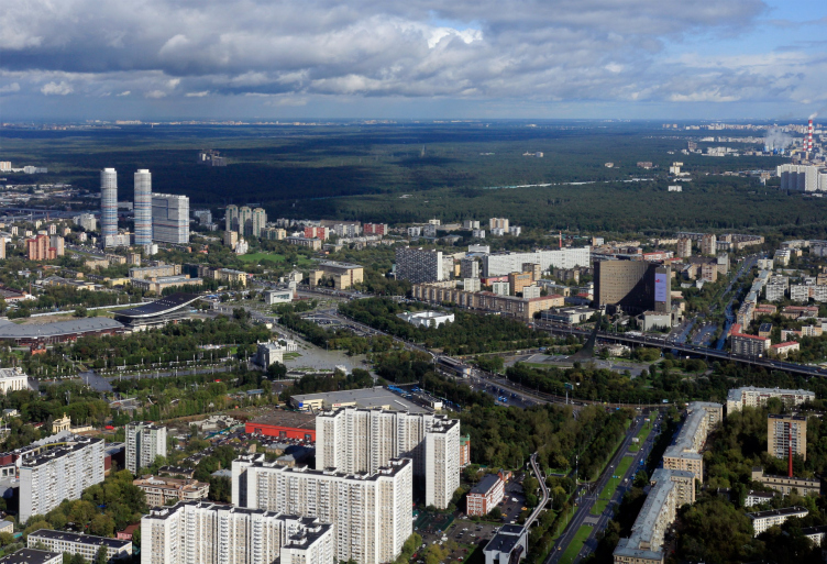
View from the Ostankino TV tower. The “Tricolor” housing complex / TPO Reserve on the left
Copyright: Photograph: Julia tarabarina, Archi.ru
Meanwhile, high-rise construction often comes under criticism just for the sheer fact of being high-rise.
Yes, a few well-known conceptual patterns have formed that are repeated countless times during this discussion that has been going on for years. However, you need to realize that high-rise construction is by no means conditioned solely by the “developer’s greed” and it does not mean “irreparable visual damage” to the city environment. On the upside, high-rise construction also means saving up the city land by shrinking the construction blueprint, and vacating the space for landscaping. Moscow is a city with a constantly growing population, and the megalopolis’s upward growth helps to keep it from sprawling. Large-scale developments become, to some extent, new city centers, reducing the need for everyday commuting within the city. This also reduces the load on the transportation system. These are considerable benefits for the city, which, I will repeat myself here, is growing fast.
Does the landscaping, inclusion of cultural institutions, retail, and other functions fully compensate for this considerable increase in the number of floors? Or perhaps my question is incorrect, and it’s not about compensation but about the fact that the high-rise construction provides the financial basis for the functional content?
I do not quite agree with the phrasing of the question either in the first or in the second version.
Parallel to the high-rise construction, what inevitably takes place is an increase in the density of various exciting and necessary city functions, and here, in my opinion, it is not “compensation” from either side that we must talk about. What matters here is just the degree of saturation and the quality of functions and landscaping.
Do you agree with the common opinion that each type of construction has its own strong sides, and the main advantage of a megalopolis is the sheer drive and a lot of different opportunities in one place?
Of course, I do! Moreover, this is my deepest conviction. A true full-fledged city combines different lifestyles, functions, and types of construction. And it is a good thing to have them in every district along the pedestrian routes or minor roads. This enriches our visual and user environment. And, again, it’s fun waking around such a city.
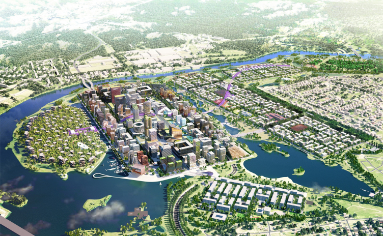
The diverse and different sized environment can form naturally, through the influence of the market forces and through the evolutionary – and sometimes revolutionary – development of the city. But this environment can also be formed within some specific projects, particularly those that cover considerable swaths of land – using an integrated approach and the typology of multifunctional complexes. A few of our projects submitted for town-planning competitions – the multifunctional center in Rublevo-Arkhangelskoe, the project of transforming the Gray Belt of St. Petersburg, and the pilot project of renovation in Tsaritsyno – propose, or, I would even say, declare precisely such diverse and relatively small planning structures, densely packed within one location.
The international financial center in Rublevo-Arkhangelskoe
Copyright: © TPO Reserve + Maxwan
The concept of reorganizing the blocks on Territory 2a and 2b in Tsaritsino
Copyright: TPO Reserve
All the three projects that you have just mentioned are essentially versions of very diverse and mixed construction. The Tsaritsyno project was predominantly composed of 6-9-15 story buildings (set by the competition specifications) with an odd inclusion of higher buildings. In Rublevo-Arkhangelskoe and the Gray Belt, large territories included natural parks, low-rise buildings from private housing construction to blocks from 7 to 9 stories high, and high-rise fragments in the vein of the Moscow City.
Now, here is the question: at which point does a building stop being just large, and becomes really oversized, inspiring hatred in the city people? And does this have to do with the size alone? There is a popular opinion that an “average” number of floors is “normal” architecture, and high-rises are “bad” by default. Does it transform into some special class of construction, which is non-architectural or sub-architectural, the kind that just “is”? Or maybe it all depends on who you talk to: some will say that 12 floors is already too much, and some will be perfectly ok with 35?
The evaluation criteria and the perception of “normalcy” of the scale and height of construction can be very different. They also depend upon the time and space, in which a transformation occurs of the urban environment that has so far been habitual to people. At the turn of the 19th and 20th centuries, Moscow’s low-rise construction slowly begins to give way to mid-rise houses. There was a time when even the Mosselprom 10-story house looked like a disproportionately large skyscraper. By the middle of the 20th century, however, the 10-story “Stalin” houses are already considered to be normal, beautiful, and comfortable architecture. Let alone the “seven sisters” – seven Moscow high-rises built in the 1950’s – they are universally considered to be beautiful. And the height certainly becomes these buildings; a building must look beautiful and appropriate. The refusal to accept – hatred is too strong a word here – the refusal to accept high-rise houses is essentially a subliminal protest against the unusual, which is basically human nature. It passes with time.
Try telling a resident of Manhattan or Hong Kong that their houses are not architecture!
Think of mega-cities that you saw in classic blockbusters, such as Star Wars, and such like. Today’s tallest building in the world looks like mid rise construction compared to them.
Then, of course, there are different walks of life and different preferences: some want to live closer to the earth, some people are afraid of heights, and some do want to be closer to the sky, and see sweeping views of cities and nature. One’s personal preferences also determine to a large extent what is and what isn’t “normal”.
Is there a place where you would never build a tower? On a windswept field? In a historical center?
A very difficult question! Abstractly speaking, I would build anything anywhere with great pleasure, much more so on a windswept field! Just imagine: a field spreading for hundreds of miles around, the sun is shining bright in a blue sky, and there is this glittering thing one kilometer high – isn’t it beautiful? But then again, the idea is not entirely new – just remember the pyramids of Egypt or the towers of castles or temples upon the hills.
Well, jokes aside, each location needs to be handled with care, and every city’s historical center, luckily, has height restrictions that are to be obeyed. But then again, there is an exception to every rule…
At some point, there were really many high-rise buildings among your projects. How exciting is this, working with large volumes? What is the main difference of working with a mega-scale?
We do have a lot of high-rise buildings even now. Yes, working with large volumes is exciting because they are sure to be conspicuous in the city, and, hence, this is a great responsibility. What makes working with a mega-scale different? There is no difference from “regular” architectural projects, really. Well, you may have to go deeper into the technicalities of high-rise construction and make a more thorough visual and landscape analysis of remote vantage points, from which this volume will be perceived.
One more thing: you need to keep a reasonable balance between the sold or rented floor space and the floor space designated for vertical and horizontal communications, including the utility lines. This, of course, holds true for low and mid-rise buildings as well, but in high-rise buildings, considering the relatively small area of the floor, the losses of useful square meters, multiplied by the number of floors, may become significant.
However, mega-buildings have no inner space, or, rather, it is much smaller compared to the size of these buildings. They are like sculptures consisting of cells. Hence, you only get to work with the outer form, is that so?
Yes, most of the time this is indeed the case because the homogeneous inner structure, consisting of repeating volumetric elements is what the typology of residential or office towers is all about. By the way, mega-buildings sometimes do have huge inner spaces: atriums, conference halls, etc.
It seems that you have been able to experiment with all the options for distributing the mass one can think of: mega city blocks, slab walls, the “Singapore-type” overpasses running at dizzying heights, and the three-towers-springing-from-a-podium, which have become a commonly accepted standard in Moscow.
Nebo residential complex
Copyright: Photograph © Aleksei Naroditskiy / provided by TPO Reserve
Do you think that one of these approaches is the optimum – for example, these towers on a podium that seem to steadily prevail today?
Any of the approaches is perfectly valid.
If you need to build something special, something iconic, and at the same time you have limited construction space on the ground, you move the large-size premises upward, and this is how the “Singapore” overpasses appear.
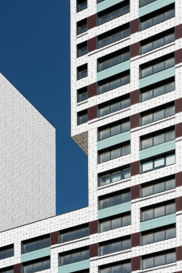
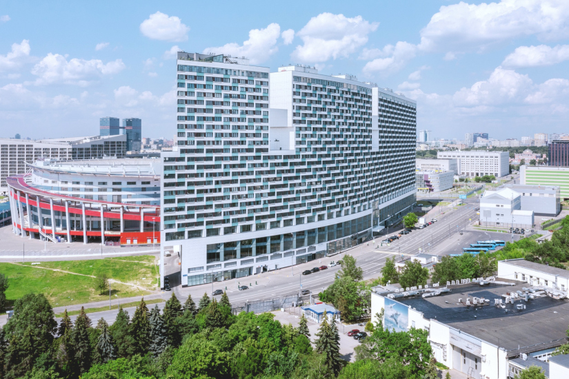
The giant “slabs” are not the most human-friendly option because they do kill the transparent city perspective, and are very often monotonous. However, sometimes it turns out that they are the most capacious and cost-effective option, and then you resort to huge slits – the openings in the top floors that open up the sky and form the silhouette of the building – this is how it is done in our “Litsa” housing complex. Then you can diversify the facades of the sections, creating an illusion of diverse construction – this approach was pioneered in Moscow by SPEECH when they designed their “Micro-City in a Forest”. But then again, even those notorious giant slabs can create a powerful visual statement – when built next to giant highways, for example.
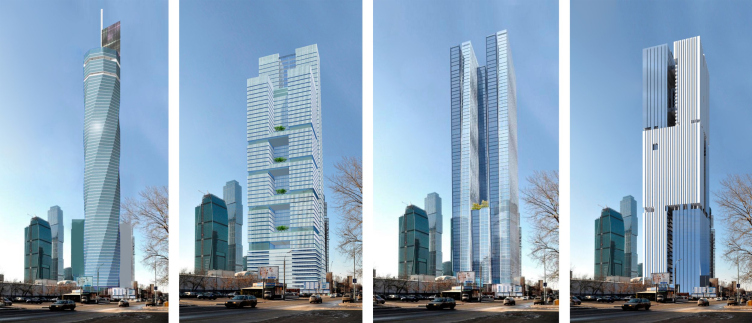
Separately standing towers with simplified or complex forms are the most adjustable option, and this approach is used most often. And if the developer wants to make an impression not just with the record-breaking height of the towers, which is often restricted by the city regulations, the architects are excited to be involved in the process of coming up with new shapes that hitherto had no analogues in the history of construction. This is how we get spiral towers, “sculpture” towers designed in the bionic “vitality” style, and sometimes they are really beautiful, I like them, even though they are not exactly to my taste. But then again, I have to admit that even among our projects you will come across an odd spiral shape, like, for example, in our contest proposal for the Moscow City that we did a years ago.
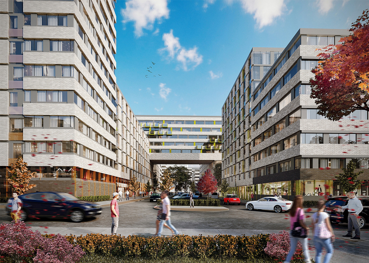
The competition project for Site 20 of the Moscow City. Height 240m / 2010
Copyright: TPO Reserve
This doubtlessly makes the environment more diverse and in the future this may become a habitual, if not prevalent, part of the cityscape.
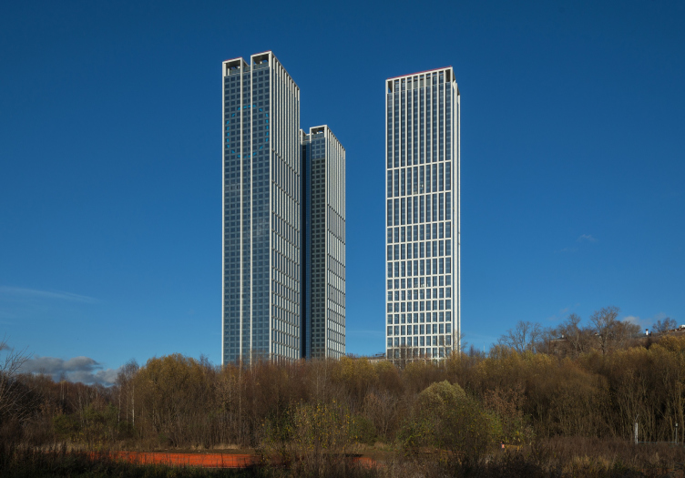
Oh, and by the way, if we are to speak about the three towers – this city is seeing the completion of very slender and graceful towers designed by Sergey Skurativ near the City on Krasnopresnenskaya Embankment.
Some of your projects display attempts to mix different city types, and pretty contrastive ones, too – hyper-scale is interspersed with small volumes 5-6 stories high. Was this approach effective? And other versions of the city of mixed height – such as city blocks with high-rise highlights – do they have a future?
As for the question about mixing the types of city development, I answered it earlier. As for city blocks with high-rise accents, they have been around forever, so I think that they also have a future. Just how tall and how beautiful these accents will be depends on the architect’s mastery.
Speaking about beautiful, by the way, what do you think is more effective: a silhouette, a height difference, a facade pattern, the organization of city space, or the complex architecture of the bottom floors?
You already answered your question with the order in which you put these things.
The algorithm of subconscious perception of architecture is usually as follows: first, the recipient is seeing the building as a whole – the height, the silhouette, the large elements. Coming closer, he stops his gaze on the facade pattern and facade elements – these are either columns, arches, and plasterwork, or some modern pattern. And then he perceives everything that is there on the eye level – the podium, the beautiful shop displays, and what he has underneath his feet – the organization of the adjacent territory.
High-rise large-scale buildings are seen from afar, and, hence, yes, the silhouette is important. The silhouette can also be formed by the surrounding construction, contrastive in terms of height.
And then you can go through the list that you mentioned, every position of which is important.
If we abstract ourselves from the historical turbulences and look at the trends of Moscow development over the last 30 years, how do you envisage its future? It will be overgrown with towers?
I think it will. The process has begun and it would be unwise to forcefully stop it. This is not to say that it must not be widely organized. The right locations and spatial vectors of the development of high-rise construction are important. Today, for example, in Moscow, the Large City is actively developing in the northwest direction.

