По-русски

Three in One

The house on Telezhnaya Street, designed by Evgeny Gerasimov and Partners, located just a couple of steps away from the Nevsky Prospect, can be visually divided into three independent entities. By doing this, the architects keep up the scale of the historical street and overcome the challenges posed by a stretching land site.

30 August 2022
Object
mainImg
The “Novy Nevsky” house is situated literally two steps away from the city’s main thoroughfare, yet in its less reputed and “tread-upon” part lying around the “Alexander Nevsky Square” metro station. The city environment is tangibly diverse here: deluxe boutiques stand next to Belarus Jersey discounters here, elite restaurants next to inexpensive bakeries, and high-end real property next to hazardous buildings. The closer to the Neva, the more industrial parks are hidden behind the grand facades.

“Novy Nevsky” housing complex
Copyright: © Photograph © Andrey Belimov-Gushchin / photo courtesy by Evgeny Gerasimov and Partners


The address of the house is Telezhnaya Street. In the 18th century it could have become the continuation of the Nevsky Prospect, and in the Soviet time its parallel relief road, had it not been for the fact that the town planners finally made a decision to combine it with the Goncharnaya Street, treating down a couple of 19th century buildings standing between the Poltavskaya and Kharkovskaya Streets. This, however, did not come to pass, and the street ended up being slightly distanced from the center of the city and the area of the Moskovsky Railway Station. Possibly, for this reason, or, possibly, due to the proximity to the infection Botkin Clinic and a sawmill, or, possibly, because of the mostly shabby facades of the historical tenements standing here, over the past few decades the Telezhnaya Street has been perceived as one that belongs more with the outskirts than with the city center. Until recently, its southeast part, leading in the direction of the metro station and the gardens of the Alexander Nevsky monastery, lay virtually undeveloped: garages and a tire service on the left, and the industrial park of the sawmill on the right.

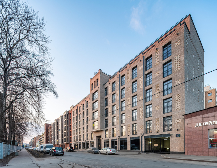
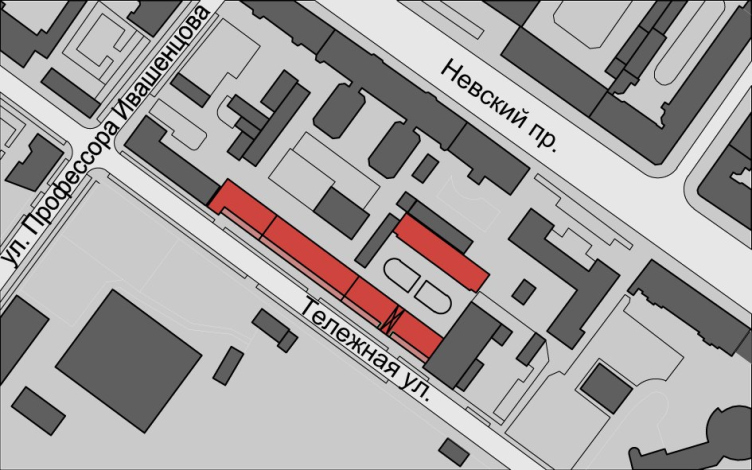
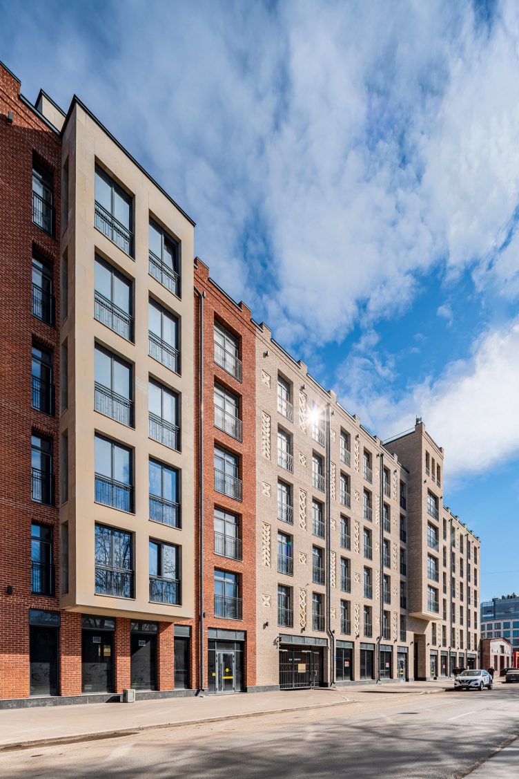
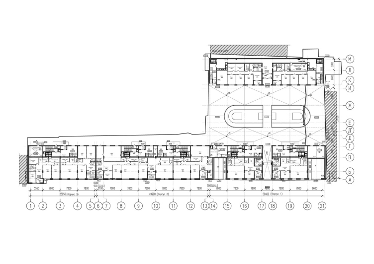
Designed by Evgeny Gerasimov and Partners, the Novy Nevsky house stretches 130 meters on the left side of the street. It picks up the rhythm and morphology of its historical front – “builds up” on it on a slightly bigger scale, but in a modern quality, hinting in this way at the prospects for its development.

“Novy Nevsky” housing complex
Copyright: © Photograph © Andrey Belimov-Gushchin / photo courtesy by Evgeny Gerasimov and Partners


Designing this house is something that the company started a long time ago – back in 2009. The number of versions allows you to track how the client’s preferences shifted – the architects gradually moved from colorful facades to more laconic ones. In one of the first drawings, the house is designed in an Art Nouveau key, and looks very much like another work by the architects – the house at Nevsky 137, built in 2004. The next interpretation is very brutal-looking, with large volumes and aggressive-looking cantilevered structures. Then the house begins to look more and more like the current version, but it is characterized by more ornaments. One of the visualizations displays a facade clad in red brick, where small details of exposed concrete look like snowflakes – this technique echoes the company’s project on Mirgorodskaya Street.

  • zooming
    1 / 6
    A version of the “Novy Nevsky” house
    Copyright: © photo courtesy by Evgeny Gerasimov and Partners
  • zooming
    2 / 6
    A version of the “Novy Nevsky” house
    Copyright: © photo courtesy by Evgeny Gerasimov and Partners
  • zooming
    3 / 6
    A version of the “Novy Nevsky” house
    Copyright: © photo courtesy by Evgeny Gerasimov and Partners
  • zooming
    4 / 6
    A version of the “Novy Nevsky” house
    Copyright: © photo courtesy by Evgeny Gerasimov and Partners
  • zooming
    5 / 6
    A version of the “Novy Nevsky” house
    Copyright: © photo courtesy by Evgeny Gerasimov and Partners
  • zooming
    6 / 6
    A version of the “Novy Nevsky” house
    Copyright: © photo courtesy by Evgeny Gerasimov and Partners


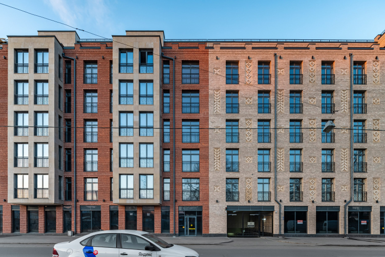
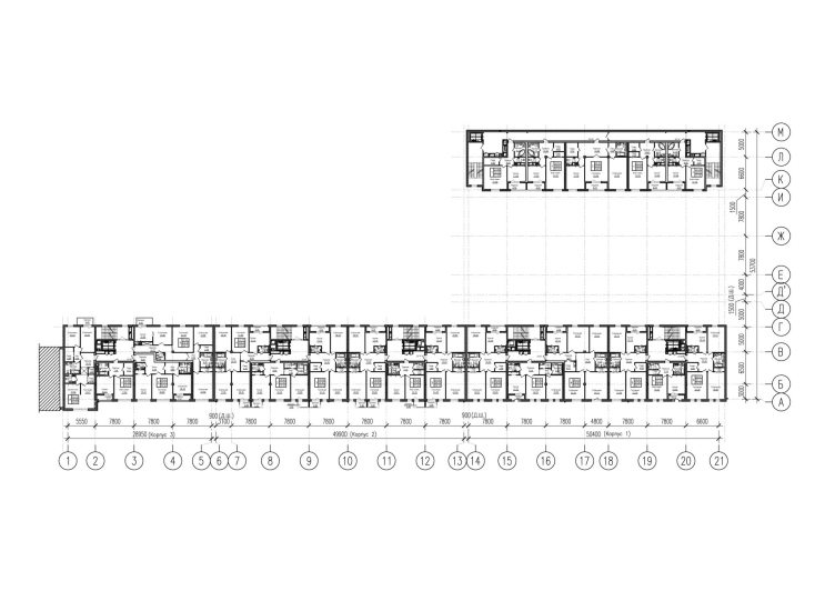
Despite the tangible differences, all the versions have in common the technique of simulating firewall construction: a volume that stretches alongside the street’s redline, is composed of a few different facades. This parceling is also preserved in the final project – the street part of the Novy Nevsky includes five sections and one arch passage leading into the yard, while its facade wall is interpreted as three different “houses” drawn within the framework of the common logic, but “by different hands”. The street building is complemented by the yard one: it is twice as short, and the facades are designed in a neutral way.

“Novy Nevsky” housing complex
Copyright: © Evgeny Gerasimov and Partners


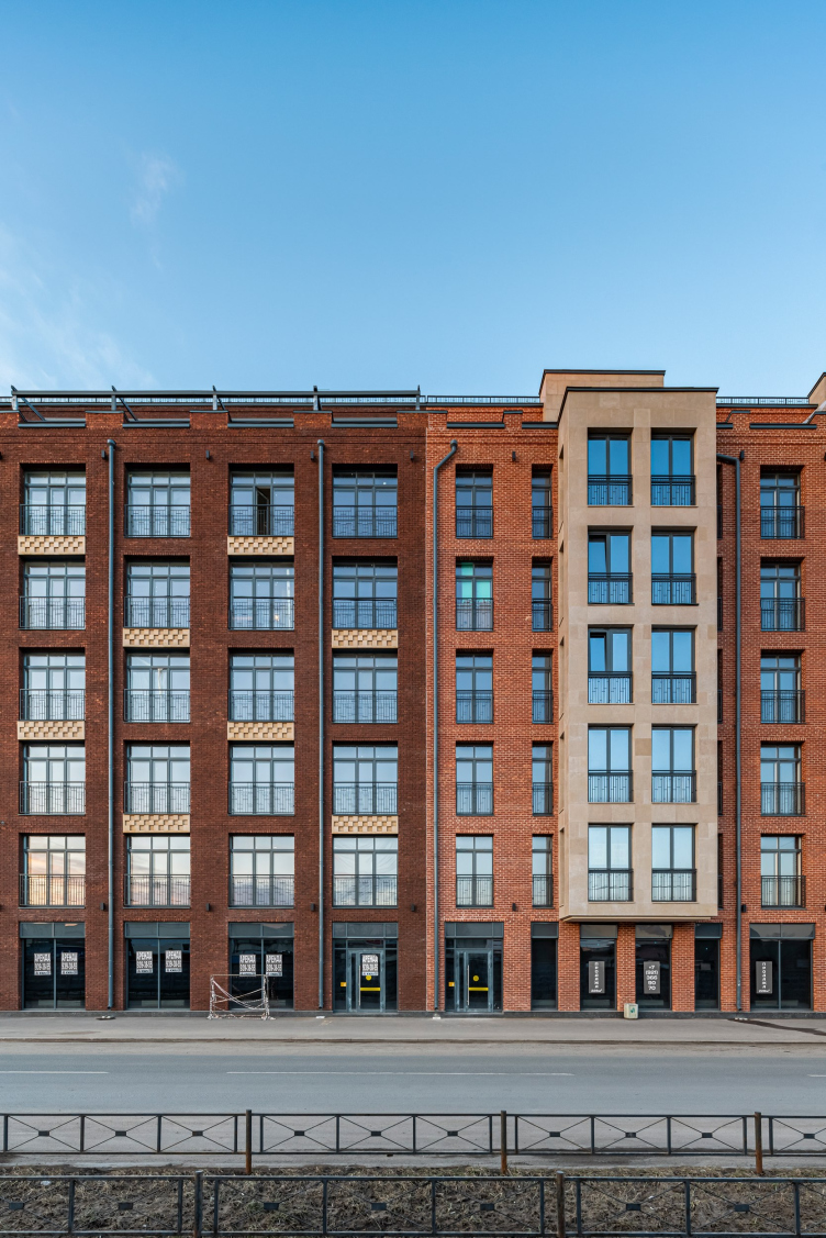
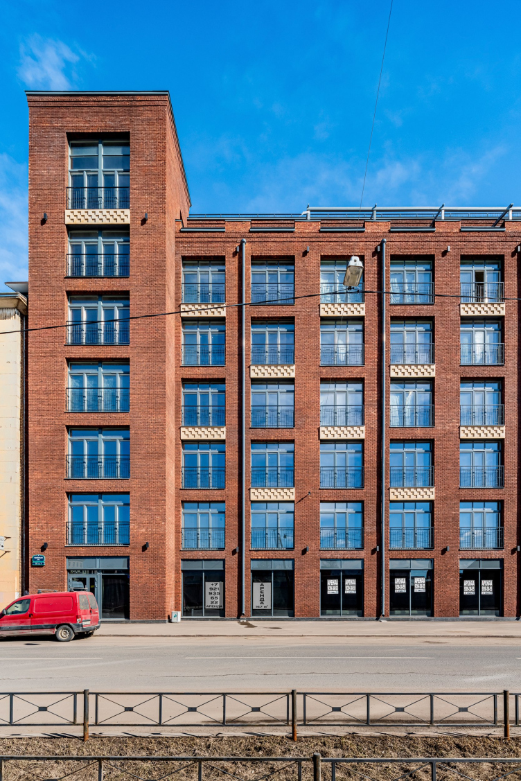
One thing that all the three street facades of the main buildings have in common is hand-molded brick, as well as the structure: the first “commercial” floor forming the basis, the five upper floors forming the “body” of the house. The sixth “residential” tier of the penthouses steps back deeper from the facades, forming open terraces before the apartments; it is all but invisible from the street below.

The architectural design of the facades and the scale of the units are adapted to the surrounding historical construction. The house fits into the context and at the same time offers a new statement on the development of this part of the city. Then the differences follow.

“Novy Nevsky” housing complex
Copyright: © Photograph © Ivan Smelov / photo courtesy by Evgeny Gerasimov and Partners


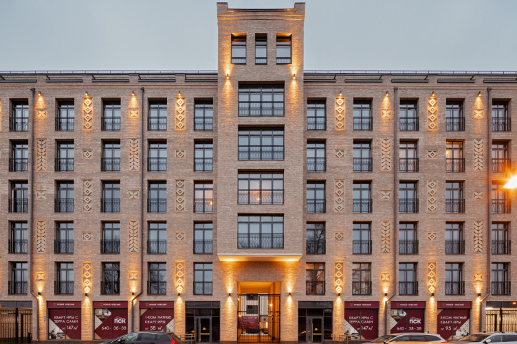
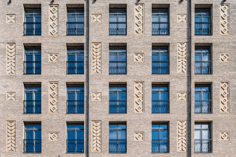
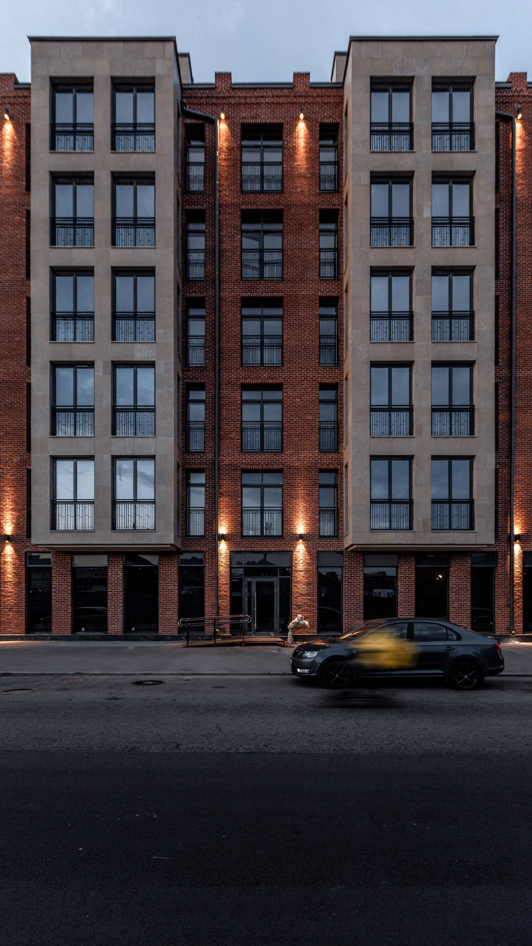
The closest to the Alexander Nevsky Monastery stands a “house” composed of light bricks of slightly different colors. It is designed in a symmetrical way; the center of the axis is the tower that reaches up to the terraces, crowned with a semblance of battlements. The rhythmic pattern of the facade is adorned by charming details of exposed concrete – diamonds and “pleats” – echoed by the wrought iron grilles on the windows. The wind brings to Telezhnaya Street the smell of bread from the nearby “Karavay” (“Loaf”) bakery, and then it seems that the “pleats” appeared precisely because of this circumstance. However, the architects claim that they focused on Art Nouveau. In any case, this part of “Novy Nevsky” turned out to be elegant and even somewhat romantic.

“Novy Nevsky” housing complex
Copyright: © Photograph © Andrey Belimov-Gushchin / photo courtesy by Evgeny Gerasimov and Partners


“Novy Nevsky” housing complex
Copyright: © Photograph © Andrey Belimov-Gushchin / photo courtesy by Evgeny Gerasimov and Partners


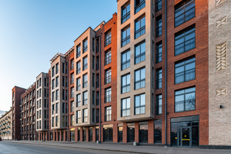
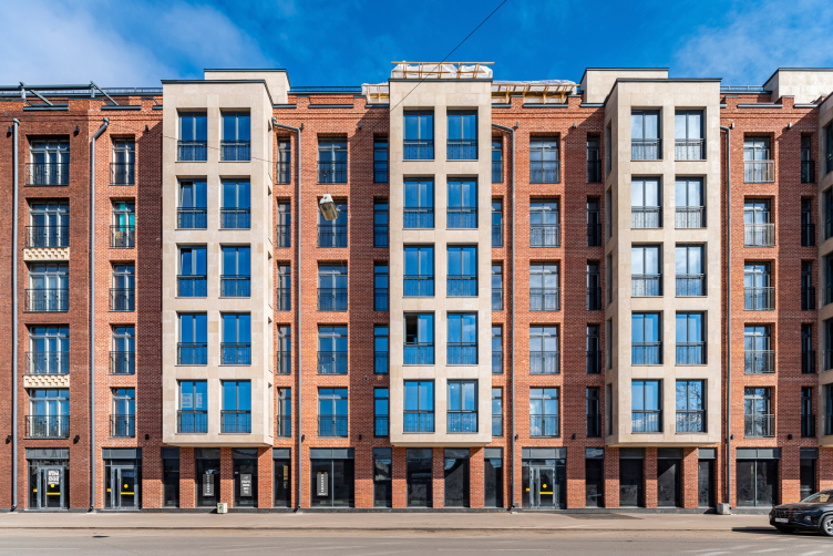
The middle “house” of classic red brick possesses the same character: here, lavish cascades of ornaments are replaced by bay windows, standing at attention; the loose-looking masonry gives way to a high-gloss surface, and that open shop windows of the first floor to more narrow “introvert” ones. Despite the clear boundary, the second “house” bleeds into the first one thanks to the decoration of the bay windows with light natural stone and light-colored masonry mortar.

“Novy Nevsky” housing complex
Copyright: © Photograph © Andrey Belimov-Gushchin / photo courtesy by Evgeny Gerasimov and Partners


“Novy Nevsky” housing complex
Copyright: © Photograph © Andrey Belimov-Gushchin / photo courtesy by Evgeny Gerasimov and Partners


“Novy Nevsky” housing complex
Copyright: © Photograph © Azamat Abikenov / photo courtesy by Evgeny Gerasimov and Partners


The third “house” is the only one that does not have a symmetry axis, and the most “loft” one thanks to the large window pattern and the brick of a wine-red “factory” hue, the depth of which is accentuated by a checkered pattern. At the joint with the neighboring five-story house built in 1961, the redline of the street changes, which allowed the architects to add a rather massive accentuated tower that steps slightly forward. According to the architects, this facade is stylistically connected with the austere functionalist architecture of Europe of the 20th century.

“Novy Nevsky” housing complex
Copyright: © Photograph © Andrey Belimov-Gushchin / photo courtesy by Evgeny Gerasimov and Partners


“Novy Nevsky” housing complex
Copyright: © Photograph © Andrey Belimov-Gushchin / photo courtesy by Evgeny Gerasimov and Partners


From the yard side, the house keeps up the decoration and the main facade solutions, while the second unit is designed in a rather neutral way: three walls ended up being blind ones because the house stands with its “back” turned to the pre-revolution wing. All the windows of this house overlook the little yard of the complex. The buildings are united by an underground level, in which there is an underground parking garage for 89 cars. The main building of the “Novy Nevsky” includes 120 apartments ranging from 47 to 180 square meters.

“Novy Nevsky” housing complex
Copyright: © photo courtesy by Evgeny Gerasimov and Partners


“Novy Nevsky” housing complex
Copyright: © photo courtesy by Evgeny Gerasimov and Partners


30 August 2022

Headlines now
The Golden Crown
The concept for a dental clinic in Yekaterinburg, developed by CNTR Studio, revolves around the idea of a “mouth full of gold”: pristine white porcelain stoneware walls are complemented by matte brass details. To avoid an overly literal interpretation, the architects focused on the building’s proportions, skillfully navigating between sunlight requirements and fire safety regulations.
Flexibility and Integration
Not long ago, we covered the project for the fourth phase of the ÁLIA residential complex, designed by APEX. Now, we’ve been shown different fence concepts they developed to enclose the complex’s private courtyards, incorporating a variety of public functions. We believe that the sheer fact that the complex’s architects were involved in such a detail as fencing speaks volumes.
A Step Forward
The HIDE residential complex represents a major milestone for ADM architects and their leaders Andrey Romanov and Ekaterina Kuznetsova in their quest for a fresh high-rise aesthetic – one that is flexible and layered, capable of bringing vibrancy to mass and silhouette while shaping form. Over recent years, this approach has become ADM’s “signature style”, with the golden HIDE tower playing a pivotal role in its evolution. Here, we delve into the project’s story, explore the details of the complex’s design, and uncover its core essence.
Gold in the Sands
A new office for a transcontinental company specializing in resource extraction and processing has opened in Dubai. Designed by T+T Architects, masters of creating spaces that are contemporary, diverse, flexible, and original, this project exemplifies their expertise. On the executive floor, a massive brass-clad partition dominates, while layered textures of compressed earth create a contextually resonant backdrop.
Layers and Levels of Flight
This project goes way back – Reserve Union won this architectural competition at the end of 2011, and the building was completed in 2018, so it’s practically “archival”. However, despite being relatively unknown, the building can hardly be considered “dated” and remains a prime example of architectural expression, particularly in the headquarters genre. And it’s especially fitting for an aviation company office. In some ways, it resembles the Aeroflot headquarters at Sheremetyevo but with its own unique identity, following the signature style of Vladimir Plotkin. In this article, we take an in-depth look at the United Aircraft Corporation (UAC) headquarters in the Moscow agglomeration town of Zhukovsky, supplemented by recent photographs from Alexey Naroditsky – a shoot that became only recently possible due to the fact that improvements were finally made in the surrounding area.
Light and Shadow
In this article, we delve into the architectural design of the “Chaika” house by DNK ag architects, which was recently completed in 2023 as part of the collection of signature designs at ZILArt. As is well-known, all the buildings in this complex follow a design code, yet each one is distinct. This particular building stands out not only for its whiteness and minimalism but also for the refined use of a limited number of techniques that, together, create what can confidently be called synergy.
Casus Novae
A master plan was developed for a large residential area with a name of “DNS City”, but now that its implementation began, the plan has been arbitrarily reformatted and replaced with something that, while similar on the surface, is actually quite different. This is not the first time such a thing happens, but it’s always frustrating. With permission from the author, we are sharing Maria Elkina’s post.
Treasure Hunting
The GAFA bureau, in collaboration with Tegola and Arkhitail, organized an expedition to the island of Kilpola in Karelia as part of Moskomarkhitektura’s “Open City” festival. There, amidst moss and rocks, the students sought answers to questions like: what is the sacred, where does it dwell, and what sustains it? Assisting the participants in this quest were landscape engineer Evgeny Levin, artist Nicholas Roerich, a moose, and the lack of cellular connection. Here’s how the story unfolded.
Depths of the Earth, Streams of Water
In the Malaya Okhta district, the Akzent building, designed by Stepan Liphart, was constructed. It follows a classic tripartite structure, yet it’s what you might call “hand-drawn”: each façade is unique in its form and details, some of which aren’t immediately noticeable. In this article, we explore the context and, together with the architect, delve into how the form was developed.
Fir Tree Dynamics
The “Airports of Region” holding is planning to build an airport in Karachay-Cherkessia, aiming to make the Arkhyz and Dombay resorts more accessible to travelers. The project that won in an invitation-only competition, submitted by Sergey Nikeshkin’s KPLN, blends natural imagery inspired by the shape of a conifer seed, open-air waiting spaces, majestic large trees, and a green roof elevated on needle-like columns. The result is both nature-inspired and WOW.
​A Brick Shell
In the process of designing a clubhouse situated among pine trees in a prestigious suburban area near Moscow, the architectural firm “A.Len” did the façade design part. The combination of different types of brick and masonry correlates with the volumetric and plastique solutions, further enhanced by the inclusion of wood-painted fragments and metal “glazing”.
Word Forms
ATRIUM architects love ambitious challenges, and for the firm’s thirtieth anniversary, they boldly play a game of words with an exhibition that dives deep into a self-created vocabulary. They immerse their projects – especially art installations – into this glossary, as if plunging into a current of their own. You feel as if you’re flowing through the veins of pure art, immersed in a universe of vertical cities, educational spaces – of which the architects are true masters – and the cultural codes of various locations. But what truly captivates is the bold statement that Vera Butko and Anton Nadtochy make, both through their work and this exhibition: architecture, above all, is art – the art of working with form and space.
Flexibility and Acuteness of Modernity
Luxurious, fluid, large “kokoshniks” and spiral barrel columns, as if made from colorful chewing gum: there seem to be no other mansion like this in Moscow, designed in the “Neo-Russian-Modern” style. And the “Teremok” on Malaya Kaluzhskaya, previously somewhat obscure, has “come alive with new colors” and gained visibility after its restoration for the office of the “architectural ecosystem” as the architects love to call themselves. It’s evident that Julius Borisov and the architects at UNK put their hearts into finding this new office and bringing it up to date. Let’s delve into the paradoxes of this mansion’s history and its plasticity. Spoiler: two versions of modernity meet here, both balancing on the razor’s edge of “what’s current”.
Yuri Vissarionov: “A modular house does not belong to the land”
It belongs to space, or to the air... It turns out that 3D printing is more effective when combined with a modular approach: the house is built in a workshop and then adapted to the site, including on uneven terrain. Yuri Vissarionov shares his latest experience in designing tourist complexes, both in central Russia and in the south. These include houseboats, homes printed from lightweight concrete using a 3D printer, and, of course, frame houses.
​Moscow’s First
“The quality of education largely depends on the quality of the educational environment”. This principle of the last decade has been realized by Sergey Skuratov in the project for the First Moscow Gymnasium on Rostovskaya Embankment in the Khamovniki district. The building seamlessly integrates into the complex urban landscape, responding both to the pedestrian flow of the city and the quiet alleyways. It skillfully takes advantage of the height differences and aligns with modern trends in educational space design. Let’s take a closer look.
Looking at the Water
The site of Villa Sonata stretches from the road to the water’s edge, offering its own shoreline, pier, and a picturesque river panorama. To reveal these sweeping views, Roman Leonidov “cut” the façade diagonally parallel to the river, thus getting two main axes for the house and, consequently, “two heads”. The internal core – two double-height spaces, a living room and a conservatory, with a “bridge” above them – makes the house both “transparent” and filled with light.
The White Wing
Well, it’s not exactly white. It’s more of a beige, white-stone structure that plays with the color of limestone – smoother surfaces are lighter, while rougher ones are darker. This wing unites various elements: it absorbs and interprets the surrounding themes. It responds to everything, yet maintains a cohesive expression – a challenging task! – while also incorporating recognizable features of its own, such as the dynamic cuts at the bottom, top, and middle.
Urban Dunes
The XSA Ramps team designed and built a three-part sports hub for a park in Rostov-on-Don, welcoming people of all ages and fitness levels. The skate plaza, pump track, and playground are all meticulously crafted with details that attract a diverse range of visitors. The technical execution of the shapes and slopes transforms this space into a kind of sculptural composition.
Proportional Growth
The project for the fourth phase of the ÁLIA residential area has been announced. The buildings are situated on an elongated plot – almost a “ray” that shoots out from the center of the area towards the river. Their layout reflects both a response to Moscow’s architectural preferences over the past 15 years, shifting “from blocks to towers”, and an interpretation of the neighboring business park designed by SOM. Additionally, the best apartments here are not located at the very top but closer to the middle, forming a glowing “waistline”.
The “Staircase” Building
In designing the “Details” residential complex in New Moscow, Rais Baishev spiced up the now-popular Moscow theme of a “courtyard” building with an idea drawn from the surrealist drawings by Maurits Escher. He envisioned the stepped silhouettes and descending slopes as a metaphysical mega-staircase, creating a key void within the courtyard that gave the project an internal “spine”. This concept is felt both in the building’s silhouette and on its façades.
Projection of the Quarter
No one doubted that the building that Vladimir Plotkin designed as part of the “Garden Quarters” would be the most modernist of all. And it turned out just that way: while adhering to the common design code, the building successfully combines brick and white stone, rhythmically responding to the neighboring building designed by Ostozhenka, yet tactfully and persistently making a few statements of its own. This includes the projection of the ideal urban development composition “14–9–6”, which can be found right next door, mathematical calculations, including those for various types of terraces (and perhaps the only reminder of the Soviet past of the Kauchuk rubber factory!), and the white “cross-stitch” pattern of the façade grid.
Domus Aurea
In this issue, we examine the “Tessinsky-1” house, designed by Sergey Skuratov and completed in 2023. Located in the middle of the Serebryanicheskaya Embankment district, at the intersection of its main streets, this house assumes a sort of “nodal” role: it not only responds to everything around it and preserves many memories of the former EMA factory within itself, but it weaves all this into a newly directed pattern, reconciling bright “gold” and dark-colored brick, largely with the help of the new, modern-yet-archaic Columba brick, which, come to think about it, is the most precious element here.
The Chimney of Nikola-Lenivets
In this issue, we are examining the “Obelisk House” designed by KATARSIS and built for the Arkhstoyanie 2023 festival. However, it was only finished later on, and this is why we are examining it now. It seems to us that after the “Obelisk House” appeared in Nikola-Lenivets, a dialogue and a few inner connections appeared between the temporary structures built here. These houses no longer look like “accidental neighbors”, more of which below.
​Periscope by the Bay
The jury awarded the second place in the competition for a public and cultural center in Petropavlovsk-Kamchatsky to the companies GORA (“Mountain”) and M4. In the consortium’s proposal, the building resembles a sperm whale with a calf swimming next to it or a periscope, whose lenses capture the most spectacular views from the surrounding landscape.
From Arcs to Dolmens
While working on the competition project for Petropavlovsk-Kamchatsky, ASADOV Architects prioritized the value of the natural and urban environment, aiming to preserve the balance of the location while minimizing the resemblance of the volume that they designed to a “traditional building”. The task was challenging, and the architects created three versions, one of which having been developed after the competition, where their main proposal took third place. However, the point of interest here is not the competition result but the continuity of creative thinking.
Hide and Seek
The ID Moskovskiy house, designed by Stepan Liphart in St. Petersburg, in the courtyards near Moskovskiy Avenue beyond the Obvodny Canal and recently completed, is notable for several reasons. Firstly, it has been realized with considerable accuracy, which is particularly significant as this is the first building where the architect was responsible not only for the facades but also for the layouts, allowing for better integration between the two. On the other hand, this building is interesting as an example of the “germination” of new architecture in the city: it draws on the best examples from the neighborhood and becomes an improved and developed sum of ideas found by the architect in the surrounding context.
The Big Twelve
Yesterday, the winners of the Moscow Mayor’s Architecture Award were announced and honored. Let’s take a look at what was awarded and, in some cases, even critique this esteemed award. After all, there is always room for improvement, right?
Above the Golden Horn
The residential complex “Philosophy” designed by T+T architects in Vladivostok, is one of the new projects in the “Golubinaya Pad” area, changing its development philosophy (pun intended) from single houses to a comprehensive approach. The buildings are organized along public streets, varying in height and format, with one house even executed in gallery typology, featuring a cantilever leaning on an art object.
Nuanced Alternative
How can you rhyme a square and space? Easily! But to do so, you need to rhyme everything you can possibly think of: weave everything together, like in a tensegrity structure, and find your own optics too. The new exhibition at GES-2 does just that, offering its visitor a new perspective on the history of art spanning 150 years, infused with the hope for endless multiplicity of worlds and art histories. Read on to see how this is achieved and how the exhibition design by Evgeny Ace contributes to it.
Blinds for Ice
An ice arena has been constructed in Domodedovo based on a project by Yuri Vissarionov Architects. To prevent the long façade, a technical requirement for winter sports facilities, from appearing monotonous, the architects proposed the use of suspended structures with multidirectional slats. This design protects the ice from direct sunlight while giving the wall texture and detail.