По-русски

​Foothills and Peaks

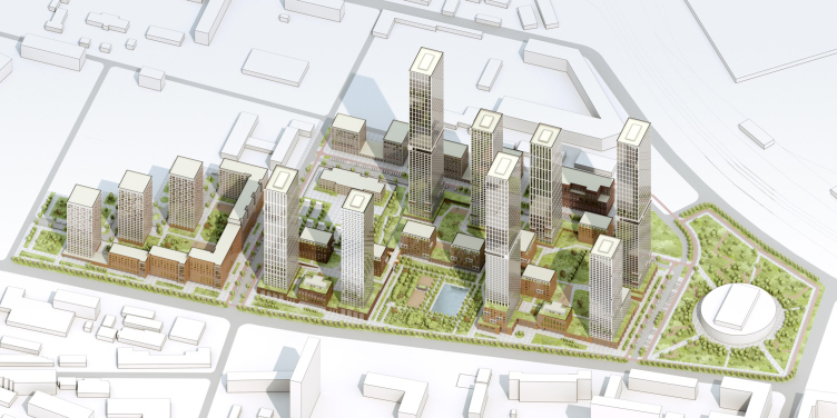
Developed by OSA, the concept of revitalization of the territory of Stankoagregat plant combines two scales: extreme-high towers and relatively “human-friendly” urban villas. In the conditions of ultra-dense construction, this solution makes it possible to vacate territories for public spaces and trees, as well as adapt the project for the conditions of the changing market.

11 April 2022
Object
mainImg
The housing complex to be built in the stead of the former Stankoagregat plant is another grand-scale project by Level Group development. The area of the site, acquired by the company, is 7.75 hectares; the company is planning to get a yield of 5,660 apartments, for which it will be necessary to solve a number of tasks of not just architectural and design nature, but also town planning ones. Earlier this year, there was a closed-door competition for the concept of developing this territory, organized by Citymakers. The proposal by OSA was rated high by the judging panel, but did not become the winner of the competition.

Architectural and town planning concept of developing the territory of Stankoagregat plant
Copyright: © OSA architects


The Nizhegorodsky District, in which the land site is situated, is considered to be one of the most industrialized ones in the capital. This automatically means that it is not really fit for housing construction: scattered all over the territory, the industrial facilities not only pollute the air but also make a lot of noise, complicate the transportation and pedestrian communication between the districts, and get in the way of creating green and public spaces.

Stankoagregat plant is part of the Karacharovo industrial park, delineated by a triangle of railways, whose three sides border on large industrial parks “Graivoronovo”, “Serp i Molot”, and the Moscow Train Engine Repair Plant. On the outside, the block pushes against yet another triangle, this time consisting of highways – the Ryazansky Avenue, the Northeast Chord, and a fragment of the Southwest Chord (to be built later on). 

Nevertheless, despite all these challenges, the territory is gradually transforming and becoming more and more interesting to the investors. Yet another impulse for further development was provided by the construction of the Nizhegorodskaya transportation hub, which is already in operation, but will be fully completed by 2024. Next to it, on the other side of the Ryazansky Avenue, shopping malls and housing complexes are being built: Sreda with a linear park, “Quarters 21/19”, “Aquilon BESIDE”, “Profit”, and “Perovskoe 2”. Some of the territories are also eligible for the program of housing stock renovation.

Architectural and town planning concept of developing the territory of Stankoagregat plant
Copyright: © OSA architects


The complex built by Level Group, as was already said, will be constructed in the very heart of Karacharovo, on the territory of Stankoagregat plant – an enterprise that took an active part in implementing the first Soviet five-year plan, and was pronounced bankrupt in 2018. The land site is surrounded by warehouses and facilities whose days are probably numbered, as well as by residential buildings of the 1950’s and 1960’e, many of which will be demolished under the housing stock renovation program. When completed, the Level Group will trigger a full makeover of the industrial zone into a residential area, and the architects not so much inscribed the buildings into the context as thought out the strategy of developing Karacharovo in a new capacity.

Architectural and town planning concept of developing the territory of Stankoagregat plant
Copyright: © OSA architects


Architectural and town planning concept of developing the territory of Stankoagregat plant
Copyright: © OSA architects


Therefore, the concept proposed by OSA goes beyond the confines of the site owned by the client. The adjacent western territory, located across the designed street, is planned for renovation. Here, the architects are proposing a composition of three towers and a sectional “slab” house: such a pattern is better suited for the size of the apartments designed under this program; it also highlights the construction of the main site. The solution was developed on the basis of participation in the competition “Oblik Renovatsii” (“Renovation Image”) – the company is on the winner list on the Golyanovo and Amurskaya sites.  

From the opposite side, the crossing of several streets created a reason for placing here some kind of conspicuous public building – in a densely packed area as this one, a Public Service Center or a Health and Fitness complex, surrounded by trees, would be appropriate. Currently, the site hosts a few industrial facilities.

Architectural and town planning concept of developing the territory of Stankoagregat plant
Copyright: © OSA architects


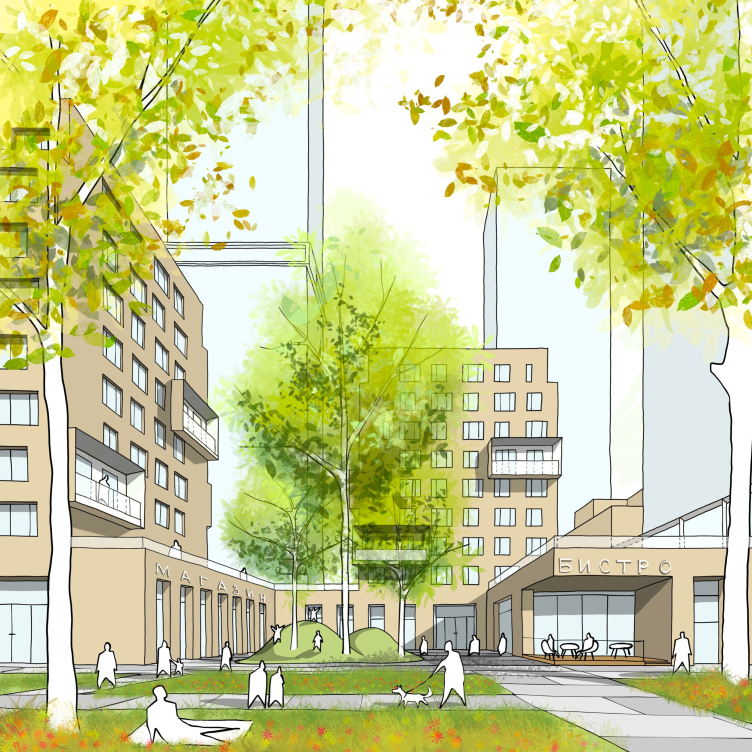
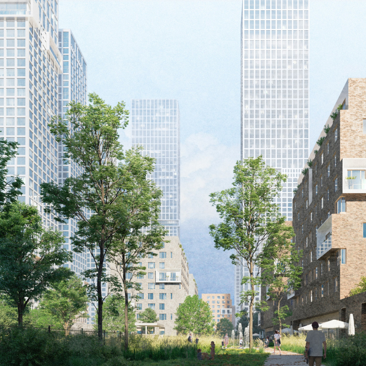
All the three sites lying on the outer contour are united by a broad green street that plays the part of the public city space here. This street is faced by mid-rise sections of the co-livings, included in the technical specifications, most of the businesses on the first floors, as well as a spacious park. The landscape of the park gets large-size coniferous and deciduous trees integrated into it, as well as a monument to the factory workers who died during the Second World War. The list of new projects also includes a man-made pond, playgrounds, and sports facilities. It was expected that the park would be landscaped simultaneously with the construction of the first stage of the housing complex, placing the sales office into it, which later on would be made over into a pavilion.

Vitaliy Zuev, Chief Architect of the Project

I consider our proposal for a park connecting the two high-rise complexes to be a local success of our project. This solution not only meets the urban planning requirements for the site regarding the presence of a “natural complex” of the specified size, but also gives the future district a unique public space. This is made possible thanks to the the location of the park on the site and its sheer size.


Architectural and town planning concept of developing the territory of Stankoagregat plant
Copyright: © OSA architects


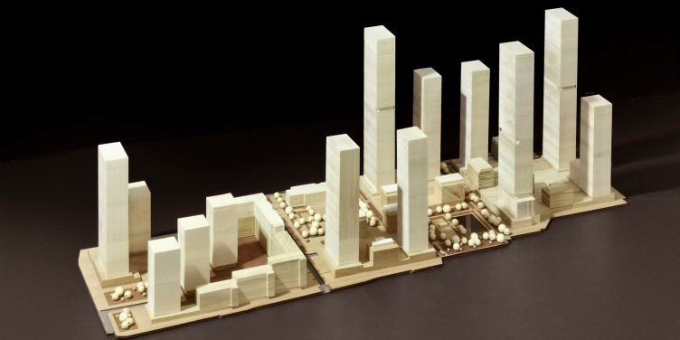
And finally, regarding the plan of the main site, the architects from the very beginning developed the idea of combining towers and mid-rise sections. Such a model allows you to solve a whole number of tasks: to form comfortable spaces  between the houses, give the complex an interesting silhouette, and achieve greater diversity of the housing typology, as well as to make sure that the overloaded Petrovsky Highway is faced by as few facades as possible.

On the whole, the combination of towers and mid-rise buildings very successfully combines the comfort of urban spaces with high density of construction, due to typological diversity, versatility, and scale. We also try to implement such patterns in mass housing in other regions of Russia, of course, adjusted for the actual number of floors and construction density. The results of this competition gave us even more confidence in this idea.


Architectural and town planning concept of developing the territory of Stankoagregat plant
Copyright: © OSA architects


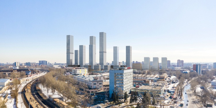
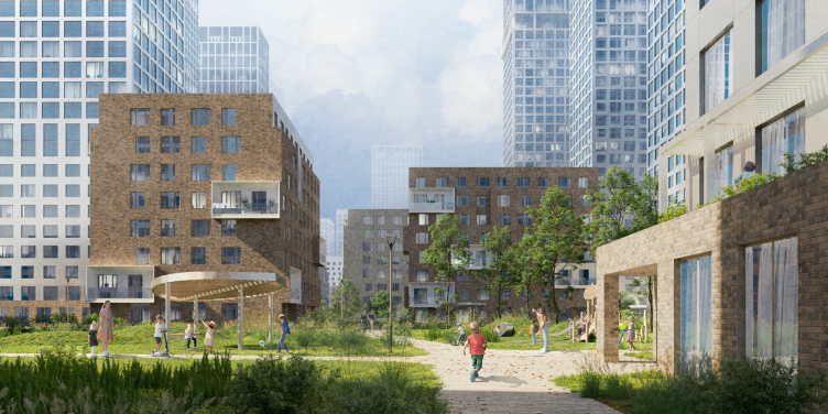
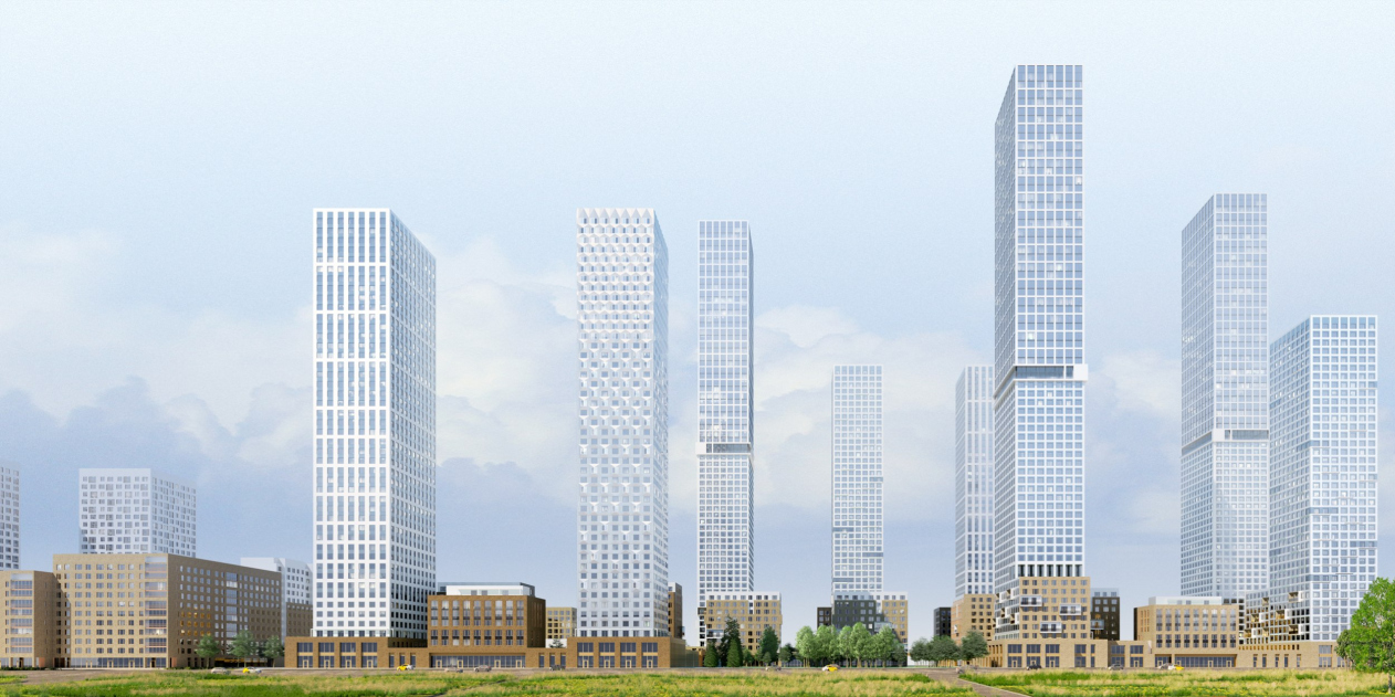
Eight towers 46 and 68 stories high (150 and 220 meters respectively) are placed in a freehand fashion along the perimeter of the site, forming views that work best from a distance. The stylobate part connects the towers and urban villas, delineating the boundaries of the system of transparent city blocks. In the space created by these blocks, one can clearly read a more habitual mid-rise scale of construction – this happens due to the textured decoration material and the sculptural design of the urban villas, and also due to the architects’ decision to push the towers away from the stylobate contour. The terraced “foothills” are brought in the foreground, and are offset by the backdrop of the “mountain peaks” of the high-rises with their rhythmic facade pattern. The freehand placement of the towers leaves the sky unobstructed, letting the sun peek into every corner of the block.

Architectural and town planning concept of developing the territory of Stankoagregat plant
Copyright: © OSA architects


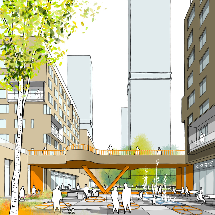
As for the high density of the complex, the architects are planning to offset it with spaces between the houses. Private yards with a landscape similar to a natural one are placed on the roofs of the stylobates, connected by overpasses. The sites that are vacant from underground structures are turned into shady boulevards – open to city people, they make the blocks more transparent. The land planning project also includes a site for a kindergarten for 250 kids. The northern part also includes inbuilt kindergartens, placed upon the stylobates.

Architectural and town planning concept of developing the territory of Stankoagregat plant
Copyright: © OSA architects


The selection of apartments was specially developed for two types of towers and varied from studios to four-room apartments with an area of 106.8 square meters. The urban villas only account for 20% of the total housing space: they are a “reserve” that will give the developer an opportunity to adjust to the realities of the ever-changing market, adding unusual typologies: houses with open terraces, little gardens, or an individual exit to the boulevard.

  • zooming
    1 / 6
    Architectural and town planning concept of developing the territory of Stankoagregat plant. The standard floors
    Copyright: © OSA architects
  • zooming
    2 / 6
    Architectural and town planning concept of developing the territory of Stankoagregat plant. 1-room apartments
    Copyright: © OSA architects
  • zooming
    3 / 6
    Architectural and town planning concept of developing the territory of Stankoagregat plant. 2-room apartments
    Copyright: © OSA architects
  • zooming
    4 / 6
    Architectural and town planning concept of developing the territory of Stankoagregat plant. 3 and 4-room apartments
    Copyright: © OSA architects
  • zooming
    5 / 6
    Architectural and town planning concept of developing the territory of Stankoagregat plant. Sections
    Copyright: © OSA architects
  • zooming
    6 / 6
    Architectural and town planning concept of developing the territory of Stankoagregat plant. Section view
    Copyright: © OSA architects


The perimeter of the first floor of the stylobate is occupied by commercial premises, lobbies, and entrance groups of the inbuilt  kindergartens; further on, there will be parking spaces. The underground floors will also include parking spaces, elevator halls, maintenance rooms, and utility hubs. The entrance to the territory of the complex is made from the streets; each of the sections can be accessed by local driveways or via the underground parking garage.

  • zooming
    1 / 5
    Architectural and town planning concept of developing the territory of Stankoagregat plant. The master plan
    Copyright: © OSA architects
  • zooming
    2 / 5
    Architectural and town planning concept of developing the territory of Stankoagregat plant. The fire lanes
    Copyright: © OSA architects
  • zooming
    3 / 5
    Architectural and town planning concept of developing the territory of Stankoagregat plant. The underground floor
    Copyright: © OSA architects
  • zooming
    4 / 5
    Architectural and town planning concept of developing the territory of Stankoagregat plant. The first floor
    Copyright: © OSA architects
  • zooming
    5 / 5
    Architectural and town planning concept of developing the territory of Stankoagregat plant. The second floor
    Copyright: © OSA architects


11 April 2022

Headlines now
The Golden Crown
The concept for a dental clinic in Yekaterinburg, developed by CNTR Studio, revolves around the idea of a “mouth full of gold”: pristine white porcelain stoneware walls are complemented by matte brass details. To avoid an overly literal interpretation, the architects focused on the building’s proportions, skillfully navigating between sunlight requirements and fire safety regulations.
Flexibility and Integration
Not long ago, we covered the project for the fourth phase of the ÁLIA residential complex, designed by APEX. Now, we’ve been shown different fence concepts they developed to enclose the complex’s private courtyards, incorporating a variety of public functions. We believe that the sheer fact that the complex’s architects were involved in such a detail as fencing speaks volumes.
A Step Forward
The HIDE residential complex represents a major milestone for ADM architects and their leaders Andrey Romanov and Ekaterina Kuznetsova in their quest for a fresh high-rise aesthetic – one that is flexible and layered, capable of bringing vibrancy to mass and silhouette while shaping form. Over recent years, this approach has become ADM’s “signature style”, with the golden HIDE tower playing a pivotal role in its evolution. Here, we delve into the project’s story, explore the details of the complex’s design, and uncover its core essence.
Gold in the Sands
A new office for a transcontinental company specializing in resource extraction and processing has opened in Dubai. Designed by T+T Architects, masters of creating spaces that are contemporary, diverse, flexible, and original, this project exemplifies their expertise. On the executive floor, a massive brass-clad partition dominates, while layered textures of compressed earth create a contextually resonant backdrop.
Layers and Levels of Flight
This project goes way back – Reserve Union won this architectural competition at the end of 2011, and the building was completed in 2018, so it’s practically “archival”. However, despite being relatively unknown, the building can hardly be considered “dated” and remains a prime example of architectural expression, particularly in the headquarters genre. And it’s especially fitting for an aviation company office. In some ways, it resembles the Aeroflot headquarters at Sheremetyevo but with its own unique identity, following the signature style of Vladimir Plotkin. In this article, we take an in-depth look at the United Aircraft Corporation (UAC) headquarters in the Moscow agglomeration town of Zhukovsky, supplemented by recent photographs from Alexey Naroditsky – a shoot that became only recently possible due to the fact that improvements were finally made in the surrounding area.
Light and Shadow
In this article, we delve into the architectural design of the “Chaika” house by DNK ag architects, which was recently completed in 2023 as part of the collection of signature designs at ZILArt. As is well-known, all the buildings in this complex follow a design code, yet each one is distinct. This particular building stands out not only for its whiteness and minimalism but also for the refined use of a limited number of techniques that, together, create what can confidently be called synergy.
Casus Novae
A master plan was developed for a large residential area with a name of “DNS City”, but now that its implementation began, the plan has been arbitrarily reformatted and replaced with something that, while similar on the surface, is actually quite different. This is not the first time such a thing happens, but it’s always frustrating. With permission from the author, we are sharing Maria Elkina’s post.
Treasure Hunting
The GAFA bureau, in collaboration with Tegola and Arkhitail, organized an expedition to the island of Kilpola in Karelia as part of Moskomarkhitektura’s “Open City” festival. There, amidst moss and rocks, the students sought answers to questions like: what is the sacred, where does it dwell, and what sustains it? Assisting the participants in this quest were landscape engineer Evgeny Levin, artist Nicholas Roerich, a moose, and the lack of cellular connection. Here’s how the story unfolded.
Depths of the Earth, Streams of Water
In the Malaya Okhta district, the Akzent building, designed by Stepan Liphart, was constructed. It follows a classic tripartite structure, yet it’s what you might call “hand-drawn”: each façade is unique in its form and details, some of which aren’t immediately noticeable. In this article, we explore the context and, together with the architect, delve into how the form was developed.
Fir Tree Dynamics
The “Airports of Region” holding is planning to build an airport in Karachay-Cherkessia, aiming to make the Arkhyz and Dombay resorts more accessible to travelers. The project that won in an invitation-only competition, submitted by Sergey Nikeshkin’s KPLN, blends natural imagery inspired by the shape of a conifer seed, open-air waiting spaces, majestic large trees, and a green roof elevated on needle-like columns. The result is both nature-inspired and WOW.
​A Brick Shell
In the process of designing a clubhouse situated among pine trees in a prestigious suburban area near Moscow, the architectural firm “A.Len” did the façade design part. The combination of different types of brick and masonry correlates with the volumetric and plastique solutions, further enhanced by the inclusion of wood-painted fragments and metal “glazing”.
Word Forms
ATRIUM architects love ambitious challenges, and for the firm’s thirtieth anniversary, they boldly play a game of words with an exhibition that dives deep into a self-created vocabulary. They immerse their projects – especially art installations – into this glossary, as if plunging into a current of their own. You feel as if you’re flowing through the veins of pure art, immersed in a universe of vertical cities, educational spaces – of which the architects are true masters – and the cultural codes of various locations. But what truly captivates is the bold statement that Vera Butko and Anton Nadtochy make, both through their work and this exhibition: architecture, above all, is art – the art of working with form and space.
Flexibility and Acuteness of Modernity
Luxurious, fluid, large “kokoshniks” and spiral barrel columns, as if made from colorful chewing gum: there seem to be no other mansion like this in Moscow, designed in the “Neo-Russian-Modern” style. And the “Teremok” on Malaya Kaluzhskaya, previously somewhat obscure, has “come alive with new colors” and gained visibility after its restoration for the office of the “architectural ecosystem” as the architects love to call themselves. It’s evident that Julius Borisov and the architects at UNK put their hearts into finding this new office and bringing it up to date. Let’s delve into the paradoxes of this mansion’s history and its plasticity. Spoiler: two versions of modernity meet here, both balancing on the razor’s edge of “what’s current”.
Yuri Vissarionov: “A modular house does not belong to the land”
It belongs to space, or to the air... It turns out that 3D printing is more effective when combined with a modular approach: the house is built in a workshop and then adapted to the site, including on uneven terrain. Yuri Vissarionov shares his latest experience in designing tourist complexes, both in central Russia and in the south. These include houseboats, homes printed from lightweight concrete using a 3D printer, and, of course, frame houses.
​Moscow’s First
“The quality of education largely depends on the quality of the educational environment”. This principle of the last decade has been realized by Sergey Skuratov in the project for the First Moscow Gymnasium on Rostovskaya Embankment in the Khamovniki district. The building seamlessly integrates into the complex urban landscape, responding both to the pedestrian flow of the city and the quiet alleyways. It skillfully takes advantage of the height differences and aligns with modern trends in educational space design. Let’s take a closer look.
Looking at the Water
The site of Villa Sonata stretches from the road to the water’s edge, offering its own shoreline, pier, and a picturesque river panorama. To reveal these sweeping views, Roman Leonidov “cut” the façade diagonally parallel to the river, thus getting two main axes for the house and, consequently, “two heads”. The internal core – two double-height spaces, a living room and a conservatory, with a “bridge” above them – makes the house both “transparent” and filled with light.
The White Wing
Well, it’s not exactly white. It’s more of a beige, white-stone structure that plays with the color of limestone – smoother surfaces are lighter, while rougher ones are darker. This wing unites various elements: it absorbs and interprets the surrounding themes. It responds to everything, yet maintains a cohesive expression – a challenging task! – while also incorporating recognizable features of its own, such as the dynamic cuts at the bottom, top, and middle.
Urban Dunes
The XSA Ramps team designed and built a three-part sports hub for a park in Rostov-on-Don, welcoming people of all ages and fitness levels. The skate plaza, pump track, and playground are all meticulously crafted with details that attract a diverse range of visitors. The technical execution of the shapes and slopes transforms this space into a kind of sculptural composition.
Proportional Growth
The project for the fourth phase of the ÁLIA residential area has been announced. The buildings are situated on an elongated plot – almost a “ray” that shoots out from the center of the area towards the river. Their layout reflects both a response to Moscow’s architectural preferences over the past 15 years, shifting “from blocks to towers”, and an interpretation of the neighboring business park designed by SOM. Additionally, the best apartments here are not located at the very top but closer to the middle, forming a glowing “waistline”.
The “Staircase” Building
In designing the “Details” residential complex in New Moscow, Rais Baishev spiced up the now-popular Moscow theme of a “courtyard” building with an idea drawn from the surrealist drawings by Maurits Escher. He envisioned the stepped silhouettes and descending slopes as a metaphysical mega-staircase, creating a key void within the courtyard that gave the project an internal “spine”. This concept is felt both in the building’s silhouette and on its façades.
Projection of the Quarter
No one doubted that the building that Vladimir Plotkin designed as part of the “Garden Quarters” would be the most modernist of all. And it turned out just that way: while adhering to the common design code, the building successfully combines brick and white stone, rhythmically responding to the neighboring building designed by Ostozhenka, yet tactfully and persistently making a few statements of its own. This includes the projection of the ideal urban development composition “14–9–6”, which can be found right next door, mathematical calculations, including those for various types of terraces (and perhaps the only reminder of the Soviet past of the Kauchuk rubber factory!), and the white “cross-stitch” pattern of the façade grid.
Domus Aurea
In this issue, we examine the “Tessinsky-1” house, designed by Sergey Skuratov and completed in 2023. Located in the middle of the Serebryanicheskaya Embankment district, at the intersection of its main streets, this house assumes a sort of “nodal” role: it not only responds to everything around it and preserves many memories of the former EMA factory within itself, but it weaves all this into a newly directed pattern, reconciling bright “gold” and dark-colored brick, largely with the help of the new, modern-yet-archaic Columba brick, which, come to think about it, is the most precious element here.
The Chimney of Nikola-Lenivets
In this issue, we are examining the “Obelisk House” designed by KATARSIS and built for the Arkhstoyanie 2023 festival. However, it was only finished later on, and this is why we are examining it now. It seems to us that after the “Obelisk House” appeared in Nikola-Lenivets, a dialogue and a few inner connections appeared between the temporary structures built here. These houses no longer look like “accidental neighbors”, more of which below.
​Periscope by the Bay
The jury awarded the second place in the competition for a public and cultural center in Petropavlovsk-Kamchatsky to the companies GORA (“Mountain”) and M4. In the consortium’s proposal, the building resembles a sperm whale with a calf swimming next to it or a periscope, whose lenses capture the most spectacular views from the surrounding landscape.
From Arcs to Dolmens
While working on the competition project for Petropavlovsk-Kamchatsky, ASADOV Architects prioritized the value of the natural and urban environment, aiming to preserve the balance of the location while minimizing the resemblance of the volume that they designed to a “traditional building”. The task was challenging, and the architects created three versions, one of which having been developed after the competition, where their main proposal took third place. However, the point of interest here is not the competition result but the continuity of creative thinking.
Hide and Seek
The ID Moskovskiy house, designed by Stepan Liphart in St. Petersburg, in the courtyards near Moskovskiy Avenue beyond the Obvodny Canal and recently completed, is notable for several reasons. Firstly, it has been realized with considerable accuracy, which is particularly significant as this is the first building where the architect was responsible not only for the facades but also for the layouts, allowing for better integration between the two. On the other hand, this building is interesting as an example of the “germination” of new architecture in the city: it draws on the best examples from the neighborhood and becomes an improved and developed sum of ideas found by the architect in the surrounding context.
The Big Twelve
Yesterday, the winners of the Moscow Mayor’s Architecture Award were announced and honored. Let’s take a look at what was awarded and, in some cases, even critique this esteemed award. After all, there is always room for improvement, right?
Above the Golden Horn
The residential complex “Philosophy” designed by T+T architects in Vladivostok, is one of the new projects in the “Golubinaya Pad” area, changing its development philosophy (pun intended) from single houses to a comprehensive approach. The buildings are organized along public streets, varying in height and format, with one house even executed in gallery typology, featuring a cantilever leaning on an art object.
Nuanced Alternative
How can you rhyme a square and space? Easily! But to do so, you need to rhyme everything you can possibly think of: weave everything together, like in a tensegrity structure, and find your own optics too. The new exhibition at GES-2 does just that, offering its visitor a new perspective on the history of art spanning 150 years, infused with the hope for endless multiplicity of worlds and art histories. Read on to see how this is achieved and how the exhibition design by Evgeny Ace contributes to it.
Blinds for Ice
An ice arena has been constructed in Domodedovo based on a project by Yuri Vissarionov Architects. To prevent the long façade, a technical requirement for winter sports facilities, from appearing monotonous, the architects proposed the use of suspended structures with multidirectional slats. This design protects the ice from direct sunlight while giving the wall texture and detail.