По-русски

​Buyan and the Court Quarter

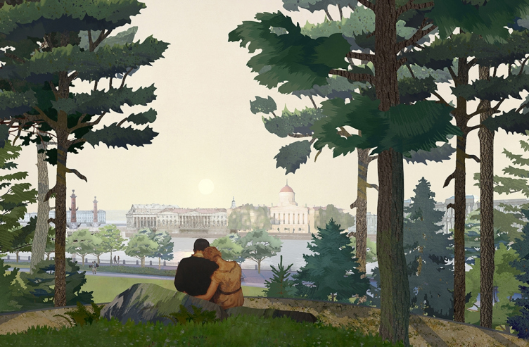
The news about cancellation of the Tuchkov Buyan park has been stirring the minds of people of St. Petersburg for a week already. In the absence of any verified specific information, we discussed the situation with the architects of the park and the Court Quarter: Nikita Yavein and Evgeny Gerasimov.

18 January 2022
View
mainImg
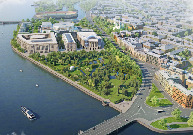
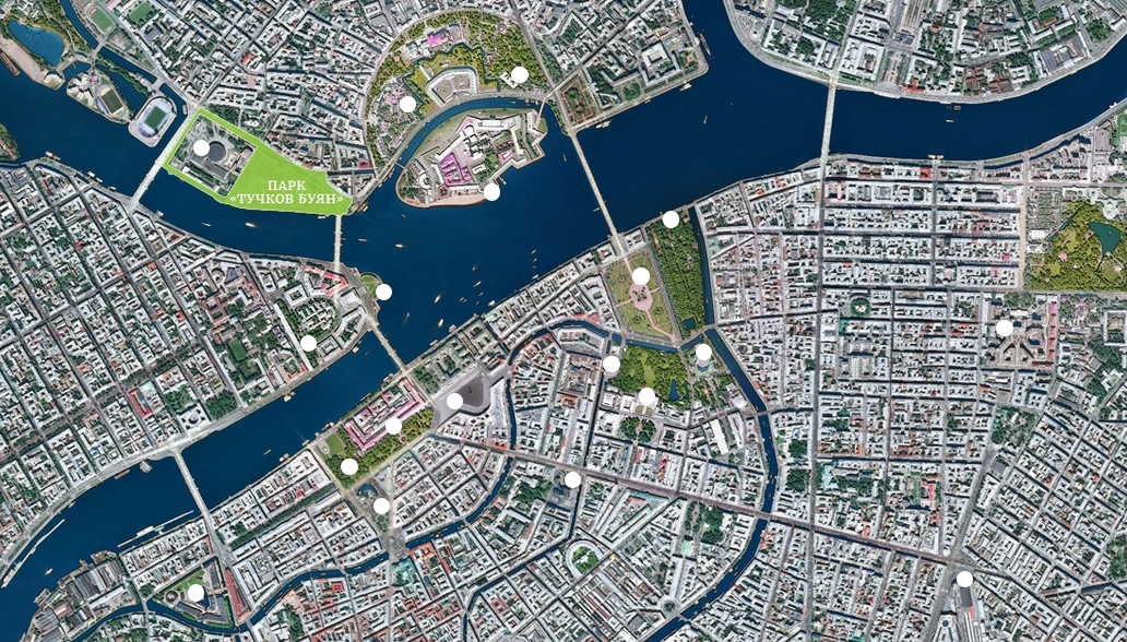
On the first working day of the year, the news came out that the St. Petersburg city council changed their minds about building the Tuchkov Buyan park and decided to pull up the idea of building the “Court Quarter” on Vatny Island. Later on, Smolny specified that the park will still be built, but, judging from the official wording, not in the form that was designed by Studio 44 and West 8, whose joint concept won in the international competition. The commentary on combining both functions was given by Dmitry Peskov, while the vice-governor of St. Petersburg Boris Piotrovsky said that the construction of Boris Eifman Dance Palace was still in progress. The local preservation activists already made a stand against building on the land site where the park was promised. 

We asked the architects to comment on the situation.

zooming
Copyright: Source: park-spb.ru


Evgeny Gerasimov:
zooming


“This construction that has been going on on Dobrolyubova forever is something that everybody is seriously tired of, and I think that finishing it would be great news for St. Petersburg.

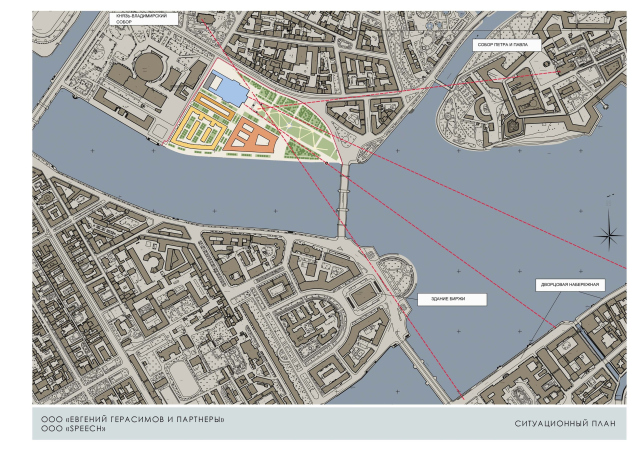
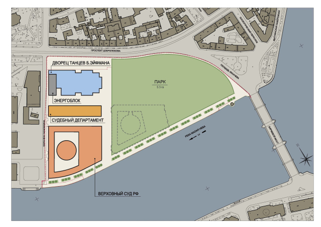
A year ago I proposed a compromise. Due to the fact that the design of the Court Quarter was 100% ready, including the interiors, it would make sense to continue the construction of the department and “relocate” the building of the Supreme Court to the spot of the former housing project, finding accommodation for the judges at another site – for example, the nearby Petrovsky Island, thus vacating the area for the park. This makes perfect sense from the town-planning standpoint: we make sure that the Boris Eifman theater does not look like a splinter, and the three neoclassical buildings stand up in a row forming the front of Speranskogo Street, without getting in the park’s way – by analogy with the Russian Museum or the Tavrichesky Palace.

  • zooming
    1 / 4
    Evgeny Gerasimov′s new proposal for Tuchkov Buyan: reduction combined with preservation of the Court Quarter on Vatny Island
    Copyright: © Evgeny Gerasimov and Partners
  • zooming
    2 / 4
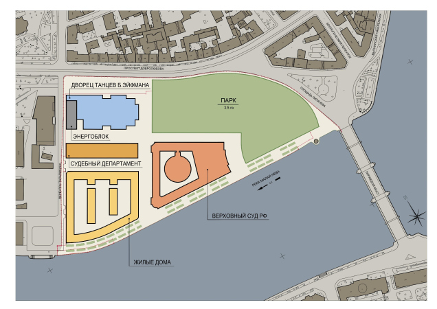
    The draft of the Judicial Quarter, relevant for the spring of 2019
    Copyright: © Evgeny Gerasimov and Partners
  • zooming
    3 / 4
    The project of the Judicial Quarter, as of spring 2019
    Copyright: © Evgeny Gerasimov & Partners
  • zooming
    4 / 4
    Scheme: the possibility of “huddling together” the buildings of the Court Quarter and vacating space for the park
    Copyright: © Evgeny Gerasimov and Partners


The area of the entire site is 9.9 hectares, including the theater. Without the theater, it is 8.7 hectares, half of which is occupied by already-complete underground floors. My proposal was that we leave 6 hectares to the park, and 2.7 hectares to the Supreme Court and the Department. This will save a whole lot of people’s money and will spare us the necessity to look for a new land site. Instead of killing an already existing real park with high-rise trees – the Neva Garden (to which the former chief architect of St. Petersburg Vladimir Grigoriev proposed to transfer the court buildings) – and building a new park on building foundations that are already there, we could save billions of rubles, lots of land, and years of hard work.

Whether or not the buildings or the Court Quarter will be constructed in accordance with our proposal is a question that should not be addressed to me – but I hope that they will. We will redesign them quickly, all the more so because the construction blueprints of the residential quarter and the Supreme Court are virtually identical.”

Nikita Yavein, Studio 44:

zooming


“For the whole year after the competition for the Tuchkov Buyan park was over, Evgeny Gerasimov went out of his way to prove to everyone that, save for this site, the court buildings will not fit anywhere else. No other land site but this one, no alternative. He did a lot of work, and, as we can see, he did succeed, which makes perfect sense: court buildings are a priority.

It’s too bad that the project that won in the competition will not be implemented. This would be a very architectural and spatial project – multilevel, with bridges, end-to-end views, and multiple scenarios of usage and perception.

  • zooming
    1 / 4
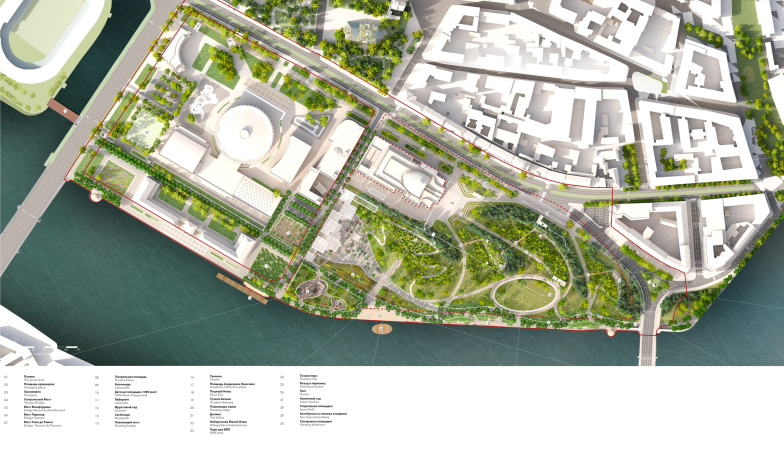
    The master plan and the explication. The competition proposal of the romantic park “Tuchkov Buyan” in Saint Petersburg
    Copyright: © Studio 44, West 8
  • zooming
    2 / 4
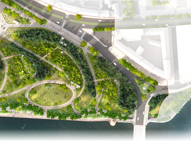
    Romantic park “Tuchkov Buyan”. The green amphitheater, the central lawn
    Copyright: © Studio 44, West 8
  • zooming
    3 / 4
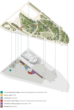
    Romantic park “Tuchkov Buyan”. Construction and engineering solutions
    Copyright: © Studio 44, West 8
  • zooming
    4 / 4
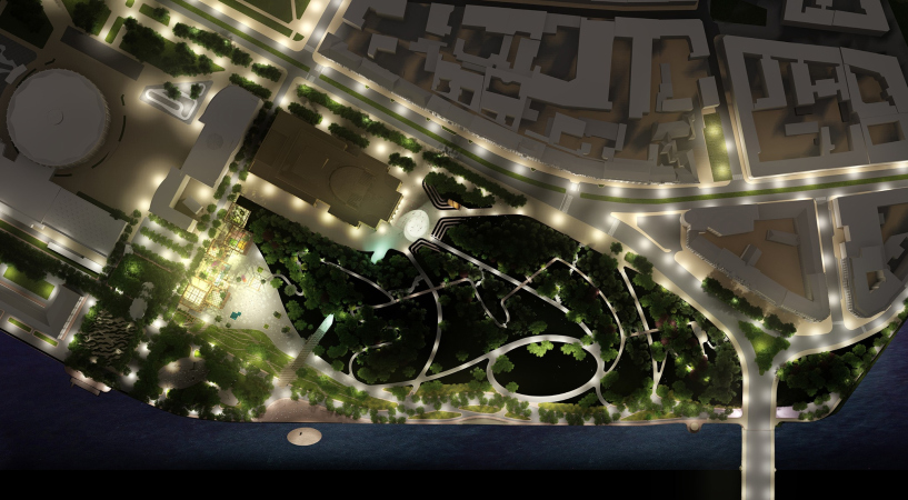
    Romantic park “Tuchkov Buyan”. The lighting
    Copyright: © Studio 44, West 8


And now the situation looks like this: the construction front along the Malaya Neva is formed by some sort of a “Turkish Empire Style”, looking like the most expensive hotel in Antalya – with full-fledged stone facades and sculptures. The difference is that in Turkey it is all done with a slightly ironic flavor, and here we are building such things like we really mean it! And in the main panorama of St. Petersburg this will stand on the right of Thomas de Thomon…

As far as I can see, the city people are shocked. They feel insulted, they feel deceived, and they collect signatures under petitions. This will hardly improve things in any way. But the aftertaste will remain in any event.”

Romantic park “Tuchkov Buyan”
Copyright: © Studio 44, West 8
***

The Tuchkov Buyan park is not at all the first project that did not come to fruition on Vatny Island. As early as in 1945, Nikolai Baranov proposed to make in this part of the Petrograd Side a large continuous green zone, but by 1960 the site was occupied by the buildings of the State Institute of Applied Chemistry.

The next phase was the competition named “Naberezhnaya Evropy” (“Waterfront of Europe”) for the residential construction held in 2009, which was won by the consortium of Evgeny Gerasimov and nps tchoban voss with an idea of city blocks designed by different European architects. This project already included the Boris Eifman Dance Palace, but there was a separate competition held for it.


After the Chemistry Institute was removed from the site, and the “project” stage was developed, the decision to make the Supreme Court complex ensued. The new 2013 competition was won by Maxim Atayants, Maxim Atayants but in the end, the Presidential Administration, which still manages the site, outsourced the design to Evgeny Gerasimov Studio.


They already started to build the Court Quarter but in 2019 the situation changed again: as is known, the future governor of St. Petersburg Alexander Beglov proposed to build a park, and the president of Russia Vladimir Putin supported this idea. The large-scale international competition was won by the concept proposed by Studio 44 and West 8, but already in May 2021 Nikita Yavein shared that the park project was frozen. 


The detailed chronicle of decisions made on Vatny Island is published in the Sobaka Magazine. On Arch.ru, you can get acquainted with the concept of the park, recall the experts’ opinions on the possibility of creating something like St. Petersburg’s Zaryadye, and read an interview with Evgeny Gerasimov about how competitions and designers came and went.

18 January 2022

Headlines now
Gold in the Sands
A new office for a transcontinental company specializing in resource extraction and processing has opened in Dubai. Designed by T+T Architects, masters of creating spaces that are contemporary, diverse, flexible, and original, this project exemplifies their expertise. On the executive floor, a massive brass-clad partition dominates, while layered textures of compressed earth create a contextually resonant backdrop.
Layers and Levels of Flight
This project goes way back – Reserve Union won this architectural competition at the end of 2011, and the building was completed in 2018, so it’s practically “archival”. However, despite being relatively unknown, the building can hardly be considered “dated” and remains a prime example of architectural expression, particularly in the headquarters genre. And it’s especially fitting for an aviation company office. In some ways, it resembles the Aeroflot headquarters at Sheremetyevo but with its own unique identity, following the signature style of Vladimir Plotkin. In this article, we take an in-depth look at the United Aircraft Corporation (UAC) headquarters in the Moscow agglomeration town of Zhukovsky, supplemented by recent photographs from Alexey Naroditsky – a shoot that became only recently possible due to the fact that improvements were finally made in the surrounding area.
Light and Shadow
In this article, we delve into the architectural design of the “Chaika” house by DNK ag architects, which was recently completed in 2023 as part of the collection of signature designs at ZILArt. As is well-known, all the buildings in this complex follow a design code, yet each one is distinct. This particular building stands out not only for its whiteness and minimalism but also for the refined use of a limited number of techniques that, together, create what can confidently be called synergy.
Casus Novae
A master plan was developed for a large residential area with a name of “DNS City”, but now that its implementation began, the plan has been arbitrarily reformatted and replaced with something that, while similar on the surface, is actually quite different. This is not the first time such a thing happens, but it’s always frustrating. With permission from the author, we are sharing Maria Elkina’s post.
Treasure Hunting
The GAFA bureau, in collaboration with Tegola and Arkhitail, organized an expedition to the island of Kilpola in Karelia as part of Moskomarkhitektura’s “Open City” festival. There, amidst moss and rocks, the students sought answers to questions like: what is the sacred, where does it dwell, and what sustains it? Assisting the participants in this quest were landscape engineer Evgeny Levin, artist Nicholas Roerich, a moose, and the lack of cellular connection. Here’s how the story unfolded.
Depths of the Earth, Streams of Water
In the Malaya Okhta district, the Akzent building, designed by Stepan Liphart, was constructed. It follows a classic tripartite structure, yet it’s what you might call “hand-drawn”: each façade is unique in its form and details, some of which aren’t immediately noticeable. In this article, we explore the context and, together with the architect, delve into how the form was developed.
Fir Tree Dynamics
The “Airports of Region” holding is planning to build an airport in Karachay-Cherkessia, aiming to make the Arkhyz and Dombay resorts more accessible to travelers. The project that won in an invitation-only competition, submitted by Sergey Nikeshkin’s KPLN, blends natural imagery inspired by the shape of a conifer seed, open-air waiting spaces, majestic large trees, and a green roof elevated on needle-like columns. The result is both nature-inspired and WOW.
​A Brick Shell
In the process of designing a clubhouse situated among pine trees in a prestigious suburban area near Moscow, the architectural firm “A.Len” did the façade design part. The combination of different types of brick and masonry correlates with the volumetric and plastique solutions, further enhanced by the inclusion of wood-painted fragments and metal “glazing”.
Word Forms
ATRIUM architects love ambitious challenges, and for the firm’s thirtieth anniversary, they boldly play a game of words with an exhibition that dives deep into a self-created vocabulary. They immerse their projects – especially art installations – into this glossary, as if plunging into a current of their own. You feel as if you’re flowing through the veins of pure art, immersed in a universe of vertical cities, educational spaces – of which the architects are true masters – and the cultural codes of various locations. But what truly captivates is the bold statement that Vera Butko and Anton Nadtochy make, both through their work and this exhibition: architecture, above all, is art – the art of working with form and space.
Flexibility and Acuteness of Modernity
Luxurious, fluid, large “kokoshniks” and spiral barrel columns, as if made from colorful chewing gum: there seem to be no other mansion like this in Moscow, designed in the “Neo-Russian-Modern” style. And the “Teremok” on Malaya Kaluzhskaya, previously somewhat obscure, has “come alive with new colors” and gained visibility after its restoration for the office of the “architectural ecosystem” as the architects love to call themselves. It’s evident that Julius Borisov and the architects at UNK put their hearts into finding this new office and bringing it up to date. Let’s delve into the paradoxes of this mansion’s history and its plasticity. Spoiler: two versions of modernity meet here, both balancing on the razor’s edge of “what’s current”.
Yuri Vissarionov: “A modular house does not belong to the land”
It belongs to space, or to the air... It turns out that 3D printing is more effective when combined with a modular approach: the house is built in a workshop and then adapted to the site, including on uneven terrain. Yuri Vissarionov shares his latest experience in designing tourist complexes, both in central Russia and in the south. These include houseboats, homes printed from lightweight concrete using a 3D printer, and, of course, frame houses.
​Moscow’s First
“The quality of education largely depends on the quality of the educational environment”. This principle of the last decade has been realized by Sergey Skuratov in the project for the First Moscow Gymnasium on Rostovskaya Embankment in the Khamovniki district. The building seamlessly integrates into the complex urban landscape, responding both to the pedestrian flow of the city and the quiet alleyways. It skillfully takes advantage of the height differences and aligns with modern trends in educational space design. Let’s take a closer look.
Looking at the Water
The site of Villa Sonata stretches from the road to the water’s edge, offering its own shoreline, pier, and a picturesque river panorama. To reveal these sweeping views, Roman Leonidov “cut” the façade diagonally parallel to the river, thus getting two main axes for the house and, consequently, “two heads”. The internal core – two double-height spaces, a living room and a conservatory, with a “bridge” above them – makes the house both “transparent” and filled with light.
The White Wing
Well, it’s not exactly white. It’s more of a beige, white-stone structure that plays with the color of limestone – smoother surfaces are lighter, while rougher ones are darker. This wing unites various elements: it absorbs and interprets the surrounding themes. It responds to everything, yet maintains a cohesive expression – a challenging task! – while also incorporating recognizable features of its own, such as the dynamic cuts at the bottom, top, and middle.
Urban Dunes
The XSA Ramps team designed and built a three-part sports hub for a park in Rostov-on-Don, welcoming people of all ages and fitness levels. The skate plaza, pump track, and playground are all meticulously crafted with details that attract a diverse range of visitors. The technical execution of the shapes and slopes transforms this space into a kind of sculptural composition.
Proportional Growth
The project for the fourth phase of the ÁLIA residential area has been announced. The buildings are situated on an elongated plot – almost a “ray” that shoots out from the center of the area towards the river. Their layout reflects both a response to Moscow’s architectural preferences over the past 15 years, shifting “from blocks to towers”, and an interpretation of the neighboring business park designed by SOM. Additionally, the best apartments here are not located at the very top but closer to the middle, forming a glowing “waistline”.
The “Staircase” Building
In designing the “Details” residential complex in New Moscow, Rais Baishev spiced up the now-popular Moscow theme of a “courtyard” building with an idea drawn from the surrealist drawings by Maurits Escher. He envisioned the stepped silhouettes and descending slopes as a metaphysical mega-staircase, creating a key void within the courtyard that gave the project an internal “spine”. This concept is felt both in the building’s silhouette and on its façades.
Projection of the Quarter
No one doubted that the building that Vladimir Plotkin designed as part of the “Garden Quarters” would be the most modernist of all. And it turned out just that way: while adhering to the common design code, the building successfully combines brick and white stone, rhythmically responding to the neighboring building designed by Ostozhenka, yet tactfully and persistently making a few statements of its own. This includes the projection of the ideal urban development composition “14–9–6”, which can be found right next door, mathematical calculations, including those for various types of terraces (and perhaps the only reminder of the Soviet past of the Kauchuk rubber factory!), and the white “cross-stitch” pattern of the façade grid.
Domus Aurea
In this issue, we examine the “Tessinsky-1” house, designed by Sergey Skuratov and completed in 2023. Located in the middle of the Serebryanicheskaya Embankment district, at the intersection of its main streets, this house assumes a sort of “nodal” role: it not only responds to everything around it and preserves many memories of the former EMA factory within itself, but it weaves all this into a newly directed pattern, reconciling bright “gold” and dark-colored brick, largely with the help of the new, modern-yet-archaic Columba brick, which, come to think about it, is the most precious element here.
The Chimney of Nikola-Lenivets
In this issue, we are examining the “Obelisk House” designed by KATARSIS and built for the Arkhstoyanie 2023 festival. However, it was only finished later on, and this is why we are examining it now. It seems to us that after the “Obelisk House” appeared in Nikola-Lenivets, a dialogue and a few inner connections appeared between the temporary structures built here. These houses no longer look like “accidental neighbors”, more of which below.
​Periscope by the Bay
The jury awarded the second place in the competition for a public and cultural center in Petropavlovsk-Kamchatsky to the companies GORA (“Mountain”) and M4. In the consortium’s proposal, the building resembles a sperm whale with a calf swimming next to it or a periscope, whose lenses capture the most spectacular views from the surrounding landscape.
From Arcs to Dolmens
While working on the competition project for Petropavlovsk-Kamchatsky, ASADOV Architects prioritized the value of the natural and urban environment, aiming to preserve the balance of the location while minimizing the resemblance of the volume that they designed to a “traditional building”. The task was challenging, and the architects created three versions, one of which having been developed after the competition, where their main proposal took third place. However, the point of interest here is not the competition result but the continuity of creative thinking.
Hide and Seek
The ID Moskovskiy house, designed by Stepan Liphart in St. Petersburg, in the courtyards near Moskovskiy Avenue beyond the Obvodny Canal and recently completed, is notable for several reasons. Firstly, it has been realized with considerable accuracy, which is particularly significant as this is the first building where the architect was responsible not only for the facades but also for the layouts, allowing for better integration between the two. On the other hand, this building is interesting as an example of the “germination” of new architecture in the city: it draws on the best examples from the neighborhood and becomes an improved and developed sum of ideas found by the architect in the surrounding context.
The Big Twelve
Yesterday, the winners of the Moscow Mayor’s Architecture Award were announced and honored. Let’s take a look at what was awarded and, in some cases, even critique this esteemed award. After all, there is always room for improvement, right?
Above the Golden Horn
The residential complex “Philosophy” designed by T+T architects in Vladivostok, is one of the new projects in the “Golubinaya Pad” area, changing its development philosophy (pun intended) from single houses to a comprehensive approach. The buildings are organized along public streets, varying in height and format, with one house even executed in gallery typology, featuring a cantilever leaning on an art object.
Nuanced Alternative
How can you rhyme a square and space? Easily! But to do so, you need to rhyme everything you can possibly think of: weave everything together, like in a tensegrity structure, and find your own optics too. The new exhibition at GES-2 does just that, offering its visitor a new perspective on the history of art spanning 150 years, infused with the hope for endless multiplicity of worlds and art histories. Read on to see how this is achieved and how the exhibition design by Evgeny Ace contributes to it.
Blinds for Ice
An ice arena has been constructed in Domodedovo based on a project by Yuri Vissarionov Architects. To prevent the long façade, a technical requirement for winter sports facilities, from appearing monotonous, the architects proposed the use of suspended structures with multidirectional slats. This design protects the ice from direct sunlight while giving the wall texture and detail.
Frozen Magma
A competition for the creation of a public and cultural center was held in Petropavlovsk-Kamchatsky. Three architectural companies made it to the final, and we consider it important to share about the work of each. Let’s start with the winner – the consortium led by Wowhaus.
Campus within a Day
In this article, we talk about what the participants of Genplan Institute of Moscow’s hackathon were doing at the MosComArchitecture booth at the “ArchMoscow” exhibition. We also discuss who won the prize and why, and what can be done with the territory of a small university on the outskirts of Moscow.
Vertical Civilization
Genpro considered the development of the vertical city concept and made it the theme of their pavilion at the “ArchMoscow” exhibition.