По-русски

​The Wavelength

Built in the town of Pushkino in the Moscow area, the “Turgeneva 13” housing complex, while fitting in with the surrounding context, differs from it with the rhythmic austerity of its dual composition, a slight wave of the façade, and the color design, in which one can see two images, winter and summer, both “growing” from the specifics of the place.

13 January 2022
Object
mainImg
The “Turgeneva 13” housing complex is not the first new project designed for Moscow area’s Pushkino by KPLN, but the first completed one. The two towers with business-class apartments, sold at rather moderate prices (2-room apartments starting at 6M rubles) stand on the embankment on the Serebryanka River. Their location is remarkable in its duality: this is almost the center of the city, next to two squares (one has a Pushkin monument standing on it, the other a memorial to the Great Patriotic War), and to the local park; at the same time, on the opposite side of the Serebryanka, there is an arboretum park, and it seems that the town stops short here: there just has been a scatter of residential towers, and – bang! – the city ends. While the embankment on this side is sturdy and made of concrete, the opposite side is total wilderness; in winter fishermen sit on the ice of the pond, and some panoramas turn out to be unexpectedly suburban and pastoral.

“Na Turgeneva” housing complex
Copyright: Photo courtesy by KPLN


“Na Turgeneva” housing complex
Copyright: Photo courtesy by KPLN


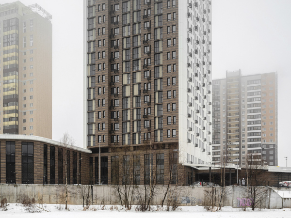
At the same time, if you look from the Yaroslavl highway, from where the housing complex is pretty viewable, it obviously looks like it belongs in the league of the Moscow-area high-rise development, which has already spread a kilometer to the north. However, what makes “Turgeneva 13” different from the rank-and-file high-rise housing projects is its compact and collected appearance and neatly drawn architecture, and even some noble character amidst the buildings, some of which are too standard, some plain ugly, and some garish-looking – the usual Moscow-area panorama that we are accustomed to.

“Na Turgeneva” housing complex
Copyright: Photo courtesy by KPLN


“Na Turgeneva” housing complex
Copyright: Photo courtesy by KPLN


The two towers, square on the plan, are connected by an elongated stylobate: the underground car parks are placed on the inside, while on the roof there is a yard with a playground and a two-tiered wooden amphitheater that bypasses the playground at an acute angle. Sitting on its stairs, you can both watch your children play and admire the pond.

“Na Turgeneva” housing complex
Copyright: Photo courtesy by KPLN


“Na Turgeneva” housing complex
Copyright: Photo courtesy by KPLN


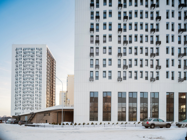
The stylobate is not exactly wide – about 40 meters wide – but it is raised high enough, about 5 or 6 meters above the ground, which ensures sufficient privacy. The towers stand at side ends – the bottom tier is “stretched” between them – and are turned at a 45-degree angle both to the line of the embankment and the stylobate’s axis, so that both from the water area and from the yard we see the houses at an angle, which allows us to appreciate the diversity of the facades.

Plan on the elevation of the 2nd floor. “Na Turgeneva” housing complex
Copyright: © KPLN


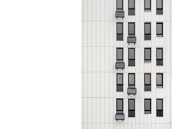
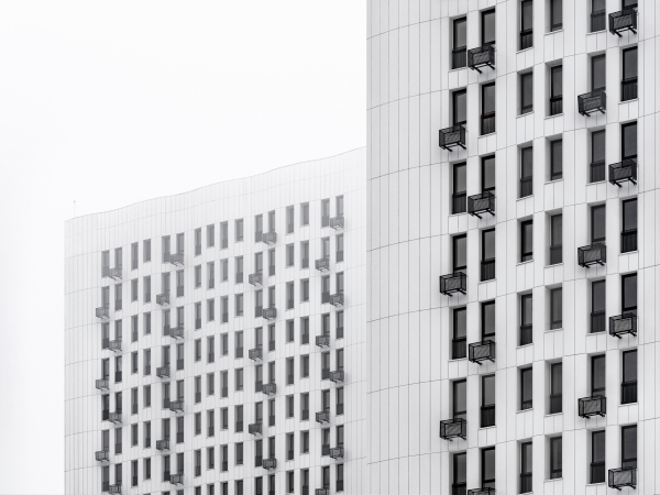
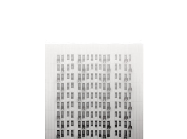
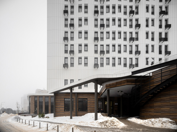
This difference is something that the entire plastique intrigue is based upon. North and south are faced by the white facades – they are a little bit longer, and, in addition, are extended by ledges that merge with the upper cornice link – this is how peculiar U-shaped “casings” appear that wrap around the volumes of the towers. forming a kind of a volumetric “frame”. The external surface of the white facades is slightly wavy, and they look particularly interesting in a slanted light that enhances the sculptural character of the curve. 

“Na Turgeneva” housing complex
Copyright: Photograph: Archi.ru


“Na Turgeneva” housing complex
Copyright: Photograph: Archi.ru


At the same time, if we look at them en face in a soft light, the white façade with a fine pattern of windows of different height and black boxes of the air conditioners take on a graphically laconic character of the pure design solution, advantageous against the multicolored context, but livened up by the different heights of the windows, which seem suspended from the upper line, like a fringe, and echo the wavy surface of the facade. 

  • zooming
    1 / 4
    “Na Turgeneva” housing complex
    Copyright: Photo courtesy by KPLN
  • zooming
    2 / 4
    “Na Turgeneva” housing complex
    Copyright: Photo courtesy by KPLN
  • zooming
    3 / 4
    “Na Turgeneva” housing complex
    Copyright: Photo courtesy by KPLN
  • zooming
    4 / 4
    “Na Turgeneva” housing complex
    Copyright: Photo courtesy by KPLN


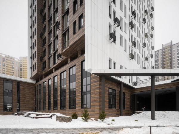
The west and the east facades are dark-colored; the horizontal panels of porcelain stoneware with an effect of brown wood form a differently toned surface. The wall recedes backwards from the white frame and sinks in one more time in the center, forming a broad vertical ledge, framed by two “risalits”. The volumetric wave of the white facades is echoed by the decorative wave of the light-beige lattices that cover some of the windows of the recessed balconies, slightly softening the straight character of the vertical lamellas. 

“Na Turgeneva” housing complex
Copyright: Photo courtesy by KPLN


Thus, the two identical towers seem to be elements cut from some kind of a blank: a light wavy “crust”, and a dark soft “middle” – on the whole, this is a well-known modern technique, but in this case it helps to build a complex solely volumetrically, based on the intrigue of comparing two types of “plastique matter”.

“Na Turgeneva” housing complex
Copyright: Photo courtesy by KPLN


“Na Turgeneva” housing complex
Copyright: Photo courtesy by KPLN


In the southern part, from the side of the 1st Nekrasovsky Drive (which serves here as the main road from the city) the lower tier is joined by a two-story volume of retail. Its facades, like the facades of the stylobate, are designed in a dark “wooden” key; the corners are rounded, the windows are combined in vertical pairs and alternate with the recesses of the entrances. A few stores are already open here, and the side-end part looks quite spectacular and seems to be a viable basis for urban life on the lake shore. 

“Na Turgeneva” housing complex
Copyright: Photo courtesy by KPLN


“Na Turgeneva” housing complex
Copyright: Photo courtesy by KPLN


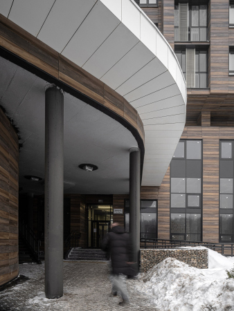
Yet another peculiar feature of the stylobate are the entrances of the residential buildings. Located in the corners between the stylobate and the bases of the towers, they are asymmetrical, shady and cozy in their own way. In front of them, there are little green knolls of geoplastics, which give the entrances an unexpected likeness to caves.

The facade from the embankment side. “Na Turgeneva” housing complex
Copyright: © KPLN


The canopies over the entrances are a separate story: they flow, bend, and stretch lintels to one another through the air, supported by round black columns. 

In a word, everything here, in the part of the complex, to which the end users – its residents – are exposed most of all, austerity gives way to some “sculptural-ness”, specifically, deconstruction. In any case, the solution, proposed by the architects, is far from “standard”: not a portal, not a portico, not a recession, but a little bit of everything rolled into one. Maybe it is this building that gives a start, like a boat sailing the lake, to the “wave” of white surfaces on the towers? This is a version just as good as any other – like some sort of the building’s reaction to the river. 

“Na Turgeneva” housing complex
Copyright: Photovraph: Archi.ru


Today, in January, you can strongly feel not just the response to the vicinity of the pond on the Serebryanka river, but also the complex’s emotional kinship to winter – not the “postcard” kind with Santa Clause, but to the real winter, the way that we see every day on the city streets. The two main tonalities: a wavy white “crust” and a loose multi-tone “base” echo each other, one with the surfaces of untouched snowdrifts and snowfields, and the other with roads traveled among them. What it ends up being is a recognizable white-ochre-brown scale, sung by the painting of the XX century; because of it, houses seem to grow “right out of the ground”, flesh and blood of the surrounding landscape, and seem firmly rooted in it. This is an unconventional approach to the context: instead of adapting to the surrounding buildings, the new complex quietly resists them, offering its own view of the image of the place.
  • zooming
    1 / 4
    “Na Turgeneva” housing complex
    Copyright: Photo courtesy by KPLN
  • zooming
    2 / 4
    “Na Turgeneva” housing complex
    Copyright: Photo courtesy by KPLN
  • zooming
    3 / 4
    “Na Turgeneva” housing complex
    Copyright: Photo courtesy by KPLN
  • zooming
    4 / 4
    “Na Turgeneva” housing complex
    Copyright: Photo courtesy by KPLN
The scheme of the architectural solution. “Na Turgeneva” housing complex
Copyright: Photo courtesy by KPLN


13 January 2022

Headlines now
A Unique Representative
The recently concluded year 2024 can be considered the year of completion for the “Garden Quarters” residential complex in Moscow’s Khamovniki. This project is well-known and, in many ways, iconic. Rarely does one manage to preserve such a number of original ideas, achieving in the end a kind of urban planning Gesamtkunstwerk. Here is a subjective view from an architecture journalist, with an interview with Sergey Skuratov soon to follow.
Field of Life
The new project by the architectural company PNKB (an acronym for “Design, Research, and Advisory Bureau”), led by Sergey Gnedovsky and Anton Lyubimkin, for the Kulikovo Field Museum is dedicated to the field as a concept in its own right. The field has long been a focus of the museum’s thorough and successful research. Accordingly, the exterior of the new museum building is gentler than that of its predecessor, which was also designed by PNKB and dedicated specifically to the historic battle. Inside, however, the building confidently guides the visitor from a luminous atrium along a spiral path to the field – interpreted here as a field of life.
A Paper Clip above the River
In this article, we talk with Vitaly Lutz from the Genplan Institute of Moscow about the design and unique features of the pedestrian bridge that now links the two banks of the Yauza River in the new cluster of Bauman Moscow State Technical University (MSTU). The bridge’s form and functionality – particularly the inclusion of an amphitheater suspended over the river – were conceived during the planning phase of the territory’s development. Typically, this approach is not standard practice, but the architects advocate for it, referring to this intermediate project phase as the “pre-AGR” stage (AGR stands for Architectural and Urban Planning Approval). Such a practice, they argue, helps define key parameters of future projects and bridge the gap between urban planning and architectural design.
Living in the Architecture of One’s Own Making
Do architects design houses for themselves? You bet! In this article, we are examining a new book by TATLIN publishing house. This book – unprecedented for Russia – features 52 private homes designed and built by contemporary architects for themselves. It includes houses that are famous, even iconic, as well as lesser-known ones; large and small, stylish and eccentric. To some extent, the book reflects the history of Russian architecture over the past 30 years.
A City Block Isoline
Another competition project for a residential complex on the banks of the Volga in Nizhny Novgorod has been prepared by Studio 44. A team of architects led by Ivan Kozhin concluded that using a regular block layout in such a location would be inappropriate and developed a “custom design” approach: a chain of parceled multi-section buildings stretching along the entire embankment. Let’s explore the features and advantages of this unconventional method.
Competition: The Price of Creativity?
Any day now, we’re expecting the results of a competition held by the “Samolet” development group for a plot in Kommunarka. In the meantime, we share the impressions of Editor-in-Chief Julia Tarabarina, who managed to conduct a public talk. Though technically focused on the interaction between developers and architects, the public talk turned into a discussion about the pros and cons of architectural competitions.
Terraced Design
The “River Park” residential complex has confidently and securely shaped the Nagatinsky Backwater shoreline. Featuring a public embankment, elevated courtyards connected by pedestrian bridges, and brick façades, the development invites exploration of its nuanced response to the surrounding context, as well as hints of the architects’ megalithic design thinking.
A Kremlin’s Core and Meteorite Fragments
We continue our coverage of the competition projects for the residential district that the development company GloraX plans to build along the embankment of the Rowing Channel in Nizhny Novgorod. ASADOV Architects approached the concept through a deep dive into local identity, using storytelling to pinpoint a central idea for the design: the master plan and composition are imagined as if a meteorite had struck a “proto-Kremlin”. Sounds weird? Find more details below!
The Volga Regatta
GloraX plans to develop a residential complex spanning 14 hectares along the Volga River in Nizhny Novgorod. The winning design in a closed-door competition, created by GORA Architects, features housing typologies ranging from townhouses to terraced high-rise slabs, a balance of functions, diverse ways of engaging with the water, and even a dedicated island (no less!) for the city residents.
Life Plans
The master plan for the residential district “Prityazheniye” (“Gravity”) in Naberezhnye Chelny was developed by the architectural company A.Len, taking into account the specific urban planning context and partially implemented solutions of the first phase. However, the master plan prioritized its own values: a green framework, a system of focal points, a hierarchy of spaces, and pedestrian priority. After this, the question of what residents will do in their neighborhood simply doesn’t arise.
A New Track
We took a thorough look at D_Station, a railcar repair depot dating back to 1906, recently reconstructed while preserving its century-old industrial structure, upon the project by Sergey Trukhanov and T+T Architects. Though work on the interiors – set to house restaurants and public spaces – is still underway, the building’s exterior already offers plenty to see. Visitors can explore the blend of old and new brickwork, appreciate the architect’s unique interpretation of ruin aesthetics, and enjoy the newly built pedestrian route that connects the Citydel Business Center’s arches to Kazakova Street.
Four Different Surveys
The “Explore the City” competition, organized this year by the Genplan Institute of Moscow, stands out as a pretty unconventional one for the architectural field but aligns perfectly well with the character of urban planning work. The winning project analyzed contemporary residential complexes, combining urban planning insights with a realtor’s perspective to propose a hybrid approach. Other entries explored public centers, motivations for car ownership, and housing vacancy rates. A fifth participant withdrew. Here’s a closer look at the four completed works.
Scheduled Evolution
ASADOV Architects unveiled the EvyCenter pavilion, a microcultural hub for fostering personal growth, organizing workshops, and doing gymnastics. Additionally, this pavilion serves as a prototype for a scalable country house, drawing inspiration from the “Loskutok” project, and constructed from CLT panels in a factory. This marks the beginning of a developer project initiated by the architectural firm (sic!), which is seeking partners to expand both small Evy settlements and even larger Evy cities, which are, according to Andrey Asadov, aimed at fostering the “evolutionary” development of the people who will inhabit them.
The Golden Crown
The concept for a dental clinic in Yekaterinburg, developed by CNTR Studio, revolves around the idea of a “mouth full of gold”: pristine white porcelain stoneware walls are complemented by matte brass details. To avoid an overly literal interpretation, the architects focused on the building’s proportions, skillfully navigating between sunlight requirements and fire safety regulations.
Flexibility and Integration
Not long ago, we covered the project for the fourth phase of the ÁLIA residential complex, designed by APEX. Now, we’ve been shown different fence concepts they developed to enclose the complex’s private courtyards, incorporating a variety of public functions. We believe that the sheer fact that the complex’s architects were involved in such a detail as fencing speaks volumes.
A Step Forward
The HIDE residential complex represents a major milestone for ADM architects and their leaders Andrey Romanov and Ekaterina Kuznetsova in their quest for a fresh high-rise aesthetic – one that is flexible and layered, capable of bringing vibrancy to mass and silhouette while shaping form. Over recent years, this approach has become ADM’s “signature style”, with the golden HIDE tower playing a pivotal role in its evolution. Here, we delve into the project’s story, explore the details of the complex’s design, and uncover its core essence.
Gold in the Sands
A new office for a transcontinental company specializing in resource extraction and processing has opened in Dubai. Designed by T+T Architects, masters of creating spaces that are contemporary, diverse, flexible, and original, this project exemplifies their expertise. On the executive floor, a massive brass-clad partition dominates, while layered textures of compressed earth create a contextually resonant backdrop.
Layers and Levels of Flight
This project goes way back – Reserve Union won this architectural competition at the end of 2011, and the building was completed in 2018, so it’s practically “archival”. However, despite being relatively unknown, the building can hardly be considered “dated” and remains a prime example of architectural expression, particularly in the headquarters genre. And it’s especially fitting for an aviation company office. In some ways, it resembles the Aeroflot headquarters at Sheremetyevo but with its own unique identity, following the signature style of Vladimir Plotkin. In this article, we take an in-depth look at the United Aircraft Corporation (UAC) headquarters in the Moscow agglomeration town of Zhukovsky, supplemented by recent photographs from Alexey Naroditsky – a shoot that became only recently possible due to the fact that improvements were finally made in the surrounding area.
Light and Shadow
In this article, we delve into the architectural design of the “Chaika” house by DNK ag architects, which was recently completed in 2023 as part of the collection of signature designs at ZILArt. As is well-known, all the buildings in this complex follow a design code, yet each one is distinct. This particular building stands out not only for its whiteness and minimalism but also for the refined use of a limited number of techniques that, together, create what can confidently be called synergy.
Casus Novae
A master plan was developed for a large residential area with a name of “DNS City”, but now that its implementation began, the plan has been arbitrarily reformatted and replaced with something that, while similar on the surface, is actually quite different. This is not the first time such a thing happens, but it’s always frustrating. With permission from the author, we are sharing Maria Elkina’s post.
Treasure Hunting
The GAFA bureau, in collaboration with Tegola and Arkhitail, organized an expedition to the island of Kilpola in Karelia as part of Moskomarkhitektura’s “Open City” festival. There, amidst moss and rocks, the students sought answers to questions like: what is the sacred, where does it dwell, and what sustains it? Assisting the participants in this quest were landscape engineer Evgeny Levin, artist Nicholas Roerich, a moose, and the lack of cellular connection. Here’s how the story unfolded.
Depths of the Earth, Streams of Water
In the Malaya Okhta district, the Akzent building, designed by Stepan Liphart, was constructed. It follows a classic tripartite structure, yet it’s what you might call “hand-drawn”: each façade is unique in its form and details, some of which aren’t immediately noticeable. In this article, we explore the context and, together with the architect, delve into how the form was developed.
Fir Tree Dynamics
The “Airports of Region” holding is planning to build an airport in Karachay-Cherkessia, aiming to make the Arkhyz and Dombay resorts more accessible to travelers. The project that won in an invitation-only competition, submitted by Sergey Nikeshkin’s KPLN, blends natural imagery inspired by the shape of a conifer seed, open-air waiting spaces, majestic large trees, and a green roof elevated on needle-like columns. The result is both nature-inspired and WOW.
​A Brick Shell
In the process of designing a clubhouse situated among pine trees in a prestigious suburban area near Moscow, the architectural firm “A.Len” did the façade design part. The combination of different types of brick and masonry correlates with the volumetric and plastique solutions, further enhanced by the inclusion of wood-painted fragments and metal “glazing”.
Word Forms
ATRIUM architects love ambitious challenges, and for the firm’s thirtieth anniversary, they boldly play a game of words with an exhibition that dives deep into a self-created vocabulary. They immerse their projects – especially art installations – into this glossary, as if plunging into a current of their own. You feel as if you’re flowing through the veins of pure art, immersed in a universe of vertical cities, educational spaces – of which the architects are true masters – and the cultural codes of various locations. But what truly captivates is the bold statement that Vera Butko and Anton Nadtochy make, both through their work and this exhibition: architecture, above all, is art – the art of working with form and space.
Flexibility and Acuteness of Modernity
Luxurious, fluid, large “kokoshniks” and spiral barrel columns, as if made from colorful chewing gum: there seem to be no other mansion like this in Moscow, designed in the “Neo-Russian-Modern” style. And the “Teremok” on Malaya Kaluzhskaya, previously somewhat obscure, has “come alive with new colors” and gained visibility after its restoration for the office of the “architectural ecosystem” as the architects love to call themselves. It’s evident that Julius Borisov and the architects at UNK put their hearts into finding this new office and bringing it up to date. Let’s delve into the paradoxes of this mansion’s history and its plasticity. Spoiler: two versions of modernity meet here, both balancing on the razor’s edge of “what’s current”.
Yuri Vissarionov: “A modular house does not belong to the land”
It belongs to space, or to the air... It turns out that 3D printing is more effective when combined with a modular approach: the house is built in a workshop and then adapted to the site, including on uneven terrain. Yuri Vissarionov shares his latest experience in designing tourist complexes, both in central Russia and in the south. These include houseboats, homes printed from lightweight concrete using a 3D printer, and, of course, frame houses.
​Moscow’s First
“The quality of education largely depends on the quality of the educational environment”. This principle of the last decade has been realized by Sergey Skuratov in the project for the First Moscow Gymnasium on Rostovskaya Embankment in the Khamovniki district. The building seamlessly integrates into the complex urban landscape, responding both to the pedestrian flow of the city and the quiet alleyways. It skillfully takes advantage of the height differences and aligns with modern trends in educational space design. Let’s take a closer look.
Looking at the Water
The site of Villa Sonata stretches from the road to the water’s edge, offering its own shoreline, pier, and a picturesque river panorama. To reveal these sweeping views, Roman Leonidov “cut” the façade diagonally parallel to the river, thus getting two main axes for the house and, consequently, “two heads”. The internal core – two double-height spaces, a living room and a conservatory, with a “bridge” above them – makes the house both “transparent” and filled with light.
The White Wing
Well, it’s not exactly white. It’s more of a beige, white-stone structure that plays with the color of limestone – smoother surfaces are lighter, while rougher ones are darker. This wing unites various elements: it absorbs and interprets the surrounding themes. It responds to everything, yet maintains a cohesive expression – a challenging task! – while also incorporating recognizable features of its own, such as the dynamic cuts at the bottom, top, and middle.