По-русски

​Analysis and Synthesis

The project of the housing complex “Krasin”, designed for the historical center of St. Petersburg, and situated in a very obliging place – next to the Mining University designed by Voronikhin, yet bordering on an industrial area – became the result of a thorough analysis of the specifics of historical construction on the Vasilyevsky Island, and a subsequent synthesis with avoidance of direct stylization, yet forming a recognizable silhouette, resonant with the “old town”.

30 September 2021
Object
mainImg
The embankment of the Big Neva of the Vasilyevsky Island is a place that is very quickly changing its character: in the east part, it starts with Strelka, Stock Exchange, Kunstkamera the old building of the University, and other famous tourist attractions. Then it continues with the Academy of Arts, an exquisite building designed by Vallain Delamont. And it ends with the Dorian portico of the Mining University, an austere, almost harsh statement in the pure dialect of classicism. However, this is where it all ends – the industrial area begins with a port area and ships in the distance.  The city of museums and monuments abruptly gives way to a few constructivist buildings, which back in their days were built to cater for the factories. West of the Mining University, starts the territory of the Baltic Shipyard and a few factories of a smaller scale: ropes, leather, and electrical appliances. Here, on the Neva, one can even now see two atomic icebreakers, Siberia and Urals.

The industrial areas, however, are already being transformed, partially into art clusters – like the Sevkabel factory situated a kilometer and a half away from here – but chiefly into city housing projects. The city, as is the custom in our postindustrial time, is gradually invading the factory grounds, turning them from restricted areas into residential ones, and, to various degrees, public. Specifically, west of the Mining University, the developer company Setl City is building two housing complexes: one of them, situated further away from the river, named “Palazzo” is almost complete – it consists of differently colored sections that take their colors from the neighboring lines of the Vasilyevsky island with a slight enhancement of their brightness. The other housing complex, built by the same developer, has been recently designed by Nikita Yavein’s Studio 44 in a more obliging place – right on the waterfront, next to the Voronikhin portico. The city council considered and approved the project in April.

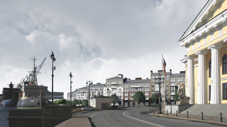
“Krasin” housing complex. Left: Krasin Icebreaker. Right: the mining University
Copyright: © Studio 44


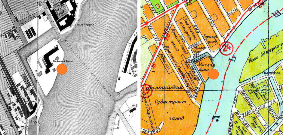
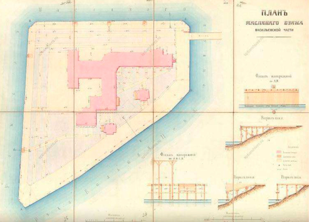
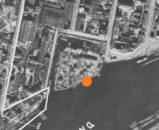
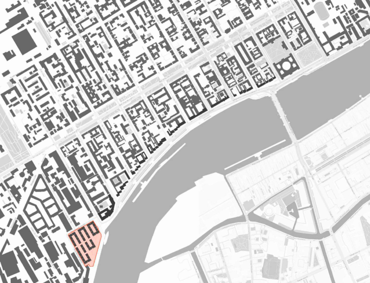
The housing complex “Krasin”, named after the icebreaker, which has now been turned into a museum, moored directly in front of it, is located on the territory of the former boiler design bureau, which moved in 2018. Historically, this place is known as “Maslyany Buyan” (“Buyan”, a dated Russian word, was a moor for unloading cargoes, and a place where warehouses were situated). As early as in the 1940s, it became an artificial island, separated from the mainland by the Maslyany Channel, which the ships could enter for loading and unloading, and where they subsequently moored like in a bay. By the 1960s, the canal was filled up, but the surrounding area on both sides of the street is named “Oil Channel”.

  • zooming
    1 / 6
    “Krasin” housing complex. Detailed plan of St. Petersburg by Major General Schubert 1828, plan of Leningrad 1934
    Copyright: © Studio 44
  • zooming
    2 / 6
    “Krasin” housing complex. Plan of “Maslyany Buyan” in its Vasilevsky Island part, 1876
    Copyright: © Studio 44
  • zooming
    3 / 6
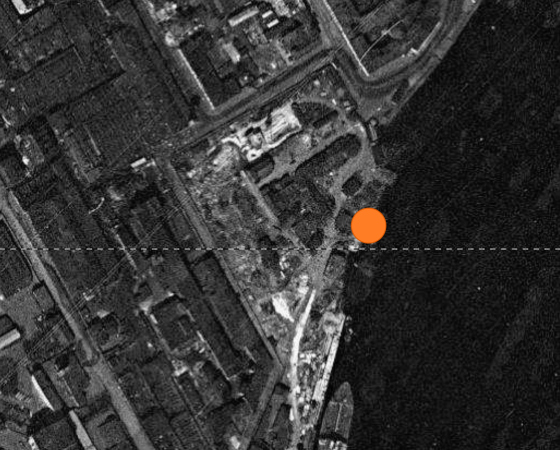
    “Krasin” housing complex. The Oil Channel, Luftwaffe footage, 1942
    Copyright: © Studio 44
  • zooming
    4 / 6
    “Krasin” housing complex. A photograph made by an American satellite
    Copyright: © Studio 44
  • zooming
    5 / 6
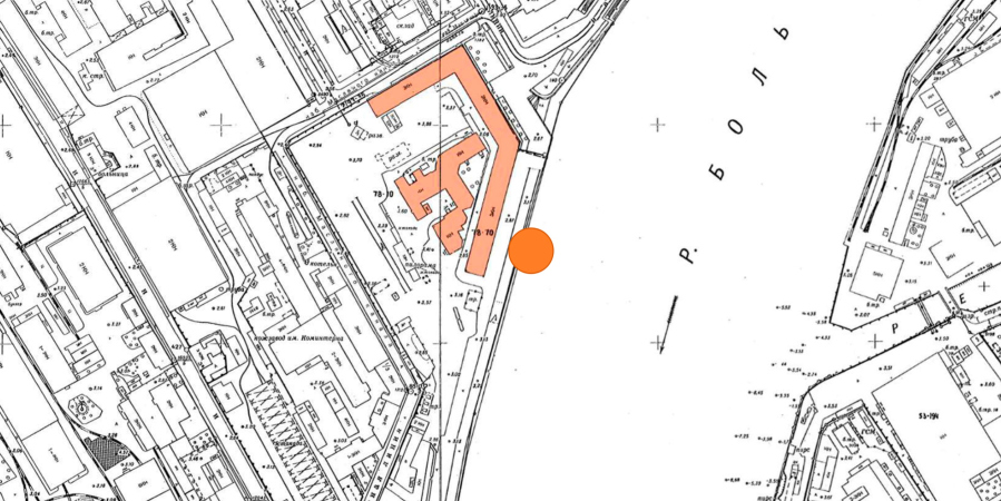
    “Krasin” housing complex. Topographic plan of Leningrad, a fragment, 1977
    Copyright: © Studio 44
  • zooming
    6 / 6
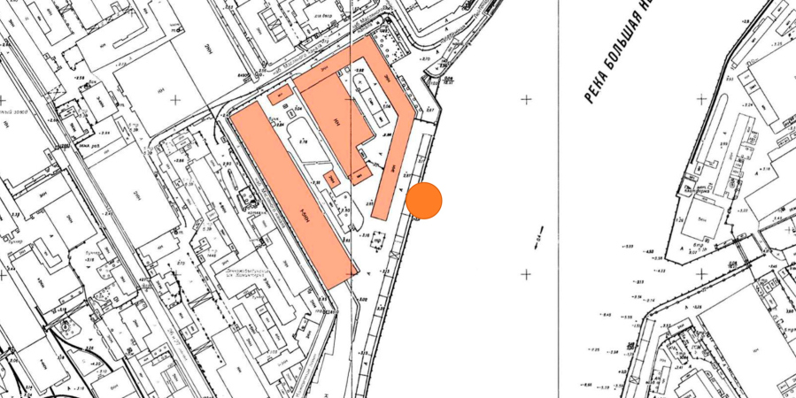
    “Krasin” housing complex. Topographic plan of Leningrad, a fragment, 1989
    Copyright: © Studio 44


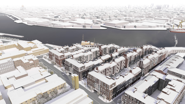
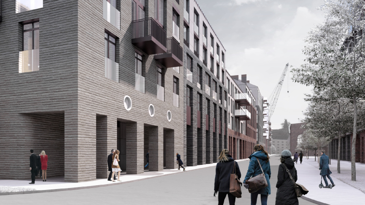
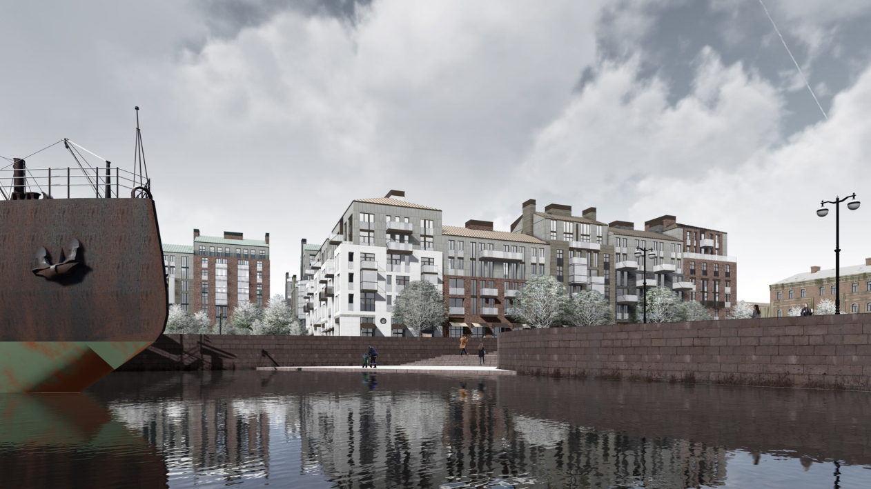
The surroundings, as was already said, are contrastive and valuable, albeit in different ways. The ice breaker and the portico of the Mining University work together to create the classic “St. Petersburg tourist attraction” theme, making it necessary for the new buildings to be a little bit uptight, and, of course, it was the Voronikhin building that became the reason for the height restrictions – 22m close to it, 33m a little bit further away from it. In addition, the site is situated within the limits of the “historical settlement”, and the complex will be plainly visible from the Neva, which makes the height restrictions particularly strict: hence the pitched roofs with a 25-degree tilt, the decrease of the height towards the river, a moderate tone of the facades, and natural-looking textures of brick and stone.

“Krasin” housing complex
Copyright: © Studio 44


Other elements of the context are not as obvious, but also important. These are the Paramonov Leather Factory, located in the west, on the opposite side of the Maslyany Kanal Street, and the late 19-century buildings in the spirit of industrial historicism of the classic nature – there are plans that these will host a health center and a school; nearby in the north there will probably be still another block of the housing complex.

“Krasin” housing complex
Copyright: © Studio 44


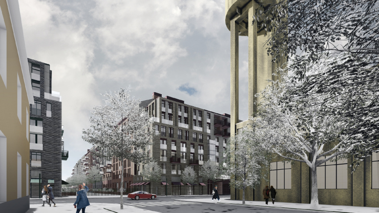
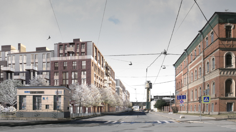
The Maslyany Kanal Street makes a right-angle turn to the right, and one can see here yet another landmark – the water tower of the rope shop, built by Yakov Chernikhov, an elegant urban accent on slender concrete legs.

“Krasin” housing complex
Copyright: © Studio 44


In addition, the residential buildings of Vasilievsky Island, situated to the east and north, provide an example of a restrained and diverse development front, ranging from classicism to historicism to modernism, while factory buildings of the 19th century to the west show an inclination towards the red-brick style of facades. As for the territory of the Maslyany Buyan itself, it was built up in the late Soviet era with three dull factory buildings, one of which was leased out for offices in recent years.

“Krasin” housing complex. Icebreaker “Krasin” (0), entrance to the Sea Canal (MK), hull-processing shop (1), mechanical shop (2), slipway A, large (3), independent thermoelectric power station “Akademik Lomonosov” on completi
Copyright: © Studio 44


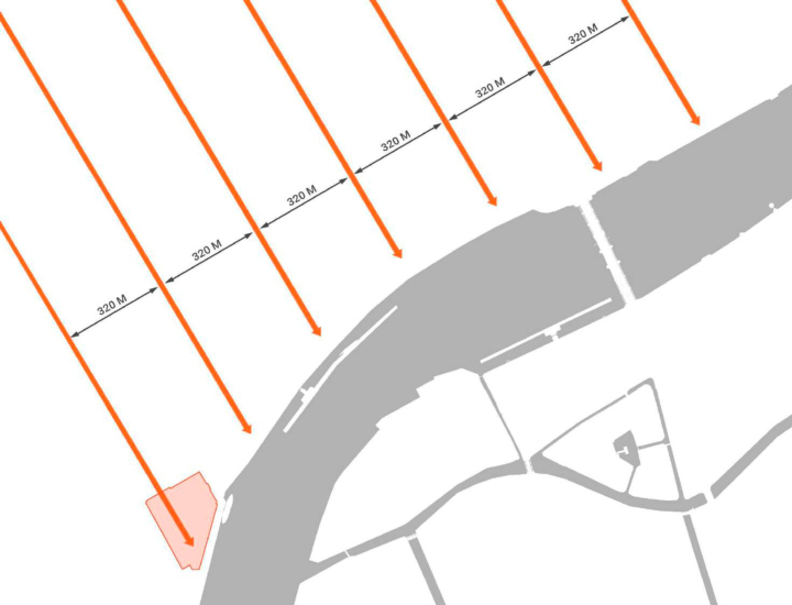
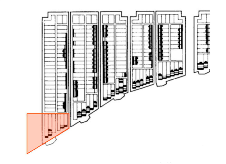
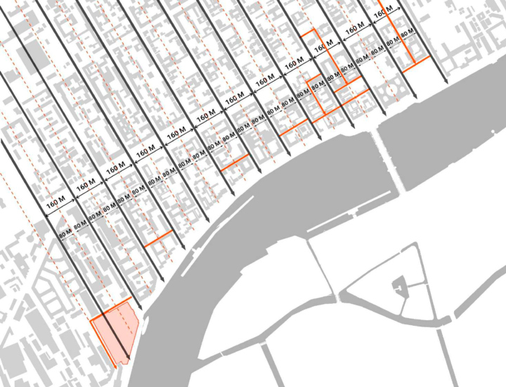
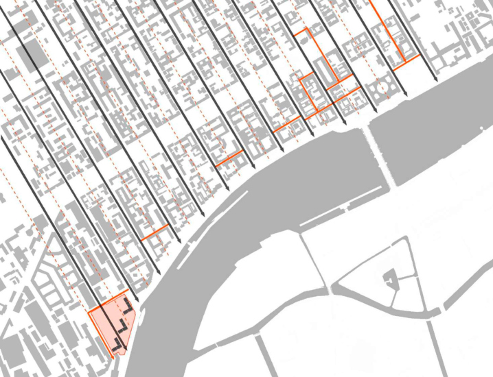
Thus, it comes as no surprise that the work for such an obliging place was preceded by a serious urban planning analysis – first of all, it covered the place of the new complex as part of the hippodamus grid of the streets of Vasilievsky Island. As is known, it is clear and simple, consisting of rather large rectangles: back in the day, Trezzini proposed a grid of streets with a cell 320 meters wide. Then finer fracturing came about, and the space between the streets stretching from northwest to southeast is now 160 meters. Historically, however, inside some of the quarters, there was a longitudinal internal passage, dividing the block into parts longitudinally (and sometimes transversely) – this is how the narrowest street in the city, Repin Street, appeared. If we take into account such cases and divide the cell in half by meridian, the cell width is already close to the “Manhattan” type: 80 meters.

  • zooming
    “Krasin” housing complex. Project plan of Vasilievsky Island Domenico Trezzini 1717
    Copyright: © Studio 44
  • zooming
    “Krasin” housing complex. Development of Vasilievsky Island according to the fixing plan. Fragment of the plan of 1726
    Copyright: © Studio 44


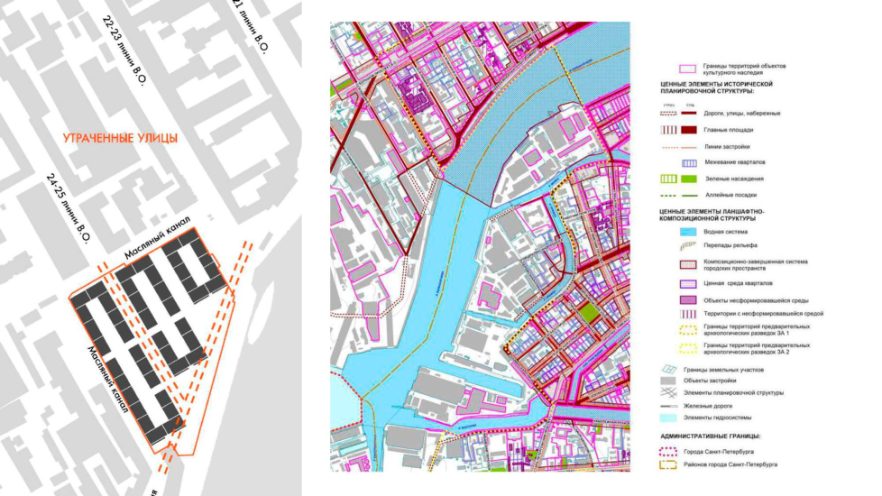
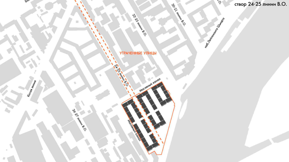
The architects also take into account this division, which historically existed in an unmanifested form, but is read in the intra-quarter voids, and is supported by the peculiar numbering of the streets: on Vasilievsky Island, they do not count the driveways as such, but the lines of houses, so each street has a “paired” name, for example, “Lines 4 and 5”. The street that leads to Maslyany Buyan is “Lines 24 and 25”.

  • zooming
    “Krasin” housing complex. Map of valuable elements of the planning and landscape-compositional structure
    Copyright: © Studio 44
  • zooming
    “Krasin” housing complex. Line 24-25 of Vasilyevsky Island
    Copyright: © Studio 44


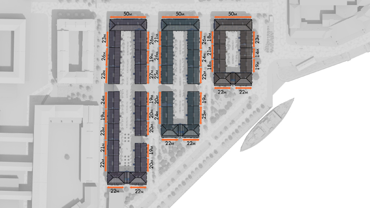
The architects took the most fractional division module as a basis – the site was divided into three equal strips with two internal streets, one of which continues the line “24 and 25”.  Currently, Lines 24 and 25 stop in a dead end in front of the Maslyany Canal Street – in the project it is planned to extend it to the embankment with a pedestrian promenade running inside the housing complex, although, according to the developer’s decision, it will, unfortunately, be open only to its residents. However, it will create, nevertheless, a promising passage.

  • zooming
    “Krasin” housing complex. Preserved in the present time internal passages and meridional connections
    Copyright: © Studio 44
  • zooming
    “Krasin” housing complex. The streets and the inner passages
    Copyright: © Studio 44


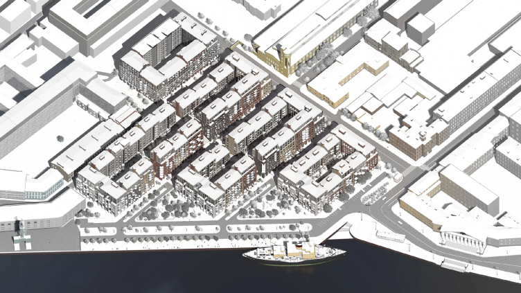
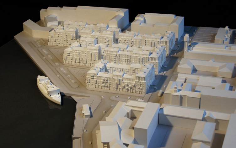
The result is compact 4 and 6-story city blocks, subjugated to the grid of Vasilievsky Island and at the same time drawn more regularly, with thin extended frames. The Neva makes a turn here, and the rectangles systematically grow in an arc, not following the curve of the embankment, but protruding forward in “angle” steps. The authors “spied” this planning technique on the neighboring embankment of the 18th-19th centuries, where all the facades are parallel to the direction of the avenues of Vasilievsky Island, and are thus inscribed in a common orthogonal grid. In front of the arc of the river, they form “angle” steps.

“Krasin” housing complex. The forming of new city blocks
Copyright: © Studio 44


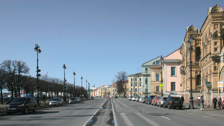
Lieutenant Schmidt Embankment to the east of the Krasin housing complex
Copyright: © Studio 44


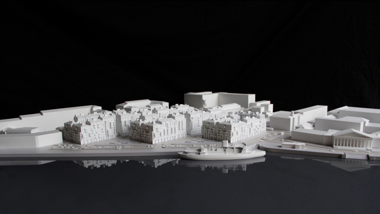
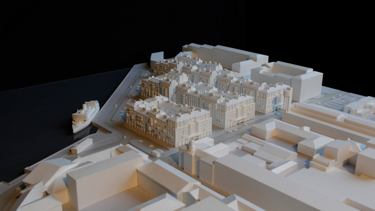
In the Krasin residential complex, this “step-like” character of the plan is more pronounced from the side of the waterfront: while in the historical front the zigzag contour is formed by the facades of individual houses, here it is formed by the ends of the city blocks, two sections in each. From the side of the river, triangular plazas are formed between them – this architectural gesture as a whole becomes more monumental, the juxtaposition of geometric angles and the smooth river bend becomes a contrast between man-made and natural, showing one of the characteristic features of St. Petersburg.

“Krasin” housing complex. The project proposal
Copyright: © Studio 44


The indentations of the side ends of the city blocks are also uniform in the spirit of the “megalithic” attitude to volumes, typical of Nikita Yavein’s projects. Each end receives a continuation in the front of the neighboring block in the form of narrow, as if cut with a knife, gaps – they support the transverse direction of the grid and provide laconic caesuras, making it possible to avoid excessively long rows, at the same time opening passages to the courtyards.

“Krasin” housing complex
Copyright: © Studio 44


“Krasin” housing complex
Copyright: © Studio 44


Thus, it turns out that at the level of general outlines of volumetric construction, the ideas were discovered by the architects in the historical development of Vasilyevsky Island – taken as a basis, but brought to a certain stereometric denominator, and thereby sharpened and strengthened. This approach to the context is particularly interesting because of its analytical nature.

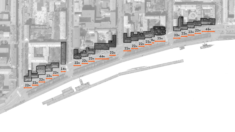
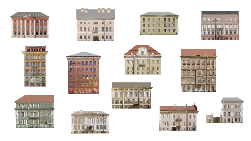
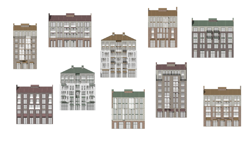
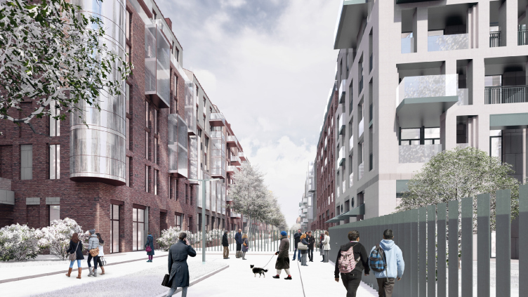
As for the facades, the opposite process takes place – while the volumes as a whole tend to regularity and enlargement, the facades are made deliberately fragmented, enlivened by a variety of textures, materials and geometry. Each section – 44 in total – received its own pattern and height, slightly different from the neighboring ones, which resulted in slight fluctuations in the silhouette. The parameters of all the sections were also the result of an analysis of the building structure of Vasilievsky Island, primarily its waterfront.

  • zooming
    1 / 3
    “Krasin” housing complex. The current parcellation
    Copyright: © Studio 44
  • zooming
    2 / 3
    “Krasin” housing complex. The current state
    Copyright: © Studio 44
  • zooming
    3 / 3
    “Krasin” housing complex. The project proposal.
    Copyright: © Studio 44


Therefore, the width of most of the sections is like that of the historical facades along the river, which ie 22 meters. From the rear side of the complex, this figure doubles up to 50 m – but no more than that. Here, the side-end houses are crowned with colonnades of attics, which is why they acquire greater monumentality, building on this side a semblance (or, perhaps, a “seed”) of an avenue.

“Krasin” housing complex
Copyright: © Studio 44


“Krasin” housing complex
Copyright: © Studio 44


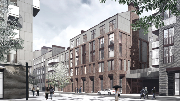
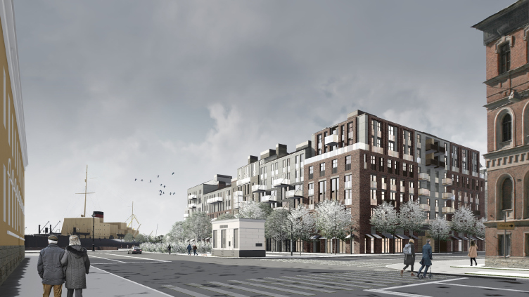
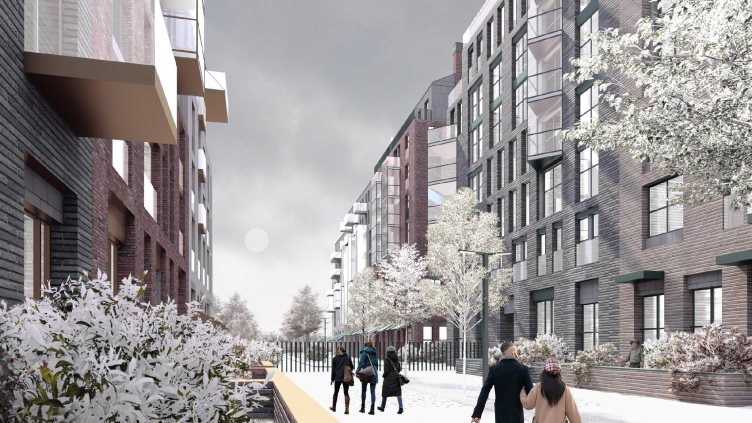
The facades pick up the rhythm and scale of the old buildings, but completely exclude direct quotes from the decor of historical architecture, focusing on rhythm, proportions, texture and tone. From the side of the Mining University and the regular historical city, where the altitude is lower, stone and light colors prevail. From the opposite side, from the west, as well as from the north, where the complex borders on industrial buildings and grows in height, there are more dark bricks. The complex responds with facades to almost all of its neighbors.

“Krasin” housing complex
Copyright: © Studio 44


“Krasin” housing complex
Copyright: © Studio 44


Closer to the water tower designed by the avant-garde architect Yakov Chernikhov, the role of round windows, characteristic of the architecture of the 1920s-1930s and, in addition, loved by Nikita Yavein, becomes more noticeable (he considers it necessary to add at least one round window to each of his projects; such a window is also to be seen in the architect’s study).

“Krasin” housing complex
Copyright: © Studio 44


On the facades, the “multilayered” method is actively used: one material, for example a brick, is treated as a large external “grid”, another, for example a stone, as the internal matter. Glass livens up the traditional materials with protrusions of balconies and bay windows, thin fences and plastic “sightseeing” cylinders at the corners – but in general the glass is not really abundant, there is even a diagram in the design materials that clearly demonstrates the predominance of “stone” surfaces.

“Krasin” housing complex
Copyright: © Studio 44


“Krasin” housing complex
Copyright: © Studio 44


On the other hand, the architects are not using painted stucco at all here – which is a little bit counterintuitive because this is the “signature” facade material for the Vasilyevsky Island. This makes it possible to avoid garishness and enhance the respectability – for a modern housing complex in the center of the city, “natural facade materials” are definitely a plus.

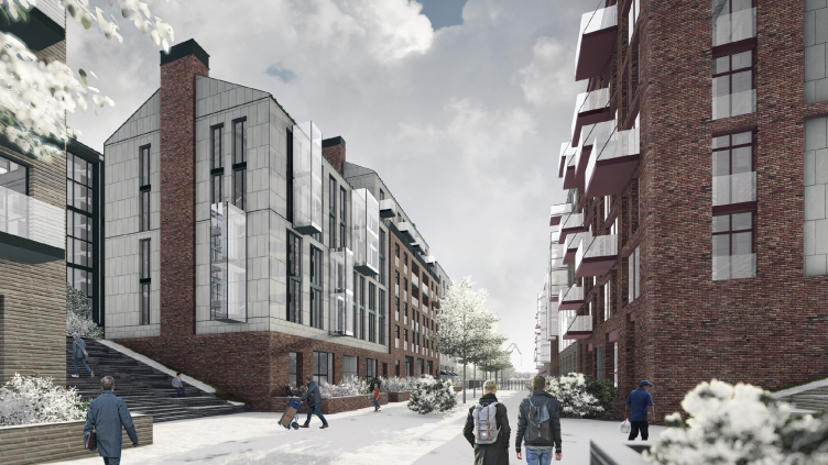
If historical details are ethically prohibited for architects, then the historical silhouette, on the contrary, is quite the right thing to do. In addition to the slight variability of the height of the sections and pitched roofs, ventilation outlets, designed in the form of plates resembling groups of chimneys, and in some cases placed on the sidewalls we and sharply reminiscent of fireplaces, work to make the silhouette of the “old city” recognizable.

The yards inside the city blocks are elevated to the stylobate floors. From the street, they can be accessed by monumental staircases with amphitheaters.

“Krasin” housing complex
Copyright: © Studio 44


The city gallery stretches along the western facade of the complex along Maslyany Canal Street in front of a continuous line of shops: it expands the sidewalk, allowing you to walk past the shop windows and hide from the rain. At the same time, it partially makes up for the residents-only status of the inner streets of the complex – you can easily walk past it to the Lieutenant Schmidt embankment.

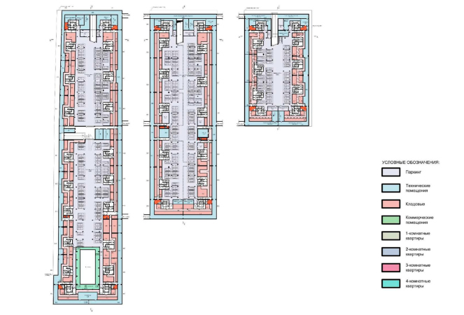
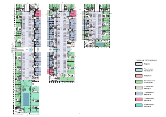
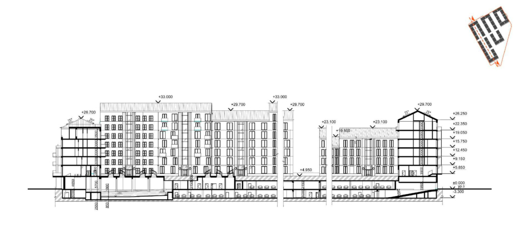
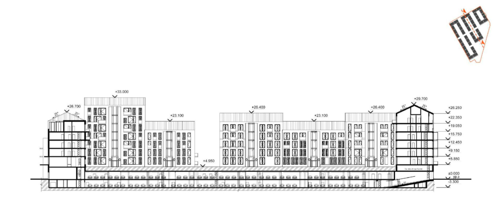
Underneath each of the blocks, there is a tier of underground parking, combined with storage rooms for the residents. Beneath the courtyard, there is another level of parking, the overland one. The spaces located at the city level are complex and, of course, not all of them are occupied by parking lots: many cafes and shops are planned along the outer perimeter of the buildings, and some of the premises under the courtyards within the city blocks are given to fitness facilities with two swimming pools, one of them, of a larger size, being illuminated by large beautiful skylights from the yard. Thus, despite the fact that the inner streets of the complex will only be accessible to the residents, the complex will still give the city a lot.

  • zooming
    1 / 6
    “Krasin” housing complex. Section View 3-3
    Copyright: © Studio 44
  • zooming
    2 / 6
    “Krasin” housing complex. Section View 2-2
    Copyright: © Studio 44
  • zooming
    3 / 6
    “Krasin” housing complex. Section View
    Copyright: © Studio 44
  • zooming
    4 / 6
    “Krasin” housing complex, Section View A-A
    Copyright: © Studio 44
  • zooming
    5 / 6
    “Krasin” housing complex. Plan of the basement
    Copyright: © Studio 44
  • zooming
    6 / 6
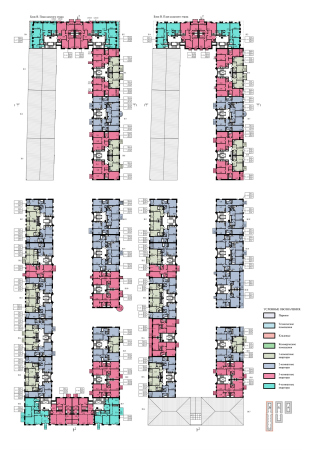
    “Krasin” housing complex. Plan of the 1st floor
    Copyright: © Studio 44


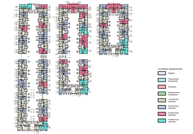
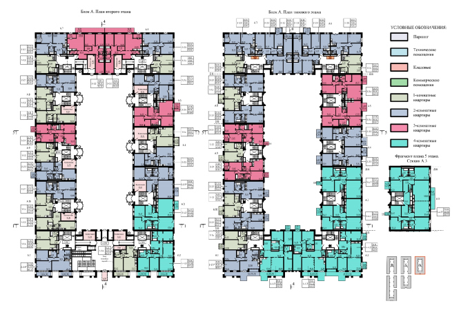
On the first floors there are apartments with their own front gardens facing the inner boulevards. The complex is quite expensive (this is how the press describes it, and its location and low altitude oblige it to a “closed-door” format), so its apartment layout is pretty diverse – there are three- and four-room apartments – the latter are grouped mainly at the corners with sweeping views of the Neva.

  • zooming
    1 / 3
    “Krasin” housing complex. Plan of the 2nd floor
    Copyright: © Studio 44
  • zooming
    2 / 3
    “Krasin” housing complex. Plan of the standard floor
    Copyright: © Studio 44
  • zooming
    3 / 3
    “Krasin” housing complex. Plan of the 7th floor
    Copyright: © Studio 44


As we can see, this premium class residential complex in the center of St. Petersburg is the result of thoughtful analytical work with the context – in addition to responding to the visual features of the environment, it is tuned in to the continuation and development of the structure of the urban fabric, dating back to the regular planning of the 18th century. Some of its features are deliberately enhanced and exaggerated for the sake of responding to the features of the site and the task at hand. A small, comfortable height is due to the height restrictions and is supported by the high-end status of the project. The emphasized rhythmic diversity becomes a response to the fine cut of the facades of historical buildings. Ultimately, the complex becomes a kind of “transitional link” between two very different parts of the city: historical center and the industrial area. The port cranes and ships, both museum and under construction, add some piquancy to the atmosphere; the residential complex is becoming the next step in the urban fabric, comfortable and inhabited, a step towards expansion and replication based on the module once set by Trezzini and Leblond.

30 September 2021

Headlines now
The Golden Crown
The concept for a dental clinic in Yekaterinburg, developed by CNTR Studio, revolves around the idea of a “mouth full of gold”: pristine white porcelain stoneware walls are complemented by matte brass details. To avoid an overly literal interpretation, the architects focused on the building’s proportions, skillfully navigating between sunlight requirements and fire safety regulations.
Flexibility and Integration
Not long ago, we covered the project for the fourth phase of the ÁLIA residential complex, designed by APEX. Now, we’ve been shown different fence concepts they developed to enclose the complex’s private courtyards, incorporating a variety of public functions. We believe that the sheer fact that the complex’s architects were involved in such a detail as fencing speaks volumes.
A Step Forward
The HIDE residential complex represents a major milestone for ADM architects and their leaders Andrey Romanov and Ekaterina Kuznetsova in their quest for a fresh high-rise aesthetic – one that is flexible and layered, capable of bringing vibrancy to mass and silhouette while shaping form. Over recent years, this approach has become ADM’s “signature style”, with the golden HIDE tower playing a pivotal role in its evolution. Here, we delve into the project’s story, explore the details of the complex’s design, and uncover its core essence.
Gold in the Sands
A new office for a transcontinental company specializing in resource extraction and processing has opened in Dubai. Designed by T+T Architects, masters of creating spaces that are contemporary, diverse, flexible, and original, this project exemplifies their expertise. On the executive floor, a massive brass-clad partition dominates, while layered textures of compressed earth create a contextually resonant backdrop.
Layers and Levels of Flight
This project goes way back – Reserve Union won this architectural competition at the end of 2011, and the building was completed in 2018, so it’s practically “archival”. However, despite being relatively unknown, the building can hardly be considered “dated” and remains a prime example of architectural expression, particularly in the headquarters genre. And it’s especially fitting for an aviation company office. In some ways, it resembles the Aeroflot headquarters at Sheremetyevo but with its own unique identity, following the signature style of Vladimir Plotkin. In this article, we take an in-depth look at the United Aircraft Corporation (UAC) headquarters in the Moscow agglomeration town of Zhukovsky, supplemented by recent photographs from Alexey Naroditsky – a shoot that became only recently possible due to the fact that improvements were finally made in the surrounding area.
Light and Shadow
In this article, we delve into the architectural design of the “Chaika” house by DNK ag architects, which was recently completed in 2023 as part of the collection of signature designs at ZILArt. As is well-known, all the buildings in this complex follow a design code, yet each one is distinct. This particular building stands out not only for its whiteness and minimalism but also for the refined use of a limited number of techniques that, together, create what can confidently be called synergy.
Casus Novae
A master plan was developed for a large residential area with a name of “DNS City”, but now that its implementation began, the plan has been arbitrarily reformatted and replaced with something that, while similar on the surface, is actually quite different. This is not the first time such a thing happens, but it’s always frustrating. With permission from the author, we are sharing Maria Elkina’s post.
Treasure Hunting
The GAFA bureau, in collaboration with Tegola and Arkhitail, organized an expedition to the island of Kilpola in Karelia as part of Moskomarkhitektura’s “Open City” festival. There, amidst moss and rocks, the students sought answers to questions like: what is the sacred, where does it dwell, and what sustains it? Assisting the participants in this quest were landscape engineer Evgeny Levin, artist Nicholas Roerich, a moose, and the lack of cellular connection. Here’s how the story unfolded.
Depths of the Earth, Streams of Water
In the Malaya Okhta district, the Akzent building, designed by Stepan Liphart, was constructed. It follows a classic tripartite structure, yet it’s what you might call “hand-drawn”: each façade is unique in its form and details, some of which aren’t immediately noticeable. In this article, we explore the context and, together with the architect, delve into how the form was developed.
Fir Tree Dynamics
The “Airports of Region” holding is planning to build an airport in Karachay-Cherkessia, aiming to make the Arkhyz and Dombay resorts more accessible to travelers. The project that won in an invitation-only competition, submitted by Sergey Nikeshkin’s KPLN, blends natural imagery inspired by the shape of a conifer seed, open-air waiting spaces, majestic large trees, and a green roof elevated on needle-like columns. The result is both nature-inspired and WOW.
​A Brick Shell
In the process of designing a clubhouse situated among pine trees in a prestigious suburban area near Moscow, the architectural firm “A.Len” did the façade design part. The combination of different types of brick and masonry correlates with the volumetric and plastique solutions, further enhanced by the inclusion of wood-painted fragments and metal “glazing”.
Word Forms
ATRIUM architects love ambitious challenges, and for the firm’s thirtieth anniversary, they boldly play a game of words with an exhibition that dives deep into a self-created vocabulary. They immerse their projects – especially art installations – into this glossary, as if plunging into a current of their own. You feel as if you’re flowing through the veins of pure art, immersed in a universe of vertical cities, educational spaces – of which the architects are true masters – and the cultural codes of various locations. But what truly captivates is the bold statement that Vera Butko and Anton Nadtochy make, both through their work and this exhibition: architecture, above all, is art – the art of working with form and space.
Flexibility and Acuteness of Modernity
Luxurious, fluid, large “kokoshniks” and spiral barrel columns, as if made from colorful chewing gum: there seem to be no other mansion like this in Moscow, designed in the “Neo-Russian-Modern” style. And the “Teremok” on Malaya Kaluzhskaya, previously somewhat obscure, has “come alive with new colors” and gained visibility after its restoration for the office of the “architectural ecosystem” as the architects love to call themselves. It’s evident that Julius Borisov and the architects at UNK put their hearts into finding this new office and bringing it up to date. Let’s delve into the paradoxes of this mansion’s history and its plasticity. Spoiler: two versions of modernity meet here, both balancing on the razor’s edge of “what’s current”.
Yuri Vissarionov: “A modular house does not belong to the land”
It belongs to space, or to the air... It turns out that 3D printing is more effective when combined with a modular approach: the house is built in a workshop and then adapted to the site, including on uneven terrain. Yuri Vissarionov shares his latest experience in designing tourist complexes, both in central Russia and in the south. These include houseboats, homes printed from lightweight concrete using a 3D printer, and, of course, frame houses.
​Moscow’s First
“The quality of education largely depends on the quality of the educational environment”. This principle of the last decade has been realized by Sergey Skuratov in the project for the First Moscow Gymnasium on Rostovskaya Embankment in the Khamovniki district. The building seamlessly integrates into the complex urban landscape, responding both to the pedestrian flow of the city and the quiet alleyways. It skillfully takes advantage of the height differences and aligns with modern trends in educational space design. Let’s take a closer look.
Looking at the Water
The site of Villa Sonata stretches from the road to the water’s edge, offering its own shoreline, pier, and a picturesque river panorama. To reveal these sweeping views, Roman Leonidov “cut” the façade diagonally parallel to the river, thus getting two main axes for the house and, consequently, “two heads”. The internal core – two double-height spaces, a living room and a conservatory, with a “bridge” above them – makes the house both “transparent” and filled with light.
The White Wing
Well, it’s not exactly white. It’s more of a beige, white-stone structure that plays with the color of limestone – smoother surfaces are lighter, while rougher ones are darker. This wing unites various elements: it absorbs and interprets the surrounding themes. It responds to everything, yet maintains a cohesive expression – a challenging task! – while also incorporating recognizable features of its own, such as the dynamic cuts at the bottom, top, and middle.
Urban Dunes
The XSA Ramps team designed and built a three-part sports hub for a park in Rostov-on-Don, welcoming people of all ages and fitness levels. The skate plaza, pump track, and playground are all meticulously crafted with details that attract a diverse range of visitors. The technical execution of the shapes and slopes transforms this space into a kind of sculptural composition.
Proportional Growth
The project for the fourth phase of the ÁLIA residential area has been announced. The buildings are situated on an elongated plot – almost a “ray” that shoots out from the center of the area towards the river. Their layout reflects both a response to Moscow’s architectural preferences over the past 15 years, shifting “from blocks to towers”, and an interpretation of the neighboring business park designed by SOM. Additionally, the best apartments here are not located at the very top but closer to the middle, forming a glowing “waistline”.
The “Staircase” Building
In designing the “Details” residential complex in New Moscow, Rais Baishev spiced up the now-popular Moscow theme of a “courtyard” building with an idea drawn from the surrealist drawings by Maurits Escher. He envisioned the stepped silhouettes and descending slopes as a metaphysical mega-staircase, creating a key void within the courtyard that gave the project an internal “spine”. This concept is felt both in the building’s silhouette and on its façades.
Projection of the Quarter
No one doubted that the building that Vladimir Plotkin designed as part of the “Garden Quarters” would be the most modernist of all. And it turned out just that way: while adhering to the common design code, the building successfully combines brick and white stone, rhythmically responding to the neighboring building designed by Ostozhenka, yet tactfully and persistently making a few statements of its own. This includes the projection of the ideal urban development composition “14–9–6”, which can be found right next door, mathematical calculations, including those for various types of terraces (and perhaps the only reminder of the Soviet past of the Kauchuk rubber factory!), and the white “cross-stitch” pattern of the façade grid.
Domus Aurea
In this issue, we examine the “Tessinsky-1” house, designed by Sergey Skuratov and completed in 2023. Located in the middle of the Serebryanicheskaya Embankment district, at the intersection of its main streets, this house assumes a sort of “nodal” role: it not only responds to everything around it and preserves many memories of the former EMA factory within itself, but it weaves all this into a newly directed pattern, reconciling bright “gold” and dark-colored brick, largely with the help of the new, modern-yet-archaic Columba brick, which, come to think about it, is the most precious element here.
The Chimney of Nikola-Lenivets
In this issue, we are examining the “Obelisk House” designed by KATARSIS and built for the Arkhstoyanie 2023 festival. However, it was only finished later on, and this is why we are examining it now. It seems to us that after the “Obelisk House” appeared in Nikola-Lenivets, a dialogue and a few inner connections appeared between the temporary structures built here. These houses no longer look like “accidental neighbors”, more of which below.
​Periscope by the Bay
The jury awarded the second place in the competition for a public and cultural center in Petropavlovsk-Kamchatsky to the companies GORA (“Mountain”) and M4. In the consortium’s proposal, the building resembles a sperm whale with a calf swimming next to it or a periscope, whose lenses capture the most spectacular views from the surrounding landscape.
From Arcs to Dolmens
While working on the competition project for Petropavlovsk-Kamchatsky, ASADOV Architects prioritized the value of the natural and urban environment, aiming to preserve the balance of the location while minimizing the resemblance of the volume that they designed to a “traditional building”. The task was challenging, and the architects created three versions, one of which having been developed after the competition, where their main proposal took third place. However, the point of interest here is not the competition result but the continuity of creative thinking.
Hide and Seek
The ID Moskovskiy house, designed by Stepan Liphart in St. Petersburg, in the courtyards near Moskovskiy Avenue beyond the Obvodny Canal and recently completed, is notable for several reasons. Firstly, it has been realized with considerable accuracy, which is particularly significant as this is the first building where the architect was responsible not only for the facades but also for the layouts, allowing for better integration between the two. On the other hand, this building is interesting as an example of the “germination” of new architecture in the city: it draws on the best examples from the neighborhood and becomes an improved and developed sum of ideas found by the architect in the surrounding context.
The Big Twelve
Yesterday, the winners of the Moscow Mayor’s Architecture Award were announced and honored. Let’s take a look at what was awarded and, in some cases, even critique this esteemed award. After all, there is always room for improvement, right?
Above the Golden Horn
The residential complex “Philosophy” designed by T+T architects in Vladivostok, is one of the new projects in the “Golubinaya Pad” area, changing its development philosophy (pun intended) from single houses to a comprehensive approach. The buildings are organized along public streets, varying in height and format, with one house even executed in gallery typology, featuring a cantilever leaning on an art object.
Nuanced Alternative
How can you rhyme a square and space? Easily! But to do so, you need to rhyme everything you can possibly think of: weave everything together, like in a tensegrity structure, and find your own optics too. The new exhibition at GES-2 does just that, offering its visitor a new perspective on the history of art spanning 150 years, infused with the hope for endless multiplicity of worlds and art histories. Read on to see how this is achieved and how the exhibition design by Evgeny Ace contributes to it.
Blinds for Ice
An ice arena has been constructed in Domodedovo based on a project by Yuri Vissarionov Architects. To prevent the long façade, a technical requirement for winter sports facilities, from appearing monotonous, the architects proposed the use of suspended structures with multidirectional slats. This design protects the ice from direct sunlight while giving the wall texture and detail.