По-русски

On the Bank of a Very Quiet River

The project of landscaping the territory of the residential complex NOW in Moscow’s Nagatinskaya Valley goes beyond the limits of its task and looks more like a modern park: with viewing platforms, an embankment, spaces different in their moods, and thought-out scenarios for visitors aged between 0 and 80.

22 July 2021
Object
mainImg
The housing complex NOW is being built in the eastern part of the “ZIL Peninsula” – a territory, with which the biggest and most popular projects of reconstructing former industrial estates are associated. The city is planning to build here more than 6M square meters of real property accommodating for a brave new life: with pedestrian embankments, streets named after artists and architects, a technology park, a “Disneyland”, and many other infrastructure projects that will allow you to describe this place as “a city within a city” with traits of a utopia. One should hardly say that the status of this territory raises the bar sky-high.

The land site of the housing complex NOW stretches along the east bank of the Novinka backwater, which was the bed of the Moskva River before the construction of the rectifier canal. Its immediate neighbors on the opposite side of Drive 7024 are a group of business centers that together constitute the aforementioned techno park next to the namesake metro station (NOW is a ten minutes’ walk away), the already completed Technopark housing complex, designed by SPEECH, and the Nagatino i-Land complex, designed by Aleksey Ginzburg. On the opposite, western bank of the lake, “the biggest housing complex in Europe”, named Chagall, the first stage of which was designed by buromoscow.

All of the above-mentioned complexes are rather modernist architecture, and this is why when ATRIUM, headed by Vera Budko and Anton Nadtochiy, won the closed-door competition for the concept of NOW with a project quite characteristic for the style of these architects, the client asked the authors to redesign the visual appearance of the complex in a more traditional key, interpreted nowadays as “Art Deco”, which they did. The second stage was designed by the APEX project bureau. The complex consists of 16 buildings forming large city blocks with public stylobates. Each one has a facade of its own; the first line of houses is situated 30 meters away from the water’s edge.

View of the promenade near Buildings 1.1, 1.4. The yards. The improvement of the territory of the NOW housing complex
Copyright: © GAFA Architects


The GAFA architects, which did the improvement of the NOW public zones, were to solve quite a large number of tasks: linking the territory of the complex to the surrounding territories, turning the embankment into the local center of attraction, which, considering the bar raised by ZIL, was quite a chore, making the yards cozy and “human-friendly”, and breathing life into this new little piece of the city by using thought-out scenarios. This whole project started from designing the sales office.

The entrance groups. The yards. The improvement of the territory of the NOW housing complex
Copyright: © GAFA Architects


When GAFA landed the commission for designing the sales office, the developer already had two landscaping projects ready. But, as is known, “there are no small roles”: designing this little project, GAFA perfected import principles, demonstrating their approach and competences, the client got inspired by their work, and then he proposed to spread the solutions over to the last stage, and then to the entire complex. 

The sales office of the NOW housing complex, a project
Copyright: © GAFA Architects


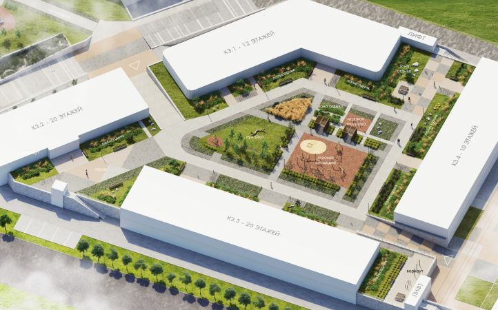
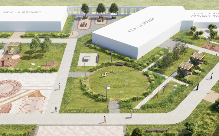
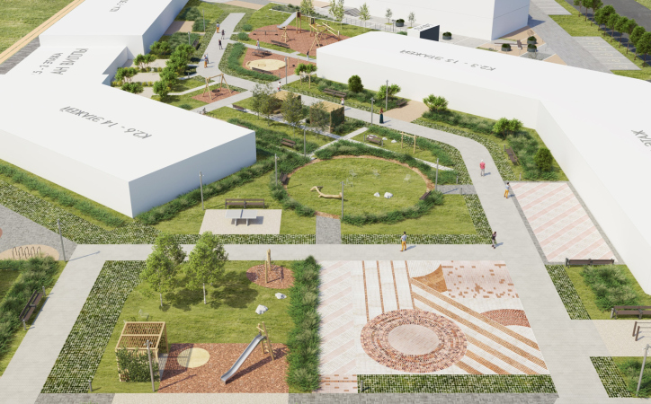
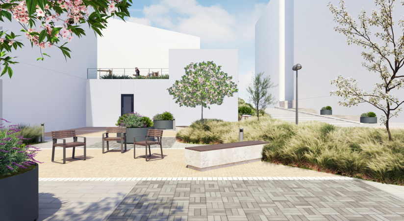
The whole space between the buildings is dissected into “cabinets”, which makes the yards look like a regular park. On the inside, each of the urban blocks features a similar set of functions – playgrounds and sports fields, quiet and noisy streets, flowerbeds and city “balconies”. However, no two single cabinets are exactly alike, which is meant to motivate the residents to move around inside the complex in search of new viewing angles and favorite locations, as well as forming neighbor communities – this last thing is particularly important for GAFA. For this reason, each yard received a unique “bonus” of its own: a community table, a large “meadow” or a “city balcony” that commands the embankment views on the one side and the dynamic city street on the other.

The master plan of the yard. The improvement of the territory of the NOW housing complex
Copyright: © GAFA Architects


The landscape solutions are aimed first of all at compensating for the rather large construction density, an excessive amount of shade that it produces, and the inevitable prevalence of hard surfaces, necessary for the emergency vehicles.

  • zooming
    1 / 4
    Urban block 2.3-2.6, an overview. The yards. The improvement of the territory of the NOW housing complex
    Copyright: © GAFA Architects
  • zooming
    2 / 4
    Urban block 2.3-2.6, an overview. The yards. The improvement of the territory of the NOW housing complex
    Copyright: © GAFA Architects
  • zooming
    3 / 4
    Urban block 2.3-2.6, an overview. The yards. The improvement of the territory of the NOW housing complex
    Copyright: © GAFA Architects
  • zooming
    4 / 4
    Urban block 4, the city balconies. The yards. The improvement of the territory of the NOW housing complex
    Copyright: © GAFA Architects


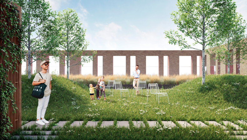
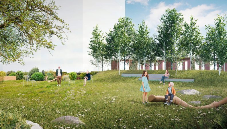
According to the architects, what makes GAFA’s approach to landscaping different is the fact that they do not seek to stuff the yards with “activities”, thereby imposing scenarios, but offer spaces that are “empty”, and, hence, multifunctional, easily adaptable to the user’s needs and moods: a lawn with a picturesque snag, a birch grove, a flower garden, and a plaza. Emptiness is a place that does not imply pragmatic benefits, but in return it gives air and a different level of experience. Free space is increasingly associated with luxury – like a weekday, in which there are no duties, and you can do whatever you have wanted for a long time. In this courtyard, you are not forced to warm up on a simulator or get bored on the playground – you can lie on the grass, smell flowers or play badminton with your children.

  • zooming
    1 / 5
    Stage 3. View of the birch garden and the city balcony. The yards. The improvement of the territory of the NOW housing complex
    Copyright: © GAFA Architects
  • zooming
    2 / 5
    Stage 3, view of the lawn and amphitheter. The yards. The improvement of the territory of the NOW housing complex
    Copyright: © GAFA Architects
  • zooming
    3 / 5
    Stage 3, view of the city balcony. THe yards. The improvement of the territory of the NOW housing complex
    Copyright: © GAFA Architects
  • zooming
    4 / 5
    Stage 3, view of the alley with shadow awnings. The yards. The improvement of the territory of the NOW housing complex
    Copyright: © GAFA Architects
  • zooming
    5 / 5
    View of the plazas. The yards. The improvement of the territory of the NOW housing complex
    Copyright: © GAFA Architects


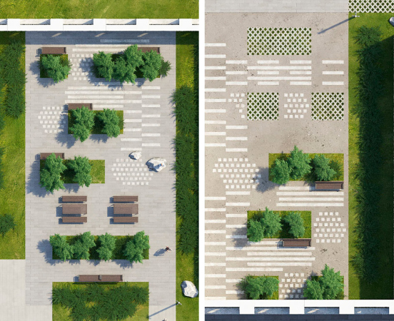
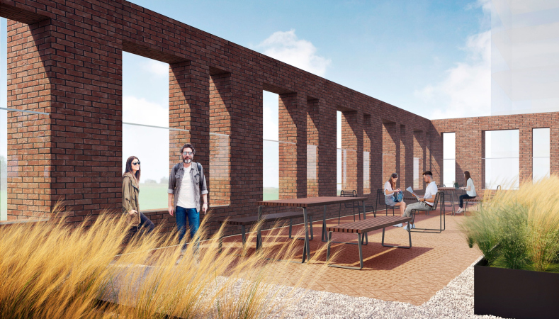
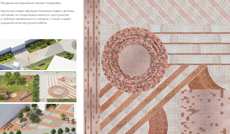
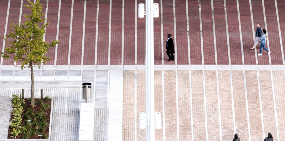
Each point commands beautiful views, which is yet another achievement by GAFA, making the yard look like a garden. The emergency drives are masked as plazas with elegant paving. Victoria Barkalova, the chief architect of the project, believes that “the brickwork retrieves people’s attention to detail, which allows us to speak about the human-friendly character of the project and the quality of manual work.” The species diversity of perennials and trees in the composition of landscaping is counted in hundreds of names-needless to say that they are distributed in picturesque groups and are designed to bloom continuously.

Such a yard not only invites you to spend more time outdoors, but also will not bore you for a long time. It is interesting to be in for people of any age and throughout the year.

  • zooming
    1 / 4
    Plaza. A landscape slide. The yards. The improvement of the territory of the NOW housing complex
    Copyright: © GAFA Architects
  • zooming
    2 / 4
    The paving pattern. The yards. The improvement of the territory of the NOW housing complex
    Copyright: © GAFA Architects
  • zooming
    3 / 4
    The yards. The improvement of the territory of the NOW housing complex
    Copyright: © GAFA Architects
  • zooming
    4 / 4
    The public spaces for the residents. The yards. The improvement of the territory of the NOW housing complex
    Copyright: © GAFA Architects


The next level of land improvement is the boulevard between the complex and the river, the “upper embankment” – a transient city space supported by the retail of NOW’s first floor, as well as by bicycle and jogging trails.

The master plan. The embankment. The yards. The improvement of the territory of the NOW housing complex
Copyright: © GAFA Architects


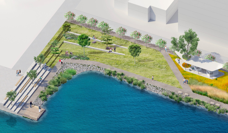
And, finally, the embankment immediately next to the water – an indisputable genius loci. The GAFA architects tried to bring it back to its original natural appearance and turn it into a local center of attraction. 

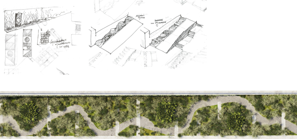
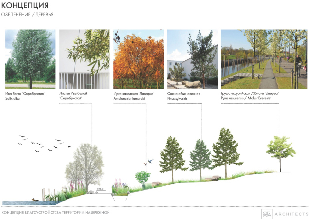
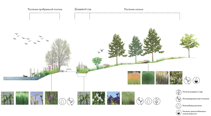
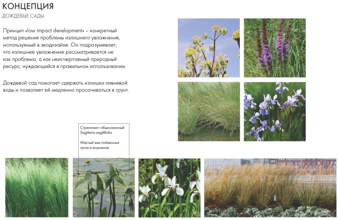
The natural contour of the riverbank will be kept intact and reinforced with boulders and pebbles, specially selected plants, and “rain gardens” that stop the excess of rainwater, filtering it and making it penetrate the soil gradually.

  • zooming
    1 / 3
    NOW housing complex. The rain gardens
    Copyright: © GAFA Architects
  • zooming
    2 / 3
    NOW housing complex. The rain gardens
    Copyright: © GAFA Architects
  • zooming
    3 / 3
    NOW housing complex. The rain gardens
    Copyright: © GAFA Architects


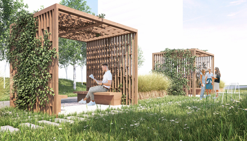
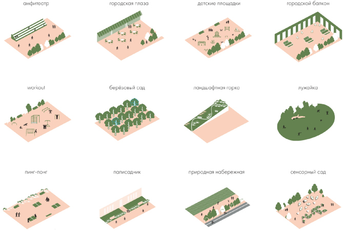
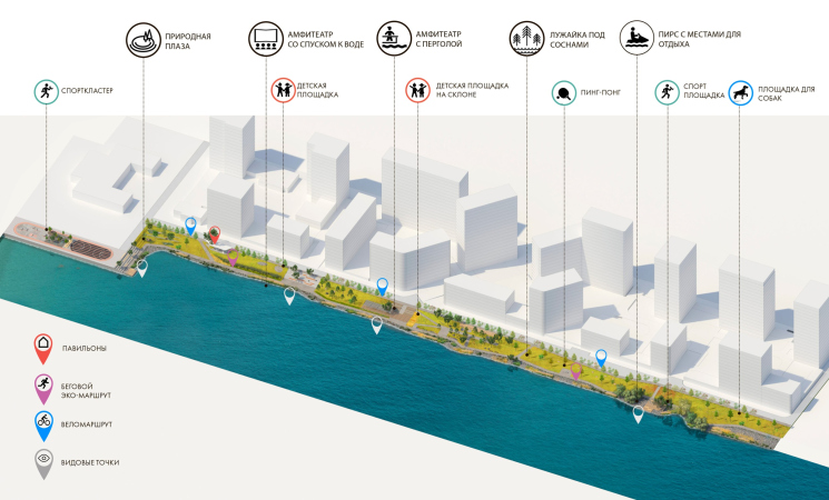
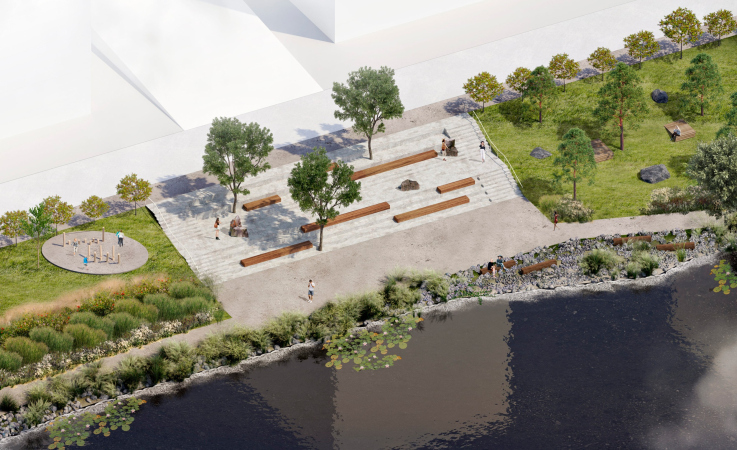
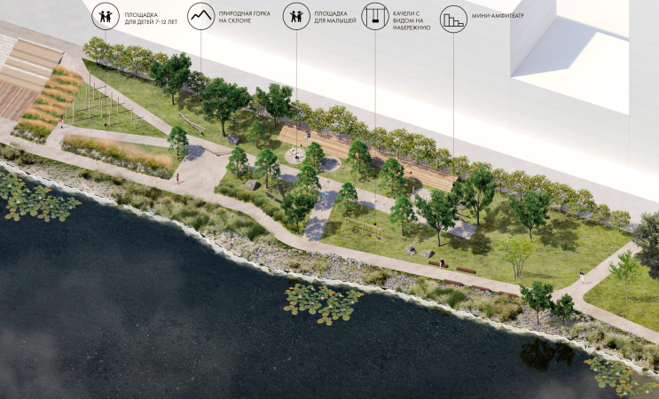
The possibilities presented by the terrain are used for creating connections – trails, descents, an amphitheater, as well as functional projects, such as playgrounds and summer slides. The minor architectural forms will be interspersed with pine trees and herbs, as well as by picturesquely scattered boulders. Essentially, the architects are creating not just the landscape but also a beginning of forming a whole ecosystem and reviving the local biological diversity – the numerous plants and flowers will attract insects, insects will in turn attract birds, and fish will return to the purified water. There is an eco trail running throughout the embankment, walking by which is meant to give the city resident new impressions and make them feel at one with nature.

The recreation place. The embankment. The yards. The improvement of the territory of the NOW housing complex
Copyright: © GAFA Architects


A mini-plaza with a pergola. The embankment. The yards. The improvement of the territory of the NOW housing complex
Copyright: © GAFA Architects


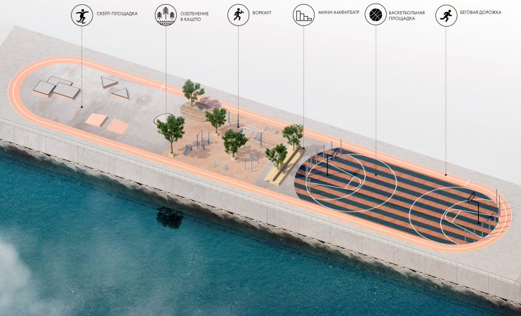
The architects tactfully included activity zones into the riverside space, they found space for amphitheaters, playgrounds, as well as a dog park, the “signature” community table, a picnic lawn, and a sports cluster that was positioned at the beginning of the embankment, closer to the Nagatino-i-Land technology park. Thus, the tiered embankment offers dozens of pastime scenarios.

  • zooming
    1 / 6
    The fuctional diagram. The yards. The improvement of the territory of the NOW housing complex
  • zooming
    2 / 6
    The routes. The embankment. The improvement of the territory of the NOW housing complex
    Copyright: © GAFA Architects
  • zooming
    3 / 6
    The “natural plaza”. The embankment. The improvement of the territory of the NOW housing complex
    Copyright: © GAFA Architects
  • zooming
    4 / 6
    The plaza with an amphitheater. The embankment. The improvement of the territory of the NOW housing complex
    Copyright: © GAFA Architects
  • zooming
    5 / 6
    The playground. The embankment. The improvement of the territory of the NOW housing complex
    Copyright: © GAFA Architects
  • zooming
    6 / 6
    The sports cluster. THe embankment. The improvement of the territory of the NOW housing complex
    Copyright: © GAFA Architects


In 2023, the construction of a road bridge across the backwater should be completed, the bridge should connect the Nagatinskaya floodplain with the ZIL-Yug / Shagal quarters, and two pedestrian bridges will also be built. In addition, the city announced the emergence of a water attraction platform, a floating spa complex and a garden with aquatic plants in the water area of the backwater. All this allows us to say that the NOW residential complex embankment will become a part of the recreational framework of the ZIL peninsula – together with the Marc Chagall embankment, the Tyuffel grove, and the Dream Island landscape parks.


22 July 2021

Headlines now
Flexibility and Integration
Not long ago, we covered the project for the fourth phase of the ÁLIA residential complex, designed by APEX. Now, we’ve been shown different fence concepts they developed to enclose the complex’s private courtyards, incorporating a variety of public functions. We believe that the sheer fact that the complex’s architects were involved in such a detail as fencing speaks volumes.
A Step Forward
The HIDE residential complex represents a major milestone for ADM architects and their leaders Andrey Romanov and Ekaterina Kuznetsova in their quest for a fresh high-rise aesthetic – one that is flexible and layered, capable of bringing vibrancy to mass and silhouette while shaping form. Over recent years, this approach has become ADM’s “signature style”, with the golden HIDE tower playing a pivotal role in its evolution. Here, we delve into the project’s story, explore the details of the complex’s design, and uncover its core essence.
Gold in the Sands
A new office for a transcontinental company specializing in resource extraction and processing has opened in Dubai. Designed by T+T Architects, masters of creating spaces that are contemporary, diverse, flexible, and original, this project exemplifies their expertise. On the executive floor, a massive brass-clad partition dominates, while layered textures of compressed earth create a contextually resonant backdrop.
Layers and Levels of Flight
This project goes way back – Reserve Union won this architectural competition at the end of 2011, and the building was completed in 2018, so it’s practically “archival”. However, despite being relatively unknown, the building can hardly be considered “dated” and remains a prime example of architectural expression, particularly in the headquarters genre. And it’s especially fitting for an aviation company office. In some ways, it resembles the Aeroflot headquarters at Sheremetyevo but with its own unique identity, following the signature style of Vladimir Plotkin. In this article, we take an in-depth look at the United Aircraft Corporation (UAC) headquarters in the Moscow agglomeration town of Zhukovsky, supplemented by recent photographs from Alexey Naroditsky – a shoot that became only recently possible due to the fact that improvements were finally made in the surrounding area.
Light and Shadow
In this article, we delve into the architectural design of the “Chaika” house by DNK ag architects, which was recently completed in 2023 as part of the collection of signature designs at ZILArt. As is well-known, all the buildings in this complex follow a design code, yet each one is distinct. This particular building stands out not only for its whiteness and minimalism but also for the refined use of a limited number of techniques that, together, create what can confidently be called synergy.
Casus Novae
A master plan was developed for a large residential area with a name of “DNS City”, but now that its implementation began, the plan has been arbitrarily reformatted and replaced with something that, while similar on the surface, is actually quite different. This is not the first time such a thing happens, but it’s always frustrating. With permission from the author, we are sharing Maria Elkina’s post.
Treasure Hunting
The GAFA bureau, in collaboration with Tegola and Arkhitail, organized an expedition to the island of Kilpola in Karelia as part of Moskomarkhitektura’s “Open City” festival. There, amidst moss and rocks, the students sought answers to questions like: what is the sacred, where does it dwell, and what sustains it? Assisting the participants in this quest were landscape engineer Evgeny Levin, artist Nicholas Roerich, a moose, and the lack of cellular connection. Here’s how the story unfolded.
Depths of the Earth, Streams of Water
In the Malaya Okhta district, the Akzent building, designed by Stepan Liphart, was constructed. It follows a classic tripartite structure, yet it’s what you might call “hand-drawn”: each façade is unique in its form and details, some of which aren’t immediately noticeable. In this article, we explore the context and, together with the architect, delve into how the form was developed.
Fir Tree Dynamics
The “Airports of Region” holding is planning to build an airport in Karachay-Cherkessia, aiming to make the Arkhyz and Dombay resorts more accessible to travelers. The project that won in an invitation-only competition, submitted by Sergey Nikeshkin’s KPLN, blends natural imagery inspired by the shape of a conifer seed, open-air waiting spaces, majestic large trees, and a green roof elevated on needle-like columns. The result is both nature-inspired and WOW.
​A Brick Shell
In the process of designing a clubhouse situated among pine trees in a prestigious suburban area near Moscow, the architectural firm “A.Len” did the façade design part. The combination of different types of brick and masonry correlates with the volumetric and plastique solutions, further enhanced by the inclusion of wood-painted fragments and metal “glazing”.
Word Forms
ATRIUM architects love ambitious challenges, and for the firm’s thirtieth anniversary, they boldly play a game of words with an exhibition that dives deep into a self-created vocabulary. They immerse their projects – especially art installations – into this glossary, as if plunging into a current of their own. You feel as if you’re flowing through the veins of pure art, immersed in a universe of vertical cities, educational spaces – of which the architects are true masters – and the cultural codes of various locations. But what truly captivates is the bold statement that Vera Butko and Anton Nadtochy make, both through their work and this exhibition: architecture, above all, is art – the art of working with form and space.
Flexibility and Acuteness of Modernity
Luxurious, fluid, large “kokoshniks” and spiral barrel columns, as if made from colorful chewing gum: there seem to be no other mansion like this in Moscow, designed in the “Neo-Russian-Modern” style. And the “Teremok” on Malaya Kaluzhskaya, previously somewhat obscure, has “come alive with new colors” and gained visibility after its restoration for the office of the “architectural ecosystem” as the architects love to call themselves. It’s evident that Julius Borisov and the architects at UNK put their hearts into finding this new office and bringing it up to date. Let’s delve into the paradoxes of this mansion’s history and its plasticity. Spoiler: two versions of modernity meet here, both balancing on the razor’s edge of “what’s current”.
Yuri Vissarionov: “A modular house does not belong to the land”
It belongs to space, or to the air... It turns out that 3D printing is more effective when combined with a modular approach: the house is built in a workshop and then adapted to the site, including on uneven terrain. Yuri Vissarionov shares his latest experience in designing tourist complexes, both in central Russia and in the south. These include houseboats, homes printed from lightweight concrete using a 3D printer, and, of course, frame houses.
​Moscow’s First
“The quality of education largely depends on the quality of the educational environment”. This principle of the last decade has been realized by Sergey Skuratov in the project for the First Moscow Gymnasium on Rostovskaya Embankment in the Khamovniki district. The building seamlessly integrates into the complex urban landscape, responding both to the pedestrian flow of the city and the quiet alleyways. It skillfully takes advantage of the height differences and aligns with modern trends in educational space design. Let’s take a closer look.
Looking at the Water
The site of Villa Sonata stretches from the road to the water’s edge, offering its own shoreline, pier, and a picturesque river panorama. To reveal these sweeping views, Roman Leonidov “cut” the façade diagonally parallel to the river, thus getting two main axes for the house and, consequently, “two heads”. The internal core – two double-height spaces, a living room and a conservatory, with a “bridge” above them – makes the house both “transparent” and filled with light.
The White Wing
Well, it’s not exactly white. It’s more of a beige, white-stone structure that plays with the color of limestone – smoother surfaces are lighter, while rougher ones are darker. This wing unites various elements: it absorbs and interprets the surrounding themes. It responds to everything, yet maintains a cohesive expression – a challenging task! – while also incorporating recognizable features of its own, such as the dynamic cuts at the bottom, top, and middle.
Urban Dunes
The XSA Ramps team designed and built a three-part sports hub for a park in Rostov-on-Don, welcoming people of all ages and fitness levels. The skate plaza, pump track, and playground are all meticulously crafted with details that attract a diverse range of visitors. The technical execution of the shapes and slopes transforms this space into a kind of sculptural composition.
Proportional Growth
The project for the fourth phase of the ÁLIA residential area has been announced. The buildings are situated on an elongated plot – almost a “ray” that shoots out from the center of the area towards the river. Their layout reflects both a response to Moscow’s architectural preferences over the past 15 years, shifting “from blocks to towers”, and an interpretation of the neighboring business park designed by SOM. Additionally, the best apartments here are not located at the very top but closer to the middle, forming a glowing “waistline”.
The “Staircase” Building
In designing the “Details” residential complex in New Moscow, Rais Baishev spiced up the now-popular Moscow theme of a “courtyard” building with an idea drawn from the surrealist drawings by Maurits Escher. He envisioned the stepped silhouettes and descending slopes as a metaphysical mega-staircase, creating a key void within the courtyard that gave the project an internal “spine”. This concept is felt both in the building’s silhouette and on its façades.
Projection of the Quarter
No one doubted that the building that Vladimir Plotkin designed as part of the “Garden Quarters” would be the most modernist of all. And it turned out just that way: while adhering to the common design code, the building successfully combines brick and white stone, rhythmically responding to the neighboring building designed by Ostozhenka, yet tactfully and persistently making a few statements of its own. This includes the projection of the ideal urban development composition “14–9–6”, which can be found right next door, mathematical calculations, including those for various types of terraces (and perhaps the only reminder of the Soviet past of the Kauchuk rubber factory!), and the white “cross-stitch” pattern of the façade grid.
Domus Aurea
In this issue, we examine the “Tessinsky-1” house, designed by Sergey Skuratov and completed in 2023. Located in the middle of the Serebryanicheskaya Embankment district, at the intersection of its main streets, this house assumes a sort of “nodal” role: it not only responds to everything around it and preserves many memories of the former EMA factory within itself, but it weaves all this into a newly directed pattern, reconciling bright “gold” and dark-colored brick, largely with the help of the new, modern-yet-archaic Columba brick, which, come to think about it, is the most precious element here.
The Chimney of Nikola-Lenivets
In this issue, we are examining the “Obelisk House” designed by KATARSIS and built for the Arkhstoyanie 2023 festival. However, it was only finished later on, and this is why we are examining it now. It seems to us that after the “Obelisk House” appeared in Nikola-Lenivets, a dialogue and a few inner connections appeared between the temporary structures built here. These houses no longer look like “accidental neighbors”, more of which below.
​Periscope by the Bay
The jury awarded the second place in the competition for a public and cultural center in Petropavlovsk-Kamchatsky to the companies GORA (“Mountain”) and M4. In the consortium’s proposal, the building resembles a sperm whale with a calf swimming next to it or a periscope, whose lenses capture the most spectacular views from the surrounding landscape.
From Arcs to Dolmens
While working on the competition project for Petropavlovsk-Kamchatsky, ASADOV Architects prioritized the value of the natural and urban environment, aiming to preserve the balance of the location while minimizing the resemblance of the volume that they designed to a “traditional building”. The task was challenging, and the architects created three versions, one of which having been developed after the competition, where their main proposal took third place. However, the point of interest here is not the competition result but the continuity of creative thinking.
Hide and Seek
The ID Moskovskiy house, designed by Stepan Liphart in St. Petersburg, in the courtyards near Moskovskiy Avenue beyond the Obvodny Canal and recently completed, is notable for several reasons. Firstly, it has been realized with considerable accuracy, which is particularly significant as this is the first building where the architect was responsible not only for the facades but also for the layouts, allowing for better integration between the two. On the other hand, this building is interesting as an example of the “germination” of new architecture in the city: it draws on the best examples from the neighborhood and becomes an improved and developed sum of ideas found by the architect in the surrounding context.
The Big Twelve
Yesterday, the winners of the Moscow Mayor’s Architecture Award were announced and honored. Let’s take a look at what was awarded and, in some cases, even critique this esteemed award. After all, there is always room for improvement, right?
Above the Golden Horn
The residential complex “Philosophy” designed by T+T architects in Vladivostok, is one of the new projects in the “Golubinaya Pad” area, changing its development philosophy (pun intended) from single houses to a comprehensive approach. The buildings are organized along public streets, varying in height and format, with one house even executed in gallery typology, featuring a cantilever leaning on an art object.
Nuanced Alternative
How can you rhyme a square and space? Easily! But to do so, you need to rhyme everything you can possibly think of: weave everything together, like in a tensegrity structure, and find your own optics too. The new exhibition at GES-2 does just that, offering its visitor a new perspective on the history of art spanning 150 years, infused with the hope for endless multiplicity of worlds and art histories. Read on to see how this is achieved and how the exhibition design by Evgeny Ace contributes to it.
Blinds for Ice
An ice arena has been constructed in Domodedovo based on a project by Yuri Vissarionov Architects. To prevent the long façade, a technical requirement for winter sports facilities, from appearing monotonous, the architects proposed the use of suspended structures with multidirectional slats. This design protects the ice from direct sunlight while giving the wall texture and detail.
Frozen Magma
A competition for the creation of a public and cultural center was held in Petropavlovsk-Kamchatsky. Three architectural companies made it to the final, and we consider it important to share about the work of each. Let’s start with the winner – the consortium led by Wowhaus.