По-русски

​Courtyards and Constructivism

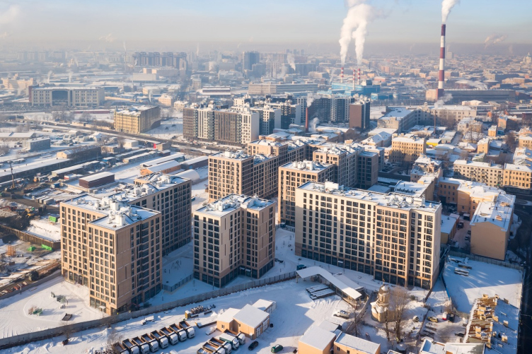
In this issue, we are examining the second major block of the “city within a city” Ligovsky City complex, designed and built by A-Len, and combining several trends characteristic of modern urban architecture.

21 May 2021
Object
mainImg
The “Second Quarter” of Ligovsky City is part of a large-scale project aimed at renovating the Volkovskaya industrial estate, which is part of the still wider “gray belt” of St Petersburg. The central part of the belt is renovated by Glorax Development, a company, popularly known for its Golden City housing complex that it built on the alluvial land of the Vasilyevsky Island. Ligovsky City is a still more ambitious project of the scale worthy of Peter the Great, and, hence, utopian to a certain point.

The Third City

The project dates back to the competition 2016 that was organized by the Committee for Architecture and Town Planning of St Petersburg: the contestants were offered to develop concepts for renovating the industrial territories lying beyond the Bypass Channel, and come up with detailed guidelines for developing three pilot sites. According to the judging panel, for the Volkovskaya industrial estate the best work was submitted by MLA+, a Dutch architectural company that already has its own branch in St Petersburg. Glorax asked MLA+ to further develop the concept to the level of a master plan – and this is how Ligovsky City came about.

According to the idea proposed by MLA+, between St Petersburg (to which the historical refers), and Leningrad (which spreads beyond the Ligovsky Avenue), a “third city” may appear – modern and comfortable, connected with nature and the history of this place, eventful and diverse. The architects propose to divide the entire territory, about 100 hectares in size, into 14 blocks, 4 squares, and 4 park spaces. Each city block is special and is designed for groups of residents with a different lifestyle – conditionally speaking, family, business, and creative peopleб which, come to think of it, is a little bit reminiscent of Sloboda settlements, only in the new reality. The promotional video explains the concept in a very comprehensible and optimistic way.


Place of the Second Quarter in the “Third City”

To design and build some parts of the construction on the basis of the MLA+ concept, Glorax Development invited different architects. In 2017, A-Len architects started working on the project for the second quarter – its construction was completed in2020.

The developers are moving from west to east: the first (and the earliest) quarter of Ligovsky City was designed and built by A Architects on the opposite side of the avenue, while for the next stage of development of the Third City, comparatively recently still another project was approved, which, in turn, is located on the east side, on the extensive territory of the former Tovarno-Vitebskaya railway station; work on this site is also done with input from A-Len in cooperation with the Dutch KCAP and Orange. However, recently it was announced that part of this territory can be sold to another developer, which may alter all the current plans. 

Let’s get back to the second quarter of Ligovsky City, however. It has been fully designed by A-Len architects and put into operation at the end of 2020. Currently, the work on land organization is being completed.

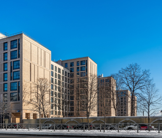
"Ligovsky City. The Second Quarter" housing complex.
Copyright: Photograph © Andrey Belimov-Gushchin / provided by A-Len


St Petersburg Town Planning

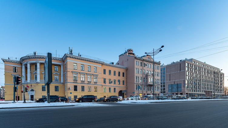
If we are to go back to the categories of the master plan proposed by MLA+, the “Second Quarter” belongs in the “blue segment”, which generally corresponds to business class – it is expected that it will become home to people who value moderate luxury, comfort, and safety. This status is further supported by the geographic location: the complex is situated far enough from the railroad line, its main facade overlooks the Ligovsky Avenue, and the view from the windows is ensured against being blocked by other buildings – in the near future, the “Borovaya” metro station will open here, around which an active city square must form. What also influenced the search for the architectural image of the “Second Quarter” was both Ligovsky Avenue itself with its rich history and the neighboring buildings on the land site – a tenement of the early XX century, and a Stalinist house, which, ironically, is now a police station.

"Ligovsky City. The Second Quarter" housing complex.
Copyright: Photograph © Andrey Belimov-Gushchin / provided by A-Len


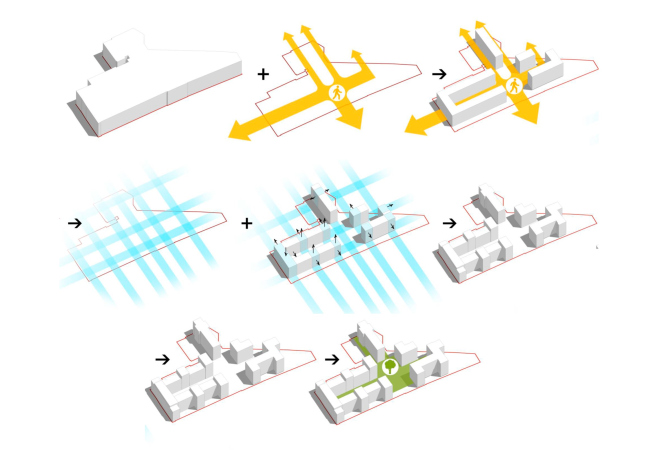
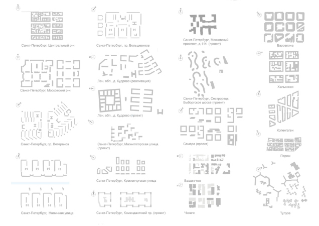
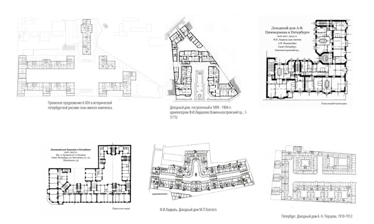
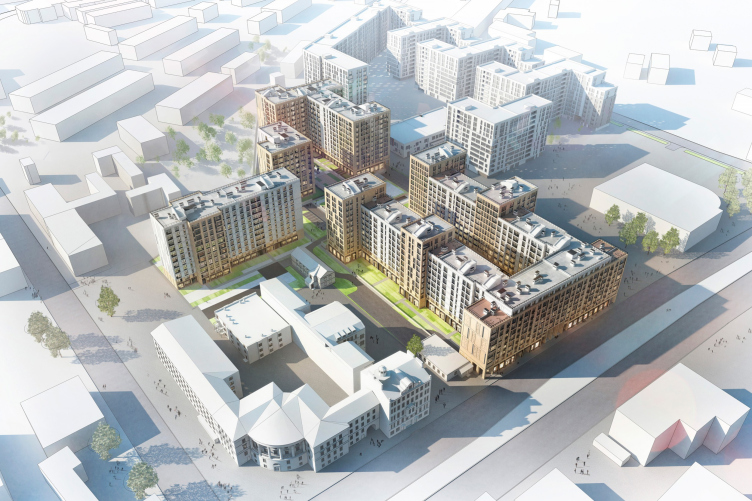
The land site that was allotted to the “Second Quarter” is a narrow one, of a complex jagged shape, which is generally characteristic for former industrial estates due to a large number of owners, property encumbrances, and sanitary zones. A-Len decided to “tame” it by using traditional St Petersburg town planning techniques – and quite successfully. One must note that reference to historical planning techniques is something that we can see in the work of St Petersburg architects more and more often, becoming their “trademark technique”: let’s remember the courtyards of the “Russian House”, “Czar’s Capital” or the “Botanica” housing complex. 

A-Len is going in the same direction, studying the spatial solutions, characteristic for the Ligovsky Avenue, as well as the famous tenements of St Petersburg, combining them with pedestrian axes and modern norms for greenery and fire parking zones.

  • zooming
    1 / 3
    "Ligovsky City. The Second Quarter" housing complex. The shape making diagram
    Copyright: © A-Len
  • zooming
    2 / 3
    "Ligovsky City. The Second Quarter" housing complex. Comparison of the parameters of various types of layouts
    Copyright: © A-Len
  • zooming
    3 / 3
    "Ligovsky City. The Second Quarter" housing complex. Tradition of yard construction of St Petersburg
    Copyright: © A-Len


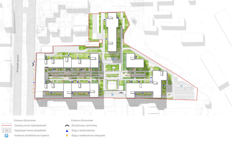
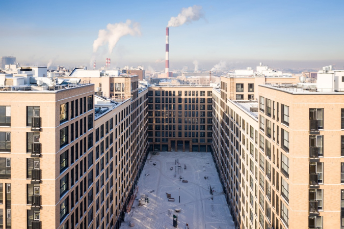
Thus, the “Second Quarter” consists of four buildings that are grouped in respect to orthogonal pedestrian axes, forming a transparent rectangular city block with a sequence of courtyards. The elongated character of the yard is masked to a certain extent by protruding “tower” sections that are different in height, as well as the color and decoration pattern of the facade. Thus, from the side of Ligovsky Avenue, we see the compact “main” facade, behind which a developed residential structure is hidden in the depths of the block. Along the Ligovsky Avenue and from the side of the future “Borovaya” metro station, the bottom floors of the buildings are occupied by commercial premises. All the remaining “pieces” of the site are occupied by greenery and open-air parking lots. This way, a clear enough composition is formed, its only “odd” element being the house that stands closer to Rastannaya Street – but this house also plays its part, accentuating the second axis and completing the block with the police station.

"Ligovsky City. The Second Quarter" housing complex. The master plan
Copyright: © A-Len


"Ligovsky City. The Second Quarter" housing complex.
Copyright: © A-Len


The Architecture of Leningrad

As for the façades of the building, they unfold a different story, which is, by the way, very much in the spirit of MLA+: while the city plan is done more in the St Petersburg tradition, the imagery is more Leningrad – and this is exactly what yields the desired version of the “third city”.

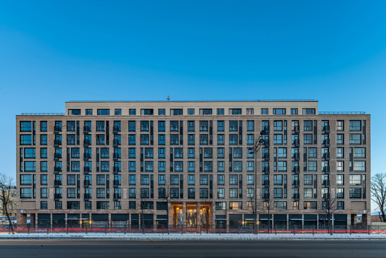
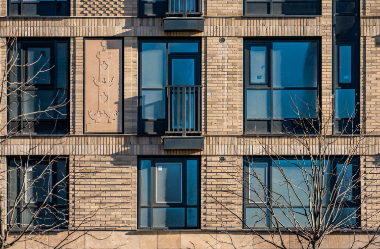
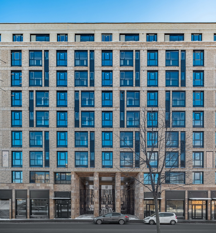
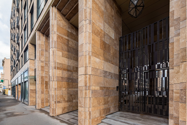
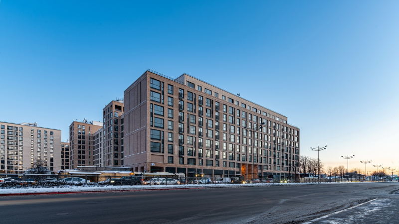
The “main” façade, which opens up on the Ligovsky Avenue, again puts us in the mind of the Petrograd Side, but this time not to the tenements of the Kamennoostrovsky Avenue, but to the famous Lensovet house on Karpovka: what makes you think about similarity in this case is the flat elongated rectangular volume, slim “legs” of the gallery on the first floor, the central portal with three arches, as well as bas-relief inserts. As for the bas-reliefs, by the way, there are plans for replacing them with more detailed ones. The work was commissioned to the reputed sculptor Vladislav Manachinsky; it is supposed to take more non-trivial subjects – for example, depicting the notable buildings of Ligovsky Avenue that have not survived into the present.

"Ligovsky City. The Second Quarter" housing complex.
Copyright: Photograph © Andrey Belimov-Gushchin / provided by A-Len


"Ligovsky City. The Second Quarter" housing complex.
Copyright: Photograph © Andrey Belimov-Gushchin / provided by A-Len


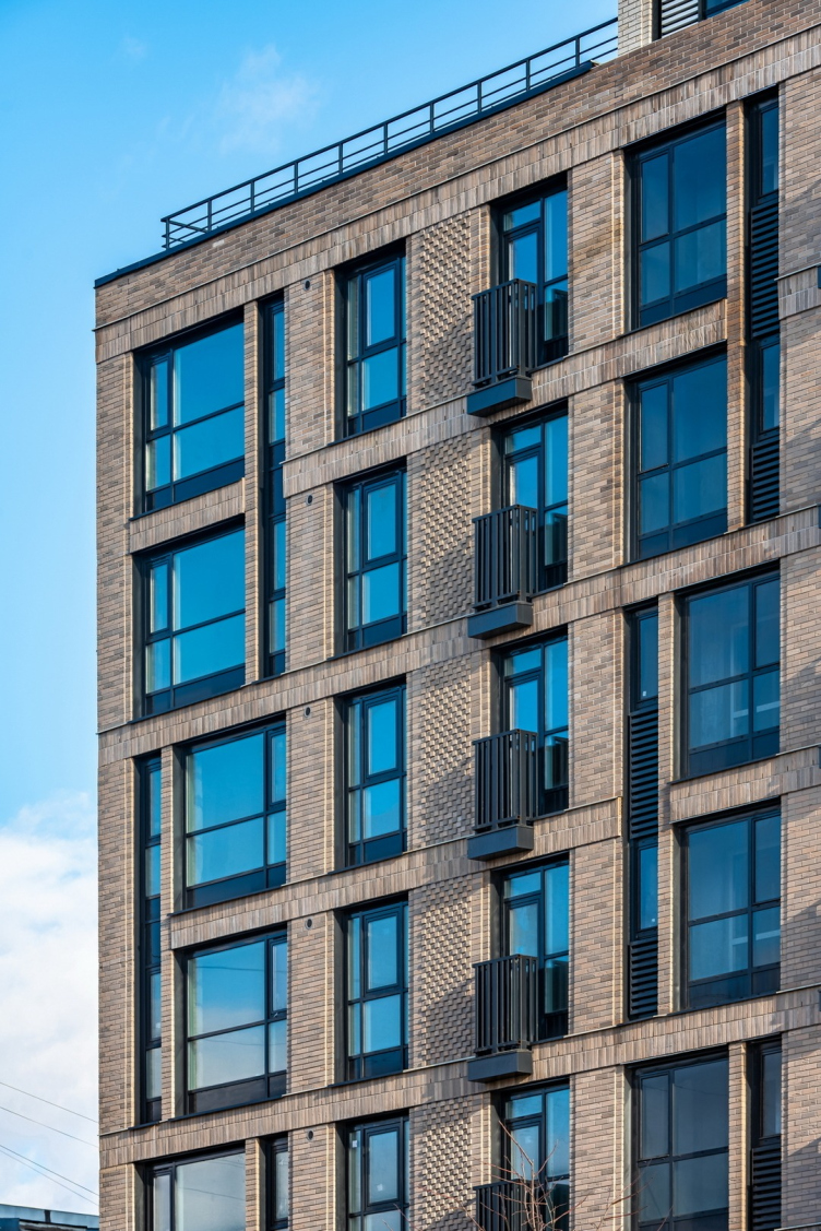
The building, of course, also has fundamental differences and signs of modernity, first of all, a greater share of glazing and facing materials. The windows are arranged in an off-beat order characteristic of our time, but at the same time they have a clear rhythm and are located strictly symmetrically relative to the axis passing through the central portal. The varying thickness of the piers and grouping the windows within the height of two floors helps create an unobtrusive pattern, and, as they say at city planning sessions, “combat the monotony of the slab of the house”. Considering the fact that the first floor is fully coated with natural stone, quite unusual is the choice of material for the rest of the facade – this is brick laid in three different patterns, each of which emphasizes the tectonics of the building.

Originally, it was expected that red brick would be used but the architects considered it to be too dark for Ligovsky Avenue, opting for two lighter shades. There was also a proposal to adorn the facade with sculptures but the client turned it down.

"Ligovsky City. The Second Quarter" housing complex.
Copyright: Photograph © Andrey Belimov-Gushchin / provided by A-Len


"Ligovsky City. The Second Quarter" housing complex.
Copyright: Photograph © Andrey Belimov-Gushchin / provided by A-Len


"Ligovsky City. The Second Quarter" housing complex.
Copyright: Photograph © Andrey Belimov-Gushchin / provided by A-Len


The “tower” sections repeat the “grand” building in a slightly simplified form. From the side of the future metro station, the side walls had to be made blind in response to the fire safety regulations – but then again, the resulting firewalls give this part of the complex a rhythm, similar to that of the housing complex on Traktornaya Street – yet another outstanding work by Soviet architects. The courtyards are decorated with brick of a lighter shade.

  • zooming
    1 / 3
    "Ligovsky City. The Second Quarter" housing complex.
    Copyright: Photograph © Andrey Belimov-Gushchin / provided by A-Len
  • zooming
    2 / 3
    "Ligovsky City. The Second Quarter" housing complex.
    Copyright: Photograph © Andrey Belimov-Gushchin / provided by A-Len
  • zooming
    3 / 3
    "Ligovsky City. The Second Quarter" housing complex.
    Copyright: Photograph © Andrey Belimov-Gushchin / provided by A-Len


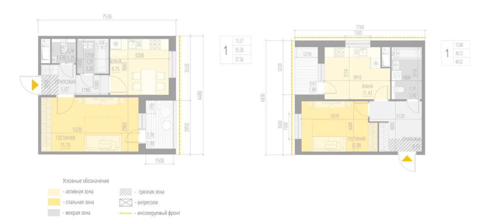
The apartment layouts are done in accordance with the original A-Len method: they are based on the resident’s portrait and his needs. The client commissioned the landscaping project to another company, because of which the logic of the concept was distorted a little by curvilinear shapes that appeared in the yard.

  • zooming
    1 / 4
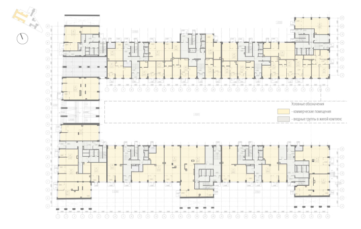
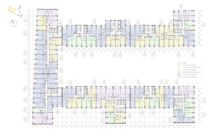
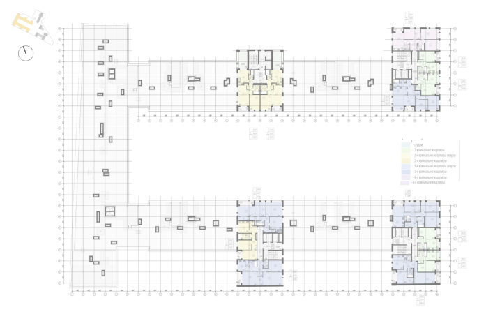
    "Ligovsky City. The Second Quarter" housing complex. Plan of the 1 floor, Building 1
    Copyright: © A-Len
  • zooming
    2 / 4
    "Ligovsky City. The Second Quarter" housing complex. Plan of the 3-8 floors, Building 1
    Copyright: © A-Len
  • zooming
    3 / 4
    "Ligovsky City. The Second Quarter" housing complex. Plan of the 11 floor, Building 1
    Copyright: © A-Len
  • zooming
    4 / 4
    "Ligovsky City. The Second Quarter" housing complex. The standard layout
    Copyright: © A-Len


Making a recap: we can definitely say that the complex is very much St Petersburg in its spirit; its austerity matches the residents’ status, it was sturdily designed and sturdy built. The relief brickwork makes an interesting textured highlight; in addition, after the existing reliefs are replaced, the facades will become even more attractive to the passers-by – not just with their regular grid, creating order, but also with their detailed character, ensuring diversity, which today is a significant competitive edge. The “human-friendly” height of the 11-story buildings, the reserved natural tone of the facades, and the symmetry of the tripartite portal on the main facade, make the image of the new houses of Ligovsky City nobly satin, at the same time highlighting and maintaining a feeling of some immanent dignity, inherent to these houses.

21 May 2021

Headlines now
The Golden Crown
The concept for a dental clinic in Yekaterinburg, developed by CNTR Studio, revolves around the idea of a “mouth full of gold”: pristine white porcelain stoneware walls are complemented by matte brass details. To avoid an overly literal interpretation, the architects focused on the building’s proportions, skillfully navigating between sunlight requirements and fire safety regulations.
Flexibility and Integration
Not long ago, we covered the project for the fourth phase of the ÁLIA residential complex, designed by APEX. Now, we’ve been shown different fence concepts they developed to enclose the complex’s private courtyards, incorporating a variety of public functions. We believe that the sheer fact that the complex’s architects were involved in such a detail as fencing speaks volumes.
A Step Forward
The HIDE residential complex represents a major milestone for ADM architects and their leaders Andrey Romanov and Ekaterina Kuznetsova in their quest for a fresh high-rise aesthetic – one that is flexible and layered, capable of bringing vibrancy to mass and silhouette while shaping form. Over recent years, this approach has become ADM’s “signature style”, with the golden HIDE tower playing a pivotal role in its evolution. Here, we delve into the project’s story, explore the details of the complex’s design, and uncover its core essence.
Gold in the Sands
A new office for a transcontinental company specializing in resource extraction and processing has opened in Dubai. Designed by T+T Architects, masters of creating spaces that are contemporary, diverse, flexible, and original, this project exemplifies their expertise. On the executive floor, a massive brass-clad partition dominates, while layered textures of compressed earth create a contextually resonant backdrop.
Layers and Levels of Flight
This project goes way back – Reserve Union won this architectural competition at the end of 2011, and the building was completed in 2018, so it’s practically “archival”. However, despite being relatively unknown, the building can hardly be considered “dated” and remains a prime example of architectural expression, particularly in the headquarters genre. And it’s especially fitting for an aviation company office. In some ways, it resembles the Aeroflot headquarters at Sheremetyevo but with its own unique identity, following the signature style of Vladimir Plotkin. In this article, we take an in-depth look at the United Aircraft Corporation (UAC) headquarters in the Moscow agglomeration town of Zhukovsky, supplemented by recent photographs from Alexey Naroditsky – a shoot that became only recently possible due to the fact that improvements were finally made in the surrounding area.
Light and Shadow
In this article, we delve into the architectural design of the “Chaika” house by DNK ag architects, which was recently completed in 2023 as part of the collection of signature designs at ZILArt. As is well-known, all the buildings in this complex follow a design code, yet each one is distinct. This particular building stands out not only for its whiteness and minimalism but also for the refined use of a limited number of techniques that, together, create what can confidently be called synergy.
Casus Novae
A master plan was developed for a large residential area with a name of “DNS City”, but now that its implementation began, the plan has been arbitrarily reformatted and replaced with something that, while similar on the surface, is actually quite different. This is not the first time such a thing happens, but it’s always frustrating. With permission from the author, we are sharing Maria Elkina’s post.
Treasure Hunting
The GAFA bureau, in collaboration with Tegola and Arkhitail, organized an expedition to the island of Kilpola in Karelia as part of Moskomarkhitektura’s “Open City” festival. There, amidst moss and rocks, the students sought answers to questions like: what is the sacred, where does it dwell, and what sustains it? Assisting the participants in this quest were landscape engineer Evgeny Levin, artist Nicholas Roerich, a moose, and the lack of cellular connection. Here’s how the story unfolded.
Depths of the Earth, Streams of Water
In the Malaya Okhta district, the Akzent building, designed by Stepan Liphart, was constructed. It follows a classic tripartite structure, yet it’s what you might call “hand-drawn”: each façade is unique in its form and details, some of which aren’t immediately noticeable. In this article, we explore the context and, together with the architect, delve into how the form was developed.
Fir Tree Dynamics
The “Airports of Region” holding is planning to build an airport in Karachay-Cherkessia, aiming to make the Arkhyz and Dombay resorts more accessible to travelers. The project that won in an invitation-only competition, submitted by Sergey Nikeshkin’s KPLN, blends natural imagery inspired by the shape of a conifer seed, open-air waiting spaces, majestic large trees, and a green roof elevated on needle-like columns. The result is both nature-inspired and WOW.
​A Brick Shell
In the process of designing a clubhouse situated among pine trees in a prestigious suburban area near Moscow, the architectural firm “A.Len” did the façade design part. The combination of different types of brick and masonry correlates with the volumetric and plastique solutions, further enhanced by the inclusion of wood-painted fragments and metal “glazing”.
Word Forms
ATRIUM architects love ambitious challenges, and for the firm’s thirtieth anniversary, they boldly play a game of words with an exhibition that dives deep into a self-created vocabulary. They immerse their projects – especially art installations – into this glossary, as if plunging into a current of their own. You feel as if you’re flowing through the veins of pure art, immersed in a universe of vertical cities, educational spaces – of which the architects are true masters – and the cultural codes of various locations. But what truly captivates is the bold statement that Vera Butko and Anton Nadtochy make, both through their work and this exhibition: architecture, above all, is art – the art of working with form and space.
Flexibility and Acuteness of Modernity
Luxurious, fluid, large “kokoshniks” and spiral barrel columns, as if made from colorful chewing gum: there seem to be no other mansion like this in Moscow, designed in the “Neo-Russian-Modern” style. And the “Teremok” on Malaya Kaluzhskaya, previously somewhat obscure, has “come alive with new colors” and gained visibility after its restoration for the office of the “architectural ecosystem” as the architects love to call themselves. It’s evident that Julius Borisov and the architects at UNK put their hearts into finding this new office and bringing it up to date. Let’s delve into the paradoxes of this mansion’s history and its plasticity. Spoiler: two versions of modernity meet here, both balancing on the razor’s edge of “what’s current”.
Yuri Vissarionov: “A modular house does not belong to the land”
It belongs to space, or to the air... It turns out that 3D printing is more effective when combined with a modular approach: the house is built in a workshop and then adapted to the site, including on uneven terrain. Yuri Vissarionov shares his latest experience in designing tourist complexes, both in central Russia and in the south. These include houseboats, homes printed from lightweight concrete using a 3D printer, and, of course, frame houses.
​Moscow’s First
“The quality of education largely depends on the quality of the educational environment”. This principle of the last decade has been realized by Sergey Skuratov in the project for the First Moscow Gymnasium on Rostovskaya Embankment in the Khamovniki district. The building seamlessly integrates into the complex urban landscape, responding both to the pedestrian flow of the city and the quiet alleyways. It skillfully takes advantage of the height differences and aligns with modern trends in educational space design. Let’s take a closer look.
Looking at the Water
The site of Villa Sonata stretches from the road to the water’s edge, offering its own shoreline, pier, and a picturesque river panorama. To reveal these sweeping views, Roman Leonidov “cut” the façade diagonally parallel to the river, thus getting two main axes for the house and, consequently, “two heads”. The internal core – two double-height spaces, a living room and a conservatory, with a “bridge” above them – makes the house both “transparent” and filled with light.
The White Wing
Well, it’s not exactly white. It’s more of a beige, white-stone structure that plays with the color of limestone – smoother surfaces are lighter, while rougher ones are darker. This wing unites various elements: it absorbs and interprets the surrounding themes. It responds to everything, yet maintains a cohesive expression – a challenging task! – while also incorporating recognizable features of its own, such as the dynamic cuts at the bottom, top, and middle.
Urban Dunes
The XSA Ramps team designed and built a three-part sports hub for a park in Rostov-on-Don, welcoming people of all ages and fitness levels. The skate plaza, pump track, and playground are all meticulously crafted with details that attract a diverse range of visitors. The technical execution of the shapes and slopes transforms this space into a kind of sculptural composition.
Proportional Growth
The project for the fourth phase of the ÁLIA residential area has been announced. The buildings are situated on an elongated plot – almost a “ray” that shoots out from the center of the area towards the river. Their layout reflects both a response to Moscow’s architectural preferences over the past 15 years, shifting “from blocks to towers”, and an interpretation of the neighboring business park designed by SOM. Additionally, the best apartments here are not located at the very top but closer to the middle, forming a glowing “waistline”.
The “Staircase” Building
In designing the “Details” residential complex in New Moscow, Rais Baishev spiced up the now-popular Moscow theme of a “courtyard” building with an idea drawn from the surrealist drawings by Maurits Escher. He envisioned the stepped silhouettes and descending slopes as a metaphysical mega-staircase, creating a key void within the courtyard that gave the project an internal “spine”. This concept is felt both in the building’s silhouette and on its façades.
Projection of the Quarter
No one doubted that the building that Vladimir Plotkin designed as part of the “Garden Quarters” would be the most modernist of all. And it turned out just that way: while adhering to the common design code, the building successfully combines brick and white stone, rhythmically responding to the neighboring building designed by Ostozhenka, yet tactfully and persistently making a few statements of its own. This includes the projection of the ideal urban development composition “14–9–6”, which can be found right next door, mathematical calculations, including those for various types of terraces (and perhaps the only reminder of the Soviet past of the Kauchuk rubber factory!), and the white “cross-stitch” pattern of the façade grid.
Domus Aurea
In this issue, we examine the “Tessinsky-1” house, designed by Sergey Skuratov and completed in 2023. Located in the middle of the Serebryanicheskaya Embankment district, at the intersection of its main streets, this house assumes a sort of “nodal” role: it not only responds to everything around it and preserves many memories of the former EMA factory within itself, but it weaves all this into a newly directed pattern, reconciling bright “gold” and dark-colored brick, largely with the help of the new, modern-yet-archaic Columba brick, which, come to think about it, is the most precious element here.
The Chimney of Nikola-Lenivets
In this issue, we are examining the “Obelisk House” designed by KATARSIS and built for the Arkhstoyanie 2023 festival. However, it was only finished later on, and this is why we are examining it now. It seems to us that after the “Obelisk House” appeared in Nikola-Lenivets, a dialogue and a few inner connections appeared between the temporary structures built here. These houses no longer look like “accidental neighbors”, more of which below.
​Periscope by the Bay
The jury awarded the second place in the competition for a public and cultural center in Petropavlovsk-Kamchatsky to the companies GORA (“Mountain”) and M4. In the consortium’s proposal, the building resembles a sperm whale with a calf swimming next to it or a periscope, whose lenses capture the most spectacular views from the surrounding landscape.
From Arcs to Dolmens
While working on the competition project for Petropavlovsk-Kamchatsky, ASADOV Architects prioritized the value of the natural and urban environment, aiming to preserve the balance of the location while minimizing the resemblance of the volume that they designed to a “traditional building”. The task was challenging, and the architects created three versions, one of which having been developed after the competition, where their main proposal took third place. However, the point of interest here is not the competition result but the continuity of creative thinking.
Hide and Seek
The ID Moskovskiy house, designed by Stepan Liphart in St. Petersburg, in the courtyards near Moskovskiy Avenue beyond the Obvodny Canal and recently completed, is notable for several reasons. Firstly, it has been realized with considerable accuracy, which is particularly significant as this is the first building where the architect was responsible not only for the facades but also for the layouts, allowing for better integration between the two. On the other hand, this building is interesting as an example of the “germination” of new architecture in the city: it draws on the best examples from the neighborhood and becomes an improved and developed sum of ideas found by the architect in the surrounding context.
The Big Twelve
Yesterday, the winners of the Moscow Mayor’s Architecture Award were announced and honored. Let’s take a look at what was awarded and, in some cases, even critique this esteemed award. After all, there is always room for improvement, right?
Above the Golden Horn
The residential complex “Philosophy” designed by T+T architects in Vladivostok, is one of the new projects in the “Golubinaya Pad” area, changing its development philosophy (pun intended) from single houses to a comprehensive approach. The buildings are organized along public streets, varying in height and format, with one house even executed in gallery typology, featuring a cantilever leaning on an art object.
Nuanced Alternative
How can you rhyme a square and space? Easily! But to do so, you need to rhyme everything you can possibly think of: weave everything together, like in a tensegrity structure, and find your own optics too. The new exhibition at GES-2 does just that, offering its visitor a new perspective on the history of art spanning 150 years, infused with the hope for endless multiplicity of worlds and art histories. Read on to see how this is achieved and how the exhibition design by Evgeny Ace contributes to it.
Blinds for Ice
An ice arena has been constructed in Domodedovo based on a project by Yuri Vissarionov Architects. To prevent the long façade, a technical requirement for winter sports facilities, from appearing monotonous, the architects proposed the use of suspended structures with multidirectional slats. This design protects the ice from direct sunlight while giving the wall texture and detail.