По-русски

The Fifth Element

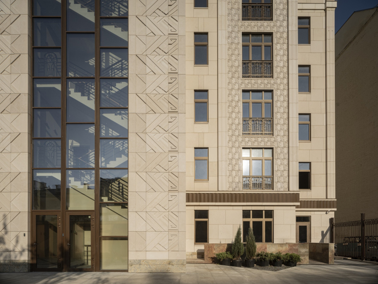
The high-end residential development in the Vsevolozhsky Lane features a combination of expensive stone and metal textures, immersing them into a feast of ornaments. The house looks like a fantasy inspired by the theater of the Art Nouveau and Symbolism era; a kind of oriental fairy tale, which paradoxically allows it to avoid direct stylization and become a reflection of one of the aspects of modern Moscow life.

03 February 2021
Object
mainImg
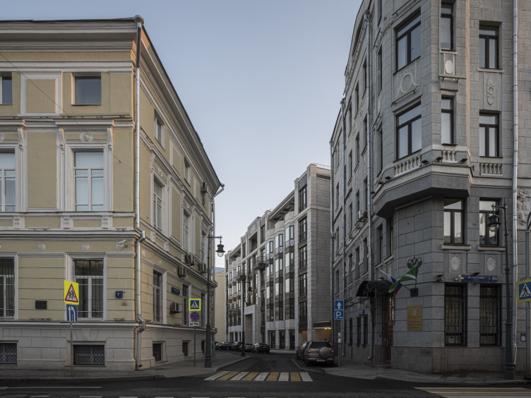
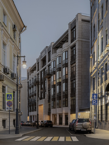
We already wrote about the project of the high-end residential complex in Ostozhenka’s Vsevolozhsky Lane back in 2016. The house is situated in the beginning of the “Golden Mile”, a five minutes’ walk away from Kropotkinskaya metro station, in the stead of a Soviet telephone hub built back in the 1980’s. Height- and redline-wise, it responds to the surrounding historical context; left and right of it, there are two tenements, designed by the architect Nikolai Zherikhov in the beginning of the 1910’s, one of them being an impressive neo-classic, the other, on the side street, unassuming Art Nouveau. Both neighbors are separated from the house by driveways, unlike the Soviet telephone station, which was pushed up against their firewalls. New caesuras in the continuous construction front opened the way for the rays of the sun, which shines from the south, from the side of the courtyard; they also let more light into the alley – the authors of the project explain.

High-end housing project “Residence in Vsevolozhsky”
Copyright: Photograph © Dmitry Yagovkin / provided by Mezonproekt


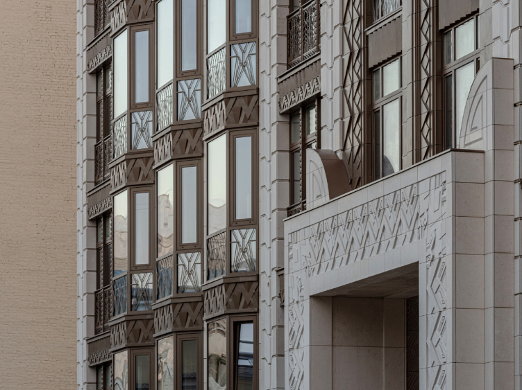
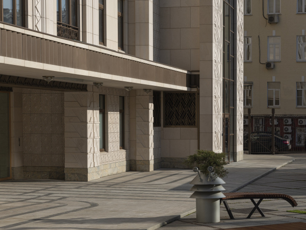
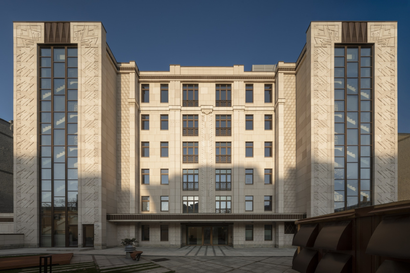
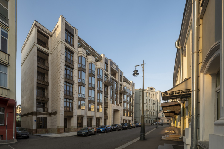
Image-wise, however, the house does not directly respond to any of the neighboring buildings or the houses across the street, but develops its own theme based on accentuated ornaments on the verge of Art Nouveau and Art Deco, yet with some modern amalgamation, freedom of interpretation and geometrization of all of its elements. The market of Moscow high-end residential construction requires, on the one hand, a design solution that looks obviously expensive, based on costly materials, and carefully drawn, and, on the other hand, it must be something unique and unparalleled. Admittedly, the house in the Vsevolozhsky Lane meets both criteria. The facades are very rich, their main textures being natural limestone and metal (glass fiber concrete with a surface imitating patinated bronze). But, more importantly, Moscow has not yet seen anything like it.

  • zooming
    High-end housing project “Residence in Vsevolozhsky”
    Copyright: Photograph © Dmitry Yagovkin / provided by Mezonproekt
  • zooming
    High-end housing project “Residence in Vsevolozhsky”
    Copyright: Photograph © Dmitry Yagovkin / provided by Mezonproekt


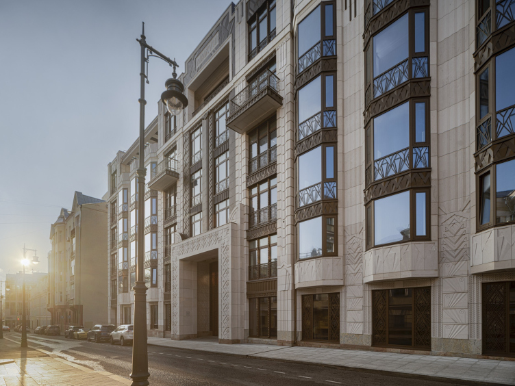
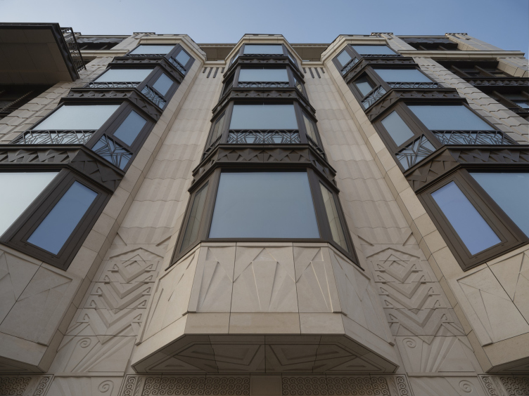
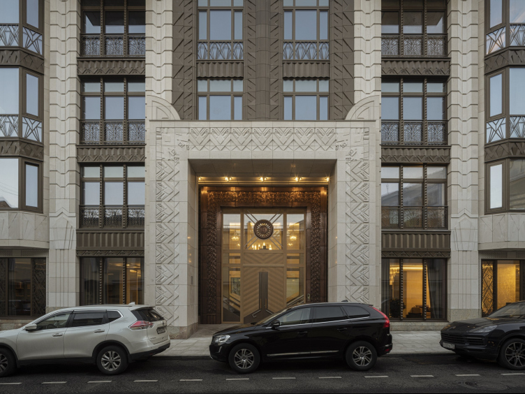
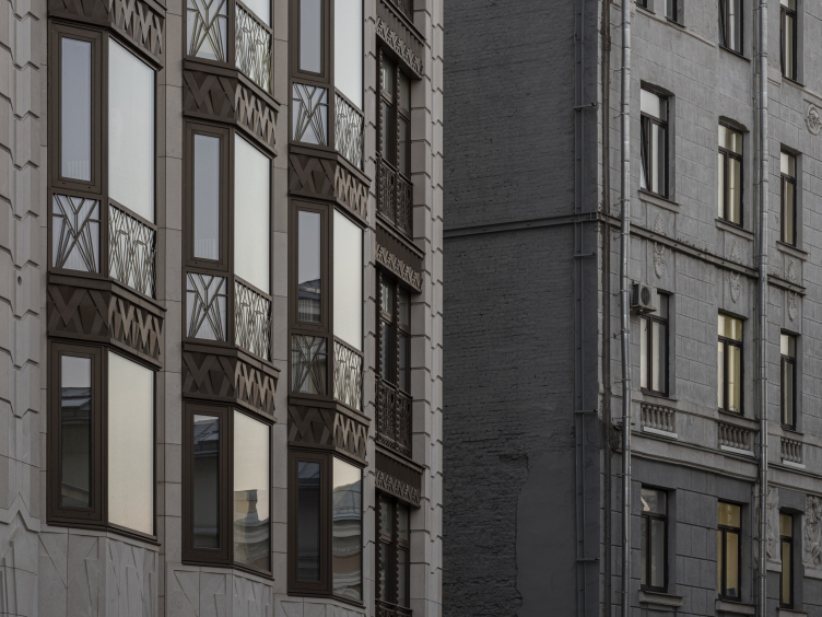
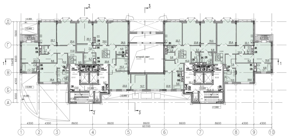
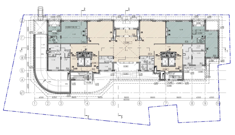
Generally, the house retains a rather conservative layout and typology: its plan has a U shape with two stairway risalits from the yard sides; in the center, the street is overlooked by an imposing entrance portal with a deep double-height lobby behind it. On either side of it, there are faceted verticals of the bay windows. The top tier above their ledges features the recessed balconies of the penthouse underneath massive canopies with skylights looking like large caissons.

High-end housing project “Residence in Vsevolozhsky”
Copyright: Photograph © Dmitry Yagovkin / provided by Mezonproekt


The structure, we repeat, is traditional, yet every element within it is enhanced a little bit more than usual. The bay windows form a faceted wave; the top recessed balconies, as if offsetting them, are deep and spacious, the entrance portal is really large. In addition, “metallic” structures are really numerous: combined with glass and stone, they form a weaving akin to jewelry, of course, adjusted for repeated enlargement.

High-end housing project “Residence in Vsevolozhsky”
Copyright: Photograph © Dmitry Yagovkin / provided by Mezonproekt


High-end housing project “Residence in Vsevolozhsky”
Copyright: Photograph © Dmitry Yagovkin / provided by Mezonproekt


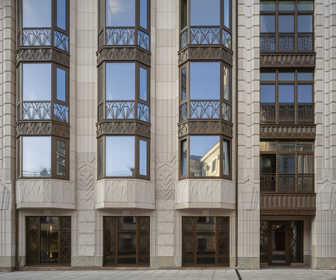
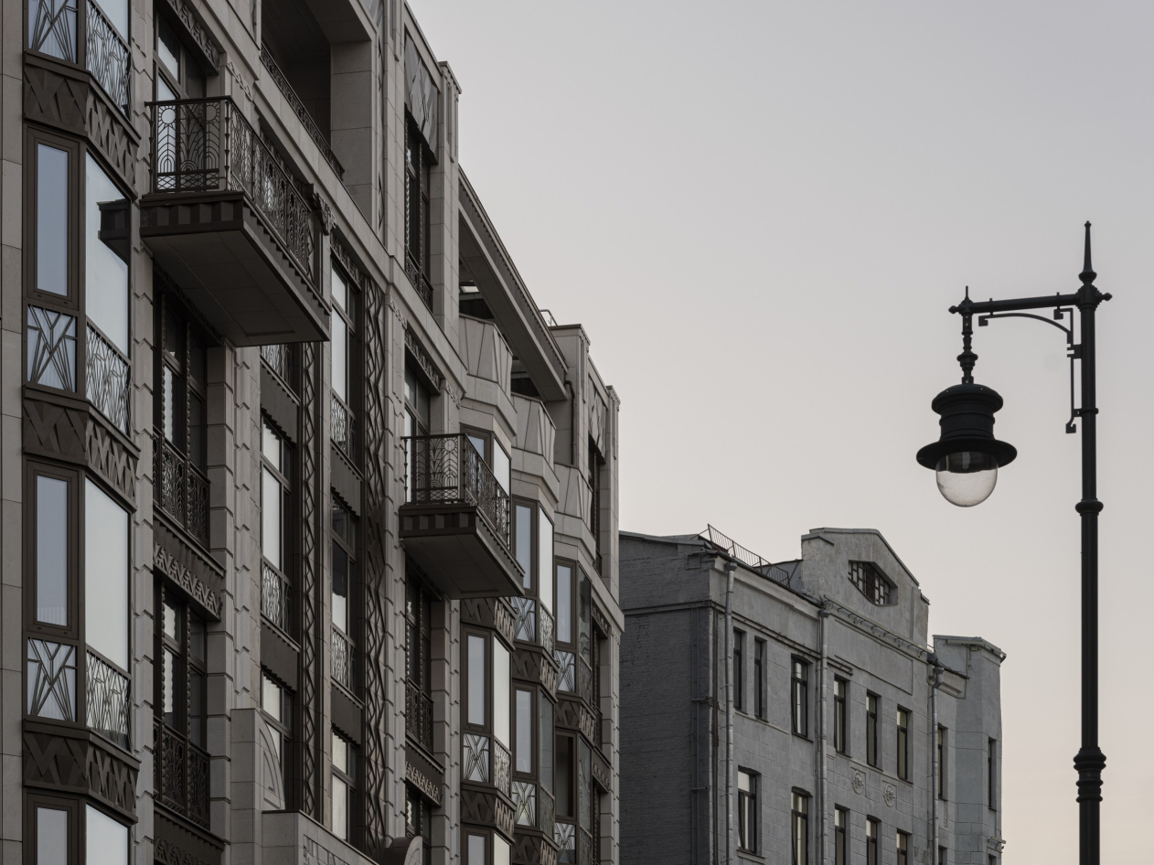
This ornamental weaving became the fundamental technique that creates the impression of this house being special. There are virtually no empty planes on the main facade, and all the elements, even those in which the order-architecture base can be traced, are subjugated to the general “carpet” decorativeness. For example, the piers between the bay windows are likened to fluted pilasters, but they have neither bases nor capitals, apart from the “secession” metallic stripes at the top. The stone verticals may equally seem to be flutes or the wall surface’s response to the shape of the bay windows, because their relief consists of three-faceted ledges, and not of traditional grooves.

High-end housing project “Residence in Vsevolozhsky”
Copyright: Photograph © Dmitry Yagovkin / provided by Mezonproekt


The rock-face surface here receives beveled contours, forming a perspective illusion in the walls between the windows – a false ledge akin to the finds of the Pompeian style. The keystones do not crown the arches and do not form cornices, but only serve as decorative “crowns”, being placed closer to the base part. The curbs everywhere are huge, made of stone and bronze, significantly larger than their order prototypes, and work to enhance the light and shade.

High-end housing project “Residence in Vsevolozhsky”
Copyright: Photograph © Dmitry Yagovkin / provided by Mezonproekt


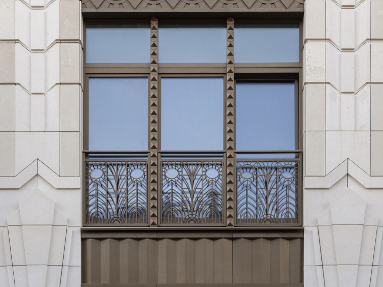
Probably, the most traditional element here is the bronze diamond cut of the bindings of the triple windows; it also enhances associations with the Pompeian style and Art Deco.

High-end housing project “Residence in Vsevolozhsky”
Copyright: Photograph © Dmitry Yagovkin / provided by Mezonproekt


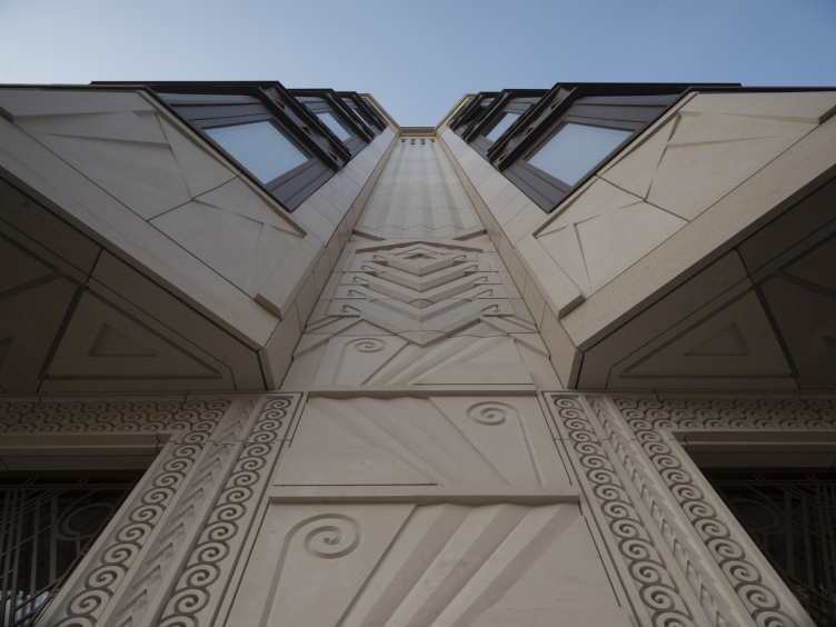
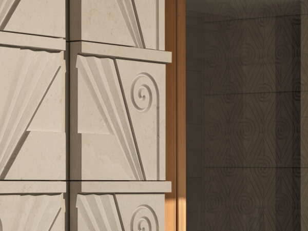
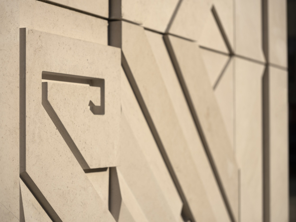
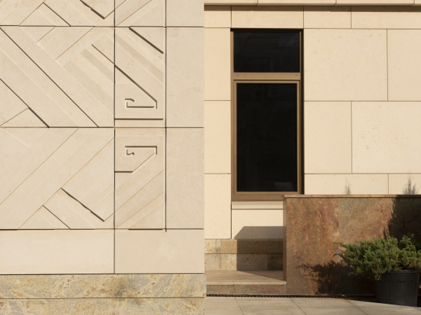
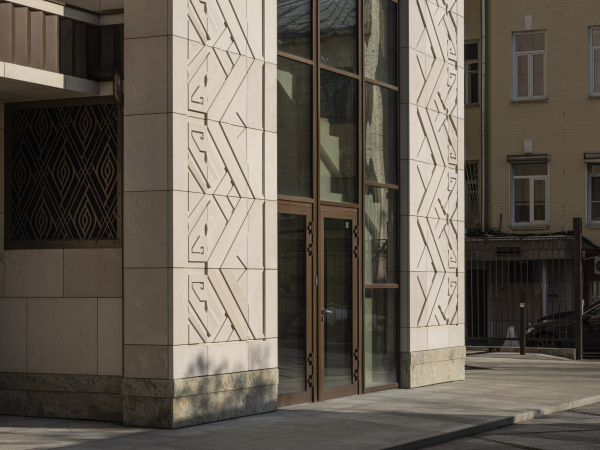
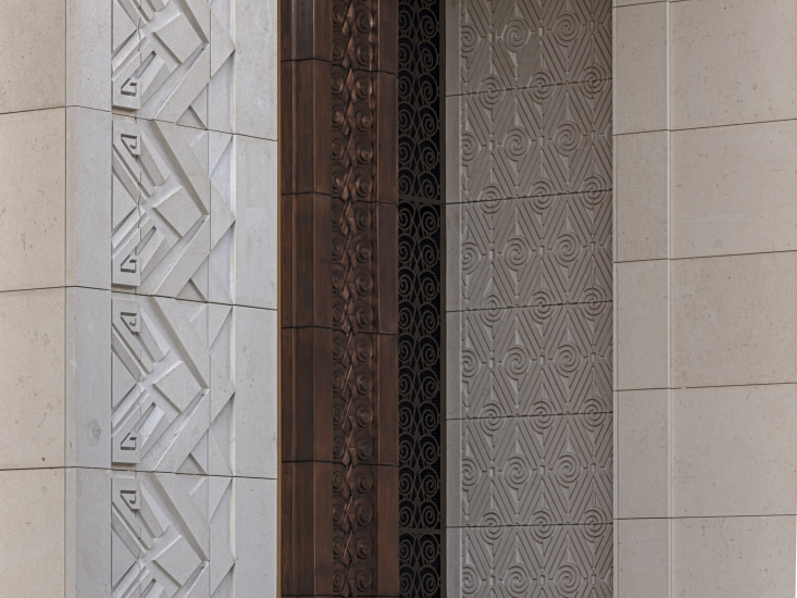
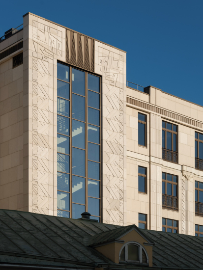
Everything that cannot be explained in one way or another from the point of view of the architecture of orders is subordinate to the ornament, which can be conventionally divided into two types: surfaces completely covered with curls very much in the spirit of Gustav Klimt – and a pattern composed of zigzags and slanted plates, each of which peeps out from under the next one. They look like “hollow relief” (or “cavo relievo” the kind of relief that is based on voids rather than protrusions, a technique first used in Ancient Egypt), depicting growing crystals. What is also curious is the fact that the large ornament responds to the spatial pattern of specks of light on the skirting boards of the staircases in the sunlight.

High-end housing project “Residence in Vsevolozhsky”
Copyright: Photograph © Dmitry Yagovkin / provided by Mezonproekt


Another important detail is that the “lamellar” relief covers not just the front surfaces: the relief decoration of the house is applied everywhere and covers, among other things, the lower planes of the bay windows, so a passer-by, raising his head, will also see an ornament. “It was essential for us to treat the surface of the house as processed and dynamic, revealing the depth of the stone surface” – emphasizes the leader of AB “Mezonproekt” Ilia Mashkov.

High-end housing project “Residence in Vsevolozhsky”
Copyright: Photograph © Dmitry Yagovkin / provided by Mezonproekt


Sometimes, the lamellar pattern “merges” with the curls, the scrolls becoming larger in these instances, and their contour freer. Between stone and bronze, the “layered crystals” are roughly halved – they are present here and there, responsible for the integrity of the approach and the connection between the two main materials of the façade.

Essentially, they keep the entire house together. All the patterns respond to the joints between stone and bronze plates, in many cases including them into the general rhythm as its quite natural part – it may seem that the house is being formed before our eyes from individual “scales”, thus making full use of the modern technology of interaction between the ventilation facade and its cladding.

  • zooming
    1 / 5
    High-end housing project “Residence in Vsevolozhsky”
    Copyright: Photograph © Dmitry Yagovkin / provided by Mezonproekt
  • zooming
    2 / 5
    High-end housing complex “Residence in Vsevolozhsky”
    Copyright: Photograph © Dmitry Yagovkin / provided by Mezonproekt
  • zooming
    3 / 5
    High-end housing project “Residence in Vsevolozhsky”
    Copyright: Photograph © Dmitry Yagovkin / provided by Mezonproekt
  • zooming
    4 / 5
    High-end housing project “Residence in Vsevolozhsky”
    Copyright: Photograph © Dmitry Yagovkin / provided by Mezonproekt
  • zooming
    5 / 5
    High-end housing project “Residence in Vsevolozhsky”
    Copyright: Photograph © Dmitry Yagovkin / provided by Mezonproekt


The relief motifs are continued in the patterns of bronze lattices – on the ledges of the bay windows they are looser and more abstract and geometric, figurative sunflowers appearing in the planar verticals, designed in a more traditional way.

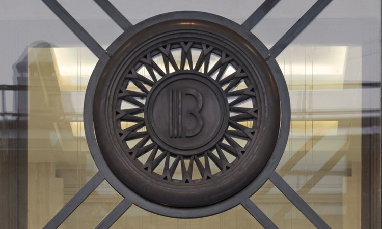
But then again, figurative can also be traced in the basic motive of the bay windows – generalized human figures, the circle of which forms the sun in the house logo proposed by the architects.

zooming
High-end housing project “Residence in Vsevolozhsky”
Copyright: Photograph © Dmitry Yagovkin / provided by Mezonproekt


The circle is meant to symbolize the community of residents, while the conditional “origami” shadows, which can be seen almost everywhere on the facades, albeit in a coded state, serve as the reminder of the main idea. The outline of the “human figure”, dissected very much like a pentagram, is even slightly reminiscent of the outline of Le Corbusier’s “Modulor”, which suddenly redirects us from the conditional “secession” to the architectural search of more recent times.

High-end housing project “Residence in Vsevolozhsky”
Copyright: Photograph © Dmitry Yagovkin / provided by Mezonproekt


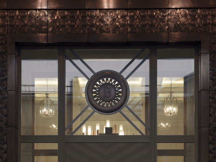
A denser and more detailed version of the ornament is continued in the copper panels above the entrance and in the lobby – here, closer to the entrance, real metal is used. The gradient shades of its precious “red” color are well read thanks to the close “brocade” weaving of multidirectional curls, working to create an image of an expensive “frame” or “lining” of the house.

  • zooming
    High-end housing project “Residence in Vsevolozhsky”
    Copyright: Photograph © Dmitry Yagovkin / provided by Mezonproekt
  • zooming
    High-end housing project “Residence in Vsevolozhsky”
    Copyright: Photograph © Dmitry Yagovkin / provided by Mezonproekt


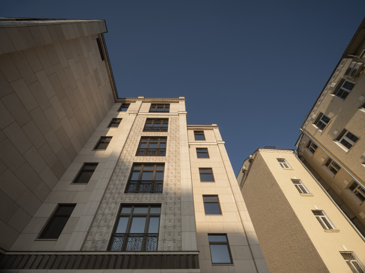
The yard façade is more laconically designed: on the one hand, this is dictated by the logic of the rear façade itself, on the other, there are more large ledges and projections here, which makes the structure of volumes resonate with the neighboring houses and is thus perceived as a contextually meaningful part of the “Moscow yard”.

High-end housing project “Residence in Vsevolozhsky”
Copyright: Photograph © Dmitry Yagovkin / provided by Mezonproekt


Here the cutting of the stone slabs takes on a noticeable resemblance to a rock-face surface, and, unlike the main façade, “synthesized” by ornaments, here the decorated and laconic surfaces are rather contrastive to each other. At the same time, the large-scale frames around the staircase risalits continue the theme set by the entrance portal, giving the house quite a solemn appearance: even from the yard side it looks “like a palace”. Maybe even some oriental, even Persian palace – first of all due to the neoclassical character of the dual composition with a pier in the center.

  • zooming
    High-end housing project “Residence in Vsevolozhsky”
    Copyright: Photograph © Dmitry Yagovkin / provided by Mezonproekt
  • zooming
    High-end housing project “Residence in Vsevolozhsky”
    Copyright: Photograph © Dmitry Yagovkin / provided by Mezonproekt


The central pier is there on the main façade as well, where it is a little less prominent. Its appearance is conditioned by the structure of the house, consisting of two sections with one entrance in the middle.

  • zooming
    1 / 7
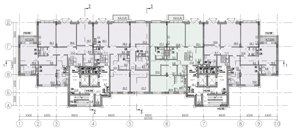
    “Residence in Vsevolozhsky”. Plan of the 1st floor
    Copyright: Photograph © Dmitry Yagovkin / provided by Mezonproekt
  • zooming
    2 / 7
    “Residence in Vsevolozhsky”. Plan of the ground floor
    Copyright © Mezonproekt
  • zooming
    3 / 7
    “Residence in Vsevolozhsky”. Plan of the typical floor © Mezonproject
    Copyright © Mezonproekt
  • zooming
    4 / 7
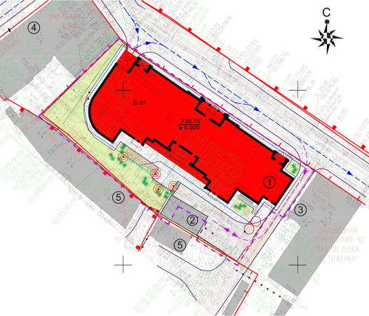
    “Residence in Vsevolozhsky”. Master plan
    Copyright © Mezonproekt
  • zooming
    5 / 7
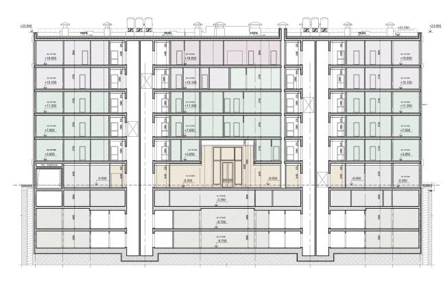
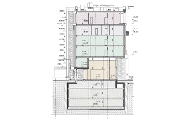
    “Residence in Vsevolozhsky”. Section view
    Copyright © Mezonproekt
  • zooming
    6 / 7
    “Residence in Vsevolozhsky”. Section view
    Copyright © Mezonproekt
  • zooming
    7 / 7
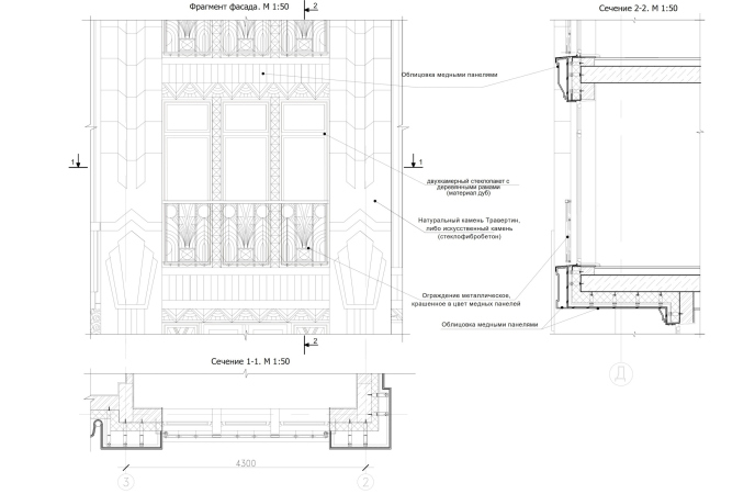
    “Residence in Vsevolozhsky”. Fragment of the facade with a section view
    © Mezonproject


However, the main effect that this house produces is the theatrical one. The Art Nouveau and neo classical buildings, standing near, vividly demonstrate that this house is not stylization and not historicism in the direct sense of this word, and not even another experience with bourgeois Art Deco. Most of all, it resembles the illustrations and scenography of the Symbolists, sketches of costumes and backstage; a curtain for some “Egyptian Nights”. The fantasy component is very strong here – trying to embellish the façade surface, the architects are emphasizing its role as some sort of a screen, upon which you can draw in a freehand manner. We will note here that this approach makes the house look like more than just a modern one: this version of craving for sensations which makes you turn the surroundings into a theater stage and provokes some pretty loose attitude towards the rules, so visible in houses that are more than a hundred years old, is specifically characteristic of this day and age. It is this approach that opposes the rules with what I would call “materiality riot” – if not in color, then in lines and textures, and ledges and recessions.

High-end housing project “Residence in Vsevolozhsky”
Copyright: Photograph © Dmitry Yagovkin / provided by Mezonproekt


If we are to compare this house with earlier houses designed by Mezonproekt in the spirit of respectable historicism – for example, the housing complex “House near Academy of Sciences” or with the house on Veresaeva Street – we will see a much freer construction, to some extent based on independence of the ornaments with a tendency to self-development. Although the house looks “Egyptian”, it does not have, strictly speaking, a single recognizable Egyptian detail about it, neither lotus, nor scarab (even though the wings, open wide in a “scarab” fashion over the central pier on the yard façade, do evoke some certain associations). The scrolls on the walls look more like the wigs and the beards of the winged Assyrian oxen from the Pushkin Museum. This house is not a stylization – rather, it is a fantasy inspired by the fantasies of the Symbolists, who in turn were inspired by an oriental tale: radiant, desperately luxurious, in many ways deliberately mysterious – the sum of those emotions that often evoke in us the most generalized idea of “the Golden Age” interrupted by the First World War. To be exact, that time is adequately termed “Silver Age” – but many people tend to think of it as the “Golden Age”, some sort of lost paradise, some sort of candy fairytale. Probably, this is the kind of fairytale that the house in Vsevolozhsky Alley must become. Well, then, it is a really understandable in the Moscow context experiments with feelings – both resident’s and passers-by.

03 February 2021

Headlines now
The Golden Crown
The concept for a dental clinic in Yekaterinburg, developed by CNTR Studio, revolves around the idea of a “mouth full of gold”: pristine white porcelain stoneware walls are complemented by matte brass details. To avoid an overly literal interpretation, the architects focused on the building’s proportions, skillfully navigating between sunlight requirements and fire safety regulations.
Flexibility and Integration
Not long ago, we covered the project for the fourth phase of the ÁLIA residential complex, designed by APEX. Now, we’ve been shown different fence concepts they developed to enclose the complex’s private courtyards, incorporating a variety of public functions. We believe that the sheer fact that the complex’s architects were involved in such a detail as fencing speaks volumes.
A Step Forward
The HIDE residential complex represents a major milestone for ADM architects and their leaders Andrey Romanov and Ekaterina Kuznetsova in their quest for a fresh high-rise aesthetic – one that is flexible and layered, capable of bringing vibrancy to mass and silhouette while shaping form. Over recent years, this approach has become ADM’s “signature style”, with the golden HIDE tower playing a pivotal role in its evolution. Here, we delve into the project’s story, explore the details of the complex’s design, and uncover its core essence.
Gold in the Sands
A new office for a transcontinental company specializing in resource extraction and processing has opened in Dubai. Designed by T+T Architects, masters of creating spaces that are contemporary, diverse, flexible, and original, this project exemplifies their expertise. On the executive floor, a massive brass-clad partition dominates, while layered textures of compressed earth create a contextually resonant backdrop.
Layers and Levels of Flight
This project goes way back – Reserve Union won this architectural competition at the end of 2011, and the building was completed in 2018, so it’s practically “archival”. However, despite being relatively unknown, the building can hardly be considered “dated” and remains a prime example of architectural expression, particularly in the headquarters genre. And it’s especially fitting for an aviation company office. In some ways, it resembles the Aeroflot headquarters at Sheremetyevo but with its own unique identity, following the signature style of Vladimir Plotkin. In this article, we take an in-depth look at the United Aircraft Corporation (UAC) headquarters in the Moscow agglomeration town of Zhukovsky, supplemented by recent photographs from Alexey Naroditsky – a shoot that became only recently possible due to the fact that improvements were finally made in the surrounding area.
Light and Shadow
In this article, we delve into the architectural design of the “Chaika” house by DNK ag architects, which was recently completed in 2023 as part of the collection of signature designs at ZILArt. As is well-known, all the buildings in this complex follow a design code, yet each one is distinct. This particular building stands out not only for its whiteness and minimalism but also for the refined use of a limited number of techniques that, together, create what can confidently be called synergy.
Casus Novae
A master plan was developed for a large residential area with a name of “DNS City”, but now that its implementation began, the plan has been arbitrarily reformatted and replaced with something that, while similar on the surface, is actually quite different. This is not the first time such a thing happens, but it’s always frustrating. With permission from the author, we are sharing Maria Elkina’s post.
Treasure Hunting
The GAFA bureau, in collaboration with Tegola and Arkhitail, organized an expedition to the island of Kilpola in Karelia as part of Moskomarkhitektura’s “Open City” festival. There, amidst moss and rocks, the students sought answers to questions like: what is the sacred, where does it dwell, and what sustains it? Assisting the participants in this quest were landscape engineer Evgeny Levin, artist Nicholas Roerich, a moose, and the lack of cellular connection. Here’s how the story unfolded.
Depths of the Earth, Streams of Water
In the Malaya Okhta district, the Akzent building, designed by Stepan Liphart, was constructed. It follows a classic tripartite structure, yet it’s what you might call “hand-drawn”: each façade is unique in its form and details, some of which aren’t immediately noticeable. In this article, we explore the context and, together with the architect, delve into how the form was developed.
Fir Tree Dynamics
The “Airports of Region” holding is planning to build an airport in Karachay-Cherkessia, aiming to make the Arkhyz and Dombay resorts more accessible to travelers. The project that won in an invitation-only competition, submitted by Sergey Nikeshkin’s KPLN, blends natural imagery inspired by the shape of a conifer seed, open-air waiting spaces, majestic large trees, and a green roof elevated on needle-like columns. The result is both nature-inspired and WOW.
​A Brick Shell
In the process of designing a clubhouse situated among pine trees in a prestigious suburban area near Moscow, the architectural firm “A.Len” did the façade design part. The combination of different types of brick and masonry correlates with the volumetric and plastique solutions, further enhanced by the inclusion of wood-painted fragments and metal “glazing”.
Word Forms
ATRIUM architects love ambitious challenges, and for the firm’s thirtieth anniversary, they boldly play a game of words with an exhibition that dives deep into a self-created vocabulary. They immerse their projects – especially art installations – into this glossary, as if plunging into a current of their own. You feel as if you’re flowing through the veins of pure art, immersed in a universe of vertical cities, educational spaces – of which the architects are true masters – and the cultural codes of various locations. But what truly captivates is the bold statement that Vera Butko and Anton Nadtochy make, both through their work and this exhibition: architecture, above all, is art – the art of working with form and space.
Flexibility and Acuteness of Modernity
Luxurious, fluid, large “kokoshniks” and spiral barrel columns, as if made from colorful chewing gum: there seem to be no other mansion like this in Moscow, designed in the “Neo-Russian-Modern” style. And the “Teremok” on Malaya Kaluzhskaya, previously somewhat obscure, has “come alive with new colors” and gained visibility after its restoration for the office of the “architectural ecosystem” as the architects love to call themselves. It’s evident that Julius Borisov and the architects at UNK put their hearts into finding this new office and bringing it up to date. Let’s delve into the paradoxes of this mansion’s history and its plasticity. Spoiler: two versions of modernity meet here, both balancing on the razor’s edge of “what’s current”.
Yuri Vissarionov: “A modular house does not belong to the land”
It belongs to space, or to the air... It turns out that 3D printing is more effective when combined with a modular approach: the house is built in a workshop and then adapted to the site, including on uneven terrain. Yuri Vissarionov shares his latest experience in designing tourist complexes, both in central Russia and in the south. These include houseboats, homes printed from lightweight concrete using a 3D printer, and, of course, frame houses.
​Moscow’s First
“The quality of education largely depends on the quality of the educational environment”. This principle of the last decade has been realized by Sergey Skuratov in the project for the First Moscow Gymnasium on Rostovskaya Embankment in the Khamovniki district. The building seamlessly integrates into the complex urban landscape, responding both to the pedestrian flow of the city and the quiet alleyways. It skillfully takes advantage of the height differences and aligns with modern trends in educational space design. Let’s take a closer look.
Looking at the Water
The site of Villa Sonata stretches from the road to the water’s edge, offering its own shoreline, pier, and a picturesque river panorama. To reveal these sweeping views, Roman Leonidov “cut” the façade diagonally parallel to the river, thus getting two main axes for the house and, consequently, “two heads”. The internal core – two double-height spaces, a living room and a conservatory, with a “bridge” above them – makes the house both “transparent” and filled with light.
The White Wing
Well, it’s not exactly white. It’s more of a beige, white-stone structure that plays with the color of limestone – smoother surfaces are lighter, while rougher ones are darker. This wing unites various elements: it absorbs and interprets the surrounding themes. It responds to everything, yet maintains a cohesive expression – a challenging task! – while also incorporating recognizable features of its own, such as the dynamic cuts at the bottom, top, and middle.
Urban Dunes
The XSA Ramps team designed and built a three-part sports hub for a park in Rostov-on-Don, welcoming people of all ages and fitness levels. The skate plaza, pump track, and playground are all meticulously crafted with details that attract a diverse range of visitors. The technical execution of the shapes and slopes transforms this space into a kind of sculptural composition.
Proportional Growth
The project for the fourth phase of the ÁLIA residential area has been announced. The buildings are situated on an elongated plot – almost a “ray” that shoots out from the center of the area towards the river. Their layout reflects both a response to Moscow’s architectural preferences over the past 15 years, shifting “from blocks to towers”, and an interpretation of the neighboring business park designed by SOM. Additionally, the best apartments here are not located at the very top but closer to the middle, forming a glowing “waistline”.
The “Staircase” Building
In designing the “Details” residential complex in New Moscow, Rais Baishev spiced up the now-popular Moscow theme of a “courtyard” building with an idea drawn from the surrealist drawings by Maurits Escher. He envisioned the stepped silhouettes and descending slopes as a metaphysical mega-staircase, creating a key void within the courtyard that gave the project an internal “spine”. This concept is felt both in the building’s silhouette and on its façades.
Projection of the Quarter
No one doubted that the building that Vladimir Plotkin designed as part of the “Garden Quarters” would be the most modernist of all. And it turned out just that way: while adhering to the common design code, the building successfully combines brick and white stone, rhythmically responding to the neighboring building designed by Ostozhenka, yet tactfully and persistently making a few statements of its own. This includes the projection of the ideal urban development composition “14–9–6”, which can be found right next door, mathematical calculations, including those for various types of terraces (and perhaps the only reminder of the Soviet past of the Kauchuk rubber factory!), and the white “cross-stitch” pattern of the façade grid.
Domus Aurea
In this issue, we examine the “Tessinsky-1” house, designed by Sergey Skuratov and completed in 2023. Located in the middle of the Serebryanicheskaya Embankment district, at the intersection of its main streets, this house assumes a sort of “nodal” role: it not only responds to everything around it and preserves many memories of the former EMA factory within itself, but it weaves all this into a newly directed pattern, reconciling bright “gold” and dark-colored brick, largely with the help of the new, modern-yet-archaic Columba brick, which, come to think about it, is the most precious element here.
The Chimney of Nikola-Lenivets
In this issue, we are examining the “Obelisk House” designed by KATARSIS and built for the Arkhstoyanie 2023 festival. However, it was only finished later on, and this is why we are examining it now. It seems to us that after the “Obelisk House” appeared in Nikola-Lenivets, a dialogue and a few inner connections appeared between the temporary structures built here. These houses no longer look like “accidental neighbors”, more of which below.
​Periscope by the Bay
The jury awarded the second place in the competition for a public and cultural center in Petropavlovsk-Kamchatsky to the companies GORA (“Mountain”) and M4. In the consortium’s proposal, the building resembles a sperm whale with a calf swimming next to it or a periscope, whose lenses capture the most spectacular views from the surrounding landscape.
From Arcs to Dolmens
While working on the competition project for Petropavlovsk-Kamchatsky, ASADOV Architects prioritized the value of the natural and urban environment, aiming to preserve the balance of the location while minimizing the resemblance of the volume that they designed to a “traditional building”. The task was challenging, and the architects created three versions, one of which having been developed after the competition, where their main proposal took third place. However, the point of interest here is not the competition result but the continuity of creative thinking.
Hide and Seek
The ID Moskovskiy house, designed by Stepan Liphart in St. Petersburg, in the courtyards near Moskovskiy Avenue beyond the Obvodny Canal and recently completed, is notable for several reasons. Firstly, it has been realized with considerable accuracy, which is particularly significant as this is the first building where the architect was responsible not only for the facades but also for the layouts, allowing for better integration between the two. On the other hand, this building is interesting as an example of the “germination” of new architecture in the city: it draws on the best examples from the neighborhood and becomes an improved and developed sum of ideas found by the architect in the surrounding context.
The Big Twelve
Yesterday, the winners of the Moscow Mayor’s Architecture Award were announced and honored. Let’s take a look at what was awarded and, in some cases, even critique this esteemed award. After all, there is always room for improvement, right?
Above the Golden Horn
The residential complex “Philosophy” designed by T+T architects in Vladivostok, is one of the new projects in the “Golubinaya Pad” area, changing its development philosophy (pun intended) from single houses to a comprehensive approach. The buildings are organized along public streets, varying in height and format, with one house even executed in gallery typology, featuring a cantilever leaning on an art object.
Nuanced Alternative
How can you rhyme a square and space? Easily! But to do so, you need to rhyme everything you can possibly think of: weave everything together, like in a tensegrity structure, and find your own optics too. The new exhibition at GES-2 does just that, offering its visitor a new perspective on the history of art spanning 150 years, infused with the hope for endless multiplicity of worlds and art histories. Read on to see how this is achieved and how the exhibition design by Evgeny Ace contributes to it.
Blinds for Ice
An ice arena has been constructed in Domodedovo based on a project by Yuri Vissarionov Architects. To prevent the long façade, a technical requirement for winter sports facilities, from appearing monotonous, the architects proposed the use of suspended structures with multidirectional slats. This design protects the ice from direct sunlight while giving the wall texture and detail.