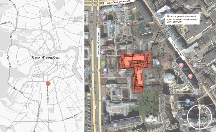
Location plan. ID Moskovskiy
Copyright: © Liphart Architects
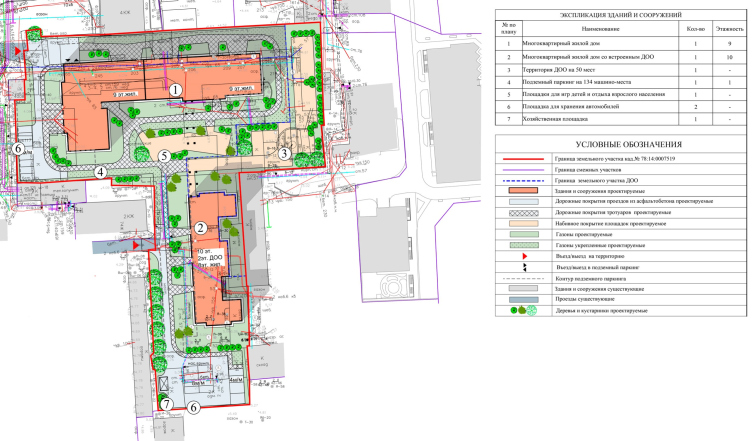
ID Moskovskiy is composed of two elements: one is nine stories high, with an L-shaped plan (sections 1 and 2), and the other is ten stories high, with a U-shaped plan (Section 3).
The master plan. ID Moskovskiy
Copyright: © Liphart Architects
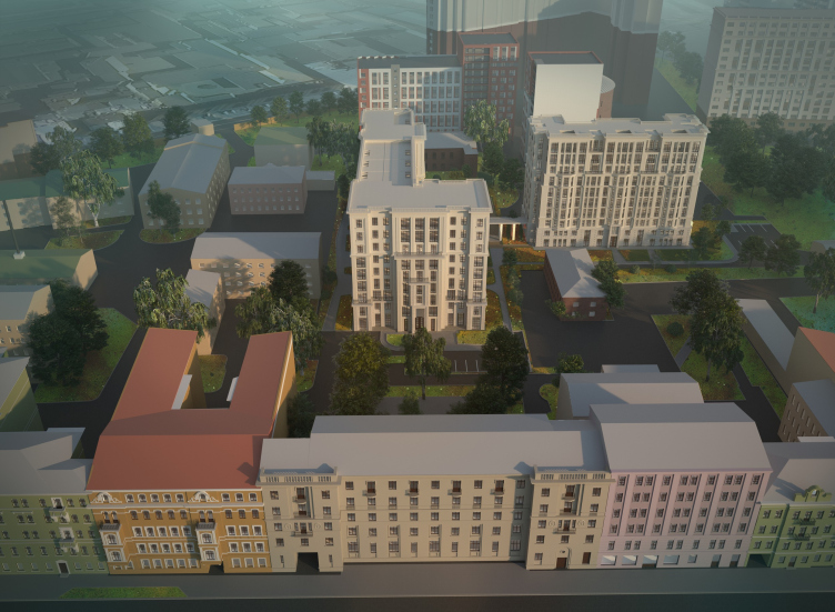
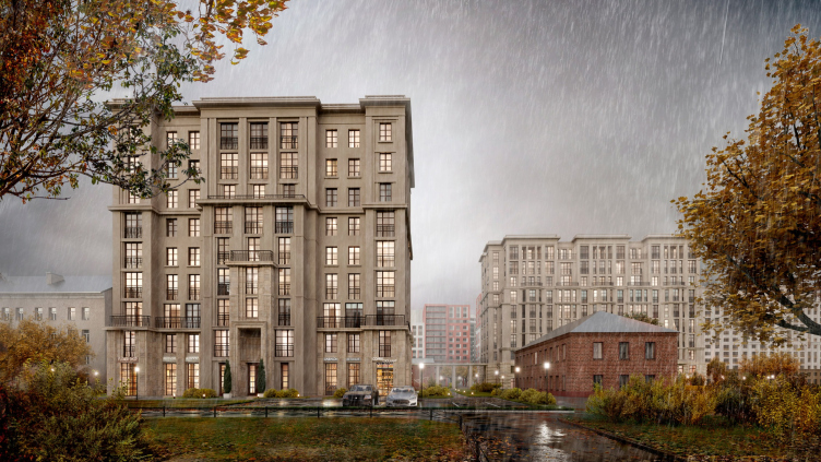
The buildings, connected by a colonnade, do not completely close the yard, which is delineated by the L-shaped building only on two sides, but stand next to each other with their facades turned to the Moskovsky Avenue. Placing them in the second line does not cancel, however, their compositional and spatial connection to the other buildings on the avenue. The entrance portal of the first section is coaxial with the symmetrical Kosven house, which steps on the redline, its drive-through arch becoming a peculiar “grand driving entrance”, which precedes the regular space of the yard. The third section stands on the same axis with the arch of House 76 on the Moskovsky Avenue, its lengthy facade becoming kind of a screen that protects the historical yards from the dull firewalls of the modern era.
Birds-eye view fro the west side. ID Moskovskiy
Copyright: © Liphart Architects
Unlike in our previous projects, where apartment plans were mainly carried out by our partners, this time they were created entirely by my team, therefore, in my opinion, it turned out to be more solid, harmonious and in tune with the St.Petersburg and Leningrad tradition. In a sense, I was inspired by the example of Lidval, who started with expensive and elaborately decorated buildings, such as the apartment building for his mother on Kamennoostrovsky Avenue, then created the architecture of very simple housing for the workers of the Nobel factory, and later returned to the expensive segment with the solutions that he found along the way, coming up with the perfect balance of the simple and the complex.
Compared to the previous projects by Stepan Liphart, Moskovskiy is much more austere. Essentially, it is generalized neoclassic, close to Peter Behrens, and the Soviet buildings of the 1930’s, which inherited from him Art Deco elements without a single rounded line. There are neither capitals, nor jibs, nor talons here. The author explains the harsh nature of the architecture by the fact that the house is located in the depths of the block, and the courtyard facades of St. Petersburg houses are traditionally more strict with decor. However, it is from the plastique standpoint that Moskovskiy looks very ingenious and anything but an average building. Alongside the generalized classical order architecture, characteristic of neoclassicism of the 1920-1930’s, Moskovskiy also looks as it is about to soar up to the sky, Art Deco style, and it demonstrates the theme of a “hardened breakthrough”, so much loved by Stepan Liphart. All of which is embodied in the grand facade of the first building.
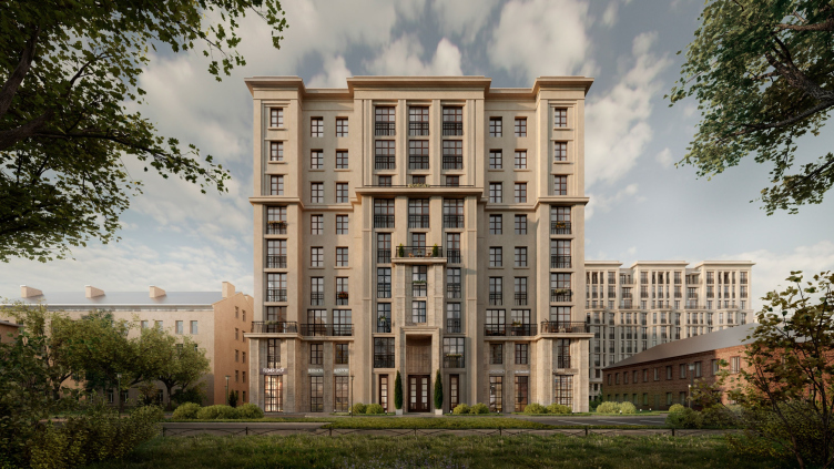
Section 1, view from the west. ID Moskovskiy
Copyright: © Liphart Architects
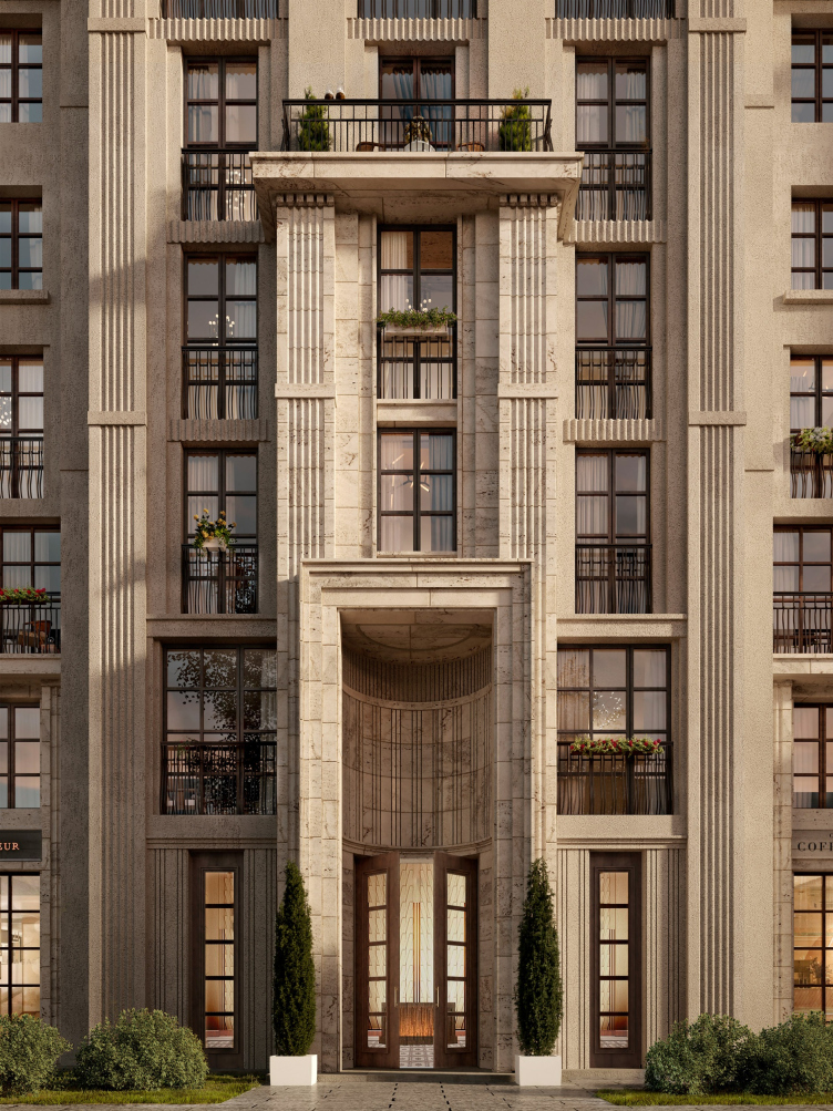
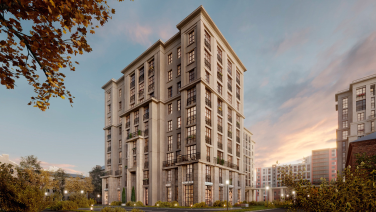
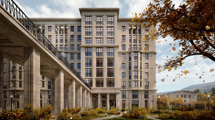
This facade, the closest to the Moskovsky Avenue, is defined by a powerful vertical motion. Its center features a powerful entrance portal of Section 1, pulled up, and presenting a semicircular niche with a flat top. This portal looks as if it is doubled by a narrow “frame” four stories high, which, in turn, is framed by the central risalit six stories high, with a three-story attic buildup. All of this yields a vertical composition the height of the entire house, which, when viewed from a side angle, looks like a telescopic lens of some giant camera.
Section 1, detail of the entrance. ID Moskovskiy
Copyright: © Liphart Architects
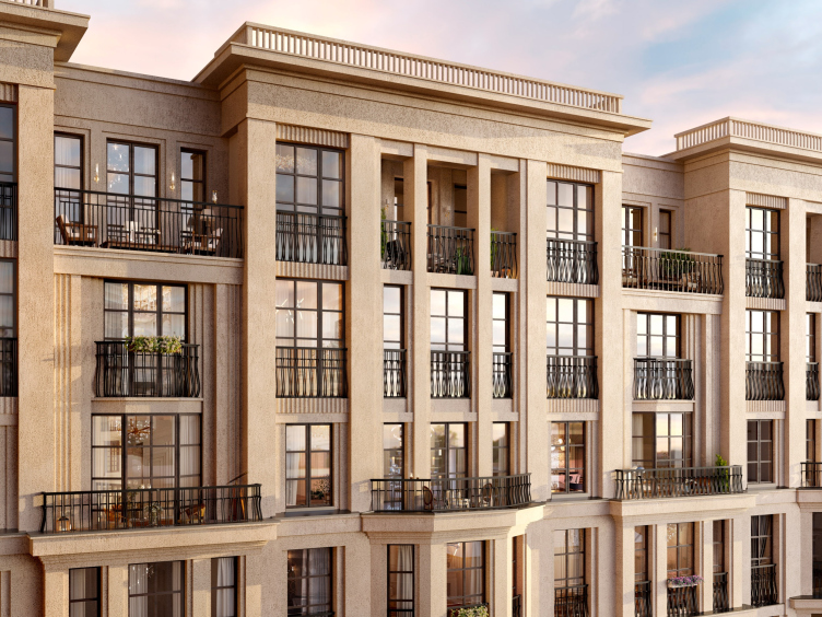
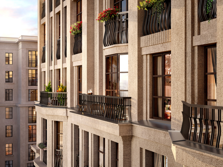
Both elements of the Moskovskiy complex have traditional classical structure: a base level, a mezzanine level, and a relatively light top. (The base level will be coated with plaster-imitating glass fiber concrete, and the top tiers will be coated with stucco). The facade compositions of the houses are engaged in a visual dialogue, and share common motifs: a portal, a risalit, a bay window, and a pergola terrace. The pristine and austere main facade of the first house is opposed by the structured yard facade, which features faceted bay windows, characteristic for St. Petersburg, continued by pergola terraces in the top tier. This is yet another technique of vertical development. First, we see the onslaught of matter (the bay windows), then the smooth neutral wall, and then, finally, almost ethereal things (pergola terraces).
View of Section 1 from the southwest side. ID Moskovskiy
Copyright: © Liphart Architects
Overview. ID Moskovskiy
Copyright: © Liphart Architects
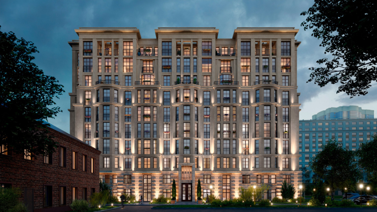
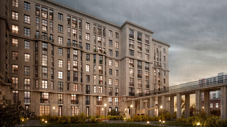
The facade of the second house ten stories high features a superposition of different themes, like stretta in a fugue: the portal, the risalits, the bay windows, and the pergolas, exposed in the first house sequentially, are here superimposed on one another. Outline-wise, the entrance portal of the second house also has two tiers and it is also as vertical as that of the first one, but it is devoid of the niche, and is not duplicated by the frames in the top floors. Here, on the two lower floors, the architects used decoration techniques different from those of the first house, the rock face kind, which, among other things, emphasizes the different functions of the bottom parts of the buildings (commercial premises and a kindergarten respectively). The architecture of the second house, on the one hand, does not demonstrate such a powerful breakthrough as the facade of the first building, and, on the other hand, its plastique is richer. Here will see little or no smooth wall – quite the opposite, the number of layers, profiles, protruding or sunken-in elements is great and diverse.
Section 3 with a kindergarten, view from the west. ID Moskovskiy
Copyright: © Liphart Architects
Among other things, the abundance of ledges and projections, makes it possible to make the line of balconies more diverse: starting from French balconies and small “tea” balconies to the already mentioned pergola terraces on the top floor.
Section 3, view fro the top floors. ID Moskovskiy
Copyright: © Liphart Architects
Section 3, balconies of the top floors. ID Moskovskiy
Copyright: © Liphart Architects
The two buildings are linked by a colonnade composed of eight double pylons that carry the promenade on the level of the second floor. One cannot fail to notice here a reference to the Benoît House on Kamennoostrovsky Avenue with a colonnade in the courtyard. The colonnade splits the yard into two parts, and, structuring it, leads on one side to the grand entrance to Section 2, and, on the other side, to the entrance to the kindergarten, which is situated on the side end of Section 3. For the children of the kindergarten, the gallery of the colonnade will be of practical importance: on rainy days, they will be able to take walks under its roof, and on fine days they can walk under it to the playgrounds located in the north-eastern part of the courtyard. The roof of the gallery will have a mini-garden upon it – a public space with benches and tubs with plants. One will be able to get there both from the street by using a staircase, and from the second floor of the first house.
View of Section 2 and the transition colonnade between sections 2 and 3. ID Moskovskiy
Copyright: © Liphart Architects
We will note here that the colonnade is essentially a new spatial experience. The space underneath it is inevitably solemn, and the space behind it is more intimate and private; walking alongside it is a rhythmical adventure.
View from the southwest side on Section 3. ID Moskovskiy
Copyright: © Liphart Architects
Liphart’s project of the lobbies will not be implemented, which is a pity because it continued the themes stated on the facades: ceilings seven meters high, emphasized verticals in the decor of the walls, three narrow windows in the second tier (the office of the managing company), looking like a concert organ, a “wing” pattern on the walls, and Art Deco octagons that almost look like rhombi. All these details would set a solemn tone.
As for the apartments, Moskovskiy offers options from studios to four-room apartments, ranging from 35 to 138 square meters. One can single out two principles characteristic of their design. The total floor space of the building grows less as the building goes up, the apartments on the upper floors becoming larger, and their number growing smaller. “A number of apartments is close to the pre-Revolution enfilade planning and the floor plans of the 1930’s-1950’s – Stepan Liphart shares – We are talking here first of all about the symmetric apartments of Section 3 [in the second building – editorial note], whose center is a large living room with a bay window. This way, not only in terms of designing the volumes and the facades, but also in terms of floor plans, we tried to observe the fundamentals of a residential building traditional for St. Petersburg and Leningrad.”
***
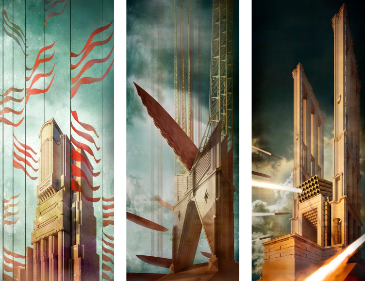
The house is chaste in details, yet its “screenplay” is sophisticated and diverse. It responds to the context of St. Petersburg and Leningrad, and builds a “second grand front” behind the line of the Moskovsky Avenue; it actively uses bay windows and pergola terraces, and its colonnade interprets a Benoît idea. As for the austerity of the architectural solution, it is double-sided. On the one hand, it is a means of achieving restrained elegance without sacrificing meaningfulness, and, on the other hand, it is a means of monumentalizing and embodying an impulse of will – a heroic theme that is consistently developed in the works of Stepan Liphart. In this sense, the house is close to the order-architecture ships of the graphic triptych, showcased by the architect at the Zodchestvo festival: focused and elegantly powerful.
The graphic triptych “Immobile super mobile erigo”. 2020
Copyright: © Stepan Liphart
Such a mood is more than consonant with the last thunderous year 2020, our “day and age” when a certain aestheticism does not exclude the exertion of all forces, and self-discipline.


