По-русски

​The Towers of “Sputnik”

Six towers, which make up a large housing complex standing on the bank of the Moskva River at the very start of the Novorizhskoe Highway, provide the answers to a whole number of marketing requirements and meets a whole number of restrictions, offering a simple rhythm and a laconic formula for the houses that the developer preferred to see as “flashy”.

02 November 2020
Object
mainImg
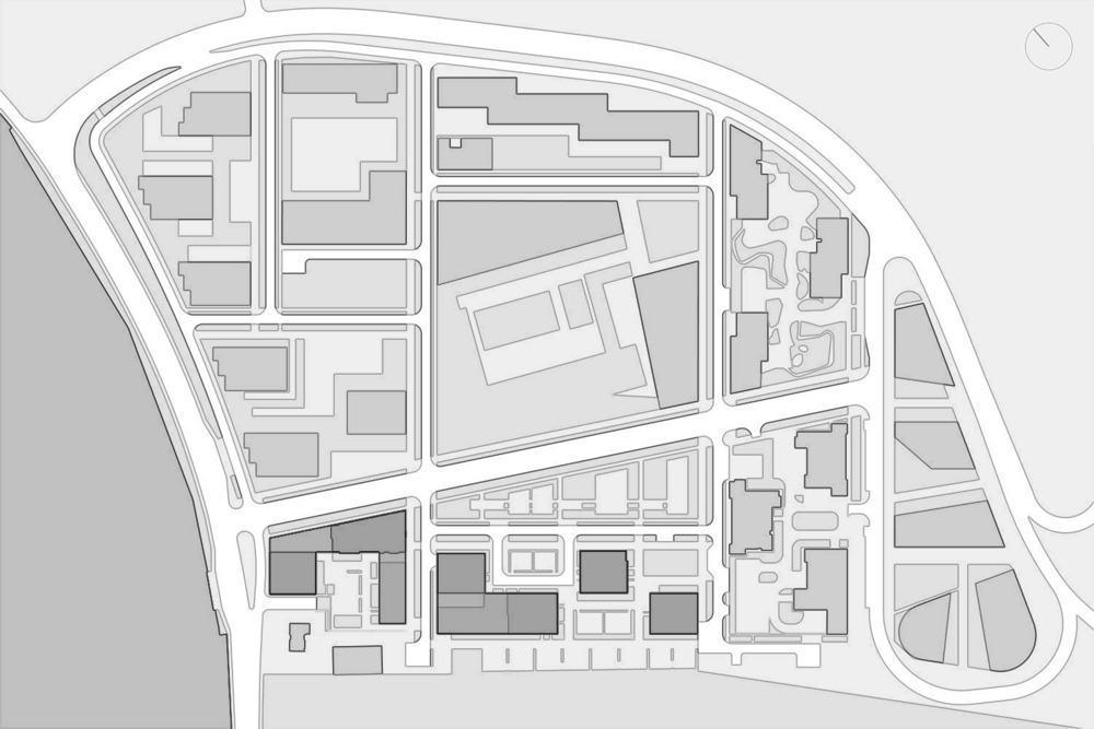
The apartment complex “Sputnik” – an extensive high-rise housing development of comfort class – is built by Samolet Group in the stead of a former sand quarry lying between the Moscow Ring Road and the Zhivopisnaya Bay, at the border of the Lipovy Les parkland. The complex is situated not far away from the bank of the Moskva River bank; there is a paid-entrance riverside beach a 10 minutes’ walk away, and the surroundings are quite in the spirit of the Rublev Highway – all around you can see a whole congregation of luxury-class villas that somehow seem to peacefully coexist with giant suburban shopping malls. There are also villa settlements that feature modern architecture: in the east, the Sputnik territory borders on the “Rublevo Residences”, build in 2012 by the project of the British PRP Architecture; a little further north, right next to the building of the Government of the Moscow Region, designed by Mikhail Khazanov, there is a low-rise six-story residential complex called “Rublevo Park”, designed by Alexander Tsimailo and Nikolai Lyashenko.

Meanwhile, large-scale development is also represented here not just by “Sputnik” alone – specifically, a kilometer and a half away in a straight line, on a peninsula that cuts into the Moskva River, PIK Development is building the “Myakinino Park” housing complex. Therefore, the context is busy and contrastive, not to say mottled, which is generally expectable outside the Moscow Ring Road. And, although the city environment has not yet fully formed on the pedestrian level, the views of the Moskva River, which one can admire from the windows of the 30-story houses, are already beautiful, which is rather an advantage for the residents of the high-rises. Originally, the concept for developing this land was developed by a Dutch architectural company, but later on the construction scale rose to 30-33 stories, and the developer distributed the tasks of designing individual land sites between a few reputed Moscow architectural companies.

The two first parts, each one consisting of three towers standing on a podium, have already been built by the projects of Ostozhenka and Reserve Union; these are situated closer to the Moscow Ring Road, about 160 meters away from the highway. In the central part of the complex, there is a school building, currently designed by Atrium Architects.

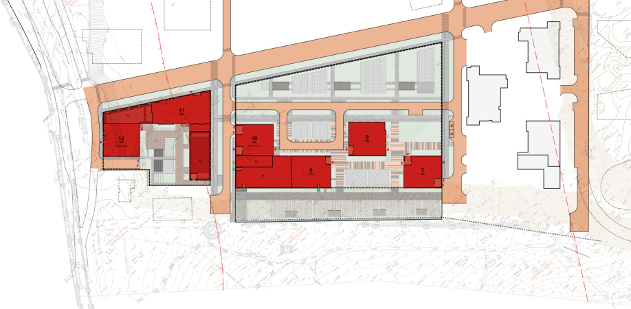
The houses of the next two stages – complexes B3 and A5 – were designed by Sergey Kiselev and Partners. The landscape design was done by Ilia Mochalov; the interiors of public spaces – by the company Haast.

zooming


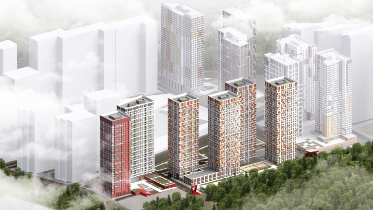
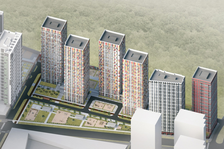
Six towers stand in a line along the Lipovaya Coppice, forming the southwest border of the complex. This is the most advantageous location here, next to the parkland. Currently, the realization of the project is underway; all of the houses are built as monoliths, and are rapidly being covered with facade fiber cement panels.

One of the main challenges of this project was not so much the scale, generally habitual for this area, as the economy of construction and lots of preset parameters that were not to be discussed. The chief architect of the project Aleksey Medvedev shares:

The typology of the towers, as well as the apartment design, was predetermined by the marketers in this case – we worked with preset parameters, rather rigid, down to the size of the fenestration. The recommendations also included colored facades. Initially, more austere and monochrome facades acquired a red-yellow “autumn” look and highlights very much like “sun glare”. Flat facades without bay windows were also part of the assignment. In such cramped conditions, however, we tried to design the volumes using a contrasting pattern, to build the rhythm of the facades at the expense of colored spots and baskets for air conditioners. We thought over the structure of the bottom floors, entrances, and double-height spaces, open to the light.


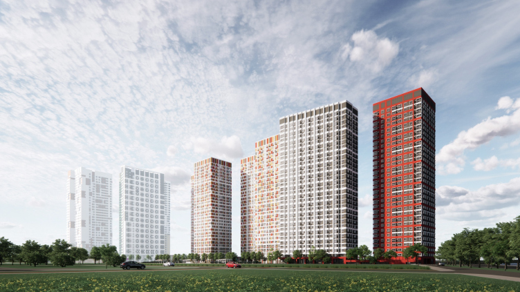
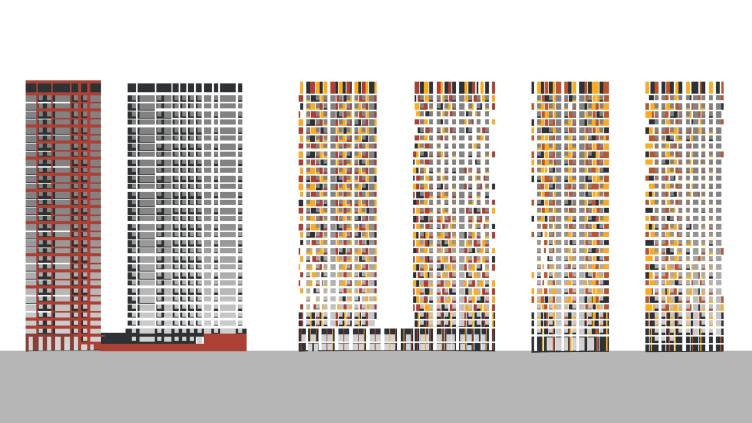
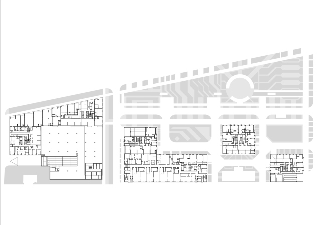
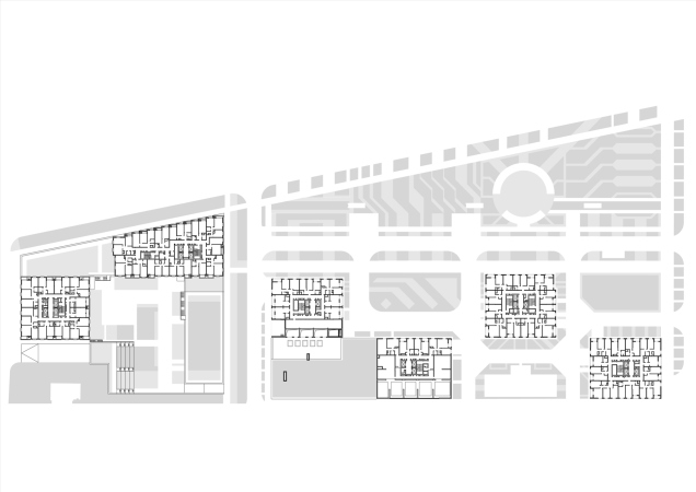
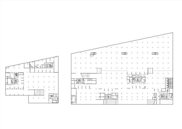
The elongated land site B3, whose construction blueprint is fully occupied by two tiers of an underground parking garage, was originally to get three houses, just like the preceding stages. The architects of Sergey Kiselev and Partners rearranged these volumes, proposing to build four towers instead of three, two of them with always perfectly square bases. Two of them are joined by a common podium that hosts a kindergarten, the others two, which are situated above the zero elevation, standing separately. On the whole, the towers are almost identical; the architects positioned them in a zigzag staggered order, which allowed them to avoid window-to-window views, and to achieve rather convenient caesuras that ensure extra transparency. We will note that the laconic repeating pattern of the square towers gives the entire group an exquisitely simple look, crowned with a 3-meter high attic floor, which neatly masks the mechanical rooms, while the 100-meter height of the towers makes them moderately slender.


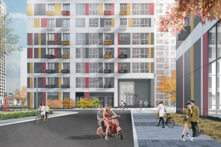
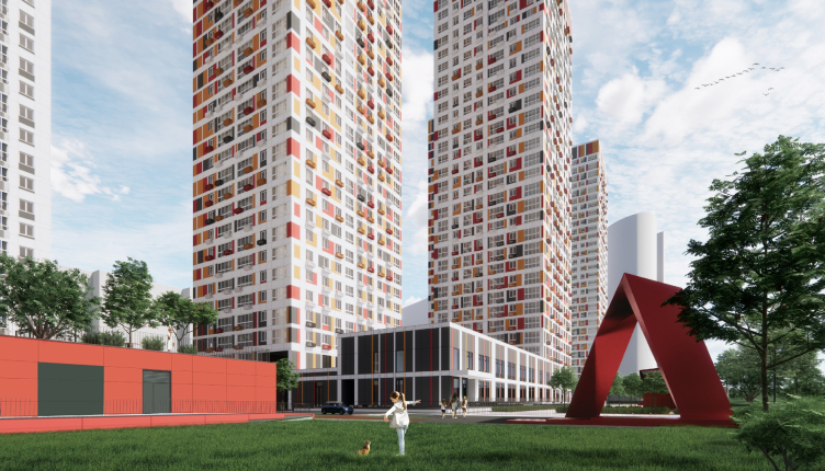
In addition to the two-tire kindergarten, hosted in the podium that joins the bases of the two western towers belonging to Group B3, the bottom floors will also include public premises and stores. The bottom floors are higher than the residential ones, but in the original project they were high as well, as a consequence of which some of the spaces were also used for construction in order to achieve the proverbial “square footage output”, Aleksey Medvedev shares. However, the entrance groups retained their visual transparency and two-story height, being some of the flashiest elements of the complex, looking like a “joint cell of a spreadsheet”, designed for pedestrian perception, and looking particularly good when seen from end to end.


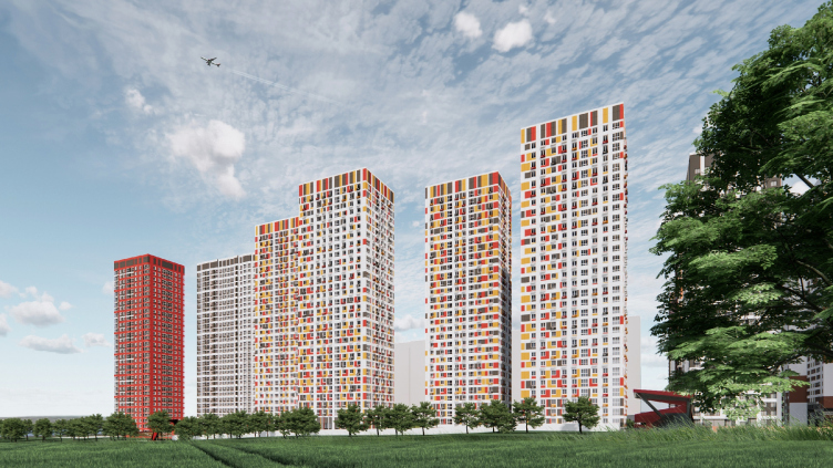
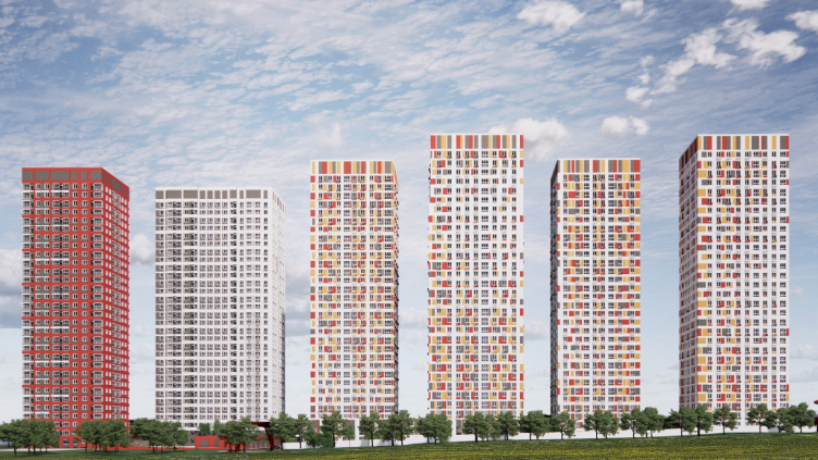
The facades of all the four square towers and the podium are subjected to a white grid: it outlines the volumes (including in the top part), enhancing their integrity, yet on the inside it constantly changes the thickness of the lines, from confidently wide, which dissect the houses from top to bottom, to exquisitely slender, which highlight the pixel pattern of the color spots – asymmetric, yet still captured in the grid and working in accordance with the same rules. The pattern consists of dark-gray, yellow, and red spots, no more than one floor tall and no more than one pier wide. Changing the width, getting sometimes thicker and sometimes sparser, supported by air conditioning units, they form a rhythm, which is, on the one hand, rather predictable, and, on the other hand, slightly quivering, like autumn leaves in the wind; the color of the inserts perfectly fits the metaphor, finding a few reflections in the already-complete towers.

In the attic tier, the pixels turn into broad and bright stripes, blending together into some kind of two-dimensional “fringe” – as we remember, it masks the mechanical rooms. The volume of the kindergarten is dominated by black; the pixel colors give way to slender stripes, which makes it look elegant and collected.


The second group – A5 – consists of two towers, one of them (on the outer corner of the complex) being square on the plan and looking much like the “four sisters” from B3. The plan of the other tower is elongated and trapeze-shaped, one of the longer walls being chamfered and designed as a volumetric “saw” – this technique was already tested by Sergey Kiselev and Partners in the housing complex MainStreet (currently under construction) on the Ivana Franko Street, which allowed the architects to give the maximum number of bay windows to the apartments, providing a lot of natural light and beautiful views. The two towers in A5 are joined by a podium that hosts stores, and, if you look at it from above, you may notice that their outlines can be described into an outline of a right triangle with a zigzagged hypotenuse. Its line is continued by a park promenade – a landscaped territory that unites all the six towers.


The towers of the second complex, by contrast, are not mottled but monochrome: the outside one is red, the trapeze-shaped one is gray, black and white. The grids of their facades are generally akin to their predecessors, yet they develop in a more flexible war: for example, the facade of the red tower, which faces the river, has more windows, including corner ones. While the black-and-white house, which marks the inner border of the group of towers A5, is more like a “wall”, the red one becomes a “point” or a corner highlight – and it is not by accident that the volume of the podium, extended into the depth of the site, is also red; this house either starts or finishes the movement, depending on how you look at it. 


The range of apartments in A5, situated closer to the river, is more diverse, and the square footage of an average apartment is larger than it is in B3 0 Aleksey Medvedev explains.

  • zooming
    1 / 4
  • zooming
    2 / 4
  • zooming
    3 / 4
  • zooming
    4 / 4


Thus, the houses that form the southern, “forest” edge of the complex are arranged in a simple rhythmic manner. On the one hand, you could assume that the laconic character of the solution has to do with the rigid constraints that the architects had to face, yet, on the other hand, one must admit that it is quite a task creating something convincing and recognizable enough, at the same time complying with all of the requirements: not “stoop down” to some garish mottled pattern trying to fulfill the request to create something “flashy”, and not come up with some dull monotonous thing, but set a clear leitmotif and stick to it. As a rule, working with such large-scale complexes is a challenge for the architects. What we are seeing here is one of the possible responses, and quite decent, too.

P.S. In 2019, Sergey Kiselev and Partners also developed a project of an office complex for a triangular land site in the eastern part of the territory that borders on the Myakinino Highway. It has a greater number of floors and demonstrates a version of a monochrome solution, from which the architects had to refrain in the residential towers, but, obviously, it is going to remain on paper.

02 November 2020

Headlines now
The Golden Crown
The concept for a dental clinic in Yekaterinburg, developed by CNTR Studio, revolves around the idea of a “mouth full of gold”: pristine white porcelain stoneware walls are complemented by matte brass details. To avoid an overly literal interpretation, the architects focused on the building’s proportions, skillfully navigating between sunlight requirements and fire safety regulations.
Flexibility and Integration
Not long ago, we covered the project for the fourth phase of the ÁLIA residential complex, designed by APEX. Now, we’ve been shown different fence concepts they developed to enclose the complex’s private courtyards, incorporating a variety of public functions. We believe that the sheer fact that the complex’s architects were involved in such a detail as fencing speaks volumes.
A Step Forward
The HIDE residential complex represents a major milestone for ADM architects and their leaders Andrey Romanov and Ekaterina Kuznetsova in their quest for a fresh high-rise aesthetic – one that is flexible and layered, capable of bringing vibrancy to mass and silhouette while shaping form. Over recent years, this approach has become ADM’s “signature style”, with the golden HIDE tower playing a pivotal role in its evolution. Here, we delve into the project’s story, explore the details of the complex’s design, and uncover its core essence.
Gold in the Sands
A new office for a transcontinental company specializing in resource extraction and processing has opened in Dubai. Designed by T+T Architects, masters of creating spaces that are contemporary, diverse, flexible, and original, this project exemplifies their expertise. On the executive floor, a massive brass-clad partition dominates, while layered textures of compressed earth create a contextually resonant backdrop.
Layers and Levels of Flight
This project goes way back – Reserve Union won this architectural competition at the end of 2011, and the building was completed in 2018, so it’s practically “archival”. However, despite being relatively unknown, the building can hardly be considered “dated” and remains a prime example of architectural expression, particularly in the headquarters genre. And it’s especially fitting for an aviation company office. In some ways, it resembles the Aeroflot headquarters at Sheremetyevo but with its own unique identity, following the signature style of Vladimir Plotkin. In this article, we take an in-depth look at the United Aircraft Corporation (UAC) headquarters in the Moscow agglomeration town of Zhukovsky, supplemented by recent photographs from Alexey Naroditsky – a shoot that became only recently possible due to the fact that improvements were finally made in the surrounding area.
Light and Shadow
In this article, we delve into the architectural design of the “Chaika” house by DNK ag architects, which was recently completed in 2023 as part of the collection of signature designs at ZILArt. As is well-known, all the buildings in this complex follow a design code, yet each one is distinct. This particular building stands out not only for its whiteness and minimalism but also for the refined use of a limited number of techniques that, together, create what can confidently be called synergy.
Casus Novae
A master plan was developed for a large residential area with a name of “DNS City”, but now that its implementation began, the plan has been arbitrarily reformatted and replaced with something that, while similar on the surface, is actually quite different. This is not the first time such a thing happens, but it’s always frustrating. With permission from the author, we are sharing Maria Elkina’s post.
Treasure Hunting
The GAFA bureau, in collaboration with Tegola and Arkhitail, organized an expedition to the island of Kilpola in Karelia as part of Moskomarkhitektura’s “Open City” festival. There, amidst moss and rocks, the students sought answers to questions like: what is the sacred, where does it dwell, and what sustains it? Assisting the participants in this quest were landscape engineer Evgeny Levin, artist Nicholas Roerich, a moose, and the lack of cellular connection. Here’s how the story unfolded.
Depths of the Earth, Streams of Water
In the Malaya Okhta district, the Akzent building, designed by Stepan Liphart, was constructed. It follows a classic tripartite structure, yet it’s what you might call “hand-drawn”: each façade is unique in its form and details, some of which aren’t immediately noticeable. In this article, we explore the context and, together with the architect, delve into how the form was developed.
Fir Tree Dynamics
The “Airports of Region” holding is planning to build an airport in Karachay-Cherkessia, aiming to make the Arkhyz and Dombay resorts more accessible to travelers. The project that won in an invitation-only competition, submitted by Sergey Nikeshkin’s KPLN, blends natural imagery inspired by the shape of a conifer seed, open-air waiting spaces, majestic large trees, and a green roof elevated on needle-like columns. The result is both nature-inspired and WOW.
​A Brick Shell
In the process of designing a clubhouse situated among pine trees in a prestigious suburban area near Moscow, the architectural firm “A.Len” did the façade design part. The combination of different types of brick and masonry correlates with the volumetric and plastique solutions, further enhanced by the inclusion of wood-painted fragments and metal “glazing”.
Word Forms
ATRIUM architects love ambitious challenges, and for the firm’s thirtieth anniversary, they boldly play a game of words with an exhibition that dives deep into a self-created vocabulary. They immerse their projects – especially art installations – into this glossary, as if plunging into a current of their own. You feel as if you’re flowing through the veins of pure art, immersed in a universe of vertical cities, educational spaces – of which the architects are true masters – and the cultural codes of various locations. But what truly captivates is the bold statement that Vera Butko and Anton Nadtochy make, both through their work and this exhibition: architecture, above all, is art – the art of working with form and space.
Flexibility and Acuteness of Modernity
Luxurious, fluid, large “kokoshniks” and spiral barrel columns, as if made from colorful chewing gum: there seem to be no other mansion like this in Moscow, designed in the “Neo-Russian-Modern” style. And the “Teremok” on Malaya Kaluzhskaya, previously somewhat obscure, has “come alive with new colors” and gained visibility after its restoration for the office of the “architectural ecosystem” as the architects love to call themselves. It’s evident that Julius Borisov and the architects at UNK put their hearts into finding this new office and bringing it up to date. Let’s delve into the paradoxes of this mansion’s history and its plasticity. Spoiler: two versions of modernity meet here, both balancing on the razor’s edge of “what’s current”.
Yuri Vissarionov: “A modular house does not belong to the land”
It belongs to space, or to the air... It turns out that 3D printing is more effective when combined with a modular approach: the house is built in a workshop and then adapted to the site, including on uneven terrain. Yuri Vissarionov shares his latest experience in designing tourist complexes, both in central Russia and in the south. These include houseboats, homes printed from lightweight concrete using a 3D printer, and, of course, frame houses.
​Moscow’s First
“The quality of education largely depends on the quality of the educational environment”. This principle of the last decade has been realized by Sergey Skuratov in the project for the First Moscow Gymnasium on Rostovskaya Embankment in the Khamovniki district. The building seamlessly integrates into the complex urban landscape, responding both to the pedestrian flow of the city and the quiet alleyways. It skillfully takes advantage of the height differences and aligns with modern trends in educational space design. Let’s take a closer look.
Looking at the Water
The site of Villa Sonata stretches from the road to the water’s edge, offering its own shoreline, pier, and a picturesque river panorama. To reveal these sweeping views, Roman Leonidov “cut” the façade diagonally parallel to the river, thus getting two main axes for the house and, consequently, “two heads”. The internal core – two double-height spaces, a living room and a conservatory, with a “bridge” above them – makes the house both “transparent” and filled with light.
The White Wing
Well, it’s not exactly white. It’s more of a beige, white-stone structure that plays with the color of limestone – smoother surfaces are lighter, while rougher ones are darker. This wing unites various elements: it absorbs and interprets the surrounding themes. It responds to everything, yet maintains a cohesive expression – a challenging task! – while also incorporating recognizable features of its own, such as the dynamic cuts at the bottom, top, and middle.
Urban Dunes
The XSA Ramps team designed and built a three-part sports hub for a park in Rostov-on-Don, welcoming people of all ages and fitness levels. The skate plaza, pump track, and playground are all meticulously crafted with details that attract a diverse range of visitors. The technical execution of the shapes and slopes transforms this space into a kind of sculptural composition.
Proportional Growth
The project for the fourth phase of the ÁLIA residential area has been announced. The buildings are situated on an elongated plot – almost a “ray” that shoots out from the center of the area towards the river. Their layout reflects both a response to Moscow’s architectural preferences over the past 15 years, shifting “from blocks to towers”, and an interpretation of the neighboring business park designed by SOM. Additionally, the best apartments here are not located at the very top but closer to the middle, forming a glowing “waistline”.
The “Staircase” Building
In designing the “Details” residential complex in New Moscow, Rais Baishev spiced up the now-popular Moscow theme of a “courtyard” building with an idea drawn from the surrealist drawings by Maurits Escher. He envisioned the stepped silhouettes and descending slopes as a metaphysical mega-staircase, creating a key void within the courtyard that gave the project an internal “spine”. This concept is felt both in the building’s silhouette and on its façades.
Projection of the Quarter
No one doubted that the building that Vladimir Plotkin designed as part of the “Garden Quarters” would be the most modernist of all. And it turned out just that way: while adhering to the common design code, the building successfully combines brick and white stone, rhythmically responding to the neighboring building designed by Ostozhenka, yet tactfully and persistently making a few statements of its own. This includes the projection of the ideal urban development composition “14–9–6”, which can be found right next door, mathematical calculations, including those for various types of terraces (and perhaps the only reminder of the Soviet past of the Kauchuk rubber factory!), and the white “cross-stitch” pattern of the façade grid.
Domus Aurea
In this issue, we examine the “Tessinsky-1” house, designed by Sergey Skuratov and completed in 2023. Located in the middle of the Serebryanicheskaya Embankment district, at the intersection of its main streets, this house assumes a sort of “nodal” role: it not only responds to everything around it and preserves many memories of the former EMA factory within itself, but it weaves all this into a newly directed pattern, reconciling bright “gold” and dark-colored brick, largely with the help of the new, modern-yet-archaic Columba brick, which, come to think about it, is the most precious element here.
The Chimney of Nikola-Lenivets
In this issue, we are examining the “Obelisk House” designed by KATARSIS and built for the Arkhstoyanie 2023 festival. However, it was only finished later on, and this is why we are examining it now. It seems to us that after the “Obelisk House” appeared in Nikola-Lenivets, a dialogue and a few inner connections appeared between the temporary structures built here. These houses no longer look like “accidental neighbors”, more of which below.
​Periscope by the Bay
The jury awarded the second place in the competition for a public and cultural center in Petropavlovsk-Kamchatsky to the companies GORA (“Mountain”) and M4. In the consortium’s proposal, the building resembles a sperm whale with a calf swimming next to it or a periscope, whose lenses capture the most spectacular views from the surrounding landscape.
From Arcs to Dolmens
While working on the competition project for Petropavlovsk-Kamchatsky, ASADOV Architects prioritized the value of the natural and urban environment, aiming to preserve the balance of the location while minimizing the resemblance of the volume that they designed to a “traditional building”. The task was challenging, and the architects created three versions, one of which having been developed after the competition, where their main proposal took third place. However, the point of interest here is not the competition result but the continuity of creative thinking.
Hide and Seek
The ID Moskovskiy house, designed by Stepan Liphart in St. Petersburg, in the courtyards near Moskovskiy Avenue beyond the Obvodny Canal and recently completed, is notable for several reasons. Firstly, it has been realized with considerable accuracy, which is particularly significant as this is the first building where the architect was responsible not only for the facades but also for the layouts, allowing for better integration between the two. On the other hand, this building is interesting as an example of the “germination” of new architecture in the city: it draws on the best examples from the neighborhood and becomes an improved and developed sum of ideas found by the architect in the surrounding context.
The Big Twelve
Yesterday, the winners of the Moscow Mayor’s Architecture Award were announced and honored. Let’s take a look at what was awarded and, in some cases, even critique this esteemed award. After all, there is always room for improvement, right?
Above the Golden Horn
The residential complex “Philosophy” designed by T+T architects in Vladivostok, is one of the new projects in the “Golubinaya Pad” area, changing its development philosophy (pun intended) from single houses to a comprehensive approach. The buildings are organized along public streets, varying in height and format, with one house even executed in gallery typology, featuring a cantilever leaning on an art object.
Nuanced Alternative
How can you rhyme a square and space? Easily! But to do so, you need to rhyme everything you can possibly think of: weave everything together, like in a tensegrity structure, and find your own optics too. The new exhibition at GES-2 does just that, offering its visitor a new perspective on the history of art spanning 150 years, infused with the hope for endless multiplicity of worlds and art histories. Read on to see how this is achieved and how the exhibition design by Evgeny Ace contributes to it.
Blinds for Ice
An ice arena has been constructed in Domodedovo based on a project by Yuri Vissarionov Architects. To prevent the long façade, a technical requirement for winter sports facilities, from appearing monotonous, the architects proposed the use of suspended structures with multidirectional slats. This design protects the ice from direct sunlight while giving the wall texture and detail.