По-русски

​Transformation with Multiplication

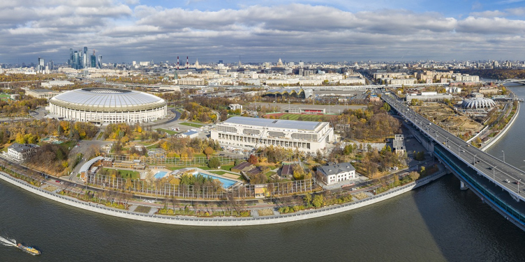
The Palace of Water Sports in Luzhniki is one of the high-profile and nontrivial reconstructions of recent years, and a project that won one of the first competitions, initiated by Sergey Kuznetsov as the main architect of Moscow. The complex opened 2 years ago; this article about it comes out at the start of the bathing season.

02 June 2021
Object
mainImg
“Reconstruction of the Luzhniki swimming complex” – this was the name of the competition conducted in 2014. We will remind you that 43 applications were submitted and five were shortlisted. The competition was won by UNK Project, whose concept, according to its leader, Julius Borisov, was based upon “reconstructing the creative method of the original authors” of the swimming complex built in the 1955-1956.

“Luzhniki” Palace of Water Sports
Copyright: Photograph © Evgeny Egorov. Provided by UNK project


The complex fell into decay: under the influence of the ever-changing Moscow weather conditions, the structures kept literally falling apart; the complex also grew morally outdated: the new requirements to sports facilities required renovating the building, as well as expanding it, and improving technologically.

The reconstruction that we proposed is a variant of the evolutionary development of the complex and the building itself. In the 1950s, this complex was an example of the use of advanced technologies and solutions of its time, just as our project is for today. At the same time, it was part of a large urban planning plan: in the Luzhniki system, the Small Sports Arena was symmetrical to it, which was extended in due time for the Olympics-80. Then symmetry and balance were lost; now we, to some extent, by increasing the length of the building, are restoring this balance.


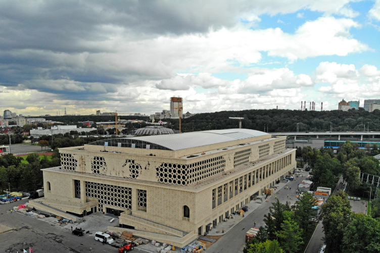
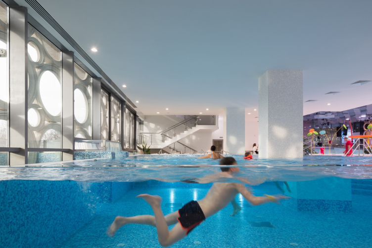
Indeed, the solution proposed by the UNK architects “fit” the object of reconstruction best of all. The project combined the idea of restoring and preserving original elements of the old building and making their replicas on a greater scale, multiplying the architectural legacy. The list of recreated things includes the colonnades under the stalls and the 50-meter-long swimming pool; the historical bay-reliefs are restored and placed in the interior; the facades got their duplicates, only of a greater scale, corresponding to the new dimensions of the building.

zooming
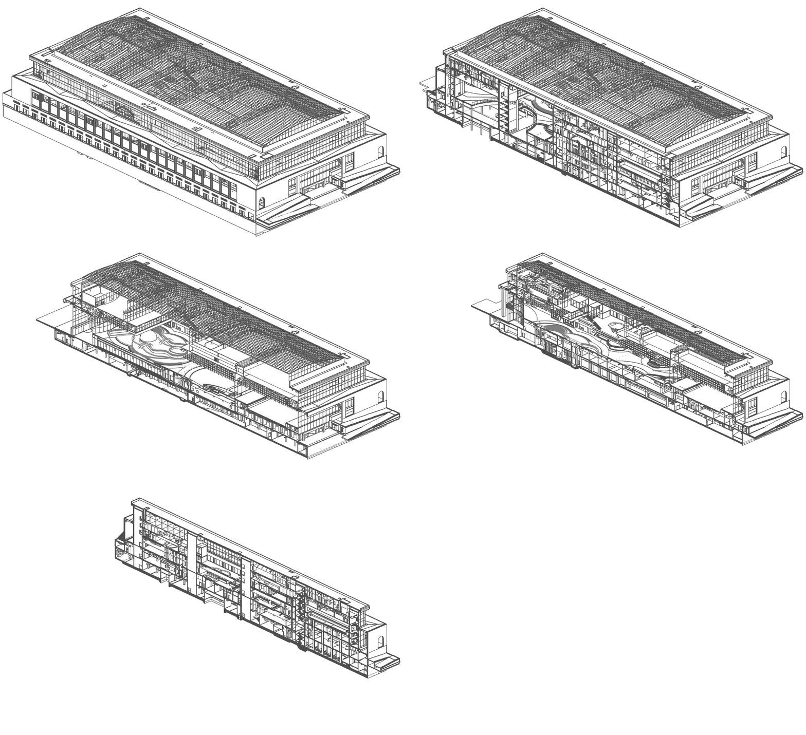
Axonometric view. “Luzhniki” Palace of Water Sports
Copyright: © UNK project


At the same time, the architects took care to make sure that the swimming pool retains its open-air quality – a segment of the roof is pulled apart, and the transparent facades not only make it possible to see the street from the inside, but also the interiors of the building from the outside.

“Luzhniki” Palace of Water Sports. The project that won the open competition 2013. Opened in 2019
Copyright: Photograph © Evgeny Egorov. Provided by UNK project


“Luzhniki” Palace of Water Sports
Copyright: Photograph © Dmitry Chebanenko. Provided by UNK project


Luzhniki as a Monument

There are two approaches to this kind of historical buildings all over the world. The first is an expensive restoration and a focus on authenticity – both in the exterior and in the interior. You will have to pay for this by reducing the number of visitors and increasing the cost of staying in such buildings – the historical infrastructure simply cannot tackle the large flows of people. The second way is to transform and increase the area by means of underground floors and superstructure. Therefore, we treated the brief of the competition with understanding and tried to get as close as possible to the historical prototype.


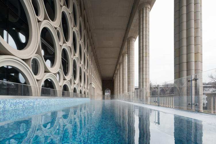
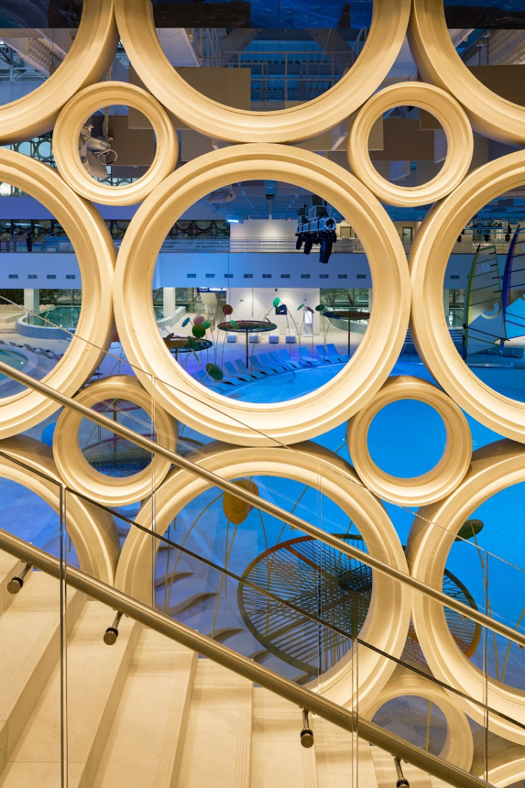
The attic floor, constructed above the historical volume of the swimming pool, is decorated with an ornamental structure, consisting of rings – this is yet another example of homage to the authors of the swimming pool: similar rings are used in the decoration of the Elektrozavodskaya metro station, designed by Igor Rogozhin, who also contributed to designing Luzhniki. In addition to the colonnades, the building also uses facade decoration, characteristic of the 1950s.

  • zooming
    1 / 5
    “Luzhniki” Palace of Water Sports
    Copyright: Photograph © Evgeny Egorov. Provided by UNK project
  • zooming
    2 / 5
    “Luzhniki” Palace of Water Sports
    Copyright: Photograph © Dmitry Chebanenko. Provided by UNK project
  • zooming
    3 / 5
    “Luzhniki” Palace of Water Sports
    Copyright: Photograph © Dmitry Chebanenko. Provided by UNK project
  • zooming
    4 / 5
    “Luzhniki” Palace of Water Sports
    Copyright: Photograph © Dmitry Chebanenko. Provided by UNK project
  • zooming
    5 / 5
    “Luzhniki” Palace of Water Sports
    Copyright: Photograph © Dmitry Chebanenko. Provided by UNK project


The return of Socialist Realism

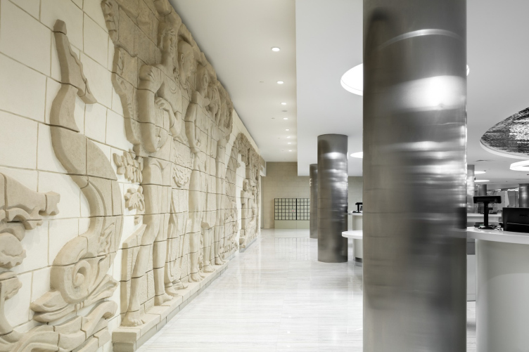
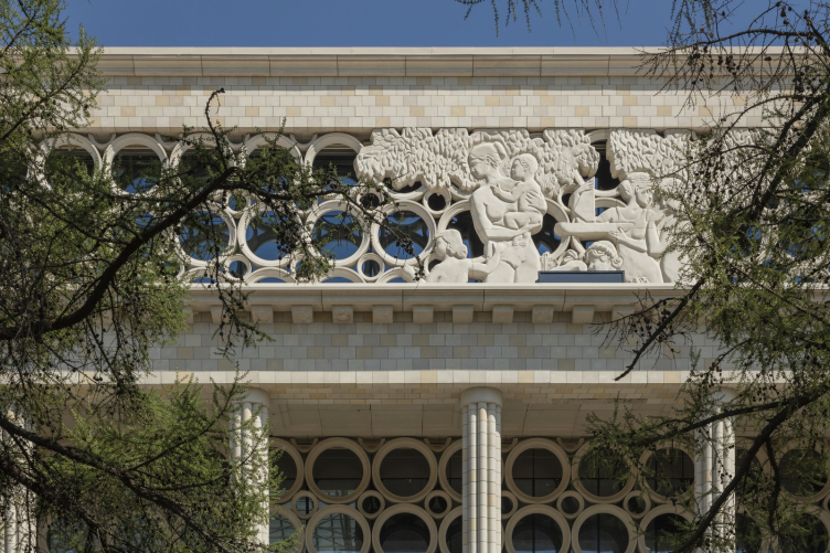
One of the new features of the Palace is the bas-relief that used to adorn the outside wall of the swimming pool. In fact, it was the only decoration of the building designed in the classicism tradition. In the 1950’s, the bad-relief on the subject of sports and youth was executed in the шамот technique – large-size bricks coated by terra cotta glazing developed by the group of young architects called “LeSS”, the name being the acronym for its members – Vladimir Lemport, Vadim Sidur, and Nikolai Silis.

“Luzhniki” Palace of Water Sports
Copyright: © UNK project


The multi-figure composition 19 meters long and 3.8 meters tall was carefully taken off the wall and lay in wait in crates: the restoration began only in 2018 in Kimry, where, as it turned out, all the technologies of working with these materials were preserved. After careful restoration – out of the 622 fragments more than a third were damaged in one way or another – the bad-relief occupied its proud place in the interior right next to the main entrance.

“Luzhniki” Palace of Water Sports
Copyright: Photograph © Dmitry Chebanenko. Provided by UNK project


What we see on the facades today is a copy, more than half again as big: the 3D scanning technologies made it possible not just to recreate an upscale composition of fiber concrete but also to make it double sided – it is viewable from the inside equally as well as from the inside. 

“Luzhniki” Palace of Water Sports
Copyright: Photograph © Dmitry Chebanenko. Provided by UNK project


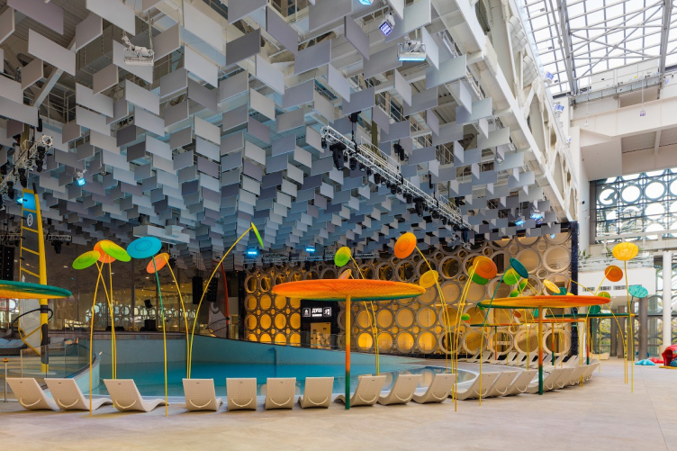
By the way, the interiors of the Palace also had enough room for modern sculptures: the three colored graces of metal wire present an homage to the Luzhniki logo. The flat drawing was converted into volume, and this yielded a composition glorifying sports, youth, and beauty in an interpretation that’s different in respect to the 1950s, brighter and more dynamic.

  • zooming
    “Luzhniki” Palace of Water Sports
    Copyright: Photograph © Ilia Ivanov. Provided by UNK project
  • zooming
    “Luzhniki” Palace of Water Sports
    Copyright: Photograph © Dmitry Chebanenko. Provided by UNK project


Technological Revolution at 60

The content of the swimming pool must match the rhythm of modern day and age, and meet the requirements of the visitors by various parameters – the service standards have dramatically changed over the 60 years” – Julia Tryaskina says, sharing about the tasks that were posed before the architects. The infrastructure of the palace grew significantly – now it has six floors in it. What was added was the underground car park and the service infrastructure – locker rooms, cafes, and a small shopping gallery.

  • zooming
    1 / 5
    “Luzhniki” Palace of Water Sports
    Copyright: © UNK project
  • zooming
    2 / 5
    Plan of the 1st floor. “Luzhniki” Palace of Water Sports
    Copyright: © UNK project
  • zooming
    3 / 5
    Plan of the 2nd floor. “Luzhniki” Palace of Water Sports
    Copyright: © UNK project
  • zooming
    4 / 5
    Plan of the 3rd floor. “Luzhniki” Palace of Water Sports
    Copyright: © UNK project
  • zooming
    5 / 5
    “Luzhniki” Palace of Water Sports
    Copyright: © UNK project


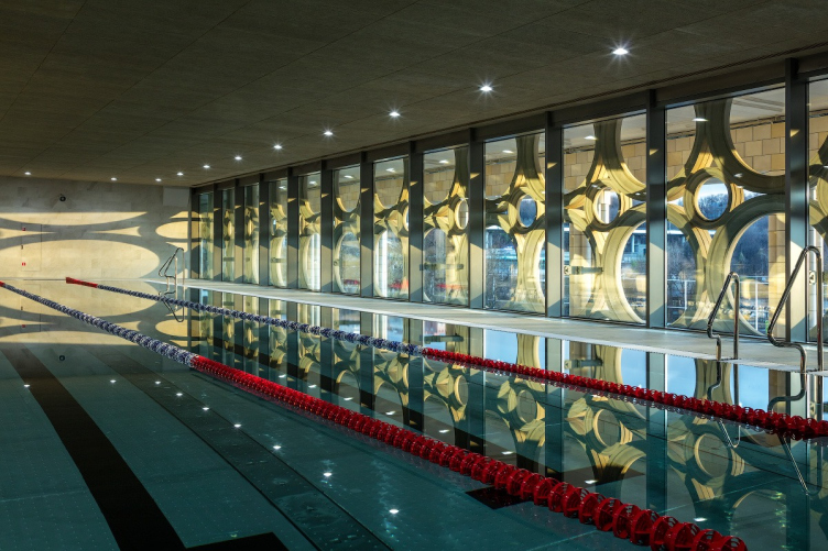
The historical swimming pool 50 meters long was kept intact, it was extended with two training ones, each 25 meters long, resting on cantilevered structures. Another thing that appeared was a large water park zone with two gyms and a spa zone on its sides.

“Luzhniki” Palace of Water Sports
Copyright: Photograph © Ilia Ivanov. Provided by UNK project


The capacity of the complex has also increased dramatically – now it can take in up to 3,000 people simultaneously, with the water park alone capable of housing up to a thousand people, which means that the complex is not just a training facility but an entertainment center as well. 

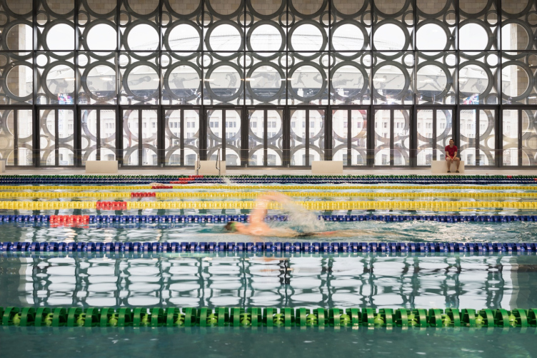
The central swimming pool features stained glass windows opening up on the street outside and on the entertainment zone – which, according to the architects, symbolizes the continuity and the transparency of the premises.

“Luzhniki” Palace of Water Sports
Copyright: Photograph © Ilia Ivanov. Provided by UNK project


“Luzhniki” Palace of Water Sports
Copyright: Photograph © Dmitry Chebanenko. Provided by UNK project


“Luzhniki” Palace of Water Sports
Copyright: Photograph © Ilia Ivanov. Provided by UNK project


“We wanted to make sure that everyone who comes to the Palace, even if the come solely for entertainment purposes, felt like an athlete” – Julia Tryaskina comments – This is why, as far as the interiors are concerned, it was very important for us to bring the sports and entertainment functions as close together as possible. And the flows of visitors, who come to the water park or to the spa complex, are merged at the exit with the flow of the professional athletes who come to train here”.

Cutting-edge technologies are also used in the water park: here, an international team developed a system of slides, the safety of which was tested practically the whole summer. 

  • zooming
    1 / 4
    “Luzhniki” Palace of Water Sports
    Copyright: Photograph © Ilia Ivanov. Provided by UNK project
  • zooming
    2 / 4
    “Luzhniki” Palace of Water Sports
    Copyright: Photograph © Ilia Ivanov. Provided by UNK project
  • zooming
    3 / 4
    “Luzhniki” Palace of Water Sports
    Copyright: Photograph © Ilia Ivanov. Provided by UNK project
  • zooming
    4 / 4
    “Luzhniki” Palace of Water Sports
    Copyright: Photograph © Ilia Ivanov. Provided by UNK project


The main challenge was to effectively arrange service units and slides that are literally interwoven with the building – but here the architects had recourse to BIM technologies. It was these technologies that allowed them to design seven slides, one of which has a curve that is exposed to the central atrium, so that the visitors can see the people flying inside the tube, and the wave-making unit, which, as the authors of the project claim, makes wave big enough for surfers to train.

The dream about a sea in Moscow

If on the facades the architects followed the architectural thought of their predecessors, in the interior, which wasn’t here before- the swimming pool was an open-air one – there was a danger of “breaking bad” and overdoing it: the recently opened Palace of Gymnastics is a vivid example of that.

However, in the interiors they were able to be tactful and respectful of the very place. First, the finish uses natural materials. The visitors are welcomed by figures of swimmers – the historical bas-relief, next to which there is a “capsule to the descendants”. The architects deliberately refrained from highlighting it – it is neatly inscribed in the interior as if it had always been there.

Transparency between the premises – gyms, swimming pools and the water park – is provided by “bubble” partitions – the very rings from the “Elektrozavodskaya” metro station reminiscent, at the same time, of the Olympic rings.

“Luzhniki” Palace of Water Sports
Copyright: Photograph © Dmitry Chebanenko. Provided by UNK project


These are echoed by the top-to-bottom wells of the atriums, circular lights on the ceiling, and the circles of the basins of the swimming pools. Thus, the water theme is present everywhere, yet in a very unobtrusive way. Further on, the noise cancelling ceilings in the training areas also remind ripples on the water.

“Luzhniki” Palace of Water Sports
Copyright: Photograph © Dmitry Chebanenko. Provided by UNK project


Traditionally, water parks aim at reproducing southern latitudes – sprawling plastic palm trees, wooden boardwalks, and bungalows. Nothing like this will you see here. All the decorations and appointments are dedicated to the theme of water and beach sports – one way or another, the Palace, even though it did take on some entertainment quality, is still a place for sports practice and competitions. The decorative elements – kites, surfboards, and Frisbees – liven up the neutral interiors a little, while the beach chairs in the recreation areas resemble waves.

Maximum openness – and this was the logic, derived from the historical swimming pool, that the authors of the project stuck to – was a task challenging but still doable: for the enthusiasts or swimming in the open air, there is a roof, two sections of which open up in the summertime. Also, right underneath the colonnade, there are small channels that allow the guests to swim out in the open air from the indoor gallery. 

Driving down the Metro Bridge, you can appreciate the sheer size of the Palace, see the bulging windows of the attic, and even examine the bas-reliefs that adorn its walls. And, probably, many will feel an urge to go in for sports, or, to make an easy start, just to visit the central water park in the center of Moscow. And to learn more about the history of the Luzhniki swimming complex, which merged with the architecture of the old Palace of water sports.

02 June 2021

Headlines now
The Golden Crown
The concept for a dental clinic in Yekaterinburg, developed by CNTR Studio, revolves around the idea of a “mouth full of gold”: pristine white porcelain stoneware walls are complemented by matte brass details. To avoid an overly literal interpretation, the architects focused on the building’s proportions, skillfully navigating between sunlight requirements and fire safety regulations.
Flexibility and Integration
Not long ago, we covered the project for the fourth phase of the ÁLIA residential complex, designed by APEX. Now, we’ve been shown different fence concepts they developed to enclose the complex’s private courtyards, incorporating a variety of public functions. We believe that the sheer fact that the complex’s architects were involved in such a detail as fencing speaks volumes.
A Step Forward
The HIDE residential complex represents a major milestone for ADM architects and their leaders Andrey Romanov and Ekaterina Kuznetsova in their quest for a fresh high-rise aesthetic – one that is flexible and layered, capable of bringing vibrancy to mass and silhouette while shaping form. Over recent years, this approach has become ADM’s “signature style”, with the golden HIDE tower playing a pivotal role in its evolution. Here, we delve into the project’s story, explore the details of the complex’s design, and uncover its core essence.
Gold in the Sands
A new office for a transcontinental company specializing in resource extraction and processing has opened in Dubai. Designed by T+T Architects, masters of creating spaces that are contemporary, diverse, flexible, and original, this project exemplifies their expertise. On the executive floor, a massive brass-clad partition dominates, while layered textures of compressed earth create a contextually resonant backdrop.
Layers and Levels of Flight
This project goes way back – Reserve Union won this architectural competition at the end of 2011, and the building was completed in 2018, so it’s practically “archival”. However, despite being relatively unknown, the building can hardly be considered “dated” and remains a prime example of architectural expression, particularly in the headquarters genre. And it’s especially fitting for an aviation company office. In some ways, it resembles the Aeroflot headquarters at Sheremetyevo but with its own unique identity, following the signature style of Vladimir Plotkin. In this article, we take an in-depth look at the United Aircraft Corporation (UAC) headquarters in the Moscow agglomeration town of Zhukovsky, supplemented by recent photographs from Alexey Naroditsky – a shoot that became only recently possible due to the fact that improvements were finally made in the surrounding area.
Light and Shadow
In this article, we delve into the architectural design of the “Chaika” house by DNK ag architects, which was recently completed in 2023 as part of the collection of signature designs at ZILArt. As is well-known, all the buildings in this complex follow a design code, yet each one is distinct. This particular building stands out not only for its whiteness and minimalism but also for the refined use of a limited number of techniques that, together, create what can confidently be called synergy.
Casus Novae
A master plan was developed for a large residential area with a name of “DNS City”, but now that its implementation began, the plan has been arbitrarily reformatted and replaced with something that, while similar on the surface, is actually quite different. This is not the first time such a thing happens, but it’s always frustrating. With permission from the author, we are sharing Maria Elkina’s post.
Treasure Hunting
The GAFA bureau, in collaboration with Tegola and Arkhitail, organized an expedition to the island of Kilpola in Karelia as part of Moskomarkhitektura’s “Open City” festival. There, amidst moss and rocks, the students sought answers to questions like: what is the sacred, where does it dwell, and what sustains it? Assisting the participants in this quest were landscape engineer Evgeny Levin, artist Nicholas Roerich, a moose, and the lack of cellular connection. Here’s how the story unfolded.
Depths of the Earth, Streams of Water
In the Malaya Okhta district, the Akzent building, designed by Stepan Liphart, was constructed. It follows a classic tripartite structure, yet it’s what you might call “hand-drawn”: each façade is unique in its form and details, some of which aren’t immediately noticeable. In this article, we explore the context and, together with the architect, delve into how the form was developed.
Fir Tree Dynamics
The “Airports of Region” holding is planning to build an airport in Karachay-Cherkessia, aiming to make the Arkhyz and Dombay resorts more accessible to travelers. The project that won in an invitation-only competition, submitted by Sergey Nikeshkin’s KPLN, blends natural imagery inspired by the shape of a conifer seed, open-air waiting spaces, majestic large trees, and a green roof elevated on needle-like columns. The result is both nature-inspired and WOW.
​A Brick Shell
In the process of designing a clubhouse situated among pine trees in a prestigious suburban area near Moscow, the architectural firm “A.Len” did the façade design part. The combination of different types of brick and masonry correlates with the volumetric and plastique solutions, further enhanced by the inclusion of wood-painted fragments and metal “glazing”.
Word Forms
ATRIUM architects love ambitious challenges, and for the firm’s thirtieth anniversary, they boldly play a game of words with an exhibition that dives deep into a self-created vocabulary. They immerse their projects – especially art installations – into this glossary, as if plunging into a current of their own. You feel as if you’re flowing through the veins of pure art, immersed in a universe of vertical cities, educational spaces – of which the architects are true masters – and the cultural codes of various locations. But what truly captivates is the bold statement that Vera Butko and Anton Nadtochy make, both through their work and this exhibition: architecture, above all, is art – the art of working with form and space.
Flexibility and Acuteness of Modernity
Luxurious, fluid, large “kokoshniks” and spiral barrel columns, as if made from colorful chewing gum: there seem to be no other mansion like this in Moscow, designed in the “Neo-Russian-Modern” style. And the “Teremok” on Malaya Kaluzhskaya, previously somewhat obscure, has “come alive with new colors” and gained visibility after its restoration for the office of the “architectural ecosystem” as the architects love to call themselves. It’s evident that Julius Borisov and the architects at UNK put their hearts into finding this new office and bringing it up to date. Let’s delve into the paradoxes of this mansion’s history and its plasticity. Spoiler: two versions of modernity meet here, both balancing on the razor’s edge of “what’s current”.
Yuri Vissarionov: “A modular house does not belong to the land”
It belongs to space, or to the air... It turns out that 3D printing is more effective when combined with a modular approach: the house is built in a workshop and then adapted to the site, including on uneven terrain. Yuri Vissarionov shares his latest experience in designing tourist complexes, both in central Russia and in the south. These include houseboats, homes printed from lightweight concrete using a 3D printer, and, of course, frame houses.
​Moscow’s First
“The quality of education largely depends on the quality of the educational environment”. This principle of the last decade has been realized by Sergey Skuratov in the project for the First Moscow Gymnasium on Rostovskaya Embankment in the Khamovniki district. The building seamlessly integrates into the complex urban landscape, responding both to the pedestrian flow of the city and the quiet alleyways. It skillfully takes advantage of the height differences and aligns with modern trends in educational space design. Let’s take a closer look.
Looking at the Water
The site of Villa Sonata stretches from the road to the water’s edge, offering its own shoreline, pier, and a picturesque river panorama. To reveal these sweeping views, Roman Leonidov “cut” the façade diagonally parallel to the river, thus getting two main axes for the house and, consequently, “two heads”. The internal core – two double-height spaces, a living room and a conservatory, with a “bridge” above them – makes the house both “transparent” and filled with light.
The White Wing
Well, it’s not exactly white. It’s more of a beige, white-stone structure that plays with the color of limestone – smoother surfaces are lighter, while rougher ones are darker. This wing unites various elements: it absorbs and interprets the surrounding themes. It responds to everything, yet maintains a cohesive expression – a challenging task! – while also incorporating recognizable features of its own, such as the dynamic cuts at the bottom, top, and middle.
Urban Dunes
The XSA Ramps team designed and built a three-part sports hub for a park in Rostov-on-Don, welcoming people of all ages and fitness levels. The skate plaza, pump track, and playground are all meticulously crafted with details that attract a diverse range of visitors. The technical execution of the shapes and slopes transforms this space into a kind of sculptural composition.
Proportional Growth
The project for the fourth phase of the ÁLIA residential area has been announced. The buildings are situated on an elongated plot – almost a “ray” that shoots out from the center of the area towards the river. Their layout reflects both a response to Moscow’s architectural preferences over the past 15 years, shifting “from blocks to towers”, and an interpretation of the neighboring business park designed by SOM. Additionally, the best apartments here are not located at the very top but closer to the middle, forming a glowing “waistline”.
The “Staircase” Building
In designing the “Details” residential complex in New Moscow, Rais Baishev spiced up the now-popular Moscow theme of a “courtyard” building with an idea drawn from the surrealist drawings by Maurits Escher. He envisioned the stepped silhouettes and descending slopes as a metaphysical mega-staircase, creating a key void within the courtyard that gave the project an internal “spine”. This concept is felt both in the building’s silhouette and on its façades.
Projection of the Quarter
No one doubted that the building that Vladimir Plotkin designed as part of the “Garden Quarters” would be the most modernist of all. And it turned out just that way: while adhering to the common design code, the building successfully combines brick and white stone, rhythmically responding to the neighboring building designed by Ostozhenka, yet tactfully and persistently making a few statements of its own. This includes the projection of the ideal urban development composition “14–9–6”, which can be found right next door, mathematical calculations, including those for various types of terraces (and perhaps the only reminder of the Soviet past of the Kauchuk rubber factory!), and the white “cross-stitch” pattern of the façade grid.
Domus Aurea
In this issue, we examine the “Tessinsky-1” house, designed by Sergey Skuratov and completed in 2023. Located in the middle of the Serebryanicheskaya Embankment district, at the intersection of its main streets, this house assumes a sort of “nodal” role: it not only responds to everything around it and preserves many memories of the former EMA factory within itself, but it weaves all this into a newly directed pattern, reconciling bright “gold” and dark-colored brick, largely with the help of the new, modern-yet-archaic Columba brick, which, come to think about it, is the most precious element here.
The Chimney of Nikola-Lenivets
In this issue, we are examining the “Obelisk House” designed by KATARSIS and built for the Arkhstoyanie 2023 festival. However, it was only finished later on, and this is why we are examining it now. It seems to us that after the “Obelisk House” appeared in Nikola-Lenivets, a dialogue and a few inner connections appeared between the temporary structures built here. These houses no longer look like “accidental neighbors”, more of which below.
​Periscope by the Bay
The jury awarded the second place in the competition for a public and cultural center in Petropavlovsk-Kamchatsky to the companies GORA (“Mountain”) and M4. In the consortium’s proposal, the building resembles a sperm whale with a calf swimming next to it or a periscope, whose lenses capture the most spectacular views from the surrounding landscape.
From Arcs to Dolmens
While working on the competition project for Petropavlovsk-Kamchatsky, ASADOV Architects prioritized the value of the natural and urban environment, aiming to preserve the balance of the location while minimizing the resemblance of the volume that they designed to a “traditional building”. The task was challenging, and the architects created three versions, one of which having been developed after the competition, where their main proposal took third place. However, the point of interest here is not the competition result but the continuity of creative thinking.
Hide and Seek
The ID Moskovskiy house, designed by Stepan Liphart in St. Petersburg, in the courtyards near Moskovskiy Avenue beyond the Obvodny Canal and recently completed, is notable for several reasons. Firstly, it has been realized with considerable accuracy, which is particularly significant as this is the first building where the architect was responsible not only for the facades but also for the layouts, allowing for better integration between the two. On the other hand, this building is interesting as an example of the “germination” of new architecture in the city: it draws on the best examples from the neighborhood and becomes an improved and developed sum of ideas found by the architect in the surrounding context.
The Big Twelve
Yesterday, the winners of the Moscow Mayor’s Architecture Award were announced and honored. Let’s take a look at what was awarded and, in some cases, even critique this esteemed award. After all, there is always room for improvement, right?
Above the Golden Horn
The residential complex “Philosophy” designed by T+T architects in Vladivostok, is one of the new projects in the “Golubinaya Pad” area, changing its development philosophy (pun intended) from single houses to a comprehensive approach. The buildings are organized along public streets, varying in height and format, with one house even executed in gallery typology, featuring a cantilever leaning on an art object.
Nuanced Alternative
How can you rhyme a square and space? Easily! But to do so, you need to rhyme everything you can possibly think of: weave everything together, like in a tensegrity structure, and find your own optics too. The new exhibition at GES-2 does just that, offering its visitor a new perspective on the history of art spanning 150 years, infused with the hope for endless multiplicity of worlds and art histories. Read on to see how this is achieved and how the exhibition design by Evgeny Ace contributes to it.
Blinds for Ice
An ice arena has been constructed in Domodedovo based on a project by Yuri Vissarionov Architects. To prevent the long façade, a technical requirement for winter sports facilities, from appearing monotonous, the architects proposed the use of suspended structures with multidirectional slats. This design protects the ice from direct sunlight while giving the wall texture and detail.