По-русски

​Lions on Glass

While reconstructing the facades of Building 4 of Moscow Hospital #23, SPEECH architects applied a technique, already known from Saint Petersburg projects by Sergey Tchoban – cassettes with elements of classical architecture printed on glass. The project was developed gratis, as a help to the hospital.

29 September 2020
Object
mainImg
At the beginning of the XIX century, the manor house of Ivan Batashev, the owner of iron-making factories in the town of Vyksa (situated near Nizhny Novgorod) was the most luxurious palace on the left bank of the Yauza River, featuring sightseeing platforms and exquisite relief adornments teetering on the verge of early and mature classicism. Although the architect is unknown, the palace is sometimes ascribed to Vasiliy Bazhenov, sometimes to Charles De Wailly (this assumption being pretty groundless), and sometimes to his student Rodion Kazakov (which is more probable). The work was supervised by Mikhail Kiselnikov, the alumni and boarder of the Academy of Arts – according to some sources, he was a serf of the Batashev family, according to other sources, he was a merchant’s son; he is also believed to have designed the façade reliefs (more about reliefs here).

The restored wing of the Batashev manor house, a fragment
Copyright: Photograph © Archi.ru


The palace is well preserved, even though it survived the fire of 1812. In the 1870’s, the Batashev estate was sold to the city and was reconstructed as the Yauza Hospital; in the early XX century, it got a few new buildings in the neo-empire style of the Silver Age, one of them authored by Illarion Ivanov-Shiz. In the Soviet time, the hospital was renamed into “Medsantrud”; in the 1920’s it belonged to “State Political Directorate”, and then to various medical institutes. Today, the hospital is named after one of the professors who worked in it in the 1930’s, Ippolit Vasilyevich Davydkovsky, a pathologist; during the Great Patriotic War he was the organizer of the field surgery system.

In other words, this hospital, which specializes in surgery and neurology, is more than well-known, and the palace itself is a popular example of Moscow classicism. Its restoration began in 2019 together with the integrated reconstruction of the hospital, the Building #4 in question being a part of the reconstruction project. The six-story building was constructed in 1972 according to the standard design of the 2MG-05-5 series, on the eastern border of the hospital territory, along the Zemlyansky Lane. A laconic white panel building, a functional structure on the former palace grounds.

Building 4 before the reconstruction. The city clinic #23 named after Ippolit Davydovsky
Copyright: Photograph © SPEECH


Building 4 before the reconstruction. The city clinic #23 named after Ippolit Davydovsky
Copyright: Photograph © SPEECH


In Moscow, reconstruction of such buildings usually consists, in addition to engineering and interior work, in the insulation of facades, which are covered, over mineral wool, with plaster, porcelain stoneware or, at best, with aluminum cassettes.

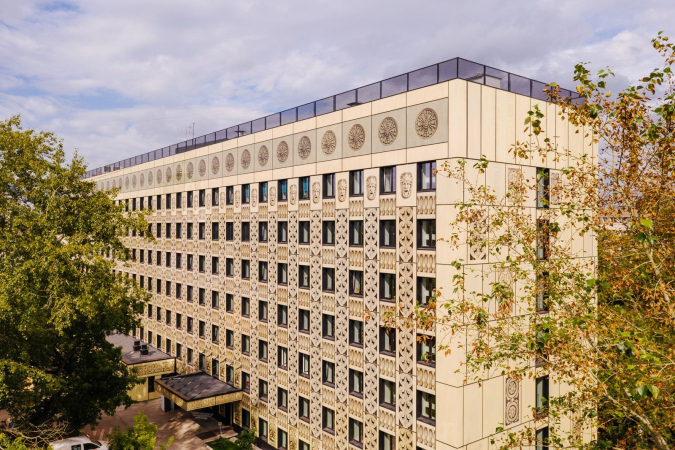
However, the SPEECH architects came up with a more sophisticated proposal, which responds to the proximity of the famous palace. As part of this charity project, they developed a project of façade reconstruction, based on the idea implemented by Sergey Tchoban 10 or 15 years ago in Saint Petersburg’s business centers “LangenZipen”, “Benoit”, and “Vremena Goda” – glass cassettes with photographs of historical decoration, applied to the inner side of the cassette.

The city clinic #23 named after Ippolit Davydovsky. Reconstruction of Building 4
Copyright: Photograph © Dmitry Chistoprudov


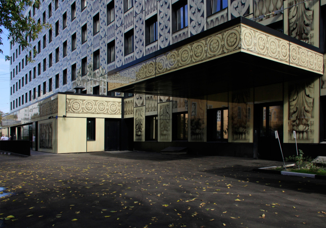
The main entrance to Building 4 is situated on the inner side from the territory of the hospital. On either side of the entrance group, accessed by a gently sloping ramp, the authors placed two unique prints – enlarged photographs of the reliefs from the main staircase of the Batashev palace, redecorated after the fire of 1812 under the supervision of Domenico Gilardi:  “Farewell to the Warrior” and “The Return of Odysseus”.

Farewell to the Warrior (a possible alternative interpretation is the sign of Aeneas to leave Troy. See the thesis by SM Tsareva). The relief of the main staircase of the house of Ivan Batashev. The city clinic #23 named after Ippolit Davydovsky
Copyright: Photograph © Dmitry Chistoprudov


Return of Odysseus. The relief of the main staircase of the house of Ivan Batashev. The city clinic #23 named after Ippolit Davydovsky
Copyright: Photograph © Dmitry Chistoprudov


These reliefs were created a little bit later than the façade décor of the main house, as they refer to the empire-style of the post-fire period. Specifically because of that, the modeling, slender and full of details, including faces and costumes, easily withstood the enlargement. The genuine reliefs on the staircase are smaller in size, are farther away from the viewer, and are meant to be viewed from below. In the printed pattern, these are enlarged, even though they stay slightly less than human height and are moved to the foreground as much as possible: whoever will walk past them on the way to the entrance, will be able to examine the details, and even compare themselves to these figures scale-wise.

What is curious is the illusion of volume: the contrasting chiaroscuro of the photographs emphasizes the relief, and at some point it seems that the figures are only placed under glass, as in a museum showcase; but on the other hand, they are drawn on glass, and look a little like a hologram.

The city clinic #23 named after Ippolit Davydovsky. Reconstruction of Building 4
Copyright: Photograph © Dmitry Chistoprudov


The city clinic #23 named after Ippolit Davydovsky. Reconstruction of Building 4
Copyright: Photograph © Archi.ru


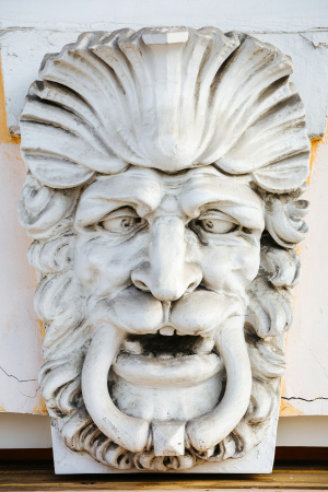
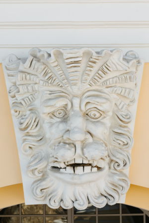
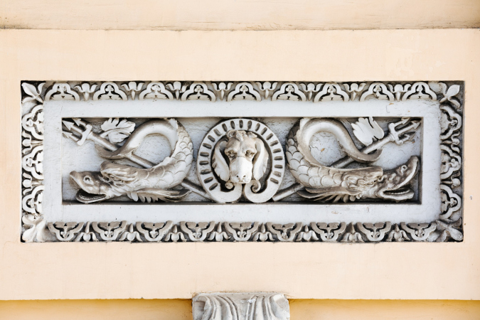
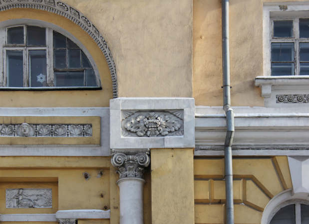
All the other reliefs, represented on the glass panels, belong to the outside decoration of the palace, evidently executed by the boarder of the Academy of Fine Arts, Mikhail Kiselnikov, still in the pre-fire period. Historians note the originality of these details, probably inspired by the Italian experience of this serf artist. Indeed, the facial expressions of the mascarons are completely atypical and may resemble the grimace in the Santa Maria Formosa bell tower in Venice; no less interesting are the compositions with tritons, tridents and a “dog” in the center – from the molded decorations of the main facade of the Batashev palace.

  • zooming
    1 / 8
    The Ivan Batashev palace. The city clinic #23 named after Ippolit Davydovsky. Details of the building′s facade of the early XIX century
    Copyright: Photograph © Dmitry Chistoprudov
  • zooming
    2 / 8
    The batashev palace. The city clinic #23 named after Ippolit Davydovsky. Reconstruction of Building 4
    Copyright: Photograph © Dmitry Chistoprudov
  • zooming
    3 / 8
    The Ivan Batashev palace. The city clinic #23 named after Ippolit Davydovsky. Details of the building′s facade of the early XIX century
    Copyright: Photograph © Dmitry Chistoprudov
  • zooming
    4 / 8
    The batashev palace. The city clinic #23 named after Ippolit Davydovsky. Reconstruction of Building 4
    Copyright: Photograph © Dmitry Chistoprudov
  • zooming
    5 / 8
    The Ivan Batashev palace. The city clinic #23 named after Ippolit Davydovsky. Details of the building′s facade of the early XIX century
    Copyright: Photograph © Dmitry Chistoprudov
  • zooming
    6 / 8
    The Ivan Batashev palace. The city clinic #23 named after Ippolit Davydovsky. Details of the building′s facade of the early XIX century
    Copyright: Photograph © Dmitry Chistoprudov
  • zooming
    7 / 8
    The Ivan Batashev palace. The city clinic #23 named after Ippolit Davydovsky. Details of the building′s facade of the early XIX century
    Copyright: Photograph © Dmitry Chistoprudov
  • zooming
    8 / 8
    The batashev palace. The city clinic #23 named after Ippolit Davydovsky. Reconstruction of Building 4
    Copyright: Photograph © Dmitry Chistoprudov


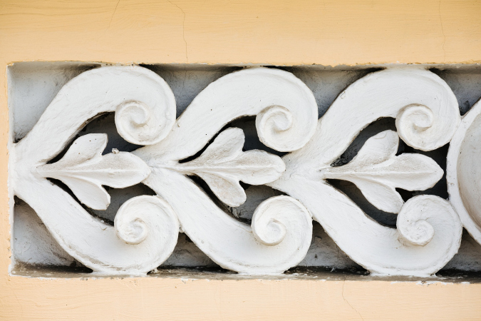
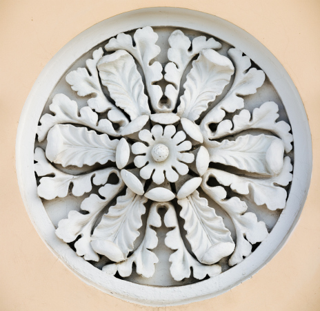
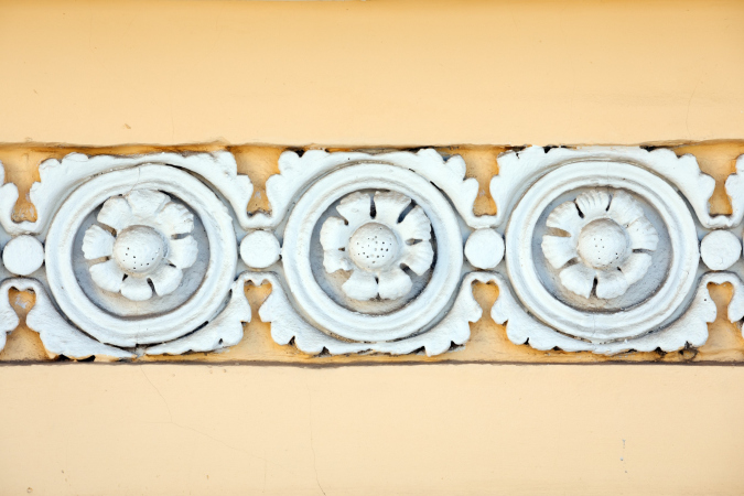
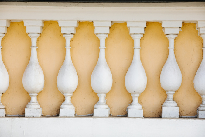
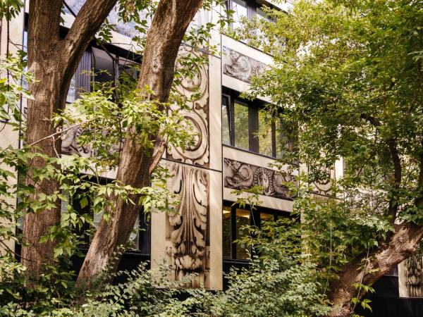
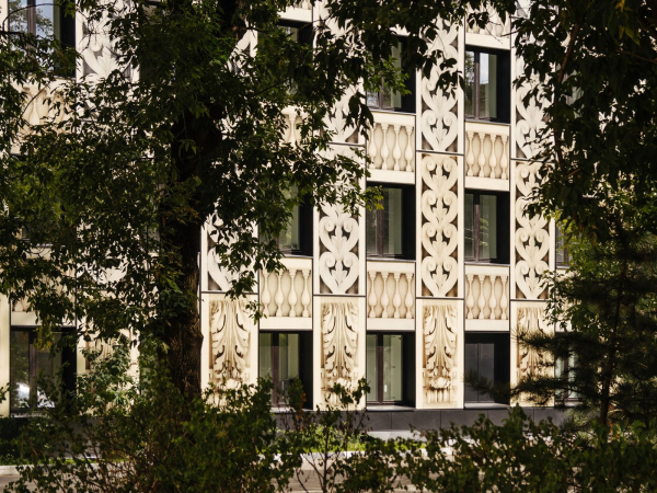
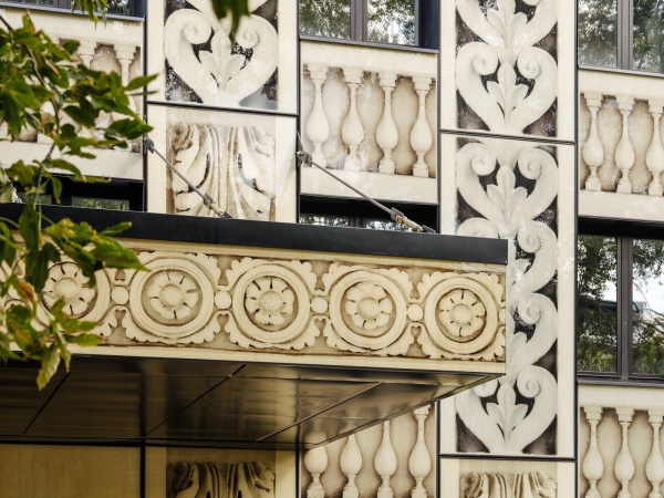
Plus the rosettes, decorative balustrades, and cantilevered structures with a rich leafy ornament. All of these elements became the basis for the décor, applied to the glass panels, and they all are dramatically increased in their scale, largely losing their places in the logic of a classicist façade, at the same time getting a new meaning.

The city clinic #23 named after Ippolit Davydovsky. Reconstruction of Building 4
Copyright: Photograph © Dmitry Chistoprudov


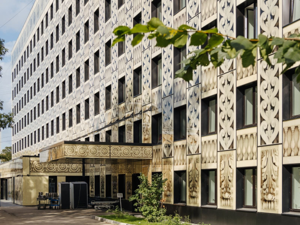
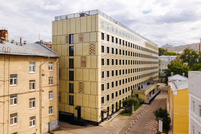
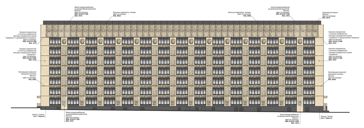
The overall logic of placing these elements is also decorative, akin to a carpet. But then again, it has a classical basis as well: the white parallelepiped with windows got verticals and horizontals, top and bottom, an attic with rosettes, and a basement tier with cantilevers. The horizontals of the balustrades cut through the verticals of the “pilasters” across their entire height; they start from the cantilevers, and end in the “lion” column caps. The dolphins that are depicted on the main façade of the palace, which overlooks the lane, are now represented on the street façade of the building.

The pitch of enlargement also varies: the miniature rosettes, placed in the original relief underneath the windows, and a fragment of the wavy pattern, are enlarged significantly, rolled over in respect to their basic horizontal position, and serve to decorate the “pilasters”. However, there is no deliberate “juggling” with the elements and fragments – rather, the motifs, justified by the proximity of the classicist palace, form some new large pattern with an inner logic of its own.

The city clinic #23 named after Ippolit Davydovsky. Reconstruction of Building 4
Copyright: Photograph © Dmitry Chistoprudov


This pattern looks like grisailles, drowned in the travertine-imitating golden-and-beige tone, which refers us more to the stone of classical architecture in its common meaning than to the yellow paint of the classicist façades. The new façade is not an attempt to turn the 1972 building into a semblance of a palace wing – rather, it becomes some reminder about the monument of architecture, a giant engraved picture of it being displayed at an exhibition. An attempt to revive the valuable reliefs, bringing them to the attention of a passer-by or a patient. And, of course, an attempt to embellish and fill with emotion the building and its surroundings.

The photographs of the façade reliefs are beautiful as they are, especially zoomed in in a slanted light. The sculptural surface, conceived by the author, in real relief is combined with irregularities, paint drips, and urban grime – these two drawings, conceived and real, are superimposed on each other and in such a combination are endowed with a special appeal. One feels like taking their pictures and examining them. Admiring them. Essentially, this is what the authors of the project of the facades of Building 4 are trying to get us to do – admire the zoomed-in reliefs, just passing by. To be surprised to see a huge cantilever behind the thickets of American maples, either embossed or “painted”, but similar to a part of some park grotto from Italy, where the serf architect Kiselnikov studied architecture.

  • zooming
    1 / 5
    The city clinic #23 named after Ippolit Davydovsky. Reconstruction of Building 4
    Copyright: Photograph © Dmitry Chistoprudov
  • zooming
    2 / 5
    The city clinic #23 named after Ippolit Davydovsky. Reconstruction of Building 4
    Copyright: Photograph © Dmitry Chistoprudov
  • zooming
    3 / 5
    The city clinic #23 named after Ippolit Davydovsky. Reconstruction of Building 4
    Copyright: Photograph © Dmitry Chistoprudov
  • zooming
    4 / 5
    The city clinic #23 named after Ippolit Davydovsky. Reconstruction of Building 4
    Copyright: Photograph © Dmitry Chistoprudov
  • zooming
    5 / 5
    The city clinic #23 named after Ippolit Davydovsky. Reconstruction of Building 4
    Copyright: Photograph © Archi.ru


The glass cassettes have yet another special feature: in addition to the fact that the drawing is elaborate and precise, the glass surface reflects the surroundings. Shadows, reflections of neighboring buildings, the palace wings, the nearby church, and the outlines of the trees are superimposed on the pictures taken out of context and enlarged – a technique that further embellishes and enriches the drawing when it is directly perceived.

The city clinic #23 named after Ippolit Davydovsky. Reconstruction of Building 4
Copyright: Photograph © Archi.ru


The city clinic #23 named after Ippolit Davydovsky. Reconstruction of Building 4
Copyright: Photograph © Archi.ru


Of course, the façade reconstruction is limited in its possibilities, and in this case the glass cassettes only helped to “collect” the volume of the building and immerse it into ornamentation. The windows retained their small sizes and recognizable proportions, even though the chamfers did give them some extra depth.

  • zooming
    1 / 7
    The city clinic #23 named after Ippolit Davydovsky. Reconstruction of Building 4
    Copyright: Photograph © Dmitry Chistoprudov
  • zooming
    2 / 7
    The city clinic #23 named after Ippolit Davydovsky. Reconstruction of Building 4
    Copyright: Photograph © Dmitry Chistoprudov
  • zooming
    3 / 7
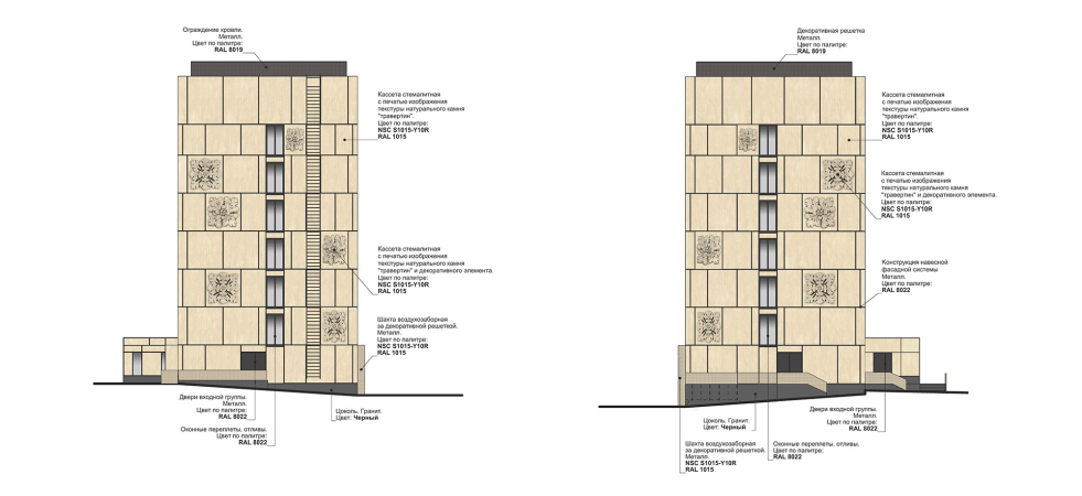
    The city clinic #23 named after Ippolit Davydovsky. Reconstruction of Building 4. Facade 1. View from the Yauzskaya Street
    Copyright: Project © SPEECH
  • zooming
    4 / 7
    The city clinic #23 named after Ippolit Davydovsky. Reconstruction of Building 4. Facade 2. View from the Zemlyansky Lane
    Copyright: Project © SPEECH
  • zooming
    5 / 7
    The city clinic #23 named after Ippolit Davydovsky. Reconstruction of Building 4. Facades 3 and 4. View from the Teterinsky Lane and the Nikoloyamskaya Street
    Copyright: Project © SPEECH
  • zooming
    6 / 7
    The city clinic #23 named after Ippolit Davydovsky. Reconstruction of Building 4. The main facade
    Copyright: Project © SPEECH
  • zooming
    7 / 7
    The city clinic #23 named after Ippolit Davydovsky. Reconstruction of Building 4. The facade along the Zemlyansky Lane
    Copyright: Project © SPEECH


However, one must keep in mind that essentially the whole project was about insulating the façades – and grew into an interesting experiment of working with reliefs, which, being turned into graphics, retain some of the characteristic traits of sculpture because, when viewed from a certain angle, the illusion of volume suggests itself. On the one hand, the repetition and mass production are obvious; on the other hand, there is no direct copying because these motifs are transferred over to a different material and are interpreted as a part of a different system. Rather, it is a collage with magnification, akin to the approach of a collector who is examining interesting details under a magnifying glass – and inviting the passersby to do the same.

29 September 2020

Headlines now
The Golden Crown
The concept for a dental clinic in Yekaterinburg, developed by CNTR Studio, revolves around the idea of a “mouth full of gold”: pristine white porcelain stoneware walls are complemented by matte brass details. To avoid an overly literal interpretation, the architects focused on the building’s proportions, skillfully navigating between sunlight requirements and fire safety regulations.
Flexibility and Integration
Not long ago, we covered the project for the fourth phase of the ÁLIA residential complex, designed by APEX. Now, we’ve been shown different fence concepts they developed to enclose the complex’s private courtyards, incorporating a variety of public functions. We believe that the sheer fact that the complex’s architects were involved in such a detail as fencing speaks volumes.
A Step Forward
The HIDE residential complex represents a major milestone for ADM architects and their leaders Andrey Romanov and Ekaterina Kuznetsova in their quest for a fresh high-rise aesthetic – one that is flexible and layered, capable of bringing vibrancy to mass and silhouette while shaping form. Over recent years, this approach has become ADM’s “signature style”, with the golden HIDE tower playing a pivotal role in its evolution. Here, we delve into the project’s story, explore the details of the complex’s design, and uncover its core essence.
Gold in the Sands
A new office for a transcontinental company specializing in resource extraction and processing has opened in Dubai. Designed by T+T Architects, masters of creating spaces that are contemporary, diverse, flexible, and original, this project exemplifies their expertise. On the executive floor, a massive brass-clad partition dominates, while layered textures of compressed earth create a contextually resonant backdrop.
Layers and Levels of Flight
This project goes way back – Reserve Union won this architectural competition at the end of 2011, and the building was completed in 2018, so it’s practically “archival”. However, despite being relatively unknown, the building can hardly be considered “dated” and remains a prime example of architectural expression, particularly in the headquarters genre. And it’s especially fitting for an aviation company office. In some ways, it resembles the Aeroflot headquarters at Sheremetyevo but with its own unique identity, following the signature style of Vladimir Plotkin. In this article, we take an in-depth look at the United Aircraft Corporation (UAC) headquarters in the Moscow agglomeration town of Zhukovsky, supplemented by recent photographs from Alexey Naroditsky – a shoot that became only recently possible due to the fact that improvements were finally made in the surrounding area.
Light and Shadow
In this article, we delve into the architectural design of the “Chaika” house by DNK ag architects, which was recently completed in 2023 as part of the collection of signature designs at ZILArt. As is well-known, all the buildings in this complex follow a design code, yet each one is distinct. This particular building stands out not only for its whiteness and minimalism but also for the refined use of a limited number of techniques that, together, create what can confidently be called synergy.
Casus Novae
A master plan was developed for a large residential area with a name of “DNS City”, but now that its implementation began, the plan has been arbitrarily reformatted and replaced with something that, while similar on the surface, is actually quite different. This is not the first time such a thing happens, but it’s always frustrating. With permission from the author, we are sharing Maria Elkina’s post.
Treasure Hunting
The GAFA bureau, in collaboration with Tegola and Arkhitail, organized an expedition to the island of Kilpola in Karelia as part of Moskomarkhitektura’s “Open City” festival. There, amidst moss and rocks, the students sought answers to questions like: what is the sacred, where does it dwell, and what sustains it? Assisting the participants in this quest were landscape engineer Evgeny Levin, artist Nicholas Roerich, a moose, and the lack of cellular connection. Here’s how the story unfolded.
Depths of the Earth, Streams of Water
In the Malaya Okhta district, the Akzent building, designed by Stepan Liphart, was constructed. It follows a classic tripartite structure, yet it’s what you might call “hand-drawn”: each façade is unique in its form and details, some of which aren’t immediately noticeable. In this article, we explore the context and, together with the architect, delve into how the form was developed.
Fir Tree Dynamics
The “Airports of Region” holding is planning to build an airport in Karachay-Cherkessia, aiming to make the Arkhyz and Dombay resorts more accessible to travelers. The project that won in an invitation-only competition, submitted by Sergey Nikeshkin’s KPLN, blends natural imagery inspired by the shape of a conifer seed, open-air waiting spaces, majestic large trees, and a green roof elevated on needle-like columns. The result is both nature-inspired and WOW.
​A Brick Shell
In the process of designing a clubhouse situated among pine trees in a prestigious suburban area near Moscow, the architectural firm “A.Len” did the façade design part. The combination of different types of brick and masonry correlates with the volumetric and plastique solutions, further enhanced by the inclusion of wood-painted fragments and metal “glazing”.
Word Forms
ATRIUM architects love ambitious challenges, and for the firm’s thirtieth anniversary, they boldly play a game of words with an exhibition that dives deep into a self-created vocabulary. They immerse their projects – especially art installations – into this glossary, as if plunging into a current of their own. You feel as if you’re flowing through the veins of pure art, immersed in a universe of vertical cities, educational spaces – of which the architects are true masters – and the cultural codes of various locations. But what truly captivates is the bold statement that Vera Butko and Anton Nadtochy make, both through their work and this exhibition: architecture, above all, is art – the art of working with form and space.
Flexibility and Acuteness of Modernity
Luxurious, fluid, large “kokoshniks” and spiral barrel columns, as if made from colorful chewing gum: there seem to be no other mansion like this in Moscow, designed in the “Neo-Russian-Modern” style. And the “Teremok” on Malaya Kaluzhskaya, previously somewhat obscure, has “come alive with new colors” and gained visibility after its restoration for the office of the “architectural ecosystem” as the architects love to call themselves. It’s evident that Julius Borisov and the architects at UNK put their hearts into finding this new office and bringing it up to date. Let’s delve into the paradoxes of this mansion’s history and its plasticity. Spoiler: two versions of modernity meet here, both balancing on the razor’s edge of “what’s current”.
Yuri Vissarionov: “A modular house does not belong to the land”
It belongs to space, or to the air... It turns out that 3D printing is more effective when combined with a modular approach: the house is built in a workshop and then adapted to the site, including on uneven terrain. Yuri Vissarionov shares his latest experience in designing tourist complexes, both in central Russia and in the south. These include houseboats, homes printed from lightweight concrete using a 3D printer, and, of course, frame houses.
​Moscow’s First
“The quality of education largely depends on the quality of the educational environment”. This principle of the last decade has been realized by Sergey Skuratov in the project for the First Moscow Gymnasium on Rostovskaya Embankment in the Khamovniki district. The building seamlessly integrates into the complex urban landscape, responding both to the pedestrian flow of the city and the quiet alleyways. It skillfully takes advantage of the height differences and aligns with modern trends in educational space design. Let’s take a closer look.
Looking at the Water
The site of Villa Sonata stretches from the road to the water’s edge, offering its own shoreline, pier, and a picturesque river panorama. To reveal these sweeping views, Roman Leonidov “cut” the façade diagonally parallel to the river, thus getting two main axes for the house and, consequently, “two heads”. The internal core – two double-height spaces, a living room and a conservatory, with a “bridge” above them – makes the house both “transparent” and filled with light.
The White Wing
Well, it’s not exactly white. It’s more of a beige, white-stone structure that plays with the color of limestone – smoother surfaces are lighter, while rougher ones are darker. This wing unites various elements: it absorbs and interprets the surrounding themes. It responds to everything, yet maintains a cohesive expression – a challenging task! – while also incorporating recognizable features of its own, such as the dynamic cuts at the bottom, top, and middle.
Urban Dunes
The XSA Ramps team designed and built a three-part sports hub for a park in Rostov-on-Don, welcoming people of all ages and fitness levels. The skate plaza, pump track, and playground are all meticulously crafted with details that attract a diverse range of visitors. The technical execution of the shapes and slopes transforms this space into a kind of sculptural composition.
Proportional Growth
The project for the fourth phase of the ÁLIA residential area has been announced. The buildings are situated on an elongated plot – almost a “ray” that shoots out from the center of the area towards the river. Their layout reflects both a response to Moscow’s architectural preferences over the past 15 years, shifting “from blocks to towers”, and an interpretation of the neighboring business park designed by SOM. Additionally, the best apartments here are not located at the very top but closer to the middle, forming a glowing “waistline”.
The “Staircase” Building
In designing the “Details” residential complex in New Moscow, Rais Baishev spiced up the now-popular Moscow theme of a “courtyard” building with an idea drawn from the surrealist drawings by Maurits Escher. He envisioned the stepped silhouettes and descending slopes as a metaphysical mega-staircase, creating a key void within the courtyard that gave the project an internal “spine”. This concept is felt both in the building’s silhouette and on its façades.
Projection of the Quarter
No one doubted that the building that Vladimir Plotkin designed as part of the “Garden Quarters” would be the most modernist of all. And it turned out just that way: while adhering to the common design code, the building successfully combines brick and white stone, rhythmically responding to the neighboring building designed by Ostozhenka, yet tactfully and persistently making a few statements of its own. This includes the projection of the ideal urban development composition “14–9–6”, which can be found right next door, mathematical calculations, including those for various types of terraces (and perhaps the only reminder of the Soviet past of the Kauchuk rubber factory!), and the white “cross-stitch” pattern of the façade grid.
Domus Aurea
In this issue, we examine the “Tessinsky-1” house, designed by Sergey Skuratov and completed in 2023. Located in the middle of the Serebryanicheskaya Embankment district, at the intersection of its main streets, this house assumes a sort of “nodal” role: it not only responds to everything around it and preserves many memories of the former EMA factory within itself, but it weaves all this into a newly directed pattern, reconciling bright “gold” and dark-colored brick, largely with the help of the new, modern-yet-archaic Columba brick, which, come to think about it, is the most precious element here.
The Chimney of Nikola-Lenivets
In this issue, we are examining the “Obelisk House” designed by KATARSIS and built for the Arkhstoyanie 2023 festival. However, it was only finished later on, and this is why we are examining it now. It seems to us that after the “Obelisk House” appeared in Nikola-Lenivets, a dialogue and a few inner connections appeared between the temporary structures built here. These houses no longer look like “accidental neighbors”, more of which below.
​Periscope by the Bay
The jury awarded the second place in the competition for a public and cultural center in Petropavlovsk-Kamchatsky to the companies GORA (“Mountain”) and M4. In the consortium’s proposal, the building resembles a sperm whale with a calf swimming next to it or a periscope, whose lenses capture the most spectacular views from the surrounding landscape.
From Arcs to Dolmens
While working on the competition project for Petropavlovsk-Kamchatsky, ASADOV Architects prioritized the value of the natural and urban environment, aiming to preserve the balance of the location while minimizing the resemblance of the volume that they designed to a “traditional building”. The task was challenging, and the architects created three versions, one of which having been developed after the competition, where their main proposal took third place. However, the point of interest here is not the competition result but the continuity of creative thinking.
Hide and Seek
The ID Moskovskiy house, designed by Stepan Liphart in St. Petersburg, in the courtyards near Moskovskiy Avenue beyond the Obvodny Canal and recently completed, is notable for several reasons. Firstly, it has been realized with considerable accuracy, which is particularly significant as this is the first building where the architect was responsible not only for the facades but also for the layouts, allowing for better integration between the two. On the other hand, this building is interesting as an example of the “germination” of new architecture in the city: it draws on the best examples from the neighborhood and becomes an improved and developed sum of ideas found by the architect in the surrounding context.
The Big Twelve
Yesterday, the winners of the Moscow Mayor’s Architecture Award were announced and honored. Let’s take a look at what was awarded and, in some cases, even critique this esteemed award. After all, there is always room for improvement, right?
Above the Golden Horn
The residential complex “Philosophy” designed by T+T architects in Vladivostok, is one of the new projects in the “Golubinaya Pad” area, changing its development philosophy (pun intended) from single houses to a comprehensive approach. The buildings are organized along public streets, varying in height and format, with one house even executed in gallery typology, featuring a cantilever leaning on an art object.
Nuanced Alternative
How can you rhyme a square and space? Easily! But to do so, you need to rhyme everything you can possibly think of: weave everything together, like in a tensegrity structure, and find your own optics too. The new exhibition at GES-2 does just that, offering its visitor a new perspective on the history of art spanning 150 years, infused with the hope for endless multiplicity of worlds and art histories. Read on to see how this is achieved and how the exhibition design by Evgeny Ace contributes to it.
Blinds for Ice
An ice arena has been constructed in Domodedovo based on a project by Yuri Vissarionov Architects. To prevent the long façade, a technical requirement for winter sports facilities, from appearing monotonous, the architects proposed the use of suspended structures with multidirectional slats. This design protects the ice from direct sunlight while giving the wall texture and detail.