По-русски

​A Brick House and the City

Being fully aware of the romantic and charismatic character of brick architecture, Stepan Liphart invested a fair amount of time into working with the theme of a brick house in St. Petersburg and solved two theorems, proposing towers designed in the style of American Art Deco for the taller housing complex Alter on Magnitogorskaya Street and sensuous Art Deco plastique in a cocktail with loft aesthetics for a house on Malookhtinsky Avenue.

09 October 2020
Object
mainImg
Two houses, designed by Stepan Liphart on the Okhta River in St. Petersburg are interesting due to the fact that they continue the idea of a brick house in a modern city. This theme is still relevant; brick is something that appeals to architects and residents alike, and over the last twenty years Russia has seen quite a few successful examples of that. A brick building can be designed in many ways: as a sculpture in the Modernist key, as a mix of loft aesthetics and techniques of modern architecture, and you can also design it in romantic variations of Art Deco, which was something that Stepan Liphart opted for.

Alter housing complex
Copyright: © Liphart Architects, Mosgraf Agency (visualization)


The house on Malookhtinsky Avenue
Copyright: © Liphart Architects


The housing complexes in the area of the Okhta River, on Magnitogorskaya Street, and on Malookhtinsky Avenue have the same common context. These sites lie on the border between the historical St. Petersburg and Soviet Leningrad, in what might be called a “loose belt” filled with both pre-Revolution residential and factory buildings, and the Soviet Khrushchev-era houses. But then again, both houses will command sweeping views – on the other side of the river the city becomes as historical as it gets, represented by the Smolny architectural ensemble and the St. Nicholas Cathedral. The area is very promising; not far away is St. Petersburg’s Artplay, and there is yet another housing project built by a Swedish developer nearby. The main starting point for turning to brick architecture became the shipyard built in 1911, which changed many names, the most memorable of them being “Fabrika Lepse” (“Lepse Factory”), a red-brick industrial building with a tower, predictably turned today into a business center.

  • zooming
    1 / 3
    Former shipbuilding factory Lepse, now the business center “Shaumyana 10”
    Copyright: © Stepan Liphart
  • zooming
    2 / 3
    Former shipbuilding factory Lepse, now the business center “Shaumyana 10”
    Copyright: © Stepan Liphart
  • zooming
    3 / 3
    Former shipbuilding factory Lepse, now the business center “Shaumyana 10”
    Copyright: © Stepan Liphart


The Alter housing complex on Magnitogorskaya Street

While the context for the projects on Magnitogorskaya Street and Malookhtinsky Avenue was similar, the ordeals of getting all the mandatory municipal approvals turned out to be different. Initially, the Alter House on Magnitogorskaya Street was devised by the author in the style of “brick expressionism” (Backstein expressionismus), a variation of Art Deco, characteristic for large-scale German and Dutch buildings of the 1920s, such as Chilehaus in Hamburg or the Anzeiger Hochhaus in Hannover, in which the turmoil of the technological processes of the machine age is already evident, yet the brickwork still sticks to the old techniques of the handmade nature. Romanticism and megalomania on the one side, and intricate fancy brickwork patterns on the other.

  • zooming
    1 / 4
    Clock tower of the town hall in Wilhelmshaven
    Copyright: Photograph: Christian A. Schroeder / CC BY-SA 4.0
  • zooming
    2 / 4
    Anzeiger Hochhaus in Hannover
    Copyright: Photograph: Christian A. Schroeder / CC BY-SA 4.0
  • zooming
    3 / 4
    Borsigwerke U Bahn station in Berlin
    Copyright: Photograph © A.Savin, WikiCommons
  • zooming
    4 / 4
    Residential Bremen Water Tower, designed by Wilhelm Kunz
    Copyright: Photograph: Hannes Grobe / CC BY-SA 3.0


The first version of Alter was a house with “bastions”, sporting an asymmetric design following the river bend. The crowning balustrade was decorated with pinnacles in the form of factory pipes – a tribute to the industrial landscape. Generally speaking, it must be said that factory chimneys inspire mysterious feelings in architects: some see in them campaniles (and basilicas in factories), and the English early-industrial landscape of factory chimneys looked to Schinkel like smoldering Egyptian obelisks. Conversely, Stepan Liphart saw the pinnacles as factory chimneys (let’s recall here that Mikhail Belov had pinnacles in the shape of oil derricks). In my opinion, the peripheral pinnacles are the perfect place for technological things, just like gargoyles perfectly match the gutters of gothic cathedrals. The architects, on the other hand, romanticize the factory and, perhaps, feel the energy and vitality in it.

  • zooming
    1 / 5
    Project of the house on Magnitogorskaya Street. The brick expressionism version
    Copyright: © Liphart Architects
  • zooming
    2 / 5
    One of the vesrions of the project on Magnitogorskaya Street in the style of brick expressionism
    Copyright: © Liphart Architects
  • zooming
    3 / 5
    One of the vesrions of the project on Magnitogorskaya Street in the style of brick expressionism
    Copyright: © Liphart Architects
  • zooming
    4 / 5
    Project of the house on Magnitogorskaya Street. The classical-style version
    Copyright: © Liphart Architects
  • zooming
    5 / 5
    Project of the house on Magnitogorskaya Street. The classical-style version
    Copyright: © Liphart Architects


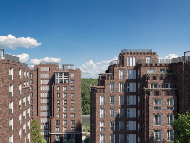
Anyway, the romantic Backstein Expressionismus did not get the approval from the main architect of St. Petersburg, and the second, the classical version of the Alter House was not accepted either. Gradually, the housing complex on Magnitogorskaya Street took on the following appearance: three brick towers grouped around a yard, engaged in a dialogue with three white towers designed by another architect, standing close by. Thus, it looks like some kind of dedication. Poets and composers often dedicate their works to some other people, and architects somehow don’t. At least, this is the first instance that I can recall.

  • zooming
    1 / 3
    Alter housing complex
    Copyright: © Liphart Architects, Mosgraf Agency (visualization)
  • zooming
    2 / 3
    Alter housing complex
    Copyright: © Liphart Architects, Mosgraf Agency (visualization)
  • zooming
    3 / 3
    The site plan. Alter housing complex
    Copyright: © A-Architects


The three towers are executed in the “ribbed” style of American art-deco. The ribbed corners of the ledges highlight the vertical movement, lines multiply and soar upwards, ending in characteristic rounded edges, like jets of fountains that have reached the climax. The terraces of the three topmost floors rest on these “jets”. Plus, there is also space on the roof for the residents of penthouses. Terraces are a characteristic feature of American Art Deco, while the windows with a fine-fractured checkered glazing pattern are more of the Amsterdam and Hamburg brick expressionism. By the way, all the windows are French, reaching down to the floor, which is nice.

  • zooming
    Alter housing complex
    Copyright: © Liphart Architects, Mosgraf Agency (visualization)
  • zooming
    Alter housing complex
    Copyright: © Liphart Architects, Mosgraf Agency (visualization)


In accordance with the accepted structure, the stylobate and the bottom floors will host commercial spaces. On the roof of the stylobate, there will be a private yard with a car park below it. What is curious here is the combination of scales. The scale of the stylobate is one floor, while the lower tier of the towers with pilasters is three floors. While the towers form what night be called a “town-planning territory” – because they are perceived from distant vantage points – the stylobate (with shops and cafes) and the car park entrances are more of the human-friendly scale and the street space. Oh, and by the way, two more public spaces – the waterfront stretching along the historical “Lepse Factory”, through Alter, and further on to the Swedish housing complex, and the yard – will also be landscaped within the framework of this project.

  • zooming
    1 / 7
    Alter housing complex
    Copyright: © Liphart Architects, Mosgraf Agency (visualization)
  • zooming
    2 / 7
    Alter housing complex
    Copyright: © Liphart Architects, Mosgraf Agency (visualization)
  • zooming
    3 / 7
    Plan of the standard floor. Alter housing complex
    Copyright: © A-Architects
  • zooming
    4 / 7
    Plan of the standard floor. Alter housing complex
    Copyright: © A-Architects
  • zooming
    5 / 7
    Plan of the standard floor. Alter housing complex
    Copyright: © A-Architects
  • zooming
    6 / 7
    Plan of the 1st floor. Alter housing complex
    Copyright: © A-Architects
  • zooming
    7 / 7
    Section view. Alter housing complex
    Copyright: © A-Architects


The house on Malookhtinsky Avenue

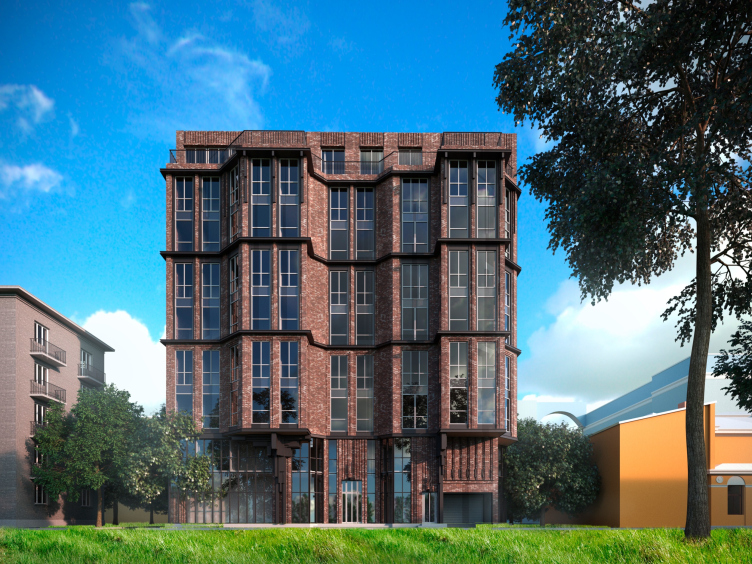
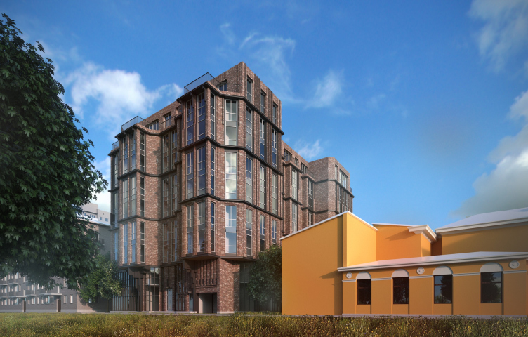
This house was designed for an even more diverse context: a yellow-and-white classic official building, a Silver-Age tenement, devoid of any decor, and Soviet five-story houses built around the 1960s. There was already a building designed for this site earlier but its solutions did not satisfy the customer. Originally, the new volume was going to be curvilinear, with a complex silhouette, and the architects kept on searching for the optimal composition from the standpoint of insolation and other performance areas. Later on, however, the client decided to return to a simpler form that was set in the predecessor project. All the facades consist of three tiers two floors each, plus a two-story “base” and an attic. Because of the fact that the floors are grouped in twos, a visual effect of decreased height appears: it seems as if there are five floors, while in reality there are nine. The house overlooks the street with one of its side ends, this side end also being the main facade. The composition is held together by two bay windows with a recession between them. The sensuous line of the bay windows refers to a Modernist tenement of the early XX century, and specifically the works by Aleksey Bubyr. One of the proposed versions was a stuccoed one, and in this version the origin was clearly visible.

  • zooming
    1 / 5
    The house on Malookhtinsky Avenue. The version with wide bay windows
    Copyright: © Liphart Architects
  • zooming
    2 / 5
    The house on Malookhtinsky Avenue. The version with wide bay windows
    Copyright: © Liphart Architects
  • zooming
    3 / 5
    The house on Malookhtinsky Avenue. The version with wide bay windows
    Copyright: © Liphart Architects
  • zooming
    4 / 5
    The house on Malookhtinsky Avenue
    Copyright: © Liphart Architects
  • zooming
    5 / 5
    The house on Malookhtinsky Avenue
    Copyright: © Liphart Architects


The asymmetric recession between the bay windows introduces a slight twist of irregularity in the composition of the main facade. It looks as though a wave washed over its surface, shifting the bay windows off the central axis. In actuality, the bay windows had to be narrowed down so that they would not, in accordance with the effective construction regulations, exceed 30% of the facade surface. The bay windows rest on cantilevers made in the shape of inverted architectons – another Art Deco detail. The brick wall is thinning out as it goes upwards: in the mezzanine, the bulging frames of the windows highlight the mass of the wall, in the next tier, the blades between the windows become thinner, and in the third tier the piers between the windows are partially covered with metallic sheets. This creates an effect of the wall thinning out and gradually losing its mass.

  • zooming
    1 / 4
    The house on Malookhtinsky Avenue
    Copyright: © Liphart Architects
  • zooming
    2 / 4
    The house on Malookhtinsky Avenue
    Copyright: © Liphart Architects
  • zooming
    3 / 4
    Akzent housing complex
    Copyright: © A-Architects and OOO ITs “Stroyexpert”
  • zooming
    4 / 4
    The house on Malookhtinsky Avenue
    Copyright: © Liphart Architects


A similar effect is also to be seen in the bottom tier, which you cannot really call a “basement floor” because it looks light and actually consists of two floors – one commercial and one residential. These two are visually connected by a glass surface, upon which brick “curtains” fold up and spread out. The yard facade is organized by risalits and bay windows, yet flatter and more regular. From the opposite side, the house sports a rounded projection that looks as if it continues the movement of the wave that starts on the main facade. In the attic, there is a penthouse; the wall is decorated with a ribbed brick pattern.

  • zooming
    1 / 7
    The house on Malookhtinsky Avenue
    Copyright: © Liphart Architects
  • zooming
    2 / 7
    The house on Malookhtinsky Avenue
    Copyright: © A-Architects and OOO ITs “Stroyexpert”
  • zooming
    3 / 7
    Akzent housing complex
    Copyright: © A-Architects and OOO ITs “Stroyexpert”
  • zooming
    4 / 7
    Akzent housing complex
    Copyright: © A-Architects and OOO ITs “Stroyexpert”
  • zooming
    5 / 7
    Akzent housing complex
    Copyright: © A-Architects and OOO ITs “Stroyexpert”
  • zooming
    6 / 7
    Akzent housing complex
    Copyright: © A-Architects and OOO ITs “Stroyexpert”
  • zooming
    7 / 7
    Akzent housing complex
    Copyright: © A-Architects and OOO ITs “Stroyexpert”


It expected that the house will be decorated with exquisite Klinker brick; the windows that it has are of the modern “loft” kind, with dark-gray aluminum frames, which effectively means that an industrial loft in its most attractive brick aspect has been crossed with the expressive plastique of the Silver Age tenement. Other things that come to mind include experiments with bay windows in brick expressionism and in the development of the Petrograd Side of the 1920s. Evidently, combining a brick loft with traditional architecture turned out to be quite a fruitful idea. For example, in Moscow’s Rassvet LOFT Studio the industrial aesthetics was superimposed on a New Urbanism technique, where the facade front looked as if it consisted of a few narrow houses. A cocktail of a brick loft, Art Nouveau, and Art Deco in the house on Malookhtinsky Avenue is also quite convincing.

The house on Malookhtinsky Avenue
Copyright: © Liphart Architects


Both variations of the brick house proposed by Stepan Liphart look to me very promising in terms of developing the modern city. The creative interpretation of brickwork forms – in the lower tiers – a kind of plastique that is pleasing to the human eye, at the same time making it possible to build as many more floors as you want, should such a necessity arise. A significant part of Manhattan and other areas of New York is built precisely this way. For large Russian cities, where, for objective reasons, it is not possible to create humane 7-8-story buildings, textured bricks of varying degrees of order are an excellent way out. And, wherever the scale is smaller, and the performance indicators do not press the author so much, the possibilities of brick plastique are virtually boundless, which is proven by the project on Malookhtinsky Avenue.

P.S. A human being as an artistic task

The unity of the human principle and artistic values in traditional architecture was always considered immutable. Idolizing the machine, which occurred in the avant-garde architecture, has led to complete ousting of everything human, which used to manifest itself in order, plastique, and the very “humanity” of the building. This process has been going on for about a hundred years. In the XXI century, the presence of human principle in the poetics of architecture is not just no longer considered obligatory – nobody so much as raises any questions about it. To a certain extent, the “humanity” has shifted to planning and organizing the interiors of the apartments, yet even there it stays purely functional, not covering the spiritual aspects of human life.

The factory of the early XX century was a home for a machine, yet it paradoxically retained the human principle in the construction of the brick facade, proportions, silhouette, and window frames. Today, we value and preserve the “pre-avant-garde” brick architecture, but it’s only the shell that we preserve, dealing with the internal space at our discretion. And it’s just beautiful that form did not follow function! In the brick expressionism of the 1920s, the residential building, ironically, became a factory, was filled with industrial romanticism, yet still kept its humanity thanks to the hand-laid brickwork pattern.

Today, architects do not ask any questions about the human principle as the artistic task, engrossed in less lofty, albeit just as important issues. For Stepan Liphart, however, this question was the main one when he was studying to get his degree in architecture. It was the human being that became the subject of an argument between the then-student Liphart and the deconstructivist Thom Mayne, and the vector was chosen by Stepan precisely during that time. In his every St. Petersburg project – the housing complexes “Renaissance”, “Beaumont”, and “Little France” on the Vasilyevsky Island, the architect explores the facade plastique, in which the human being is inevitably present. And the two brick houses on Okhta are no exception.

Then, of course, the main question remains – Why? Why do we need man in architecture? The answer, at least for a Christian, is very simple. Man is the image of God. By throwing man out of architecture, we also eliminate God from it. What remains is nature and technology, ecological totalitarianism and robotic civilization, which we are seeing in the impending sixth technological order. Art and architecture (if the latter indeed is an art) always predicts the image of the future very accurately. And it’s great that they give us hope.

09 October 2020

Headlines now
The Golden Crown
The concept for a dental clinic in Yekaterinburg, developed by CNTR Studio, revolves around the idea of a “mouth full of gold”: pristine white porcelain stoneware walls are complemented by matte brass details. To avoid an overly literal interpretation, the architects focused on the building’s proportions, skillfully navigating between sunlight requirements and fire safety regulations.
Flexibility and Integration
Not long ago, we covered the project for the fourth phase of the ÁLIA residential complex, designed by APEX. Now, we’ve been shown different fence concepts they developed to enclose the complex’s private courtyards, incorporating a variety of public functions. We believe that the sheer fact that the complex’s architects were involved in such a detail as fencing speaks volumes.
A Step Forward
The HIDE residential complex represents a major milestone for ADM architects and their leaders Andrey Romanov and Ekaterina Kuznetsova in their quest for a fresh high-rise aesthetic – one that is flexible and layered, capable of bringing vibrancy to mass and silhouette while shaping form. Over recent years, this approach has become ADM’s “signature style”, with the golden HIDE tower playing a pivotal role in its evolution. Here, we delve into the project’s story, explore the details of the complex’s design, and uncover its core essence.
Gold in the Sands
A new office for a transcontinental company specializing in resource extraction and processing has opened in Dubai. Designed by T+T Architects, masters of creating spaces that are contemporary, diverse, flexible, and original, this project exemplifies their expertise. On the executive floor, a massive brass-clad partition dominates, while layered textures of compressed earth create a contextually resonant backdrop.
Layers and Levels of Flight
This project goes way back – Reserve Union won this architectural competition at the end of 2011, and the building was completed in 2018, so it’s practically “archival”. However, despite being relatively unknown, the building can hardly be considered “dated” and remains a prime example of architectural expression, particularly in the headquarters genre. And it’s especially fitting for an aviation company office. In some ways, it resembles the Aeroflot headquarters at Sheremetyevo but with its own unique identity, following the signature style of Vladimir Plotkin. In this article, we take an in-depth look at the United Aircraft Corporation (UAC) headquarters in the Moscow agglomeration town of Zhukovsky, supplemented by recent photographs from Alexey Naroditsky – a shoot that became only recently possible due to the fact that improvements were finally made in the surrounding area.
Light and Shadow
In this article, we delve into the architectural design of the “Chaika” house by DNK ag architects, which was recently completed in 2023 as part of the collection of signature designs at ZILArt. As is well-known, all the buildings in this complex follow a design code, yet each one is distinct. This particular building stands out not only for its whiteness and minimalism but also for the refined use of a limited number of techniques that, together, create what can confidently be called synergy.
Casus Novae
A master plan was developed for a large residential area with a name of “DNS City”, but now that its implementation began, the plan has been arbitrarily reformatted and replaced with something that, while similar on the surface, is actually quite different. This is not the first time such a thing happens, but it’s always frustrating. With permission from the author, we are sharing Maria Elkina’s post.
Treasure Hunting
The GAFA bureau, in collaboration with Tegola and Arkhitail, organized an expedition to the island of Kilpola in Karelia as part of Moskomarkhitektura’s “Open City” festival. There, amidst moss and rocks, the students sought answers to questions like: what is the sacred, where does it dwell, and what sustains it? Assisting the participants in this quest were landscape engineer Evgeny Levin, artist Nicholas Roerich, a moose, and the lack of cellular connection. Here’s how the story unfolded.
Depths of the Earth, Streams of Water
In the Malaya Okhta district, the Akzent building, designed by Stepan Liphart, was constructed. It follows a classic tripartite structure, yet it’s what you might call “hand-drawn”: each façade is unique in its form and details, some of which aren’t immediately noticeable. In this article, we explore the context and, together with the architect, delve into how the form was developed.
Fir Tree Dynamics
The “Airports of Region” holding is planning to build an airport in Karachay-Cherkessia, aiming to make the Arkhyz and Dombay resorts more accessible to travelers. The project that won in an invitation-only competition, submitted by Sergey Nikeshkin’s KPLN, blends natural imagery inspired by the shape of a conifer seed, open-air waiting spaces, majestic large trees, and a green roof elevated on needle-like columns. The result is both nature-inspired and WOW.
​A Brick Shell
In the process of designing a clubhouse situated among pine trees in a prestigious suburban area near Moscow, the architectural firm “A.Len” did the façade design part. The combination of different types of brick and masonry correlates with the volumetric and plastique solutions, further enhanced by the inclusion of wood-painted fragments and metal “glazing”.
Word Forms
ATRIUM architects love ambitious challenges, and for the firm’s thirtieth anniversary, they boldly play a game of words with an exhibition that dives deep into a self-created vocabulary. They immerse their projects – especially art installations – into this glossary, as if plunging into a current of their own. You feel as if you’re flowing through the veins of pure art, immersed in a universe of vertical cities, educational spaces – of which the architects are true masters – and the cultural codes of various locations. But what truly captivates is the bold statement that Vera Butko and Anton Nadtochy make, both through their work and this exhibition: architecture, above all, is art – the art of working with form and space.
Flexibility and Acuteness of Modernity
Luxurious, fluid, large “kokoshniks” and spiral barrel columns, as if made from colorful chewing gum: there seem to be no other mansion like this in Moscow, designed in the “Neo-Russian-Modern” style. And the “Teremok” on Malaya Kaluzhskaya, previously somewhat obscure, has “come alive with new colors” and gained visibility after its restoration for the office of the “architectural ecosystem” as the architects love to call themselves. It’s evident that Julius Borisov and the architects at UNK put their hearts into finding this new office and bringing it up to date. Let’s delve into the paradoxes of this mansion’s history and its plasticity. Spoiler: two versions of modernity meet here, both balancing on the razor’s edge of “what’s current”.
Yuri Vissarionov: “A modular house does not belong to the land”
It belongs to space, or to the air... It turns out that 3D printing is more effective when combined with a modular approach: the house is built in a workshop and then adapted to the site, including on uneven terrain. Yuri Vissarionov shares his latest experience in designing tourist complexes, both in central Russia and in the south. These include houseboats, homes printed from lightweight concrete using a 3D printer, and, of course, frame houses.
​Moscow’s First
“The quality of education largely depends on the quality of the educational environment”. This principle of the last decade has been realized by Sergey Skuratov in the project for the First Moscow Gymnasium on Rostovskaya Embankment in the Khamovniki district. The building seamlessly integrates into the complex urban landscape, responding both to the pedestrian flow of the city and the quiet alleyways. It skillfully takes advantage of the height differences and aligns with modern trends in educational space design. Let’s take a closer look.
Looking at the Water
The site of Villa Sonata stretches from the road to the water’s edge, offering its own shoreline, pier, and a picturesque river panorama. To reveal these sweeping views, Roman Leonidov “cut” the façade diagonally parallel to the river, thus getting two main axes for the house and, consequently, “two heads”. The internal core – two double-height spaces, a living room and a conservatory, with a “bridge” above them – makes the house both “transparent” and filled with light.
The White Wing
Well, it’s not exactly white. It’s more of a beige, white-stone structure that plays with the color of limestone – smoother surfaces are lighter, while rougher ones are darker. This wing unites various elements: it absorbs and interprets the surrounding themes. It responds to everything, yet maintains a cohesive expression – a challenging task! – while also incorporating recognizable features of its own, such as the dynamic cuts at the bottom, top, and middle.
Urban Dunes
The XSA Ramps team designed and built a three-part sports hub for a park in Rostov-on-Don, welcoming people of all ages and fitness levels. The skate plaza, pump track, and playground are all meticulously crafted with details that attract a diverse range of visitors. The technical execution of the shapes and slopes transforms this space into a kind of sculptural composition.
Proportional Growth
The project for the fourth phase of the ÁLIA residential area has been announced. The buildings are situated on an elongated plot – almost a “ray” that shoots out from the center of the area towards the river. Their layout reflects both a response to Moscow’s architectural preferences over the past 15 years, shifting “from blocks to towers”, and an interpretation of the neighboring business park designed by SOM. Additionally, the best apartments here are not located at the very top but closer to the middle, forming a glowing “waistline”.
The “Staircase” Building
In designing the “Details” residential complex in New Moscow, Rais Baishev spiced up the now-popular Moscow theme of a “courtyard” building with an idea drawn from the surrealist drawings by Maurits Escher. He envisioned the stepped silhouettes and descending slopes as a metaphysical mega-staircase, creating a key void within the courtyard that gave the project an internal “spine”. This concept is felt both in the building’s silhouette and on its façades.
Projection of the Quarter
No one doubted that the building that Vladimir Plotkin designed as part of the “Garden Quarters” would be the most modernist of all. And it turned out just that way: while adhering to the common design code, the building successfully combines brick and white stone, rhythmically responding to the neighboring building designed by Ostozhenka, yet tactfully and persistently making a few statements of its own. This includes the projection of the ideal urban development composition “14–9–6”, which can be found right next door, mathematical calculations, including those for various types of terraces (and perhaps the only reminder of the Soviet past of the Kauchuk rubber factory!), and the white “cross-stitch” pattern of the façade grid.
Domus Aurea
In this issue, we examine the “Tessinsky-1” house, designed by Sergey Skuratov and completed in 2023. Located in the middle of the Serebryanicheskaya Embankment district, at the intersection of its main streets, this house assumes a sort of “nodal” role: it not only responds to everything around it and preserves many memories of the former EMA factory within itself, but it weaves all this into a newly directed pattern, reconciling bright “gold” and dark-colored brick, largely with the help of the new, modern-yet-archaic Columba brick, which, come to think about it, is the most precious element here.
The Chimney of Nikola-Lenivets
In this issue, we are examining the “Obelisk House” designed by KATARSIS and built for the Arkhstoyanie 2023 festival. However, it was only finished later on, and this is why we are examining it now. It seems to us that after the “Obelisk House” appeared in Nikola-Lenivets, a dialogue and a few inner connections appeared between the temporary structures built here. These houses no longer look like “accidental neighbors”, more of which below.
​Periscope by the Bay
The jury awarded the second place in the competition for a public and cultural center in Petropavlovsk-Kamchatsky to the companies GORA (“Mountain”) and M4. In the consortium’s proposal, the building resembles a sperm whale with a calf swimming next to it or a periscope, whose lenses capture the most spectacular views from the surrounding landscape.
From Arcs to Dolmens
While working on the competition project for Petropavlovsk-Kamchatsky, ASADOV Architects prioritized the value of the natural and urban environment, aiming to preserve the balance of the location while minimizing the resemblance of the volume that they designed to a “traditional building”. The task was challenging, and the architects created three versions, one of which having been developed after the competition, where their main proposal took third place. However, the point of interest here is not the competition result but the continuity of creative thinking.
Hide and Seek
The ID Moskovskiy house, designed by Stepan Liphart in St. Petersburg, in the courtyards near Moskovskiy Avenue beyond the Obvodny Canal and recently completed, is notable for several reasons. Firstly, it has been realized with considerable accuracy, which is particularly significant as this is the first building where the architect was responsible not only for the facades but also for the layouts, allowing for better integration between the two. On the other hand, this building is interesting as an example of the “germination” of new architecture in the city: it draws on the best examples from the neighborhood and becomes an improved and developed sum of ideas found by the architect in the surrounding context.
The Big Twelve
Yesterday, the winners of the Moscow Mayor’s Architecture Award were announced and honored. Let’s take a look at what was awarded and, in some cases, even critique this esteemed award. After all, there is always room for improvement, right?
Above the Golden Horn
The residential complex “Philosophy” designed by T+T architects in Vladivostok, is one of the new projects in the “Golubinaya Pad” area, changing its development philosophy (pun intended) from single houses to a comprehensive approach. The buildings are organized along public streets, varying in height and format, with one house even executed in gallery typology, featuring a cantilever leaning on an art object.
Nuanced Alternative
How can you rhyme a square and space? Easily! But to do so, you need to rhyme everything you can possibly think of: weave everything together, like in a tensegrity structure, and find your own optics too. The new exhibition at GES-2 does just that, offering its visitor a new perspective on the history of art spanning 150 years, infused with the hope for endless multiplicity of worlds and art histories. Read on to see how this is achieved and how the exhibition design by Evgeny Ace contributes to it.
Blinds for Ice
An ice arena has been constructed in Domodedovo based on a project by Yuri Vissarionov Architects. To prevent the long façade, a technical requirement for winter sports facilities, from appearing monotonous, the architects proposed the use of suspended structures with multidirectional slats. This design protects the ice from direct sunlight while giving the wall texture and detail.